At the heart of photography is the idea that you are conveying a message to your viewers. Perhaps you want to show the beauty of a waterfall or the drama of an incredible sunrise. Or, you may hope to depict the dark intensity of a jagged mountain peak. A photograph with a clear message can be as effective as possible; its composition, colors, subject matter, and lighting all add to the impression that you are trying to convey. And, more than any other element of composition, the concept of simplicity helps you achieve this goal. In this article, I will cover the ways in which simplicity plays a role in successful photography, including how to implement it to improve your own photographs.
Table of Contents
The Scene in Front of You
There are two types of simplicity that matter for the purposes of this article. The first involves the scene in front of your camera; some scenes are simpler than others. A landscape, for example, may be a nothing more than a field of grass with rolling hills in the distance; or, it may be a rainforest with countless trees and vines intersecting from every direction in front of your camera. The first scene, of course, is much simpler than the second.
As a scene grows in complexity, it becomes progressively more difficult to weave successful compositions. Even expert photographers will likely find it difficult to photograph a chaotic forest; they might even simplify their task by focusing on the details of just a single tree. In contrast, a rolling field of grass presents few challenges with regards to composition; if you photograph the scene in good lighting, it isn’t hard to make a successful image.
Especially as a beginner, it is far easier to focus on photographing simple scenes. As an example, I still display a few images from my earliest days of photography, even though I had very little practice with composition at the time. These images succeed because I photographed a landscape with just a few points of interest; in other words, I didn’t bite off any more than I could chew.
That’s not to say that complex or chaotic scenes should be avoided; they simply tend to take more effort to photograph. However, I am sure that you have seen wonderful images of rainforests and other busy landscapes, despite their complexity. The more pictures you take, the easier it will become to photograph scenes like this. As a beginner, though, it is easiest to take successful photographs if you focus on simple scenes – even if you learn more by practicing with landscapes that are more difficult.
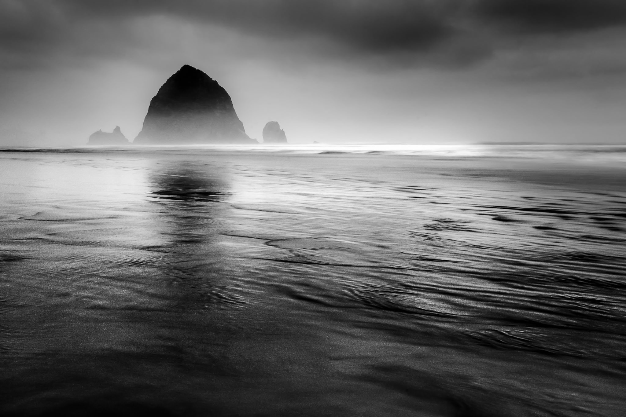
NIKON D5100 + 18-55mm f/3.5-5.6 @ 32mm, ISO 100, 6, f/22.0
Simplicity in Your Composition
Along with the simplicity of a scene, there is another element at play: the structure of your composition itself. In the same way that landscapes vary in their complexity, so do the structures of your photographs. Even images of the same scene can have different levels of complexity; some will be simpler, clearer, and more readable than the others.
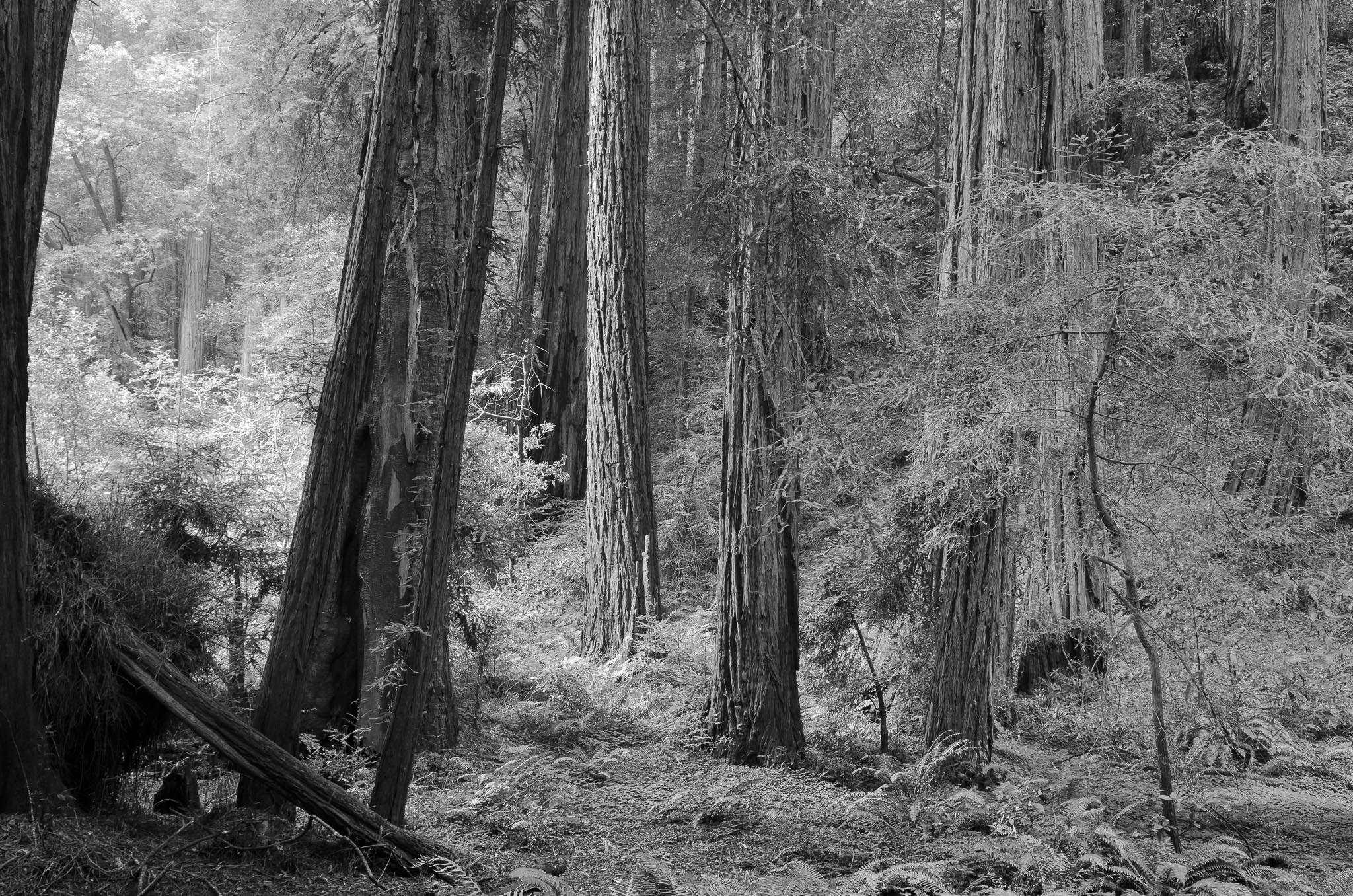
Consider the two photographs below, for example. I have shown this example before, but it is particularly relevant to this discussion and merits a second look. Here, you can see the obvious difference between a cluttered and a simple composition. Even though the landscape itself is exactly the same (and I took the images just a few seconds apart from one another), the second photograph is far more powerful than the first:
Second:
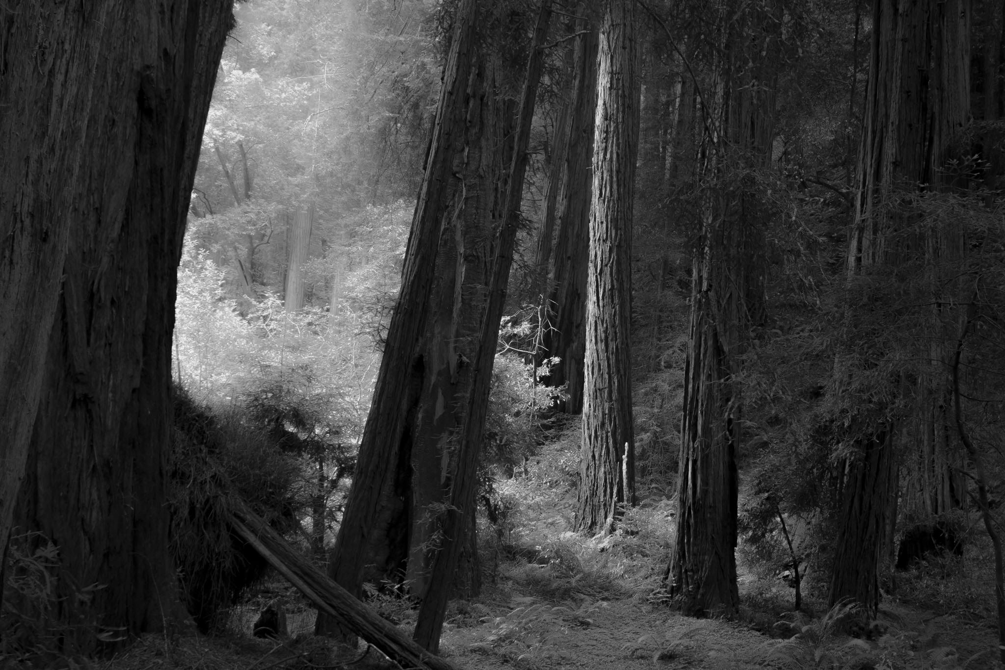
In the first photograph, I tried to reveal every detail of the frame. The resulting photograph, however, is confusing and drab. The second photograph, on the other hand, is my final take on the same scene. With this version, instead of revealing every possible detail, I intentionally darkened (in post-production) the portions that didn’t add to my final intent. My framing, too, is different, removing the distracting plants from the right-hand side of the image. The second photo has exactly the message I wanted to convey: a soft, peaceful mood and a beautiful subject.
The second photograph succeeds because of my use of simplification. After thinking about the scene, I realized that my message was one of gentleness and tranquility. Although the first photograph showed more details in the nearby forest, none of those details added any sense of beauty to the frame. So, I eliminated every object that took away from my message, and the photograph improved drastically as a result. This process – removing any objects that detract from your intent – is the concept of exclusion.
Exclusion
When I am taking pictures, my first thought is always on what I can leave out of an image to make it stronger. To construct a somber composition, I exclude the cheerful wildflowers at the edge of a photo; to show a wild desert landscape, I shoot over any footprints in the foreground. You lose simplicity every time that a tree branch cuts through the sky without a purpose – every time that you try to photograph a scene without regards to composition.
Simplicity is about clarifying your message by excluding useless details.
Your goal is to include objects only if they add value to your photograph. Run through every element of the frame. How is the lighting? Does it complement your photograph’s message? What about the subject itself? Ask yourself questions. If every aspect of an image adds value to its whole, you have created a successful photograph.
This doesn’t mean, of course, that a good image must have just a few points of interest. In fact, I think the opposite is true; many of the world’s great photos succeed precisely because they are intricate and complex.
Simplicity Versus Complexity
I believe that one reason Ansel Adams grew so famous is the powerful complexity of his photographs. His compositions are easy to understand, yet they also are elaborate and filled with details. One of my favorite Ansel Adams photographs, for example, is The Tetons and the Snake River. Despite – or due to – its complexity, this photo delivers a strong message of drama and beauty. Even though it is filled with several elements (the river, the clouds, the mountain snow, the trees along the river, and many more), each one adds strength to Ansel Adams’s message.
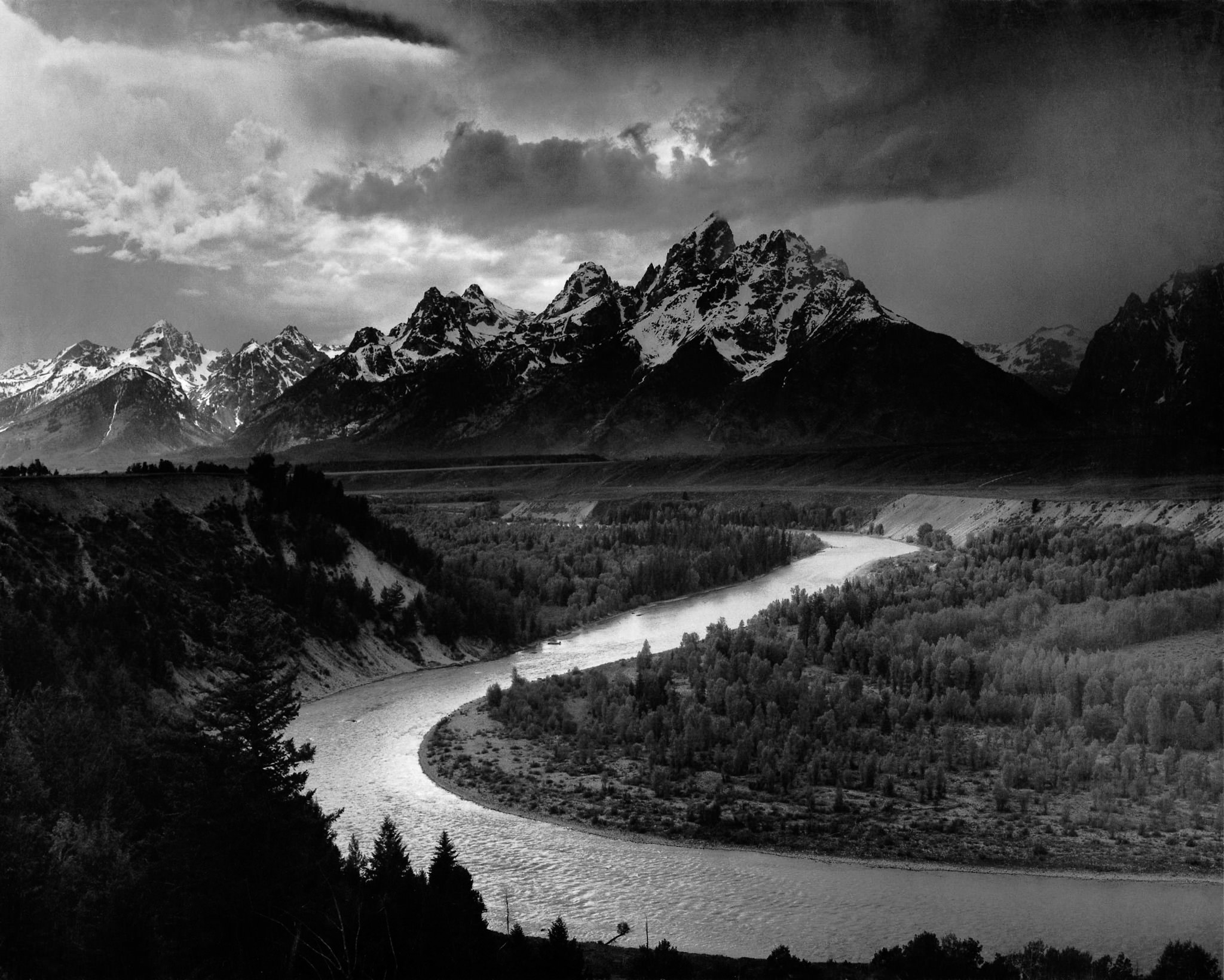
However, this does not contradict the idea of simplicity. In fact, I believe that many complex photographs succeed precisely because they are simple at their core. The Ansel Adams image above, for instance, is incredibly complex; it is filled with countless details and points of interest. At the same time, its underlying message is perfectly clear – the dramatic beauty of the Snake River under a stormy sky.
This is why a photograph of a plain, white wall – a simple shot of a simple subject – is also inherently boring. Simplicity certainly clarifies your message, but you need to have a message in the first place for it to be worthwhile. A photo that is too simple is dull, but an overly complex photograph can be impossible to understand.
When it comes to composition, simplicity is just another word for clarity. Whether you photograph rolling hills or a chaotic forest, the underlying message of your photograph is what really counts. As you search for the most effective possible images, simplicity is among the best tools at your disposal.

- Introduction to This Guide
- What is Composition?
- Elements of Composition
- Light
- Color
- Simplicity (You Are Here)
- The Refining Process
- Composition Tips
Thanks Spencer for your very valuable articles ! One funny think in this one : the photo of your first trip perfectly respects the rule of third… Wish you hate :-)
Thank you, Marc! I do hate the rule of thirds, but only in the sense that I find it irrelevant – I don’t think about it one way or another. At the end of the day, I’m not actively pursuing it or actively avoiding it. Some of my photos do line up with it by chance.
Zen
How refreshing to find articles about photography (and great articles too) rather than the usual gearhead or shill or “influencer” trying to persuade us that we “need” the latest and greatest equipment.
Thanks
Nice contemplative article. The difference between looking and seeing.
Glad that you enjoyed it!
Thank you for this site, you are wonderful people who share knowledge, wisdom and technique selflessly and with passion. I would like to disagree that the first photograph is simple: it has fog, long exposure, ominous clouds: three very powerful elements. I believe it’s confusing to beginners to call it simple, when its a phototograph that beginners can’t take, because they don’t know yet the meaning of making the photograph versus taking it.
Ansel Adam’s photograph is so powerful, I believe because he used a bit of the chiaroscuro technique: a light patch os followed by a dark patch, then light patch, then dark, and on and on, both in the vertical and horizontal direction. Very powerful, and his 2nd most famous photograph.
Thank you, I am glad that you enjoy this site! What I meant by the first photo is simply that the landscape itself was fairly simple, although I agree that the resulting photo has some elements of complexity. Thanks for your comments.
Hi Spencer,
Nice article and I totally agree. I have a 13 x 19 portfolio that I use only to print my really best pictures. Most of them are quite simple and you don’t have to ask yourself what is the subject haha.
Thanks for your comments, Simon! Prints are the best way to look at your favorite photos, in my opinion. It’s very rewarding to hold a tangible version of your hard work in the field and in post-production :)
I have a niece in law that is on her way to being a professional photographer. When I first took her on photo walks she instantly focused on one thing in a complex landscape. She had no training (which was good) but immediately sought simplicity. Her landscapes were effective immediately. She has since won many competitions and gotten better and better.
Unfortunately, many of my failings as a landscape photographer comes from too much complexity. I could learn much from her, yet she has little experience overall. I have taught her a great deal about portrait photography and lighting, but nothing to show her regarding landscapes. In fact, she should be teaching me. Very humbling.
She just turned 18…
Thanks for sharing, Sceptical. Your niece in law sounds like a natural photographer. Some people have an eye for simplicity and composition without any prior practice — I hope she continues to enjoy photography so much.
The final take is weather simple or copmplex ,beauty is the same …well done ,thanks.
Thank you for your comments, Hani!
A great article, Spencer, couldn’t agree more :)
Cheers,
Sharif.
Thanks, Sharif!
Very interesting article. Really helps to remind oneself that very often less is more.
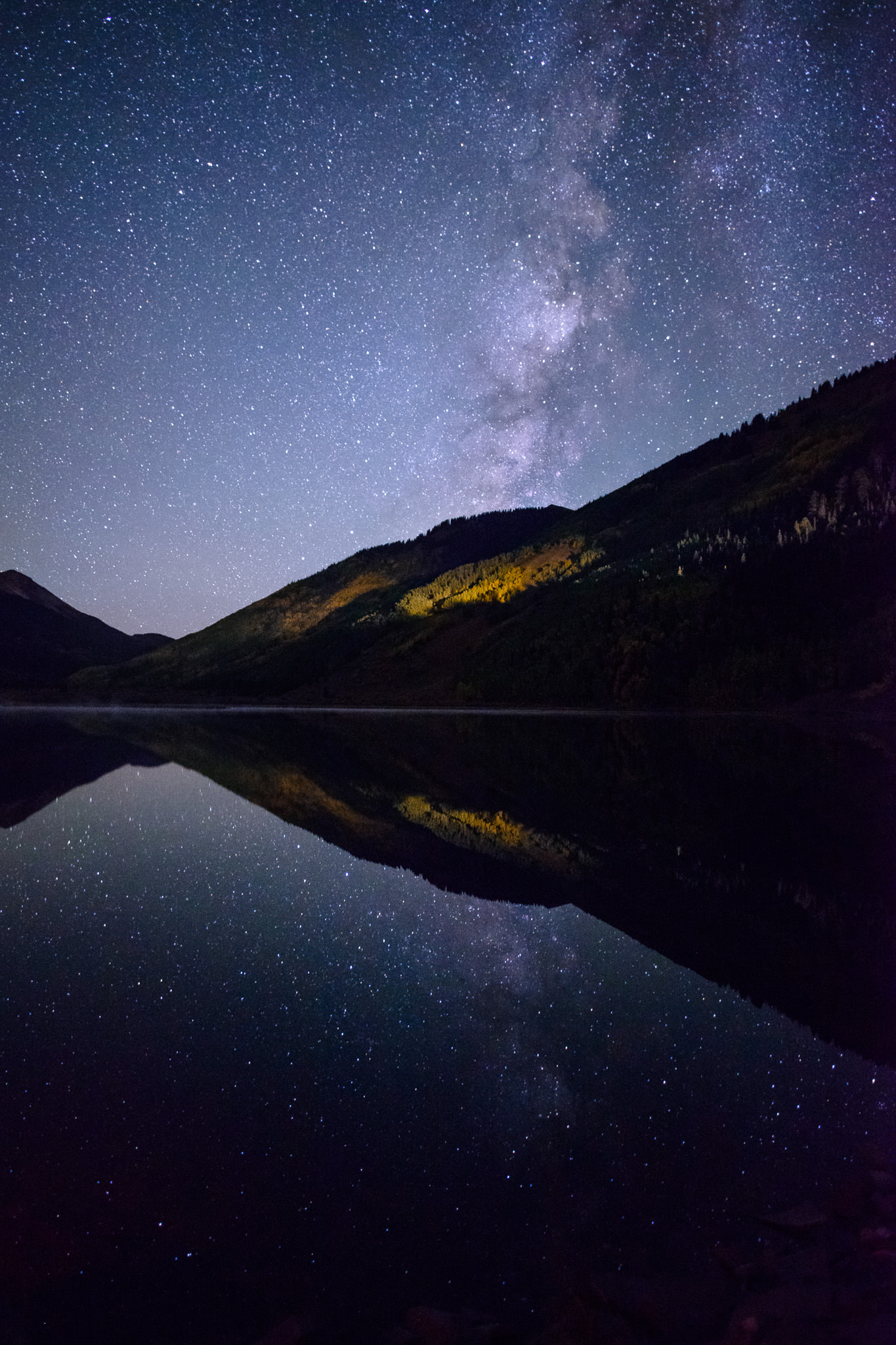
Keep up such great articles. Can you tell me where you took the last image. A really amazing photo.
Thank you
Thank you, Ralph. I took that last photo at the Mesquite Sand Dunes in Death Valley National Park. It was about fifteen minutes after the sun had set.