Chances are good that you’ve run across plenty of inaccuracies and misinformation in the online world of photography, landscape or otherwise. Some myths, though, stand the test of time, outlasting years of diligent debunking. Below are four of the most common myths and misconceptions you’ll find in the field of landscape photography, including some which are prevalent even among advanced photographers.
Table of Contents
1) The Rule of Thirds
Perhaps the single most stubborn myth in landscape photography, and photography in general, is the rule of thirds. You’ve heard of it before, I’m sure. Even non-photographers know about the rule of thirds.
The rule of thirds isn’t simply the most well-known composition tip; it’s the only one that a lot of people know. But is it worthwhile? Should you mentally superimpose a 1/3 grid across many, most, or all of your photos before taking them?

The simple answer is no; you shouldn’t default to composing to the rule of thirds. Perhaps the most important reason why is that the rule of thirds is just a single inflexible structure, reducing one of the most important concepts in photography – composition – into a formula that takes away much of your creative control.
Think of the best photos of all time. How many of them are composed according to the rule of thirds? Some certainly align more than others, but their compositions are all over the board.
The rule of thirds is only valuable in one way: It introduces beginners to the fact that off-center compositions can be successful. That’s it. If you already understand this fact – the potential value of placing your subject off to one side or the other – you’ve outgrown the rule of thirds.
Other than that, there is no psychological basis to the rule of thirds. There is no difference between the rule of thirds and, say, the “rule of two fifths” except that it’s easier to remember. Our eyes certainly don’t gravitate to the 1/3 intersection points; generally, they gravitate toward the points of interest in a photo regardless of where they are located.
Same goes for other compositional structures. If you try to compose a large portion of your photos in the same way, you likely will miss out on a lot of interesting images.
Myth: The rule of thirds is the most pleasing and powerful way to compose your photos.
Instead: Composition is very complicated, highly subjective, and deeply personal. The ideal composition will change significantly from photo to photo. It’s not that the rule of thirds structure is bad by any means – it’s just neutral, no more special than other ways to frame a photo. The better method is to compose every landscape photo for its own merits. Don’t fall back on an inflexible, one-size-fits-all rule to address such an important subject.
2) Exposing to the Right (ETTR) and Blown Highlights
Exposing to the right, or ETTR, is when you take the brightest possible photo that doesn’t overexpose any pixels with important details. Done right, ETTR results in the highest possible image quality, since you are capturing as much information as possible.
However, you’ll sometimes hear landscape photographers say that they don’t expose to the right because they don’t want to blow out any highlights. Or, they’ll mention a handful of situations where ETTR isn’t helpful, such as high-contrast scenes. Is that an accurate perspective or another myth?
First, let’s look at an easy example. The following photo is as bright as possible, but none of the highlight details are completely blown out. An image like this out of camera is exposed to the right:
No one really argues with that example. It is a clear case of ETTR, with very a bright photo that nonetheless preserves all of the important highlight detail. Virtually all photographers agree that ETTR in cases like this will result in the best possible image quality (after darkening the RAW photo in post-production).
Where many people get confused is that this example, too, is properly exposed to the right (unedited):
And so is this one (also unedited):

That’s because exposing to the right has nothing to do with whether your photo appears too dark or too bright. It has everything to do with preserving your highlight detail.
In fact, exposing to the right frequently means taking a darker exposure than what your camera’s meter recommends. Of the three photos above, if I had followed my meter, the bottom two would have lost significant highlight detail. Exposing to the right, then, saved the photo.
So, if anyone ever tells you not to expose to the right because it can result in overexposure, they are misinformed. By definition, ETTR can’t blow out your highlights.
That’s not to say you should always expose to the right, though. It can take some extra time in the field to get exact, and you might be willing to accept a less-than-optimal exposure in order to guarantee that you got something before the scene faded. And, at higher ISOs (not as common in landscape photography), the benefits are much subtler.
But don’t fall for the myth that exposing to the right can blow out your highlights. Instead, ETTR is calculated underexposure – calculated to the brightest possible point, so that you capture the greatest amount of information in a single image.
Myth: Exposing to the right can blow out your highlights.
Instead: Exposing to the right is the optimal exposure in a photo. Proper ETTR simply cannot blow out any important highlights, since the fundamental definition of exposing to the right is that you’re keeping your highlights intact. Rather than following your camera’s meter exactly, expose to the right if you have time to do so. (If you want tips, check out this article.)
3) Where to Focus in a Landscape
If you’re trying to capture a landscape, and you want the entire image to appear as sharp as possible from front to back, where would you focus? The horizon? Your main subject? A third of the way into the scene? None of the above. It seems like for every possible focusing distance, you’ll find someone recommending it as optimal! But most of these suggestions miss the mark.
Even hyperfocal distance calculators and charts are not ideal if you want the sharpest photo from front to back. They are biased toward giving you the exact same (relatively low) amount of background sharpness in every single photo, regardless of whether or not a sharper result is possible, and regardless of how close or far away your foreground is. On top of that, they don’t even take diffraction into account. If maximum front to back sharpness is your goal, they’re not worth consulting.
Instead, to find the distance where you should focus in order to capture both a maximally sharp foreground and background, you don’t need a chart; you only need some elementary school math. It’s the “double the distance” method, as we’ve mentioned a few times before on Photography Life: Find the closest object in your scene that you want to be sharp. Estimate its distance away from your camera. Double that distance. Focus there.
Here, I the nearest flowers were about one foot (0.3 meters) away from my camera, so I focused on flowers about two feet (0.6 meters) away.
You can go in more detail by reading our full hyperfocal distance article, but you already have the fundamental information you need. If the closest object in your photo is roughly two feet away, focus four feet away. If the closest object in your photo is one meter away, focus two meters away.
The only counterexample is if you don’t want maximum sharpness from front to back – for example, if you’re prioritizing subject sharpness more than anything else. In that case, simply focus on the subject (such as the Milky Way at night).
Myth: You should focus “1/3 into the scene” in landscape photography. Or you should focus on the horizon. Or you should use a traditional hyperfocal distance chart. Etc.
Instead: There is only one focusing point which equalizes foreground and background sharpness, giving you the sharpest possible photo from front to back. Although there are a few methods to find it, the easiest is simply the double-the-distance method. (Also check out our other article on selecting the optimal aperture now that you’ve focused properly.)
4) Professionals and Manual Mode
Somehow, word got around to beginning photographers that the pros shoot all-manual everything. Although that makes sense in theory – expert photographers wouldn’t want the camera making any crucial decisions, right? – it doesn’t capture a large part of the truth.
The fact is that professional photographers use various automatic features all the time. Autofocus, automatic metering, semi-automatic exposure modes, auto subject tracking, TTL flash, and so on. It’s almost inescapable, and that’s a good thing.
Automatic modes aren’t just a way to fill in gaps in your knowledge. They also serve an important purpose to speed up the capture process.
For example, say that you’re capturing a sunrise as the sky gets brighter and brighter. Do you want to watch your camera’s meter and manually change exposure when it shifts, or would you rather the camera do the exact same thing on its own, giving you one less thing to worry about?
Most people would prefer the latter. That’s one reason why I use aperture-priority mode (the most useful of the semi-automatic modes, in general) all the time for landscape photography, and only switch to manual when I need several photos in a row to have exactly the same exposure settings.
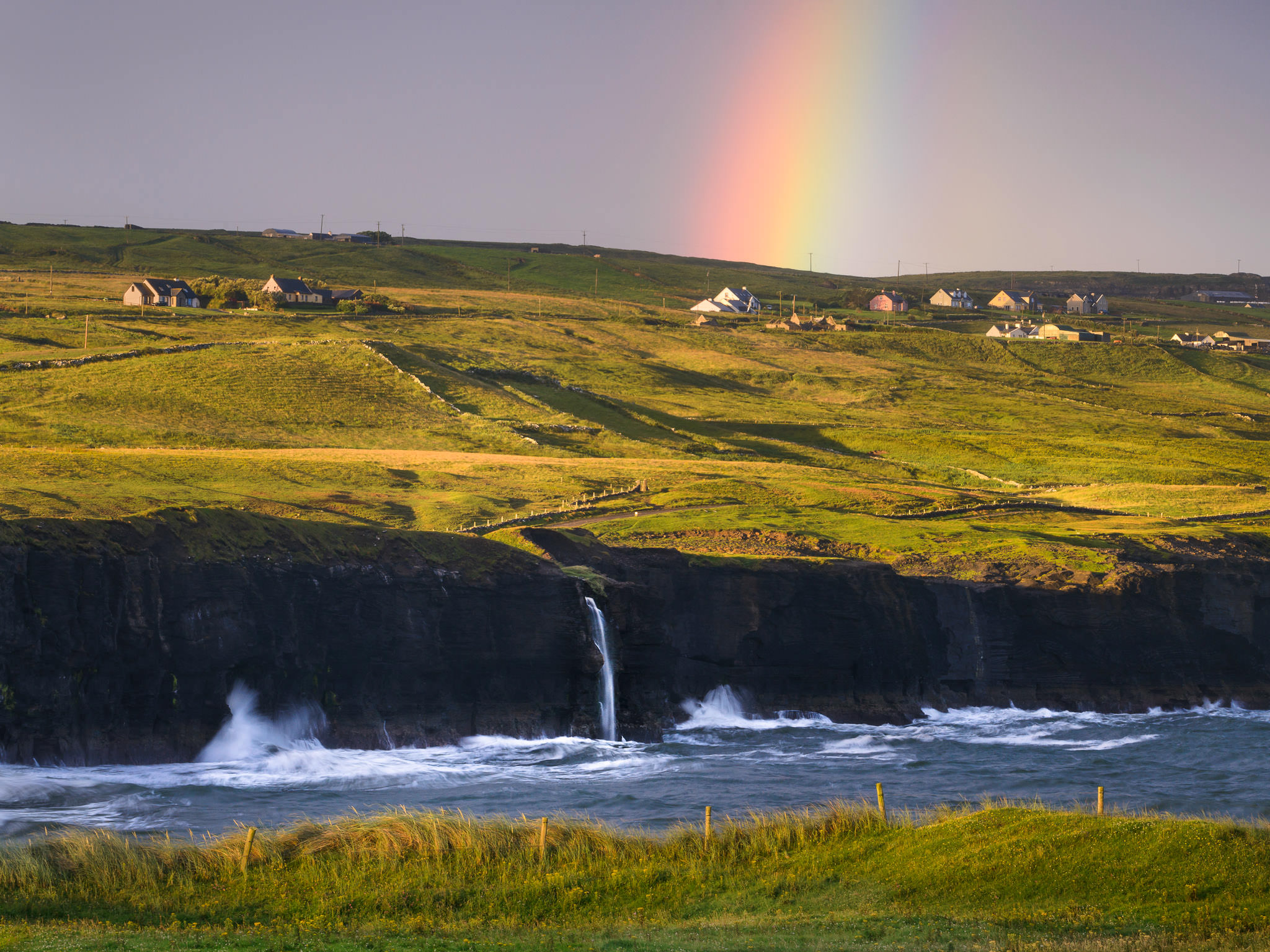
In another case, say that you’re trying to focus perfectly on a fence in your foreground while a rainbow is fading quickly in the background. Should you take the time to magnify live view as much as possible, then manually turn the focus ring until the image looks sharp? Or, would you rather use autofocus to focus at the exact same spot much more quickly, and with generally equal accuracy? That’s what I did below:
Pros shoot with various automatic settings all the time. I’m not referring to all professionals – certainly, some photographers prefer to shoot completely manually all the time, either out of habit or just because they’re most comfortable with it – but the vast majority will use specific automatic features constantly without a second thought. If it’s an easier way to get the same image, why not?
Myth: Advanced photographers avoid the “auto” settings a camera offers.
Instead: It depends upon the person, but most advanced photographers will shoot with some auto settings quite often. This doesn’t mean you should use the full-auto mode on your camera, which really does take away vital control. It also doesn’t mean manual mode is useless; it’s essential for certain images. But once you’ve mastered things like exposure and focusing, you’ll realize that there are several times when you can use an automated feature to speed up your process without giving up control.
Conclusion
From the creative side of landscape photography to the technical, there are plenty of popular myths that can harm your photos if you believe them too thoroughly.
These just scratch the surface, but hopefully the information above provides a framework for parsing the reality of common landscape photography suggestions. Quite simply, question everything you learn and test it out for yourself before accepting it as valid. Try out different compositions other than the rule of thirds and see how you like the results. Practice exposing to the right – the proper way – if you’ve been wary of it before. Compare for yourself the double-the-distance method against traditional hyperfocal distance charts to see which one gives you sharper images from front to back. And, if you’re shooting all-manual everything, use a semi-automatic mode of some kind and see if it improves your speed in the field.
The good news is that a number of photographers out there already know the information above, and they’re constantly correcting myths when they may appear. Still, some faults will always find a way into the fold, and it helps to be prepared against them from the start. Hopefully the list above puts a few of them into perspective for you.
If there are any other myths you’ve come across that you want other photographers to know, feel free to add them in the comments below!
But ETTR means exposing to the right of neutral grey in the light meter. I don’t understand how the second and third photos are ETTR. Or am I missing something? How can an ETTR photo look dark? Doesn’t it mean shifting from what the camera perceives as a neutral exposure, to what it considers a bright exposure? So for a ‘dark’ photo to be ETTR, it should have something extraordinarily bright in the frame. This isn’t true incase of the clouds or the sunset.
Dare I suggest the author is making a mistake? Maybe he thinks ETTR is something else?
“But don’t fall for the myth that exposing to the right can blow out your highlights. Instead, ETTR is calculated underexposure – calculated to the brightest possible point, so that you capture the greatest amount of information in a single image.”
In this statement shouldn’t it be ‘ETTR is calculated overexposure’?
In-fact the second and third examples (clouds and sunset) are underexposed.
I am willing to be corrected here if my understanding is wrong.
The photos are great by the way.
Thank you for the great question and for putting it in a kind way compared to most internet arguments! You have a very common misunderstanding, but ETTR doesn’t mean taking a photo that is exposed to the right of neutral gray on an incident meter. Instead, ETTR is exposing a photo as much toward the right-hand side of the histogram as possible, *without* blowing out any important highlights!
Often this does mean that the photo will look brighter than an incident meter would suggest. But in very high contrast scenes, there may be some bright highlights (like the clouds in the photo in this article) that would be overexposed even according to an incident meter’s recommendation, let alone if you exposed more than that. In such situations, in order to push the photo as far to the right as possible without overexposure, ETTR actually requires you to take a darker image than the meter suggests. The image may apparently be underexposed, but it’s actually the brightest possible photo that you could have gotten away with, without blowing out your important highlights.
Hope this makes sense and let me know if you have any more questions about it.
I like myth no. 4) Professionals and Manual Mode. It seems that a lot of my wedding photographer friends are using manual setting only with their camera ie manual exposure, manual flash. Their excuses are they cannot control the exposure properly with auto setting. I always said that what’s the point of having thousand dollars camera and flash when you can’t trust them to set the exposure properly for you. After years of using the camera I use whatever settings that the camera have as long that it gives me the exposure that I want without missing the moment.
My favourite are manual, aperture and shutter priority.
Manual when I believe the exposure is not changing so much ie in a room with an off camera flash setting. Aperture priority when I want to maintain a fixed aperture ie when I want a shallow depth of field. Lastly shutter priority when I want to maintain maximum flash sync with the camera ie when I want to have a fill flash under the midday sun.
You might phrase your question another way. Why buy a manual camera for thousands of dollars and then set it to auto? You can buy a far cheaper camera that will do the same thing and give you the same results. Shooting auto will give all your pictures a similar look because the camera’s sole goal is a correct exposure. But exposure is not all there is. Getting correct exposure is relatively easy. Other things are more important. If you want to move outside the box for a more creative and personalized look, then manual is the better choice. Perhaps your friends who shoot manual are more
knowledgeable and do not worry about exposure, but want the creativity that manual shooting will give them.
While it’s good to not feel too constrained when doing creative work, I think portraying these types of “rules” as “myths” misses the point.
When learning techniques that support creative work, a common process is:
1. Learn the “rules”
2. Master the “rules”
3. Break the “rules”
Guidelines on how to capture a photograph, place paint on a canvas or arrange music are intended to give people a foundation of basics to build upon with more advanced techniques and to eventually deviate from with creative endeavors. They aren’t “myths”, they are the building blocks for learning. Rather than dismissing them as such, provide people with some of the next blocks for building (some other articles here have already taken this direction with more advanced lessons on composition, exposure, etc.).
To answer your comment above – of course fundamentals/basics should be taught. Some people can start off well with “do whatever looks good to you” but most want more concrete starting points to try and build from. Does it always need to be the rule of thirds? No, it could be leading lines, balance, symmetry, etc. That’s why some people enjoy daily/weekly/monthly “challenge” based learning where they focus on one thing at a time for a while, then move onto another. The rule of thirds is popular because it’s simple to understand and (important in a tech world) can be easily implemented as in-camera guidance. Many other techniques are difficult to build right into a viewfinder.
Great article. And, man, I so love that shot of the rainbow. It speaks peace and rest, a time of joy and not friction. Great shot. Thanks again.
Spencer,
My only ‘quibble’ with your article is that the distance that is two times that of the nearest object you want in focus in your composition IS the hyperfocal point or a very close approximation.
Richard
Yes indeed! Unfortunately, whenever I write that in an article, it seems to devolve into a long discussion on the definition of hyperfocal distance, where I argue (and have always maintained) that the definition of hyperfocal distance is flexible enough to allow the double-the-distance method to count as hyperfocal distance.
The technical definition is: “The closest point to your camera that you can focus, while still ending up with an acceptably sharp region at infinity.”
Hyperfocal distance calculators ask you to pick your definition for “acceptably sharp” as an arbitrary circle of confusion value. They usually default to 0.03 mm of background blur (due to out-of-focusness, not diffraction) for that value if you don’t specify one. This is not going to give you the same result as double-the-distance. But the problem is that some images are capable of backgrounds with significantly more sharpness than that, without sacrificing foreground details (such as cases where the foreground is relatively far away, and you are using a wide angle lens). Other situations can’t even manage 0.03 mm of background blur, such as shooting with a medium lens and a very nearby foreground.
So, I prefer to pick my definition of “acceptably sharp” in a way that is less arbitrary and more meaningful: Rather than a specific value, I take “acceptably sharp” to mean “equal in sharpness to the foreground.” That is totally allowed within the definition of hyperfocal distance, since “acceptably sharp” is already open to your own personal requirements. Then, the result is perfect for my needs – a photo with equal foreground and background sharpness, i.e., the maximum possible sharpness from front to back. And this is indeed the double-the-distance point.
By now, you’re already focused in the right spot – the hyperfocal distance, which is also double the distance – but you don’t know which aperture to use. When you extend the definition to “equal in sharpness to the foreground, and as sharp as possible,” then what’s left is to choose the aperture that balances depth of field (circle of confusion blur) with diffraction (Airy disk blur). Calculating that aperture value takes a bit of effort, but you could always look at the charts I made in an earlier article to avoid that step!
photographylife.com/how-t…t-aperture
A very good, concise article.
ETTR, auto vs manual mode and hyperfocal distance got a bit left out in the comments though.
Your explanation of these topics is excellent and hits the nail on the head. They are so misunderstood and yet so important.
Thank you, Betty, glad that you enjoyed it. Those are the myths (particularly ETTR and hyperfocal distance) that are widespread among even advanced photographers, just because so much of the information online is inaccurate or misleading on those topics.
I think the rule of the(your) eye takes president over all. Pho
Martin, I agree 100%. It’s all about making the photo look how you want and conveying your message. Beyond that, it’s also all about being deliberate, asking yourself questions in the field and trying to improve an image as much as possible. Composition is a multi-layered concept, but man, when it works for an image and highlights the most important parts of a given photo, the results are exceptional.
Good discussion, Spencer; thanks. My own approach to the “rule of 3rds” is to try to determine what each area of the image contributes to the composition. I do mostly wildlife photography so it’s a little different than landscape photography- more “composition” is done in post-processing. But I see so many wildlife photogaphers who compulsively apply the rule of 3rds and end up with an image where two thirds of the picture contributes nothing!
So whether it’s landscape or wildlife or any other type of photography, I think it’s imperative to try to see how each area of the image contributes to the composition.
Also, I find that the rule of 3rds doesn’t necessarily have to be vertical/horizontal; I often use the “rule” diagonally with pleasing results.
Thank you, Philip, that’s the way to do it – the more deliberate you can be in assessing each portion of the frame, the better. Ask yourself why it exists, what it adds/subtracts from your message, how you can improve it, and so on. I like that you bring up composition in post-processing via cropping. Quite true that it’s valuable for wildlife photography, perhaps more so than most other genres. Even for landscapes, I find that only a small handful of my top images require no cropping whatsoever. Sometimes, I’ll leave a bit of wiggle room in the field just in case, if I’m unsure whether I prefer the composition slightly one way or slightly another, just to take advantage of the “limitless” time that you have to compose a photo once you bring it back to the computer.
Olaf Otto Becker
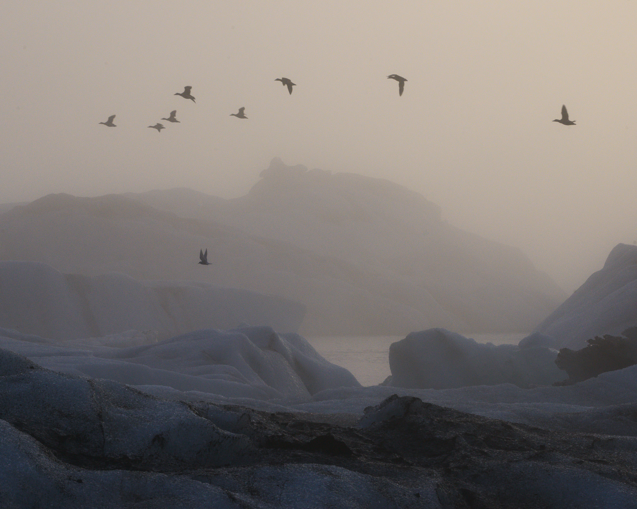
Hi Frank, not sure if your comment got cut off or not, but I just looked up Olaf Otto Becker’s photos of icebergs, and they are absolutely stunning. If this is also a rule of thirds comment, I’ll note that most of his images don’t comply :)
Spencer, I saw his work at the Reykjavik Museum of Photography last week, and bought a couple of his books, my favorite is his landscape presentations of Sumatra and other places besides Iceland and Greenland; it is amazing what and 8×10 large format rig can do.
F
Thank you for adding this, then – his photos are excellent. I just checked out his work from Sumatra as well and enjoyed it. I’m sure the 8×10 rig helps to get the particular look he’s after, but it’s clear that the person behind the camera really knows his craft in this case, too.
I subscribe to the theory that you learn the fundamentals so you know when to break them.
Agreed, although it’s still worth questioning whether some of those fundamentals deserve to be taught in the first place :)
Everyone has a different opinion on the rule of thirds issue, and that’s all right by me.