Have you heard of the Orton Effect? This post-processing technique has been around since the 1980s, if not earlier, but the trend has exploded tremendously in the past few years. If you haven’t heard of it, you aren’t alone – it only recently began to gain mainstream popularity. And yet, in some ways, the Orton Effect is swallowing the modern world of landscape photography. This is barely an exaggeration; after seeing the Orton Effect in practice, you should be able to spot it in at least a third of the trending 500px landscape photos, as well as many winning photo contest entries. This article covers all the basics of the Orton Effect, including a tutorial on how to implement it in your own images – and a discussion on why you may not want to do so.
1) What is the Orton Effect?
At its most basic, the Orton Effect is a glow added to photographs (typically landscapes) in post-production. In and of itself, that doesn’t seem too harmful. The problem, though, comes when a huge portion of landscape photos have the same glow. Take the photograph below for an exaggerated application of the Orton Effect:
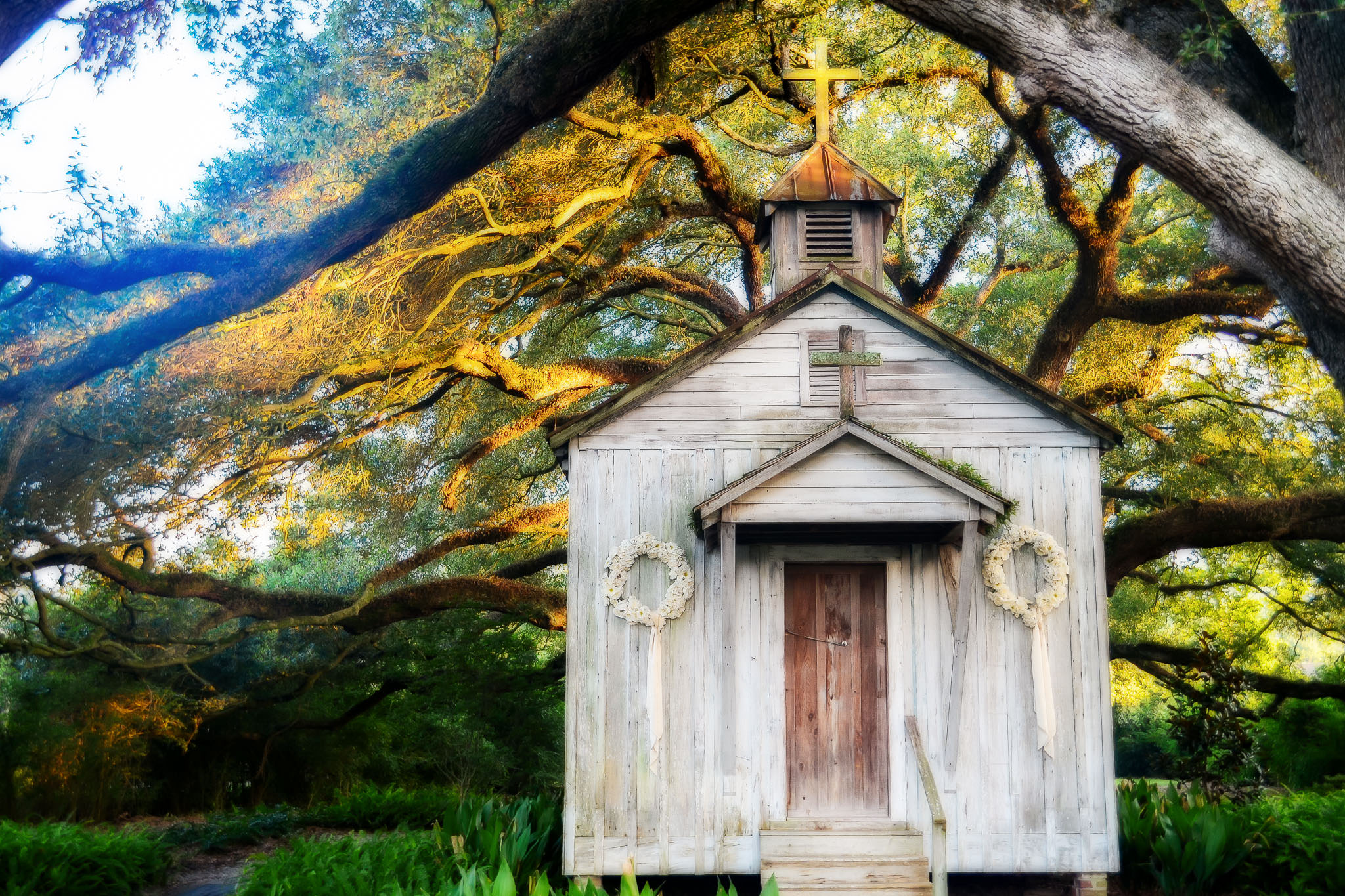
You should be able to tell that something is unusual about the photo above; it has a bizarre glow around it, and certain areas of the photo are hard to focus on. That’s the Orton Effect.
The Orton Effect was created by abstract landscape photographer Michael Orton, and it was originally a technique used in film photography. With film, a photographer would take two images and layer them on top of each other – one that was in focus, and one that was overexposed and out of focus. When layered, the two pieces of film produced a single photograph that was simultaneously sharp and blurry. This technique added a soft glow effect to a photo.
This article is not a reaction against Michael Orton. His photographs are great; you should check out his website if you get the chance. Even his Orton Effect images are so abstract and surreal that they hardly fall under the umbrella of this article.
Instead, I want to focus on the modern-day implementation of the Orton Effect. This technique is overused among digital landscape photographers, and I believe that its proliferation harms our collective idea of creativity.
2) How to Apply the Orton Effect
I won’t go into extreme details in this section, since (as I discuss ahead), the last thing I want is an even higher number of photographers defaulting to the Orton Effect. Still, a brief tutorial is below:
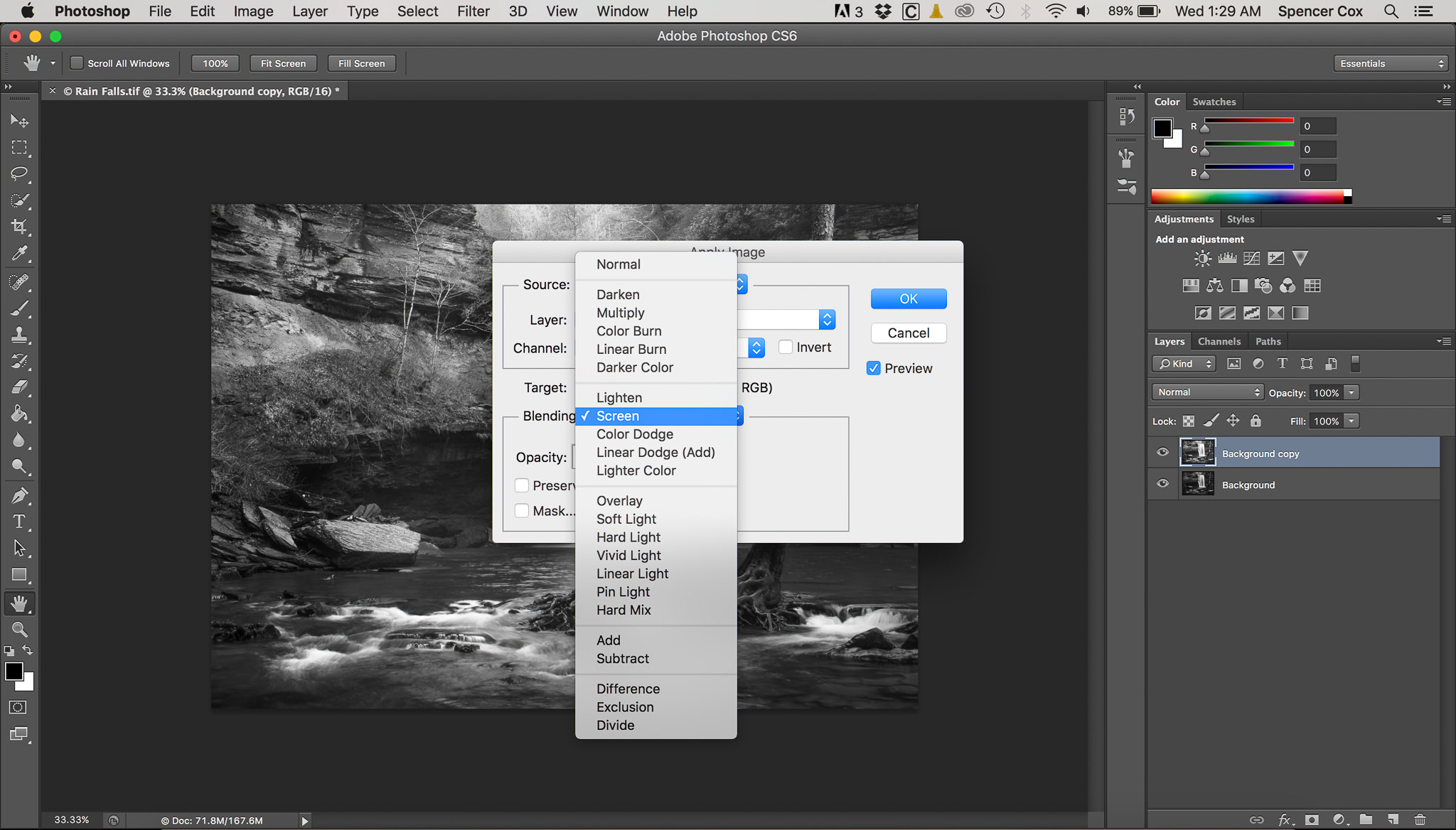
- Open your image in Photoshop and duplicate the layer:
- For the top layer, click Image > Apply Image:
- In the “Apply Image” blending mode, click “Screen” and hit enter:
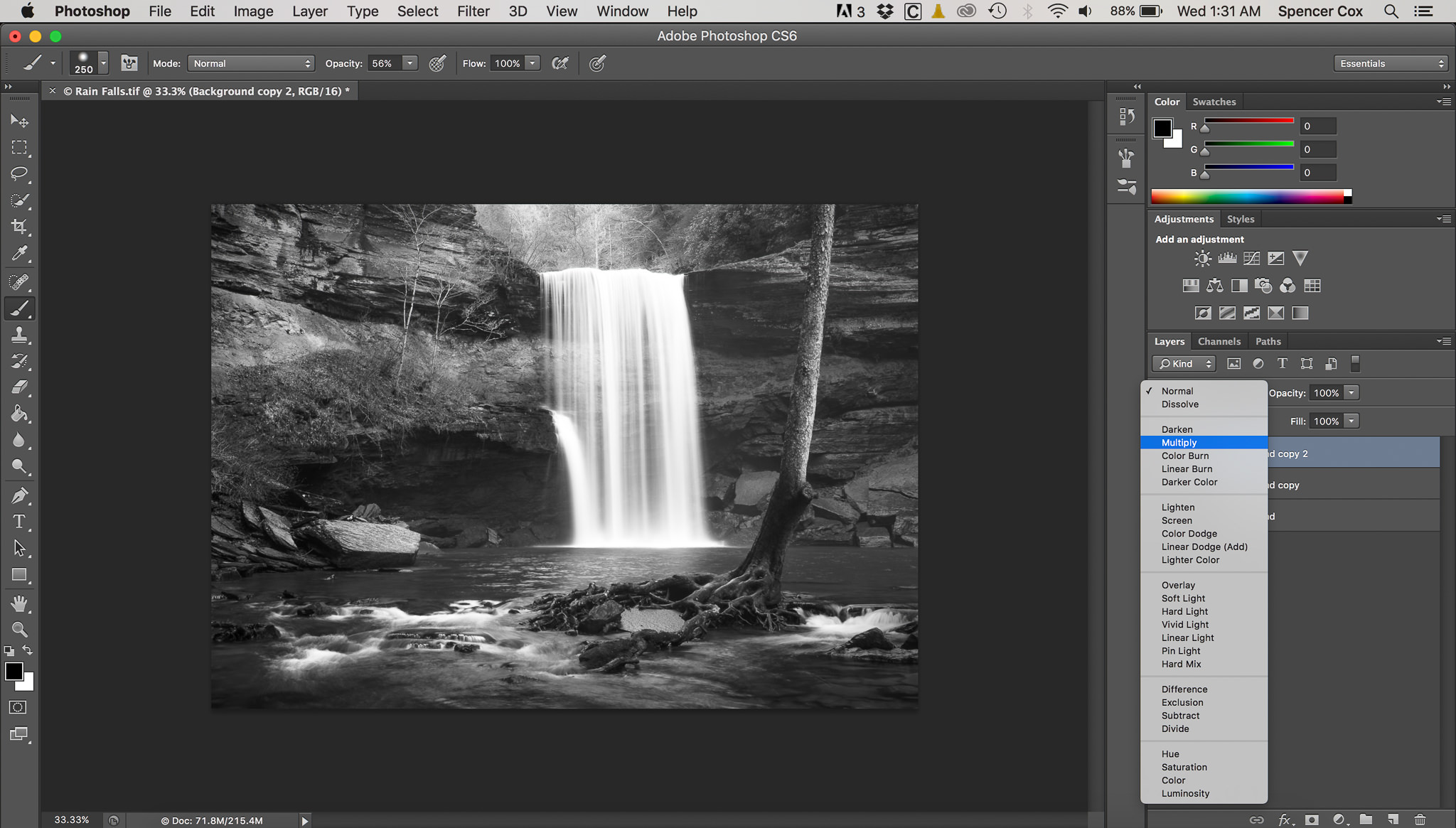
- Duplicate that layer, then click the “Multiply” blending mode:
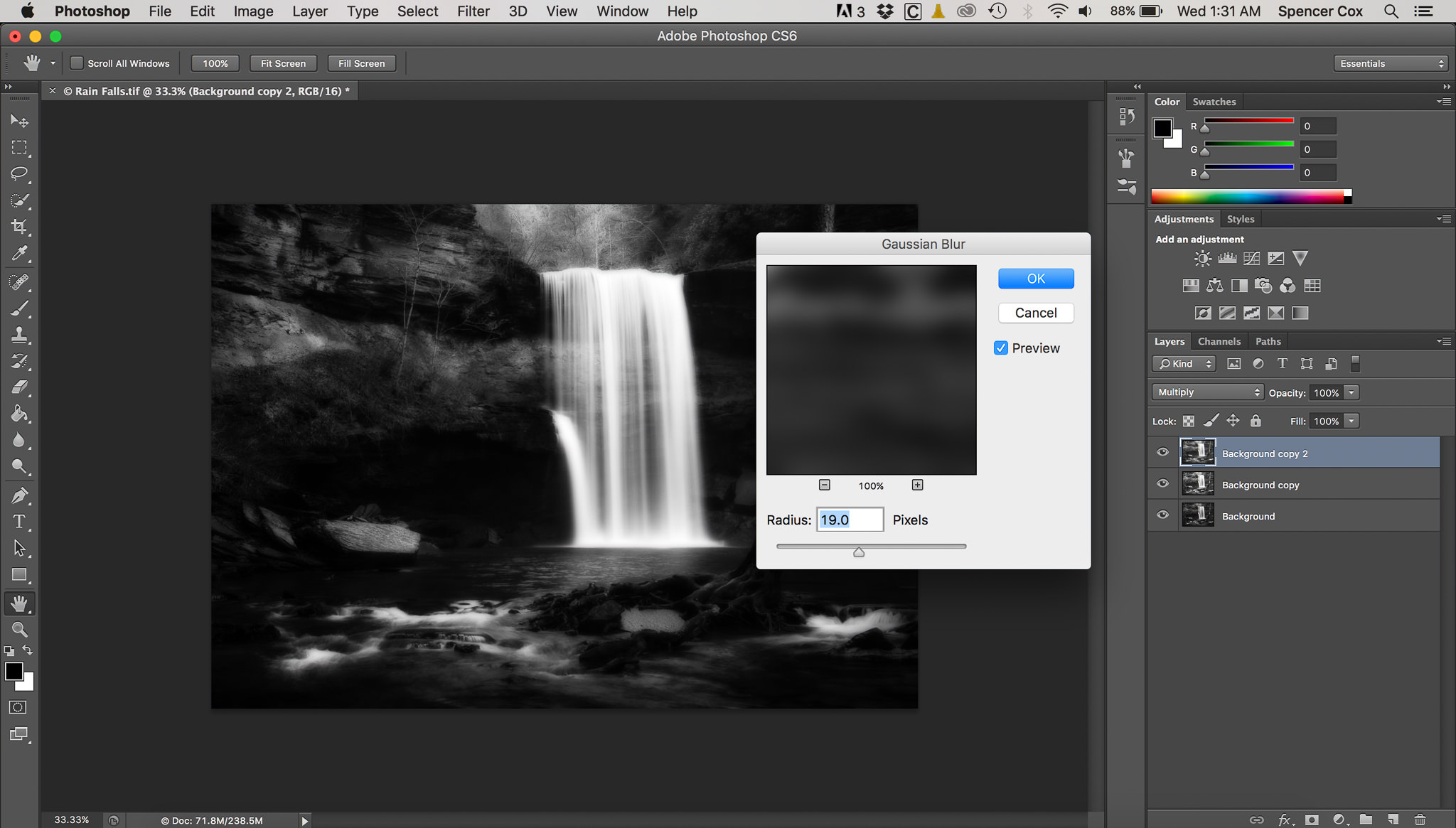
- Go to Filter > Blur > Gaussian Blur. Adjust to taste:
- Merge the two top layers (Command+e or Control+e) and create a mask to decrease or increase the Orton Effect in different portions of the image. You almost certainly will want to reduce the layer’s opacity, or the effect will be far too strong:
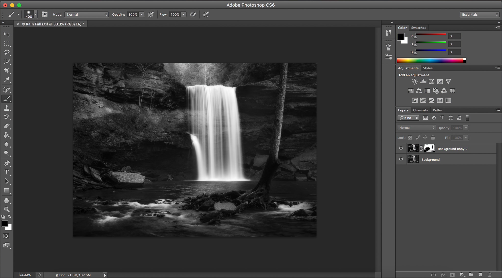
As a final touch, since the Orton Effect darkens the shadows of a photo, you may want to lighten them back in Lightroom or Photoshop.
That’s it; the Orton Effect is pretty simple to implement. However, it does take a few steps in Photoshop, some of which may not be intuitive. Some software has built-in Orton Effect settings, while others (like Lightroom) do not allow for layers and thus cannot be used to create the Orton Effect.
3) Exaggerated Examples of the Orton Effect
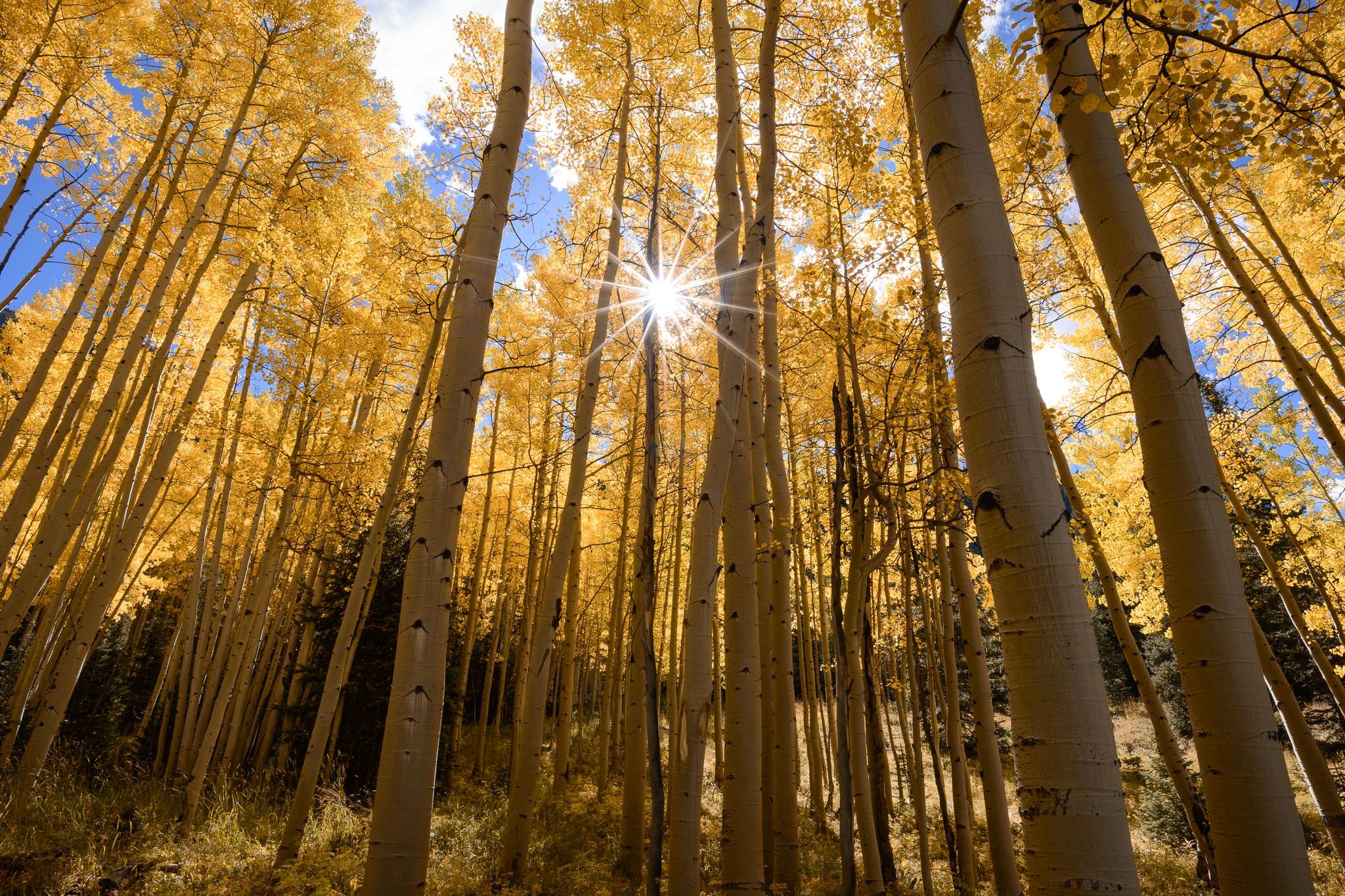
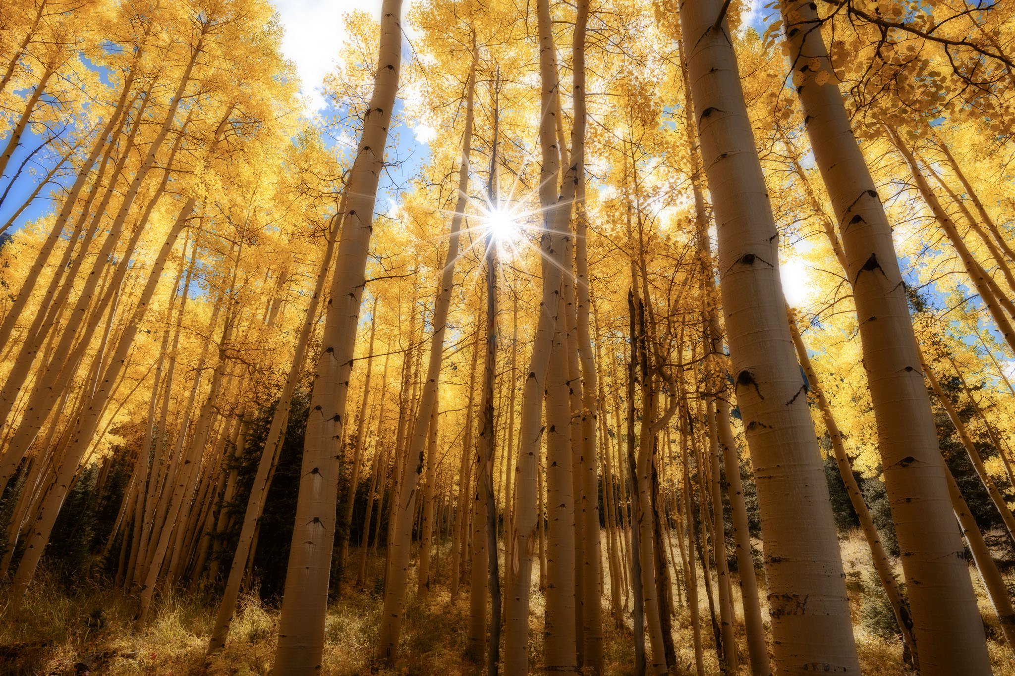
In order to show clear examples of the Orton Effect, I have included three before/after comparisons below. These are far more exaggerated than typical implementations of the Orton Effect, but they will help solidify the concept if you are not yet familiar with it.
Here’s an incredibly pronounced example, where I barely reduced the opacity of the Orton Effect layer at all:
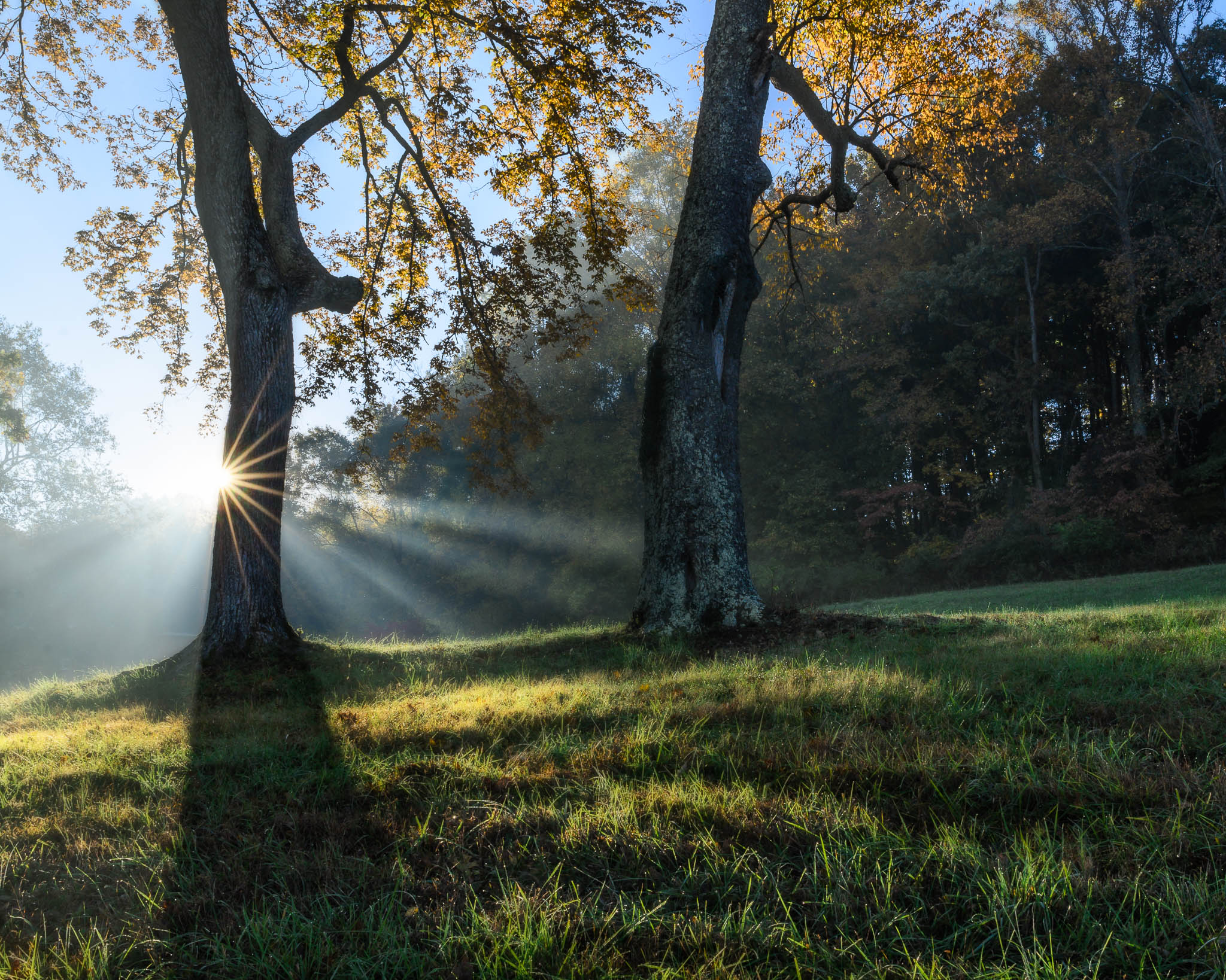
This next one is a bit subtler, but pay attention to the trees and rocks near the top of the frame. It’s still pretty pronounced:
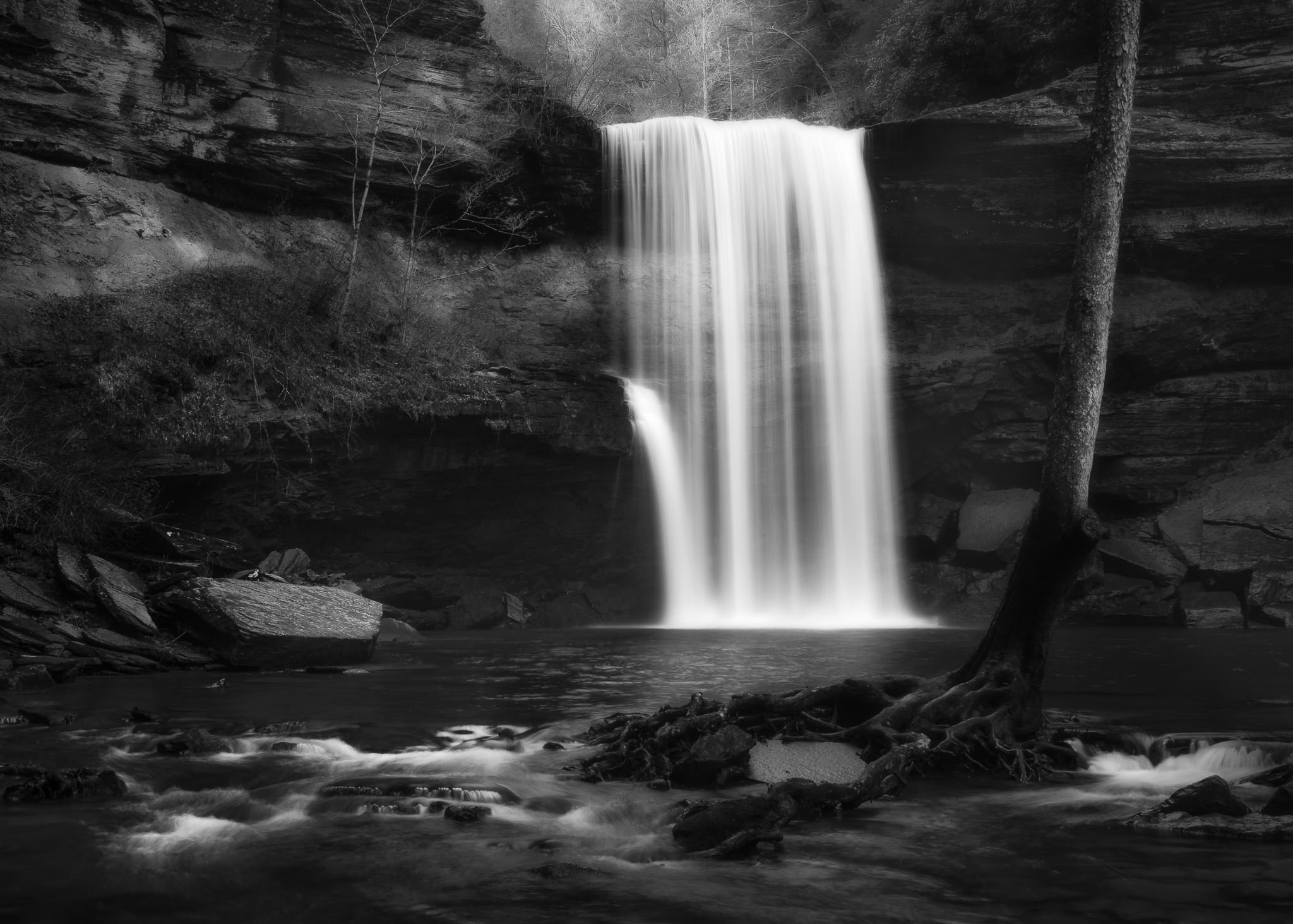
Finally, here’s a landscape that never should have had this soft effect applied in the first place, since it is supposed to be harsh and dramatic:
4) Typical Use of the Orton Effect
The examples above are pronounced, to say the least. Although some photographers do employ the Orton Effect to such extremes, most – including a majority of 500px photos with this effect – are far, far subtler.
Take a look at the landscape photograph below, for example. It has had the Orton Effect applied, but only in certain areas of the frame. This is similar to how many of the photos on 500px appear:

Since you’ve seen some other examples, hopefully you can tell that this photo has the Orton Effect applied. Still, it is much less noticeable than the three comparisons above. (If you’re having a tough time seeing it, pay attention to the glowing spots of grass near the sunbeams; the effect also is more visible on a large monitor.) Photographers who don’t know about this effect – like the vast majority of 500px viewers – may think that the glow in the photo above is simply a natural result of fog. But what if every photo that I took had the exact same “natural” fog? It no longer would add interest to the photo; it would add a creepy sense of uniformity.
5) What’s Wrong with It?
If every photograph of mine employed the Orton Effect, even subtly, they would all start to look the same. Perhaps there is nothing wrong with one or two such photos in someone’s portfolio, but it would be unbearable if every single photo looked exactly like this.
Therein lies the problem. Although not all popular landscape photos employ this technique, a shockingly large portion of them do. While writing this article, I looked at the top fifty trending landscape photos on 500px (which have now changed) for a comparison; I am certain that seventeen of them used this effect, and there were a few others that were too close to tell. Two of them used the Orton Effect so strongly that my eyes began to blur; I started to see a false glow in the real world for a few seconds – not a pleasant experience!
Collectively, photographers don’t yet look at the Orton Effect in the same way that we see over-the-top HDR photography. However, I believe that both – especially when overused – lead to equally garish photographs. Under most circumstances, details in the real world do not have an etherial glow lingering around them; even when employed lightly, the Orton Effect feels “off” from how we experience the world. In subtle doses, the Orton Effect may not be a bad thing. But, in subtle doses across a third of the popular 500px photographs, I think it has run its course.
6) Proceeding from Here
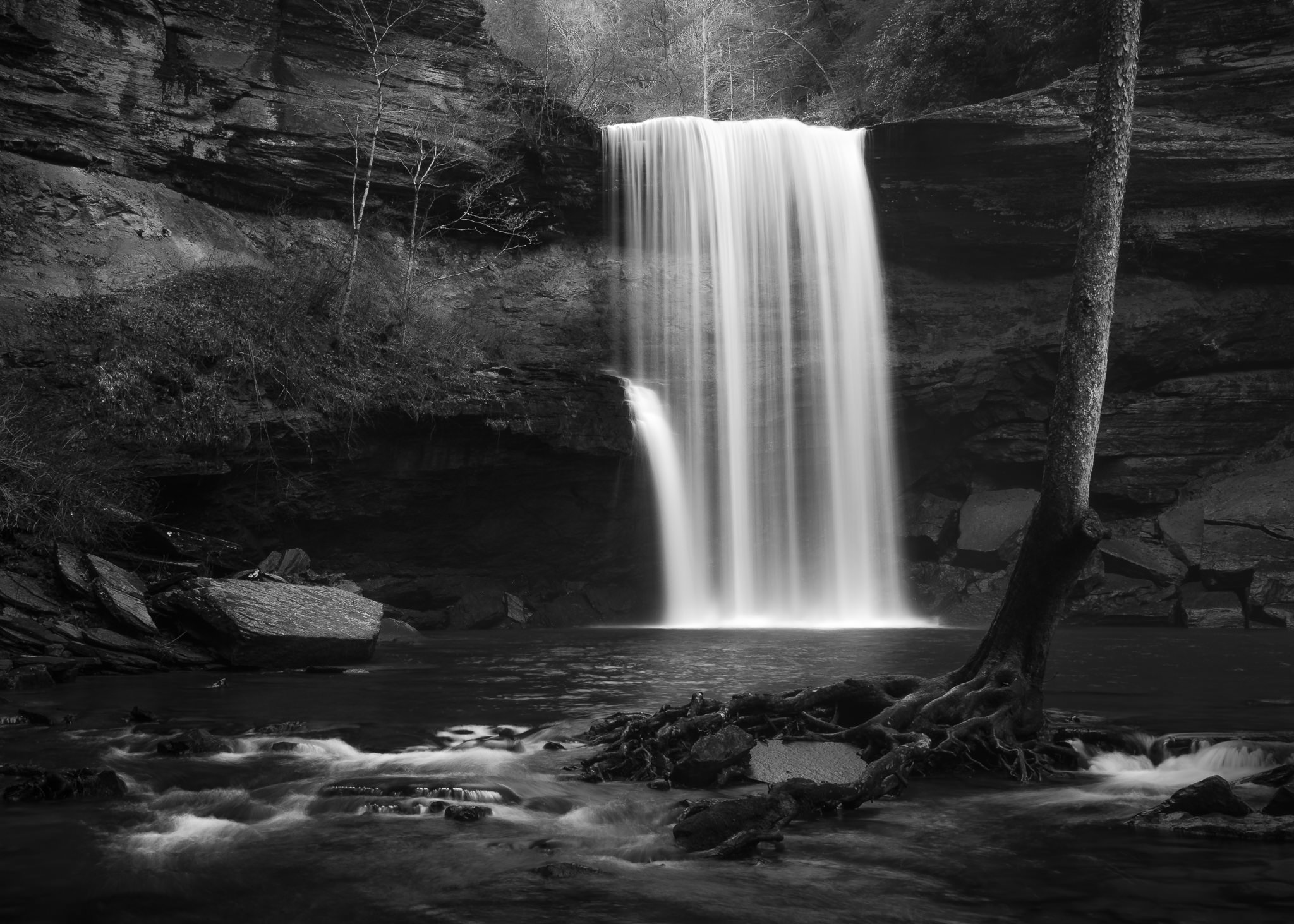
I shared an Ansel Adams photo in a previous article, and it is worth adding here as well:
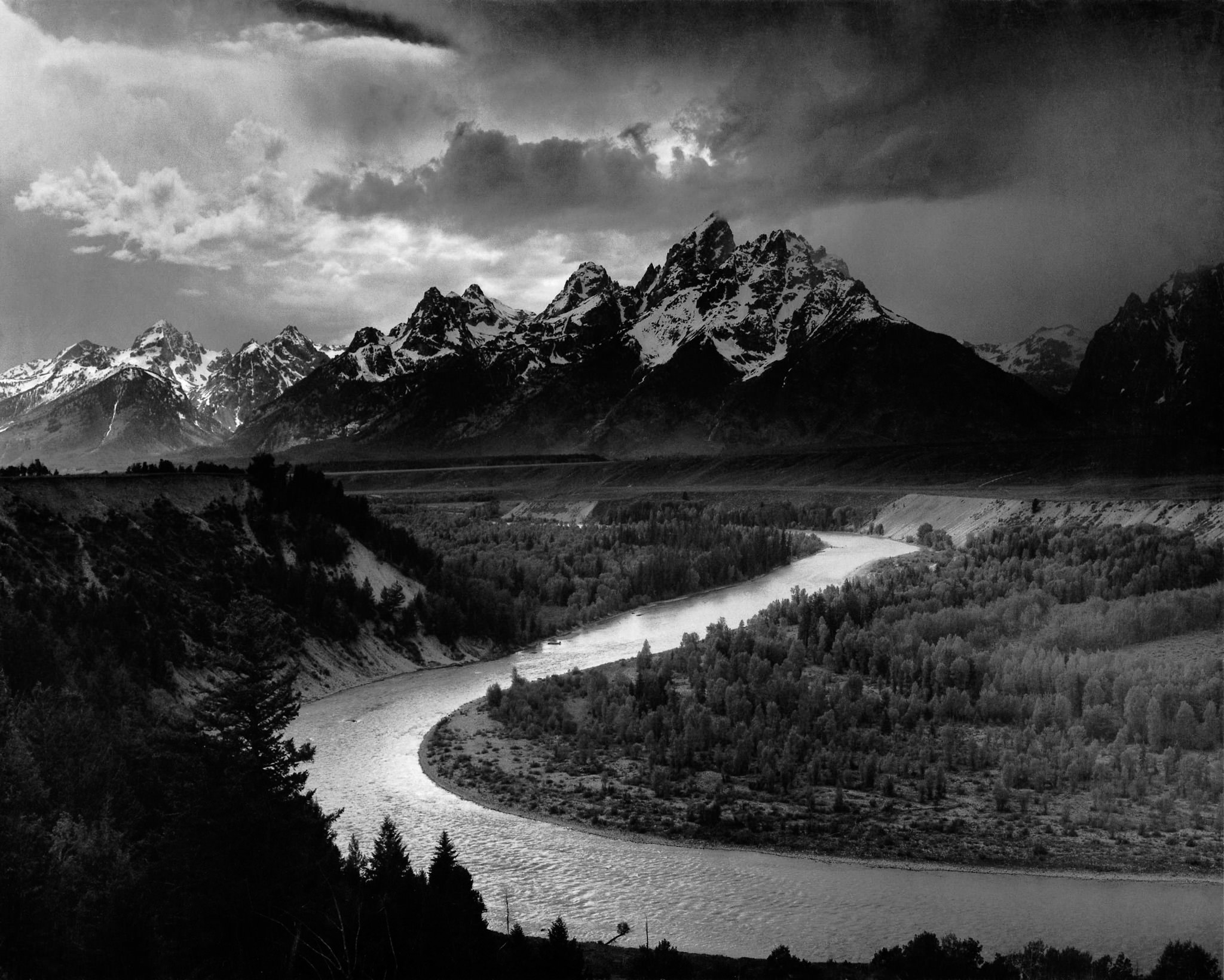
Feel free to stare at this photograph until your eyes no longer see the world with a cheesy glow effect.
As you can tell, I am not a fan of the Orton Effect’s prevalence today. I believe that it has encroached upon our collective concept of a “good” landscape photograph – its otherworldly glow gives the false appearance of improving every landscape image. In reality, I think it does more harm than good.
Is this post simply a reaction against the mainstream concept of beautiful landscape photography? Am I calling out a system simply because I have different tastes from most people? Perhaps so. I enjoy Ansel Adams’s photos far more than any Orton Effect image; maybe my opinion of photographs is simply stuck in what used to be considered beautiful, and I have yet to move on.
Still, I know what makes a photograph work for me, and it isn’t the Orton Effect. I think that, as photographers, we are far beyond the point of using the Orton Effect reasonably; we have fallen victim to the soft, glowing, faux-beautiful atmosphere of photos that have been adjusted well beyond their inherent value. I am not immune; until recent weeks, I also gravitated to the impossible beauty of these photos. Now, though, I have begun to see the consequences of the Orton Effect. The most popular landscape photos on the world’s largest photography websites are beginning to look like Thomas Kinkade paintings (which you should Google with caution).
7) Conclusion
There is nothing inherently wrong with a post-production glow, even if it looks overdone and fake. But I absolutely believe that there is something wrong when more than a third of the “popular” landscapes on photography boards use the exact same Photoshop effect. We are no longer reacting to the photographs themselves; we are reacting to the presets that have been applied. This isn’t much better than an Instagram filter.
The Orton Effect wouldn’t bother me much, except that it gets almost universal praise from photographers across the internet. Sunrise photos of Mount Fitz Roy with the Orton Effect? They are among the most popular on every photography website. A field of glowing green grass with an extreme Orton Effect? They win photo contests and elicit thousands of Facebook likes. Even if a photo’s quality has nothing to do with its online popularity, all this attention certainly counts for something.
As a final note, if you do use the Orton Effect for your own photographs, please do not take this article as a personal criticism. People certainly love Orton Effect photographs, and it would not surprise me if landscape professionals find that their sales increase with this effect (similar to HDR photographs). In the end, you should feel free to use whatever methods you enjoy; for most photographers, that’s the real point of taking pictures in the first place.
But if you find yourself jealous over the increasing number of overly-beautiful, glowing landscape photos on sites like 500px, don’t feel discouraged. The Orton Effect is rarely more than eye candy, and it loses its “magic” the moment that everyone has access to this technique. A landscape photograph doesn’t need a mystical glow in order to be beautiful; it just needs to represent your personal take on the world.
I have Orton effect in my presets :) I use it time to time but I`m not big fan of it
That’s completely fine! When you use it for a handful of your own photos, I see nothing wrong with the Orton Effect. For me, the problem is its absurd popularity among the “trending” landscape photos on certain photo-sharing sites.
As a matter fact, I discovered Orton Effect when I was searching how to get Lord of the Rings look on some of my landscape photos :)
:) – yeah, I remember using special processing in a darkroom to achieve it – it was really complicated – this days people can use a ton of glow presets for ps to achieve it without any knowledge of PS
How is this technique any different than the countless other photoshop manipulations that occur in countless photos?
The technique is no different to the “other countless manipulations that occur in countless photos”.
If you care to actually read the article, the criticism is of over-use of the technique not of the technique itself.
I get the Orton Effect when I have had my eyes dilated for an eye exam, then walk out into daylight without dark glasses. Not only is everything super bright, there’s also a fuzzy edge to objects and an overall haze. Not pleasant.
Yes! I’ve had that done, and it’s the same for me! Maybe a third of the top 500px photographers have had their eyes dilated recently :)
I’ve always experienced the Orton Effect when I’ve walked out into daylight after a written exam — it started while attending primary school and it has continued ever since.
I’m intrigued to know what inspired Michael Orton to develop his technique.
Pete, perhaps he was the same way :)
In truth, it seems like Michael Orton particularly enjoys abstract, painterly photography. Maybe he tried soft-focus lenses or out-of-focus images, but realized that a hint of detail is still necessary (usually) to provide some grounding for a photo. Just speculation, though.
I developed my own techniques for my abstract work because I wanted to achieve results that were unique yet almost familiar, and just short of being over the top — maximizing intrigue while avoiding the temptation to generate shockingly bizarre images. Your article has enabled me to finally accept that my techniques are not, as I’d previously thought, simply a happenstance result from my plethora of experiments with image editors; they are the result of my attempts to convey to others the frequent anomalies that occur in my (mis)perception of the real world.
Michael Orton uses his various techniques judiciously, in my opinion, which serves to highlight the problem that so often results from copying the techniques of others. We can reverse-engineer a technique in order to copy it, but we can’t reverse-engineer the skill and the judgement of the originator. In other words, we can copy *how* something was done, but not the *why* it was done or not done in each instance of the originators work.
The most wonderful thing about photography is the epiphany moment when the photographer finally discovers the hidden book of its golden rules. Rule Number 1: There are no rules; there isn’t even a requirement to be proficient in its craft or creative in its art!
Photography is, I think, a truly exquisite ‘toolbox’ that contains both the hardware devices and the freely-available-to-read physics that underpins the design and the usage of the hardware. Unlike a conventional toolbox from which misusing the tools inevitably results in disaster, judicious misuse of the photography toolbox is most aptly named “creativity” and/or “innovation”.
Hi Spencer,
Thanks for another great “lesson.” I will be on the lookout.
The Orton effect and the HDR effect et al, are like a Wah-wah pedal on guitar, simply a fad… They don’t create great composition, and until Photoshop has a Composition filter, a good taste filter and a sense of humor filter, we still have those “tricks” to rely upon!
Cheers,
Duffy
Thank you, Duffy! I am looking forward to the day that Photoshop adds a “composition” filter! (Well, I guess it would take all the fun out of photography… But what does fun matter when your computer is composing perfect images for you :)
great reply
Interestingly enough I just used the technique (partially) on a photo where global sharpening looked good for the foreground area but the trees &etc. in the background looked ‘wrong’. Mr. Orton’s technique helped to balance that. It’s a good tool to be familiar with but like you, I believe it can be overdone, or overly relied on.
That’s definitely a worthwhile use of the Orton Effect — like subtle HDR, it isn’t something that you always should avoid. Thanks for adding this.
Very interesting, I had not heard of this effect before, thank you for the clarification. Personally I don’t care about trends, I look for originality.
Thank you, Christian – originality is key!
Good article Spencer, in which you’ve nailed your colours to the mast. So you don’t like the effect.
However I see this as harmless by comparison to over saturation that some think makes a good image.
In fact life looks great after a couple of beers and this effect replicates that.
I like it and in the days of darkroom always kept a soft focus filter by the enlarger. The portraits done with a softening of the blacks (with negs) were always the ones chosen.
Love your ice cube in Iceland shot, and yes I prefer the “Orton effect version”
Thanks, Andrew. It definitely works for some people – as you might expect, given its popularity! Not my personal cup of tea, but to each his own.
Andrew: “In fact life looks great after a couple of beers and this effect replicates that.”
THAT’S why my photos look so much better when editing with a nice cold Stone Ruination!!!… It’s not the “Ort
on” effect…It’s the BEER effect…ha….try it out Spencer, you might like it….
Interesting write-up – comes across as a kind and educated rant, but a rant none-the-less – why so frustrated?. The fact is that most of us will jump on any bandwagon that is moving our work, gains “Likes”, or simply tickles our fancy…whether that is constructing panoramas, applying sharpening, white-washing, vignettes, HDR, or implementing this latest trending effect. I would be lying if I said I hadn’t tried to push all of the above onto my photos at one time or another – I suspect most of us are like that – we go overboard with a new-found application until the novelty wears off and the tool finds it’s rightful place. In time I’m sure we will all use this tool, over-use this tool, and then finally learn to apply it when the situation calls for it (the analogy that comes to mind is my daughter’s use of make-up – hah). If we need to speed the passing of the current Orton Effect storm I suggest we displace it with more appealing images :), otherwise this fad will have to run it’s course.
Ha, thanks, Mark, it definitely is a sort of rant :)
I think you are right that the Orton Effect is still in the “novelty” phase where people are first starting to use it in a widespread fashion. One hopes that it will run its course in the same way that HDR has – a good tool for some photos, but not a universal way to improve every image.
I am suspicious of any ‘collective idea of creativity’ or ‘collective concept of a “good” landscape photograph’. If they do exist, I rather imagine they’d be something to struggle against. I go some way towards agreeing with you about the Orton effect, but stop well short of being troubled by its prevalence. Any more than I am bothered that the seas around our coastlines are so frequently blurred into shapeless submission by the Big Stopper. Following on from Nasim’s essay on the narcissm of selfie-takers, your article’s style is certainly à la mode!
That is fair – it’s hard to define a “collective creativity” among photographers. My intent with that phrase was to say that a large portion of well-known photographers are using very similar methods to produce their photos – nothing wrong on its own, or if only a few photographers use this style. But now that so many people are using the same effect, I am concerned that we (as viewers of photography) have shifted what we collectively consider a “good” photograph towards images that employ this effect rather than photos that are successful in their own right.
There has always been a battle between pictorialists and realists in landscape photography. Perhaps the popularity of this soft-focus effect is a reaction against the constant pursuit of maximum sharpness – by landscape photographers, camera makers, and lens makers. What lens is the sharpest? What aperture is the sharpest? What’s the sharpest hyperfocal distance? Which camera has the most resolution? Best tripod for sharpness? etc.
For example, there was the pictorialism trend of early photographers a century ago – soft-focus, ethereal, surrealistic, impressionistic images. Often using lenses wide open, or specially-designed soft-focus lenses. It was this notion that Ansel Adams and his Group f/64 were against – they pursued sharpness and realism. (Converting an 8×10″ f/64 aperture to a full-frame 35mm equivalent, it would be something like Group f/11 today.)
It’s hard to say which is “right” and which is “wrong” … on a long enough time scale, everything is a fad.
Bob, I love the way that you phrased this. Perhaps pictorialism is reinventing itself in today’s world via the Orton Effect. I do believe that I fall more on the realist side of the coin (although I certainly post-process my photos quite a bit – as, of course, did Ansel Adams, despite being a realist). So, it very well could be that landscape photography is moving forwards and my mindset has not yet caught up. Neither is universally right or wrong, just right or wrong for different people.
That’s a very astute observation.
I had never heard of this effect either – really enjoyed this article – thank you. I like you comment in the conclusion that states responding to the presentation as opposed to the photograph itself.
Thanks, Donna, glad that you enjoyed it.
It is not a fad but what artists do. BTW, this is not the only technique for photographers to apply lighting effects/glow. Masks are painting /lighting techniques we use in Photoshop. Painters do this all the time. Thomas Kincade was a master in this technique. And let me add Ansel Adams to this mix. Ansel’s film processing was extraordinary. His assistants likened it to a dance, where Ansel exposed here and there to get the effect that he wanted. It took him 5 years to get Moonrise Hernandez to look like he wanted. In the process he darkened the sky and removed clouds.
I think it is just fine that we are finding new creative ways and means to make our photographs over very own, our style and our unique expression. And no it does not look like everyone else’s. No one can duplicate the same masks, strokes and opacity you choose.
I agree with some of what you said, and I should have been more specific in the article. It is not the step-by-step Orton Effect itself that I was reacting against, but rather against a more general glow effect applied to so many landscape photos today. I labeled it as the Orton Effect, but of course there are countless other ways to get a similar look.
I don’t quite agree that Ansel Adams falls within this umbrella simply because he post-processed his images so significantly. I process all my images, and some quite a bit – Lightroom, Photoshop, Nik software, and many other effects. It is not post-processing or masking that I find troubling, but rather the prevalence of this single, niche technique in such a large portion of “trending” photos today.
You are, of course, free to disagree. I love that we are coming up with techniques like this in the first place; they are pushing creative photography ahead in the world. But when so many landscapes add a false glow effect, I question whether it is the glow or the landscape itself that attracts our attention.
If it is the glow, that’s fine – but its effect is wearing out now that it is so commonly used.
Hi Spencer, interesting article.
I have been using this effect for over two years, discovered it by accident when using the (Photoshop) Distort/Diffuse Glow native filter in Photoshop 6 (it was also in 5.5) and it has a parallel in DXO Optics Pro. If you use the new (to version 10) ‘Clearview’ filter, and then compensate for it by raising the exposure about half a stop, and reducing the saturation slightly, you get to the same general place with a RAW image.
I would say that if you are happy with your initial image, and the glow effect is important to you on that image, the route would be ACR -> Photoshop 6 ‘Diffuse Glow’ but if your initial image needs more work, I tend to go to Optics Pro where there are distortions, noise and other issues that need sorting out first, then I save (they call it Export in Optics Pro) as a Tiff, and take it back to Photoshop to apply the Diffuse Glow filter before final saves.
It works a treat, and the nicer part of Photoshop on this particular filter is that you can edit the effect after hitting the ok button by reducing the effect by a self determined percentage in the edit menu, so if you over applied the filter, you can fine tune it without abandoning it completely with a Ctrl Z.
I love the look, but as you say, it can be overdone, and it can be over-applied across too many images.
I mention this because anyone who wants to give the technique a go can access it very easily in Photoshop.
That’s very true. Thank you for adding info about other software – I don’t use DXO and didn’t know you could do the same effect there.
I also love the look, assuming that it is just a single photo and it truly complements the scene. In isolated doses, it really doesn’t bother me at all. What I find troubling is that so many “trending” photos online have the exact same effect applied, even if it is subtle. That raises questions – is it the photo that we like, or the (albeit subtle) Orton Effect? It used to be rare and interesting, but it’s current prevalence is rendering it progressively less intriguing and unique.
Thanks for the thoughtful comments.
be careful with clearview as it tends to add a haze around solid objects if added too much of it
Hi JJ, I couldn’t agree more. Those serious about trying the effect should really try the Photoshop Distort/Diffuse Glow filter until they get used to the effect, but if you happen to have a suitable image open in Optics Pro, or, indeed, if you don’t have Photoshop or Lightroom, then Optics Pro can do a fairly decent job of it too.
Like most things computer, there is often more than one way to do something. (or overdo, if you’re not careful).
I agree and that why I see less photographer but more PHOTOSHOPher nowadays.
It is not less photography, IMO. But what photography is all about. It is not photojournalism which has its own rules. In post, you can add individual touches, effects that make this image yours. If I go to Yosemite falls and take a shot, it will be like so many others. BUT, when I take it into post, I can make it my very own. It is the same in film. In the past we added color to images with sepia tones. In the 1950ies, we colorized black and white and those old images today are and revered and expensive. As long as it is a photography, it is still photography. A follow up question is when does a photograph no longer a photograph?
Hi Nature Lover, I get what you meant, but you have to take on board that many film photographers, professionals too, used colour labs to process and print from their negatives back in the day – very few did their own.
The importance of this fact is that, once the negative is processed, the lab determines colour balance, contrast, (to a degree) exposure and everything else needed to make the print – with digital photography that is no longer possible if you shoot RAW – you HAVE to do these ‘photoshopher’ things for yourself before sending the image to a printer, or getting it printed outside by a lab.
If you shoot Jpeg, the camera itself is acting like a mini-photoshop system, because it makes a best guess of what you were looking for in your final result, and makes those adjustments in-camera before saving the Jpeg onto your card.
To me, the analogy of making a print from film (unless you were an expert and did it all yourself) makes film photography much easier in one sense, which is, getting the composition, exposure, and focus correct, and leave the rest to the lab.
Shoot RAW and you have to do all this yourself in Photoshop or (in my case DXO Optics Pro) something else to make the RAW file into a Jpeg with the qualities you were looking for when you took the shot.
Jpeg shooting puts you in the same camp as film shooters of old, who used labs for all their work, and I know several wedding photographers at the time were doing just that, but using a very good lab, not a retail outlet etc, but a pro one.
I get where you’re coming from. There’s such a tendency in today’s world to eke all the beauty from a photo as you possibly can. This has always been the case in different ways, darkroom processes included. But now that we see so many photos online, including thousands of people’s once-in-a-lifetime images, overdone Photoshop effects are wearing thin.
Still, it’s a pretty great thing to have so many options available. If you don’t like the status quo of over-edited photos, you aren’t tied to it. Or, if you love the Orton Effect, it is very easy to create. In the days of film, if you didn’t like the look of Tri-X, Potra, Velvia, or other popular films, you didn’t have too many other options.
I had not heard of the Orton Effect. Find it interesting, fun and worth having in the toolbox. Any tool that will help achieve a mental vision is one worth having. That said, I agree 100% with your skepticism, and your caution that OE should be used sparingly in the right places. The toolbox is rapidly becoming a pandora’s box in the hands of photographers that know nothing but digital. Having spent my share of time in a print darkroom, I find it more fun to exercise creativity with the camera. I guess when your tools are limited to a “dodge and burn” tool and polycontrast filters, you learn to find your fun elsewhere. Probably sounds like “I had to walk to school, up hill, both ways!” I think everyone should have to try a roll of film though. It would thin out the herd of photoshop heroes! Thanks for a good article!
Thank you, Patrick! The Orton Effect is a nice addition to a photographer’s toolbox, you are right. It loses its value, of course, when it’s the only tool that many photographers ever use. I definitely agree with your experience with film photography!
Fortunately I’m not experienced enough yet with Lightroom and photoshop to be this dangerous, most likely by the time I am this fad will be past us.
LOL, Sean, that’s too funny!
Would it be possible to use the HDR merge function in lightroom with one properly exposed sharp image combined with one defocused over-exposed image to achieve the same effect? One more out there who wants to try it because of your article :-)
I tried to combine two such photos in Lightroom, and it unfortunately didn’t accept them. Although even if it did, you wouldn’t have as much control over the process. Still, interesting concept. I do wish that Adobe would add layers to Lightroom, although I understand that they would want to keep it as separate as possible from Photoshop.
Michael Orton’s images seem more than just applying an effect. His best images hint at another way of looking. Applying this effect to a landscape does not make it better or worse. An uninteresting image will remain uninteresting. There are actually some good HDR images in the world but simply applying that effect does not make a good image either. Take pictures. Make art. Keep working. Copy styles. Experiment. Make your own mistakes. Try to see what you see.
Thanks for your comments, David. I agree that Michael Orton’s photos are very good, even painterly.
I have just taken an orton-effect-hdr-selfie in front of the Tour Eiffel. I think I’m just going to jump down, there’s no other way.
LOL Giovanni, don’t forget to take another selfie on your way down! :D
That would probably become as famous as the man falling from the Word Trade Center. Yet, no one on instagram would notice. Because, you know, kittens are all that matters!
I personally can’t stand that effect – in my opinion it is a cheap way used by amateurs to add extra “pop” to the otherwise dull images…. People get PS plugins and get crazy with the “glow effects” – maybe being too harsh, but that is how I feel….
Really? “amateurs to add pop to dull images?”. Yup, you are harsh. Today, everyone is using whatever effect they can to give their images an advantage. That would include everyone, professionals, enthusiasts, and amateurs. And it’s not applied just to dull images but every image especially if you are shooting raw images where by their very nature are dull. I know of no photographer of any level that does not use a plug-in of some type, preset, etc. It is what digital photography is and does. Yes, you can definitely over do it but there are some that are done so well you would never even know they had done it. But that does not mean it wasn’t done.
Thanks for this excellent tutorial on how to create the Orton Effect!!! I never knew this before — but now I’m going to apply it to my images. Cool!
Wait! What? It’s not a “good” thing?
Haha, DB, nice comment :)
Here’s the thing. When you start seeing it you can’t un-see it easily, and as you say its everywhere right now. Just like seeing HDRs with badly imbalanced shadows and halos, just like seeing oversharpening, just like seeing clarity+10 spammed across an image.
To my mind the problem will be looking back in 10 or 20 years time on a long term collection of landscapes. It will be – oh here is my HDR phase, here is my Orton phase, here is my oversaturation decade, here is my everything at f2.8 landscape phase. For me I already have a section of mild HDRs from the days when I was less experienced, and they already stand out like a sore thumb in any portfolio I put together that includes anything that far back. These trends will quite simply stop you having a consistent long term body of work.
So sure, its easy to do terrible things to nice photos to get instant likes from the sharpening-saturation-HDR-orton-heavy vignetting and whatever else crowds, but people have to decide what they are doing this for and what they want their stuff to look like looking back. Maybe you are selling a ton of these and your entire portfolio is now Orton, great its just a tool and there is nothing wrong with tools.
That’s an interesting thought, thanks. I definitely can look back at my photos and correlate them with different phases I was in. That’s not necessarily a bad thing — especially, as you said, if your photos sell :)
And you are right that the Orton Effect is very difficult to un-see. I only began to notice its extreme prevalence on photography boards once I started researching for this article.
Photography stopped being about reality since digital manipulation became an essential part of producing any “photo”.
Manipulations are good for producing images, nothing wrong with that.
But to call an image a photo? Plenty wrong there.
And no, old photographers did not alter the image itself when working it in the darkroom!
Effects makers did. Not photographers.
But in this day and age where photography has been reduced to small, low quality smartphone camera images in tumbler, instagram and/or facebook, manipulated by auto “enhancing” software, nothing else needs be said.
Roll on the Orton effect and heaps of others, who cares? I ceased to be bothered.
I agree with the premise of what you’re saying, although I definitely think that some post-production can be allowed and still call a photo a “photo.” For me, this is especially true with digital photography. A RAW photo cannot be displayed on its own; you need to apply a picture setting (or a Lightroom picture profile) to see anything in the first place. And which picture profile is ideal? Camera Standard? Camera Neutral? The same is true for JPEGs — it is impossible to avoid some sort of manipulation/interpretation of the raw data.
I think the heart of the matter is that, although photos have always been used as documenting tools, they are not reality. They are a creation by the photographer, whether by the framing chosen, staging the scene, in the darkroom or photoshopping.
Noons: “And no, old photographers did not alter the image itself when working it in the darkroom!”
Read some photography history before making such uninformed statements.
en.wikipedia.org/wiki/…nipulation
Thanks for this article, it is revealing. The mind’s eye will always be the greatest tool in photography or as Ansel Adams called it “visualization.” Gimmicks are interesting for a while but just like a fashion trend they eventually compromise individuality in artistic expression and burn out. Of course, artists always copy each other to some extent but we hope we can produce something more our own than not. I am afraid the ubiquitous manipulation in photography now has taken away a measure of “purity” if you will, and truth. In its early life photography competed with painting and struggled to be considered an art form. Eventually photography achieved that status thanks to people like Adams and others. Now it seems that some are trying to mimic painting as if there is still an inferiority of photography. I prefer to manipulate only enough to reproduce what I saw with my eyes but others feel differently and they have a right to make their art.
Thank you, Jim. I agree that visualization is the most crucial element of composition; if you can envision the final photograph/print, you will be able to make strong, conscious decisions in the field. Thanks for these comments. I don’t always aim to process an image exactly in the way I saw it, but I certainly want to maintain the impression that I felt in the field. For example, if a storm is rolling in, I may darken the photo and add more contrast than what would be literally “correct.” This would add a more ominous impression, mirroring any sense of worry or apprehension that I felt while taking pictures.
Photographers are so desperate these days. No one has any paying clients to keep them busy anymore so they go off and create these stupid effects, stage fake wedding photos called styled shoots and now this. Engineers struggle to create accurate colors in camera, sharp lenses and then someone blurs the photos and puts instacrap filters on them. I give up.
LOL, don’t give up — there are still plenty of good photos to be taken!
Iam sorry for this Off-Topic comment. But would this set up be good?
NIKON D7100+18-140mm AF-S lens+Nikkor 85mm f/1.8 ??
This setup was comparitively cheap but would it be good for BLURRING the background or for Bokeh ?
Hi Muhammad, that setup should work very well. The 18-140mm lens is not very good for blurring the background, but the 85mm f/1.8 is great! Set the aperture to f/1.8, find a pleasant background, and your bokeh will be beautiful. The D7100 is a great camera as well. (The 18-140mm lens is very good for traveling, or if you only want to use one lens at a time. It has a nice zoom range.)
Muhammad: yes, not only is the 85mm 1.8 a good lens, but it does a good job with background blur due to its relatively long focal length and wide aperture. The 18-140 is a good walk-around lens too.
If you want good background blur, the big thing is to pay attention to the background when taking your shots! I have images at 85mm f/1.8 that have good background blur, and others that have busy, congested backgrounds. Often all it takes is a couple steps one way or the other to make a huge difference in the quality of the background.
It’s a good thing only photographers look at photographs. That way we can determine how much of any processing is allowable and say things like it’s overdone, don’t do it. Maybe, just maybe, regular people, yes they exist outside photography forums, like the effect. Who has the right to tell me what I can or can’t do to a photograph I take. Catty photogs whining about what they can’t or won’t do and trying to force others to bow to their opinion. I’ll over saturate and over process every photo I take and it’s no one’s business but mine. Maybe some photographers don’t care what other photographers like or don’t like. Do your own thing and blow off stupid articles like this. Don’t let the uh, hum, professionals tell you what you like. If you are basing your talent on the professional photography community then you’ll never enjoy taking a photo.
Non-photographers look at photos all the time, of course. That’s why extreme saturation and HDR are so popular on Instagram — people who aren’t professional photographers often do like these effects. And, like you say, there’s nothing wrong with that at all! But I would hope that people who spend all their free time practicing photography have more experience judging photos for their deeper merits. I like Poptarts, but that doesn’t mean that food critics should sing their praises :)
Spencer, “Poptarts”, (Phototarts) good name for a lot of art with a small “f”.
John Sherman mentioned photography is literally painting with light. There is a distinction from digital art with flamboyant effects.
Picture profiles are surely to correct for the deficiencies of sensor, i.e. to restore the original colours. As is control of highlight and shadow detail to get the image to how best it can be replicated, all the rest of “digital manipulation” falls outside of “photography” in its true sense.
Not a lot to do with “rights” to like, or “don’t tell me what to think” kind of folk. Pfft!
You’ve handled all this criticism deftly, cheers.
Thank you, Andrew!
Rather reminiscent of the effect achieved with “proper” soft focus lenses.
www.cookeoptics.com/l/lar…ormat.html
I am sure there are others still available, but this is the one I am aware of, but never used
Graham
Graham, very interesting! Thanks for sharing this link.
I don’t think that “more than a third of the “popular” landscapes on photography boards use the exact same Photoshop effect”. They probably use a (partial) negative clarity in Lightroom or ACR. But the results are similar.
Kind regards,
Jens
That’s true, I should have been more specific in the article. I don’t know that a negative clarity setting can replicate this exactly, but there certainly are other ways in Photoshop. Thanks for adding this info.
(I’d written a lengthy reply but forgot to click the “I’m not a robot” button before posting – grrrrrr…. I wish the back button would have returned my post!)
In short then: nice post, Spencer, and I agree that people should be made aware of this technique so that they can educatedly judge its merit.
Ah, Greg, sorry about your longer post. Thanks for your comments!
I love Instagram filters. Filters are great fun, they rock!
Hanna, by all means, use Instagram filters! Everyone has a different style, and I wholeheartedly think you should work within the processes you enjoy.
It’s funny, first the photographers spend a ton of money to get the best cameras and lenses with the highest megapixel available for landscape work and in the end the blurry the details away :-D
Tim, yes, it is a bit ironic! The trend has always been there — nothing inherently right or wrong with that, just the way it works.
Great article. Just as we begin to recover from garish HDR landscapes along comes the somewhat cheesy Orton effect.
I used something like this for one photo of mine about 8 years ago. A floral shot, and I like the result, but it isn’t something that I would turn to regularly (or ever again for that matter). Thanks for the words to the wise.
Glad you enjoyed it! I definitely see the Orton Effect as a useful tool for some images; it just seems to me that a surprising number of trending photos use this effect even when it harms the image.
Spenser, thanks for the great article (as always, they are great). However, I must disagree with some of your claims regarding the process and the damage supposedly being done to landscape photography.
Your distaste for the process, being noted as a personal distaste, might sound a bit dramatic when you pose the idea that somehow the landscape genre of photography stands to suffer because so many people are engaging in such pursuits according to their likes, their vision, or whatever they feel makes their image(s) stand out. You admit that you post-process your images quite a bit (as did Ansel Adams, which you keenly point out). You probably know that Ansel was in fact a years-long adherent to the Pictorial movement before abandoning it for a more Realist approach, which fit with his vision. That was a matter of his taste, was it not? And a taste vis-a-vis the differing tastes and agendas of the like of other Pictorial photographers such as Alfred Stieglitz et al. But it’s important to note that Ansel took parts of the Pictorial process with him into the Realist approach, in the form of deviating from the “reality” of the scene by way of coloured filters, lens choices, and later, in the development of his negatives and prints.
Imagine if we were to chastise the photographic community for dodging and burning, digitally or otherwise, because it stood to “take over” landscape photography and lend a depiction of “reality” in an unnatural fashion? Or better still, how about all that focus-stacking presently going on, or bracketing exposures to combine later in an effort to increase the dynamic range of the final image/print? Should we look at such techniques as akin to the Orton Effect — “swallowing the modern world of landscape photography” so that every photograph, “even subtly, […] all start to look the same?” I must say, rather than your idea that “Perhaps there is nothing wrong with one or two such photos in someone’s portfolio, but it would be unbearable if every single photo looked exactly like this,” it would actually be more beneficial if someone’s portfolio contained nothing but the Orton Effect or some other commonality that actually brought unity to their work. From my point of view (and I know I’m not alone… legions of articles have pointed out) a much larger problem with photography today, or at least for those trying to get their work noticed, is that most photographers these days don’t have anything unifying within their larger body of work: here we see a photographer’s work — there are some portraits; there are some sports shots; there are some landscapes; there are some street photos; there are a few macros. Etc!
Now, on the one hand, that’s a problem. But it’s great that so much interests them. Professionals will quickly point out that such a broad portfolio makes it hard for a professional to take such a photographer seriously for commissioned work or for a spot in an exhibition, though: they simply lack unity in their work. The photography Masters (both past and present) had/have one thing in common, despite their differences in approach or subject matter: they more or less stuck to one genre, one vision that guided their work. A photographer with a comprehensive body of work that employs the Orton Effect in each image? I’d like to see that! –see where that process took him or her, and the result.
As you note, “Collectively, photographers don’t yet look at the Orton Effect in the same way that we see over-the-top HDR photography.” You do, however, state you believe that “both [processes] – especially when overused – lead to equally garish photographs.” Spencer, that is all a matter of taste, is it not? Pointing out that the Orton Effect is wrong because “Under most circumstances, details in the real world do not have an etherial [sic] glow lingering around them,” is a rather poor choice of defense of the “real.” Water doesn’t smooth in the “real” world without a long shutter speed. And the sun doesn’t make nice 18-point sun-stars without a closed-up aperture with 9 (or more) blades. None of these things are “natural” or “real” anymore than the Orton Effect is “real.” But blurred water and sun-stars and focus-stacking are ubiquitous in landscape photography these days. Does that diminish the genre? Hardly.
I don’t see anything wrong with photographers experimenting with different techniques, as the process of experimentation can help a photographer find a particular process which works for them. Who cares what the landscape photography genre stands to win or lose through the process. You are hardly stating that photographers ought to shoot in the service of their chosen genre(s). So why not instead encourage more people to give the Orton Effect a try in their process? Explain it better, and give ideas on how to employ it without it being “overdone?” Same as with an ND filter, slow shutter, tutorial, etc? Sure, the Orton Effect is presently a fad. And sure, history may not look back kindly on it. But who knows where such experimentation might lead the individual giving a go? Personal distaste for a process should not be conflated with doing a genre of photography a disservice. Well, at least not to me.
Thanks again for yet another well-written article. Food for thought.
Brian
Thank you, Brian, this is a very comprehensive and interesting comment!
I absolutely see where you’re coming from. Interestingly enough, I don’t see a problem using an extremely long exposure, dodging and burning, or even the Orton Effect. I think that deviating from reality is a natural (and even unavoidable) part of photography, and such manipulations can make images significantly more compelling.
For me, the discomfort stems from seeing that trending images from dozens of different photographers all have the same, clear preset applied. I get the sense that the Orton Effect’s prevalence is actually decreasing landscape photographers’ creativity, since our preconceived notion of a “good” landscape photo is beginning to include this effect. This isn’t like dodging and burning, where it can be impossible to tell if the effect has been applied, and the photographer’s personal touch is much more present; instead, it is glaringly obvious if you know what you’re looking for.
In that way, the Orton Effect is similar to other photographic techniques and decisions — star trails, HDR, and even your subject matter (which is why I mentioned Mount Fitz Roy in the article). If 1/3 of the trending 500px photos used extremely long shutter speeds along a coastline, I would have written almost the same article about that. (I know that quite a few such photos do become popular on 500px, but not to the same degree as the Orton Effect.) From my perspective, even though it is another tool in your toolbox, the Orton Effect can reduce your creativity if you only use it (consciously or not) because of what is currently trending. That’s what I think is happening now.
As for the concept of a unified portfolio, I think there’s quite a bit of truth to what you’re saying. Personally, I would prefer that a photographer’s portfolio is unified based upon colors, subject matter, and composition rather than upon a Photoshop adjustment. Again, though, that is a personal preference — I’m sure that many people would disagree.
I appreciate such a well thought-out comment. I definitely don’t expect everyone to see these trends from the same perspective that I do, and your points are very well put.
Brian
“Your distaste for the process,….etc,etc,etc,”
You seem to have entirely missed the point of the article and gone off on a rambling tangent.
There was no distaste for the process.
The distaste was for the overuse of the process.
All and any processess are valid in the creation of an image when used judiciously to achieve a particular effect.
It’s called editing and post processing an image and is not only essential, but unavoidable.
But when a particular process takes on cult status and is plastered over every second image willy nilly, it becomes nothing more than a mindless gimmick – usually to mask a shortfall in content, originality or both.
Betty!
“You seem to have entirely missed the point of the article and gone off on a rambling tangent…”
Not according to the article’s author, which my comment was directed solely towards and whom kindly replied.
But your typical feedback to my posts and your enlightening perspective on what constitutes “editing” and “post[-]processing is always…
#yawns
Brian
The author very politely said your comments were “interesting” and “comprehensive” (idiosyncratic and verbose) and then, equally politely, disagreed with every one of them.
For a moment I was tempted to dismember this latest quasi intellectual ramble point by point, but from past experience know that to be rather akin to entering a maze wearing a blindfold.
Any chance you and Brian will be attending a workshop together someplace? This would be really entertaining in person. :)
Mark
Ha, ha, ha. What a grizzly sense of humour you have.
Brian may feel differently and can no doubt write on his own behalf.
It shouldn’t take more than about twenty six, comprehensively baffling, sheets of A4 for him to meander around his answer before failing to reach a conclusion.
Just trying to lighten things up Betty but I must admit that I do get a kick out of your come-backs!
The nuances of what makes art (or disqualifies something as art) is a question that was no doubt debated in front of the first cave paintings… I’ll be the first to admit I have both improved and worsened images using various techniques. The real answer to moving beyond Orton is to displace it with the next flavor of the day!
Mark
Thanks – it’s all in fun and a gal has to stick up for herself doesn’t she?
Absolutely – keep that wit coming!
Mark,
Surely you must know (you must all know by now) that I hold a special place in Betty’s heart: a spot reserved for me and only me; a hardened location filled with utter disdain and contempt for every thought I put to words; a critical space that ignites whenever I am present; yea–that very place where eye-rolling and disgust emanate. I adore that Betty consistently leaps to the occasion to parse through article-after-article’s comments on PL, scanning for the off-chance of my presence and, if discovered, to take time out of her busty day to enthusiastically compose clever, tongue-in-cheek retorts to anything I might say. …Time and time again! …Year after year. …Whether based on my content or my verbosity or (usually) both! But what’s especially flattering is that despite my long-time absence here on PL (I only read one or two articles a year on here anymore), I am still so remembered. My thoughts still lighten up Betty’s day and ignite that same disdain and contempt she’s always held for me! It’s almost as if (nay–it’s exactly as if) Betty can’t resist the urge to seek me out, single me out, and give me her witty all. In all sincerity, I am flattered to be the constant focus of Betty’s sweet verbal caressing :)
Betty, I look forward to your clever reply. I know you love having the final word… how else can a gal like you “stick up for yourself” if you’re not on the preemptive and unprovoked attack?
Love,
Brian
Brian I think you really set her up this time with “take time out of her busty day”. :)
Cheers to you both!
Mark
Dear Brian
You flatter yourself if you imagine for one moment that you hold any position of special privilege in my heart and you are mistaken if you believe I have any special animosity towards you. On the contrary, I read your comments, in the articles that I find stimulating, with the same impartiality and interest as anyone else’s.
However, when you draw attention to my commenting on content and verbosity you hit the nail on the head and since you invite comment, here it is.
When content is factually incorrect, irrelevant or misleading, I exercise the prerogative to comment lest inexperienced photographers, who draw on this site for accurate information and intelligent discourse, are misinformed.
Likewise, when or if I say something stupid, I expect to be taken to task.
On verbosity, I confess to having a dislike of convoluted claptrap, otherwise known as Artspeak, which amounts to little more than pseudo intellectual elitism, self aggrandisement, pretentious posturing and a desperate attempt to elevate one’s self to a level of importance that is patently undeserved.
Here is a classic example – which you may recognise:
“With each photograph I take, I use my camera to parse out the emotional qualities a particular moment evokes in me. My camera is the tool through which I am able to access my creativity, but moreover, through the collection and manipulation of light, I am able to record my subjectivity as it exists in a fraction of transitory time… In my professional photographic work, I primarily shoot traditional portraiture and lifestyle sessions, with an emphasis on location-based visual narratives with creative, portable lighting strategies…I employ a shooting approach rooted in photojournalist praxis.”
For anyone else with a need to appear erudite in a deeply incoherent way, I can warmly recommend an excellent little website – Arty Bollocks Generator artybollocks.com/) – where all your dreams of being as clever as Brian can come true.
Perfectly answered, as ever.
Had a good laugh at the artybollocks site.
Opinion should never be confused with fact, or indeed confuse a fact.
I’m guilty but unintentionally.
I have absolutely no problem in how Brian describes his approach. Betty, don’t take offense in what he says but focus (pun intended) as to what he does. To me a picture is a thousand words (cliche intended). And you’re not perfect, in fact quite arrogant, and demeaning. It is what makes you as what makes Brian. Some how, I see the pot calling the kettle back (and over used cliche but appropriate). But I take no offense and it triggers nothing, no emotional response. Why, because in the context of an open public forum, it is meaningless. Let me put it this way, garbage in, garbage out. Hmmm… all those cliches are going to irritate some one, I am sure of it.
“But I take no offense and it triggers nothing, no emotional response.” So, did your comment write itself then manage to click POST COMMENT button :-)
And you the same … meaningless? We agree ….
There’s a vast difference between “meaningless” and “illogical”.
Maggie-the-Cat
“I have absolutely no problem in how Brian describes his approach.”
Well that’s just dandy. Could you please explain what he means – in plain English?
As to what he does, I neither know nor care very much. Then again, if he used a picture perhaps we could be spared a thousand words?
I take no offence at what Brian says and not wanting to have this descend into personal invective,
let’s just say I have a low tolerance for incomprehensible verbiage which in reality has little or no substance and serves only to mask its own mundanity.
As for being perfect, I have to admit that in my most private moments, and in spite of my many admirers’ protestations to the contrary, I am not. Well, not completely… I was once, but time and gravity have taken their toll.
I do however, adopt a firm, not to say busty, point of view, try to make my position clear and substantiate what I say. Not everyone likes that in this politically correct world where not causing offence is deemed more important than being honest.
I will stop there as I am beginning to sound unbearably pompous, even to myself.
Time for a quiet half hour in my hammock with a large gin and a fat cigar.
You described yourself exactly as I see you. How about a picture to go with?
I should (we all should) like to thank you as well for standing as a vigilant guard against all those occasions “When content is factually incorrect, irrelevant or misleading, [that you] exercise the prerogative to comment lest inexperienced photographers, who draw on this site for accurate information and intelligent discourse, are misinformed.”
What would we do without you?! Thank you very much taking the reins on this one. Photography Life would probably collapse into total ignorance, were it not for your safeguarding those poor “inexperienced photographers” from thinking for themselves. It’s no wonder you’ve acquired an army of supporters here.
Best,
Brian
Brian
“Photography Life would probably collapse into total ignorance, were it not for your safeguarding those poor “inexperienced photographers” from thinking for themselves. It’s no wonder you’ve acquired an army of supporters here.”
Denigrating inexperienced photographers as being incapable of thinking for themselves is a bit of a cheap shot.
Inexperienced photographers (and everyone starts out inexperienced) need a sound foundation of science-based fact on which to build a knowledge base and from which they can then think and question.
Being fed fatuous gobbledygook at the outset does nothing to aid progress.
Now Betty,
Are you seriously going to imply that ‘your’ initial comment, which I was replying to sarcastically (in case you can’t see that), isn’t the comment that’s actually “denigrating inexperienced photographers as being capable of thinking for themselves?”
Recall that you stated “[You] exercise the prerogative to comment lest inexperienced photographers, who draw on this site for accurate information and intelligent discourse, are misinformed.”
Recall also that “Likewise, when or if [you] say something stupid, [you] expect to be taken to task.”
Task taken!
There was nothing in my original comment to Spencer that would qualify as — how did you say it above? –“Being fed fatuous gobbledygook at the outset […]” I merely offered my perspective. In plain English, no less.
Brian
Define “plain english.”
I defer to a quote from F.A.T. City Workshop: Reading Comprehension to demonstrate that you obviously have no clue what “plain english” really is.
Are there any words you’ve not seen before?
are
between
consists
continuously
corresponding
curve
draws
variation
graph
if
isolated
known
making
only
often
with
one
points
relation
set
table
values
variables
Well? Do these word not represent “plain english”?
If the known relation between the variable consists of a table of corresponding values, the graph consists only of the corresponding set of isolated points. If the variables are known to vary continuously, one often draws a curve to show the variation.
(Basic College Math, M. Michael Michaelson, 1945)
Can you pass basic college math Betsy? Even if you can so easily as I, being a math major, understand what that says and agree that it is the best way to describe the process, it doesn’t change the underlying fault that “plain english” simply does not exist.
There are people familiar with and intelligent enough to understand some concepts described with words you know and understand; and there are people who need help having those concepts explained to them.
Language, by itself, isn’t “artsybollocks” or whatever artsy insult you come up with. Maggie tried to point out how you were molding the definition of “plain english” to suit your argument as the argument continued. “Defining the terms of the argument” is extremely important because what the debaters personally consider “artsybollocks” differs between individuals.
Again, as the F.A.T. City Workshop showed, the teachers were all gungho about how their kids only needed to know what the words meant and that it was their fault for not “listening” or whatever nonsense the teachers came up with. The teachers defined “comprehension” as simple vocabulary, while the students defined “comprehension” as the capacity to understand the underlying message.
But who defines what an individual’s capacity for “understanding the underlying message” is? Again a term that has difficulty being defined as only the individual can answer that question, but the individual often does not know what he/she does not know.
Is that obfuscated? The idea that you do not know what you do not know? Do you know how many bugs are in a bar of chocolate? Did you even think about there being bugs in a bar of chocolate before I mentioned it? If this is the first time you’ve thought about that, then you never knew you did not know how many bugs are in a bar of chocolate… but who else could tell me that you do not know how many bugs are in a bar of chocolate? Your mother? Your father? Your siblings? Who? Only you…
Which gets to my point. You’re fighting an untenable war against those who speak in a manner to which you are not accustom, yet each individual word must make perfect sense to you.
Perhaps, the real question should be, if to a writer verbosity is to a photographer dynamic range, image quality, colour contrast, would you still tell the writer to “cut it out and use plain english?”
If you cannot understand why someone has a particular photography style, would you directly tell that person “I hate people who use the Orton Effect! You all irk me to the core. Here is an Orton Effect instagram filter, now I can do super cool Orton Effect photos with my iPhone. Orton Effect SUCKS!”
There is no “pretty bow” summing up of feelings, of emotions, of the verbosity of human thought and communication. How we write, what we write, are just as much an expressive artwork of ourselves as our photography.
Betty,
Thank you so much for your predictable reply. I’m pleased to have that reinforce that I do in fact understand you well.
In reading that you “confess to having a dislike of convoluted claptrap, otherwise known as Artspeak, which amounts to little more than pseudo intellectual elitism, self aggrandisement, pretentious posturing and a desperate attempt to elevate one’s self to a level of importance that is patently undeserved,” I cannot help but roll on the floor though, being this is exactly what you do all the time. I wouldn’t expect for you to see that in yourself, though. That would be too bold a step for you.
Oh, but kudos for taking the rather large intellectual step in discovering that my name here on PL, highlighted in blue, is actually a link that goes directly to my website, and that on that site, there is an cutting-edge feature called an ‘ABOUT’ section that is also clickable, wherein one is taken hostage against their own will to a new page on MY page to read more about ME–what motivates me and excites me about photography! How deeply elitist of me to have such a section on my page, and to dare to express who I am in a way that is honest to my abilities.
Did I write that (paraphrased) bit that you quote above? Of course I did. All by my little self, though, with nothing but the years of education I worked very hard to achieve to assist me in said narrative. Had I only known about the “Artybollocks” generator you so graciously bestowed. Then I wouldn’t have had to painstakingly engage in introspect in an effort to discover for myself what moves me and motivates me and challenges me–in photography, but also in life. In hindsight, (some might call it retrospect), I suppose I should apologise for my ability to articulate thoughts to words beyond “Me take pictures ’cause life pretty.” Apologies all around.
I should also apologise for being so opaque over who I am, through the words I use and with the photos I take, being that I am finally ready to own who I am in an honest fashion and admit it’s all been plagiarised until just now. You’ve lead the way for me, Betty, through your own courageous and transparent actions.
;)
Honestly, I should rather stick with complete and total anonymity, as have you. It’s far easier and safer to craft and then stand behind such a ‘presented’ personality, without ever really divulging who the ‘real’ me is, beyond a cantankerous and elitist (and historically labeled) Internet troll. I really should start to live my life more safely, both online and in the actual real world, as do you. It would be far better if I stayed safe in the UK, hidden behind my computer and my wit, and only ventured out on a few occasions to take a few choice shots whilst on, say, safari. I cannot believe I’ve bothered to make myself so open and willing to engage in new things, with new people, who have new perspectives, wherein I might actually (GASP!) stand to learn something beyond my tired, trite, and so-predictable commentary on an Internet forum. What a waste indeed!
Warmly,
Brian
If you have any mirrors in your house then I suggest that you return them to your supplier in order to obtain a refund — because it is blindingly obvious to others that they don’t work.
Wow… “Pete A,” that is quite an intellectually stimulating thought you’ve presented! Brilliant, really! I’m sure you’re right, though: It’s totally plausible that Internet personalities such as yourself and the infamous “Betty” know me far better than I know myself… “blindingly” so!
Keep up the great work!
Brian
Pete, go away but do come back when never arrives.
Brian Gaschler,
I tried my best to match your levels of intellect, humour, and humility. I conclude that my levels of achievement in these three attributes will never match yours.
Many thanks for your insightful reply.
Brian
“Had I only known about the “Artybollocks” generator you so graciously bestowed… Then I wouldn’t have had to painstakingly engage in introspect in an effort to discover for myself what moves me and motivates me and challenges me–in photography, but also in life.”
Exactly Brian, you could have explained it all in good, intelligent (and intelligible) English instead of arty bollocks. If you did the same in your other contributions it would be a double blessing.
Betty,
Perhaps I should have explained the following from the ABOUT section on my webpage (which is paraphrased identically to how you quoted it above) in a more intelligent (and intelligible) English, instead of “artsy bollocks.” I’ll take an honest look here. So let us examine again what you quoted/paraphrased me as saying on my website:
“With each photograph I take, I use my camera to parse out the emotional qualities a particular moment evokes in me. My camera is the tool through which I am able to access my creativity, but moreover, through the collection and manipulation of light, I am able to record my subjectivity as it exists in a fraction of transitory time… In my professional photographic work, I primarily shoot traditional portraiture and lifestyle sessions, with an emphasis on location-based visual narratives with creative, portable lighting strategies…I employ a shooting approach rooted in photojournalist praxis.”
In all honesty, is it that hard to comprehend what I am trying to convey, when I use words like:
1) Photograph (rather than ‘light-painting’?)
2) Camera (rather than ‘image-making tool’?)
3) Parse (rather than ‘to analyse and break down into separate parts’?)
4) Emotional Qualities (rather than ‘that which in particular moves me regarding…”?)
5) Moment (rather than ‘a unidentified or quanitifed measure of time’?)
6) Evokes (rather than ‘brings back to my conscious mind’?)
7) Access (rather than ‘as a means of approaching and tapping into…’?)
8) Creativity (rather than ‘my imagination and original ideas’?)
9) Collection and Manipulation of Light (rather than ‘gathering and altering the characteristics of light’?)
10) Subjectivity (rather than ‘my own judgement, based on my independent feelings rather than outside influences’?)
11) Fraction (rather than ‘a tiny percentage’?)
12) Transitory (rather than ‘not permanent’?)
13) Lifestyle (rather than ‘photographing people whilst they are doing stuff they would do anyway’?)
14) Portrait (rather than ‘photos of people’s faces and heads whilst not necessarily doing stuff they would do otherwise’?)
15) Emphasis (rather than ‘special importance’?)
16) Visual Narratives (rather than ‘stories being told not through words but through seeing’?)
17) Portable Lighting Strategies (rather than ‘a collection of speed-lights and light-modifiers used to create a mood, but that can be easily moved from one area to another)
18) Photojournalist (rather than ‘like those other people who report on newsworthy events through pictures, not just words’?)
19) Praxis (rather than ‘accepted practices and customs within a specific field’?)
I know you loathe the way I write. That’s OK by me. I don’t write the way I write to annoy you or to come across as pompous. And I really don’t care that you (or others) think that is my agenda. What you (and others) might wish to consider, is that each and every word I used in the paraphrased section above, is indeed ‘plain English’ — unless you have no formal education and/or spend little time reading outside of Internet forums. If that is the case, I would suggest you grab a dictionary and (GASP!) learn something new! Not to be pompous, mind you, but because there is always a more precise and succinct word to describe that which you wish to convey through language.
If you don’t like the way I write, why on earth would you go out of your way to navigate to my webpage in order to read my ABOUT section? Oh right! — because that’s what you do, Betty: you troll!
Know thyself, dearest Betty.
(BTW: “thyself’ is another way of saying ‘you’)
Brian
This slug-fest is now at 33.2.1.1.1.2.2.3.2.1…deeper (numerically at least) than any contract I’ve ever worked on….it makes me think this could be even funnier if you two were attorneys going at it. Amazing work – both of you – staying in character this long with no breaks in the rhetoric!
Brian
At last, a piece of clear, unambiguous writing. I read and understood every word without having to stand back , scratch my head and try to decipher what the hell you were trying to say through a fog of Artspeak. You are making progress. All that going to school is finally paying off.
I regard, as would most others, that using words like ‘busty’ and ‘troll’ to bolster your argument/ego, to be sexist and unpleasant. There have been much worse terms bandied about, it is true, but usually calling someone a troll is a surrogate for an effective counter argument. It’s the last hurrah of the moron.
“When do you actually go out and take photos though, I wonder. You certainly don’t share them here.”
I have shared a significant number of my images on Photography Life – you only need to look in the PL Critique and Nature forums. I don’t however, recall ever seeing any of yours. Perhaps you are more interested in waffling?
“It’s no secret that you loathe the way I write.”
‘Loath’ is a strong word, but it is true to say that I dislike pseudo intellectual claptrap and challenge comments which are either irrelevant or tangential to the discussion, factually inaccurate or just plain fatuous. Others, like Pete A, Iliah, Waldemar…take a similar stance and thank heaven for that.
“Because it’s fun, getting a rise out of you and watching you reach for anything that might bolster your comments and status.”
I thought it was me you were accusing of engaging in that behaviour. Make up your mind – for once.
Well now it is you and “others”. I don’t see others. I just see you. This is another effort to define the argument, and therefore the solution. It is a the self-righteous approach. But who appointed you as the artspeak Nazi? Who are you to police this forum and others? The real issue here is that you feel threatened by Brian and others like him. It threatens your supremacy.
Betty, the issue is not artspeak as others do understand Brian. You just lack that capacity, and your supremacy is threatened. You apparently also have a great interpersonal need to have the last word in this meaningless banter, It is often referred to as “egocentricity”. Get over it.
Maggie-the-Cat
Since when does defining the argument define the solution? Claptrap.
Nobody appointed me as the artspeak Nazi. Nice choice of words though.
I am not policing this forum, I just have my say like everyone else. It’s a forum.
I don’t feel threatened by anyone, least of all Brian.
I had no idea I had a supremacy. So thanks.
My issue is with artspeak and artybollocks, not with Brian. It’s just that Brian is a master of both.
Define “plain english.”
I defer to a quote from F.A.T. City Workshop: Reading Comprehension to demonstrate that you obviously have no clue what “plain english” really is.
Are there any words you’ve not seen before?
are
between
consists
continuously
corresponding
curve
draws
variation
graph
if
isolated
known
making
only
often
with
one
points
relation
set
table
values
variables
Well? Do these word not represent “plain english”?
If the known relation between the variable consists of a table of corresponding values, the graph consists only of the corresponding set of isolated points. If the variables are known to vary continuously, one often draws a curve to show the variation.
(Basic College Math, M. Michael Michaelson, 1945)
Can you pass basic college math Betsy? Even if you can so easily as I, being a math major, understand what that says and agree that it is the best way to describe the process, it doesn’t change the underlying fault that “plain english” simply does not exist.
There are people familiar with and intelligent enough to understand some concepts described with words you know and understand; and there are people who need help having those concepts explained to them.
Language, by itself, isn’t “artsybollocks” or whatever artsy insult you come up with. Maggie tried to point out how you were molding the definition of “plain english” to suit your argument as the argument continued. “Defining the terms of the argument” is extremely important because what the debaters personally consider “artsybollocks” differs between individuals.
Again, as the F.A.T. City Workshop showed, the teachers were all gungho about how their kids only needed to know what the words meant and that it was their fault for not “listening” or whatever nonsense the teachers came up with. The teachers defined “comprehension” as simple vocabulary, while the students defined “comprehension” as the capacity to understand the underlying message.
But who defines what an individual’s capacity for “understanding the underlying message” is? Again a term that has difficulty being defined as only the individual can answer that question, but the individual often does not know what he/she does not know.
Is that obfuscated? The idea that you do not know what you do not know? Do you know how many bugs are in a bar of chocolate? Did you even think about there being bugs in a bar of chocolate before I mentioned it? If this is the first time you’ve thought about that, then you never knew you did not know how many bugs are in a bar of chocolate… but who else could tell me that you do not know how many bugs are in a bar of chocolate? Your mother? Your father? Your siblings? Who? Only you…
Which gets to my point. You’re fighting an untenable war against those who speak in a manner to which you are not accustom, yet each individual word must make perfect sense to you.
Perhaps, the real question should be, if to a writer verbosity is to a photographer dynamic range, image quality, colour contrast, would you still tell the writer to “cut it out and use plain english?”
If you cannot understand why someone has a particular photography style, would you directly tell that person “I hate people who use the Orton Effect! You all irk me to the core. Here is an Orton Effect instagram filter, now I can do super cool Orton Effect photos with my iPhone. Orton Effect SUCKS!”
There is no “pretty bow” summing up of feelings, of emotions, of the verbosity of human thought and communication. How we write, what we write, are just as much an expressive artwork of ourselves as our photography.
Brian
“In all honesty, is it that hard to comprehend what I am trying to convey, when I use words like:……..”
In all honesty Brian, yes it is.
And why should it be hard at all?
Clear and unambiguous descriptive writing should surely be a pleasure to read and easy to understand.
Taken individually and painstakingly defined, this collection of Artspeak buzzwords is, of course, intelligible. We are after all, literate. However, when assembled into a narrative, they become nothing less than an exhausting exercise in pretentious posturing and pompous affectation. The art world is riddled with this kind of obscure blather which presumably is intended to make the writer appear profound, but in truth serves only to irritate and alienate.
If you want to appear more profound Brian, say something profound, rather than spouting this kind of self indulgent morse code.
So yes Brian, although each and every word you paraphrased is indeed plain English, the end result is a turgid Irish stew.
“If you don’t like the way I write, why on earth would you go out of your way to navigate to my webpage in order to read my ABOUT section? Oh right! — because that’s what you do, Betty: you troll!”
No Brian, I used your About page because you kindly provided a link and because it was the shortest route to making my point. Going back over your previous convoluted, vacuous contributions was simply too daunting a proposition.
Finally Brian, it does neither you, nor your argument, any credit when you fall back on sexist jibes and infantile name calling as a substitute for rational debate.
Betty,
Nothing I said was sexist, nor has any name-calling taken place. Looks like someone needs to grab the dictionary yet again so they can get their words and facts straight.
If it makes you feel safer to presume I am trying to be pompous, or engage in “Artspeak,’ that’s fine by me, Betty. I’ve stated my purposes already. It’s totally my fault that I went to school and learned to write. It’s also my fault that I’m not ashamed of who I am nor what motivates me to engage in photography. No need to senselessly beat a dead horse. It’s your word against mine as to my intentions. You would be some form of awesome if you knew my own intentions better than I do. Sadly, you’re just keen to be stubborn. If only you’d “listen” to me when I explain myself. Nope.. you’d rather hear your own self. How rich! But that’s not what makes your behaviour ridiculous…
What makes your behaviour so incredibly ridiculous is not this instance, but your history of making such a fuss over any and all things I might ever contribute on here which, incidentally, have been positive and productive commentary. Anyone who ever wishes to go back in time and read past articles wherein we engaged each-other, will plainly see that you come out of blue to pay tribute in a hostile manner to any/all my comments. And more often than not, to mine alone.
You were long-ago accused by a number of readers as behaving in a Trollish manner. Even the staff writers here on PL accused you of behaving like a troll. To top it all off, you were almost blacklisted by Nasim himself, and Nasim needed to create PL’s Code of Conduct as a result. You have a terrible and ugly history on PL for abusive comments and condescending tones to others. All that’s changed over the years is that you’ve also acquired a fan-following. Congrats! What a thing to be proud of.
When do you actually go out and take photos though, I wonder. You certainly don’t share them here. All you seem to share is your typically snarky, elitist tone. Again, you must be so proud.
It’s no secret that you loathe the way I write. It’s no secret that I find you incredibly boring and predictable. I honestly think you’re the most boring person I’ve ever conversed with. Why? Because you are always the same snarky, opinionated, elitist self. Always. To me. To others. Always. How very boring indeed. Your contributions are know-it-all and harsh. You just can’t help but jump in on my comment alone here, to make your point: “Brian’s opinions are not valid because I don’t like the way Brian writes or the things Brian has to say. I’ll prove that by taking quotes of his out of context and accusing him of things he’s not even doing in an effort to get him to engage.”
And engage I have. Because it’s fun, getting a rise out of you and watching you reach for anything that might bolster your comments and status. Wow….
I’ll now bow out so you can satiate your hunger for the final word
All the best, Betty. ‘See’ you on the next thread wherein I dare to share a comment!
Brian
You are just as bad as you report he is. Bantering over artspeak is still bantering. Crux of the matter is that you simply don’t understand. It not that you are upset with the artspeak but more upset with yourself. Rather that addressing your shortcomings, you have choose to lash out at Brian. In essence, you have litter this posting with meaningless comments that do nothing for the many who come in here. So why don’t you just stop? I am tired of getting notices in my inbox on the latest attempt to put someone in his place. It doesn’t work Betty. You still will not convince, sway or change any of it. It is useless like the artspeak you abhor.
Maggie-the-Cat
Bantering is a good natured exchange of views – surely the prime purpose of a PL forum?
I will continue to banter whenever I have something to banter about.
Perhaps this whole subject of Artspeak could be made the subject of a fresh article – or perhaps it has now been flogged to death?
Betty:
Bantering for the sake of bantering serves no purpose. I don’t see this as an exchange of views but insistence that one’s view is the only view. But I agree, you should open up your own website and pursue the point.
Maggie-the-Cat
“Bantering for the sake of bantering serves no purpose.”
Agreed, on that at least.
However, to argue one’s corner is not to insist that one’s view is the only view.
Neither is pointing out factual inaccuracy a desire to be right at all costs.
You may enjoy trying to decipher artybollocks or accepting scientific fallacy as truth.
I, along with many others, prefer verifiable fact and plain English.
Brent
>>Well? Do these word not represent “plain english”?<>Can you pass basic college math Betsy?<>Language, by itself, isn’t “artsy bollocks” or whatever artsy insult you come up with.<>“Defining the terms of the argument” is extremely important because what the debaters personally consider “artsy bollocks” differs between individuals”<>Perhaps, the real question should be, if to a writer verbosity is to a photographer dynamic range, image quality, colour contrast, would you still tell the writer to “cut it out and use plain (e)English?”<>How we write, what we write, are just as much an expressive artwork of ourselves as our photography.<<
My point exactly.
Pretentious arty bollocks usually comes from photographer/artists whose arty output amounts to little more than arty bollocks too. The effusive language just seeks to disguise the paucity of content.
It’s like putting lipstick on a pig. You may for a moment believe you are looking at Kate Moss, but the illusion is all too transient and the confrontation with reality all the more disappointing.
This is for you.
Enjoy…
"Mercurial, pluralistic and singular, the publication of the first two books of Silence in a single volume represents the genesis of a radical new form of epic poetry.
Embracing the seemingly diverse spheres of apophatic theology and Big Bang cosmology, and drawing inspiration from the works of Ovid, Joseph Beuys and Ezra Pound, the epic seeks, through the juxtaposition of intuitive and rational voices, to counter-signify the divine darkness of a singularity.
Here Nietzsche, Socrates and Dionysos dissolve into a dithyramb of Primordial Fire, whilst Caravaggio, Leonardo and St. Hieronymus perform the photonic dance of the early Matter Era; here the Universe begins to speak through the masks of cultural memory, and laugh in the face of the ineffable."
Beyond price.
PS Apologies for the late response, I have just returned from a trip to Africa.
Brent
>>Well? Do these word not represent “plain english”?<>Can you pass basic college math Betsy?<>Language, by itself, isn’t “artsy bollocks” or whatever artsy insult you come up with.<>”Defining the terms of the argument” is extremely important because what the debaters personally consider “artsy bollocks” differs between individuals”<>Perhaps, the real question should be, if to a writer verbosity is to a photographer dynamic range, image quality, colour contrast, would you still tell the writer to “cut it out and use plain (e)English?”<>How we write, what we write, are just as much an expressive artwork of ourselves as our photography.<<
My point exactly.
Pretentious arty bollocks usually comes from photographer/artists whose arty output amounts to little more than arty bollocks too. The effusive language just seeks to disguise the paucity of content.
It's like putting lipstick on a pig. You may for a moment believe you are looking at Kate Moss, but then the illusion fades and you find yourself confronted with bald reality.
This is for you.
Enjoy…
"Mercurial, pluralistic and singular, the publication of the first two books of Silence in a single volume represents the genesis of a radical new form of epic poetry.
Embracing the seemingly diverse spheres of apophatic theology and Big Bang cosmology, and drawing inspiration from the works of Ovid, Joseph Beuys and Ezra Pound, the epic seeks, through the juxtaposition of intuitive and rational voices, to counter-signify the divine darkness of a singularity.
Here Nietzsche, Socrates and Dionysos dissolve into a dithyramb of Primordial Fire, whilst Caravaggio, Leonardo and St. Hieronymus perform the photonic dance of the early Matter Era; here the Universe begins to speak through the masks of cultural memory, and laugh in the face of the ineffable."
Beyond price.
PS Apologies for the late response, I have just returned from a trip to Africa.
are you jealous because you can’t go to the mount Fitz Roy?
I would love to go to Mount Fitz Roy! But it’s definitely true that those photos have begun to explode in popularity in recent years. Nothing wrong with that – it didn’t stop me from going to Iceland, which I feel has been similar!
Wow… I never know that it’s an Orton effect and frankly I’ve used it several times not only on landscape but on portrait as well. Love to see the face glow and all the blemishes and skin flaw suddenly gone. But that was the time when I was very new to Photoshop and photography. I’ve not used this effect for quite sometimes.
Film photography had all sorts of filters, include crosses and multipointed stars, that could be attached to the lens to get these effects. There was also plenty of modification in the dark room, such as dodging and burning in, masking parts of the paper or neg, and using several negs to get one composite image, which could then be copied to a single negative and reprinted. There was a WWI photographer who did that. I think his name was Hunter, not sure – I’d have to go look that up.
The point is, this is nothing new. However, at some point, doing all these modifications does wear thin. There is no reason that the real world can’t provide the same effects by the photographer, simply by employing the camera to get them instead of doing it with software. You can crop a single image into panoramic format to improve the landscape image, or do a composite of two or more images for the same thing. I’ve done glowing sparkles in a tree for an effect.
I think the problem is that once it’s discovered, everybody piles on and it loses its effect. And sometimes, it just looks silly. If you want that silky flow of water, why not do a time exposure? You’ll get the same thing. It just takes skill and patience, which is something people don’t want to acquire. My impression of this technique is that it’s a crutch to lean on in place of taking the time to do it in-camera.
It’s possible that CGI imaging used in movies like ‘Lord of the Rings’ and ‘Avatar’ are what got this started in the first place, but why not just do CGI imaging and at the same time, learn to be a better on-the-spot photographer?
every time i open 500px i see that kind of romantic fantastic photos and im really disappointed, really even pro photographers like this kind of images that look like coming out of a fairy tale?
There’s a lot of muddled thinking going on – to the point of condemning normal/essential post processing.
Any process or effect is absolutely fine when used with judgment to improve an image, or at least fulfill the photographer’s vision, whatever that may be.
What is being criticised is the faddish overuse of an effect (and this applies to all effects) as a substitute for originality and genuine creativity.
A great image can be enhanced by judicious post processing, but too often, mediocre images are tarted up with gimmicky effects to mask the inconvenient truth that they have little or no intrinsic merit.
Thank you, Betty, that’s exactly what I was trying to say! It’s not this adjustment, or any other, that particularly bothers me (with garish HDR being a possible exception)! It’s just the loss of creativity that comes when a particular effect turns into a fad.
In looking at the three sample photos, I will say I don’t like it either. One main reason is demonstrated in the first sample (the trees). The “effected” photo looks out of focus (or is that called “soft focused”?). Either way, to me it looks to unrealistic, or just plain wrong (out of focus!).
Exactly, William, this effect doesn’t even improve many photos! Since it has become such a strong trend, people are applying it almost habitually, which harms creativity.
Thanks for the interesting article Spencer. Whilst I agree with your concerns, I think King Canute had a better chance holding back the tide than you or I do with this issue! Let’s face it, photo FX are so easy these days that a landscape picture without either HDR/diorama/soft-focus/Orton/selective colour/compositing/selective filtration/blur etc just isn’t going to cut it!
“a landscape picture without either HDR/diorama/soft-focus/Orton/selective colour/compositing/selective filtration/blur etc just isn’t going to cut it!” Oh, I don’t know about that. I think you can still get a pretty good image out of the camera. These have had minimal post processing; brightness/contrast, color correction, etc. They are low resolution for the web: www.flickr.com/photo…[email protected]/
Wow, do you think I am going to buy that those images have minimal post processing? There are halos on the edges from over sharpening. Color cast from over saturation. The dark areas are pitch black while in the same image colors are brilliant and quite contrasty. In the real world, that would not happen specially in morning and evening light where light is soft, not hard as the images are depicted. I guess, we have differences as to what is minimally processed and what is exaggerated. Are any in a fine art gallery? Can you list the gallery or provide a vita?
Were those taken with film? I like them. First one especially.
Yes.
For my taste, (and I like punchy images), these are wildly oversaturated and in their own way look just as artificial as overdone HDR or Orton Effect. I could go on… but it just goes to show that one man’s meat is another man’s poison.
Hi Spencer, a very thought provoking article. I have raised this concern within my circle of photography friends…both for HDR & over the top Orton effect.
Personally I believe & practice minimum use of IES for my work, …in the film days (when I started photography in the ’70s), it took us years to master dodging & burning, and believe me even after acquiring a fair mastery over the technique, I would still use up a number of sheets to get that perfect print.
Let us all remember that the soul of any creative work is brevity and brevity comes from restraint….imagine Michael Angelo’s David and for a moment visulise that the maestro had made him as muscular as a present day body-builder on steroids or conversely, had given him a lean and hungry look…
Thank you for the comments, Samir!
Yes, these images are from film and I try to reproduce as closely as possible what came out of the camera but also with the concept of what I saw as best I can remember. Film, like digital sensors, is limited in its ability to capture the full range of light, a fact, which has been known since the dawn of photography and, which photographers have been trying to control for that long. Some of what you may be talking about is due to my clumsiness in using contrast masking which can produce halos. I try to avoid sharpening except to repair what is lost in scanning but sometimes I mess that up too. As I mentioned, I do adjust contrast and if the range is too great, I use a contrast mask. . I don’t consider those adjustments to be in the same class as the type of effects that were the original subject of this discussion and I was responding to the idea that unless one uses those types of techniques today, images “just don’t cut it.” I don’t agree with that but I am just an amateur and a novice at Photoshop and digital manipulation, etc. I have never sold a photograph nor had one in a fine art gallery so I am not in the same league as all the professionals who haunt this site. That was the first time I have ever posted an image on the web. I photograph for my own enjoyment and occasionally a few other people may like my images also. If someone enjoys looking at a photo I created, that image “cuts it” for me.
Without wishing to be unkind or going too far off topic, film is much underestimated as regards the amount of detail and the depth of tonal scale captured. If you are working with film scans it should be possible to extract a whole lot more from the shadows than your images display – unless what you show is as intended.
Jim,
Very nice example shots, especially compositionally, although I find somewhat over-saturated as others also said.
Fret ye not! My initial comment on ‘not going to cut it’ was a pithy remark about what is required for the typical photo competition or magazine print these days, not whether the picture is actually ‘good’, whatever that means. I was mirroring the thrust of the article that we are bombarded with over-processed shots today that typically bear no relevance to the lighting conditions at the time, which is certainly not my style and concerns me regarding putting off new photographers that might not know what manipulations in post are often going on. Whether there is any chance of turning the tide, at least in popular press, was my question (seems like most phones have HDR as standard theses days).
My personal style is for minimal adjustments too, because I worry about looking back on the picture in 10 years time and thinking every day was perfect light in the past! A big preference is to use a Lightroom film simulation preset only, rather than dozens of curves and sliders etc, then at least I can claim some historical consistency.
Happily, I just attended a presentation from Michael Wayne Plant about balancing highlights and shadows in cityscape photography, with generally a very light touch recommended.
I see your point about requirements for publication. Thanks for the information.
James,
Thanks for sharing those images. I quite like them.
Don’t let conventional wisdom on aesthetics dictate your style. There is no law that says you must have maximum dynamic range with minute shadow detail.
It is a relief to see a different style. Restricted dynamic range, solid blacks and high saturation may well be a signature of yours. It works to my eye in the majority of your images. They have a mysterious mood which requires an input from the viewer.
Enjoy the journey of developing your craft.
Do you think Van Gogh did something similar?
Hannah, Thank you for the kind words of encouragement. It always helps to have a little positive feedback while one is forever trying to figure out what the heck is going on with art.
I agree, I should have said that in my response. The dynamic range of film, while limited, is greater than digital sensors have been able to accomplish so far. I am sure digital will catch up at some point, technology marches on. As to the saturation issue, film photographers are now limited to a few films and the transparency film that produces the sharpest images has also been criticized since its inception as being too saturated. Kodachrome is gone so we work with what we have. Maybe I will learn to desaturate some day.
How so?
What, “film 7 stop and digital 5 stop”? I thought that understanding ceased a while back.
S-Log and the other high dynamic range profiles have got 15 stops out of digital.
Someone more scientific might be able to chime in here, but I see no point in shooting/using film only then to make a restricted dynamic range scan to digital.
Andrew,
Some, but definitely not most, negative films manage to achieve a recording dynamic range of 15–16 f-stops, which is a wider range than 35 mm format digital cameras can achieve.
Some specialist digital sensors can achieve an even wider recording dynamic range, but these are not used in cameras that are mass-produced for photographers.
Reversal film [aka transparency film] for photography has a recording dynamic range of only 4–6 f-stops. However, the high level of non-linearity of the film chemistry with respect to exposure, results in it having a high gamma value: its recording dynamic range is expanded to a reproduction density range in the region of 3.6 to 4.5; 12–15 f-stops. This is beyond the capability of consumer-grade scanners; only top-rate drum scanners are able to full extract the 4–6 f-stops recorded by reversal film. The high gamma value of reversal film is, I think, the main driver of the meme/myth: the dynamic range of film exceeds the capabilities of digital cameras.
In practice, when I compare shooting Velvia in the past (scanned on my Coolscan and even occasionally having special shots drum-scanned), to my (now outdated) D7000 – I feel that I have more dynamic range with the D7000…especially with a little post-processing. Is this not the case? I should probably go back and experiment with some of my old scans in today’s Lightroom environment. Good discussion – thanks!
Velvia has quite a bit of contrast — more so than most types of film, especially black and white. I wouldn’t be surprised to see the results you got.
I read that slide film (like Velvia), always had more contrast than negative film, which means less dynamic range. The blacks and whites are punchier, means they clip/blow out faster, because they were desgned to be projected to be shown on a projector in a dark room, and the result was breathtaking. Negative film was supposed to be post processed and printed, slides didn’t have room to be post processed.. Good digital sensors lay between negative and slide film in terms of dynamic range.
An idea is that two of you guys talk to each other, for example about the Orton Effect or any other polarizing matter, and you record your conversation, and publish a transcript of it. Hopefully the two of you would have opposite opinions, or one would complement the other and add to the argument. The conclusion of your discussion could be to mend your differences over a pint of beer, or duke it out, or overall agree with each other. I think a discussion between two people would add interest to the content of your site, it may be more interesting than a monologue. Two brains are better than one, they say.
Referring to the Orton Effect itself, I find we are very particular, and whoever strays from what we consider correct, hurts our eyes. Aesthetics are subjective, and its difficult to turn them off. I witnessed a seasoned photographer shoot a nude study with a very soft focus lens, all glowy (to me, it was cheesiness to the max. To him, it was great). He asked a student if this effect could have been duplicated in Photoshop; the answer was no. My answer would have been yes, but I didn’t tell him, because i didnt want to give him modern weapons to create outdated images of the female body. I too am particular in my aesthetics, and can’t turn it off.
i read an interview recently, and was wondering how she got these pictures, now i think i know
landscapephotographymagazine.com/2016/…en-hutton/
photos 1, 5, 6 and 8, am i correct?
Thanks very much Mjane – that squares with my experience.
Hi Spencer,
I think I have been called out here. I purposely use the Orton Effect to create a subtle halo around some outdoor dog / horse portraits. Cheesy / cheap trick, but I found lots of clients that like it. It doesn’t look real and some just don’t care. What can I say?
The customer is always right.
Good on you for your honesty.
Don’t feel bad; remember, there is shooting for yourself and there is shooting to make a living.
Eventually I hope that photography returns to the skill of capturing a subject, animal, portrait or landscape through the camera rather than relying on photoshop. All these over-photoshop photographs are beginning to look the same with the fake, overdone colours etc.
While photographers abhor over processed photographs, the non-photographers love it, and they buy it. If you go to the Mountain of Light Gallery founded by Galen Rowell in Lone Pine, CA, all of his images are over saturated and have a painterly effect. BUT THEY SELL!
So glad to read this “But if you find yourself jealous over the increasing number of overly-beautiful, glowing landscape photos on sites like 500px, don’t feel discouraged.”
Honestly I am one of those jealous people. I am only learning, have been clicking for over two years now, and am getting increasingly jealous of those who get such dreamy haze not by chance but consistently. First I thought you get it because of fog. After clicking many photos in fog, I thought it was because of mist/dust. Then waited for those moments, but after consistently failing to get what I wanted, I started to get discouraged, until when I googled how to get a dreamy haze and found this article.
So all those articles which say- “get it right in the camera” are to be taken with a pinch of salt, I suppose, if I am to compare my good photos with one of those ‘great photos’. Okay I understand expensive lenses may help too, but for now I’ll just have to keep learning how to get better pictures with what resources I have. Again, I am under heavy influence of those “it is the photographer that matters” articles. Another thing that makes me jealous is that whatever pictures you take, they are very likely not unique. Very likely there are a hundred other pictures similar to that of yours. The only way yours can stand out among the thousands (to become one among hundreds – isn’t that better?) is to have an exaggerated something in it, like the Orton effect.
In any case, knowing the technique helps, so thanks a lot for the detailed article. I am going to try this effect on some of my old photos and new ones. I am only starting to sharpen selective parts of pictures and use blending modes. May be I’ll go through a phase of overusing them and finally get to a balance. But this is an oddly moment of revelation and I am truly thankful to the author.
Thank you, glad that you enjoyed it! Most of the trending landscape photos on 500px are a combination of a crazy landscape, amazing light, and extreme post-processing. However, it isn’t as hard as you might expect to get a crazy landscape under amazing light, given the sheer number of people who post photos there.
Say that 5,000 landscape photographers visit Torres Del Paine — an enormously popular landscape for 500px users — over the course of a month (roughly accurate, given that the park receives 150,000 tourists/year). If only one day that month has beautiful lighting, hundreds of people will be in the perfect place to capture it. If even 10% of them know how to use the Orton effect and other post-processing tricks (such as luminosity blending in Photoshop, which is also incredibly popular on 500px), then you’ll have several “perfect” photos of this landscape pop up on the site every week. Then, the rest of us mere mortals are left wondering how anyone can possibly take such crazy photos :)
Which brings up my original question.
When does a photograph stop being a photograph…?
Probably never – assuming the original capture was a photographic image.
Manipulation/processing ranges from the absolutely necessary ( RAW conversion/film development), through the recommended (adjustment of tone, white balance, colour, sharpness, etc) to the creative, the ludicrous and finally the utterly mad.
I would say that as long as the processes involved in the final image are photographic then it’s a photograph. If an image strays into another medium such as painting and is merely derived from a photograph I would say it had ceased being a photograph.
This strikes me as the crux of many different points of view – mine herewith:
I would say it stops being a photo-graph the instant it ceases to be a graph of the photons present at that one place and one time.
Simple answer, but leaves the next question – so what? It’s just semantics, after all, since it simply becomes “photographic art” rather than a “photograph” and under the “art” rubric, anything goes. There’s no accounting for taste.
A bit irreverent – I know but just Two things
1 : Seems I’ve been doing the Orton effect for years & don’t have any problems – as the majority of my photos look out of focus most of the time anyway !!!! :)
2 : Might also be something to do with the way you guys record the date ( today is Easter Sunday – eg 16:4:2017 in my world ) – but why are the oldest posts at the top of the lists that are on this site
Wouldn’t it be more useful the other way
This could be construed – it’s not by the way – as a further example of British Colonialism !!!!
Just made me smile – !!!!!!
Colby Burke – UK :D /. ;)
Well said, thank you for the article. Adams as beautiful as always!
Thanks for showing me how to do the effect. I love it and will use it often. That said, I’m not trying to replicate nature in my shots, I enjoy image manipulation and making things seem surreal. That also said, I enjoy a good rant and am prone to them myself :)
Nice photography
Hi Spencer I am doing a six month trip through the Australian outback soon and am trying to choose between a canon 11-24mm and 10-22mm wide lens for my landscapes. When I’m looking at Flickr trying to compare shots taken with both lenses it becomes confusing to me because of the amount of effects used I can’t get a realistic feel of distortion. I am a huge fan of Ansel Adams’ style and really want to take more raw shots. Would you have any lens advice for a relative newbie?
First, unless you you know you are looking at images taken at the widest and/or narrowest focal lengths or at least at a particular focal length, the exercise of looking at images on Fllckr taken with two zoom lenses is pretty pointless.
Second, looking at images from different photographers, using different techniques and different focal lengths, in different conditions, from different positions (perspectives) and at different levels of ability is both pointless and, as you have found, confusing.
If you are huge fan of Ansel Adams you wouldn’t even be considering a wide angle zoom lens. Adams used mostly a 5×4 view cameras (and later a Hasselblad) and whatever lenses were available – a wide variety, none of them zooms, not many of them wide angle and none of them a patch on what we have today. Zooming was not an option in his day. As he put it, “A good photograph is knowing where to stand”.
If you want to emulate his technique you might need to look at fixed focal length, tilt-shift lenses and at using very small apertures, long exposures shooting from a big heavy tripod.
If you want to emulate his ability, well, that may take some time.
To quote the great man…
‘Landscape photography is the supreme test of the photographer—and often the supreme disappointment.’
and…
‘There is nothing worse than a sharp image of a fuzzy concept.’
More seriously, the differences between two such lenses are not great in practical terms and unlikely to make the difference between a good image and a great one. That part is up to you.
First, unless you know you are looking at images taken at the widest and/or narrowest focal lengths or at least at a particular focal length, the exercise of looking at images on Fllckr taken with two zoom lenses is pretty pointless.
Second, looking at images from different photographers, using different techniques and different focal lengths, in different conditions, from different positions (perspectives) and at different levels of ability is both pointless and, as you have found, confusing.
If you are huge fan of Ansel Adams you wouldn’t even be considering a wide angle zoom lens. Adams used mostly a 5×4 view cameras (and later a Hasselblad) and whatever lenses were available – a wide variety, none of them zooms, not many of them wide angle and none of them a patch on what we have today. Zooming was not an option in his day. As he put it, “A good photograph is knowing where to stand”.
If you want to emulate his technique you might need to look at fixed focal length, tilt-shift lenses and at using very small apertures, long exposures shooting from a big heavy tripod.
If you want to emulate his ability, well, that may take some time.
To quote the great man…
‘Landscape photography is the supreme test of the photographer—and often the supreme disappointment.’
and…
‘There is nothing worse than a sharp image of a fuzzy concept.’
More seriously, the differences between two such lenses are not great in practical terms and unlikely to make the difference between a good image and a great one. That part is up to you.
To Spencer Cox
I got to this page after spending a few days looking at numerous landscape photography websites. I love landscape photography, esp. mountains, fields, lakes and places like the English Lake District or southern France or the Appalachian mountains. It relaxes me and is akin to meditation for me.
But I kept noticing that many photos looked dark, almost sinister or foreboding, or there was some strange glow. I wasn’t finding any “natural” looking landscapes. So I googled “why are current landscape photographs so dark?” and your article came up.
So, I agree with you. To me, landscape photography should reveal the beauty of the landscape in all it’s brilliance (or darkness, if that’s the natural way it looks) otherwise I might as well just look at manufactured images.
I want to see great PHOTOGRAPHY, not great IMAGE DISTORTION.