In the third of a series of follow-up articles to The Quality of Light, I will delve into my revered interests in photography: light and landscapes. In this article, I will extend the discussion of the quality of light by examining how landscape photographers of all levels can use light and shadows to create more compelling landscape images. I will also examine briefly the challenges in balancing light and composition in landscape photography.
Tachihara 4×5, Nikon 75mm f/4.5 S Nikkor-SW, Ilford Delta 100 Professional, Hoya Y52, Hoya HD Polarizer
Torrey Pines State Natural Reserve, California
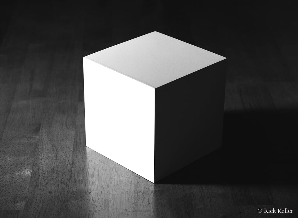
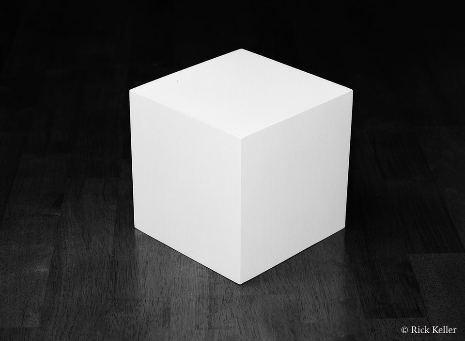
To summarize the previous discussion in The Quality of Light, consider the following two photographs that I had made under controlled conditions. The same subject, yet markedly different lighting and moods. One photo is potentially interesting, whereas the other is lifeless. Why???
Mamiya 645 AF, Mamiya 120mm f/4 Apo Macro, Ilford Delta 100 Professional
Mamiya 645 AF, Mamiya 120mm f/4 Apo Macro, Ilford Delta 100 Professional
The visualization of a photograph, whether it is a landscape or not, arises from the creative intention of the photographer, which in turn leads to the framing of the composition. From there, the choice of the quality of light (e.g., the directionality and color temperature) provides the photographer his or her most powerful tool to translate that artistic vision into reality. Finally, the skill of the photographer unifies artistic vision and light to make the exposure.
In landscape photography, an essential consideration is knowing what quality of light is best suited to consummate the visualization process. There is no one quality of light that serves as the common denominator for the creation of an inspiring landscape photograph. The choice of light is contingent on the photographer’s artistic vision and style. Personally, I am inspired by and seek strong illumination of the landscape with interspersed shadows such that there is visual emphasis on structure, texture, depth, and emotion. Certainly, other landscape photographers may gravitate to alternative qualities of light to achieve different results.
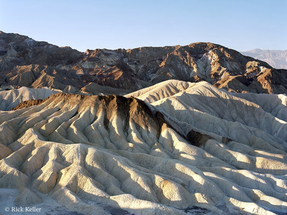
Tachihara 8×10, Fuji 300mm f/8.5 Fujinon-C, Kodak Ektar 100, Hoya 81A, Hoya HD Polarizer
Death Valley National Park, California
Contrary to misguided opinion in some circles, a photographer cannot fix bad or incongruent light after the fact. Sure, you can jack an image around in a post-processing software program, or a negative in a dark room, for hours on end; but if the desired light did not materialize from inception, you may very well be disappointed with your results.
Assuming that the photographer’s composition is strong (and that is a big assumption), the aspect of light that I feel determines the strength and impact of a landscape photograph is the interplay of the highlights and shadows that defines and reveals a landscape’s structure, imparts a certain mood, and ultimately creates visual impact. The directionality of light (e.g., side lighting, backlighting, oblique lighting) plays a critical role in how the light and shadows define these attributes and draw the viewer into the scene. If the light bathing the landscape is dynamic and inspiring, then the viewer’s attention and interest are more likely to be captivated; conversely, if the light is flat and uninspiring, then the viewer’s mind will lose interest (gasp!).
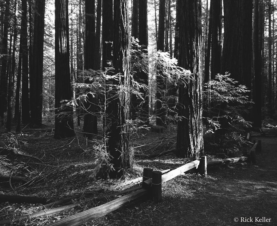
Mamiya 7II, Mamiya N 43mm f/4.5 L, Ilford Delta 100 Professional , B+W 022
Armstrong Redwoods State Natural Reserve, California
Too often, I come across landscape photographs that appear (needlessly) flat and lifeless because the light is flat and lifeless. I have viewed landscape photos in which large portions of the frame are either obscured in shadow or mid-tones, or illuminated with uninspiring light, as well as photos that lack texture or depth – many of those from my own early attempts at landscape photography (more on this below).
Nikon D800, 100mm f/2.8 E Series
Death Valley National Park, California
(Note the flat, even, and ‘cold’ lighting and the paucity of contrast, shadows, depth, and minimal texture)
Nikon D800, Nikkor 28-300mm f/4.5-5.6 G ED VR, Hoya HD Polarizer
Death Valley National Park, California
(Note the unidirectional side lighting, warm color temperature, strong contrast, rich textures, deep shadows, and the sense of depth)
When I study a landscape and desire to make a reproduction of it in my own vision, I want my own eyes and my viewer’s eyes to be immediately drawn into the image by the highlights. By human nature, the visual center in the brain is automatically drawn to the brightest part of a scene. It is a basic animal neurophysiologic reaction to a light stimulus.
To accomplish the objective of inviting the viewer into the scene, I personally gravitate to strong highlights in the immediate foreground – especially if I am using a wide-angle or wide-normal lens, and especially if there is structure of interest in the foreground.
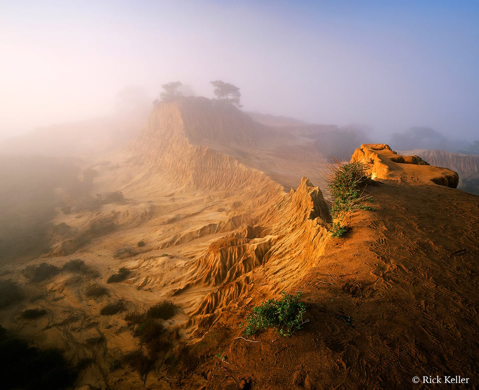
Mamiya 7II, Mamiya N 43mm f/4.5 L, Fujichrome Velvia 50, Hoya 81C, Hoya HD Polarizer
Torrey Pines State Natural Reserve, California
(In the immediate foreground, note that there is structure of interest that is illuminated by unidirectional and warm side lighting, drawing the viewer into the scene)
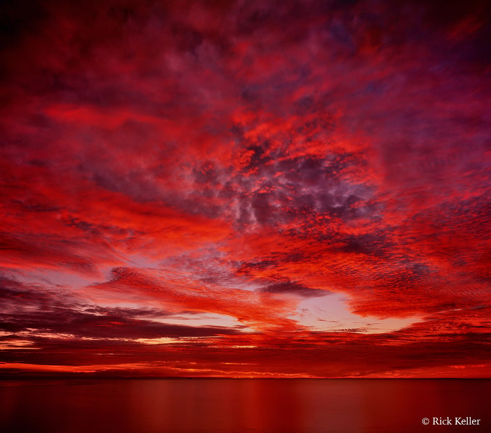
One notable exception that I make to the placement of highlights in the immediate foreground or middle ground would be in photographing the “Secondary Sunset”, where the vibrantly illuminated sky in the distance and silhouetting in the foreground and middle ground are salient features of the landscape or seascape.
Mamiya 7II, Mamiya N 43mm f/4.5 L, Fujichrome Velvia 50, Hoya 85C
San Diego, California
(Note the vibrant highlights in the sky and textures in the clouds created by the strong backlighting)
Once I place highlights over structure of interest in the immediate foreground, from there what determines whether the visual center and ultimately the frontal cortex of the brain signal the eyes to maintain visual fixation and interest is the presence of visual cues in the landscape (e.g., contrast, three-dimensionality, contours, shape, textures, and color).
Based on my own experiences in general and landscape photography, the above visual cues are created by juxtaposition of highlights and shadows from the incident light. If on the other hand the landscape is inundated with shadow, or highlights, or mid-tones, then the resultant low contrast may weaken these visual cues and cause the visual center of the brain to become disinterested (gasp!).
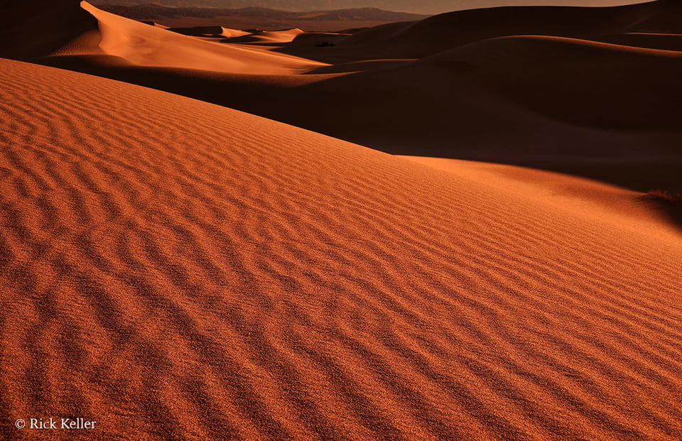
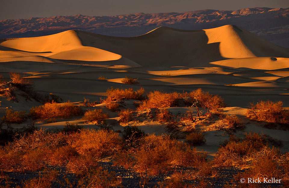
Nikon D800, Nikkor 28-300mm f/4.5-5.6 G ED VR, Hoya HD Polarizer
Death Valley National Park, California
(Note the alternating highlights and shadows in the immediate foreground, in the middle ground, and in the background)
If contrast, texture, shape, and depth are prominent throughout the frame (near to far), then the photographer’s prospects for capturing the viewer’s attention will be enhanced, and the more likely the viewer’s mind will be inspired to visually explore the world that you create. But if the quality of light that creates these essential visual cues is flawed from the outset, then the success of the image (if the photographer decides to proceed with the exposure) may well be ill-fated . . .
To illustrate these considerations, let’s delve into some cases studies. I made this next photograph during a recent trek into one of my favorite places for exploring landscape photography – Death Valley National Park. Because I relish studying structure, textures, depth, and mood in landscapes, to construct this photo I chose one of my preferred qualities of light: oblique (a combination of backlighting and side lighting) such that the shadows are headed toward the lens at an angle. Through my own studies and experiences, I have discovered that oblique lighting lends itself well to revealing textures and accentuating shape and depth in a landscape.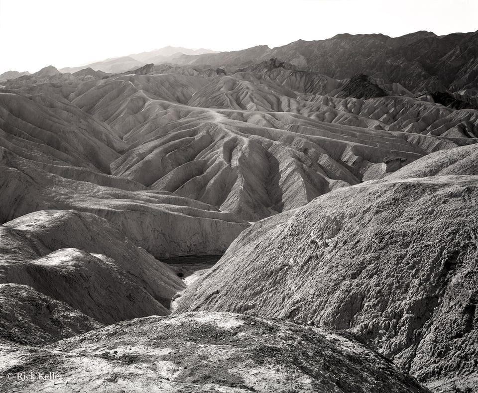
Tachihara 8×10, Caltar II-N 240mm f/5.6, Rollei Ortho 25 Plus, Hoya HD UV
Death Valley National Park, California
(Note the oblique incident light and the coarse textures in the immediate foreground that draw the viewer into the scene)
As the viewer’s eyes first meet this image, they are naturally and automatically drawn to the brightest area in the frame (the strong highlights in the overexposed sky); yet when the mind interprets nothing of interest in the sky, it automatically searches for a brightly illuminated portion of interest, and that is where the composition and the quality of light play a decisive role. In the immediate foreground, by virtue of the unidirectional oblique lighting, the eyes are drawn to a series of prominent textures and structure. Note the light raking across the frame at a low angle that predictably forms a series of alternating highlights and shadows, creating enhanced local contrast that unveils rich textures in the rocks. As the eyes and mind explore, they are naturally enticed to hunt elsewhere in the frame for more structure and texture to enjoy. In the middle ground of this image, there is depth imparted from both the chosen perspective (i.e., close camera-subject distance) and more alternating shadows and highlights/local contrast/textures extending into the background until the viewer’s eyes are met yet again by the strong highlights in the sky, which functions to redirect the eyes to “the starting point”, so to speak.
If a landscape composition is interesting and the lighting is inspiring, then the success of the landscape image will have been strengthened if the viewer re-explores the image from near to far and side to side. The salient point in the above image is that the landscape is illuminated throughout the chosen frame, with unidirectional incident light raking the landscape at a low angle, creating an interplay of highlights and shadows with strong contrast to vitalize the structure and mood in the scene. If a large proportion of this scene had been cloaked in shadow (or highlight or mid-tone), then the resulting image likely would not have been as compelling, regardless of the strength of the composition. Indeed, it is all about the light . . .
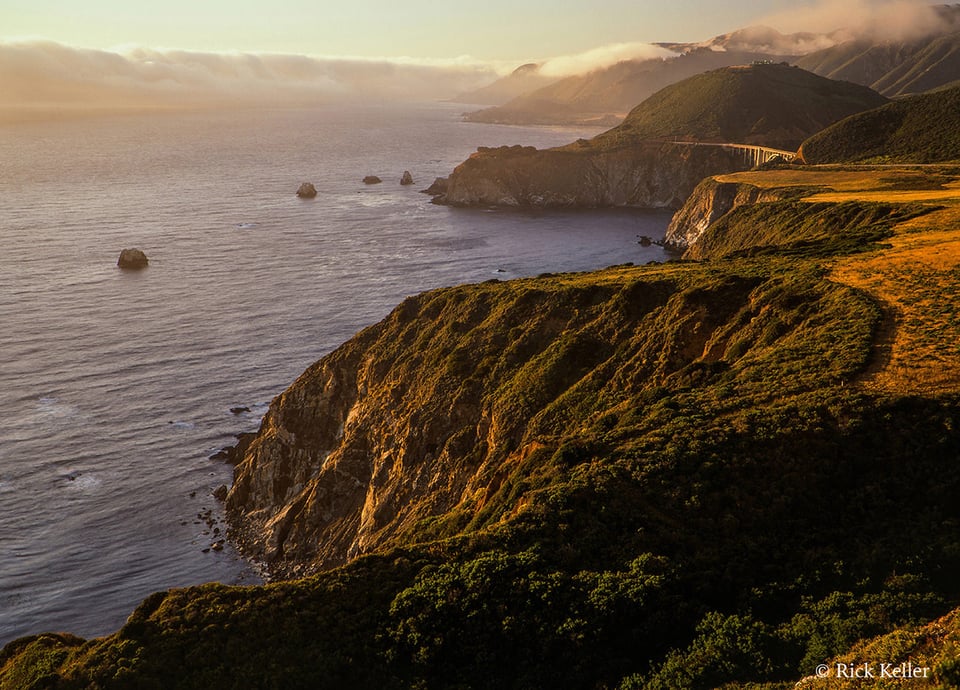
This next landscape photograph illustrates the same considerations. Here, I chose the warm, low angle, and unidirectional side lighting of the ‘Golden Hour’ to impart vitality and an uplifting mood to the scene.
Mamiya 7II, Mamiya N 80mm f/4 L, Fujichrome Velvia 50, Hoya 81C, Hoya HD Polarizer
Big Sur, California
(Note the interplay of highlights and shadows from near to far and array of textures from near to far)
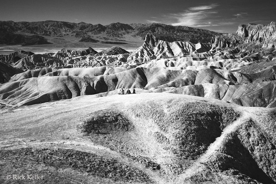
For this next photograph that I had made at Death Valley National Park, once again I was inspired by contrast in light and contrast in structure. The more I studied this scene, the more I visualized texture and contrast – and more texture and contrast! Texture in the immediate foreground, the middle ground, and in the background. Texture from near to far. Texture from edge to edge. This particular lighting was strong and contrasty (meager cloud cover on this mid-afternoon winter day), but still unidirectional and illuminating the scene at an oblique angle. This quality of light just worked!
Mamiya 7II, Mamiya N 65mm f/4 L, Ilford Delta 100 Professional, Hoya (O) G filter, Hoya HD Polarizer
Death Valley National Park, California
(Note the strong highlights intermixed with deep shadows and rich textures in the immediate foreground, the middle ground, and in the distance)
As I was crafting my composition through my composing card and studying the directionality of light, I was inspired by my interpretation in the immediate foreground of an uncanny resemblance of a ‘bird of prey’ staring at me straight in the eyes. I visualized the curve in the foreground as representing the head of the bird. I construed the oval and symmetrical coarse and dark textures as forming large eyes. Finally, I visualized the convergence of lines at a sharp angle at the bottom of the image as forming a beak. At the decisive moment of opening the shutter, it felt as if the ‘raptor’ were inviting me to make a photo . . .
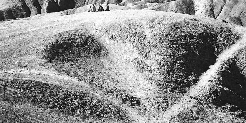
Furthermore, my overall interpretation of this scene was that the landscape was full of life – the raptor in the foreground juxtaposed with the human element in the middle ground – in the midst of a harsh desert environment. A study in contrasting structure, a study in contrasting mood. When the emotion of the moment dissipated long after the shutter had closed and the time had arrived for studying the result, viewing the image transported me back in time to relive the moment; it looked and felt as if I were again staring the ‘raptor’ in the eyes, even more so since I made the exposure in black and white, which lends it itself well to studying texture, shape, and structure. Experiences like this in the visualization process are what I *love* about landscape photography! Interestingly, if I had chosen light of an alternative directionality, then the textures that I had originally visualized and my interpretation of the scene would have differed starkly. For example, if I had chosen to make this exposure in the morning with the light to my back (a very poor quality of light for landscapes), then the ‘raptor’ would have been invisible. Hmm . . . why??
On a brief technical note, the Mamiya N 65mm f/4 L lens is a *wickedly* sharp and contrasty lens – one of the best I have ever used for landscape photography and which I highly recommend to my fellow landscape photographers.
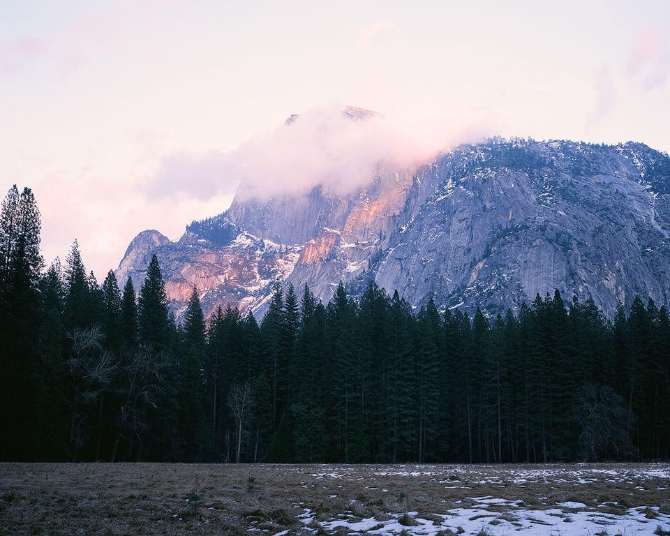
Consider this next photo that I had made six years ago when I was first experimenting with landscape photography.
Mamiya 7II, Mamiya N 150mm f/4.5 L, Fujichrome Velvia 50, Hoya 81A
Yosemite National Park, California
Ahhh . . . this one of the worst landscape photographs I have ever made, both in terms of composition and the light. Why? Due to the flat and uninspiring light, most of the landscape (the right side of the mountain in the background and the entire foreground and middle ground) was shrouded in shadow and mid-tone, leaving the viewer’s eyes to focus on the empty high values of the sky and to some extent on the sparse pockets of light falling on the mountain. In the absence of direct illumination, local contrast, and interesting detail in the bottom half of the landscape, combined with a paucity of depth and texture to study, the viewer’s eyes lose interest swiftly and move on elsewhere. Not good . . .
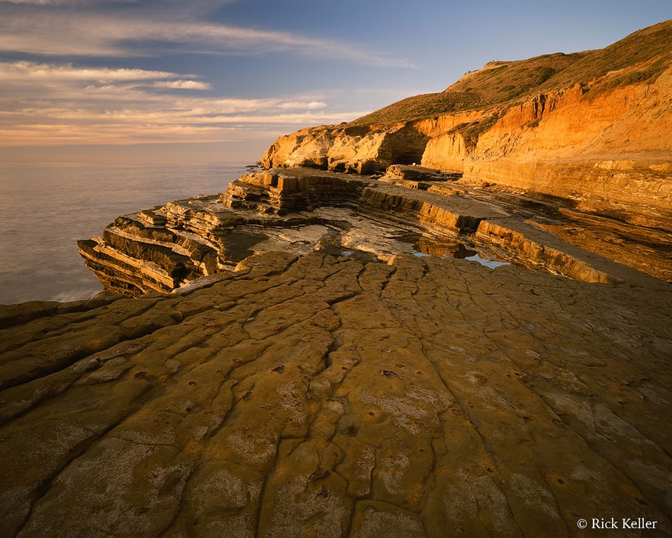
What about this next landscape photo?
Mamiya 7II, Mamiya N 43mm f/4.5 L, Fujichrome Velvia 50, Hoya 81C
San Diego, California
At the time, I thought this scene was interesting, both visually and emotionally. The composition had promise; there was interesting rock structure with hints of texture in the immediate foreground seemingly inviting the viewer into the scene. I even chose the lovely, warm, low angle unidirectional side lighting of the ‘Golden Hour’ to create an uplifting emotion. Well . . . ahem . . . this is another bad photo. Although the scene in the middle ground is visually delightful, it is poorly balanced by the landscape in the immediate foreground because the foreground is shrouded in mid-tone and shadow, thus rendering this part of the frame flat and uninspiring. As the viewer first meets this image, the eyes are automatically drawn into the brightest area of the frame (here, the middle ground). But when the mind automatically searches elsewhere for ‘balance’ in light and structure, it is sorely disappointed . . . Certainly, if the immediate foreground had been illuminated with the same beautiful quality of light as the middle ground, then I feel that this image would have been immensely more compelling and enjoyable.
In my humble opinion, the above photo exemplifies one of the pitfalls of using a wide-angle lens in landscape photography. It is challenging enough for the photographer to use a wide-angle lens to craft a strong composition where the foreground may occupy up to 50% (or more!) of the frame; but if the composition is not vitalized by inspiring light from near to far, then any weaknesses in the compositional elements that the photographer chooses will be magnified by the imbalance of light.
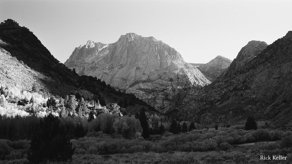
In this next image, the low angle unidirectional light at sunset had created strong contrast and well-defined patterns of highlights and shadows.
Nikon F6, Nikkor 24-120mm f/4 G ED VR, Ilford Delta 100 Professional, Hoya Y52, Hoya HD Polarizer
June Lake Loop, Eastern Sierra Nevada Mountains, California
Even though the immediate foreground was cloaked in deep shadow (which was not desirable), fortunately in the middle ground to the left of center there was juxtaposition of strong highlights and deep shadows that along with the illuminated mountain in the distance appeared to ‘balance’ the paucity of tonality and texture in the foreground. Had there not been illumination in the middle ground, then half of the scene would have been ‘hidden’ in deep shadow and the visual and emotional impact of the scene would have been weakened, so much so that I would not have chosen to open the shutter . . .
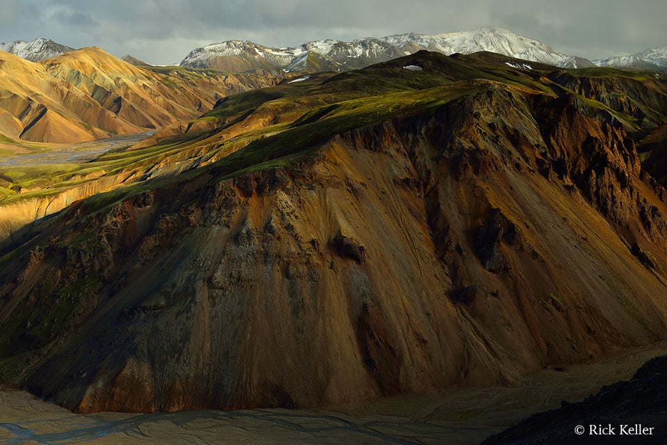
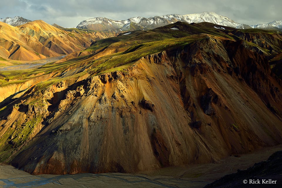
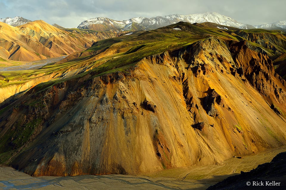
Finally, let’s examine how the interplay of highlights of shadows influences the mood of a landscape. Consider this next series of photographs (taken seconds apart) that I had made in breathtaking Landmannalaugar, Iceland after a clearing sleet storm (and with another approaching).
Nikon D800, Voigtländer Ultron 40mm f/2 SL-II, Hoya HD Polarizer
Nikon D800, Voigtländer Ultron 40mm f/2 SL-II, Hoya HD Polarizer
Nikon D800, Voigtländer Ultron 40mm f/2 SL-II, Hoya HD Polarizer 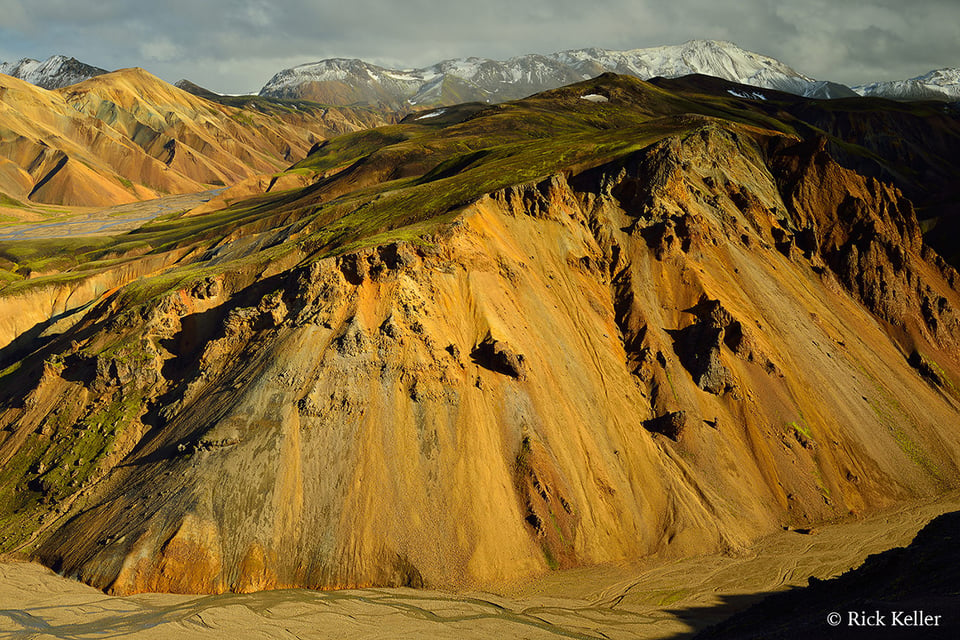
Nikon D800, Voigtländer Ultron 40mm f/2 SL-II, Hoya HD Polarizer
As you study this series, you can easily discern that the quality of light is unidirectional side lighting with a lovely warm color temperature. Further, you may readily interpret that the first and last photos are relatively flat (both physically and emotionally) because the landscape is either cloaked in deep shadow, or inundated with highlights, respectively. However, the middle two photographs are visually and emotionally more striking because of the presence of alluring shadows, richer textures, the appearance of three dimensionality, and the conveyance of a mysterious ambiance. Again, these attributes were created by the alternating highlights and shadows from the unidirectional side lighting filtering through dynamic cloud cover. With rapidly changing light such as this, the appearance of new patterns of highlights and shadows in a span of seconds to minutes just may inspire the photographer to visualize a completely different interpretation of the landscape, and therefore to create a unique landscape photo. This lighting scenario is an epitome of why I (and hopefully many other photographers) *love* landscape photography!
Conclusions
The study of the intersection of light and shadow in landscapes is arguably one of the most enjoyable aspects of this genre of photography. How the landscape photographer chooses to use the quality of light to capture light and shadow will be predicated on his/her unique visualization process. There is no right or wrong. Having said that, if the aspiring landscape photographer wishes to explore with more passion and perhaps exalt his or her work, then I would highly recommend experimenting in capturing well-balanced patterns in light and shadows that create strong contrast, alluring textures, well-defined structure, depth, and emotion such that the viewer’s mind is captivated and inspired to explore the photographer’s vision of the scene.
If there is one take away message from this article, it is that the sine qua non of a compelling landscape photo is balance in light. In unison with balance in composition, the chances are very good that you will end up creating a landscape image that you and your viewing audience will enjoy. It really is all about the light!
Special thanks to Northcoast Photographic Services for the film development services for these photos. Great job, Bonnie & Scott!
All of these photographs are copyright protected. All rights reserved, Rick Keller © 2018. You may not copy, download, save, or reproduce these images without the expressed written consent of Rick Keller.
Suggested Reading

Rick, this is my first comment on PL after 3 years of reading. I have loved your series on light and shadows. Loved it. I don’t do landscape…mostly candies of family, some BIF and have just done a few events recently. I’ve been practicing with bounce flash for about 2 years and have been paying more and more attention to how I want the lighting to look. I’m usually looking for soft, flattering light (people) and have seen remarkable improvement. But, man, your articles really make me want to get some off camera flash going to practice different lighting, playing with shadows and mood. I would like to be able see the scene and pre visualize different lighting to know what the potential of the scene is. This is a new desire for me (an enthusiast).
Thank you for re-awakening this desire to take control of my photography and reexperience lighting.
Hi Rick,
Your article was insightful, and well structured. I am new to landscape photography, and was fortunate enough to come across your article. Especially love the way you compare the same scene in different lighting.
I enjoyed the article and your illustration of your ideas with your photos. Clearly it shows that one also needs patience (and/or planning!) to arrive at a place to find the light favourable. I use a free app on my phone to help judge when the light might be optimal, but being able to plan to be in the right place at the right time is not always easy, especially if travelling with others!
A minor correction: I believe you transposed the order of your comments about the first and fourth of your photos from Iceland. “Further, you may readily interpret that the first and last photos are relatively flat (both physically and emotionally) because the landscape is either inundated with highlights, or cloaked in deep shadow, respectively. ” The first is in deep shadow and the last is full of highlights.
This gives me much to think about. I just visited Zion NP and found the west side of the park(canyon side) very challenging to photograph because of the deep shadows present and in heavy contrast to the sunlit portions or sides of the cliffs. The east side of the park though was a complete joy to photograph with a healthy dose of color, texture, light, contrast and every other element you mentioned. I’d love to see your treatment of the east side of Zion!
Hi Mark, thank you for sharing your experiences with us. It sounds like you had a memorable photo shoot at Zion NP. I have yet to visit Zion, although it is on my ever growing wish list of places to photograph. :)
Thanks a lot…all I can say!
George, you are very welcome, Sir. :)
Wow! Great article! It made sense and is very applicable. I like my compositions, but this explains one reason I think some of them are lacking dynamism. Thanks for the helpful article and the follow on links!
Hi Brandon, thank you for your keen response. I’m very pleased you enjoyed the article. :)
This is a great article
Thanks :)
Hi Rifki, you’re most welcome. I’m happy you enjoyed it. :)
It is hard to argue the fact that shadows and highlights interplay can make n outstanding photograph. Indeed it is that interplay of shadows and highlights what gives a sense of tridimension to our best shots arising the emotions we feel when the image has depth.
It is sidelight and backlighting, in my humble experience, what offers great opportunities to make excellent images, obviously combined with good exposure and visual design. Flat light is not good for landscape photography. The golden hours, as you described in this most interesting article when used properly can render images of great beauty and excellent quality.
When the experience of using the right type of lighting finally touches us we begin to produce a different, more impacting photographs. Camera and lens have become an obsession when what really counts is the art and vision of the experienced photographer.
Thank you for this revealing article.
Hi William, thank you so much for your sagacious commentary and contribution. I wholeheartedly agree! :)
Rick.
Stick with black and white. Your color photos are oversaturated. Go for a true nature look.
peter
Thanks for the nice article. It is refreshing to hear photographers embrace shadows in a time when people are clamouring for more dynamic range and bad HDR is still rampant.
Hi KomradeKiev, thanks for your astute comment. I’m pleased you enjoyed the article. Indeed, shadows . . .