How is it that two photographers can visit the same landscape at the same time, but one of them manages to take a better photo? It’s not about equipment, or camera settings, or sharpness. Instead, it’s all about composition. Composition is how you arrange the elements of your photograph to guide a viewer’s eye. How do you pick a good composition for your landscape photos? There are two elements that matter more than anything else: simplicity and visual weight. In this article, I’ll share some tips for using them correctly.
1) Simplicity
A good landscape photo says what you want it to say, and nothing more. Every single element of the photograph adds to your message. It forms a strong, cohesive whole.
Simple — but how do you make it happen?
The first step is to have the right mindset. Always start by thinking about simplicity. Which items can you leave out of your photo to make it stronger? Don’t get rid of everything in your photo, of course. That’s not simplicity — that’s boring. An empty photograph of the sky might be simple, but it doesn’t say anything in the first place or have a reason to exist.
Instead, just clarify your message. When you’re at an amazing landscape, try to capture the character of the scene as clearly as possible. Your viewers should look at the photo and feel the same emotions as you.
Let’s put it into practice. Say that you want to photograph an enormous, epic mountain. You could start by standing back and making any people in the scene as tiny as possible. Then, compose your photo to eliminate large objects that are nearby, or you might end up with a tree in the foreground that looks bigger than the mountain. Finally, use a longer focal length so that the mountain takes up as much of the photo as possible, giving it the greatest possible scale.
This tip — refining your message — has let me capture some of my favorite landscape photos. All you need to do is form a goal, then eliminate everything from the photo that distracts from your goal. That’s the best way to capture a strong photo.
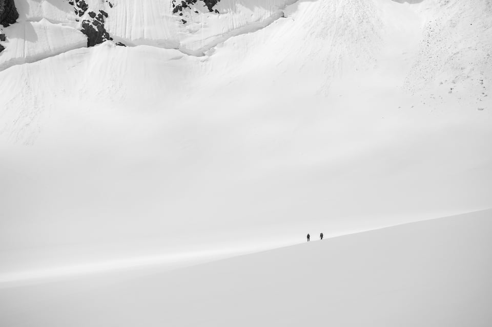
Use simplicity to refine a scene to its essence.
Also, check out this comparison between a chaotic and a simplified composition:
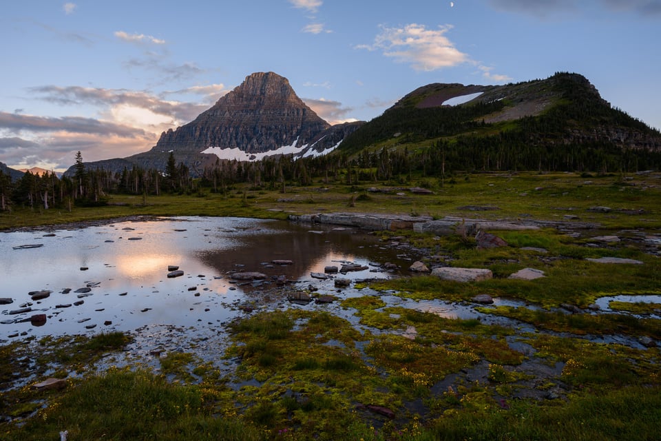
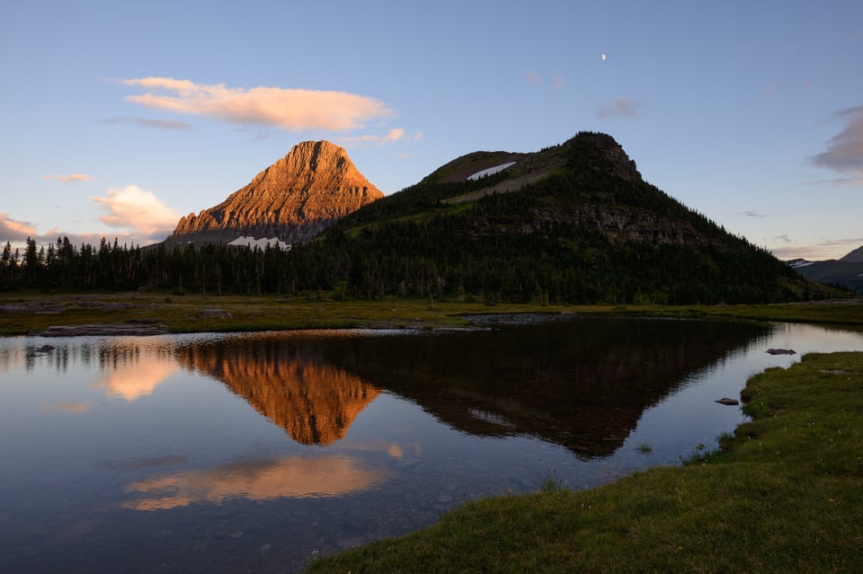
A more refined, simpler composition, where everything exists for a reason.
2) Visual weight
What’s the first thing you notice when you look at a landscape photo? It depends upon the photo, of course — and that’s the key.
Sometimes, you’ll notice the setting sun before anything else. Other times, you’ll pay attention to an interesting foreground, or a mountain in the distance. It all depends upon the interest levels of each element in the image. And that’s visual weight: the amount of attention that a particular part of the photo demands.
Take a look at the photo below. Which items have the highest visual weight?
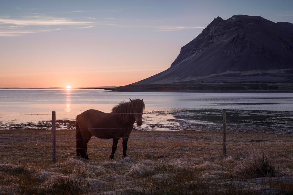
The first thing you notice here is probably the horse or the sun. Maybe a few people will look at the fence or the distant hill before anything else.
You know what you didn’t look at first? The bottom-right corner. Why not? It’s dark and empty. Until I mentioned it, there was no reason to look there at all. In other words, it doesn’t attract attention, since it has almost zero visual weight.
There’s no mystery or secret about which items have high visual weight. The same elements that catch our attention in real life do exactly the same in photography: high contrast, vivid colors, bright objects, people, animals, eyes, and so on. Visual weight is important because it pulls your viewer’s eye across a photo. That’s critical. You control the path people take through your images. Even though you can’t know the exact path a viewer will take through the frame, you can form a very good idea of the most likely places, and then use that knowledge to your advantage.
This isn’t just relevant in photography. Magicians and stage performers often wave their hands dramatically to draw attention away from something else — and this trick usually succeeds even when you know it’s happening.
This also holds true for landscape photography. When you want to emphasize (or de-emphasize) a particular subject, there are several options at your disposal. For one, you can wait for the light to start shining in a different spot. Or, you can adjust your composition. Post-processing also falls under this umbrella, since it’s all about picking which elements you want to emphasize.
The key is that you can get your viewer to pay attention to the good elements of an image, and you can minimize the importance of anything that takes away from your message. Perhaps your photo has distracting highlights near one of the edges, for example. By altering your composition and post-processing, you have the power to improve that area and re-shape how a viewer sees the image.
Visual weight is the foundation of many other elements of composition: balance, structure, positive space, and more. Learn it. Figure out what attracts the most attention, and then compose your photo with that knowledge in mind. Don’t let your viewer wander aimlessly through a photo. Instead, use your knowledge of the landscape’s visual weight to give your photos a solid, intentional structure.
3) Conclusion
I think composition is the most personal part of landscape photography. It’s certainly among the most important.
A good composition gives your photo structure. It’s the envelope that contains your message, whatever that message may be. How do you compose a good photo? It starts with simplicity and visual weight. Figure out the most attention-grabbing parts of the image, and compose them thoughtfully to convey your message as clearly as possible. In the best photos, nothing exists by accident, and every part of the image is highly intentional.
Composition has been described as the strongest way of seeing. In my opinion, that’s a fine way to frame it.
Hello, all your advice helped me a lot …
A question you know what is the name of the site of images 2 and 3, it would help me a lot.
Thanks :)
I took those photos on the trail to Hidden Lake in Glacier National Park (although the pond in the photo isn’t Hidden Lake itself)!
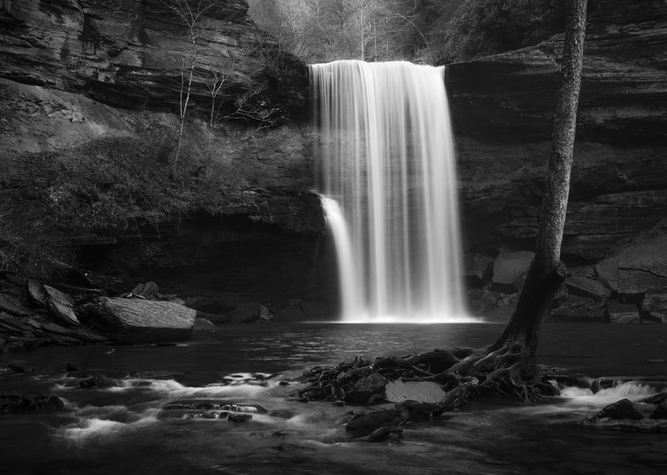
First. Thanks for this informative article. We’ll written with lots of great point. I have a question more so than a comment. The b&w waterfall scene looks so familiar to me. Would you mind telling me where this location is? It reminds me of one of the “zillions” of falls in our North Carolina mountains.
Oh, btw. Really love the snow scene with the two tiny hikers. Great composition and scale….I guess I had a comment after all :-) Tim Smith, Wilmington, NC
Thank you, Tim! That’s Greeter Falls in Tennessee. I’ve been there more than a dozen times for photography — a really beautiful location, and lots of opportunities walking up and down the river.
I knew I recognized that waterfall. Been there MANY times, hauling in all sorts of cameras from 35mm to large format 4×5. Nice work done here! www.flickr.com/photo…4213238272
I really appreciate seeing photos that work and those that don’t of the same scene. I wish there were more in this article. In so many tips and how to articles, authors show their most beautiful photos. They seem more like a showcase of the author’s images rather than truly trying to communicate something. I learn so much more when I also see what doesn’t work.
Dee Dee, that is an excellent suggestion. I am going to write an article doing exactly what you describe — showing the photos that don’t work, leading up to the successful images. Because the truth is that unsuccessful photos outnumber the good ones several times over :)
I would be interested in that as well. I think it would also be useful to see what a crop might look like of the unsuccessful photos especially something like the landscape above you describe as unsuccessful with too many elements.
Great advice, I’ve always wondered if I was capturing enough to tell the viewer what I was seeing. It is an individual’s viewpoint. Always wondered if, why n how someone else would see my pictures. It’s just up to the viewer if they like what they / I see.
Janis, thank you, glad you enjoyed it! You’re right, a lot of this is definitely up to the viewer — though, you can help them along by composing photos with as much thought and intention as possible.