I recently posted an article on how to calibrate a monitor, but completely forgot to mention about using color-managed applications. Whenever you deal with different color profiles on your pictures, you should always use color-managed applications. Otherwise, some of the pictures could appear abnormal and the colors could be way off.
One of the most basic applications that we would expect to have integrated color-management is our Internet browser that we use everyday. Surprisingly, many of the most popular browsers such as Internet Explorer, Google Chrome and Opera simply ignore color profiles embedded into pictures. Therefore, for ultimate photo-viewing experience, you should always try to use a color-managed browser. The best and the most popular color-managed browser is Mozilla Firefox. It is my favorite browser and I use it primarily to surf the web.
Mac users do not have to deal with this, because the Apple Safari browser already has full support for color profiles.
How can you tell if your browser is color-managed?
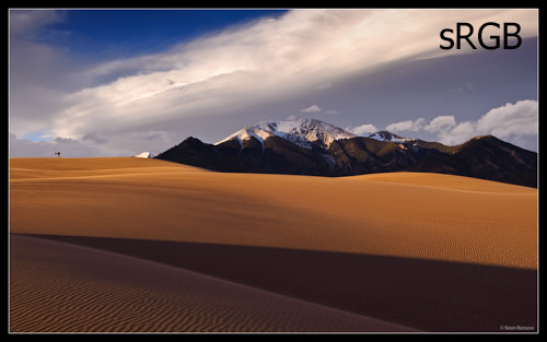
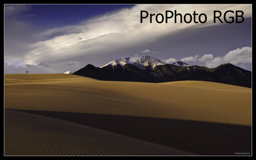
Take a look at both of the below images on your browser. If they look identical as far as colors are concerned, then your browser is color-managed. If the second image below appears to have a dark blue/magenta sky with yellowish sand, then your browser is not color-managed.


If you see any differences between the above pictures, you should change your browser!
sRGB should look different from ProPhoto RGB as the sRGB profile clips the color gamut significantly. We ran in to issues using sRGB for showing proofs for Print Projects. We now show them using the embedded CMYK profile with a reduce resolution. Monitors and Graphic Cards have improved significantly. However even with color corrections for you montior and graphics card, no two correct to match. I have three monitors connected to my Dell work station with the identical graphics cards for each and I cannot get them to match. So customers out their without color corrected monitors may be seeing something much different that what you are supplying.
We use the Adobe RGB 1998 profile which has a wide color gamut, but not quite as wide as the ProPhoto RGB profile, We have our photographers convert from RAW to Adobe RGB 1998 as it is is well suited for conversion to CMYK. Keep in mind that the SWOP ICC profile illustrated in the link below is for web-fed presses printing periodicals and is not suited for printing on a US sheet-fed press printing on a number 1 or 2 coated sheet. (most projects in the US)
en.wikipedia.org/wiki/…olor_space
If your photography is eventually going to end being used for printing, this is a great resource. This is our starting point for our joboptions files for InDesign (PDF Presets) to export to Print PDFs…
connect.idealliance.org/g7/ab…eproviders
Go here to check your browser for color management…
www.color.org/brows…est.xalter
To elaborate on color correcting monitors: Even with multiple high end monitors connected to the same graphics cards (one for each monitor) within the same high end computer, it is almost impossible to get them to match exactly. Few customer color correct their monitors, so customer monitors are going to very widely as to how they render color. A very few good, a many not so good and most poorly. The best we can do is make sure our monitors are rendering color as close as possible.
Printer Art Departments can calibrate their monitors using G7 standards. IE: Monitor calibrated to match their Ink Jet proofing system which is calibrated to match their press.
To elaborate on why we use the Adobe RGB 1998 profile rather than the ProPhoto RGB profile even though the ProPhoto RGB profile producers a wider color gamut is because the ProPhoto RGB profile creates colors outside of the human eye’s ability to see them. The link I provided above and below shows the ProPhoto RGB profile color gamut which as you can see goes outside the color spectrum (the human eye’s ability to see color) while the Adobe RBG 1998 profile stays within it. While the article refers to those colors as imaginary they are in fact just colors outside the human eye’s color spectrum, so we can’t see those colors…
en.wikipedia.org/wiki/…olor_space
Everybody talks about aRGB in terms of image editing. I wonder why nobody tells how they watched video. It must certainly look better.
Interestingly, Chrome is the only browser on my PC that shows the two images the same. Both Firefox and IE show them differently…
I have tested firefox, Chrome & IE.
The photos look different in all of the above browsers.
I think I am in the same situation as what you replied to Kerry.
I am using Windows XP and a DELL E178WFP monitor.
Thank you for your information. I know monitor is just like any other merchandises, good one expensive; not so good one cheap. But to those manufacturers out there, I can not accept a colour monitor that can not display colours to approximate.
Try Opera. It’s the only one that’s color managed.
Hi Nasim ,
I read this article, with interest.
Colour perception is so subjective, and as you have mentioned, which browser you can use can make a significant difference!
I have tried all most of the popular browsers, and until recently found Firefox, the best.
However, more recently, after upgrading to Windows 8, I have found Internet Explorer 10 gives better colour rendition.
Images that I post on Flickr (www.flickr.com/photo…57078@N05/) correspond very closely to those on my monitor, using IE Ten.
I am a keen photographer, and undertake my editing in Photoshop CS6! I always processing in 16 bit, and in ProPhoto RGB colour space.
However, for posting on the internet, I have found it is essential to convert back to sRGB; otherwise, the browser will make the conversion, usually doing a poor job!
I found the information I was looking for, along with the tutorial on calibrating your monitor in Windows 7!
Hi Nasim;
I was interested in this article, because I have noticed the term monitor calibration – as I have seen this term before, but did not know what it really meant. I have read your other article related to monitor calibration, and it all makes sense now. The first post caught my eye because I have the same problem. The colors are a little different with the mountains showing a little more detail. I use Mozilla, and keep it up to date.
So I did try Internet explorer and found that the mountains have a little more detail, but the colors actually appear a little different.
After reading the other article on calibrating your monitor, I found my monitor is a PnP.
Through this article, I found that when photography websites post their photographs, they appear oversaturated at times with sun streaks or just oversaturated in general when I view.
Do you know about PnP monitors? (I will research a little myself).
Also, upon receiving my computer, I found the glare from the monitor unbearable, so I bought an antiglare monitor overlay. Will this make a difference in how colors are viewed as well?
Lastly, no wonder, I am hesitant to perform post production.
I always feel the colors/ saturation etc are off.
Thanks for your input.
Why use prophotoRGB at all when it has lousy support? When you’re a photographer and want people to see your photo’s how they are meant. just use sRGB. Prophoto isn’t supported on tablets and phones and sRGB always is. Most monitors aren’t able to show prophotoRGB’s range anyway. Keep it in in your workflow, but don’t export it to the web.
Hi Nasim, thank you for another helpful article. I have been visiting your site almost daily, it is one amoung the best and very useful site. I have subscribed to your feeds and it is very helpful.
I learnt a lot of things from your site; recently bought ASUS PA 238 based on your recommendation and very happy with it.
For me, your site provides wealth of relevant information.
Thank you so much for your effort/help.
Hi Nasim,
Thank you again for the excellent article. I have a quick question and would like to know your advise about it.
I think my adobe lightroom gives me different colors if I encode images by different color profile. Am I missing anything? I believe that adobe lightroom should manage it well. Or is it that the color will always look quite different if I encode it by different profiles. Any suggestions would be highly appreciated.
Thanks
Scott