What makes a good black-and-white photograph, how do I take one, and why should I try when I have this nifty hypersaturation preset that makes even my lamest photos look awesome? I’ll answer the last question first – your oversharpened oversaturated photos stink. Their gaudy colors may suck the eye in, but then the eye gets stuck, realizes there’s nothing more to look for in the picture and hastily moves on. When Photography Life has covered black and white photography recently, we’ve shown that it relies upon the concepts of form, texture, lines, contrast, tonality, and composition to engage the viewer. Without flashy colors to draw viewers in, the black-and-white photographer either masters the principles of composition or perishes. Shooting in black-and-white is a great way to improve your photography skills.
Table of Contents
But My Eyes See in Color
True, to some extent. In bright light the “cone” photoreceptors in your eye register color information. But go into a dark room or out at night and then your “rod” photoreceptors take over – they are more sensitive in low light and primarily recognize contrast, shape and movement. So you are already programmed to see those important aspects of B&W pics – form, texture, lines and contrast. This is going to be easy. Let’s get going with some examples.
Form
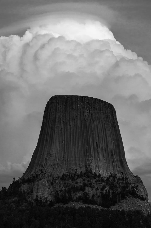
Ah, a grand landscape in the traditional style. The classic form of Devil’s Tower anchors this composition. Form, or shape if you prefer to call it that, works well when you have a large/predominant composition element in your photo. The viewer recognizes the element and it pushes an emotional button. For instance, lets say I was shooting a portrait of Dolly Parton…but I digress, lets move on.
Texture
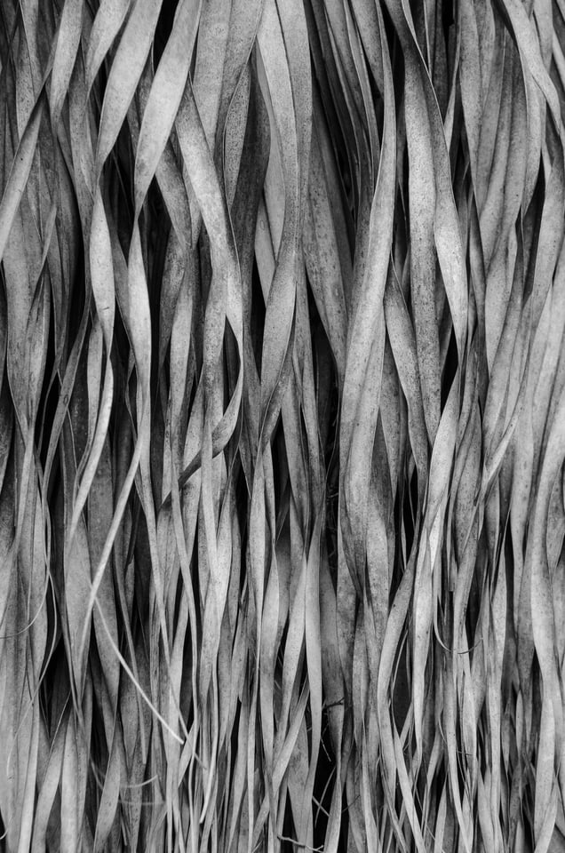
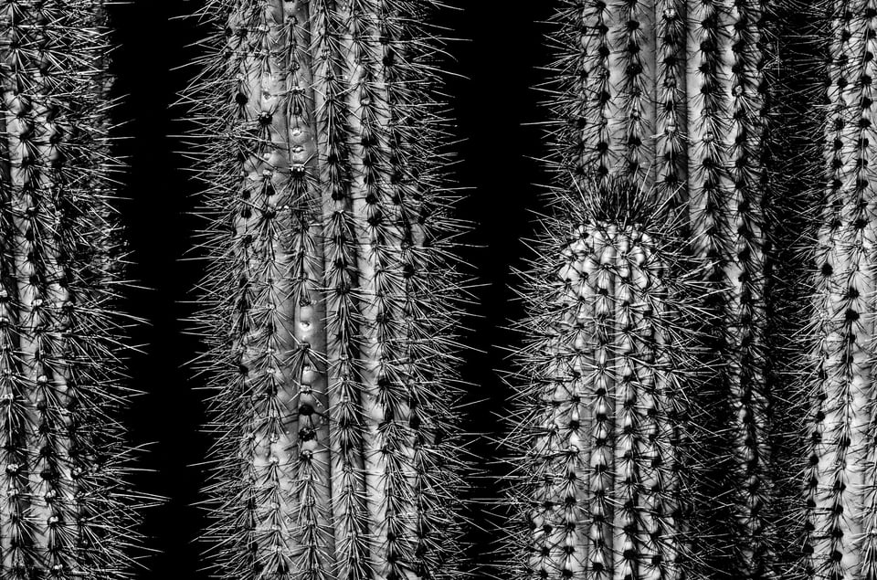
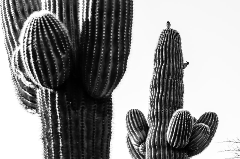
Texture is formed by contrast and tonality changes on the small scale, then repeated to create texture. Some textures we find pleasing, say a cat’s fur. Others trigger the opposite response, such as cactus needles
Lines
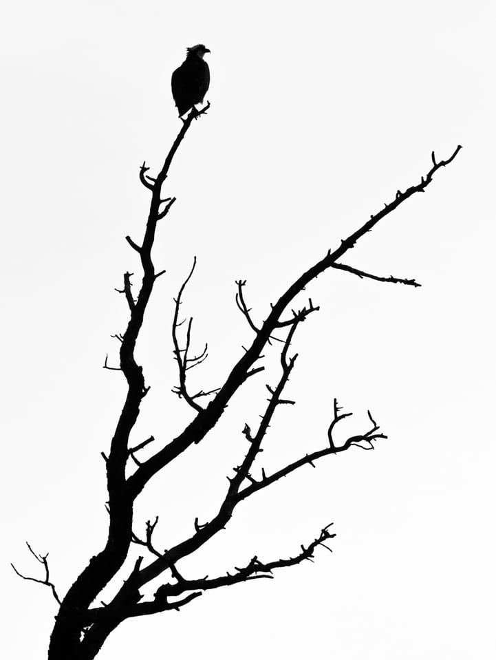
Lines lead our eye to move about the composition and not get stuck in one place. When I view this simple composition my eye first goes to the heavy thick trunk of the tree, then shoots up the branch to the perched osprey; the osprey is looking right and this moves my eye to the top to the branch to the right, from whence it travels down that branch to the trunk and right back where it started to take another loop. This takes just an instant. Mapping your eye movements is a cool way to learn about composition – look at some of your favorite pictures and track how you eye moves about the composition – on a good photo it keeps moving. On a poor composition it gets stuck as bad as a piece of legislation in DC.
If lines repeat they can form patterns and a very regular pattern can create a texture. Lines or curves coming together can create forms. I could blather on about converging lines, “V”’s and such for pages, but this is the stuff of any composition how-to. Let’s move on.
Contrast
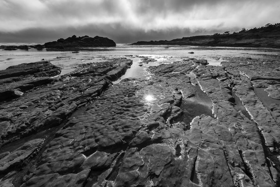
Contrast – do I need to define this? Suffice it to say high-contrast images tend to give a harsh, sometimes uneasy, feel like in the cactus shot earlier. Low-contrast images have a softer mellower impact. The above shot from Weston Beach has a rugged feel due to a fairly high-contrast rendering. Compare that with this shot of leaves on the forest floor in Kentucky.
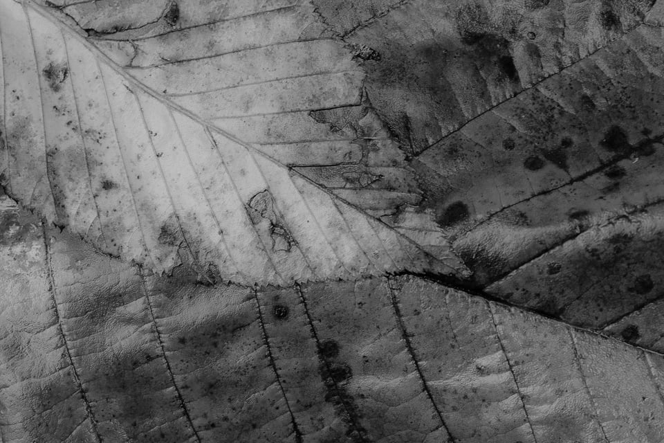
Here there’s no abrupt intersections of light and dark – it looks smoother and more soothing to my eye.
Tonality
Tonality refers to the range of tones in an image – how many shades of gray there are from featureless black to featureless white. The Osprey silhouette has a very limited tonal range, just black and white. The Weston Beach shot looks contrasty due to the juxtaposition of light and dark lines, however it actually has one of the most complete tonal ranges of the shots in this post with good representation of grays all the way from black to white. The overlapping leaves actually have a lower range of tones as there are mostly dark grays and blacks and very little representation at the white end. This is not a defect, just an artistic decision on my part as to how I want the final output to look – hmmm a bit dark and depressing, maybe my team lost that day. One often hears that a good black-and-white photo contains a complete range of grays from black black to white white but this is one of those rules that once you understand how to practice it, you may feel free to disregard.
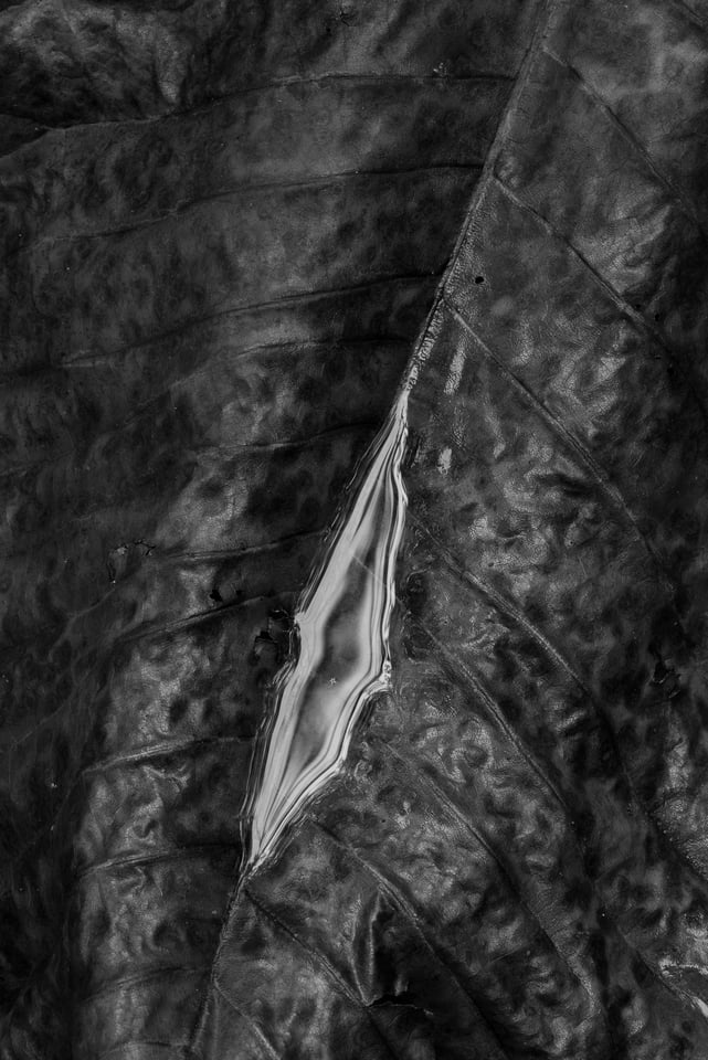
Mostly black and near black and the tiniest smattering of white (insert your own NBA joke here) – where’s the light gray representation? Not needed in my estimation – I dig this. What do you think?
Composition
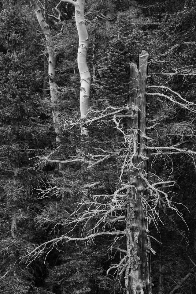
Good composition is essential to both B&W and color photography. The only difference in black and white is instead of using contrasting and/or complementing colors to balance our compositions (or unbalance if that’s our goal), we have to depend on the above elements of form, texture, lines, contrast and tonality to compose our images. Let’s quickly analyze the shot above. As humans, our eyes are drawn to bright objects and sharp objects first. In this case the big dead pine snag on the right and the two aspen trunks on the left, the brightest objects in the image, suck the eye in. These familiar forms create parallel lines encouraging the eye to move up and down each trunk. The horizontal dead pine branches help the eye move left to right and not get stuck on one of the three trunks. They also encourage the eye to visit the leftmost, darker tree and revel in the texture of the spruce needles. There is a full tonal range, but weighted to the dark side – however the eye doesn’t register this (the histogram does) because light objects carry more psychological weight in our mind than dark ones and balance out the composition. This happens too in color photos where warm tones outweigh cold ones – for instance a small figure in a red jacket can balance out a huge blue iceberg.
Okay, that’s a pretty busy shot. Let’s go pine tree again, this time alive.
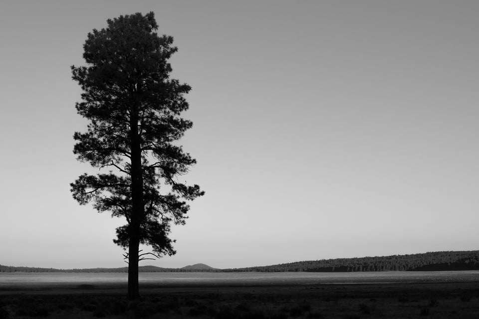
This is pretty minimalist. The eye doesn’t have many places to go. Up and down the tree, then left and right along the dry lake and horizon, maybe back up the tree then cut across the empty sky to the right end of the horizon. The one dominant form – a lone pine tree reaching upwards – is balanced with…nothing. Ha! Negative space to the rescue. The vast empty sky to the right of the pine balances the “weight” of the tree. Yes, negative space when used correctly carries it’s own weight. In this case the lack of other trees implies a sense of independence to the single majestic pine. Or one might see it as a lonely figure. Many interpretations to this one.
Good black-and-white compositions don’t need all of the characteristics discussed above to work.
Your Take
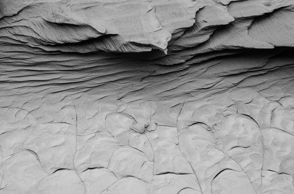
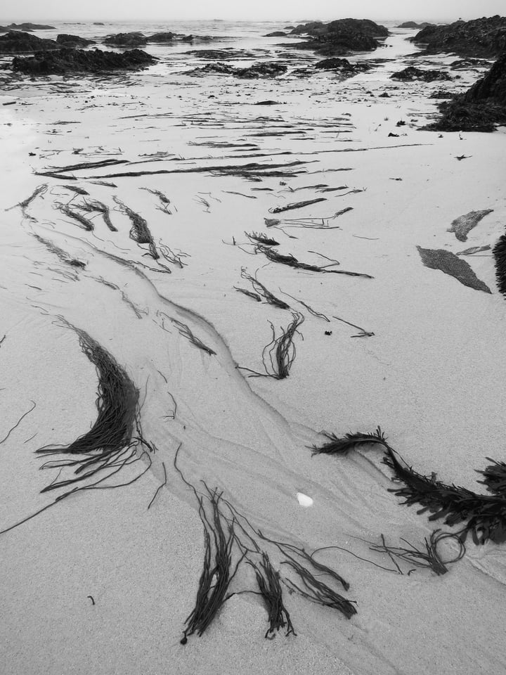
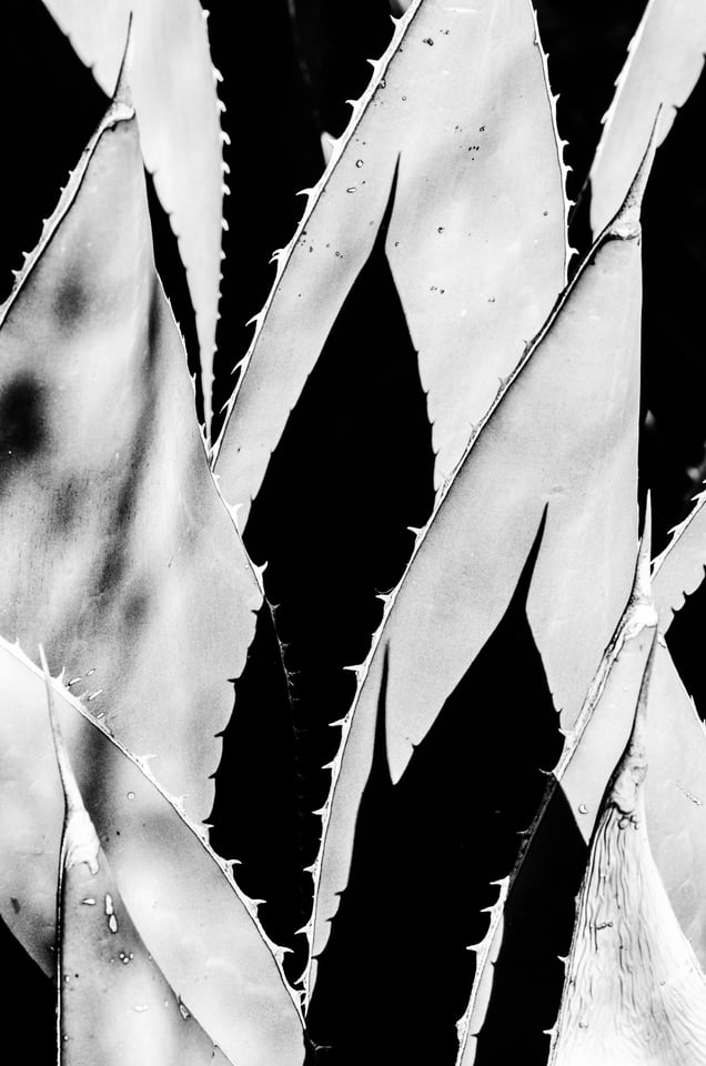
Here’s some sample shots you can analyze in terms of form, texture, lines, contrast, and tonality. Feel free to comment on them. Do you like them? Which ones work for you and which ones don’t? Why?
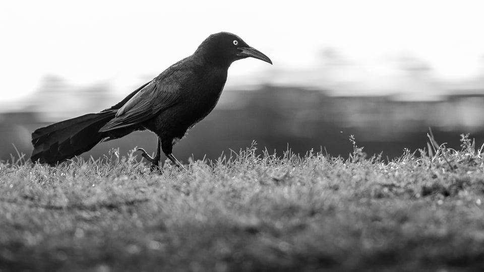
How To Get Started Shooting Black-and-White
You may have some image files already you can practice with. Any color digital image can be easily converted to black-and-white (all of the above came from RAW files which by default contain all the color information the sensor collects). In Lightroom it’s as easy as selecting an image and hitting the “v” key. This gives a default B&W rendering. Each color is rendered as a particular shade of gray but can be lightened or darkened in the develop module by using sliders in the “black-and-white mix” panel or you can check out the various preset B&W filters and looks in the presets panel. When choosing a file to work with, think about lines, form, texture, etc – find a file strong in these and give it a try. If the file is weak in color or the white balance is whacked, so much the better. Alternatively you can go out and shoot your digital DSLR in monochrome mode (e.g. on my D810 I can go to the shooting menu, select picture control and select monochrome). This will give B&W views of your shots on the camera’s LCD. If you shoot jpeg it will dump your color info. I recommend shooting RAW. The color info will be stored and allow more options when it comes to post-processing later, but you’ll still get to see your in-camera previews in B&W while you shoot and this will help you compose. All of the images in this post were converted in Lightroom, however there are many other programs for B&W processing. Silver Efex Pro is popular and I like how the noise it creates looks more like old school B&W film grain than the more digital-looking post-processing noise in Lightroom.
Two Last Shots
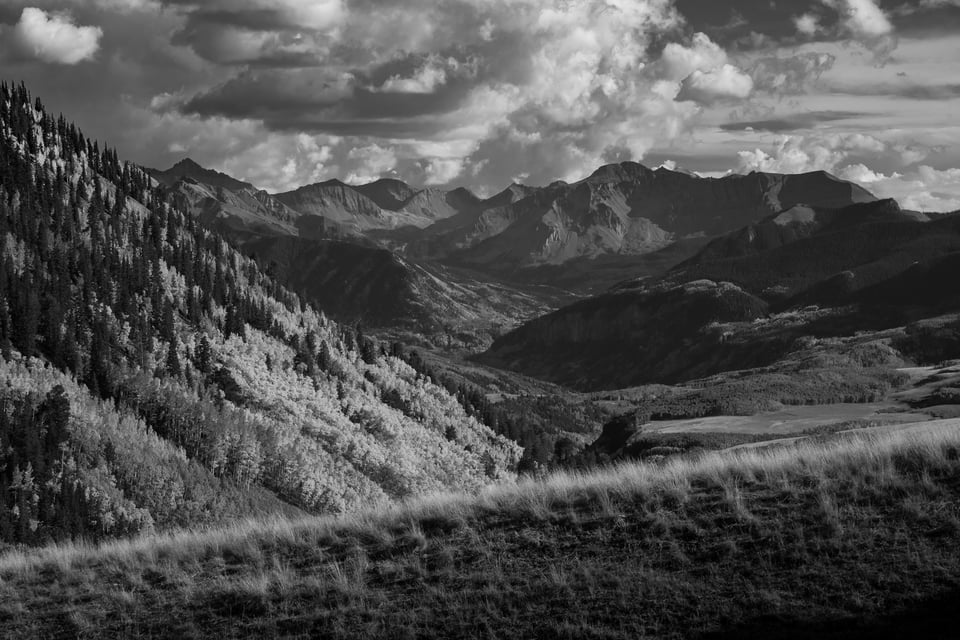
Fall colors in Black and White?
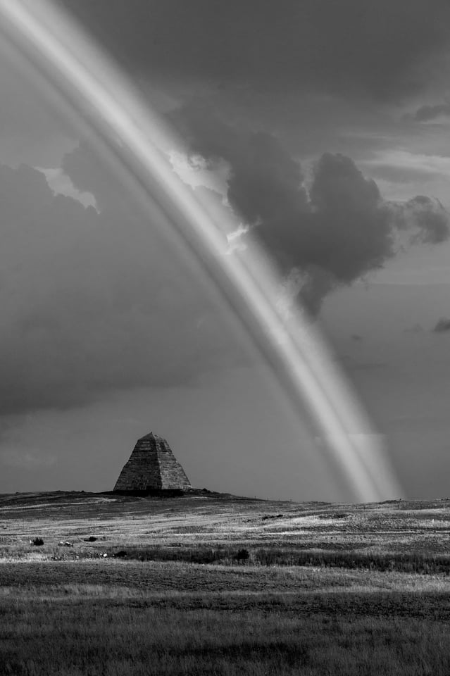
Oh, what the heck!
Fantastic article. It is so unusual to read a piece of work the explains in detail and with obvious passion for black and white work. Many thanks, a great read.
John
www.johnhuttonphotography.co.uk
LIKE: Have you ever stopped to think about the moment that it hit you? The moment you realized how much you loved photography? Not necessarily when you www.hugedomains.com/domai…#038;e=com
I smiled when I read your comment. I find myself over sharpening and over saturating colors (a bit, sometimes more than a bit!) because most of the people I share my pictures with are my friends and a few relatives who think photography is something you do with your smartphone – they all love my pictures! So when I read that opening statement, “your over sharpened oversaturated photos stink” I was slightly put off but also intrigued and continued reading the article. I’m glad I did!
Photography to me is something I do for enjoyment – it adds “color” to my life!
:)
Ron
Beautiful photos and very clear explanations. You are a true talent. When I read the sentence containing the crude phrase, ‘your oversharpened oversaturated photos stink’, I also moved on however. Who are you to tell someone their vision stinks? That one sentence almost ruins what is otherwise an excellent piece…
Hi Duffy,
I agree my statement about oversaturation was a broad and provocative blast. If someone’s vision is truly to see the world through oversaturated colors that’s fine, but I worry that many people just hit the “punch” button by default in an effort to follow a trend that is currently pervading the photo world. I hope my statement encourages people to look inwards to discover their own personal vision and not just duplicate what the masses are doing. To a far lesser degree I hope it gets people to simply think about any tweak in post and only hit click if it will make the picture better. The final rainbow shot is a great example of tweaking in post that doesn’t help the photo – that image is way better in color. It was tossed in as a joke and if anyone tells me that one stinks, I’ll have to agree with them.
Regards,
Verm
Hi Verm,
Yes, a ” broad and provocative blast.” I too get frustrated with the “hit the button” method of processing. Some people think it’s cool to use the wah-wah pedal on everything, and in truth it doesn’t sound anything like the guitar, even when used tastefully! Sometimes the vividness of a brilliant sunset simply can’t be captured without a little extra saturation, especially the emotional impact of it! There was a school of modern art called the expressionists who were trying to convey the emotion they felt in a painting, often by using extremely bright colors…
People often over-sharpen when their technique doesn’t quite match their passion, or their equipment (glass) can’t quite get there. Sometimes they overdo it, however they like us are on a learning curve. There are endless numbers of people in front of us and endless people behind us.
I think your images are terrific. I think you are a fine writer as well. I look forward to hearing and seeing more of each.
Cheers to you,
Duffy
Duffy,
Amen to that. I’m with you all the way and yet pictures you describe keep appearing, don’t they?
Duffy,
I think Verm, acknowledges and I agree that beauty is in the eye of the beholder. But aren’t you also tired of some aspects of overdone techniques in photography? As a musician, aren’t you tired of hearing the same riffs over and over again from different artists? I think all Verm is saying is don’t over do something that is beautiful by itself. Sometimes the natural is better than the enhanced. Would you agree with that?
Hi Mike,
Yes I would agree with “sometimes.” Yes I get tired of hearing the same old riffs. I get tired of seeing the same photographic cliches as well. I don’t need to see anymore slow shutter waterfalls, people spinning a burning hunk of steel wool on a rope, anymore wedding rings making a heart shaped shadow on a book binding, or even anymore sunsets, which I myself am guilty of shooting all the time. I want more “Jazz,” more improvisation, more abstract (much more abstract), more relationships where one element echoes another, in shape, texture, color etc. There are terrific compositional opportunities at our feet, no matter where one is. I want to see much more of that, seeing pleasing composition in ordinary stuff, instead of another mundane shot of the Delicate Arch. Yes, overdoing the post-processing is tiresome, but not nearly as tiresome as photographers who keep trying to shoot the same old shots. Overdoing in post-processing is something most people gradually grow out of, but boring not so much. I want to see Photographers reaching for something new. Each of us has a unique POV. I want to see us use it!
Have a splendid Sunday,
Duffy
Duffy,
We are in agreement here. And as you stated, we are both guilty of taking just one more sunset or sunrise picture.
I don’t mean to be denigrate anyone when I say that most photographers as hobbyists want to create what they see the professional photographers create. As we find oversaturation…over done, it seems to sell pictures so some photographers will continue to do this until their photographs no longer move to an audience that is willing to buy them. Once the amateur accomplishes what they see other doing they tend to move one but in the creation of the flowing waterfall, they learn to control their creative POV to other subjects. One of the methods I employ with my high school kids who come to me to learn photography is exactly that, go out and shoot a sunset or sunrise, make the water flow soft and creamy. Then apply that technique to something else. It teaches them to use polarizer filters and ND filters and control shutter and aperture and ISO to create something new.
I think it was Joey L who started using the technique of putting a one stop ND filter in front of his Phase One with powerful strobe flash. I wondered why he did that because one could just make adjustments to flash, or shutter speed in order to create the same effect, I thought. I don’t have a Phase One but I tried this experiment with my D800e and certainly got different effects then just making adjustments to the camera. However, we still all must learn what each component element of photography does before we can alter it for our own purpose. And yes, I still make soft water pictures and tend to over saturate sunsets or flower photos. But my flower pictures sell and I will keep doing it until they no longer have appeal to my clients.
Yep, flowy waterfalls, sunsets, rainbows, national parks, BIF, bugs on flowers, star trails, head shots, kids on their birthdays, lightning photos, beach photos, Italy, city scapes at night, fall colors, all so 1999. Get creative people.
Wow, you’re amazing!
Jason,
That about covers it except for the few photos of my feet accidentally taken while walking through the city. OH and yes, family events and the grand children.
I think accidental feet photos are going to be big in 2015 so hold onto those.
Jason,
I’m counting on it. I have them in color and black and white; and then there is the shoe variety. I’m set for the new year.
If you photograph the real world then anyone can argue that it’s all been done before.
in my opinion the hardest form of speech, great job
very, very nice article i really aprecciate it!
Splendid photos. I am sure you have inspired some people to go out and try their hand creating some black and white images that will improve their photography.
Darn it… now I want to go out and shoot instead of work all day! Consider me inspired.
Inspiring article! Thank you!!!
Great article Verm. I loved the last photo with the mountains in the background. I have seen one of these photos before as well on your blog.