I recently decided to upgrade from my current infrared-converted Nikon D7100 to a Nikon D7200, taking advantage of Kolari Vision‘s Anti-Reflective coated glass (article to follow). In the process, I once again considered my filter choices. Although I had some decent results from a 665nm filter from another infrared conversion house, I was not satisfied with the overall results and had Kolari Vision swap the 665nm out and install a 720nm filter. I always thought the 720nm filter provided the best overall balance of bright white vegetation and false color processing capabilities, but admit suffering from occasional bouts of ICE – Infrared Color Envy. Some of the photos taken with the 590nm filter are… well… rather gaudy. But I have also come across some that are jaw-droppingly gorgeous.
I have occasionally found ways to boost the false colors of my 720nm photos and have seen an extra splash of color from others using the same filter. Before settling on the 720nm filter (again), I decided to challenge my preexisting notions regarding the 720nm’s ability to process false colors. Hence the question: Is it possible to consistently and reliably coax more color from my 720nm IR filter?
Table of Contents
1) Background
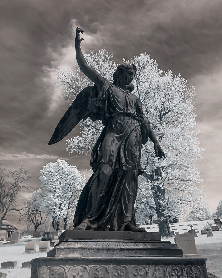
My current D7100 / Kolari Vision 720nm IR filter combination provides great results, but the false colors are rather limited, apart from the blues. The series below is representative of my standard 720nm processing technique.
RAW File With Custom Lightroom Profile:
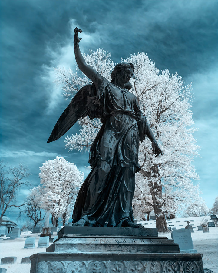
Here is the image after using my False Color Preset in Photoshop:
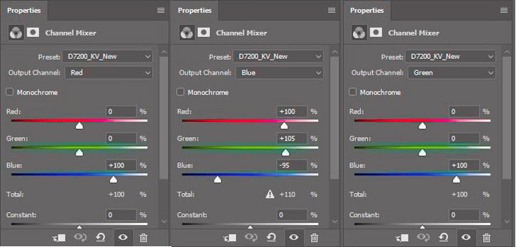
Here are the settings I used to create this image:

As you can see below, pushing the Yellow Slider in the Hue/Saturation Control does very little to the color of the vegetation. Admittedly, I could change the White Balance setting to increase the yellow saturation, but I happen to like this look:
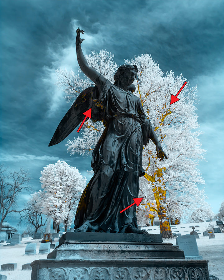
Here is the final image after a layer of SilverEfex using the Luminosity Blend Mode in Photoshop. I find this look quite appealing for most of my IR photography:
2) Infrared Filter Selection
As you can see from Kolari Vision’s filter guide (other conversion companies’ filter examples are similar), fans of brightly colored IR photos will likely opt for the 590nm. There is little to suggest the 720nm might also yield some of the same splashy colors as the 590nm filter. These charts also show the relative ease of getting good whites out of any of the filter choices (e.g. “How To Make Your 590nm Super Color Filter Images Look Like They Were Taken With A 720nm Filter”):

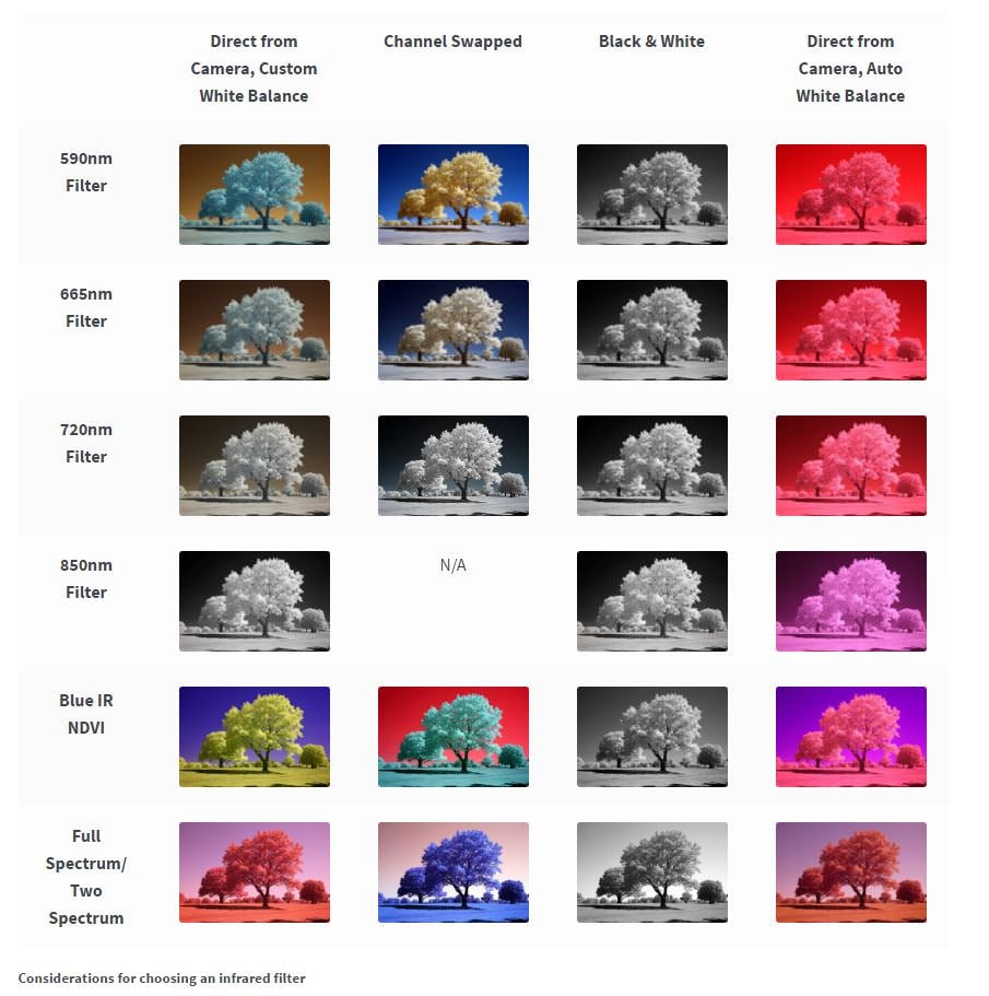
Charts such as the one above should always be considered as general guides. Different vegetation reacts differently to IR light. In some cases, it is nearly impossible to affect the color of some vegetation, even after desaturating and boosting the luminance associated with the yellow slider in Photoshop’s Hue/Saturation Control. If you have taken IR photos of evergreens, you know what I mean.
Of course, the beauty of any IR filter lies in the eyes of the beholder, particularly if he/she is paying for the conversion. Each IR filter represents a trade-off (more false color options / duller whites or brighter whites / less false color options). The trick is finding out how to produce the widest latitude of results for the IR filter of your choice and quickly adjust your IR workflow process as needed.
3) IR Frustrations and Challenges
Since I began writing for Photography Life, I have received a few hundred emails from those experimenting with IR photography (including a few from our founder, who later on ended up converting his Nikon D800E). Many expressed frustrations with white balance settings, post-processing techniques, lack of information about a lens’ IR performance, and achieving consistent results under varying conditions. The post-processing frustrations often arise because of the subtleties of working with IR images. You can make some fairly sizable changes in using the Contrast, Vibrance, Blacks, Whites, and other slider controls in Lightroom and Photoshop, without affecting a photo very much. But even small changes in White Balance or Photoshop’s Channel Mixer settings (the two most critical settings for IR processing) can have huge impacts on the final image.
As a reminder, your specific IR results will vary based on a combination of:
- Individual camera make/model
- Camera sensor
- Infrared filter wavelength
- Infrared filter manufacturer (there may be variations between vendors)
- Whether you shoot RAW or JPEG
- Your camera’s processing engine
- Lens used (different lenses may react differently to IR light)
- Type of vegetation and its ability to reflect IR light
- White balance settings
- Quality, combination, and wavelengths of infrared and visible light
- The steps and sequencing of your IR processing workflow
Because the White Balance and Photoshop’s Channel Mixer settings work with one another and very small changes can have huge impacts, finding a combination of settings (outside the standard Red/Blue Channel Mixer Swap and standard White Balance) that produce desirable results can be challenging and time-consuming. Unfortunately, you cannot judge the results of changing these settings (at least not without some practice) until you have completed your IR processing routine.
Given some people’s frustrations with IR processing, it is not surprising once they have made their filter choice, they develop a set routine for processing IR images within a given range of false color choices (per the “Selecting a Filter” guidelines) and accept the inherent trade-offs depicted by the IR conversion companies’ filter guides. I suspect few but the die-hard IR enthusiasts go back and tinker with a formula once they have found one delivering consistent results.
I use a combination of Lightroom and Photoshop to process IR photos and rely heavily on Presets and Actions because they can significantly speed image processing and make it easier to experiment. I strongly suggest saving Camera Profiles, White Balance, Channel Mixer, Hue/Saturation, and other settings once you find some that work for you. Once you have these various settings stored, you can make minor changes to understand how each affects the overall image quality. And when you find a new variation? Save it as new Preset and incorporate it into another Action.
4) Turning On The 720nm’s Color
Back to the question at hand: Is it possible to consistently and reliably coax more color from my 720nm IR filter?
The short answer is: yes. The slightly longer answer is: yes, but it may take some experimentation on your part to develop a consistent formula yielding the results shown below for your specific camera and IR filter.
4.1) The Starting Point – White Balance
The first step is shooting in RAW and having a Solid White balance setting in your camera. The next step is creating a White Balance setting in Lightroom with enough latitude to mimic the White Balance setting in your RAW file (assuming you are using Lightroom for managing your photos). I covered this in a previous article on post-processing infrared photographs.
4.2) The Base Image
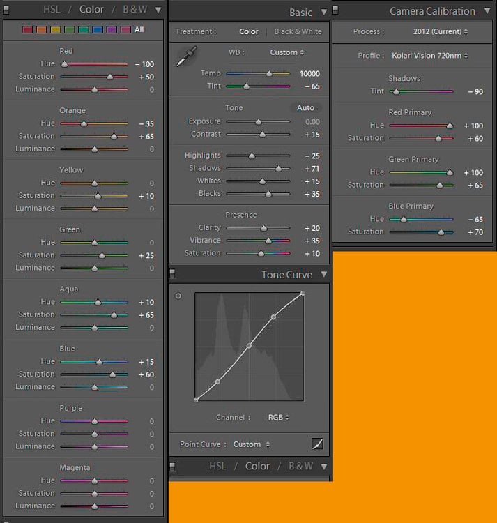
Following are the Lightroom settings used to create what I refer to as my “base” image for maximizing the color capabilities of my 720nm IR filter:

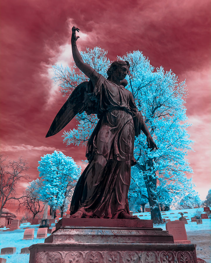
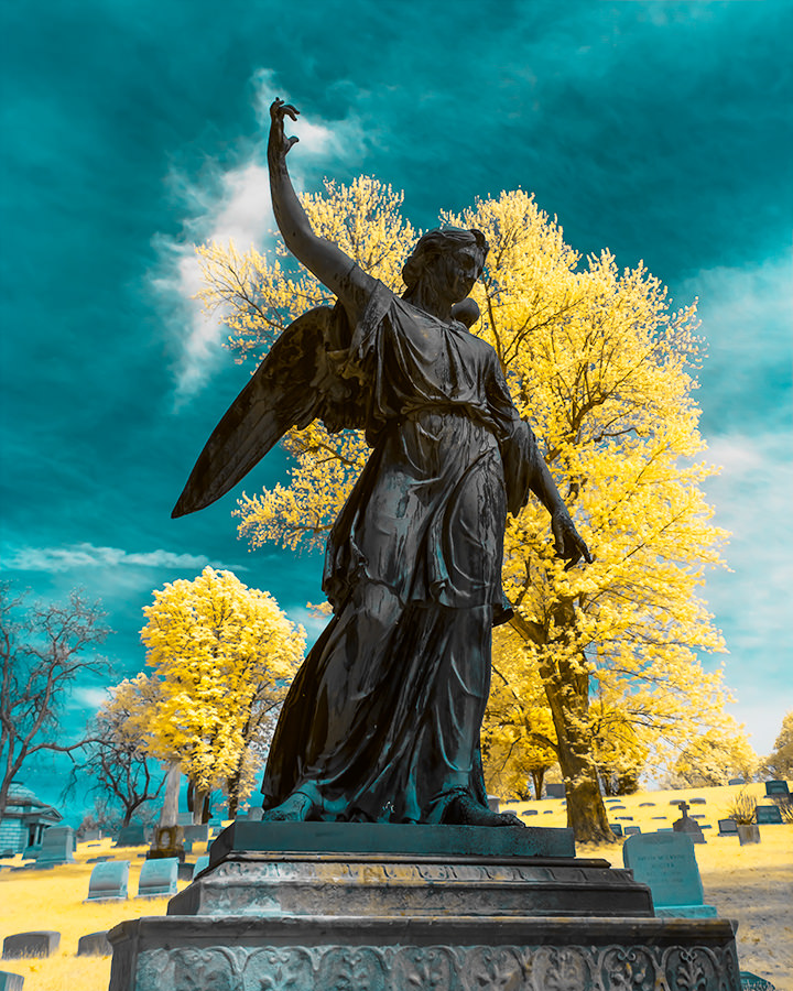
I nicknamed this effect “Southwest”:
I am confident if you can process your RAW file to look similar to this one, you can adjust it to achieve the results in 4.3. I know because one of our readers sent me a JPEG file, which I was able to tweak to look fairly close to my Southwest photo. I simply ran my other Photoshop actions and the resultant images looked quite close to those below.
4.3) Modifying The Base Image
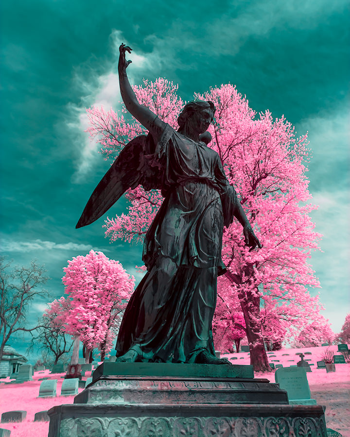
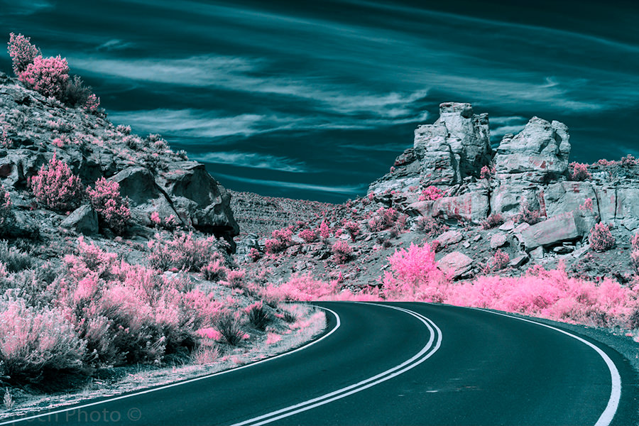
The following image was created by running my Channel Mixer settings (above) with some Hue/Saturation presets in a single action against the Southwest base image. I refer to this one as the “720nm Goldie” because it looks very similar to the results from the 590nm Goldie filter:
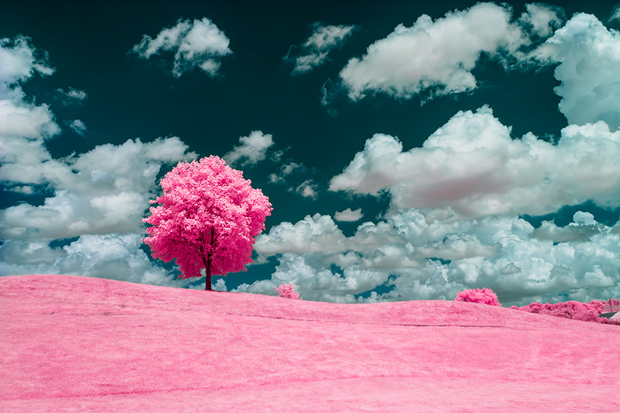
I created this image, “Cotton Candy,” by taking the Southwest image and applying another Hue/Saturation preset. This is another popular look produced by the 590nm filter:
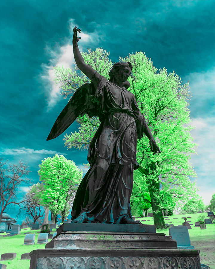
I created the last image, “Sour Apple,” by taking 720 Goldie and applying another Hue/Saturation preset. I don’t see this style quite as often, but some 590nm photos feature some very pleasant green tones:
Thus with a few Presets and clicks, I am able to process the base image in many different ways, limited only by how much time I choose to tinker with each photo.
4.3) Noise
You always need to keep an eye on noise when you start swapping colors and changing hue and saturation. I looked at the histograms and zoomed in quite often to determine if any of the associated changes were negatively impacting photo quality. I was surprised to find this technique did not increase noise levels. Nor did I do any serious damage to the histograms. I clipped some colors, but with infrared processing, I do not typically worry about it. I compared the image quality results with those produced by my standard 720nm processing technique and noticed little if any difference.
5) Summary
Can the 720nm filter mimic the 590nm completely? No. The 590nm filter will produce different results based on it allowing additional visible light to reach the sensor. The 590nm filter will also handle portrait photography much better than the 720nm filter. Can the 720nm filter mimic some of the results you often see with the 590nm filter? In some cases, the 720nm filter will come quite close. Will this technique work for all IR photos? Probably not, but it may work for some.
If you like the traditional false color processing results of the 720nm filter but have an occasional desire to add an extra dose of color to your IR photos, the technique outlined can help, particularly if you are willing to experiment and have some patience.
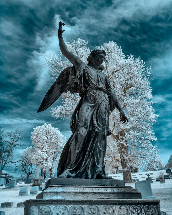
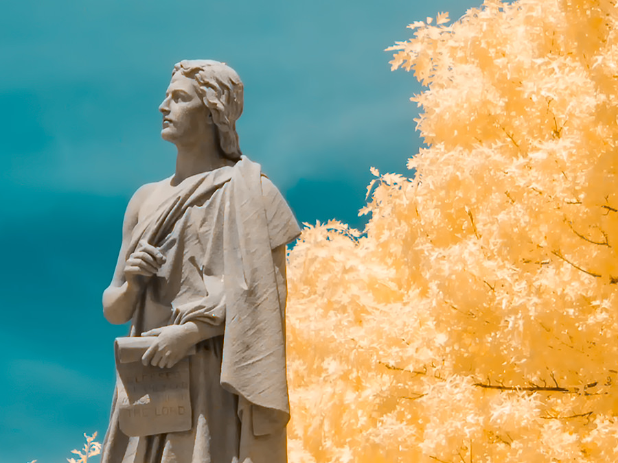
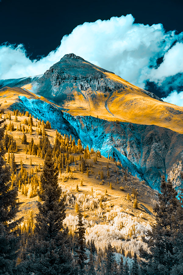
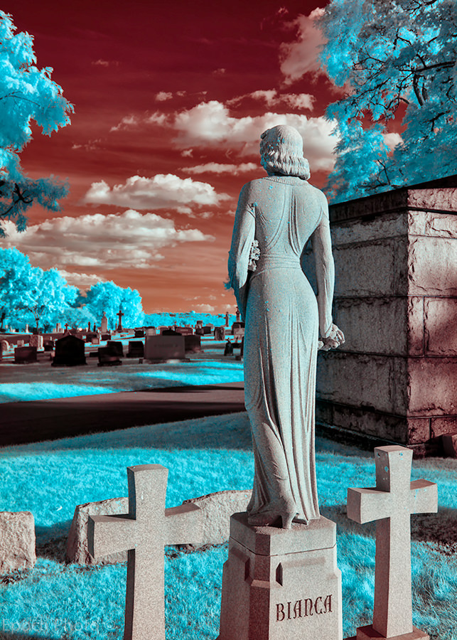
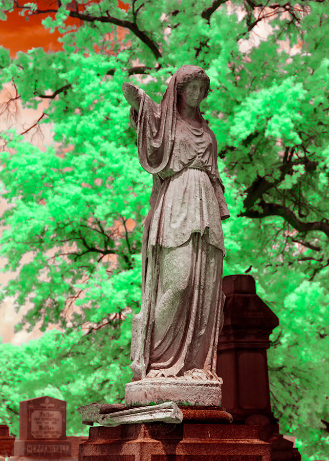
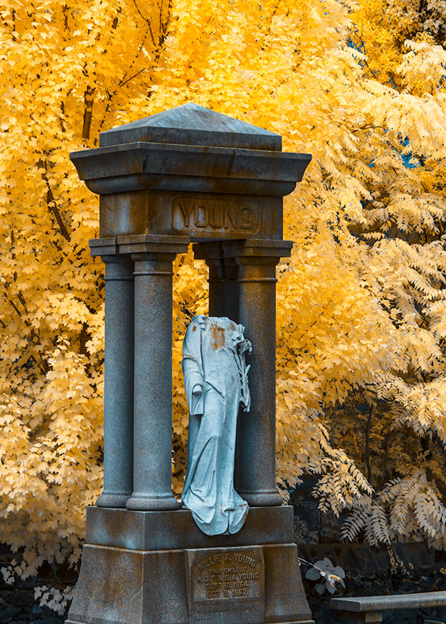
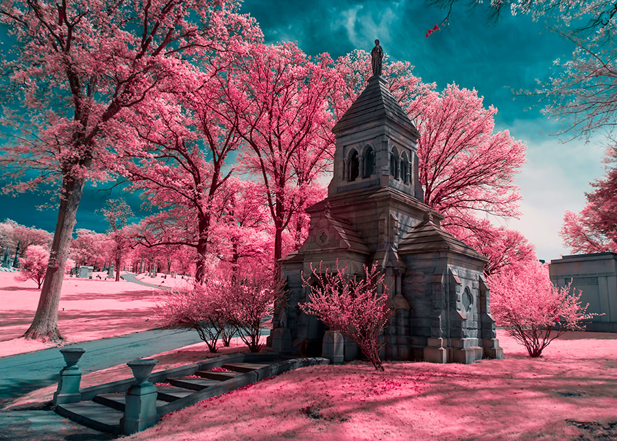
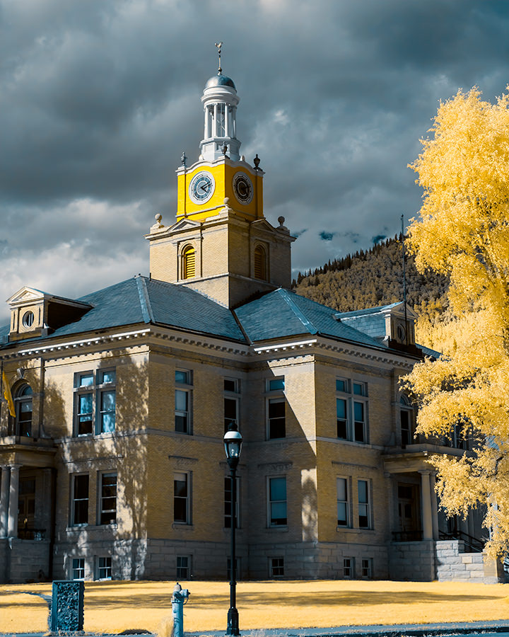
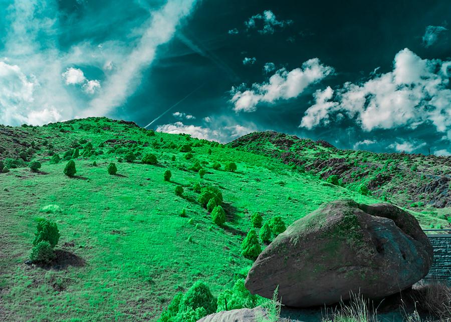
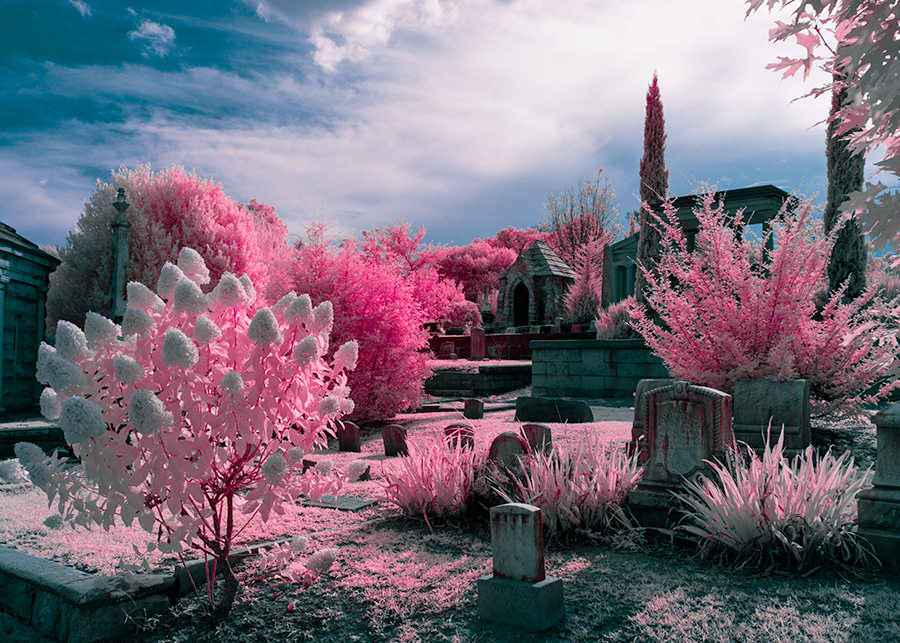
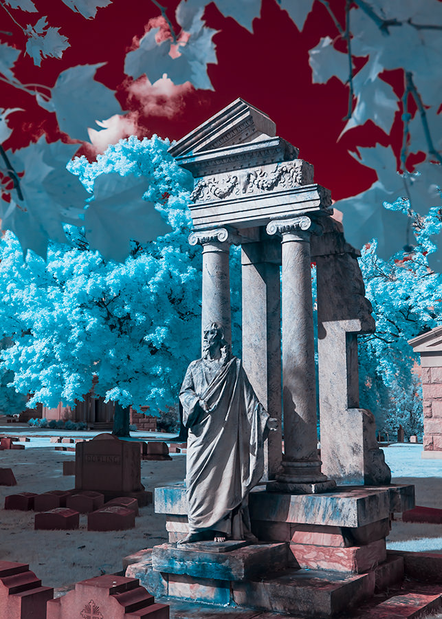
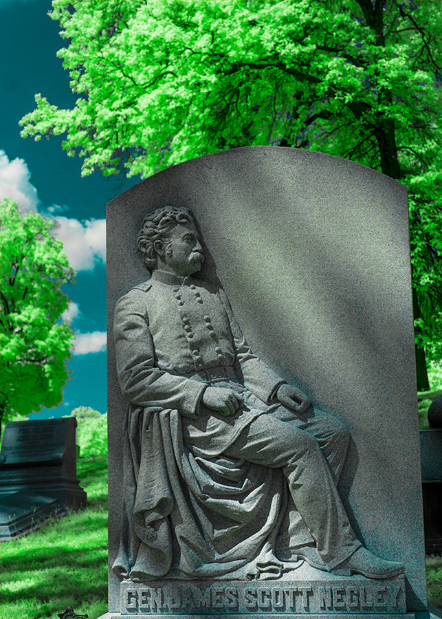
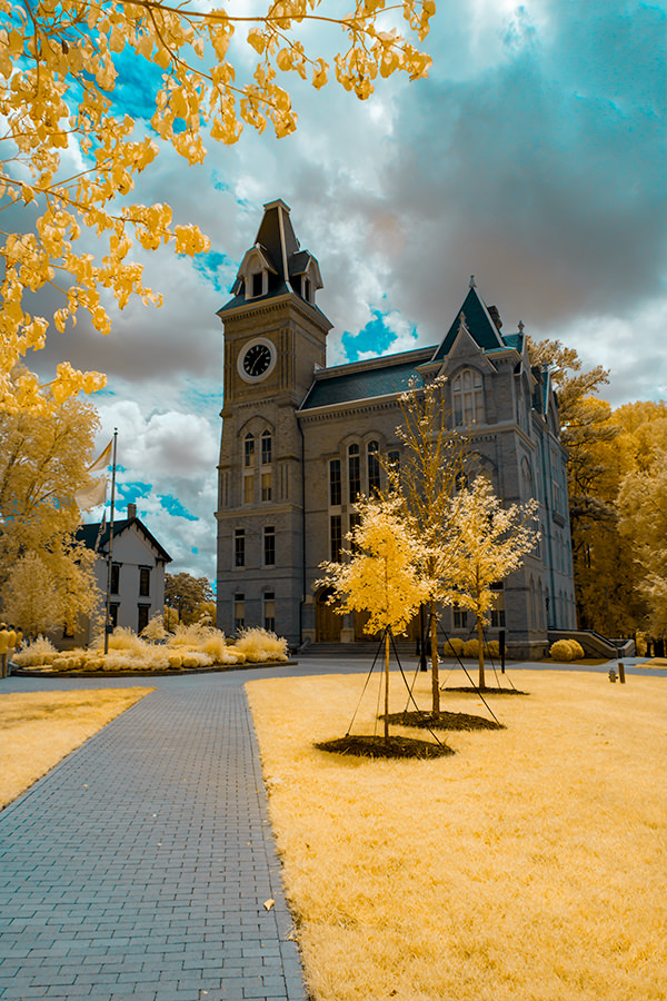
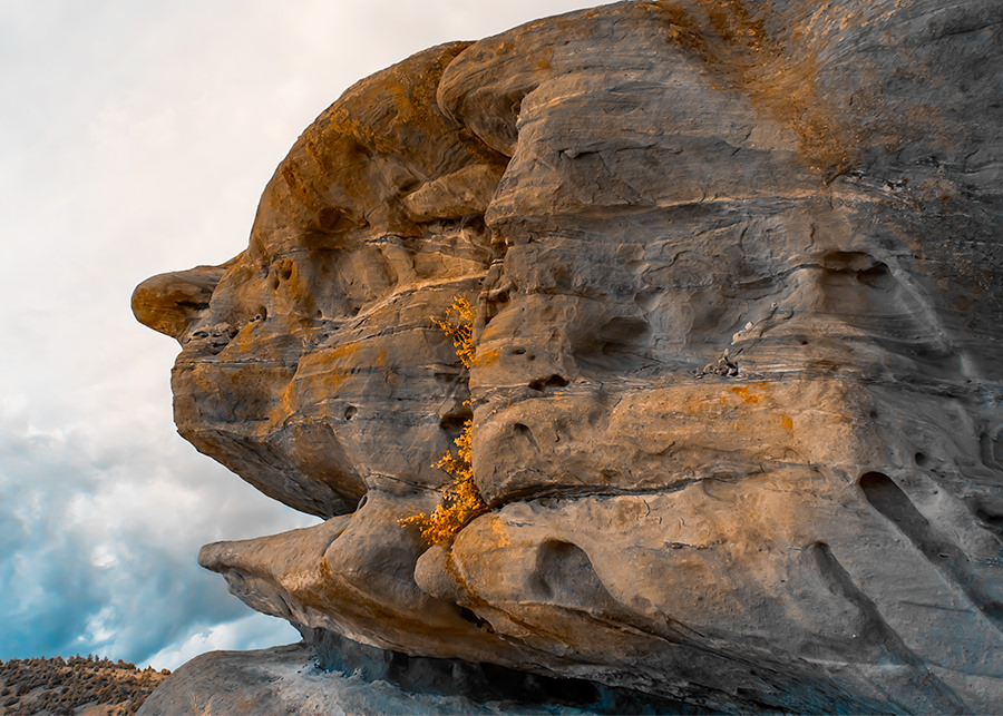
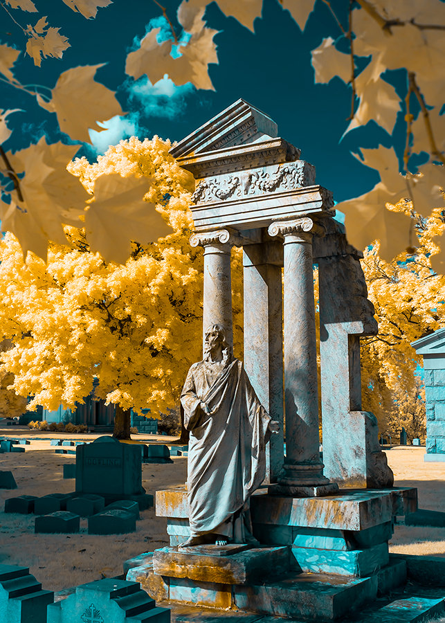
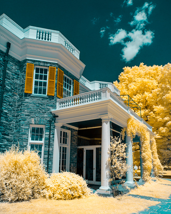
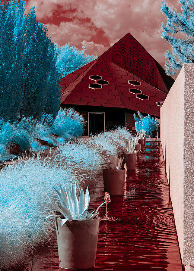
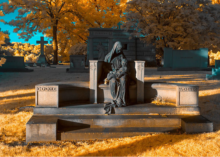
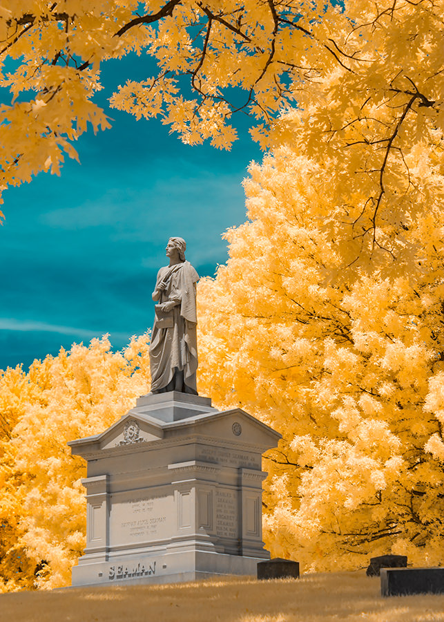
6) Some Other Examples
Following are a variety of photos I processed and modified using the technique above. As you can see, the 720nm is capable of producing significant false colors:
Have you ever experimented with infrared photography? Please share your thoughts and feedback in the comments section below.