Out of all the pursuits I’ve tried, I think wildlife photography has got to be one of the most difficult – and I’m including my doctorate in pure mathematics on that list. That’s why I like to take some time at the end of the year and go through my favorite shots and figure out what I liked and what I didn’t like. It’s also a good time to think of ideas for the future so that I can better express myself in photography next year.
Something I do to keep learning as a photographer is to choose a series of up to twenty images as my favorites for the entire year. It’s a somewhat difficult task. By asking, “Why is this photo more attractive than the other?” I have to really stop and think about visual concepts that I like in a photo – whether I had thought of them at the conscious level before or not. This exercise helps me to understand the sort of image that I consider just very good and one I consider portfolio-level.
To show you what I mean, I’ll include three images that didn’t quite make the cut, and my thought process when deciding to exclude them from my yearly favorites. Then, I’ll show you one image I included in my portfolio-level category. It doesn’t mean it is perfect, but it does mean that I think it is among the highest level I was able to achieve in 2024.
Non-Portfolio Images
Before I show you the images, I need to tell you one key aspect of my thought process. Namely, I still like the images that didn’t make it into the final selection and would be happy showing them to others. They all have some concept that I like. But within the microcosm of each individual image, I felt that I would still like to try again later to better illustrate the same ideas.
So, without further ado, here is the first photo:

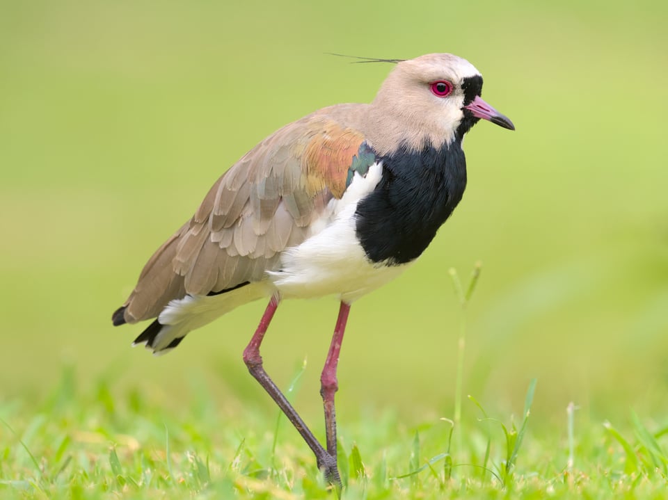
Southern Lapwings favor grassy laws, so I like the idea of showing this habitat. Still, there are some ideas I would like to improve upon. For one, something bothers me about the grass. There is one strand coming up between the legs of the lapwing, along with some brightly-colored grass to the right, including some fairly out-of-focus grass that renders as bluish bokeh. There is also some yellowish grass due to the time of year, and I know it’s possible to get more attractive looking grass.
The bird’s right foot is also raised only a little, and I wonder if it might be possible to get that foot in a more distinct pose? Also, the legs of the lapwing are slightly out of focus. Could I have changed that with slightly different angle? And finally, as lapwings are some of my favorite birds, I have a particular desire to capture it as best as possible and try different approaches. For example, the lighting on this day was pretty flat and cloudy, which gave the scene a “studio-like” appearance. Maybe that’s the right approach, but I think I would like to experiment a bit more before deciding that this sort of light is the best suited for lapwings.
The next shot is of a Striated Heron:

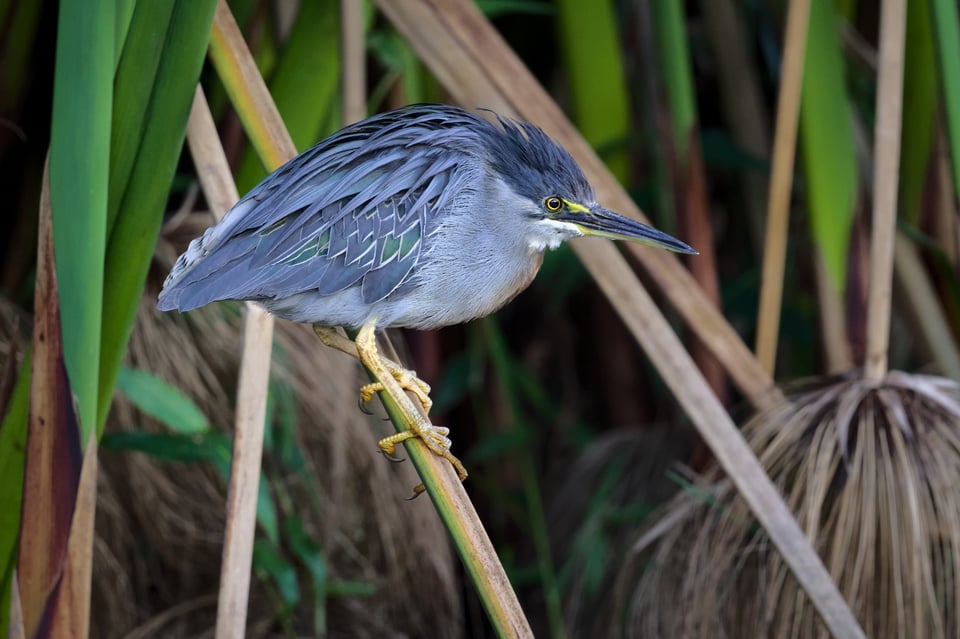
I like the concept of the heron prowling through a reedy, marshy environment. And I like that “broom” end of the plant at the bottom right. But although the heron is still pretty well-defined, there are some elements that I’d really like to change. For example, if I were drawing this image, I’d omit the fine strands of plant underneath the heron. Also, perhaps most importantly, I’m not really a fan of the solid thick branches going through the head of the heron. I already darkened them a bit in post, but this is not something you can really fix in post, only ameliorate.
I guess the branches might contribute to the idea of a heron emerging through the brush, but even if one were going for this idea, there’s still a prominent space between the branches going through the head of the heron that I find distracting. Perhaps a lower camera position would have accomplished that better.
Overall, this strikes me as a prototype shot. It’s a good blueprint and has the start of a clear concept, but I would like to improve on its execution. That would likely involve going back to a similar location, finding the best background, and waiting for a heron to step into it.
Finally, let’s understand this Eared Dove:

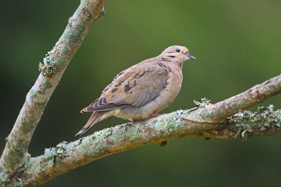
The Eared Dove is a common dove in South America, so I’ve had plenty of opportunities to try and get a good shot of it. And I really liked some of the concepts here – the idea of photographing in the rain, with a triangular branch, and gentle light. That being said, I don’t think I’d include this in my final selection of portfolio shots.
First, I think the rain concept is not so clear – not enough a few of the raindrops are distinct, and that makes them look more like distractions than part of the environment. As for the composition, I like the pose of the dove looking up, but I think it might be too exaggerated. Perhaps if I had been standing a bit higher, the effect wouldn’t be so prominent.
Also, while I like the general idea of getting rich, dark green backgrounds, I think that the color scheme overwhelms the dove a bit, especially since the plumage has hints of pale blue. Finally, I wonder about some of the potential distractions on the branch. I like most of the lichens, but there are so many that I think the detail overpowers the soft patterns in the dove. There are also some weird things on the lower curve of the branch that strike me as indistinct.
A Portfolio Shot
One of the shots I decided to include in my portfolio is of a Limpkin:

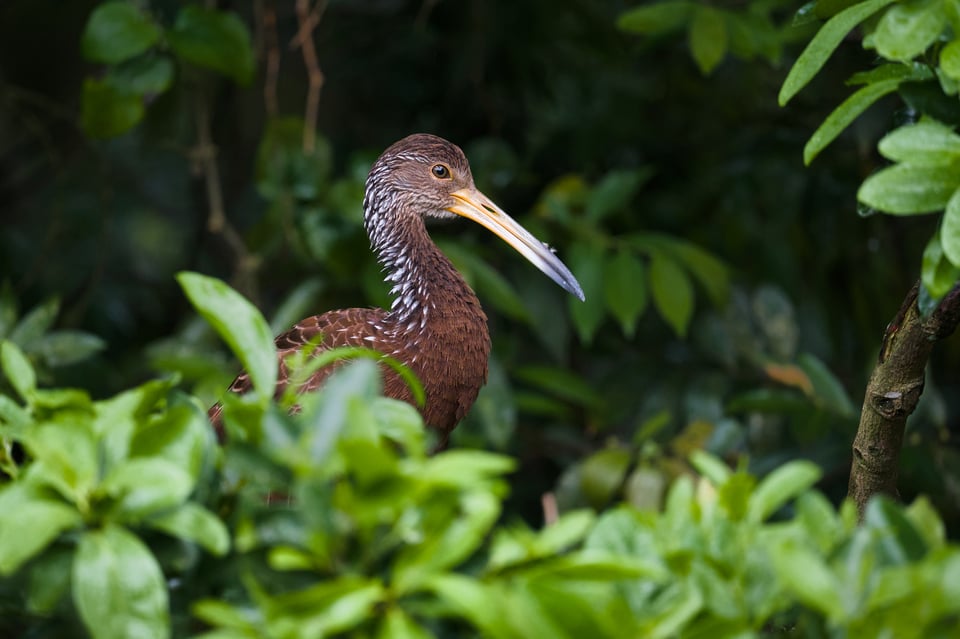
Not only is the Limpkin in its natural environment here, the leaves seem decently well-arranged and not disruptive of the Limpkin’s form. I also like the in-focus tree trunk on the right and how it provides some environmental context, and a bit of a natural frame to the image.
Although there may be one or two things that could still be improved, I think I came pretty close to getting what I wanted when it comes to “Limpkin resting in a tree.” This was an example of where I walked around the tree and tried many different positions, which gave me a chance to refine my composition. The result is that I captured my theme, or idea here with the Limpkin about as well as I could hope. Unlike the three prior images, I don’t feel compelled to re-capture this one at the soonest opportunity.
Thoughts and Conclusion
I feel like I still have a lot to learn in wildlife photography. Going back over 2024, I think if I had to give myself a progress report, I think I’m about 30% of the way toward recognizing in real-time the patterns I like best, and being able to include them in compositions before the animal flies or runs away. In 2023, it was more like 20%. And in terms of post-processing, I feel that I’ve improved quite a bit, but there are still mysteries I’ve yet to solve. I’d say now I’m about 40% through solving those mysteries, whereas in 2023 it was closer to 30%.
I’m still in the process of going through my images from this year, but I believe taking the time to sit down and really thinking about the strengths and weaknesses of each image really helps this improvement process. Thus, I encourage everyone to repeat this exercise. Go through your photos, think about what separates the good shots from the portfolio shots, and really take time to figure out how you can improve.
Another way to review photos is about personal memories.
Some photos I take may not be my technically best, but I will remember the moment
I took the photo for the rest of my life because of the effort involved
and because it was a magical moment!
This is why I love wildlife photography.
Other photos I take may be fantastic from a technical perspective, great in a portfolio,
but were easy from a fieldcraft perspective and may soon be forgotten.
Don’t forget to review those “magical moments” of 2024!
Excellent! I am looking ahead to 2025 by looking back at 2024. I shoot wildlife almost everyday (retired and in Montana) and by looking at my 2024 calendar I can plan for when to expect certain key events…when did the ice go out at the dam creating a small pool of open water that was loaded with Goldeneyes? When did the pintails, redheads, canvasvbacks, etc. arrive? When did the mountain bluebirds arrive? When was the arnica in peak bloom in bighorn country? When did the short-eared owls fledge and stat flying around? When did the black bears first appear in the riparian berry patches? When did the elk start bugling? and so on. I then write tentative target dates in my 2025 calendar: January-February river otters and goldeneyes, March – April early spring waterfowl, May–waterfowl and songbirds, whitetail fawns, June waterfowl, bison calfs, bighorn sheep, July-August,owls, bighorn sheep, Sept—bugling elk, Oct-Dec rutting sheep and deer.
I also have specific goals within each month. For example a quality shot of a Lazuli Bunting and I know exactly where and when to go and wait for that shot. Looking forward to 2025!
As a bird photographer i like a lot your Lapwing photo more than other three photos. Portfolio is something tha is Dynamic and get improoved and expand by time.
I appreciate simplicity in Wildlife Photography.
Photography is art and everyone has different percective.
Congratulation for your work
Thank you for the feedback. It is indeed figuring out your portfolio and which shots are best for it is a continuous and very enjoyable process. Yes, the simplicity of the lapwing has something going for it, and I am continually trying to produce the best Lapwing. (Some people accuse me for spending too much time on Lapwings.)
Amazing article! Looking back at your past works is very important for your progress. As your skills become better, you notice mistakes you were inclined to make earlier and it also helps you avoide new ones. I like making smartshow 3d slideshows with my photos to look through my works and maybe stop at the ones I’d like to examine closer.
Thank you for the reply, Lilly. Making a slideshow is another very nice idea.
Thank you for this article!
In the interest of full disclosure, I AM NOT a wildlife photographer. (In fact, every time I try to grab my camera – even smart phone – to capture a hummingbird outside my kitchen window at the feeder, they’re gone! It’s not my strength…)
What appealed to me was the discipline you advised on scrupulously reviewing our work at the end of the year. (“…taking the time to sit down and really thinking about the strengths and weaknesses of each image really helps this improvement process.”) This was very encouraging.
I even took up Spencer’s advise in his article “35 of the Best Photo Gifts” and ordered myself some Itoyo Art Portfolio’s to start doing just that. (As landscapes are my passion, I ordered the 13×19 books and will scale my prints down, as needed…)
It’s simply a wonderful teaching method to hear a similar voice coming from the lot of you on PhotoLife: Same message told differently.
Thanks again! (And somehow I can hear you advising “patience” on the hummingbird shot. Yup – that’s what I need!)
Nice idea. Printing is another awesome thing to do because you really have to focus and select the shots that are worthy of the cost. Also it can aid in your postprocessing too!
First let me say that I think all your photos were lovely. You really have a way with capturing birds. As a lifelong birdlover, I really appreciate your ability to do that. I fully understand why you chose to negative the first two photos, and for the same reasons. I couldn’t agree on the dove photo. I really responded to that picture, and could not find a single flaw in it. Of all of them, it was my favorite. If I had to choose something to critique, I’d say that maybe the bird and branch needed a bit more contrast added in post. As for the photo you did choose, for me there was not enough bird and too much out of focus foliage. I would really have liked to see more of that beautiful bird and less greenery. I know, ha ha, this is a wildlife photo we’re talking about here. In my own work, I tend to cull pictures with out of focus front foliage. I find it way too distracting and annoying, and also a bit too amateurish. My solution is that if the foliage has to be there, I try to get it in focus along with my subject so that it won’t be a distraction, then I’d do a bit of cropping it out in post to minimize it.
Definitely a fair assessment, Elaine. And I appreciate the feedback immensely. I hope I didn’t come across as too negative, though. I like the other photos a lot. Perhaps it’s better to say that I’m still trying to figure out what I am trying to do with those concepts than to say that there’s something objectively amiss with it.
That is an interesting point about the branch in that photo. I was slightly at an angle so most of the branch is slightly out of focus, which might also lend it a lower-contrast look. Also a very interesting perspective on the Limpkin. Out of focus foliage is a tricky thing, isn’t it? Sometimes it can be distracting indeed. I think a little more bird would have been cool, too! So maybe another thing to think about…haha.
Most of us at PL have a bit of a thing about sharpness. Sharpness doesn’t always make things better, in my opinion. I aim for it too, but don’t get bothered if some aspect of an otherwise very good photo is a bit unsharp. I didn’t even notice that the branch was a little out of focus until you pointed it out. HA! I guess what I loved about it was the greenery and the green algae framed the bird and made it seem a friendly place for the bird to land on and stay for a while.
I agree with that. I do think sharpness is good, but only on parts of the photo that are in focus of course, and it’s okay to have some out of focus branches, especially if it indicates depth.
I first mis-read your title as “… by analysing your gear.” I think it is time for some serious introspection. :D
I enjoyed the article and really like the light in all of those shots, including the first. I can see why the grass would bother you, but then, you cannot go mow all the lawns on which you are intending to take photographs of birds. ;) One thing I was wondering about is whether you are, or are not, bothered by the feet of the lapwing being so close to the edge of the frame.
Haha. By analyzing your gear! That’s funny.
I didn’t mention it in the article but you are right, the legs are a bit too close for me too. It was kind of a compromise between having a larger out of focus area at the bottom and just the grass starting from the bottom. There is a “V” shape that touches the edge of the frame. It doesn’t catch my eye like some edge distractions but it is something to think about. Both can be avoided if the grass is a little longer and the camera is really touching the ground so that some grass blocks the bottom of the lens and the front-focused grass to in-focus ground is mostly eliminated, but didn’t work here because there was no grass there and it was too short, too……
I actually photographed a few lapwings yesterday and the grass was more well-behaved because it rained more and it was longer. Grass is so weird…I distinctly remember some very light neon-green grass in parks in Australia and here the grass is different. I felt like Canadian grass was different too. The ground here is made of clay and I think the grass dries out more easily.
very nice pictures Jason! I can understand that as a professional you are very critical of your shots (I would be very happy with that as an amateur), but the blades of grass in the first picture and the stems in the 2nd picture are now completely in nature. You do not always have the time and opportunity to avoid this. In the first picture I personally think that the legs of the Lapwing are a bit too tight at the bottom. Good luck with making perfect images in 2025!
Thank you, Danny. I agree with what you said. I think the grass isn’t so bad. I think it’s more of a matter that I had a bit of a different idea when taking the shot and I’m trying to figure out how to do it! I keep thinking about grass and different styles and how to make all of them work. Grass is a complex thing I guess!
I really like this idea, Jason. And I agree with you about the photos, although I think I like the first one more than you do, because I like how the Y-shaped blade of grass sort of mimics the Y-shaped legs of the bird.
I was doing something similar recently (deciding on my top ten of the year), and I found it easy to pick the first 3-4 photos because I already knew they were my favorites. It became extremely tough after that point. There were maybe 20 contenders and not a lot of differences in how I felt about them. My selections changed every time I looked at them until I finally settled on my picks. It’s a great exercise that leads us to develop our visions and parse what really makes a photo more effective than another.
Maybe one way to go about this would be to keep ranking/picking as long as your choice is clear but stop once the differences “flatten out”, indicating that these shots are no longer stand-outs among your body of work but more “routine” results?
Thank you for the input, Spencer. Yeah it’s true, picking the first few is easy and then it gets quite difficult indeed. Would love to see your top 10!