Back in the day when I was working in corporate life, I gained quite a bit of experience creating and managing advertising, usually print based. When we designed ads, it became second nature for us to constantly think about fundamental concepts like visual depth, dominating elements, and ad balance. The goal was to achieve good eye flow in our ads. Since leaving corporate life I’ve tried to apply what I learned about advertising design to my photography. This article deals with something seldom discussed on photography sites: creating corner exits in our images to improve image eye flow.
In Western culture we read from top to bottom, left to right. So, early on we were taught that good advertising should have a logical and pleasing exit point, which in Western culture is the lower right corner. That’s why you’ll often find corporate logos situated in that portion of a print ad.

NIKON D600 + 16.0-35.0 mm f/4.0 @ ISO 800, 1/250, f/13.0[/caption]
Obviously, I wouldn’t force fit a subject to comply with a lower right hand corner “rule”. But, when I have a choice of framing, I will usually choose a left to right image flow as illustrated in the image above.
This may seem strange, but for many images the one thing I am most focused on just before I press the shutter is getting the composition of the bottom right corner just the way I want it. I find this is often the case when I’m doing street photography. Here are two recent images that illustrate this point.
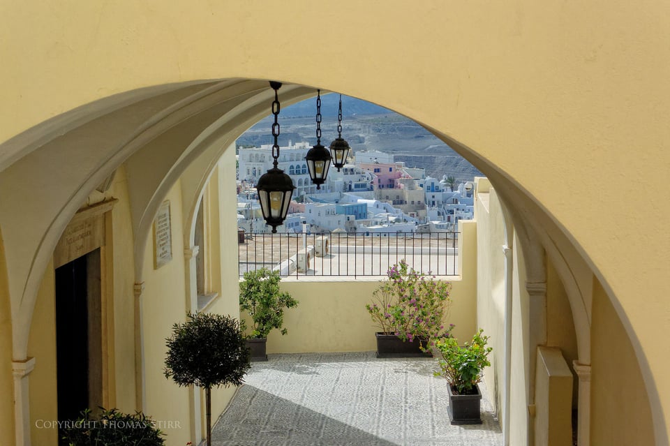
NIKON 1 V2 + 1 NIKKOR VR 10-30mm f/3.5-5.6 @ ISO 160, 1/500, f/5.6[/caption]
In the image above I wanted the flow of the arch to exit very smoothly and precisely out of the bottom, right hand corner. To my eye this gave the entire image a sense of order, balance and calm. The exit point “finishes” the image.
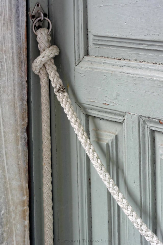
NIKON 1 V2 + 1 NIKKOR VR 30-110mm f/3.8-5.6 @ ISO 160, 1/60, f/5.6[/caption]
The same thing holds true for the rope in this street photography image. From my perspective, not getting the correct corner exit would have damaged the overall impact of the image. If possible, I like to capture images so I don’t need to crop in post at all. This is my preferred method of shooting, and also why I prefer shooting with zoom lenses. Sometimes I simply can’t capture an image exactly as I want and some cropping and other adjustments are needed. Let’s have a look at a couple of images.
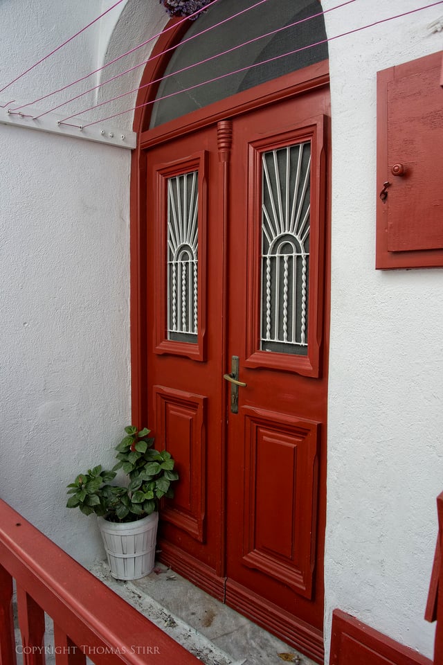
NIKON 1 V2 + 10.0-30.0 mm f/3.5-5.6 @ ISO 160, 1/60, f/6.3[/caption]
As you have noticed, the image above has corner exit points on both the upper and lower right hand corners. I wasn’t able to get these precisely aligned with the original image capture, so I had to slightly crop the image on the top, right hand side and on the bottom to achieve the desired framing. Having these two exit points removes visual dissonance from the image, especially given the number of parallel lines.
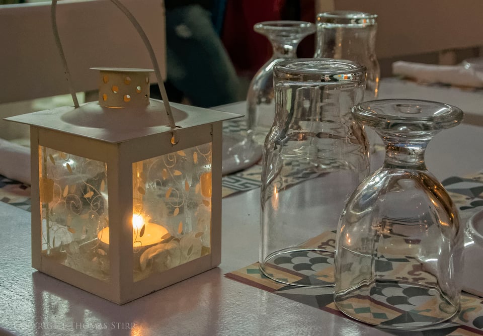
NIKON 1 V2 + 10.0-30.0 mm f/3.5-5.6 @ ISO 3200, 1/30, f/5.0[/caption]
I spent some time trying to get the right shooting angle for this image so that the glasses would form a semi-circle type of shape and be ‘flowing’ towards the bottom right corner of the image. Unfortunately, the candle holder had distracting back-pointing angles caused by the wide angle with which I was shooting. As a result I had to use a perspective adjustment to shift it to the right in post, which then necessitated some image cropping. With my final crops, I aligned the dark burgundy stripe in the placemat so it could exit out of the bottom right hand corner of the image.
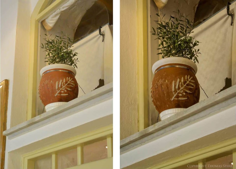
Sometimes even a simple looking image takes a bit of work in post as the ‘before and after’ comparison above shows. This pot was up on a second floor window sill and I could not get any closer, or change my shooting angle.
You can see I made a number of adjustments with the image. First, I made some perspective control adjustments to make it square and reduce the visual distraction caused by all of the competing angles. Then I cropped in on the left side to remove the distracting light and dark colours, leaving a plain, single colour framing on that side. Since the image naturally flows right to left I cropped the bottom in order to create an exit point on the lower left corner. In the bottom right hand quadrant of the original image you’ll notice a small, distracting shadow on the right hand edge of a window inset. This needed to be cropped out. Then the final crop at the top of the image was done to create a corner exit point for the curtain. The final result is a more balanced and pleasing image.
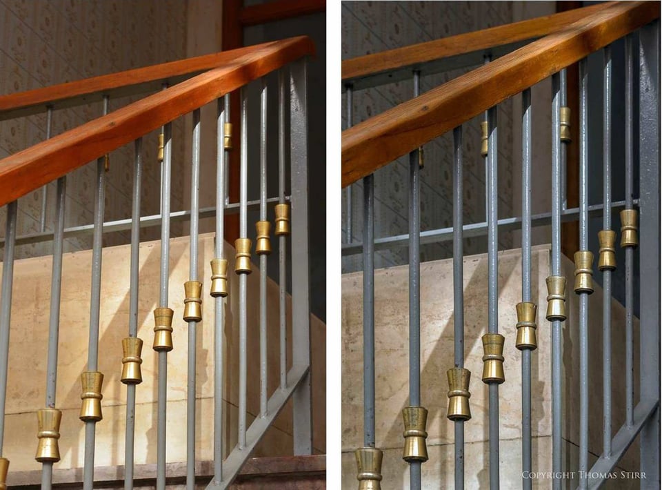
The image above really intrigued me when I shot the original frame. I loved the repetition of the brass details on the spindles and the strong angles created by the handrails. As the ‘before and after’ illustrates, a reasonable degree of work was needed to transform the original image into the vision in my mind. First, I adjusted the highlights and overall colour and tone to get a smoother, more monotone look to help accentuate the repetition of the brass details. Then I did a number of perspective adjustments to correct all of the distracting angles. Next, I cropped in tight to right side of the vertical post so it could frame that side of the image. Then I cropped out the distracting horizontal lines at the bottom of the image. The final crop at the top created a corner exit point.
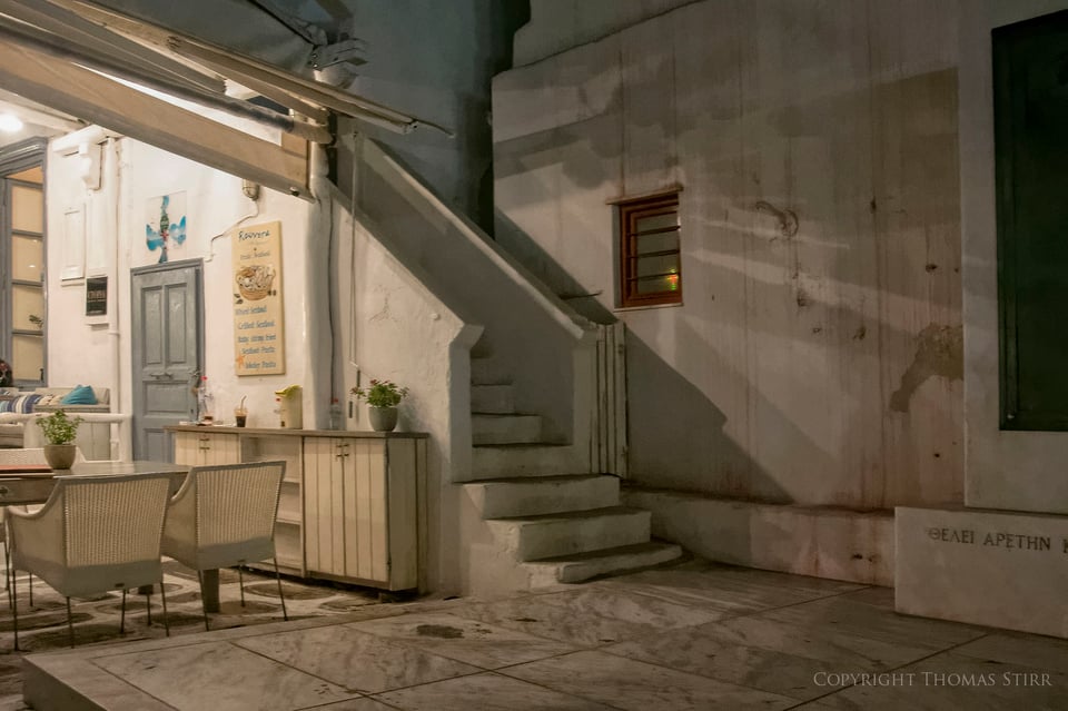
NIKON 1 V2 + 10.0-30.0 mm f/3.5-5.6 @ ISO 3200, 1/4, f/5.0[/caption]
The lighting in some images can create a natural exit point if we look for it. In the image above we can see that that left hand portion of the image is the brightest and has a good amount of contrast. This would likely draw our initial attention, quickly followed by the stairs, and then the shadows on the wall. After initially looking at the kitchen area, the angle of the stairs and the wall shadows would then push our gaze away to the right and off the image. I loved the natural flow of the lighting in this image and took it at a very slow shutter speed (1/4 second hand-held) against my better judgement. Even though the image has a slight blur I still love the lighting in it and how it directs image eye flow.
Final Words
Creating corner exits to improve eye flow may not be a technique that will apply to a high percentage of your images. You may have a few photos that, for whatever reason, just don’t seem right, but you feel they still have some potential. Give them another look. If you can rework them to create some corner exits, that may be the solution you’ve been seeking.
Article and all images Copyright 2014, Thomas Stirr. All rights reserved. No use, reproduction or duplication including electronic is allowed without written consent.
Wonderful article. Thanks so much for sharing!
Hi Sarah,
Thanks for the positive comment….very glad you enjoyed the article!
Tom
What a gem of an article … Superbly illustrated & articulated … while sufficiently backed up with the visuals.
Thank you for sharing your insights. I’ll be looking at frames a little differently now (hopefully) :)
Hi Prakash,
Thank you for your very kind words! Glad you got some value from the article.
Tom
A timely and nicely done treatment of a tricky but important topic. Distractions can lurk in the corners, and I have often found it difficult to get them as I wish. There are many online discussions of composition and framing, but many tend to overlook this aspect.
Thank you.
Hi Alex,
Thanks very much for the positive comment…glad you enjoyed the article!
Tom
Good article. The constant pop-up advertisements were really annoying and made me want to leave the site.
Hi Mark,
Glad you liked the article!
I never see any pop-ups on articles when I’m on the site…?
Tom
Hi Thomas,
Really enjoyed this post as it pointed out a new “tool’ (at least for me) for improving composition. Your examples and clear description make a great case for incorporating corner exists. This is one of the more immediately useful posts I have seen in quite a while. Thanks much for taking time to share this technique.
Hi Jim,
Thanks a lot for the positive feedback…always appreciated! I’m glad you found the article practical and useable.
Tom
Thanks very much.
Hi Keith,
You’re most welcome!
Tom
Interesting piece. I have been instinctively using corner exits in my compositions for years. I was only sub consciously aware of the enhanced eye movement it caused. I just did it because it seemed ‘tidier’. ow I know why. Thank you for this.
Hi Don,
‘Tidier’ always leads to great compositions! Glad you found the article of interest.
Tom
Thomas,
Busy day here in the studio so not much time to play with the posting. Another great article and very informative. Now back to photographing body parts. But then we all have to earn a living.
Sharif, read your post and really liked it. Just didn’t have time to mention at your article.
Hi Mike,
Thanks for the positive feedback! I hope you’re planning on photographing body parts tomorrow…after all it would be appropriate given the day! :-)
Tom
Thomas,
It’s 11:15AM here in Richmond and I just got back from the morgue. First autopsy. Now I’m having lunch and then back to the morgue for the second shift and another autopsy. Maybe I should take some body parts home with me for the kids trick or treat. Naw! maybe not.
Unless the kids are zombies….likely a good decision to leave the parts at the morgue.
Tom
Tom,
Yeah! you’re right. Guess we’ll just pass out candy.
Thank you for writing this article. I loved it and learned a thing or two.
Hi John,
Thanks very much for the feedback…I always view an article as a ‘success’ when I it has helped a reader pick up a nugget or two!
Tom
Nice post!
I like that you introduced the topic with simple examples and worked towards more complex ones, although I missed a couple of pictures that represent the not so trivial cases.
All in all, very important article for educational purposes.
Hi David,
Thanks very much for your positive comment…much appreciated!
Tom