Lines are some of the most fundamental elements of photography, and some of the simplest, too. But don’t let that fool you. Lines come in many varieties – sometimes leading lines that guide the composition, other times barriers segmenting a photo. They also impact an image’s sense of emotion and structure. In this article, I will cover the best ways to use leading lines and other lines in photography, including how to put them into practice in your own compositions.
Table of Contents
How to Use Leading Lines in Your Composition
The most obvious effect of lines is that they guide a viewer’s eye. They point from one area of the photo to another, often from the foreground to the background. This is why you’ve probably heard of “leading lines” before – lines that sweep through the photo and make it more interconnected.
Some of the most common leading lines are roads, fences, rivers, canyons, and so on. They physically stretch through space, not just providing a compositional link from foreground to background, but also creating the actual route you’d follow to get there in the real world. This is why they’re so powerful in composition. They give the viewer a very literal trail to follow through an image.

There are a few ways to use leading lines when you are composing a photo. First, you can make them the primary subject of your photo, taking up a lot of space and attracting high levels of attention. The image above is one example. To do this, you generally need to get very close to the leading line in the real world. It often helps to use a wide angle lens to exaggerate its size compared to the background.
However, leading lines can be more subtle elements of composition, too. Take a look at the photo below, which clearly has a leading line – the footpath at the bottom – yet isn’t dominated by it. This still counts as a leading line because it provides a path for viewers to follow from one part of the image to another. But it also demonstrates that even small elements in the composition can fill a similar role:
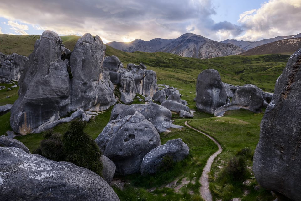
Leading lines don’t always need to be paths that you could actually follow, manmade or otherwise. Sometimes, they’re just patterns on the ground, or shapes in the sky, that guide a viewer’s eye nonetheless. It can be tricky to differentiate between leading lines and, simply, lines. A tree branch spanning from left to right can guide your composition, and so can two people’s arms when they hold hands.
So, the next section dives other important uses of lines in photography, whether they count as “leading” or not.
Lines Provide Structure to a Photo
Composition is all about structure. You’re organizing elements of an image to convey your message as effectively as possible. Lines are among the best tools in your kit to make that happen.
If a road links the foreground and background of a photo, you just created a compositional structure. If a cloud encircles your subject and keeps the viewer’s eye trained to the center of an image, it’s the same result – a structure to your composition.
Because lines have the power to link two different parts of a photo (or more), they’re one of the most natural ways to organize your composition. Although this sometimes comes in the classic form of a leading line from foreground to background, it doesn’t always. In the photo below, the canyon lines form a heart shape that gives this composition a reason to exist:

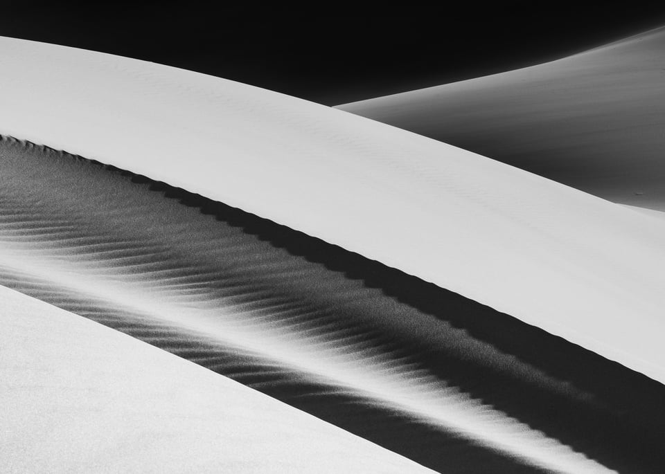
In other cases, the line itself is your subject. Sure, lines are simple elements of composition, but they still have a lot of interest and emotion. A gentle, curved line tells a very different story from a sharp, jagged line. So, even the simple image of an angular mountain silhouetted against the sky can convey strong emotions. The same is true of the pleasant shape of a winding line in the sand.

Great Sand Dunes National Park, Colorado.
Also keep in mind that lines don’t only set paths in a photo; they also set boundaries, as you’ll see in the next section.
How to Use Lines as Barriers
The eye has an easy time flowing along lines. It has a much harder time flowing across them.
Horizons, if not dealt with properly, can divide the top and bottom of a photo in an unpleasant way. It’s why I often look for soft horizons, or cases where a different element crosses between the sky and the land to make them feel more connected (say, a lightning bolt, rainbow, or cloud – and note that all of these, themselves, could be considered leading lines).

So, if you want your entire image to feel interconnected, “barrier lines” are worth paying attention to. A line going the wrong way can divide an image rather than connect it.
Then again, used properly, the barrier property of lines can be an effective way to make your photo feel self-contained and deliberate. For example, look for natural frames around your scene – elements such as trees or clouds that create barriers near the edge of a photo. Because photographers often don’t want to lead the viewer’s eye out of the frame, putting a barrier can be a powerful way to contain or close your composition.
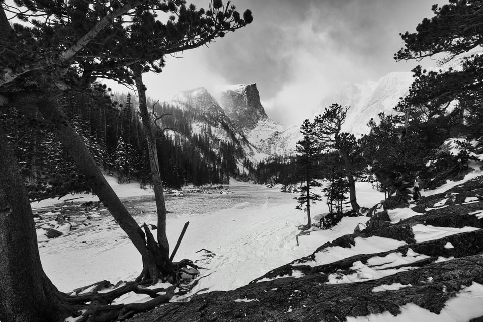
Case Studies
Here are some examples of lines used in photos – from traditional leading lines to broader compositional structures. Examine the compositions below and pay attention to how the lines guide or block a viewer’s eye:


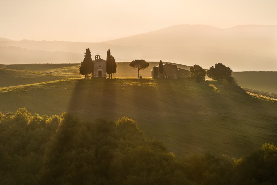


As you can see, almost anything can create a line in your photos. If you’re after a classic foreground-to-background leading line, here are some of the most common subjects to look for:
- Manmade roads and paths
- Rivers and ocean waves
- Sand dunes
- Rock formations and lines on the ground
- Shadows from backlit subjects
- Footprints going into the distance
- Fallen trees
- Patterns in ice
- Canyons
And lines, more generally, can be formed in countless other ways, including:
- Rainbows
- Tree trunks
- The Milky Way at night
- Waterfalls
- The shape of people
- Columns and edges in architecture
- Horizon lines
- Clouds
- Implied lines (like someone looking at an object)
- Exaggerated lines from wide-angle lenses
- Lightning
- Hard-edged shadows
If you want to use lines as an element of composition, keep an eye out whenever you see these subjects.
How to Compose Lines Effectively
After you’ve found some interesting lines to photograph, or a nice leading line from front to back, how do you make it look as good as possible in your composition?
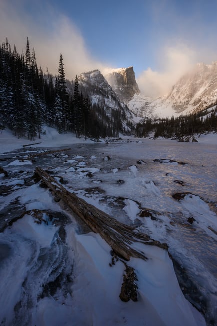
The first step is to ask yourself if it actually helps the image. Although it’s nice to connect the foreground and background of a composition, don’t force it. Not every photo needs a fallen tree or a set of footprints wandering to the horizon. Sometimes, lines are more subtle (such as the natural stretching of a wide-angle lens), or even not important at all in a given photo.
Nasim has shared the following two images before on Photography Life, and they illustrate this perfectly. The first photo, with the log in the foreground as a leading line, is actually quite distracting. The second image simplifies the composition and is much stronger as a result:


This isn’t just true for leading lines, but also for frames at the edge of a photo. Natural frames aren’t always ideal or worth searching for 100% of the time. I see some photographers try to put a tree branch over the top of their composition whenever they can, closing off the composition with lines whenever possible. This sometimes works, but other times the tree doesn’t have any significance given the context of the rest of the image; it just looks insincere somehow.
So, if you want to use lines effectively in photography, leading and otherwise, these are the steps I recommend you follow:
- Find an interesting line and figure out how much attention it draws
- Make sure that your photo benefits from a connecting line and that it isn’t just a distraction
- Analyze the emotion of the line, and see if it works well for the emotional message of the rest of the photo
- Decide if you want the line to be your primary subject or a smaller element of composition
- To increase the impact of the line, stand close to it and use a wide lens
- If your viewers tend to read from left to right, you may wish to compose your leading line so it starts in the foreground on the left, then travels to the right as it goes into the distance (though I’m not fully on board with this idea personally)
- Pay attention to horizons and make sure they don’t block your viewer’s eye
- Keep the edges of your photo free from distractions if possible, potentially by blocking them off with various compositional lines
Hopefully, the tips above give you a good idea of how to use leading lines and other compositional lines in photography! If you have any questions or comments, please let us know below.
This was a great article. I have only recently taken up landscapes and finding lines is what I seem to spend a decent amount of time looking for.
Thank you for taking the time to explain in detail what your mind knows so much about. It’s nice that your so willing to teach what you know and share it with anyone willing to learn and interested in photography. Thank you
Spencer
Very good. Your comments on composition is good and very informative.
Thank you, Ziggy! Keep an eye out, we have more composition articles coming up soon, including a detailed guide with multiple articles.
Interesting: You talk about lines and nearly all your sample pictures are heavily based on curves. I don’t want to split hair, I’d like to learn something about language concepts. The English wikipedia has one definition for line: ” a concept which includes, but is not limited to, an infinitely-extended one-dimensional figure with no curvature”. That doesn’t apply to your beautiful samples, I think.
However, I also once stumbled about the line concept when a guy used Cartier-Bresson’s picture as samples for a line concept in the geometrical way. Feel free to delete the link, I found it on DPReview and it was on dynamic symmetry: www.dpreview.com/video…omposition
Now your sample pictures are landscapes and a mathematical line is an exception there, C-B’s pictures are all in urban context where curves are an exception. In fact it will be challenging to do landscapes with lines or cityscapes with curves. Which is why these exceptions catch our eyes if they are technically well done.
In English we have the line and the straight line. A line may have any number of curves and corners, as for example a long road between two cities must go around mountains and villages to connect the two points. A straight line has no curves or corners between its two terminals, as for example the famous New York City street Fifth Avenue, which connects downtown to uptown in a direct line with no deviations. Photographically speaking, an ocean horizon is a straight line. Spencer’s mountain photos provide lots of curved lines. I do not mean to oversimplify. It is just a question of explaining the subtleties of colloquial English for non English speakers.
Elaine, I like your example of a road between two cities – in a way, it is the most direct “leading line” that exists, since it traverses the underlying terrain in the most efficient way possible (at least economically). And even for the horizon, in theory a perfectly straight line, we often say things like an “uneven horizon” or a “curved horizon line” when talking about distortion due to lenses or the scene itself. Though it’s also true that the article assumes these definitions to be acceptable, since they are in common usage, despite a line having a different mathematical definition.
Joachim, very true, and thanks for bringing up this point. I didn’t use the mathematical definition of a line or line segment here – I should have clarified that. It is a word which means something different technically and colloquially. At least in the way I often hear it, the phrases “a curved line” or “a jagged line” are not unusual, and the article reflects that. In any event, whether curved or straight, lines tend to function similarly in photography – they guide the eye or block the eye, and create a structure for the composition.