How to Edit Your Photos in Lightroom
It only took 6000 words to get to the best part: editing your photos!
Along with organization, post-processing is one of the crucial pillars of Lightroom. It’s also one of the most personal parts about photography, and your individual post-processing style has a major effect on the way your photos ultimately look. It’s a crucial way to differentiate your work from the rest of the market.
At a broad level, a good philosophy for post-processing is that your final result should look natural. If someone immediately thinks one of your photos looks fake, they aren’t likely to see it in a very positive light.
Still, if you’re a color-high photographer who throws conventions in the wind, and you want otherworldly contrast and bright red skies in your photograph, you can do that in Lightroom, too.
Lightroom isn’t as advanced as Photoshop in terms of the sheer number of post-processing options it offers, but it certainly includes the most important options. Unless you are focused on conceptual, studio, or advertising photos, which could require intense levels of retouching and photo blending, the options in the Develop module will likely be enough for most of your photos. Personally, I spend 50x more time in Lightroom than Photoshop, and most of my work is in the Develop module.
The Develop Sliders
The heart of the Develop module is the right-hand side bar — the post-processing sliders.
This is where you change the brightness, contrast, saturation, colors, and other global image edits. The Develop sliders affect the entire photograph rather than just a specific part. (A note on what I mean by this: Yes, something like the “shadows” slider will affect the shadows more than the rest of the photo. But it will affect all the shadows equally across the entire image. So, it’s still a “global” adjustment.
Most of them are fairly intuitive, and it isn’t worth spending 1000 words describing how “shadows” affects the brightness of the shadows in a photo, and “contrast” boosts the overall contrast of your scene. Play around with these sliders, and you’ll get a better feel for what they do than you ever could just by reading an article online.
However, if you’d like to read about any of them in particular, we have several articles that dive into more detail on some specific topics:
- The sliders in the “Basic” panel
- The sliders in the “Tone Curve” panel
- Using the “Camera Calibration” panel to get more accurate colors: Nikon, Canon, Fuji, and Sony
- The split-toning panel
- Lens corrections
You’ll get a lot better at using the sliders as you continue to edit photos over time — and there is plenty more to learn. Like I mentioned at the start of this article, Lightroom is a huge program, and even a “complete” guide like this one couldn’t possibly dive into everything it offers.
Making Local Adjustments
Beyond the Lightroom sliders (global adjustments), though, there are a set of local adjustments that you can make to your photos, too.
These can be very useful. Say that you want to highlight the importance of one particular tree trunk in your photo — a simple solution is to do a local adjustment and brighten that single area of your image.
Which local adjustments does Lightroom offer? It depends upon the version that you have. However, at the most, you’ll be able to set five local adjustments: spot removal, red eye correction, graduated filters, radial filters, and adjustment brushes.
Spot Removal
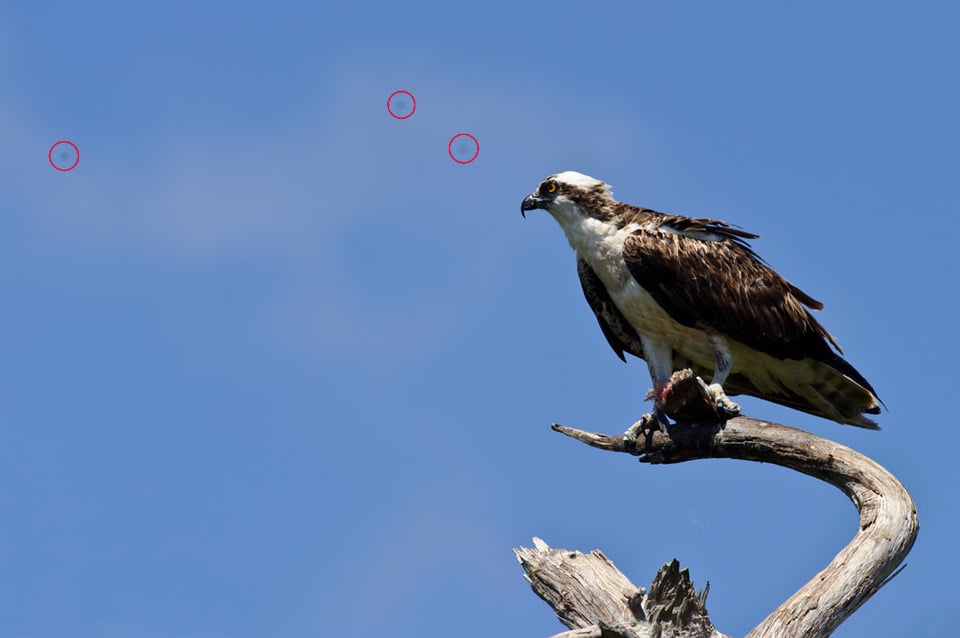
This is one of Lightroom’s most useful features. Have you ever taken a photo where your camera sensor has dust specks? They show up as small, annoying blobs in different parts of an image:
The spot removal tool is intended to eliminate dust specks like this, as well as other parts of your photo that need to be healed. For example, if you’re trying to get rid of a tiny bird that flew across part of the sky in your image, you could use the spot removal tool to clone it out.
To see the photo more closely, you’ll probably want to zoom in. Press the “Z” key, or go to the “Navigator” in the left-hand tab and choose the magnification that you want. (Lightroom doesn’t have a slide-zoom feature that some other software does — you’re limited to zooming to very strict magnifications.)
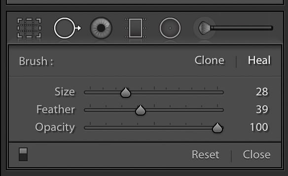
You’ll notice that there are two options within the spot removal tool: clone and heal. Both work by sourcing the replacement pixels from some other part of the photo. If you choose “clone,” Lightroom replaces your spot-healed section using the exact pixels from the source area. If you choose “heal,” Lightroom replaces your spot-healed section a bit more flexibly, using its algorithms to determine how it thinks those pixels should look (though it still uses the source pixels as a baseline). I find that I generally get better results with “heal,” but, for hard edges, it sometimes does a poor job replacing pixels. In that case, “clone” can be a better option.
As of later Lightroom versions, the spot heal actually works in more than just circular spots; you can “paint” a healing brush in whatever shape you want. I was glad when Lightroom added this feature, since the earlier version was much more difficult to use.
Although the spot removal isn’t as advanced as Photoshop’s healing brush and similar features, it does its job. Unless you want to do extensive spot removal adjustments, it should be good enough in most cases.
Red Eye Correction
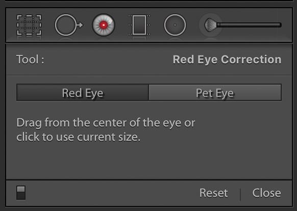
I don’t take pictures of people very often, so I don’t think I’ve ever needed to use this tool. However, if you used on-camera flash and ended up with red eye in one of your photos (or if you’re editing images that someone else took), this is a nice option to have.
It’s pretty self-explanatory. The only tip I have is to zoom in on the photo (again, by pressing Z), which should make it easier to click on the right spot.
Graduated Filter
This tool, on the other hand, I use all the time!
If you ever need to adjust part of a photo and not the rest, your goal should be to make everything look as natural as possible. You don’t want any halos around your subject; it just looks weird.
The graduated filter tool is a great help for this exact reason. Essentially, it allows you to adjust all the normal settings — brightness, saturation, contrast, etc. — but only to part of the photo. Specifically, it adjusts the photo along a smooth gradient.
If you want a darker sky, for example, it can be difficult to make it look natural without affecting the horizon line as well. In such a situation, my go-to would be the gradient tool, since it is a very gentle adjustment. A gradient going from slightly above the horizon to slightly below would be very difficult to spot, and is likely to look much more natural than most other local adjustments would.
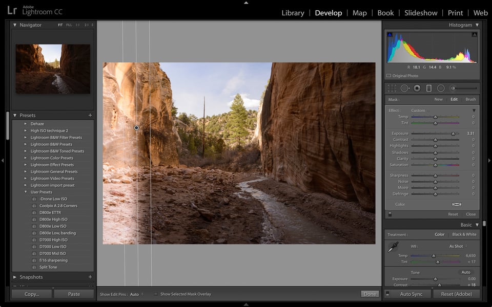
Of course, it’s still possible to mess up the graduated filter; it doesn’t automatically create a seamless result. Here’s an example where, by brightening the left-hand side of the frame with a graduated filter, I still ended up with a result that looked unnatural:
This is just one over-exaggerated example, though, and there are dozens of good examples of the graduated filter, too. Again, you’ll need to experiment. I find myself using this tool for a huge portion of the photos I take since it’s the most subtle way to edit a portion of an image selectively.
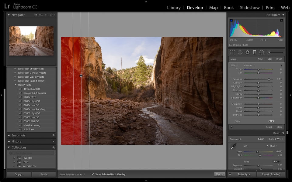
Also, if you want to see the exact area that your adjustment is targeting, here’s a useful tip: Press the “O” key! You’ll see the area of your gradient highlighted in red, which makes things pretty easy.
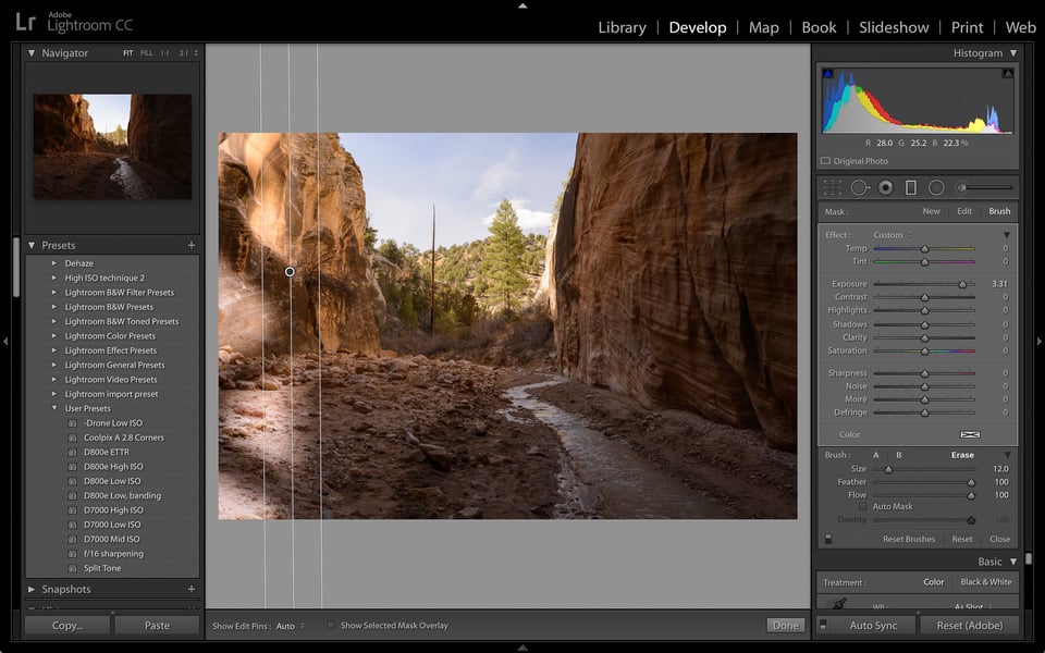
Finally, it’s worth noting that some later versions of Lightroom allow you to edit the gradient that you’ve created using the “brush” option (see below):
This can be useful if your gradient works well across most of the photo, but there’s a small bit that you don’t want it to affect. Not all versions of Lightroom have this option, but it’s nice if yours happens to include it.
Radial Filter
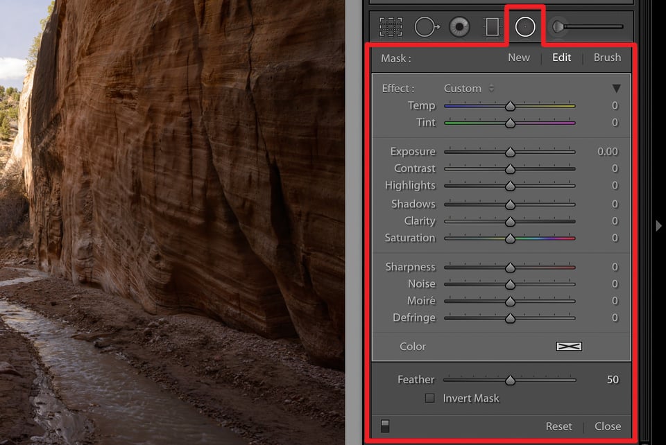
Similar to the graduated filter, newer versions of Lightroom will offer what is called the radial filter.
In this case, your “gradient” is circular or oval-shaped, but otherwise acts exactly like the graduated filter tool.
I use this tool quite often, since, once again, it is one of the gentler ways to make a local adjustment. If you’re trying to brighten a rock in the foreground of a landscape photo, for example, this tool can be very useful.
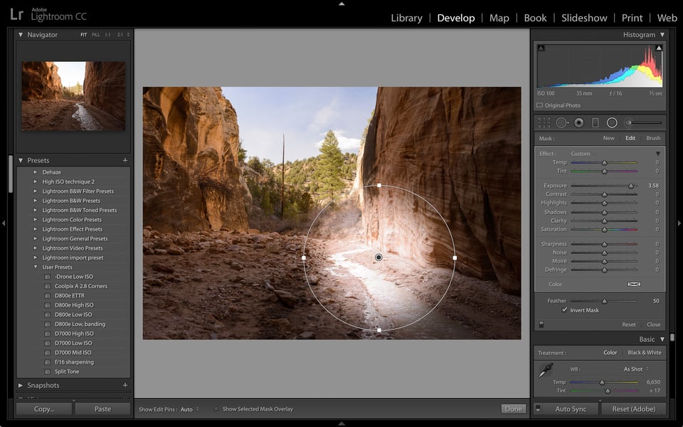
The only additional point to mention is that the radial filter can be inverted, too — that is, you get to choose whether the filter affects the area outside or inside the circle/oval that you draw. You can switch between them simply by checking or unchecking the “invert mask” option.
Adjustment Brush
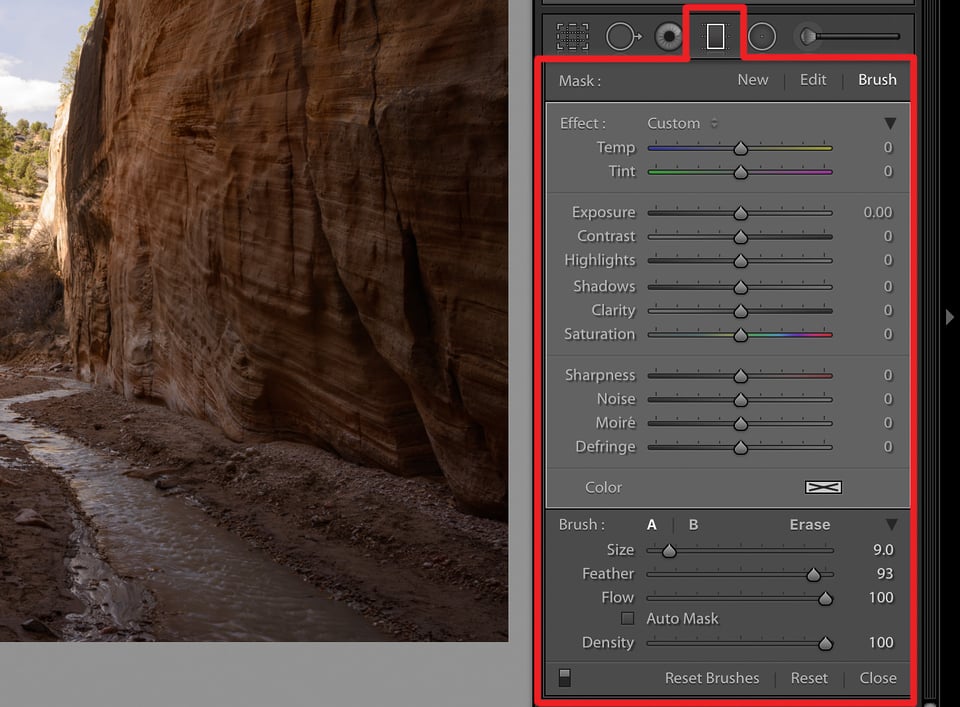
The last of Lightroom’s local adjustment options is the adjustment brush.
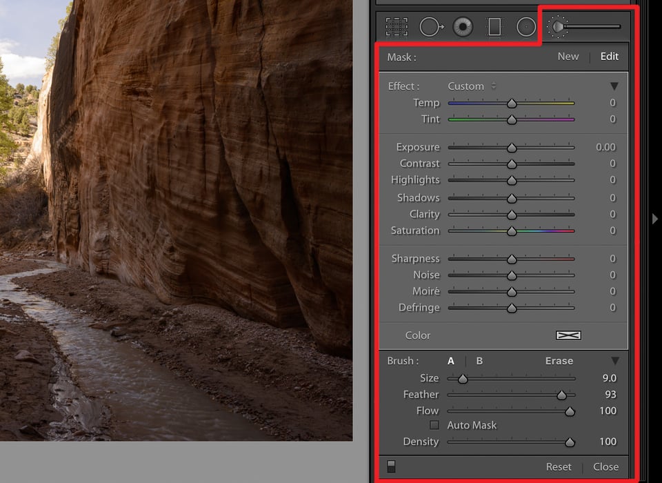
This one is as simple as it gets: As if you’re using Microsoft Paint, you just paint over all the areas that you want to adjust. Here, especially, it helps to press the “O” key (or click “Show Masked Overlay” in the Toolbar) so that you can see all the areas you’re selecting.
The adjustment brush is easy to misuse. First, my main tip is to avoid clicking the “auto mask” option (in the right-hand pop-out) for most photos. What does the auto mask do? Essentially, it tries to find hard edges in your photo, then stop/start the boundary of your adjustment brush so that you don’t go beyond them.
It sounds like a good idea, but it doesn’t work very well. If you accidentally leave “auto mask” turned on, and you use the adjustment brush over something like a cloud, you may realize later that the cloud looks really weird at full magnification, since the brush you wanted to apply works on some pixels and not others. Potentially, you’ll end up with grainy and splotchy sections that don’t look good at all. (However, if you’re trying to select something particularly tough — say, curls of hair — you may want to turn on the “auto mask” option briefly. Just make sure that the final result actually looks good.)
Also, if you apply the adjustment brush without care, it’s easy to get strange halos around your subjects. Always watch out and double-check that your edits look as natural as possible.
With those qualifications, Lightroom’s adjustment brush can be a great tool. It’s the most flexible way to edit your photos selectively, which makes it a very useful option to have at your disposal.
Sync Develop Settings
It will often be the case that you want to edit two photos similarly, or perhaps the exact same way. For example, when I’m taking Milky Way photos, the light doesn’t change very quickly from photo to photo. This means that I can use the same Develop settings on several photos in a row without a problem.
Obviously, you could do this the slow way: re-editing photo after photo with exactly the same settings. However, there’s a much quicker way to do this: syncing the Develop settings.
How do you sync the Develop settings from photo to photo? It’s fairly easy:
- Edit one of your photos however you want; this is what you’ll copy the settings from.
- Enter the Grid View of the Library module (press G).
- Highlight all the photos that, ideally, would have identical Develop settings. You can do this by holding down the Shift key and clicking the first/last photos of the group. Or, you can hold down the Control key (Command on a Mac) and click each photo individually.
- Now that all the photos are highlighted, click once on the already-edited photo. The other photos should remain highlighted, but the already-edited photo should be highlighted brighter than the rest.
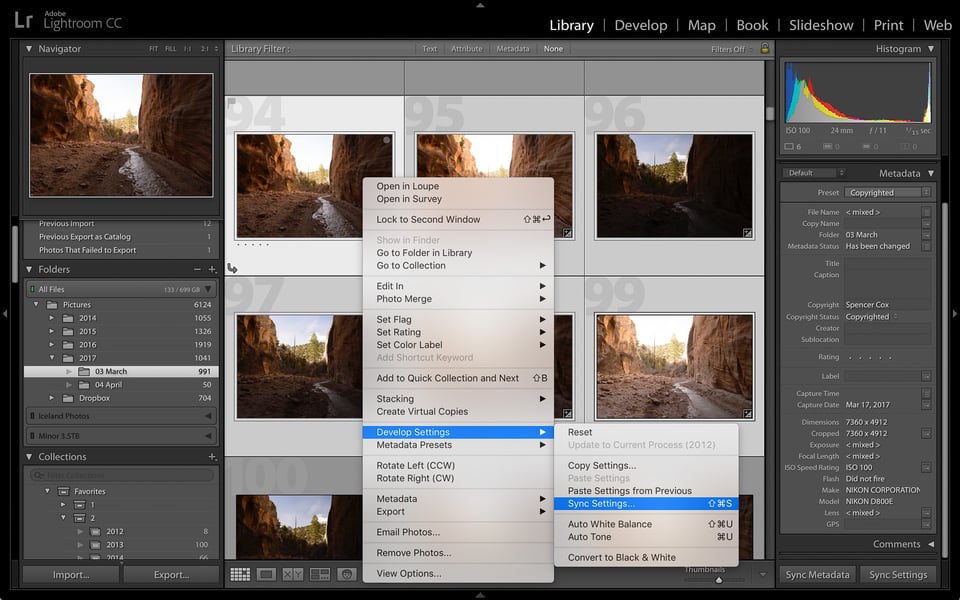
- Right-click on any of the highlighted photos. Go to Develop Settings > Sync Settings.
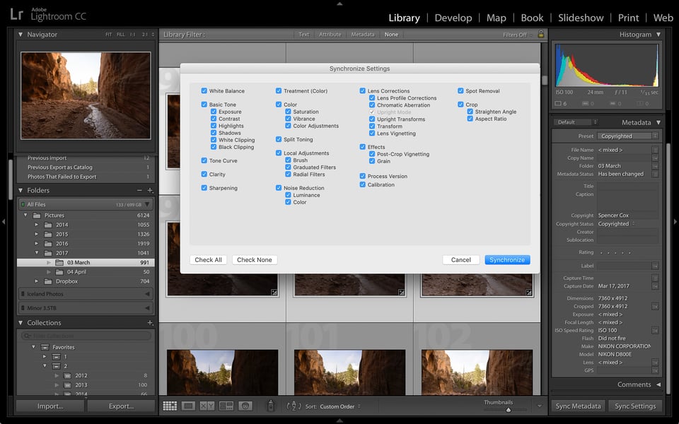
- A dialogue will pop up asking which of the Develop settings you want to sync. Remember that any local adjustments you’ve made may not appear in the right spot in other photos, assuming that your composition changed from shot to shot.
Photo Merge
If you have the newest version of Lightroom (Lightroom Classic), you also have access to a useful feature called photo merge.
This option lets you blend together photos as an HDR or as a panorama. Hopefully, in the future, it will allow merging as a focus stack, too, although that isn’t available as of May 2017.
To merge photos together, you’ll want to highlight all of them in Lightroom’s Grid View. Again, to do so, you need to hold down the Shift key, then click the first/last photo that you want to merge. (Or you could hold down Control — for Mac, Command — and click each photo individually.)
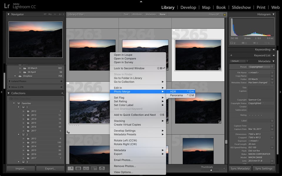
Then, right-click, and go to Photo Merge > HDR, or Photo Merge > Panorama. In both cases, a dialogue will pop up that gives you a few options. They’re all pretty self-explanatory.
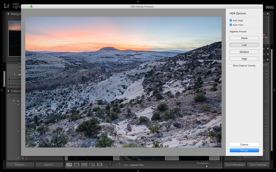
Here’s what the HDR panel looks like:
The HDR photo above has some strange colors here (since I clicked the “auto tone” option, and Lightroom didn’t do a great job), but that is very easy to correct later. The completed photo looks something like this:
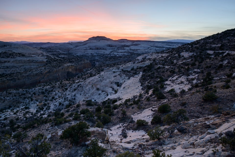
Not too bad! Lightroom’s Photo Merge tool is one of the main reasons I upgraded to the newest version. It also exports these HDR or panoramic photos as .DNG files, which means they are still RAW files (as covered earlier in the section on “Copy as DNG”).
Editing Externally
As nice as Lightroom’s develop options are, you still may want to edit your photos in different software from time to time. Personally, I use Photoshop for certain images — those which require complex edits, like focus stacking, that Lightroom does not allow.
To edit a photo externally, just right click and select Edit In > Adobe Photoshop, or Edit In > [whatever software you want to use].
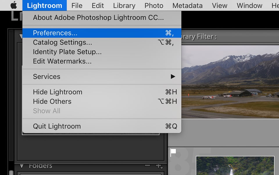
By default, when you save the photo in your external software, a copy of the photo reappears inside Lightroom. This is very useful! You can change the specific settings for the reopened photo by clicking at the very top menu: Lightroom > Preferences.
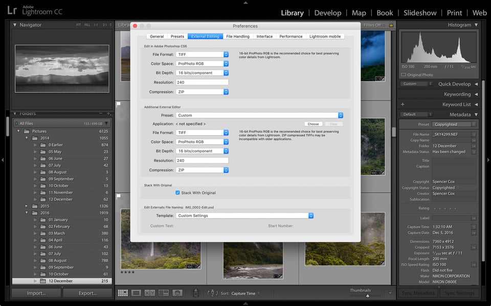
When you open the Preferences dialogue, go to the header labeled External Editing, and you can adjust the settings for photos that are reopened from other post-processing software:
I leave mine set to import 16-bit TIFFs with the ProPhoto color space, since those are the largest files with the most information. You can set these however you want, though, and save more hard drive space with more compressed options.
(As a side note — if you’re ever trying to change some of Lightroom’s behind-the-scenes settings, this is the place to do it. There are several different options in the Lightroom > Preferences dialogue, covering everything from the folder location of your Catalog file to the background color of your Library window.)
In addition to external editors, you can also use external plugins — tools that can make your life easier and accomplish tasks that Lightroom itself does not natively allow. For example, I bought an external plugin called LR/Mogrify 2 that lets me add borders to the edges of my photos when I export them, which wasn’t otherwise possible.
If there’s something you can’t do in Lightroom, you can almost always accomplish it via an external editor or an external plugin.
Table of Contents
