Today we’re going to look at how and when to use the HSL and Color tools in Adobe Lightroom. The HSL/Color controls are some of the most powerful color editing tools that Lightroom offers. These tools are relatively straightforward once you know how they work, but they’re easy to overlook. HSL/Color is my favorite tool for making subtle color adjustments within an image, although it can be used for making more dramatic color changes as well.
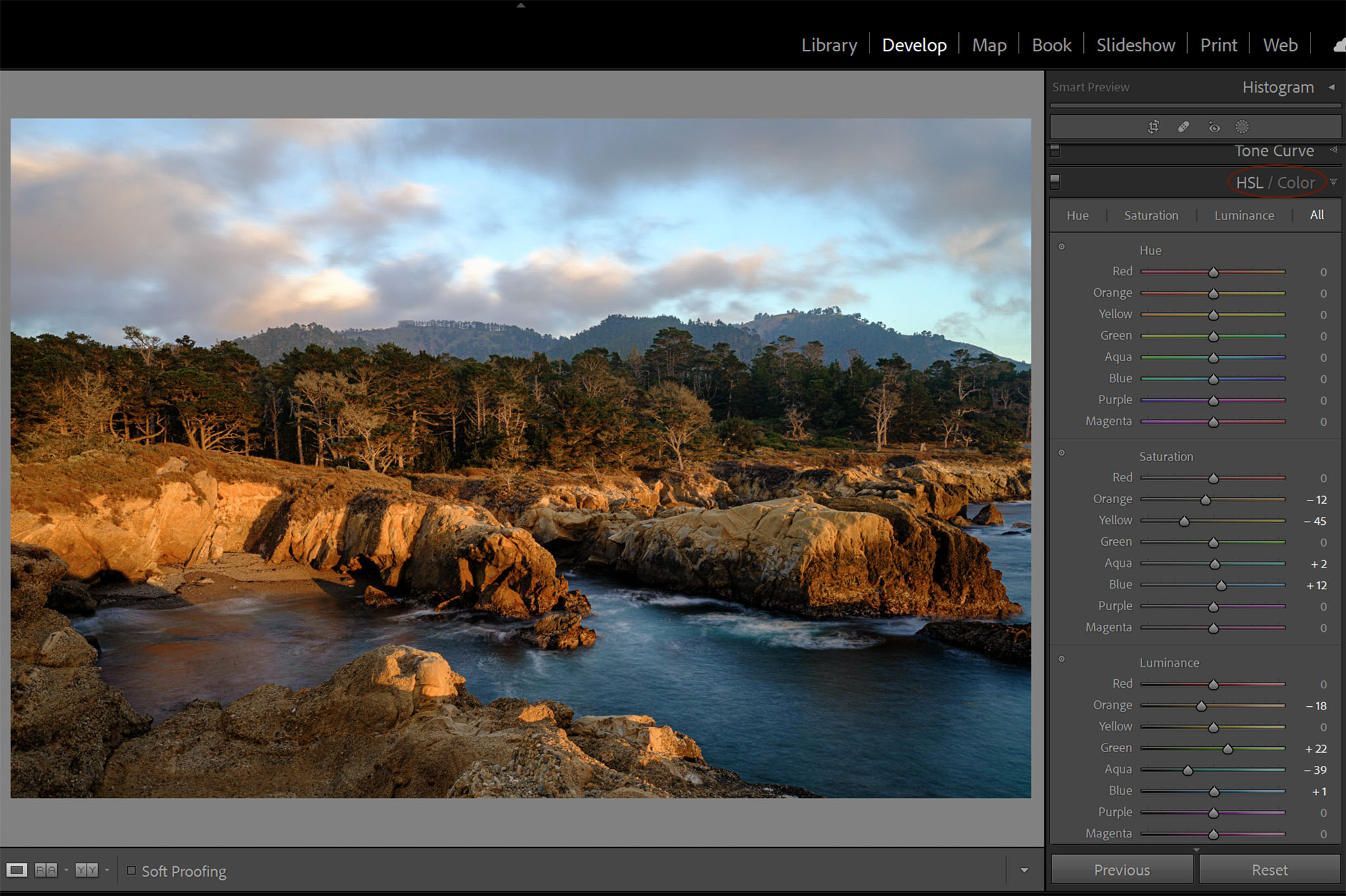
Table of Contents
What is the HSL/Color Panel?
HSL/Color is designed to make targeted color corrections within your image. Unlike sliders in the Basics Panel that affect the entire image at once (like the color temperature adjustment), the sliders in the HSL/Color panel only affect individual colors.
From this panel, you are able to control the Hue, Saturation, and Luminance of specific colors in your image (AKA their actual color, intensity, and lightness/darkness). In particular, Lightroom allows these targeted adjustments to eight regions of color within your image: red, orange, yellow, green, aqua, blue, purple, and magenta.
Difference Between HSL and Color
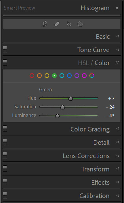
The panel is labeled HSL/Color, and you can click on the words “HSL” or “Color” in the panel header to change how the information is shown. However, for the most part, both HSL and Color do exactly the same thing and are simply different arrangements of the same editing options.
The HSL view shows all the colors simultaneously, whereas the Color view (shown above) only shows you one color at a time. I like working in the Color view because that’s how I tend to think about the colors in my images – one by one, rather than all at once. But it’s down to personal preference. Plus, the HSL view does have one tool the Color view lacks: the HSL Target tool.
HSL Target Tool
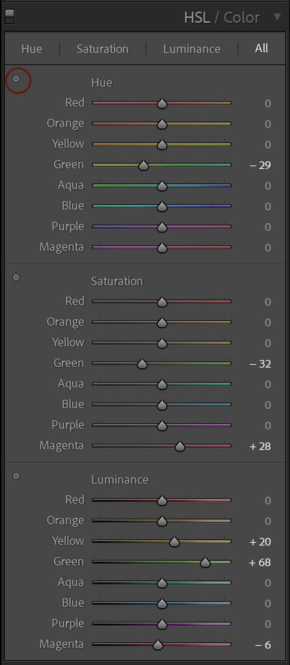
The one major difference between the HSL and Color views is that the HSL layout includes a target tool which allows you to click to target a specific color in your image.
In other words, when you’re using this target tool, you just hover over part of your photo and click to select what colors you’d like to edit. This can be helpful if you aren’t positive which color group an object falls into (blue vs. aqua in your sky, for example).
More importantly, many of colors in an image won’t fall distinctly into one of the 8 color groups (but are instead made up of a mix of the colors). The target tool takes this into account. If you click on part of your image that contains both yellows and greens, the target tool will adjust sliders in both the yellow and green HSL section at the same time.
To use the target tool, simply click the dot icon next to the adjustment you want to make (Hue, Saturation, or Luminance) and then click on the color you want to target within your image and drag the cursor up and down to adjust the sliders.

HSL Adjustments Apply to the Whole Image
Unlike the sliders in the Basics panel, the HSL/Color sliders will only target the relevant color in your image. However, these adjustments still affect that particular color everywhere it appears in the image.
So, it’s easy to end up with unwanted effects with the HSL tools. If you want to brighten the sky in your image, for example, adjusting the luminance of the blue sky will also affect the blue shirt your subject may be wearing (and anything else blue within the image).
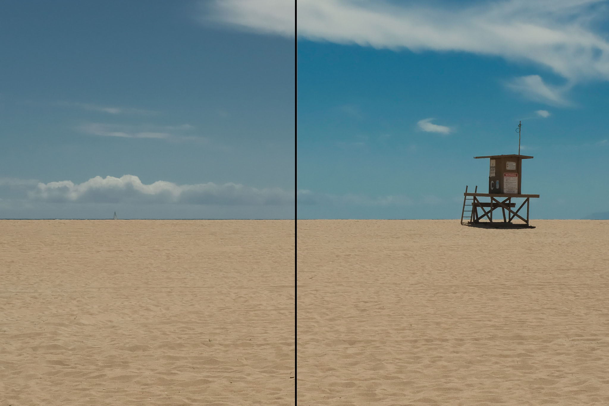
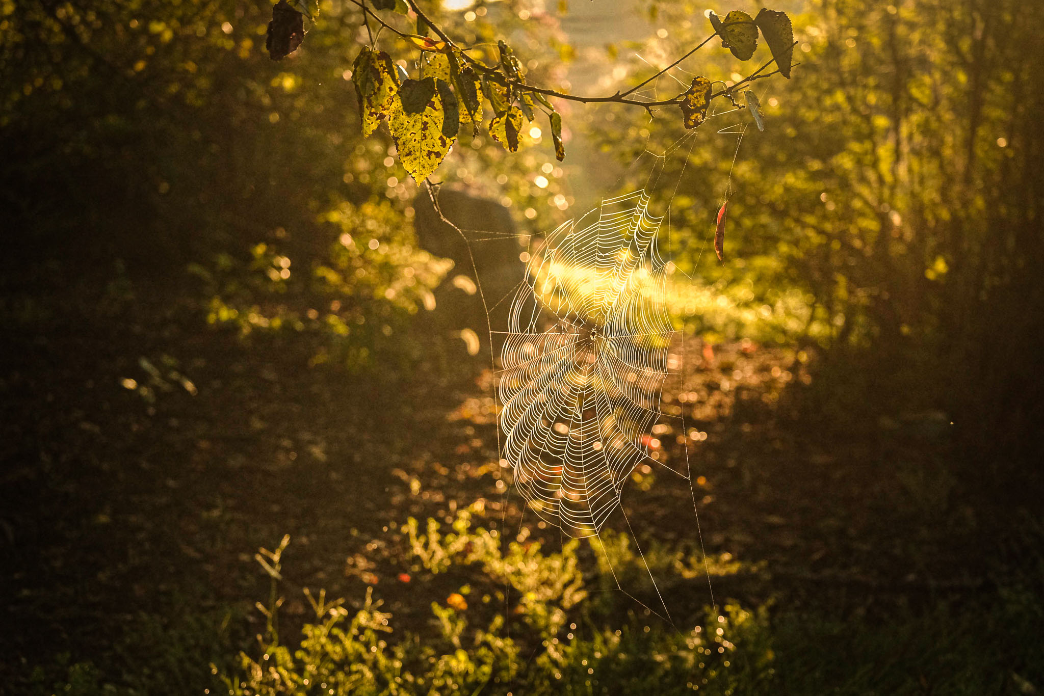
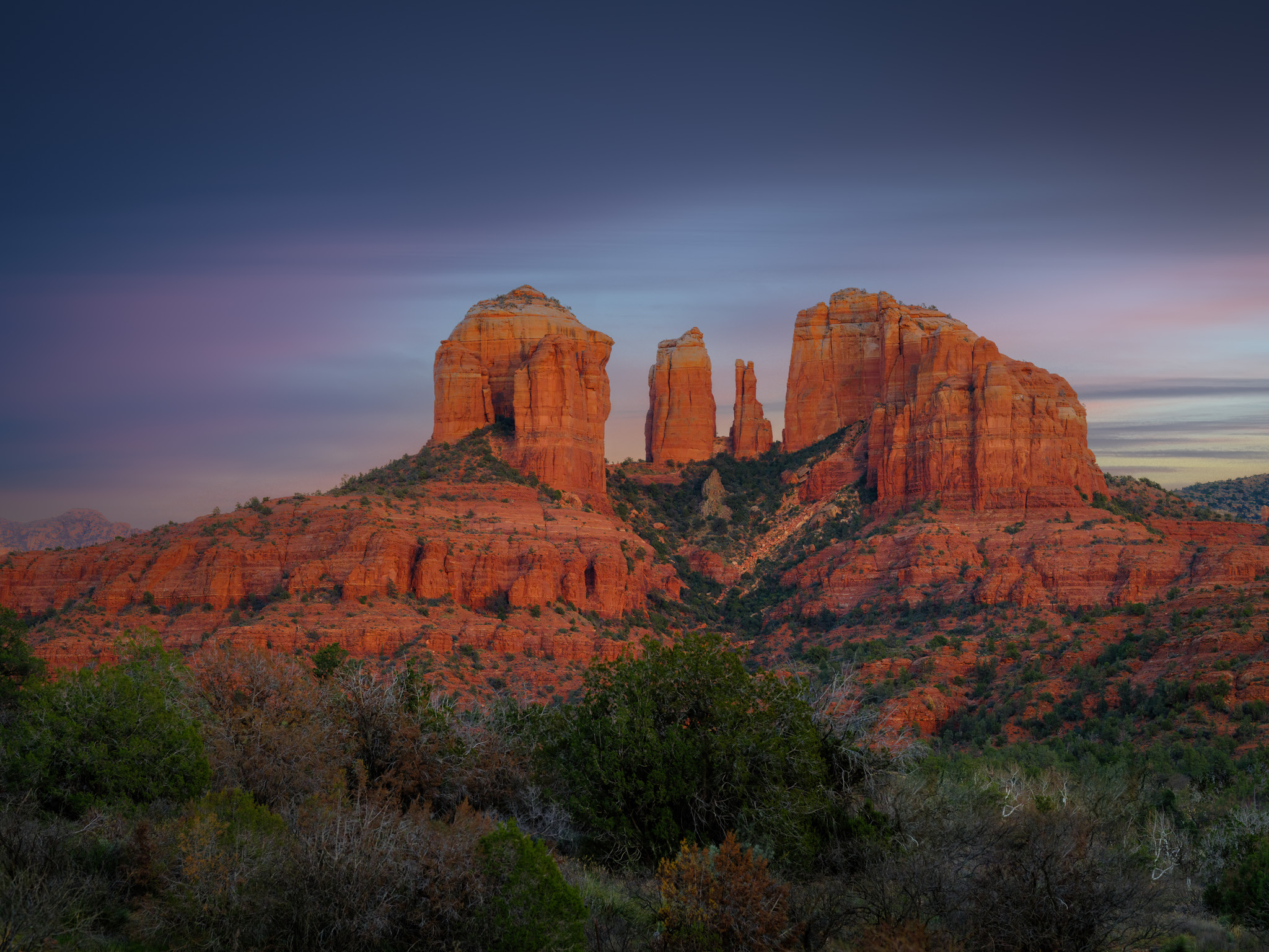
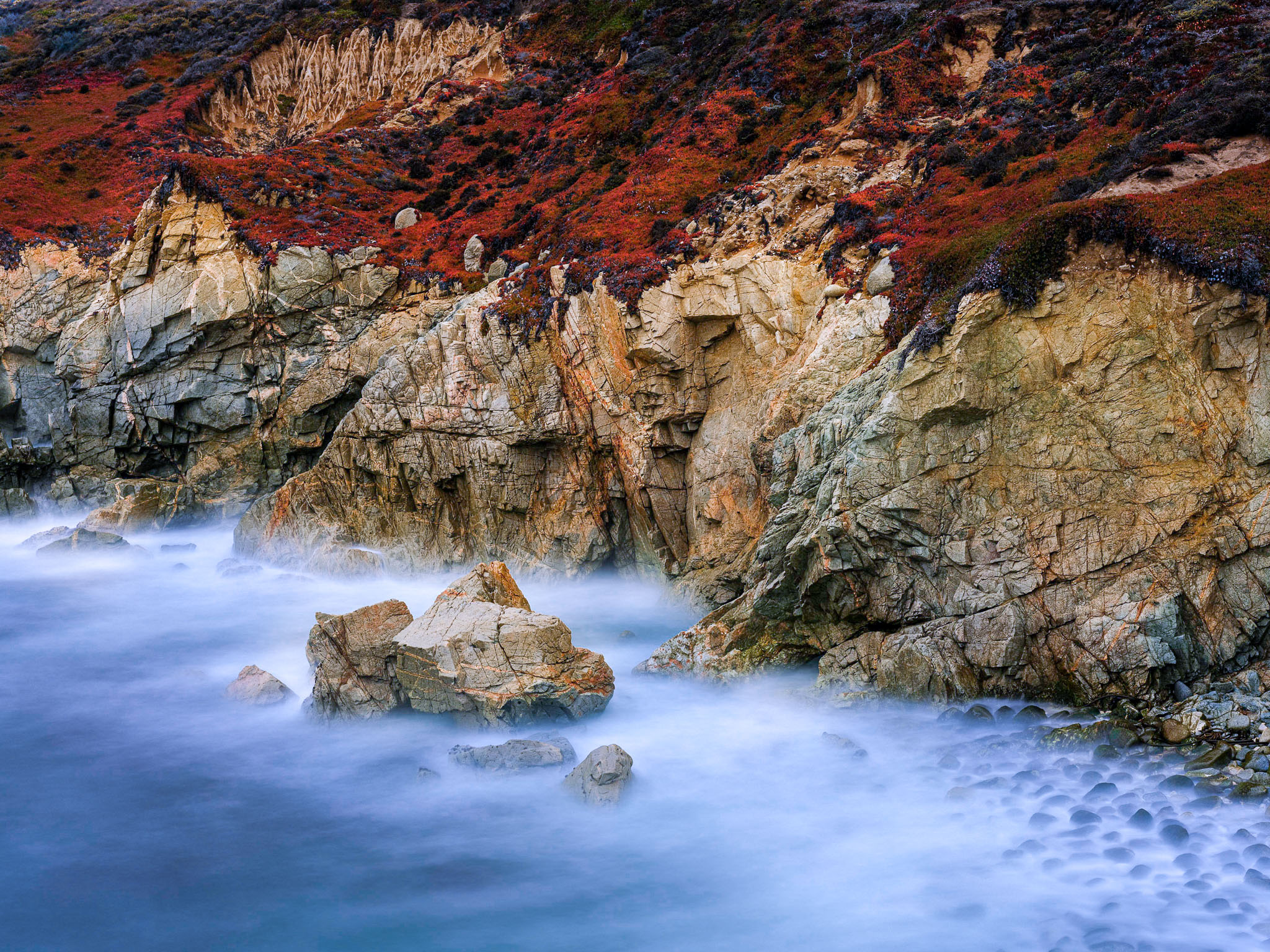
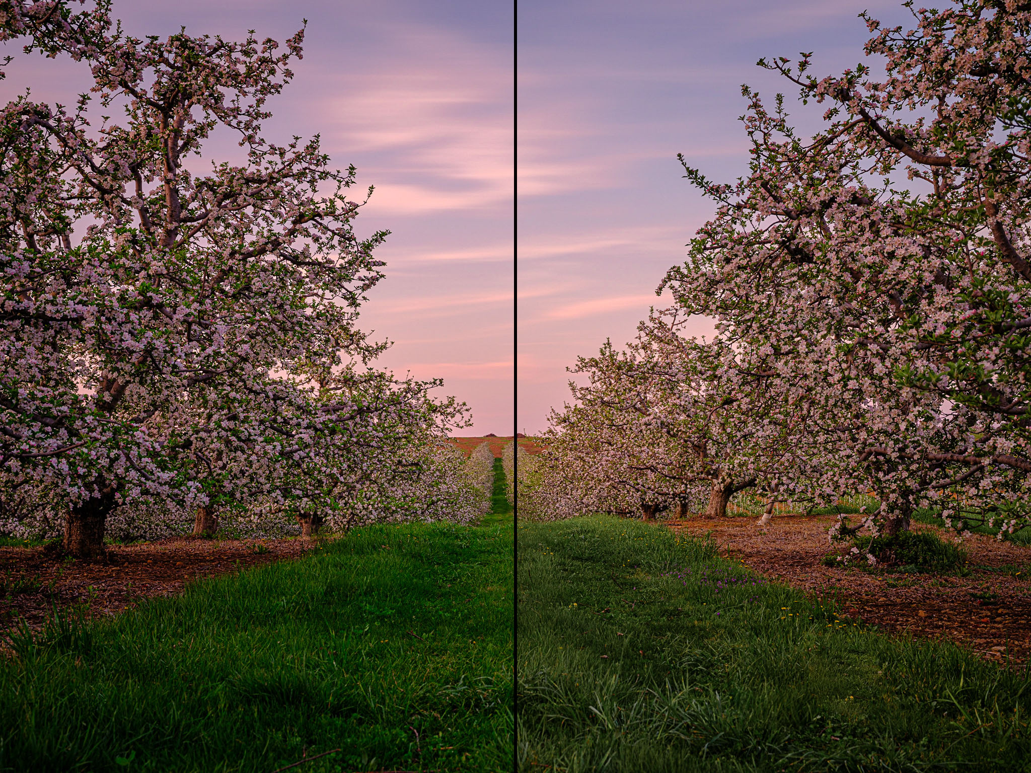
Still, with a little practice, you will quickly be able to identify which images are candidates for HSL/Color adjustments. The photograph below, for example, is a good candidate for adjusting the blue sky with the HSL sliders, because there are no other blue objects in the photo that would be wrongly affected.
Using the HSL/Color Adjustments
1. Identify the Color(s) that Need Adjusting
The first step to adjusting any specific color in your image is to identify what color it is. This might seem easy – and often it is. Grass and sky, for example (two of the most common adjustments I make with this tool), are obvious. But many colors are made of a mixture of the 8 colors in the sliders. In that case, you will have to either experiment with which sliders affect your image, or better yet, use the Target tool located within the HSL view.
2. Make Small Changes
These sliders are powerful, and most photos require very small changes. Adjusting the hue slider just a small amount can easily add some green back into dying grass, but it’s easy to shift the hue to the point where it looks like something from a fantasy movie.
It is possible to make more drastic changes using these tools, but most of the time I think of them as a way to perfect a color that is already 90% of what I want. Also, significant changes in the HSL panel can add high levels of color noise to your photos.
3. Make Global Adjustments First
Along similar lines as the previous tip, I recommend doing most of your color adjustments in the Basics panel – especially the color temperature, tint, vibrance, and saturation sliders.
The HSL tools are not a cure for bad/incorrect color or exposure in an image. Relying on HSL/Color to correct the overall color of the image would be tedious and inefficient. It might also add excess color noise, or look weird if you later need to adjust any of the Basics panel sliders.
So, instead, think of the HSL sliders as a way to fine-tune and finalize the particular colors in the image. It shouldn’t be the first place you turn when a photo’s color needs improvements. You’ll get better results if you use it after adjusting the overall, global look of the image first.

How HSL/Color Can Save You Time
One of the most time-consuming edits in Lightroom or Photoshop is to mask certain areas of the photo for targeted editing. In some cases, masking is your only choice, but other times, HSL/Color can be used instead.
For example, if the only green in your image is the grass, there is no need to make a complex masking selection of all the grass in your photo just to lighten or darken it. Instead, you can simply slide the Luminosity slider in greens section of the HSL panel.
Likewise, in many cases, you can make all of the adjustments you need to a sky simply using these tools. Even with Lightroom’s automatic sky-masking tools, it’s hard to beat the speed and efficiency of using the HSL/Color sliders.
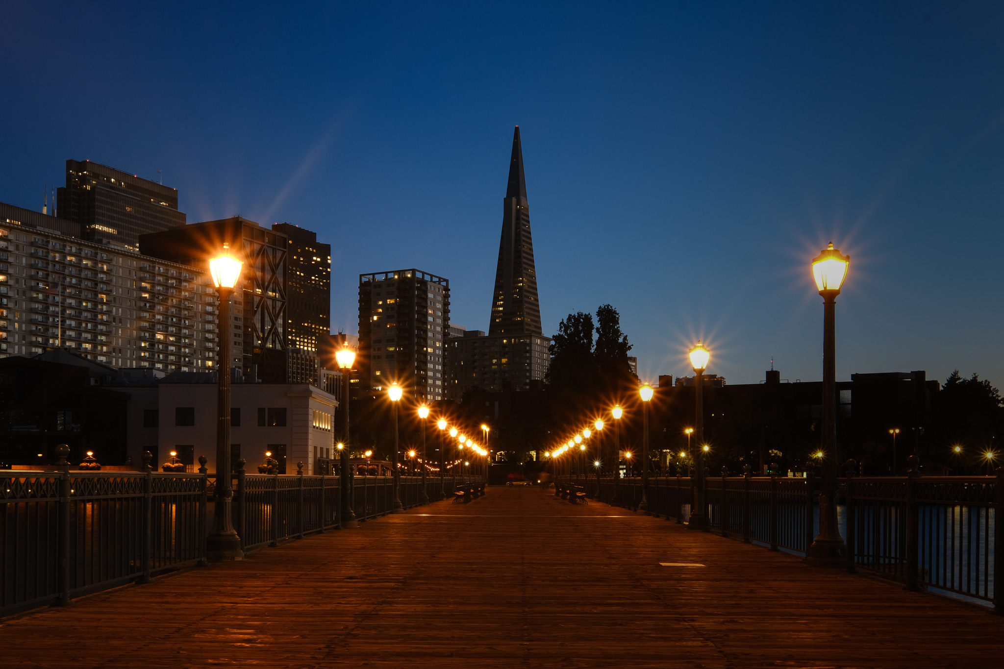
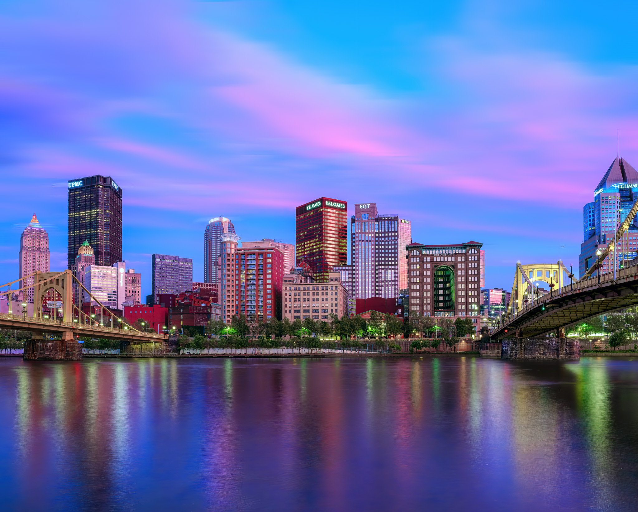
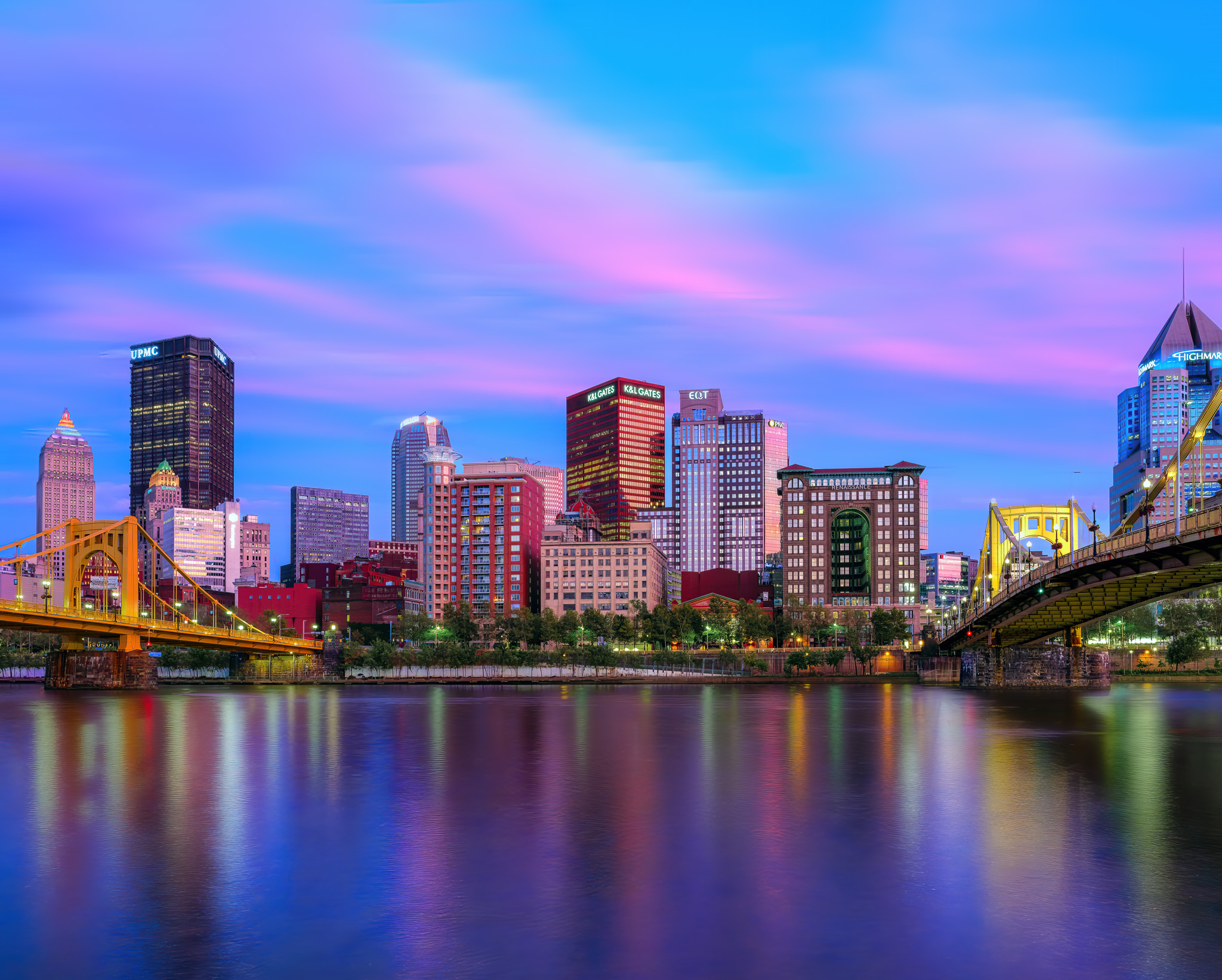
The photo below is one case where the HSL/Color sliders saved me the hassle of masking out my subject when I needed to make a targeted adjustment to the color of the bridges.
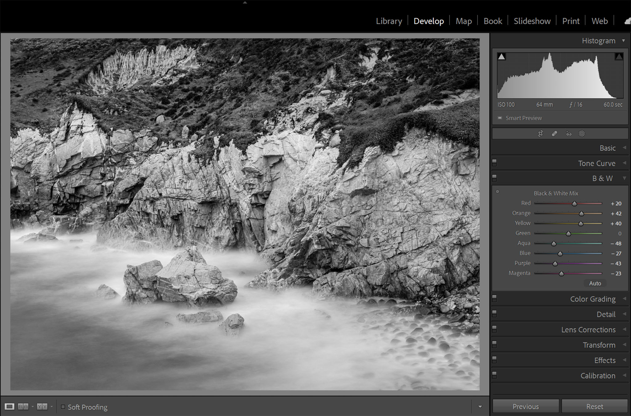
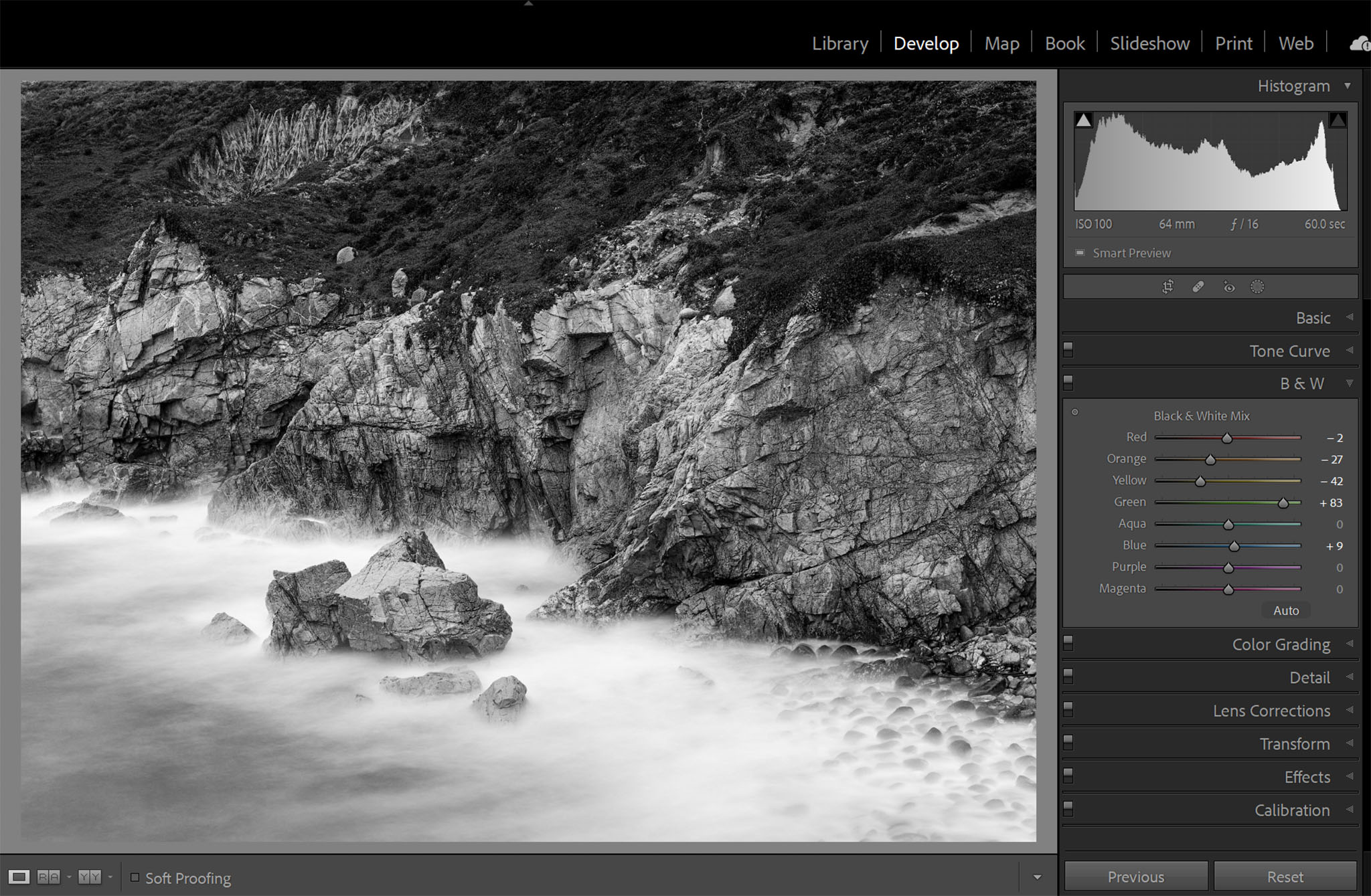
The HSL/Color Panel for Black and White Photos
When you convert an image to black and white by switching modes in the Basics Panel, you’ll notice something interesting happen to the HSL/Color panel: It’s automatically replaced with the B&W panel.
While it might seem counterintuitive that the B&W panel contains sliders for the 8 colors, this allows you to control the lightness/darkness of each color as it is converted to grayscale. This gives you an incredible amount of control over your black and white conversions.
Historically, black and white film photographers would use color filters like yellow, orange, and red to change the relative lightness/darkness of objects in their photos. This panel in Lightroom allows you to replicate the effects of those filters entirely digitally.
Examples of When to use the HSL/Color Tools
There are many reasons to use the HSL sliders. The more familiar you are with this tool, the more opportunities you will find to use it. Honestly, I use it in almost every image I edit – but to get you started, I want to share some of the places where this tool can be the most useful:
- Adjusting the sky in an image: I’ll increase saturation and decrease luminosity in the cyan, blue, and purple tones to make a bland sky pop
- Fixing “neon” grass: I tend to reduce the saturation and luminosity of the greens, and sometimes shift the hue to be more yellow
- Fixing dead grass: Usually, I’ll adjust the hue of the yellows to add a green tint
- Deepening the colors of a sunset: I might increase saturation or decrease luminosity in the reds and oranges
- Reducing distracting colors in the background of images: I usually lower the saturation and possibly reduce the luminosity of offending colors
Conclusion
The HSL/Color tools in Adobe Lightroom give you a lot of control over the colors in your image. They’re not hard to use, and learning when to use them can save a lot of time in editing.
Once you start using the HSL adjustments, you will also find more and more uses for them. I personally use them in pretty much every image I edit. If you already use the HSL/Color tools, or if you start experimenting with them after this, feel free to share your most common use cases in the comments!
Thank you, Meg. I, too, have ignored the HSL/Color panel due to not understanding what they do and how to use them. I can’t wait to start practicing.
What is beyond me is why HSL in Lightroom can only be applied globally, but not locally via masks. That would be sooo much more useful!
I’ve been using Lightroom for a few years and have managed to avoid using HSL, mostly because I didn’t really get it. Now I do. Thanks for this very helpful article, Meg.
That was a very clear account of this panel. I normally have mine set to Colour – I tend to think of colour one by one and having all the sliders to hand feels right, even though I nearly always use Luminance (if anything), sometimes experiment with Saturation and never touch Hue – far too easy to aquire that Fake look!
So I never caught on to the targeting tool in HSL view. I can imagine finding the sort of use that you illustrated very convenient. I need to bear it in mind. Thanks!
I also use luminance the most, followed by saturation. I agree with you that it is very easy for hue adjustments to look fake. It needs a very light touch, but I use it quite a bit to adjust grass tones. My kids play sports and the fields sometimes look a little dead when its been hot here. A tiny touch of hue adjustment in the yellows and they have nice green fields again (at least in the photos! If only it were that easy to keep my yard green).
Excellent, very clear, very helpful. Thank you!
You’re welcome!
Meg, thanks for this helpful article. I find I can also adjust colors using the Color grading and the calibration panels, and also by selecting the individual parts of the tone curve (i.e. red, green and blue). Perhaps those options are better for bigger adjustments, while the HSL/Color panel is more appropriate for subtle adjustments? I do a lot of astrophotography, so a reddish or greenish sky is not to my taste and something I prefer to turn more to the blue region of the spectrum.
Yep, exactly. Color/HSL is great for smaller, localized color adjustments. But all of the color tools in lightroom have their place for sure!
Excellent article Meg! Thanks for posting it.
Very helpful. I am new to Lightroom and this information will help reduce some of the masking that I have been trying.
I’m glad! I’m often surprised how often I can use HSL/Color to save myself masking. In almost all of the examples above I could have accomplished the same edits by masking, but adjusting the colors instead saved me a lot of time!