How does one use curves in Photoshop? In this article we will take a detailed look at understanding and using one of the most powerful tools in Photoshop, Curves. Even though there are many tools to enhance the contrast in Photoshop, curves are the most effective. Curves go beyond the limitations of merely adjusting the contrast. In this article, in addition to enhancing contrast, we will see how to use the curves tool to color correct images. Before proceeding to how to use curves to enhance contrast with curves, you can go through my article, Understanding Contrast in Photography.
Table of Contents
Starting Curves
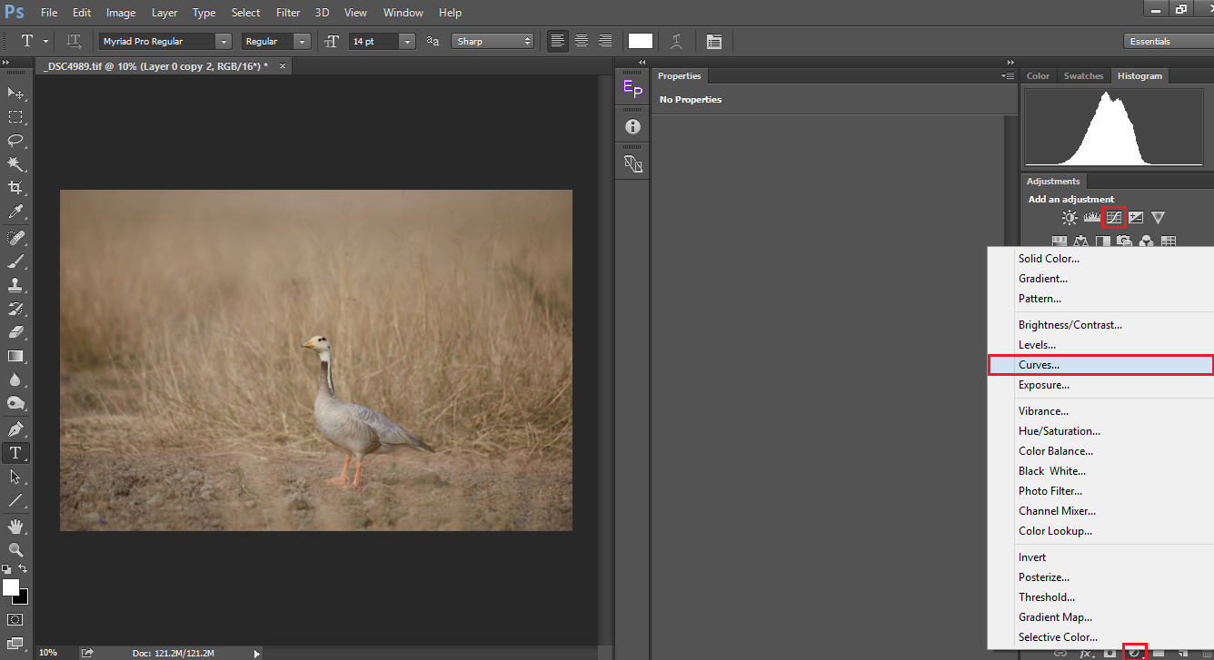
There are two ways to use curves in Photoshop. One way of doing it is, by going to the menu Image->Adjustments->Curves. The second and the most effective way is to use curves as an adjustment layer. The former method applies the curve directly to the image making it a destructive form of editing ie., you cannot modify it later, unless you have converted it into a smart object. By using curves as an adjustment layer, you are doing the same in a non-destructive way, ie., you can change the values or even delete the entire layer at any point of time without altering the original image. You can add a Curves adjustment layer either by clicking on the create new fill or adjustments icon in your layers panel or directly clicking on the curves tool if you have the Adjustments tab open.
Understanding Curves
Once you create a curves adjustment layer, you see what is below in the properties tab/window. The window has two bars, an inclined line and a histogram embedded inside it. Let us first brush up our memory on how Photoshop defines a pixel. It considers a pixel as a combination of Red, Green & Blue as numerals from 0 to 255. For eg., (0,0,0) is black, (255,0,0) is red, (0,255,0) is green, (0,0,255) is blue and (255,255,255) is white. For more on it please go through Spencer’s article on sRGB Vs Adobe RGB Vs ProPhotoRGB. So the slanting line you see running across the window represents the corresponding luminosity values.
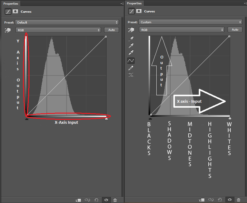
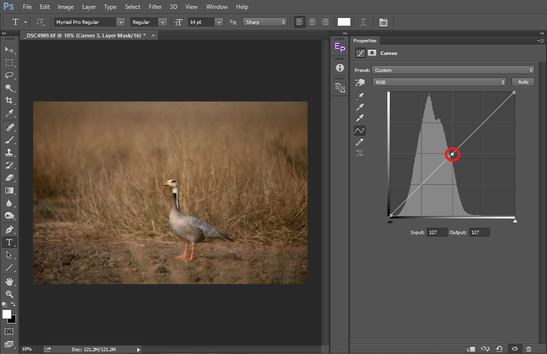
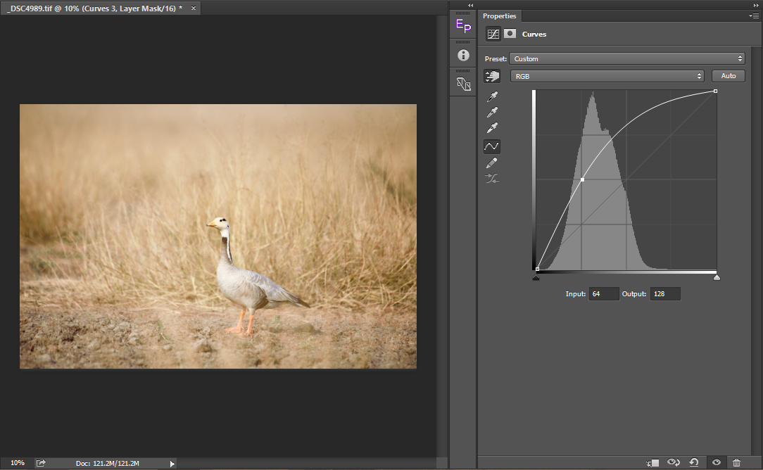
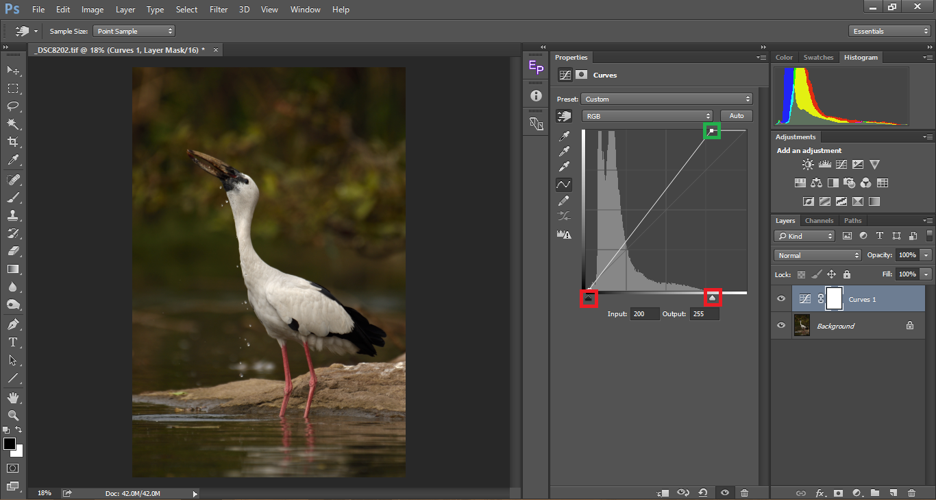
Let us take a closer look at the tool. You have two bars (marked in red), one representing the X-Axis and the other representing the Y-Axis. In the X-Axis, the left most corresponds to black (0) and the right most corresponds to white (255) with all shades of grey inbetween. The X-axis represent the input pixels. The Y-Axis represent the output pixels. In the Y-Axis, the bottom corresponds 0 and you can see it max out at 255 at the top. So eventually, (0,0) is black; (255,255) is white and (128,128) are the middle greys. Take a look at the below image. I have clicked on the curve and selected a point right in the middle. As mentioned above, it is middle grey (127,127), which means both the input and the output are the same.
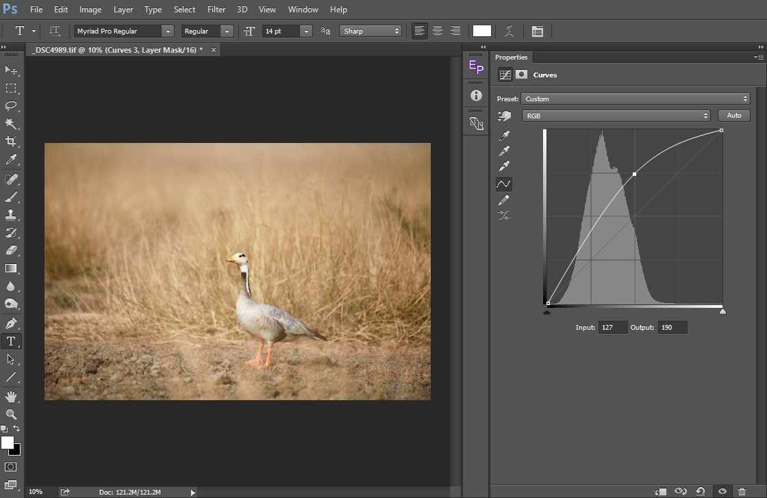
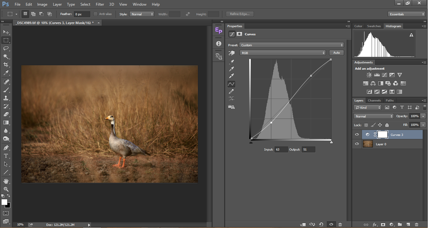
When we drag the point upwards, as shown in the picture below, the input stays at 127 (which is unchanged in the X-Axis) whereas, we see the output (y-axis) increase to 190. What we have done is, we have selected all the pixels that are 127 and increased them to 190, making those pixels brighter. In other words, we have moved all the pixels in midtones to the highlights and as a result you can see that the image is now over-exposed. I have deliberately increased it by a big margin to show the evident result. We always get the best results when we make the changes subtle.
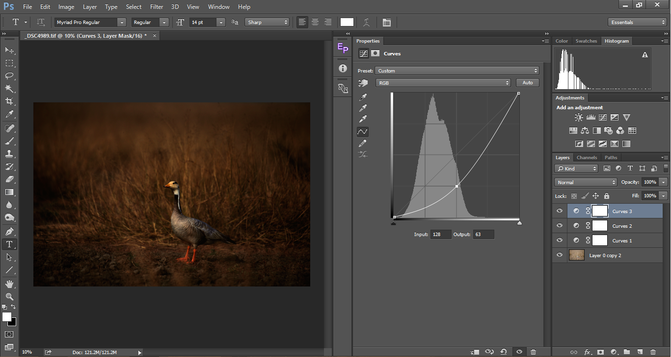
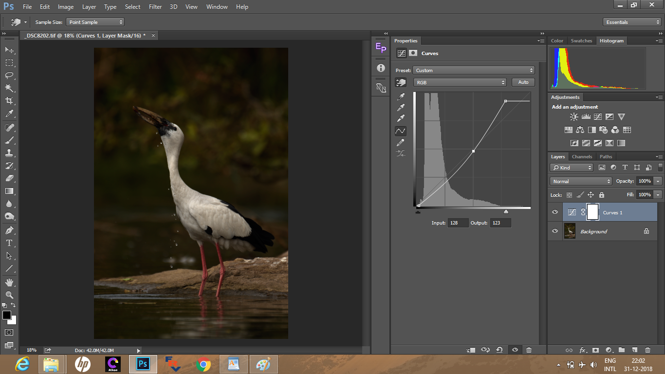
Now, similarly, let us see what happens when we drag it down. The input remains the same at 128, whereas we see the output decreasing to 63. Here what we have done is, we moved all the pixels from the midtones to the shadows, hence making the image look darker.
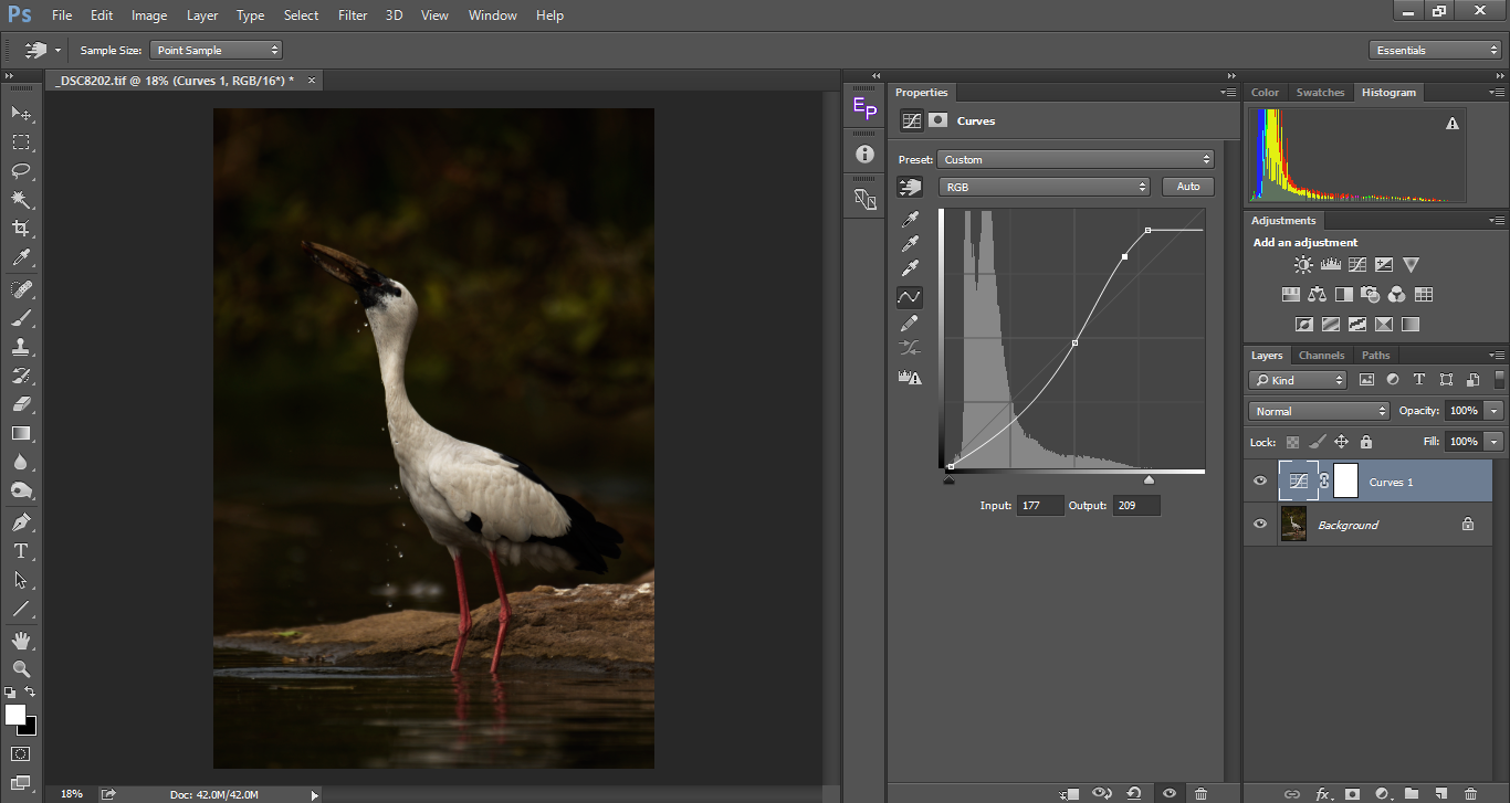
When we move the selected point along the Y-Axis we saw that the output changes accordingly. Similarly, when we move the selected point along the X-Axis, the input points change accordingly and the output remains the same again making the pixels brighter or darker depending upon which side we move it.

To summarize, when we get a ‘U’ shaped curve, the image appears darker and when we get a ‘n’ curve, the image appears brighter. Instead of selecting just one point on the curve, we can select any number of points and make the corresponding adjustment. Getting back to contrast, how do we add contrast? By making the brights brighter and darks darker. To do that, we select a point on the highlights and drag it up, increasing its pixels and making it brighter. On the other side, we select a pixel on the shadows and drag it down making the darks darker. The result is a typical ‘S’ Curve.
Below are a few points to have in mind when using curves:
- ‘n’ curves add light to the image but decreases contrast
- ‘U’ curves make the image darker but increases contrast
- ‘S’ curves are the most preferred as they add contrast without making the overall picture dark
- Inverse ‘S’ curves recovers details in the shadows, but bring down the overall contrast of the image.
Using Curves to Add Dynamic Range
Sometimes we end up with images having a narrow dynamic range. This often happens with soft light. Most of the time, the image give a smooth, pleasing effect, but sometimes, it makes an image look flat. In such scenarios, the curves tool comes to aid to pull out maximum possible dynamic range of the picture without clipping the shadows or the highlights.
The above picture looks dull. In the pursuit of protecting the highlights (whites on the subject) I ended up making the picture darker. The picture looks flat. Take a look at the two sliders on the X-Axis (marked with reds in the illustration image below) on the curves tool. Now, press the Alt/Option button on the brights slider and drag it left until you see the clipping. Similarly, drag the darks slider (while pressing alt/option) and move it towards the right until you see clipping. Looking at the histogram, we see that it has moved towards right, widening the bars, hence increasing the dynamic range. You can see depth being added to the histogram.
With the above adjustment done, even though there is no clipping, some of the whites on the subject looks over-exposed. So let us bring the whites down as shown below. As we bring down the whites, we can see the contrast coming down as well. So to add more contrast, we find a middle point and drag it further down making it a ‘U’ curve
Now, we select another point near the highlights to brighten the image which gives a result that is contrasty and not dull.
Precise Curve Adjustment with the Hand Pick Tool
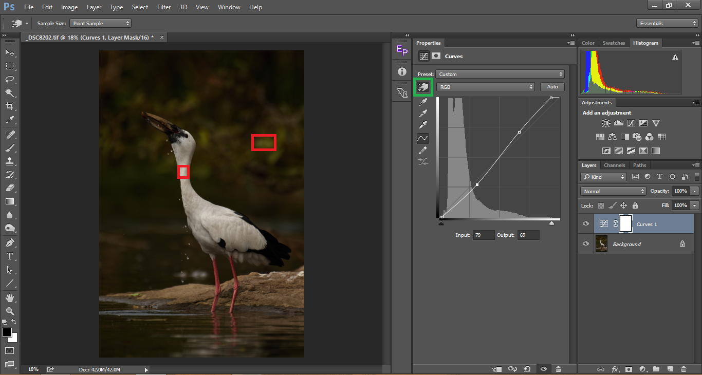
It becomes hard to guess where the highlights, midtones and the shadows are. Sometimes we might think a tone being in the shadows, but in reality it might be placed as a midtone. In other cases, we might not be able to precisely pin point where the brightest spot in our picture lies. That is where the hand picker tool comes handy. Using this tool, we can click on a sample directly on the image rather than guessing the corresponding place it has on the histogram. In the example below, I have selected the sample picker tool (marked in green), then hover it over the image and click to select a spot on the image and the corresponding value gets marked in the histogram. You can either drag it up or down in the image itself or you can drag it on the curves adjustment as we did in our previous examples to get the desired contrast. I have selected two samples, the square spot on the neck of the subject which is a highlight. The rectangular red selection spot which is the shadows. Looking at the bright green, we might have guessed it would have been placed somewhere around the mid-tones, but in reality we see it placed closer to the shadows. This is where using this tool comes in very handy and accurate. It is always best to use this tool rather than guessing the highlights and shadows.
Below is a step-by-step procedure of a typical Curves workflow:
- The first step should be adjusting the highlights. Always remember, most of the time a blown out highlight a.k.a clipped highlight is what damages the aesthetic of a photograph, unless and until you are looking to create a high-key image.
- Once you are done with the highlights, try to recover the shadows. Always remember that when you brighten the shadows too much, the overall contrast will suffer. I personally do not worry too much when I have to sacrifice shadow details unless it makes an important part of the subject like hair detail in portrait photography or eyes of the subject.
- After fixing the highlights and the shadows, work with the mid-tones to bring out optimum contrast. It is always better to make subtle changes than going too much. Too much contrast will burn the shadow details and blow the highlights. It also makes the picture over saturated.
- As mentioned above, use the hand picker tool for accurate editing.
- Keep in mind that curves are parabolic which means when you change a single point, it does affect the entire curve to various degrees. Also, remember that when you are adjusting curves, saturation changes accordingly. This is another reason not to over do, but make subtle changes.
Using Curves for Color Correction
The application of curves go beyond adding contrast to an image. Curves can also be used to correct the colors of an image, especially if we need to remove the color cast from an image. Most of us use the White Balance and the tint sliders to correct colors, considering we shoot RAW. If the picture was shot as a JPG those two sliders would be disabled. In such a case, the curves tool will be an alternative to correct colors. This is not to advise on shooting as JPG, as many consider the use of RAW to be only useful in color correction. The benefits of RAW goes way beyond it. That is why most of us, especially here in PhotographyLife advise on shooting RAW. Coming back to color correction, Curves give a more controlled approach to correcting colors than merely relying on the White Balance slider.
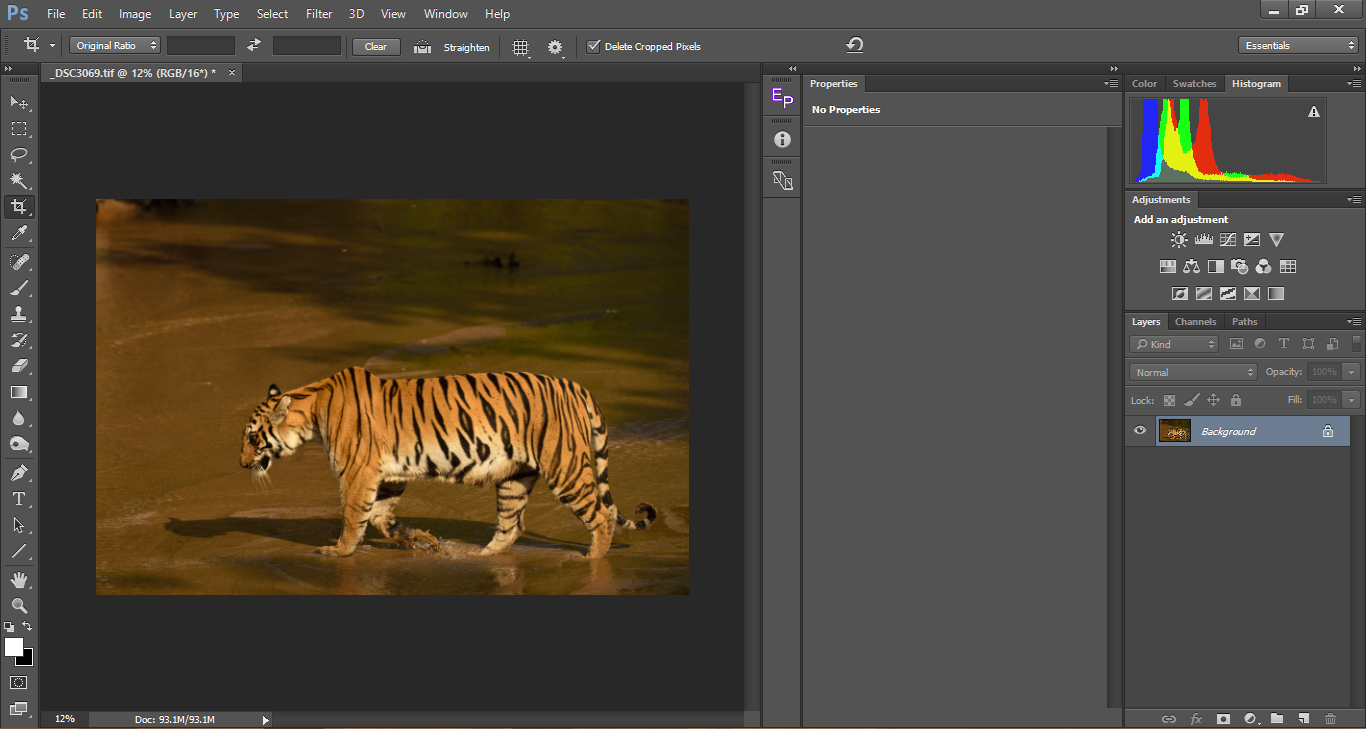
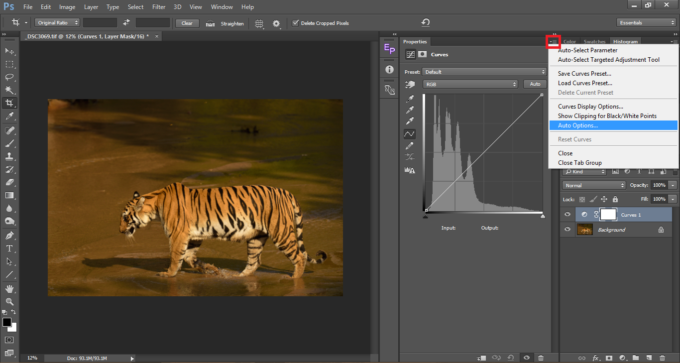
If you take a look at the above image, you can clearly see a yellow color cast. The underside of the tiger which are infact white are off-white giving it a ‘muddy’ look. Color casts also make the image look flat. First let us see how to simply use the Auto Color Correct option in Photoshop (which works great for about 80% of the images) and then let us move to doing it manually. As always add a new curves adjustment layer. In the curves properties window, click on the upper right icon to pop the drop down list and choose Auto Options…
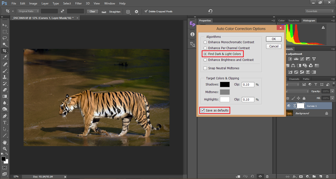
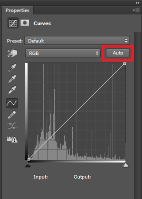
The default option chosen would be Enhance Brightness and Contrast. Instead choose Find Dark & Light Colors. If you want you can check the Save as Default as the other options do not come handy as much as this does and once you have saved it as the default option, you can just use it as a single click color correction option by pressing the Auto button as shown in the image below.
Take a look at the color corrected image above. The color cast is gone and you can see accurate colors.
Hope you enjoyed this article. If you have any questions, please let me know in the comments section below!
another very helpful article. thanks for the good explanation…..and greetings from Colorado!
This is the most informative, most easily understood article on curves I have read, to date.
I’m hoping to read more about using curves to manually perform color corrections, beyond the auto-correct option you discussed.
Thank you..!
Thanks for the very informative article. I’m a novice in photography & photoshop (elements) but slowly educating myself by reading articles such as this, then trying for myself. I can’t wait to experiment with curves on some of my images.
Excellent description of how to use Curves. I did not know that colors could be corrected using
Curves but now I know. Thank you for such an educational article.
I think many photographers understand curves, but they don’t understand when it’s best to use them instead of the built-in sliders In Lightroom & ACR, like the Highlights, Shadows, Blacks, & Whites.
Got any tips on one vs the other? I’ve seen some people exclusively use curves, others ignore curves completely and use just the sliders, and some weirdos even go so far as to do silly stuff like reducing contrast using the Contrast slider and then add it back in using the “Medium Contrast” curve preset in Lightroom. Confusion on when to use what abounds!
You’ve expanded my vision with a relatively short demonstration. I look forward to future articles.
Very good and well illustrated article on Curves. The best I have seen.
Thanks for a great and descriptive explanation on basic curves.
One of the best I have seen.
This is a great article. Thank you.
It is a shame so few photography writersion do not have the courage to write on this topic.
I had pretty well figured out how to use the rest of Lightroom’s features in the develop module but this feature has too many variables to understand by experimentation.
I suspect that few writers understand curves as well as you obviously do. That is why they avoid the topic.
Brian,
It is true that curves are pretty tricky to understand and the learning curve is pretty long. As with most aspects of post processing, however complex a technique is, once we understand the core concepts of how it works, then it becomes relatively simple to use the tool to fit our needs.
Great article. I’ve moved to Lightroom for basic adjustments and then import into Photoshop for more serious adjustments, but I sometimes forget about the powerful tools in Photoshop.
The issue for me with respect to adjustment layers is that the resulting files are huge. Any way around that problem?
Mark,
It is true that every additional layer you make almost doubles the file size. One option would be to merge all layers once you are done editing. But on the flip side, you would not be able to make alterations to previous edits which obviously beats the purpose of layers. Another non destructive option would be to convert your base layer as a smart object and then apply adjustments to the same layer.