Landscape photography goes hand in hand with black and white. It isn’t just because of famous landscape photographers like Ansel Adams, but also because the intricate shapes that attract our attention in nature often “just feel right” in monochrome. Want to take better black and white landscape photos? This article explains why such images work so well, including how to make your own black and white landscape photography as strong as possible.
Table of Contents
What Changes (and Doesn’t) in Black and White
At the surface, a good black and white photo is still just a good photo. You’ll see many pictures that work well in both color and in black and white. Sometimes, it may even be difficult to pick which version is better. That’s pretty clear evidence that the underlying elements of composition are just as important no matter what palette you are using.
The only thing that really changes with black and white photography is that you are eliminating a pillar of your creative toolset. You’re deleting it completely and replacing it with… nothing. And when color is no longer a relevant force, your viewer’s eye is drawn to different places in the image. In a way, the rest of the photo takes on more emphasis and importance as a result.
Say, for example, that you are photographing sunbeams filtering through a morning forest. Your goal may be to emphasize the gentle path of light, especially how it intersects with the texture of tree trunks. Even if there is a green canopy of leaves overhead, that’s not the critical part of your message. Although I have no doubt that such an image could look good in color, it’s not what matters here – where you want all your viewer’s attention on the sunbeams.
And, of course, color actively does damage to other images (rather than simply being an unneeded element of the landscape). Under difficult light, you may find that colors are distracting and counter to your message, making the overall photo look dull or distasteful. If the colors in a photo simply don’t work, converting to monochrome is one of the best remaining tools to improve your photo.
Of course, don’t think you can just convert a bad photo to B&W and end up with something good. If your light, subject, and composition have fundamental flaws, black and white won’t save the day. This is something we talk about in our larger guide to black and white photography.
Specific Considerations for Landscape Photography
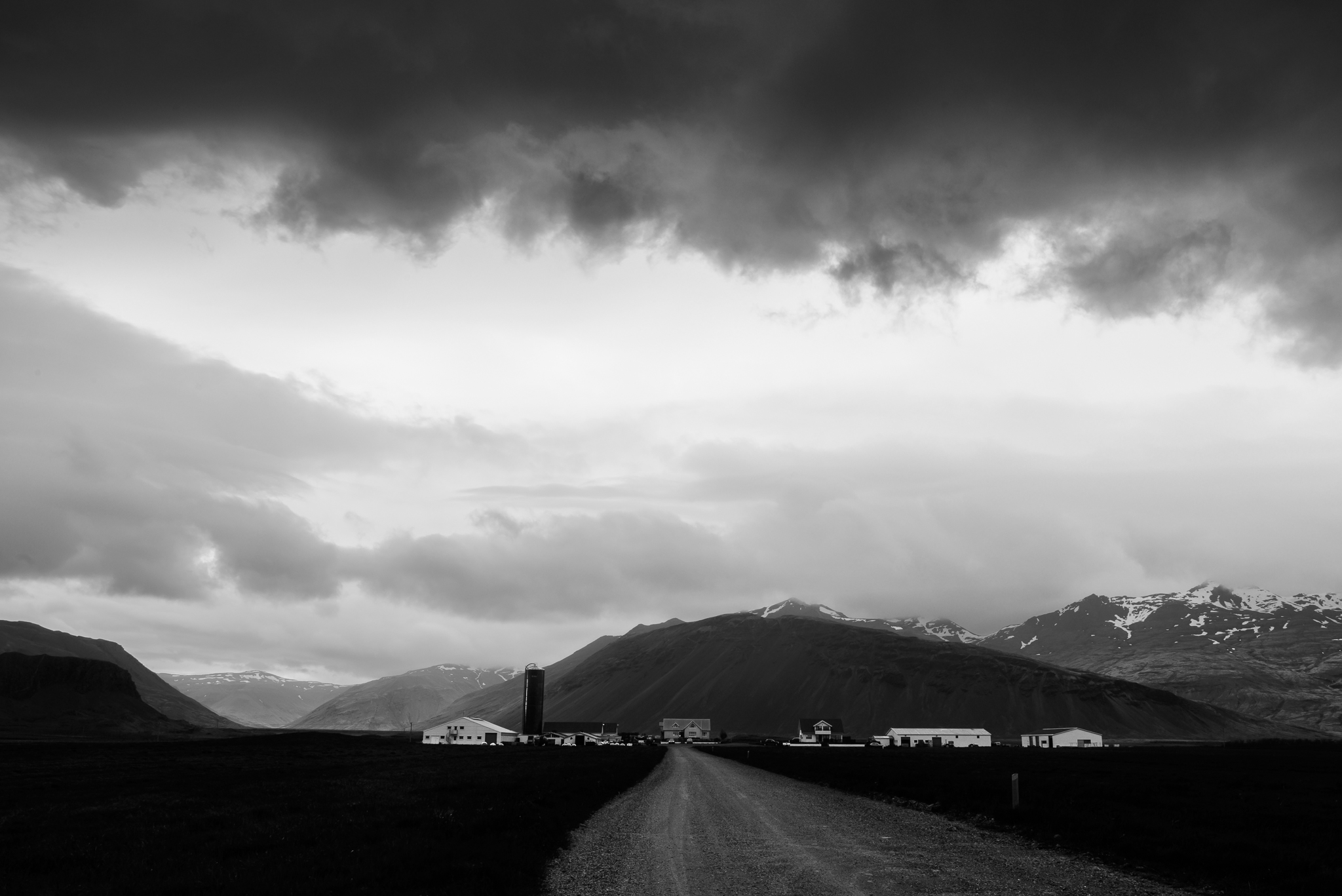
Landscape photography is defined by the following three elements (although not every landscape photo has all of them): foreground, background, and sky. All three of these features change when you shoot in black and white.
First, landscape photographers often choose a foreground based on how it draws the eye. That still applies in black and white, but it’s now more important to find subjects that stand out in brightness from their surroundings, especially with strong shapes or leading lines. It’s why landscapes like rock formations in Utah work so well for black and white work, while something like lupine flowers might not (unless they stand out from their green surroundings in brightness).
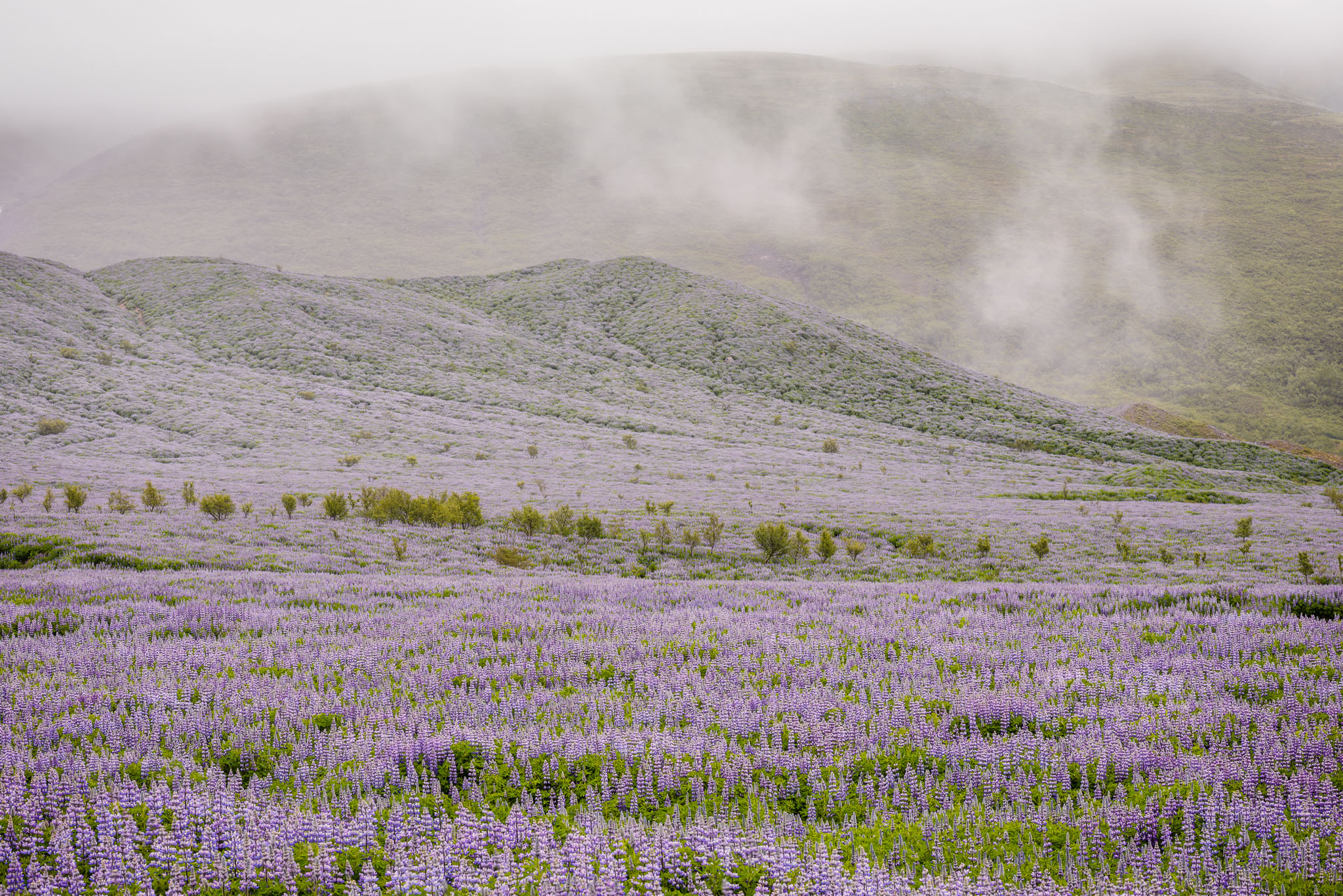
Beyond that are the middleground and background. With black and white, I’ve always found it tricky to avoid large, uninteresting swaths of uniform gray in a photo. It’s a major reason why I rarely convert macro photos to black and white: their colorful out-of-focus backgrounds would become unending gray. By the same token, if the background of your landscape photo has structure only because of small color contrasts, you’ll lose that subtlety in black and white. I would never convert the image below to black and white, for example, since the background is built on the purple/green contrast:
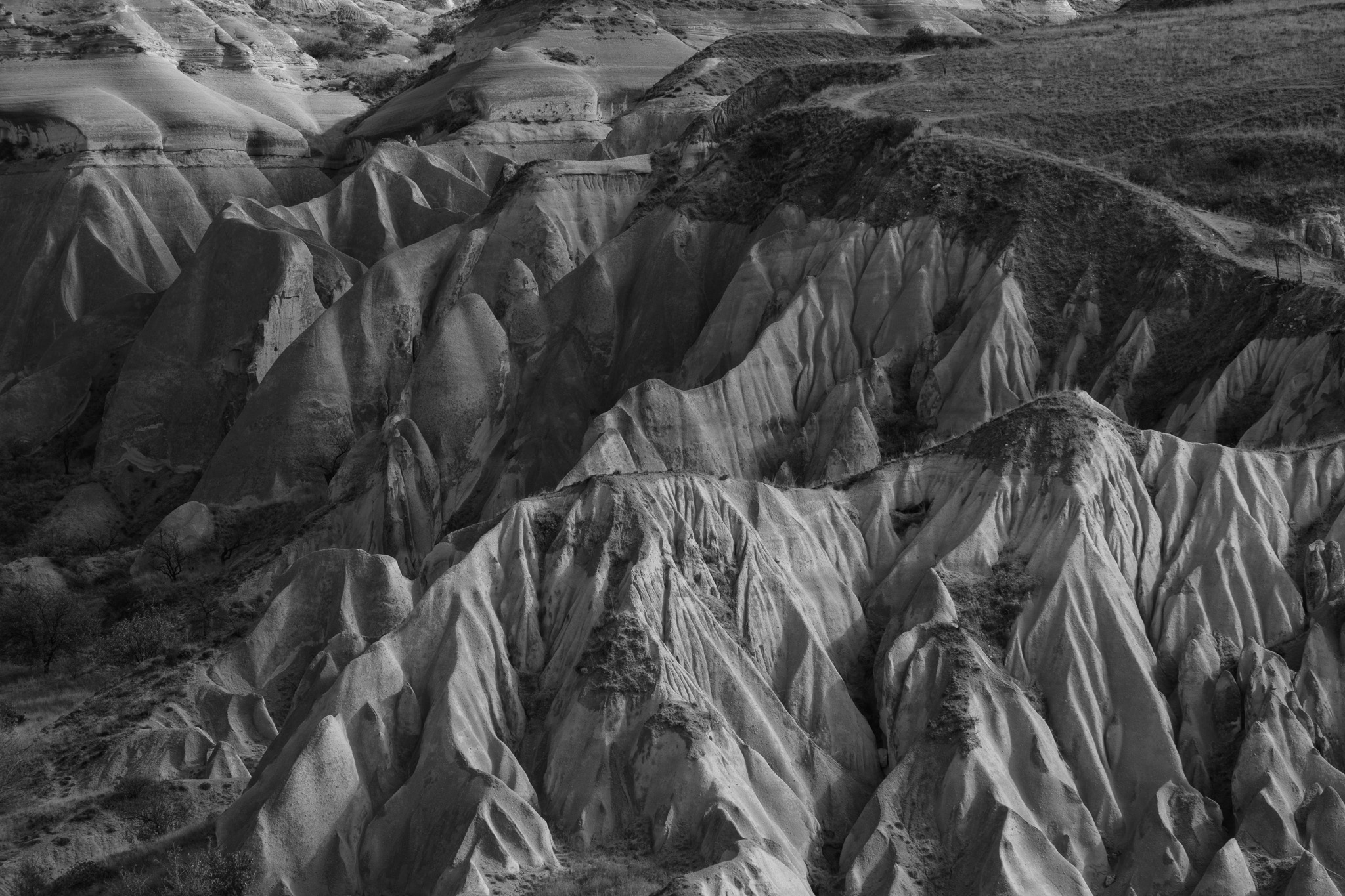
But the photo below has a middleground and background of angular shapes, which are equally strong with and without color:
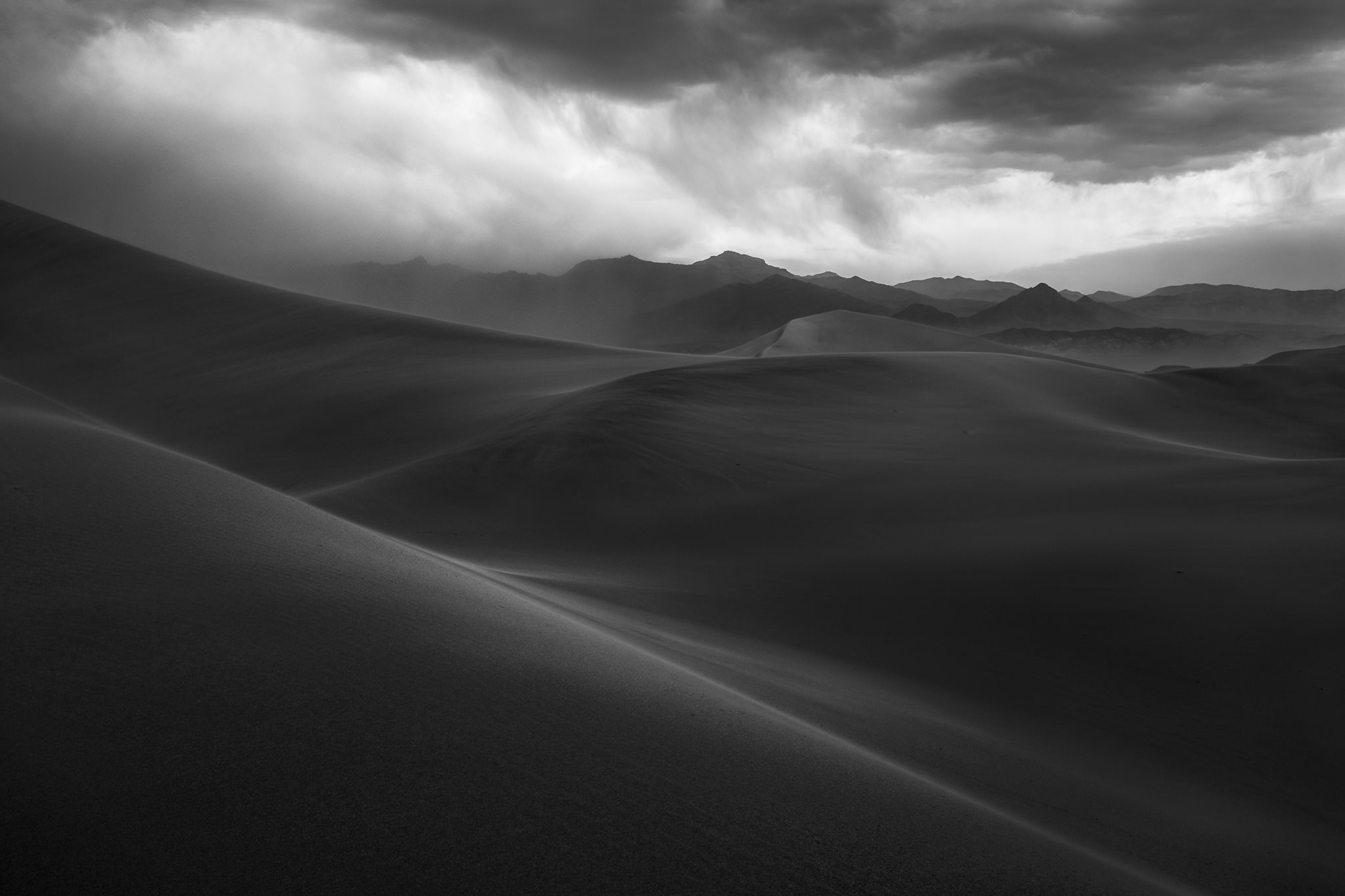
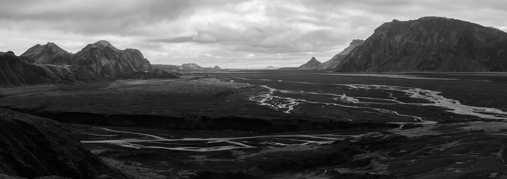
Last is the sky, an element that can make or break any landscape photo – especially in black and white. At sunrise, a gentle pink cloud against the pastel sky can be a very emotive element. But with monochromatic photography, it can fade into its surroundings and look no different than a thin cloud in the middle of the day. It’s not that gentle clouds are always bad for black and white landscapes, but you do have to watch out more that your sky has the contrast you want. This is also why a polarizing filter can be a big help with black and white landscape photography, maybe even more so than in color.
How to See in Black and White
One of the tricky parts of black and white photography is that it often works best when you plan your photos to be monochromatic from the start. You create your composition with contrast, light, and texture in mind – not color. But we don’t see the world in black and white, so it’s not a natural thing to do. How can you find your way around this mental block and envision the world more easily in shades of gray?
The obvious answer is that you’ll get better at it over time, especially if you shoot in black and white a lot. Does anyone doubt that lifelong B&W film photographers can envision almost any landscape accurately in monochrome? There’s nothing stopping digital photographers from exercising the same mental muscles – although that route takes a lot of time before you have a perfectly accurate “monochrome mindset.”
In the meantime, there’s a bit of a cheat: set your in-camera JPEG mode to black and white, while still shooting RAW. This doesn’t change the RAW data from any camera (it’s still a color image when you open it on your computer) but you end up with a live black and white preview on the LCD or EVF. I’ve always found this to be the easiest way to envision monochrome images in landscape photography. It also comes without any real risks, since you can always revert to the color version back on your computer.
To Filter or Not to Filter?
Aside from polarizers, which I highly recommend, are there any other special considerations for using a filter in black and white landscape photography? After all, some of them – specifically color filters – are almost exclusively intended for monochrome work. It seems a bit of a shame to leave all those high-quality red and yellow filters on the shelf of the camera store. But that might actually be the right move.
First, here’s a quick illustration of a color filter’s effect on black and white pictures:
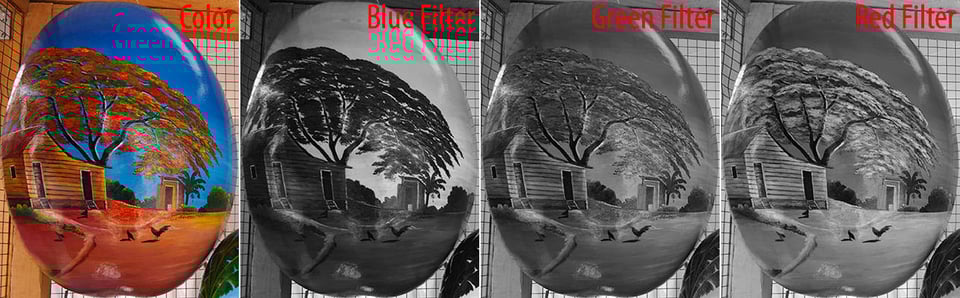
As you can see, color filters lighten objects with their color, while darkening the opposite (complement) color. For example, a red filter darkens blue and green while brightening red areas. In most landscape photos, this increases contrast by darkening the sky and grass, while leaving other parts of the image unscathed. B&W film photographers commonly buy a filter set of red, orange, yellow, and green, although you can find them in far more colors than that if you look.
My biggest problem with color filters for black and white photography is that their effects are not really possible to remove if you later decide you prefer the color version of an image (a digital-only problem, of course). You’re committing yourself pretty strongly to black and white when you use one of these filters.
Not to mention, if you don’t use a color filter, you still have the option to replicate it in post-processing without much difficulty. You can just select the “blues” or “greens” and darken/lighten them as you please. The effect isn’t exactly the same, and overdoing it can add noise to an image, but ultimately it’s the more flexible option in many cases.
For that reason, unless you are shooting film or really want to go all-out with digital, I don’t recommend color filters for black and white photography. Stick with a polarizer (and ND filters as needed), and you’ll be good.
Rapid-Fire Creativity Tips
There are a few elements of creative photography that matter more in black and white than anytime else. Here are the most important of those tips for capturing landscapes in monochrome:
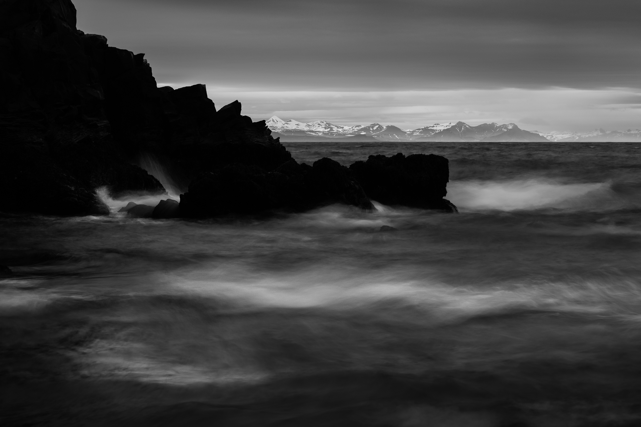
1. It’s About Shapes (and Contrast)
I’ve alluded to it a few times, but black and white photography doesn’t give you as many elements to work with in terms of separating and defining your subject. You can’t rely on color to do your bidding. Instead, shapes and contrast do that job, because they stand out no matter their color. So, when you’re framing a composition, be aware that viewers will lock onto shapes and contrast very easily in B&W work, more so than in color. It’s how their eyes move across the frame.
2. Watch the Shadows
Shadows carry emotion in every photo. Are they hard-edged and nearly black? The photo will look more intense and powerful. Are they open, with smooth transitions? The photo will appear calmer and gentler. Creative photography is about conveying the emotions you want – and for black and white, that starts with your shadows. Both in the field and in post-processing, pay attention to the darkest regions of the photo. The rest of the image will flow from there.
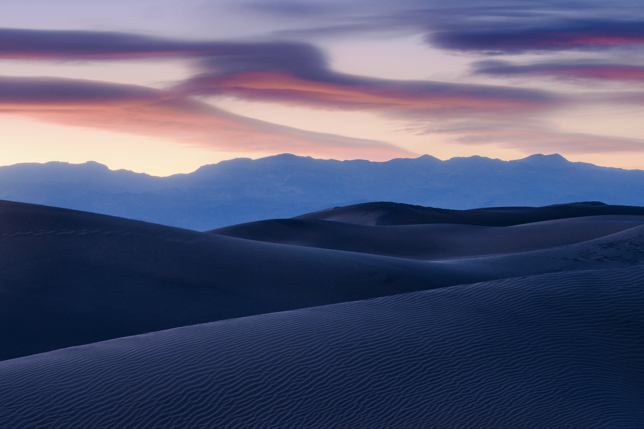
3. And Explore the Midtones
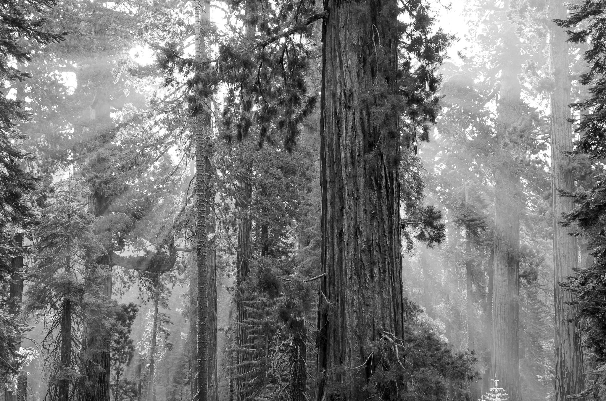
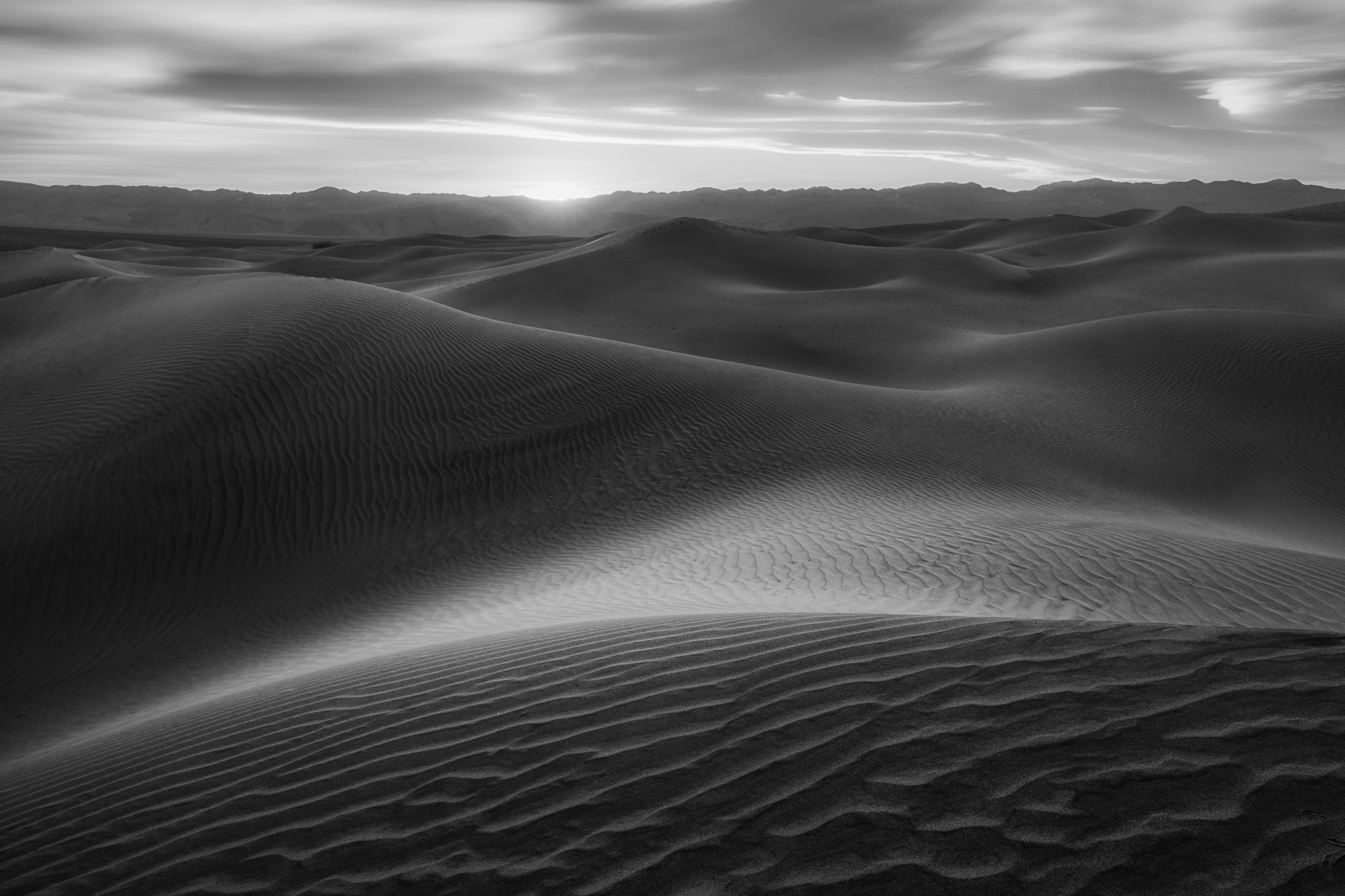
It’s a bit of a myth that every black and white photo needs to have both pure white and pure black. No one will recommend that to you outright, but it’s a subconscious style that many photographers adopt because it’s what we see in other monochromatic work. There’s nothing wrong with the midtones, though; many of my favorite B&W images of all time are low-contrast landscapes centered on middle gray, such as images of aspen trees and sand dunes. High-contrast images work in many cases, but that’s not the only way to create good black and white work.

4. Spend Time in Post, Locally and Globally
I see a lot of people convert an image to black and white, add some contrast, and maybe slap on a “noire” preset. To them, black and white is jut an easy way to edit a moody image – a tool lacking in subtlety, much like an Instagram filter. But black and white photos demand just as much post-processing as usual, and more in many cases. That includes both global and local adjustments.
To me, global edits are about emotion, while local edits are about drawing the viewer’s eye. Use basic adjustments to brightness and contrast to impart the mood you want on a photo, while you locally dodge and burn objects in the landscape to emphasize or obscure them. Black and white photos often allow more intense processing than color photos before they appear fake, but it’s just as important as ever to be subtle and not overdo your edits.
5. Learn the Elements of Emotion
Every decision you make in photography – whether black and white or not, landscape or not – has an impact on the photo’s emotion. Are you composing a balanced or imbalanced frame? Is the image bright and airy or dark and powerful? Are the lines in the photo smooth and curved or rough and jagged?
Be aware that each of these choices – and countless others – are the building blocks of a photo’s mood. Focus your composition on including elements that add to your chosen mood and message, not detract from them. And it might just be me, but I think viewers often notice these things consciously in black and white more than in color, since the image is less about realism and more about the fundamental elements of composition.
When Black and White Landscape Photos Don’t Work
Some objects, we identify almost exclusively by their shapes: tree branches, fences, rocks, sand dunes, and so on. We don’t need colors to understand what they are, or to relate to them. For that reason, they often – though certainly not always – look good in black and white.
Other things rely on color. When I Google “black and white photo with rainbow,” half the images include a color rainbow. Because, really, a bright curve doesn’t strike us as a rainbow unless it has colors. The same is true with something like a ladybug – so associated with its red color that it hardly feels like the same subject otherwise. Sure, you can take black and white photos of either of these subjects successfully, but it’s far from the norm. And it can feel strange if you attempt it without care.
No, if color is what gives your subject structure and personality, it’s usually best to keep it in. I mentioned earlier that color contrast is sometimes essential to avoid a muddy look in the image, and that remains accurate. But in many cases, the true reason to take a color photo is more fundamental: color is an important part of the subject’s story. Removing color would harm your message, not improve it, since the emotion you’re after is well-served by the hues in the image. See also our article on the emotions of color in landscape photography.
Conclusion
Hopefully, this article gave you some food for thought with black and white landscape photography. There is no rule saying when a particular photo will work well in black and white or not; a lot of it is about taking a step back and examining if it just looks right to you. But underneath the “looks right” impression are the variables I talked about above – things like color contrast, emotion, light, and shapes, all of which change in message when you make that conversion.
Are there any subjects you prefer for black and white landscape photography? I’ve always been a fan of monochromatic sand dunes and forests, while usually preferring color for wide-angle sweeping vistas at sunrise or sunset. Then again, you can take good black and white pictures at any type of landscape. It just helps to know ahead of time that it’s what you plan to do.

Excellent article to understand the key elements of B&W photography. Will bookmark it for future reference. Thank you
Howard, thank you for the comment, and I’m happy to hear that you liked the article! Tell all your friends :)
I really like using SilverEfex in the Nik Collection, even though DxO bought it and set a high price for the formerly free package. There are so many interesting possibilities that pop out with the options they provide. The hardest part is deciding which if their presets work best.
I’m also a fan of SilverEfex, and despite the price, I’m glad DxO picked it up from the dead… it would be sad to see such awesome software eventually grow unusable due to compatibility issues.
While I understand where you are coming from on the pricing from DxO (what, $50-60 US), it would be good to put pricing in some perspective. When I bought the full set from its developer, Nik Software, the price was $500+. Unlike the internet, we can’t really expect all things to be free.
Spencer,
Thank you for another excellent article. Along with the well-written narrative, the beautiful photographs certainly reinforce the points you are making. I love B&W photography, but have not done any since my film days many years ago. After a rather lengthy hiatus from photography and subsequent switch to digital, I have shot only in color. Converting some of those images to B&W with post processing software will present new challenges.
John
Thank you for this article. I am just getting started in photography as a hobby. I love black and white photos because of their moodiness. Without color as a guide, certain shapes seem alien and intense. Genres like noir and horror seem to blend well with black and white imagery… I can’t wait to work my way through the complete guide next!
Jon, agreed – there is a sense of surreality in black and white that is hard to capture any other way. It’s difficult to describe (hopefully this article pins down at least some parts), but easy to see.
Thank you, John, I’m glad you enjoyed the article. Although it might have been a while since you shot black and white, I suspect you’ll get back into things pretty seamlessly. Whether digital or film, it’s not about the tools you use to convert a photo (those can be learned in a couple weeks), but about the creativity and vision behind the shot – and that’s not an easy thing to forget.