One of Lightroom’s simplest, most useful post-processing options is the humble split-toning panel. Buried between the HSL and Detail sidebars, split-toning isn’t exactly a go-to tool for most photographers. And why should it be? From tint to saturation, Lightroom already offers several ways to change the colors of an image; another option seems unnecessary. In truth, though, split-toning is far more useful than it may first appear, and certainly more valuable than some photographers believe it to be. In this article, I will cover in-depth the uses of split-toning, as well as the issues that arise from this interesting tool.
Table of Contents
1. What is Split-Toning?
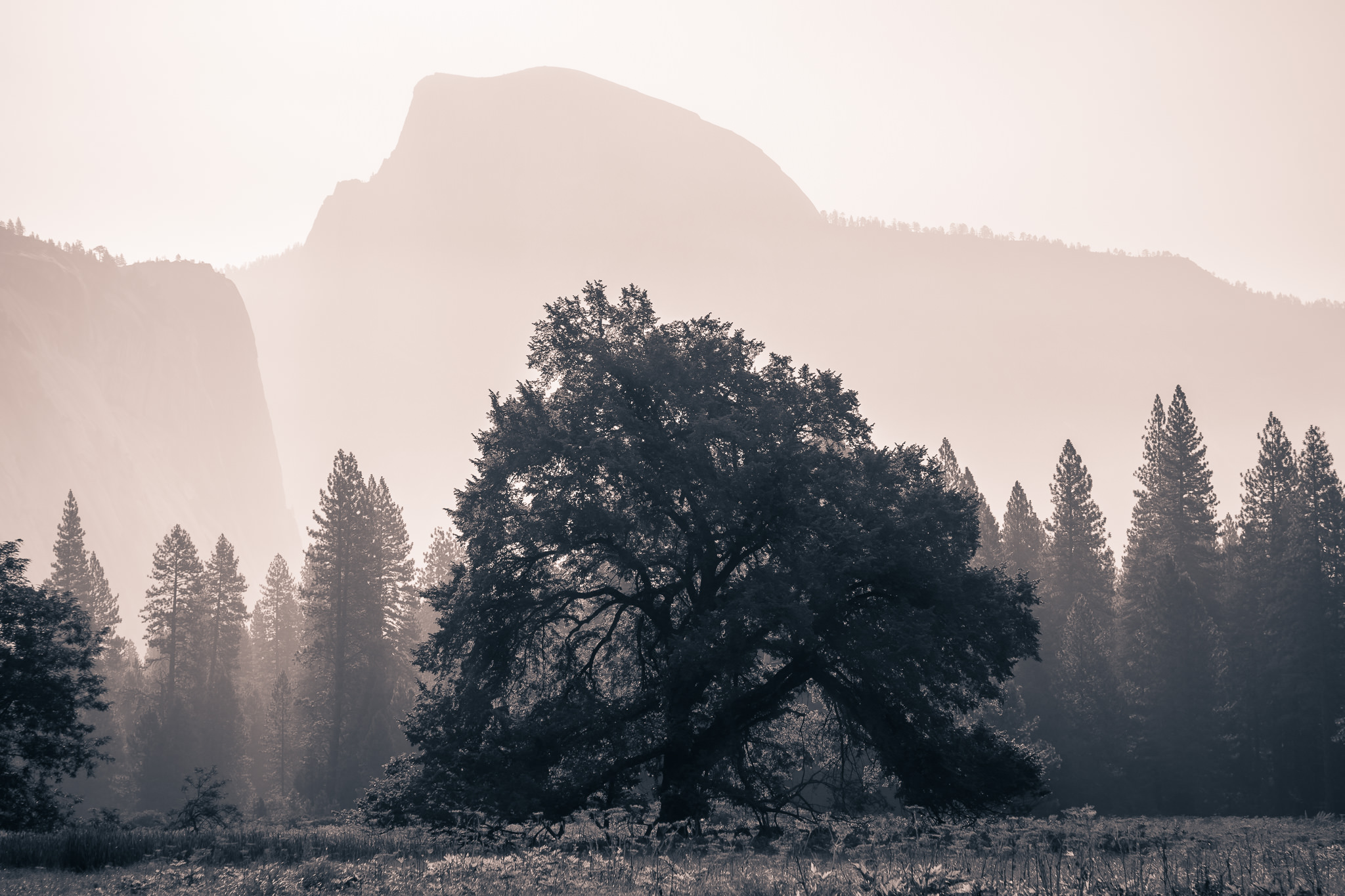
At its most basic, split-toning is simply the addition of two different colors to the highlights and shadows of a photograph. Split-toning is a slight variation on toning, which is the addition of just a single color to an image. This subtle difference is easy to notice in practice, as shown in the two examples below:

Toning has existed since the dawn of photography. Most old photographs appear tinted, either due to the photographer’s darkroom work or the print’s yellowing over the years. At the same time, toning – including split-toning – has rebounded in popularity recently, thanks to smartphone apps like Instagram. Sepia photographs, along with blue cyanotypes or other toning variations, have an innate vintage feel.
In my opinion, the trend of faux-vintage filters has harmed the reputation of toned images. Photographers from Edward Weston to Nick Brandt have produced a majority of their prints in sepia or similar tones, and their images are no less powerful as a result. Now, unfortunately, people associate toned images with cell phone snapshots more than anything, which can lead photographers to avoid using such techniques in their own work.
Indeed, toning and split-toning can be valuable additions to your toolkit, even as high-end or professional photography. Often, there is no other way to adjust the colors of your image properly; other times, split-toning can add an element of style that is otherwise impossible to achieve. In other words, whether or not you prefer toned images, they are not inherently gimmicks.
2. Available Options
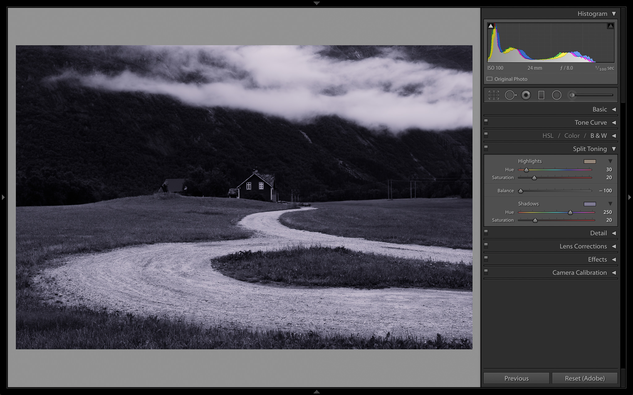
Lightroom’s split-toning option is quite easy to use, both for split-toned and single-tone adjustments. There are only five options: highlight hue, shadow hue, highlight saturation, shadow saturation, and balance. Check the image below:
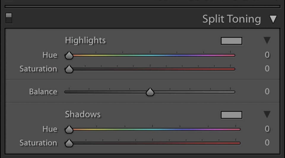
The effects of these five adjustments are fairly easy to understand, and I encourage you to test them out on your own images. Essentially, by splitting the highlights and shadow adjustments, Lightroom lets you achieve a full split-tone effect; dark and light areas of the photo can be tinted differently.
The saturation adjustment simply controls the degree to which an image is toned. High saturation will add a very strong color, whereas low saturation will merely hint at the added tone. The “hue” options control the actual color that you add; for example, a blue “hue” will tone your photographs blue.
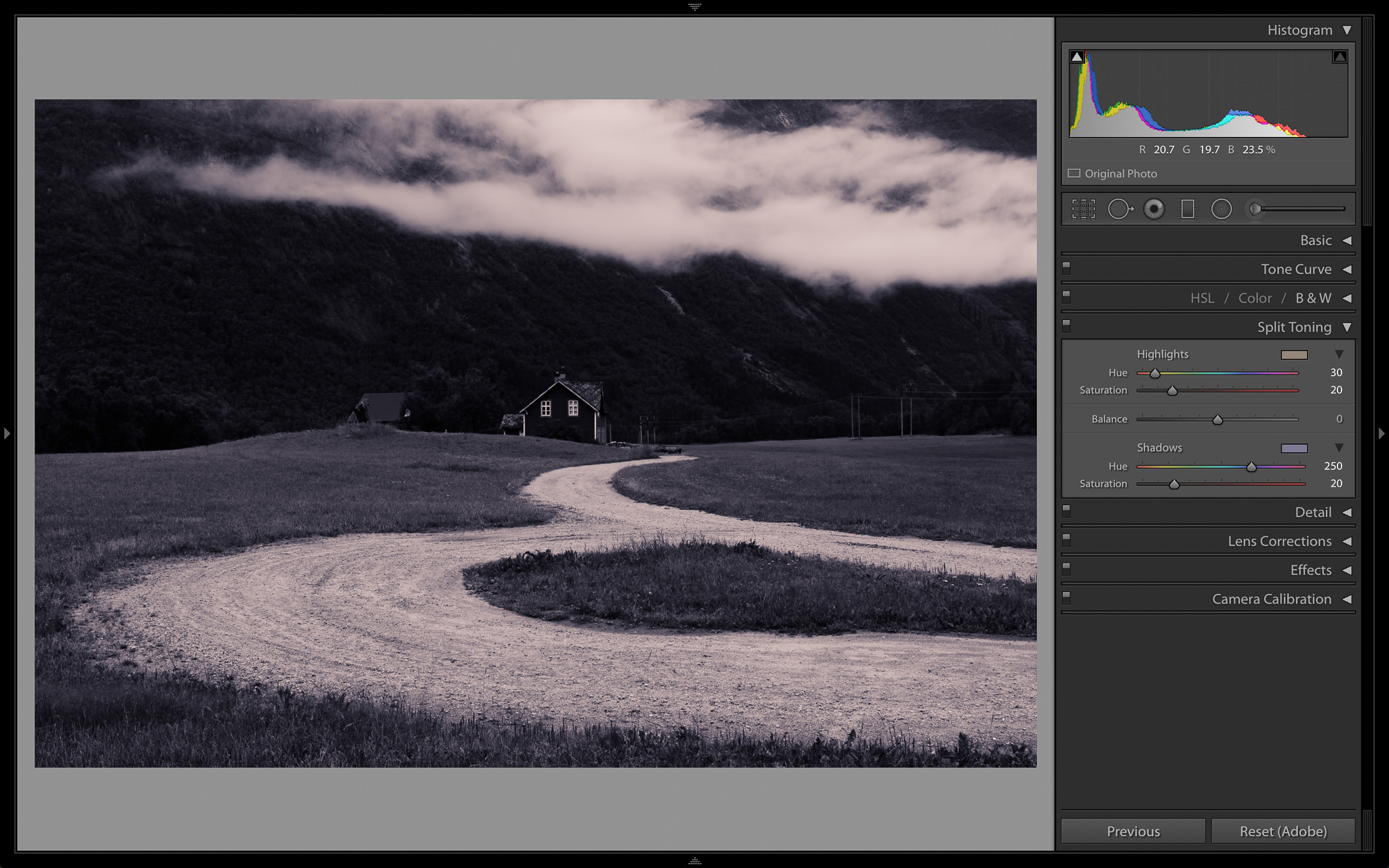
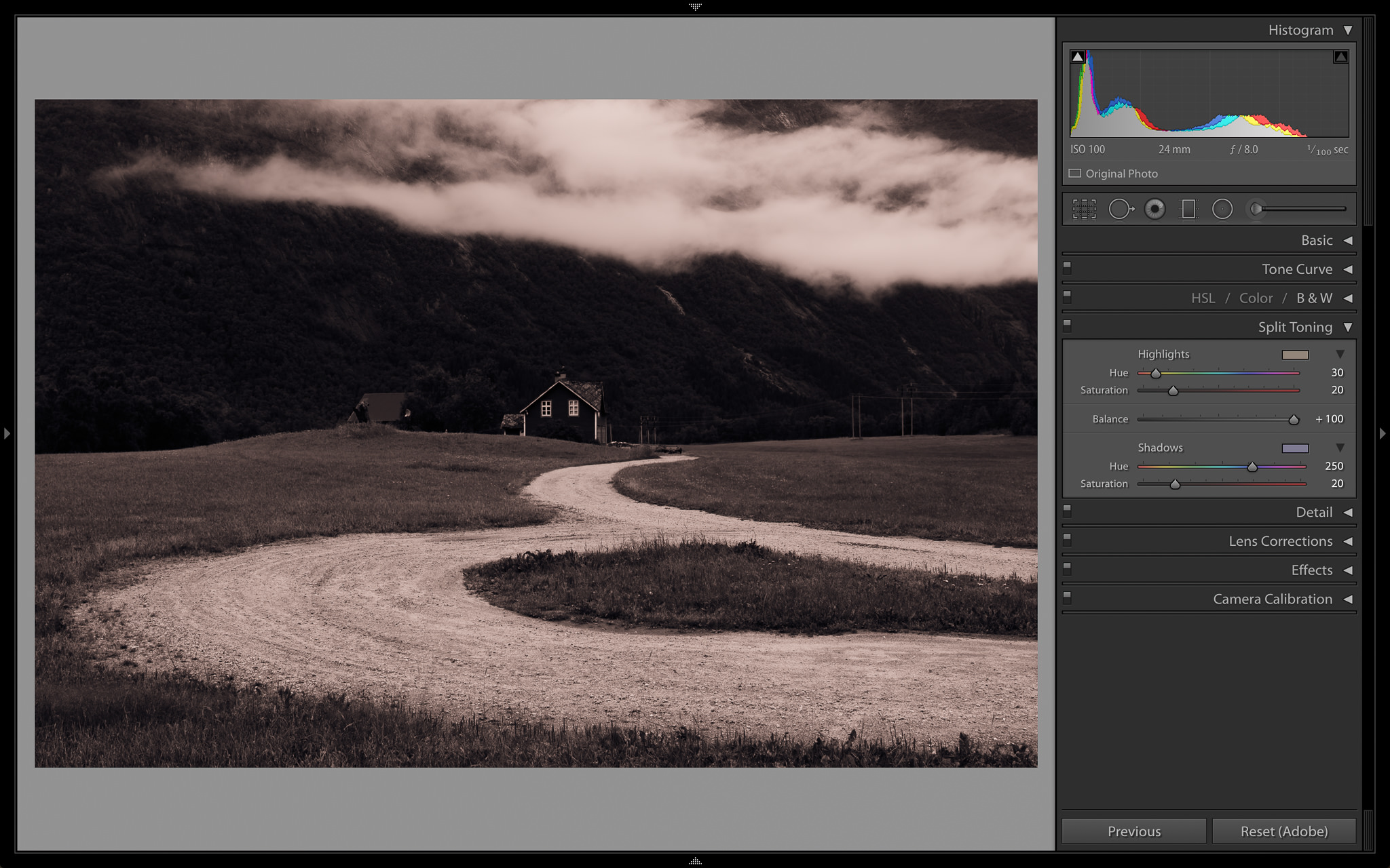
Balance is the trickiest option, and even it is very easy to use. Essentially, balance lets you define exactly which brightness levels qualify as shadows or highlights. If you move the balance slider to the far right, everything in the photo will qualify as a highlight; by moving the slider to the far left, the entire image will qualify as a shadow. The balance slider allows you much more precision with your split-tone adjustments, as shown below.
There are two additional elements of Lightroom’s split-tone panel that are worth discussing. First, look at the small rectangle near the words “Highlights” and “Shadows” (shown below):
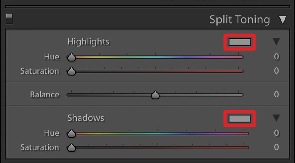
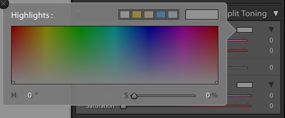
If you click on these, you access an interesting adjustment menu that is not obvious at first glance. This option allows you to choose a specific color within a large range; it essentially combines the “Saturation” and “Hue” options into one adjustment (see below). The color sampler doesn’t let you do anything new, but it provides perhaps an easier way to visualize the changes that you make. This all comes down to which method you find easier to use.
Lastly, a “hidden” option in the Split-Tone panel is the ability to envision exactly which tone you are adding to either the highlights or the shadows. Simply hold down the “alt” key (“option” for Mac) while moving the “hue” or “balance” sliders. You will instantly see a high-saturation version of your changes! This makes it far easier to tell which colors you are adding to a photograph, particularly if your adjustments are minimal.
3. Tinting Color Photographs
The classic way to split-tone your images, and the most familiar option, is to make these adjustments to a black and white photograph. Indeed, every image that I have included in this article so far has been black and white, since split-tone adjustments are much more obvious for such photographs. However, in Lightroom, you can tint color images just as easily.
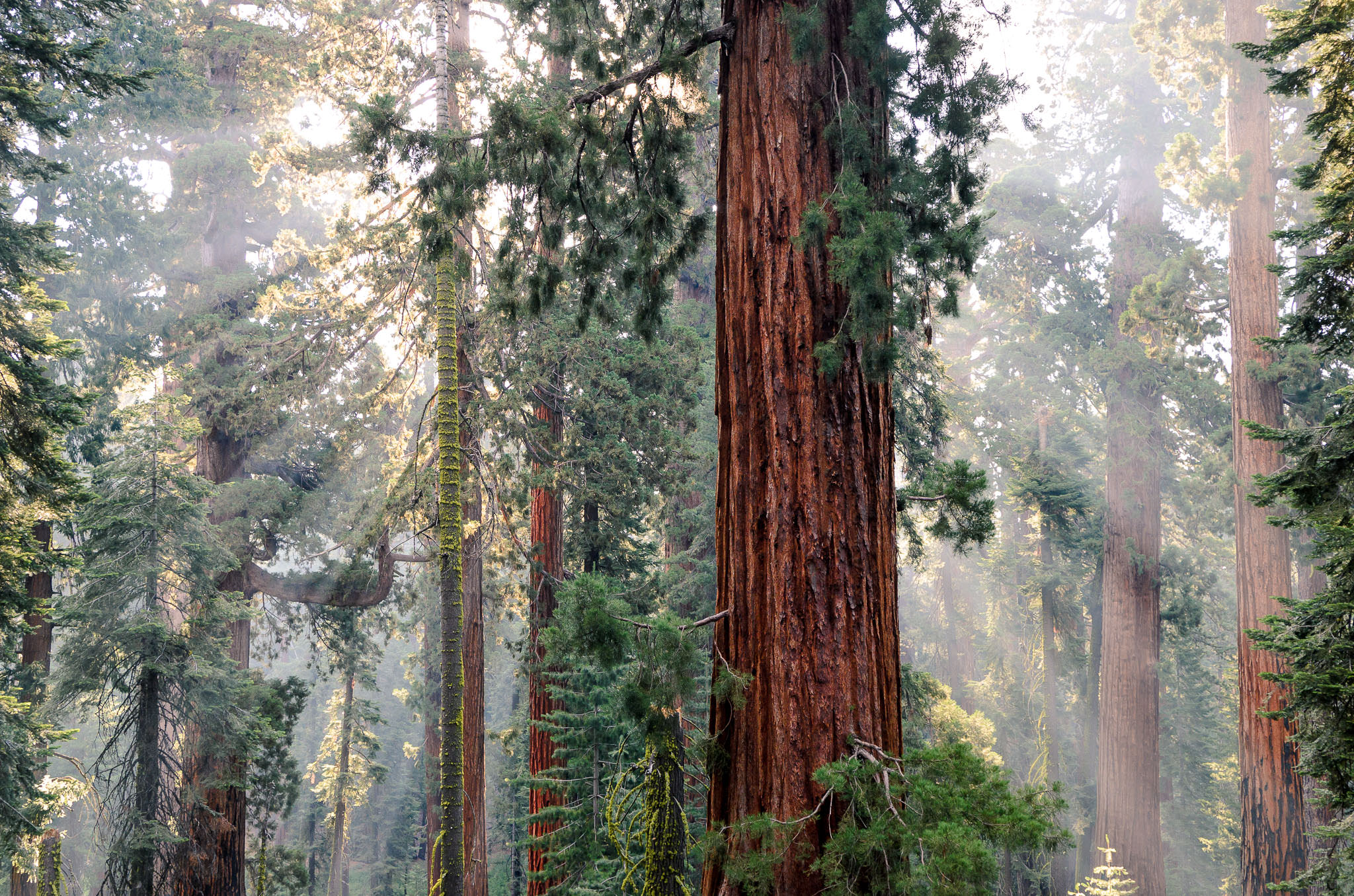
Why would you want to do this? It depends upon your situation. As I mentioned before, Lightroom offers many ways to adjust the color of your images; the most popular is the color temperature adjustment in the “Basic” panel. However, there are some situations that favor split-toning instead. Consider the image below:

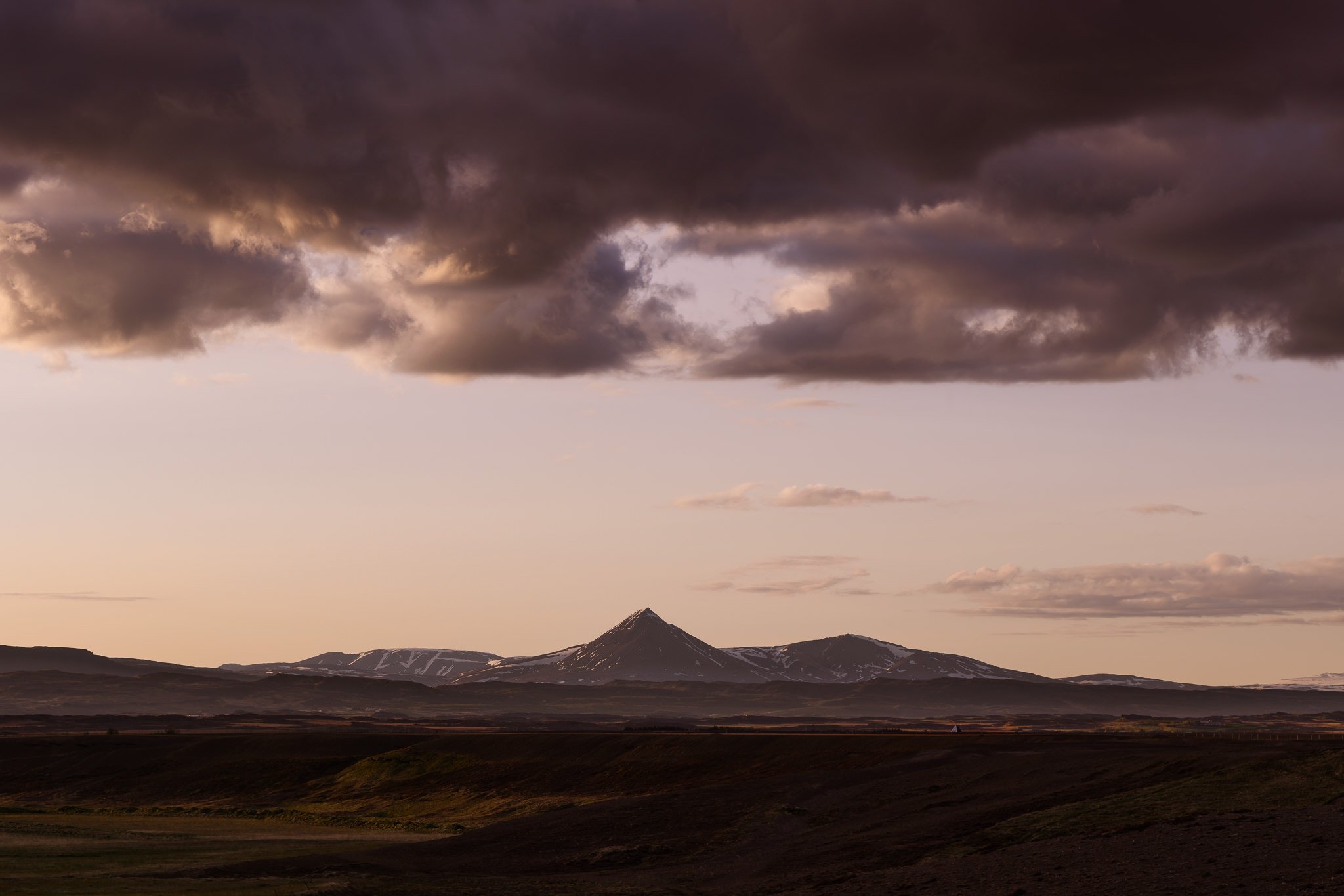
I am happy with the photograph above, but I would like the highlights to be warmer (more yellow-gold) in color. As it is, they are too bluish for my taste. The rest of the photo looks the way I want; only the highlights need adjustment. In this case, although I could change the color temperature, doing so would harm the rest of the image. See below:
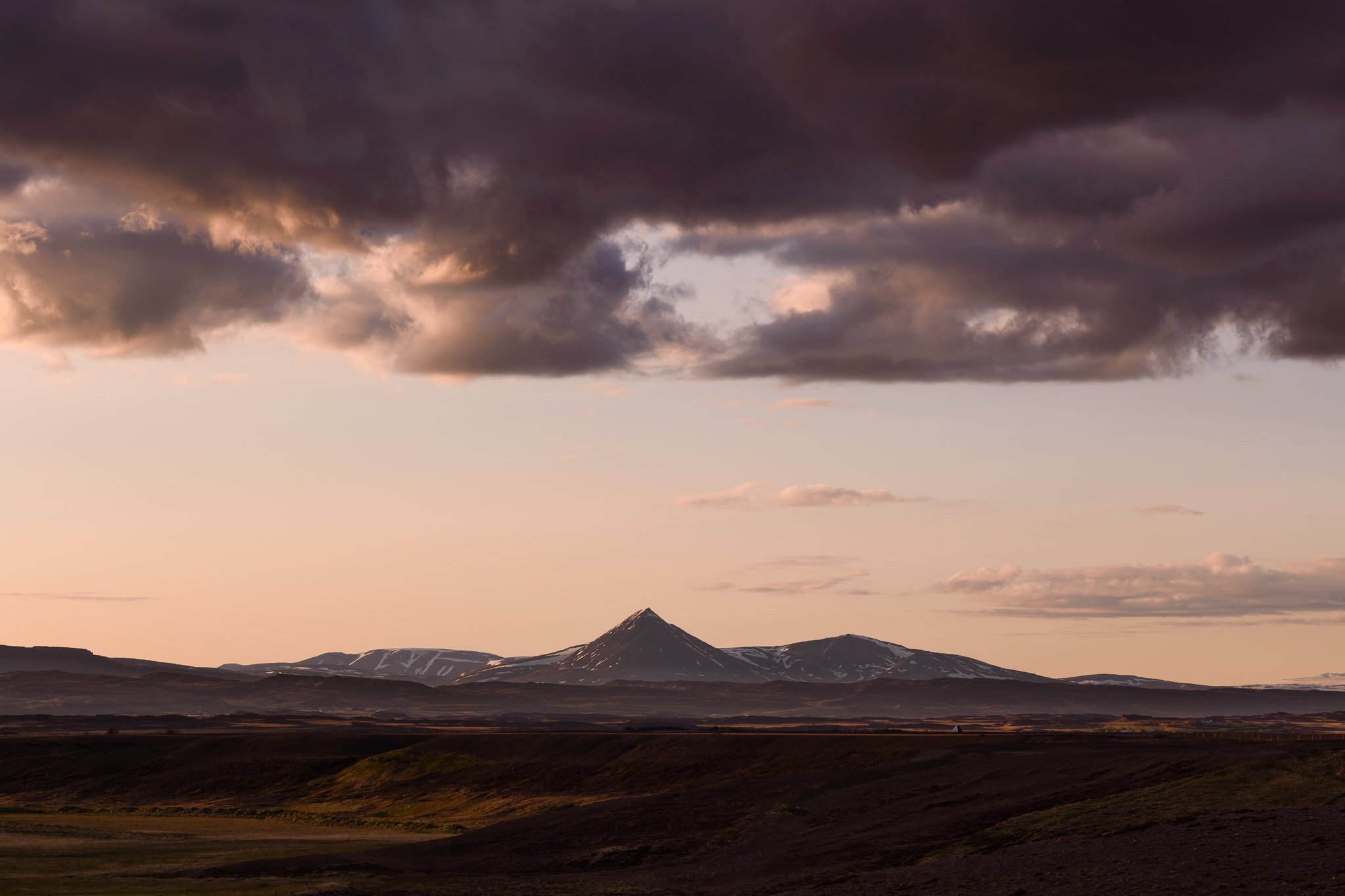
Although this adjustment above changed the color of the highlights – which is exactly what I wanted – it hurt the colors everywhere else. In particular, the tree trunk is far too red. Instead, a much better way to warm the image is with a split-tone adjustment to the highlights only, as shown below:
For the version above, I adjusted the highlights with a hue of 37 and a saturation of 40, toning them gold in color. I also used a balance setting of -62, which ensures that only the brightest highlights are affected by this adjustment. Note that the highlights have become much yellower in color, but the tree trunks have retained their original color.
This image demonstrates the most popular split-toning adjustment: adding yellow-gold colors to the highlights of an image. By the same token (although not something I did for this photograph) it is very common to adjust the shadows to appear slightly blue in color. These are just generalizations, of course, but they mirror the way we see the world; shadows are blue, while sunlight is gold.
Clearly, split-toning can be a valuable tool for certain images. Although other adjustments may lead to a similar result, the simplest option for the photograph above was clearly the split-tone panel. However, there are some scenarios to avoid split-toning, including times when the color temperature slider is far more effective. I will discuss those situations in the next section.
4. When to Avoid
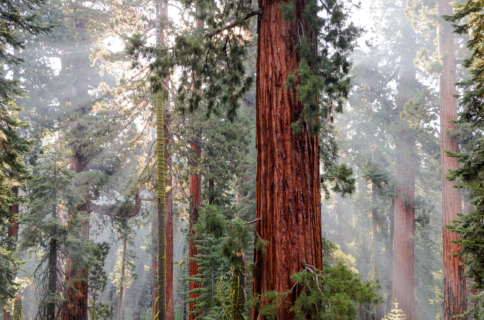
In the redwoods photograph above, split-toning certainly worked better than the color temperature adjustment. Theoretically, split-toning changes would often be preferable to the color temperature slider, since color temperature does not offer as many adjustment options. In practice, though, this is not true.
Color temperature uses a different algorithm than split-toning and one which responds better to large adjustments. Consider the image below, which is directly out of the camera:

This photograph is far too cool (blue) for my taste, so I need to adjust the colors in the orange direction to compensate. Here, I have two different options. First, I could use the split-toning adjustment, changing both the shadow and highlight hue values to orange. Alternatively, I can change the color temperature in the “Basic” tab. In this case, the color temperature adjustment is preferable. See the images below; the “Before” was adjusted with split-toning, whereas the “After” used color temperature instead.
Both of these options are better than the original version. However, between the two, I prefer the one adjusted with color temperature. Note, in particular, the highlights near the bottom-left of the image. With the color temperature adjustment, this region maintains contrast and detail; the split-toned version, by contrast, is faded and flat. You may like that faded look – which certainly is not wrong – but I tend to prefer the higher-contrast version. At the very least, the two are markedly different; in many situations, those differences will not favor split-toning.
Essentially, as your adjustments become more extreme, split-toning causes the image to lose detail in its highlight and shadow regions. That is to be expected; split-toning is meant to add character to your photographs, not (typically) to fix your white balance. Still, it can fill a double duty for some shots. If you want a stylized photograph, you certainly should feel free to adjust “white balance” with the split-toning tool; I just don’t recommend it if you want the most realistic image.
5. Conclusion
Split-toning is one of Lightroom’s lesser-discussed tools, but it certainly has its uses. If you are working with a complex photograph, fixing difficult color-related issues, it can be a valuable tool to target your adjustments. Or, if you are trying to add a stylistic element to your shots, split-toning may be a welcome part of your toolkit.
At the same time, though, split-toning adjustments can stick out in your photographs – particularly when the saturation slider is pushed near its limit. If you want an image to look natural, use this tool carefully. Then again, who says that an image must look natural? Split-toning adjustments add character and style to a photograph, which could fit your goal perfectly. As with all post-processing, the value of the split-toning tool depends entirely upon the look you are trying to achieve.
Great discussion & very helpful – fun to read. Thank you,
i love jacob martin
Thank you for a concise explanation of this tool. I will experiment on my own travel photos.
really fun using this feature… great article!
Just got around to reading this, nice one Spencer, cheers. It’s explained a lot of what I’ve been seeing over the last few years. I’m not a fan of image manipulation, and it’s opened my eyes to what people are doing.
Excellent article and explanation, thanks a lot!
Thank you for the useful article.
Just wanted to add my thanks for this useful article. I’m looking forward to better control over my images now!
Excellent article. Thanks !
Thanks Spencer! There is another application for the tone splitting pane in Lightroom. Say you would like to reduce your picture to just two colors and get rid of all the others.
In order to create a two-tone version of your photo, just convert your photo in LightRoom to Black&White, and do nothing else. One click.
Then, follow the proces you have described in your article.
Et volia (@Claude B, this is my best French), it will bring out your picture in two tones and make an instant Andy Warhol out of us.