When my article on field curvature was published a while ago, where I talked about how one could do a quick analysis of lens MTF data and determine if it exhibits any field curvature, some of our readers expressed interest in understanding how to read MTF charts. Since we talk quite a bit about lens performance and MTF data here at Photography Life, I decided to write a detailed article on the subject and do my best to thoroughly explain everything related to MTF curves, charts and all the verbiage that comes with them.
Because many modern lens manufacturers publish MTF data to show the potential performance of their newly released lenses, it can be quite useful to know how to interpret the provided data – whether you are researching lenses, comparing them, or evaluating their performance before making a purchasing decision. At first, MTF charts seem to look overly complex, but once you understand the underlying basics, you will be able to quickly assess the data and draw important conclusions.
Table of Contents
Contrast and Resolution
Before we talk about MTF, it is a good idea to get familiar with the terms “contrast” and “resolution”, since both terms are used throughout this article extensively. For most photographers, the term “contrast” is associated with a slider in Photoshop or Lightroom that is used to increase global contrast in images and make images “pop”, as some say. Resolution, on the other hand, is often associated with sensor and image resolution in pixels, like “800 x 600”. While the two terms sound like they have nothing to do with each other, they are actually interlinked in optics and mean different things. In the world of optics, resolution stands for the amount of fine detail that a lens is capable of transmitting (which is also known as “microcontrast”), while contrast stands for the ability of a lens to distinguish between different light intensities (e.g. blacks and whites). When contrast levels drop significantly, black and white lines eventually become gray and indistinguishable. Take a look at the following example:
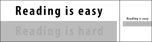
Looking at the left (large) side of the image, you can read “Reading is easy” with ease, without having to concentrate your eyes. Contrast is very high here and there is clear distinction between pitch black and brilliant white. On the lower side, however, I changed the white background to gray and made the black color slightly darker in comparison. The “Reading is hard” text is now harder to distinguish. It is still perfectly readable, because the text is big and your eyes can still see the borders between the two shades of gray. However, if the same image is reduced by 400%, you can still read the high contrast text (since it has plenty of resolution), but you will have a hard time reading the bottom text without concentrating your vision. And if you still think you can read it easily, pay close attention – the text now says “Bead1ng is baid” instead of the original text. Had I not told you about this, you would have never noticed the change in text. What this shows, is that both resolution and contrast are equally important: a lens could have high resolution, but lack contrast, and vice-versa. A good lens must be able to resolve enough detail, while having a reasonable amount of contrast to distinguish between those details. Take a look at the below photograph that illustrates three different extreme case scenarios:
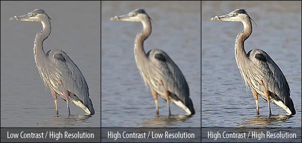
The image on the left clearly shows very low contrast (a rather exaggerated example for illustration purposes), while resolution remains relatively high. You can see some feather details on the heron, but lack of contrast in the image makes many colors and shades indistinguishable. In short, the lens provides enough resolution, but not enough contrast. The middle image has plenty of contrast, however, lack of resolution makes the image appear blurry. The image on the right, however, has both high contrast and high resolution, which makes us perceive it as the sharpest and the most detailed of the three.
To be a little more technically correct, I am going to rephrase the above. You would never say something like “that photo has high resolution”, but rather something like “that photo is sharp”. Now we are going to dig a step further into the definition of sharpness and its perception.
Perceived Sharpness
No matter how you look at it, sharpness is always subjective. One image could appear sharp to one person, while appearing blurry / soft to another. That’s why there are so many never-ending debates on why one lens is better than another, or why manufacturer A is better than manufacturer B. The fact of the matter is, people perceive sharpness differently. If I say that the Nikon 200-400mm f/4G lens is soft with the 2x teleconverter due to significant loss of sharpness, there will always be someone that will argue otherwise. Not because they have a better copy of the lens or the teleconverter, or better technique, but because their perception of sharpness is very different from mine. What I define as “unacceptable” could be “reasonably sharp” for someone else. This has happened to me recently, when one of our readers complained about my comment and sent me a “sharp” photo. After I opened the image, I could clearly see that it was far from being sharp and it even lacked contrast, but the sender apparently did not think so. For many photographers, reasonable sharpness with enough detail to be able to downsample and sharpen the image for the web is more than adequate. Whereas for me and many others, that’s really not an option, because we want to sell high-resolution prints, not tiny images that will only be shown on the Internet. And many of us that photograph little birds often have to crop heavily, which shows all the deficiencies at the pixel level. If you factor in other variables such as sensor size, lens quality, in-camera sharpening, downsampling and post-processing, you will realize how many different factors can potentially influence the perceived sharpness of an image.
Sharpness: Resolution and Acutance
If we throw the “subjective sharpness” out of the equation for now and try to define the term more or less objectively, we will realize that sharpness is comprised of two parts – Resolution and Acutance. Both resolution and acutance are equally important and thus affect the overall perceived sharpness. As previously defined, resolution is the amount of detail that a lens is capable of transmitting. All those fine feather and hair details are resolved by the lens and then transmitted to the imaging sensor. Acutance, on the other hand, is not about resolving fine details, but rather about the transition between edges in an image. Acutance can be greatly increased by a number of factors, such as in-camera sharpening, downsampling and applying sharpening in post-processing. Resolution, on the other hand, cannot be changed – if a lens is not able to resolve fine details, those details cannot be added after the image is captured. So if an image is very soft to start with, you cannot add the missing details to it by sharpening it later. Take a look at another image sample:
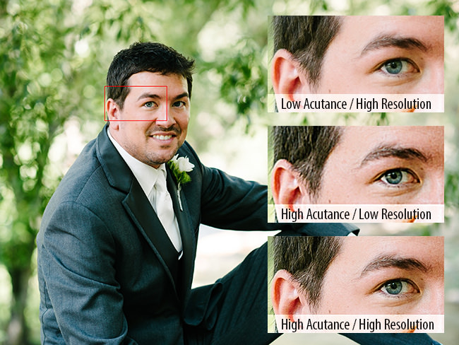
The first crop on the top of the image shows low acutance and high resolution. The lens was able to resolve plenty of detail, but the transition between the edges is not sudden, which makes the image appear a little soft. The second image in the middle lacks resolution, but has high acutance (edge transitions), because an excessive amount of sharpening was applied to make the image look sharp. As you can see, full details could not be fully recovered and hence some of the features are grossly over-exaggerated. The last image has a high amount of both acutance and resolution, which makes us perceive it as the sharpest and the most detailed of the three. This example shows that our perception of sharpness is highly dependent on both resolution and acutance.
Now that you understand how important contrast, resolution, and acutance are in yielding sharp images, let’s take this a step further and talk about measuring and quantifying lens performance.
What is MTF?
Since perceived sharpness is always subjective, it is impossible to quantify lens performance by merely looking at details in an image. As I have pointed out above, too many variables could influence our perception. Because of this, manufacturers came up with objective methods to measure lens performance in controlled lab environments or approximate the potential performance of a lens through computer simulations (more on simulated MTF data below) without relying on human perception. This commonly accepted measure of lens performance is called MTF, which stands for “Modulation Transfer Function”. Since no lens is perfect in transmitting light, MTF can be quite useful in quantifying the loss of both contrast and resolution. Acutance does not apply here, because we are not talking about our perceived sharpness, but rather strictly about the ability of a lens to resolve high amount of detail with maximum contrast.
Most MTF graphs you see today are made with specialized computer software that measures or simulates lens performance and outputs the results. On our site, for example, we use Imatest software to measure lens performance.
One of the advantages of MTF, is that it is capable of providing plenty of useful information in a single chart. MTF charts can potentially provide some or all of the following data:
- Lens Resolution (center to extreme corners at maximum and stopped down apertures)
- Lens Contrast (center to extreme corners at maximum and stopped down apertures)
- Astigmatism and Lateral Chromatic Aberration
- Field Curvature
- Focus Shift
This data can reveal quite a bit of information about the overall performance of the lens. The same data can be used to compare resolution and contrast between different lenses from the same manufacturer as well. However, MTF data cannot be compared between different brands (see additional notes below) and there is other optical data that MTF charts cannot provide, such as:
- Distortion
- Longitudinal Chromatic Aberration
- Color Reproduction
- Vignetting
- Lens Flare
Hence, while MTF charts can be useful for evaluating some data, they do not provide a complete picture of the optical performance of a lens. Most manufacturers came to the conclusion that providing MTF data is sufficient and the above deficiencies were never incorporated into specific lens tests or additional charts. It is also important to note that performance between short and long focal lengths in zoom lenses is also typically not provided. For example, for a 70-200mm lens, manufacturers will provide MTF data only for the shortest and the longest focal lengths of 70mm and 200mm, but nothing in between. That’s one of the reasons why we (and many other sites) focus on the above optical problems and data deficiencies when reviewing lenses.
How MTF is Measured
Let’s now talk about the actual process of measuring MTF data. As you may already know, the performance of a lens can strongly vary from its center to extreme corners. Most lenses are optimized to perform extremely well in the center, but start falling apart in sharpness towards the corners. Lenses with “magical” optical designs can be quite strong across the image frame, but there are very few of those – even some of the best and most expensive professional-grade lenses have various optical issues. Therefore, taking only one portion of the image frame and assessing its sharpness would be very limiting, which is why the MTF data is comprised of multiple points that are measured: from the center of the frame to the extreme corners. Here is an image provided by Nikon that shows each point where lens performance is evaluated:
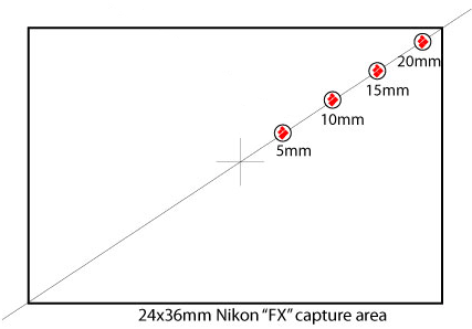
Those red dots are fine line patterns that are analyzed at a certain position from the center of the image frame, or the 24x36mm full-frame FX sensor in this case. Measurements are taken at 5mm, 10mm, 15mm and 20mm from the center of the sensor. On APS-C size sensors, Nikon takes measurements at slightly different intervals – 3mm, 6mm, 9mm and 12mm, because the sensor size is obviously much smaller than full-frame.
Evaluation of lens performance is done with simple straight lines, typically black lines over a white background. The thicker line pairs are used for measuring contrast and are typically 10 lines/mm, while the thinner lines that are used for measuring resolution are 30 lines/mm. Take a look at the following graph provided by Nikon:
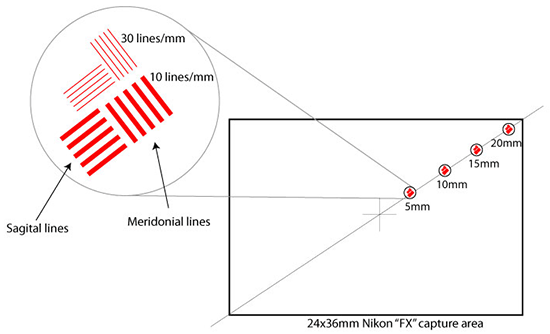
As you can see, thick and thinner red lines are placed at different intervals to measure contrast and resolution, respectively. Line groups are strategically placed at two different angles – one angled from the center of the frame outwards, parallel to the radius of the lens and pointed towards the center (also known as “Sagittal”) and the other angled in the opposite direction (also known as “Meridonial”). This is done for a reason – due to lens aberrations, some lenses are very good in resolving details pointed in one direction, but no so good in resolving details pointed at another direction. For MTF measurements, both Sagittal and Meridonial data is provided, which helps to easily identify lenses that exhibit astigmatism (more on astigmatism below).
Once a test chart with the Sagittal and Meridonial lines placed at different intervals is properly aligned across from the lens, both contrast and resolution can be measured by evaluating the thickness of the transition of line groups from black to white. A high-resolution lens with excellent contrast will show a clear boundary between blacks and whites and clearly distinguish lines in the fine 30 lines/mm group for both Sagittal and Meridonial lines. On the other hand, a low-resolution lens with optical flaws will show a very smooth transition from blacks to whites, indicating low contrast, and will blur the 30 lines/mm group so much that it just all becomes one gray blob, as shown below:

The lines on the very left are easily distinguishable – that’s what a perfect lens with no optical flaws would transmit. Since such a lens does not exist, there will always be some amount of blur visible. As the performance of a lens gets worse, especially towards the corner, the measurement system might no longer distinguish blacks from whites, which basically means a total loss of resolution.
If you take the much thicker 10 lines/mm group and repeat the same exercise, it is very unlikely that the blacks will converge with the whites to gray. Even some of the worst modern lenses have more than enough contrast for 10 lines/mm. Only if one were to de-focus the lens, those patterns might become indistinguishable.
How to Read an MTF Chart
Now that you know how line groups are placed and measured, it is now time to get to know how to read typical MTF charts. Please note that all manufacturers have their own methodology on how they display MTF data and what data they actually plot, so a single “howto” guide is not sufficient to cover it all. That’s why I separated this part by the manufacturer. Before we jump to specifics, let’s go over the typical layout of an MTF chart.
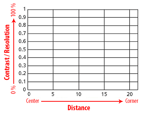
Before we get into curves, you first need to understand what the X and Y axes are for. Above is a simplified Nikon MTF graph with no data plotted on it.
The X axis (horizontal) shows the distance from the center of the frame towards the corners. The value 0 indicates dead center, while 5, 10, 15 and 20 represent the distance in mm from the center of a full-frame sensor that I talked about earlier. Typically, most manufacturers will have the same intervals for full-frame lenses. If the above chart was for a smaller Nikon APS-C size sensor, the numbers would be 0, 3, 6, 9 and 12. Interval steps for APS-C sensors can be different across manufacturers – Canon, for example, uses 0, 5, 10 and 13 for APS-C lenses.
The Y axis (vertical) shows the amount of light that a lens is capable of transmitting. Instead of plotting percentages (0% to 100%) that indicate the amount of light that is transmitted, the data is simplified from 0 (0%) to 1 (100%). Each horizontal line in the chart is plotted in 0.1 (10%) increments such as 0, 0.1, 0.2, etc.
As you remember from section #5 of this article, two groups of lines are measured for MTF – a “fine” detail group of 30 lines/mm that measures resolution and a much thicker group of 10 lines/mm that measures contrast. So you will typically see both contrast and resolution curves plotted on an MTF chart. A perfect lens would have a straight line for both contrast and resolution running from the center of the frame to its extreme corners:
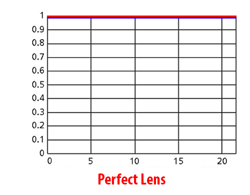
For this particular example, I am using a red line to show contrast and a blue line to show resolution. As you can see, both are flat, sitting at the top of the chart, which basically means that the lens transmits 100% of the light. But we know such lens cannot exist, so let’s examine a much more realistic MTF chart instead:
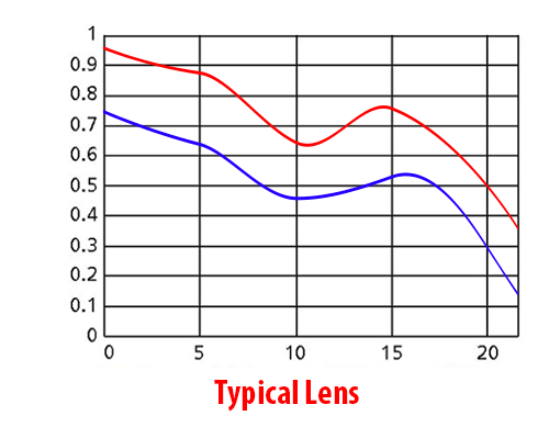
If we examine the red curve, which indicates the contrast of the lens, we can see that the lens has pretty high contrast in the center, which then gradually decreases towards the middle of the frame, then drops sharply right in the middle (10mm mark), then picks up between mid-frame and corners, then drops sharply again towards the extreme corners. Resolution starts fairly strong in the center, then gradually falls towards the middle of the frame, then picks up a little between middle and corners, then drops sharply in the corners. What this all means, is that at this particular aperture, if you took a picture of a flat target, you would see impressive center performance that gradually drops towards the middle and then sharply at the corners. The “wavy” nature of the curve indicates the presence of curvature of field, as explained in my article on field curvature.
You might be wondering about what numbers in the vertical Y axis can be considered “good” or “bad” for both contrast and resolution. Generally, contrast will typically be higher than resolution in MTF charts, so anything higher than 0.9 indicates excellent contrast, between 0.7 and 0.9 is generally very good, between 0.5 and 0.7 is average and anything below 0.5 is soft / bad. For resolution, these figures are obviously going to be a little lower, especially for wide-open performance. But this is my subjective opinion – the ranges for what is considered to be excellent or average will probably vary from person to person.
This is a very simple MTF chart, as it only shows two curves. Because MTF measurements include both Sagittal and Meridonial lines, a typical chart would actually contain at least four lines, as shown in the below MTF example:
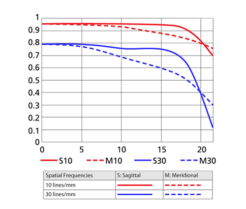
This is obviously a more complete MTF chart, because it shows us a lot more data. Just from analyzing the above chart, we can get the following data:
- Resolution (30 lines/mm) from center to corner of the frame for both Sagittal and Meridonial line groups
- Contrast (10 lines/mm) from center to corner of the frame for both Sagittal and Meridonial line groups
- Astigmatism and Lateral Chromatic Aberration
- Field Curvature
If you compare the above chart to the previous one, you should now be able to tell that this lens has better overall performance than the previous one. Both contrast (red lines) and resolution (blue lines) are higher and the performance of both is very good all the way to the corners. At the extreme corners, there is a sharp decline of resolution, but the contrast stays very high. Now what’s important to note here, is that we also have dotted lines that run close to the solid lines, so if you look at the chart legend, you will see that the two types of lines indicate Sagittal (solid line) and Meridional (dotted line) groups that we talked about before. So in this case, because the solid lines and dotted lines are fairly close to each other in the center, the lens exhibits almost no astigmatism. The lines separate a little more from the mid-frame, so we should expect to see slightly more astigmatism in that area of the frame.
Some manufacturers claim that the closeness of Sagittal and Meridional lines indicates good quality of blur or “bokeh“. I would not try to make quick conclusions of bokeh quality by looking at MTF charts alone, because there are many other factors that affect the quality of the blur, including: number of diaphragm blades, aperture, quality of optical elements, etc. Personally, I only look at the separation of solid and dotted lines to see if the lens suffers from heavy astigmatism and lateral chromatic aberration. The strong separation of Sagittal and Meridonial lines is always an indication that the lens is badly corrected for astigmatism and lateral optical aberrations. For bokeh tests, I perform completely different tests in a controlled environment (which you can see in many of my lens reviews).
Lastly, because the lens does not curve up and down throughout the frame, we can conclude that this particular lens does not suffer from wavy field curvature issues like in the “typical lens” example.
Let’s now go over specific examples on how to read and interpret manufacturer-specific MTF data.
How to Read Nikon MTF Charts
Nikon has been providing MTF data for every new lens it makes for a while now. You might not be able to find MTF charts for some of the very old Nikkor lenses, but all current ones have MTF data, including some 10-15 year old AF-D lenses. When it comes to providing lens performance data, Nikon’s MTF charts contain the following data:
- Lens performance at the maximum aperture
- Lens performance at the shortest and longest focal lengths
- Sagittal and Meridonial Contrast and Resolution figures at 10 lines/mm and 30 lines/mm
- Astigmatism and Lateral Chromatic Aberration
- Field Curvature
What Nikon MTF charts do not provide, unfortunately, is stopped down performance of lenses at f/8 (like Canon and other manufacturers do). MTF data is also limited for zoom lenses because only the shortest and the longest focal lengths are provided. In the case of superzoom lenses like Nikon 18-300mm, it basically means that you can only look at the performance at 18mm and 300mm, but nothing in between.
If you are familiar with Nikon MTF charts, by now you have already recognized that the MTF chart I used above is from a Nikon lens. Here is another MTF chart sample for analysis – the AF-S Nikkor 50mm f/1.8G:
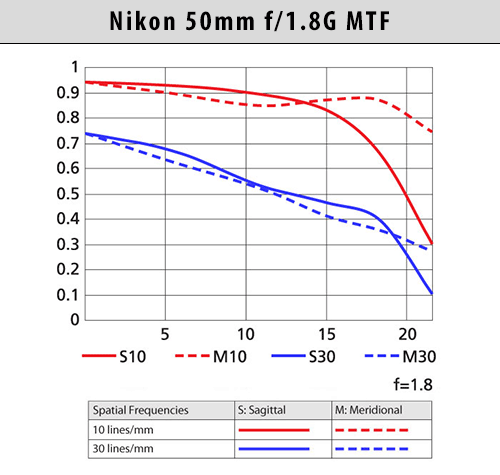
As you can see, the Nikon 50mm f/1.8G has pretty good contrast for both Sagittal and Meridonal lines in the center and middle of the frame at the maximum aperture of f/1.8. Resolution is very good in the center and it gradually falls off towards the extreme corners, where it is pretty weak. There is almost no sign of wavy field curvature, because we do not see sudden spikes in both curves. The Sagittal and Meridonal lines do separate at the extreme corners for the thicker 10 lines/mm spatial frequency (contrast), but not so much for the 30 lines/mm (resolution), which means that astigmatism and lateral chromatic aberration is less pronounced on fine patterns and should not be an issue overall.
This is the type of summary you can make from just looking at the above MTF chart. At the same time, as I have already pointed out earlier, Nikon’s MTF is pretty limiting, since it does not show the stopped down performance of the lens.
How to Read Canon MTF Charts
Similar to Nikon, you can find MTF data for all Canon lenses that are currently being manufactured. Canon has a slightly different method of providing MTF data. Unlike Nikon, Canon also shows the stopped down performance of lenses at f/8, which can be very useful. Hence, here is the type of data you can get from Canon’s MTF charts:
- Lens performance at the maximum aperture and f/8
- Lens performance at the shortest and longest focal lengths
- Sagittal and Meridonial Contrast and Resolution figures at 10 lines/mm and 30 lines/mm
- Astigmatism and Lateral Chromatic Aberration
- Field Curvature
- Focus Shift
Aside from the difference in wide open and stopped down performance, the rest of the data is pretty much the same. Let’s take a look at a sample Canon MTF – in this case, it is for the Canon EF 50mm f/1.8 II lens:
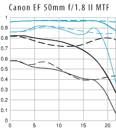
The MTF graph looks messier than Nikon’s, but it actually provides more useful information. The thick lines represent contrast measurements (10 lines/mm), while the thin lines represent resolution (30 lines/mm). The black lines show performance at maximum aperture, while the blue lines show performance at f/8. The solid lines represent Sagittal measurements, while dotted lines represent Meridonial measurements.
Taking all this into consideration, let’s take a look at the lens performance. First, we will take a look at the black lines, which represent contrast and resolution of the lens at the maximum aperture of f/1.8. Looks like the contrast of the lens is very good in the center, which obviously gets worse towards the extreme corners. Resolution is pretty average and also diminishes towards the corners. Both Sagittal and Meridonial lines are fairly close in the center, which is good news, but separate largely at the corners, which translates to astigmatism and lateral chromatic aberration. There is a little bit of field curvature, but it is more or less under control.
Stopped down to f/8, the performance of the lens improves dramatically. Contrast is excellent from the center to the extreme corners, while resolution is also excellent, although there is some amount of wavy field curvature present. Meridonial resolution stays pretty flat, but Sagittal sharply drops at the 17mm mark. So signs of astigmatism and lateral chromatic aberration are still there, but only in the extreme corners. Because both large and small aperture performance is provided, you could also potentially evaluate serious focus shift problems. If the sharpness moves away from the center when the lens is stopped down, it typically means that the lens suffers from focus shift issues.
Looking at the maximum aperture data, you might draw a conclusion that the Canon EF 50mm f/1.8 II is worse than the Nikon 50mm f/1.8G. I would not rush to make that assumption, because MTF data cannot be compared across different manufacturers. This is due to the fact that optical measurements, as well as MTF criteria are different between Nikon and Canon.
How to Read Zeiss MTF Charts
By the time you get to this section, you are probably already wondering why manufacturers can’t just use a standardized method of measuring and displaying MTF data. In the case of Zeiss, as I have pointed out above, the provided MTF data is measured from real lenses, so the MTF data is not theoretical or “simulated”. So the MTF figures that are provided by Zeiss are typically comparable to what you would see from a purchased lens. As for the Zeiss MTF data, here is the type of information you can obtain from it:
- Lens performance at the maximum aperture and stopped down (stopped down apertures vary by lens)
- Lens performance at the shortest and longest focal lengths
- Sagittal and Meridonial Contrast and Resolution figures at 10, 20 and 40 lines/mm
- Astigmatism and Lateral Chromatic Aberration
- Field Curvature
- Focus Shift
One major difference between Zeiss and Nikon/Canon MTF charts, is that Zeiss provides MTF data at three different frequencies – 10, 20 and 40 lines/mm. The 40 lines/mm is a very fine measure that is obviously higher than 30 lines/mm from Nikon/Canon. In addition, Zeiss provides both large aperture and stopped down MTF performance, which means that the amount of data provided in MTF charts is higher. Because each frequency is displayed with both Sagittal and Meridonial values, it means that there is a total of 6 curves per chart. Mixing maximum and stopped down performance into a single chart would yield 12 total curves, which would clutter the chart and make it unreadable. Because of this, Zeiss typically keeps performance at different apertures in separate MTF charts. In addition, Zeiss chooses not to normalize percentage figures for the vertical X axis to 0-1, but uses percentages instead.
Here is an example of two MTF charts for the Zeiss Planar T* 50mm f/1.4:
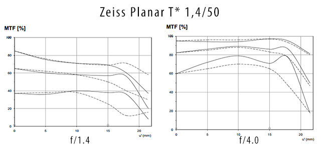
The MTF chart on the left represents performance at the maximum aperture of f/1.4, while the chart on the right shows stopped down performance at f/4. MTF data is not colored or bolded for the different frequencies, so you can always assume that the first 10 lines/mm curve that is used for measuring contrast is on the top, followed by the 20 lines/mm curve and the 40 lines/mm curve for resolution is always on the bottom.
Looking at the above chart at the maximum aperture of f/1.4, we can make the following assumptions. The contrast of the lens is excellent in the center, which steadily diminishes towards the extreme corners. Resolution is very uniform, with practically no signs of wavy field curvature until it gets to the 17mm mark – that’s where resolution drops. The Sagittal and Meridonial lines are pretty close together at all frequencies right up to the middle of the frame. Starting from the middle, Meridonial measurements drop, which indicates that there is some astigmatism and lateral chromatic aberrations visible towards the borders of the frame.
Stopped down to f/4, both contrast and resolution improve dramatically. Contrast is excellent throughout the frame. Resolution starts out very strong in the center and increases in sharpness towards the middle of the frame, which is a sign of focus shift. There is a little bit of wavy field curvature visible at the very fine frequencies. Both Sagittal and Meridonial lines run almost in parallel and gradually fall off together, which indicates that astigmatism and lateral chromatic aberrations are practically absent (only visible in the corners at 40 lines/mm).
As you can see, MTF data is presented differently between the three brands we looked at. If you looked at MTF data from other manufacturers, they could have more or fewer frequencies in their MTF charts. Leica, for example, provides the most amount of data with 5, 10, 20 and 40 lines/mm measurements.
Optical Bench Testing and MTF Simulation
When manufacturers test lenses, they typically measure the performance of the lens itself, without other components like the camera. Because camera technology changes every year and sensors obviously also change in resolution, it would be foolish for manufacturers to test lenses on a particular camera body. Imagine what an MTF chart would look like from 10 years ago tested on the 6 MP Nikon D70, versus one tested on the 36 MP Nikon D800E. Because of this, real MTF tests by manufacturers are always carried out using expensive optical bench setups. Different frequencies are measured with precision instruments in order to produce MTF data.
Therefore, one should understand that any MTF results that involve both the lens and the camera will always be tied to that particular camera body. If I test a lens attached to a Nikon D800E body using Imatest today, I cannot provide comparable data that is captured with a different camera tomorrow. This is why it is often absolutely meaningless to compare contrast and resolution between different brands. Too many variables come into play – from sensor resolution and AD (analog to digital) conversion to in-camera sharpening. All these variables will affect produced MTF data. The only exception is when one uses an adapter and mounts lenses from different manufacturers on the same camera body. But even then, lens adapters can create other problems and still potentially affect the precision of measurements.
While many manufacturers provide MTF charts for the lenses they manufacture, it turns out that very few actually test lenses. This may sound shocking to you, but it is true. Aside from very few manufacturers like Zeiss, Schneider and Leica, most MTF charts are theoretical that only show the “potential” performance of a lens, not its actual real-world performance. That’s because of manufacturing tolerances and variables that can result in differences in lens performance between identical lens models. By now you have probably heard someone say something like “my lens sample is sharp”, which basically points out the fact that there is sample variation.
Thanks to modern computerized testing methods and semi or fully automated assembly lines, these tolerances have certainly improved, but they are still there. And if you factor in other potential causes of lens defects, such as shaking / dropping of shipped packages, changes in temperature, etc., you will realize that it is quite natural for lenses to sometimes vary in performance. Given all this, which lens would the manufacturer have to test to provide MTF numbers? The one that shows the best performance, the worst, or an average of multiple tests? This question surely becomes a dilemma, so instead of thinking of all this and trying to come up with a good measure, manufacturers end up picking the “best potential performance”. This means that in order for you to get performance numbers similar to the published MTF, your copy of the lens has to be manufactured perfectly – from each optical element in the lens to every nut and bolt that secures them. And we all know – that just does not happen.
Does it mean that simulated MTF data is completely useless and should not be looked at? No, not at all. MTF is still a good reference for looking at the potential performance of a lens and for comparing lenses from the same manufacturer. If there is no MTF data, how would you know that the newer Nikon 50mm f/1.8G performs better wide open than the older and the more expensive Nikon 50mm f/1.4G? You would have to obtain both lenses, assemble a testing lab and then start figuring out the differences, or wait for a trusted resource to do that for you. Obviously, most people do not have the time, patience or deep pockets to thoroughly test lenses, so an MTF chart becomes a good reference.
I apologize for such a long article on reading MTF charts. I just felt like the topic had to be expanded to explain things in a little more detail. Please keep in mind that the language of this article is simplified – optics can be quite complex to understand and I simply do not possess such deep knowledge of the subject to go into all the details.
Thanks for the article!
Little correction: the correct word is “meridional”, from the Latin meridionalis (southern), from meridies (noon / South). I’ve seen the incorrect form, “meridonial”, quite a few times, but it’s wrong all the same. Those words, meridional and sagittal, don’t require capitalization.
Thank you very much for this excellent article. Thank you interpreting the MTR charts and quality for each Nikon lens in outstanding details. When you say center, mid and corner, do you mean distances 5, 10 and 20 or 0, 10 and 20 respectively?
It’s the radial distance away from the optical axis, at the image plane (film/sensor).
0 mm: centre (on axis)
10 mm: mid
20 mm: corner
The actual corner of a full-frame image is ~21.63 mm away from its centre:
0.5 × √ ( 36² + 24² )
Prior to reading this article, i had not understood how to interpret MTF charts. Now rushing off to look at MTF for the specific lenses i own!
I found this article today and am now a new subscriber. I originally saw the article in 2019 when I was researching switching from full frame gear to M4/3 Lumix and checking out the Leica pro lenses for that system. I did make the switch – thankfully so. As part of my continuing learning this article along with others I have found written by the Photography Life contributors are of true value to me.
found this artical and now understand Nikon and Zeiss use different way in presenting the MTF dragram. thanks for the long artical and it is worthy.
good
Really helpful material and laid down in good understandable language. Thank you.
Fantastic article for a new comer to photography, like me. While the article itself was superb, what amazed me was the simplicity with which it was written and only because of this I was able to read it completely and appreciate it. I do occasional photography and tried to understand MTF many times but gave up as I was finding it to difficult to understand. Thank you so much for this contribution in my photo journey. Last but not the least, Photographylife is increasingly becoming my everyday diet, so thank you so much for wonderful articles on the site. Thanks
The best explanation on the internet! Thank you so much!
Nice presentation giving details. I like it.