There are so many ways to edit a Milky Way photo in Lightroom that it can be tough to know where to start. That’s particularly true if you’re after maximum image quality, because some of Lightroom’s sliders can cause unwanted noise or halos that are difficult to remove.
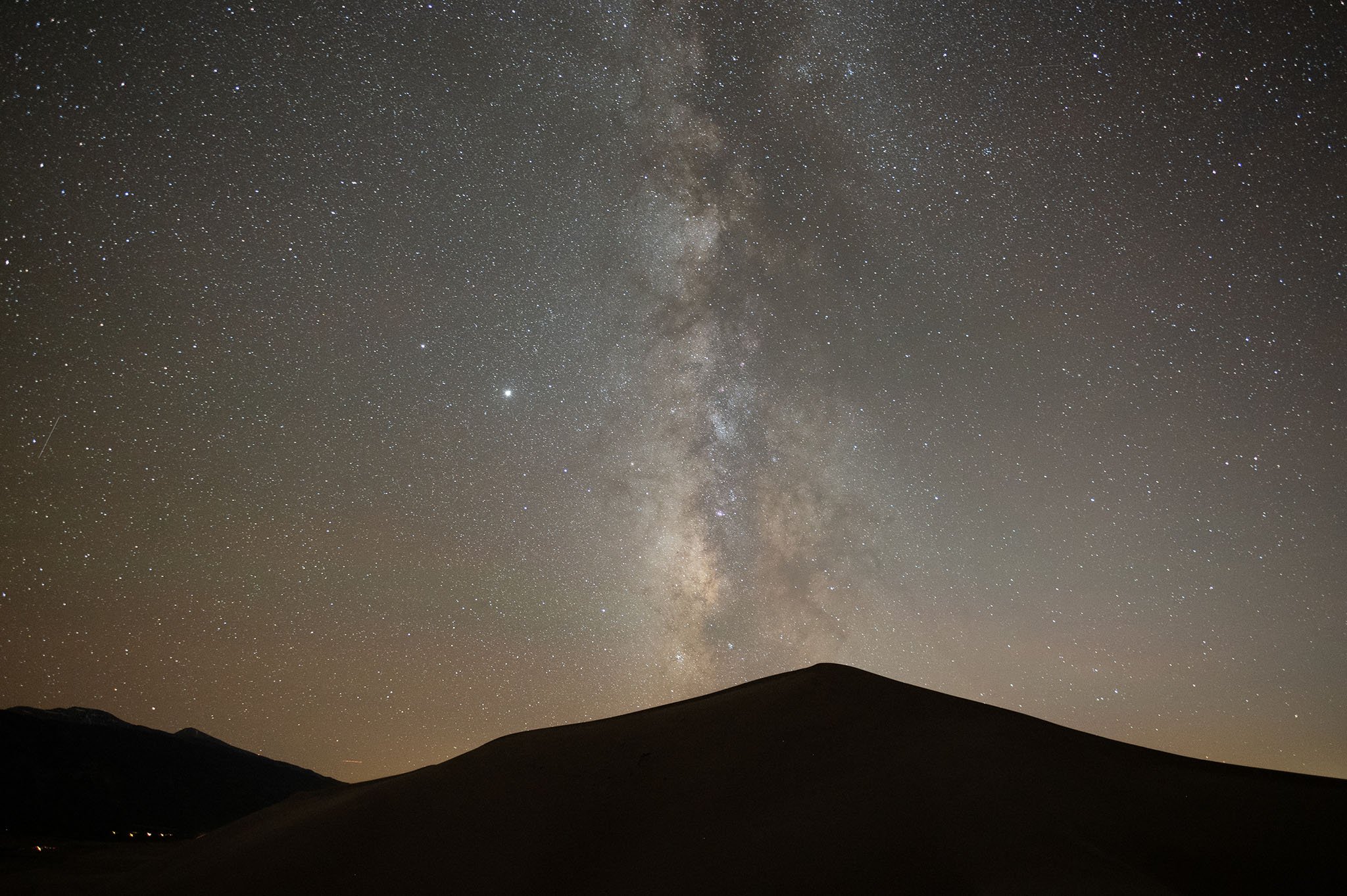
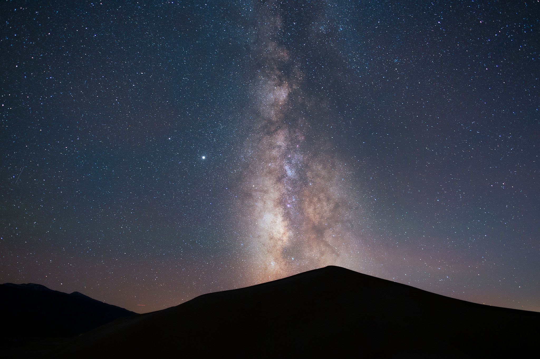
Here, I’ll go through my step-by-step process in Lightroom to help your Milky Way photos pop without losing image quality. This is the photo (unedited shown below) that I’ve chosen to process for the tutorial:
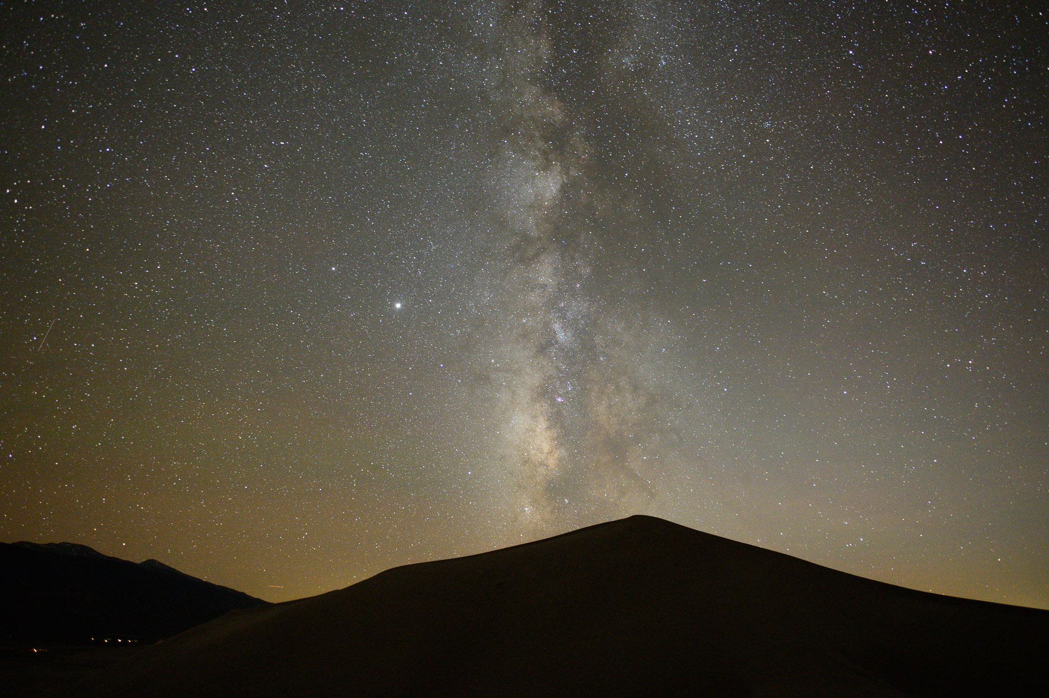
From a composition standpoint, it lacks a good subject other than the Milky Way, so it’s not my favorite photo ever. But it works well for this tutorial because it’s simple: a silhouetted foreground and a clear Milky Way in the sky. It’s a very common situation in astrophotography, and learning how to deal with photos like this is important before working with more complex images.
I’ve divided my process into 12 steps that you can see below.
Table of Contents
1. Form a Plan
Before you start doing any edits in Lightroom, it helps to have a plan. Here’s the order I suggest for your edits: Global > Local > Spot > Photoshop.
- Global: Start by doing as many slider adjustments as you need. This includes everything from the Basic Panel to the sharpening and noise reduction sliders, as well as cropping the image.
- Local: After you’ve gotten a good base, start dodging and burning your photo or making local color adjustments using the gradient, radial gradient, and brush tools. I recommend starting broad (gradients) and working your way down to finer adjustments (very small brush edits).
- Spot: Do any spot healing in areas that need to be fixed, like unwanted airplane or satellite trails in the sky.
- Photoshop: If there are edits you can’t do in Lightroom, open your photo in Photoshop after completing all the steps in this article. Soon, I’ll publish a separate post about editing Milky Way photos in Photoshop.
I recommend trying to visualize the edits you’re planning to make rather than shifting sliders randomly.
2. Set the Right Defaults
Some of Lightroom’s default settings aren’t optimal for astrophotography. Here are the ones I recommend changing:
- Set the Profile at the top of the Basic Panel to Adobe Standard, or, if it shows up as an option, Adobe Standard V2. We’ll come back to this in a later step.
- Turn off the sharpening and noise reduction settings for now; Lightroom’s defaults aren’t great for Milky Way photography.
- Make sure “remove chromatic aberration” is selected in the Lens Corrections panel.
- Click “enable profile corrections” in the same panel, but feel free to reset the Distortion slider to zero and lower the Vignetting slider substantially. Lightroom often overdoes the vignetting correction, and the distortion correction isn’t needed for a lot of Milky Way photos.
Also, crop your photo prior to doing the rest of the steps below.
3. Find a Neutral White Balance
It’s a good idea to find a relatively neutral white balance before doing any other edits. Milky Way photos tend to have very bad white balance settings by default, because the camera’s Auto white balance doesn’t do well in low light, and other options like Daylight or Tungsten white balance are usually too yellow or blue.
While you could try using Lightroom’s white balance selector eyedropper tool, I’m not a big fan for this type of photography. It’s too easy to fool by clicking in slightly different areas of the frame. Instead, I recommend boosting vibrance and saturation all the way to +100, then adjusting color temperature and tint until there’s a good balance of colors in the sky.
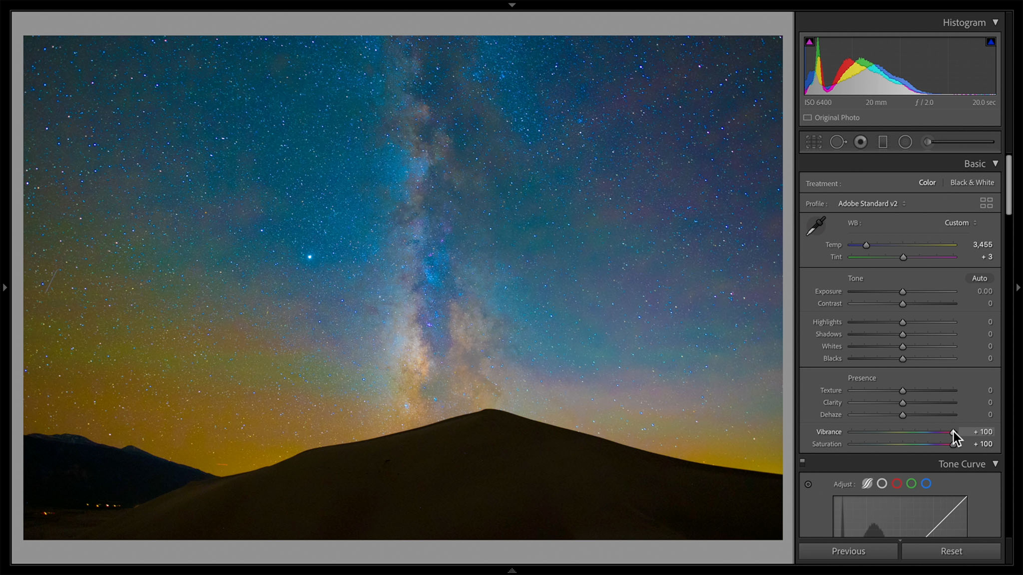
After you’re done setting white balance and tint, reset the vibrance and saturation sliders back to zero.
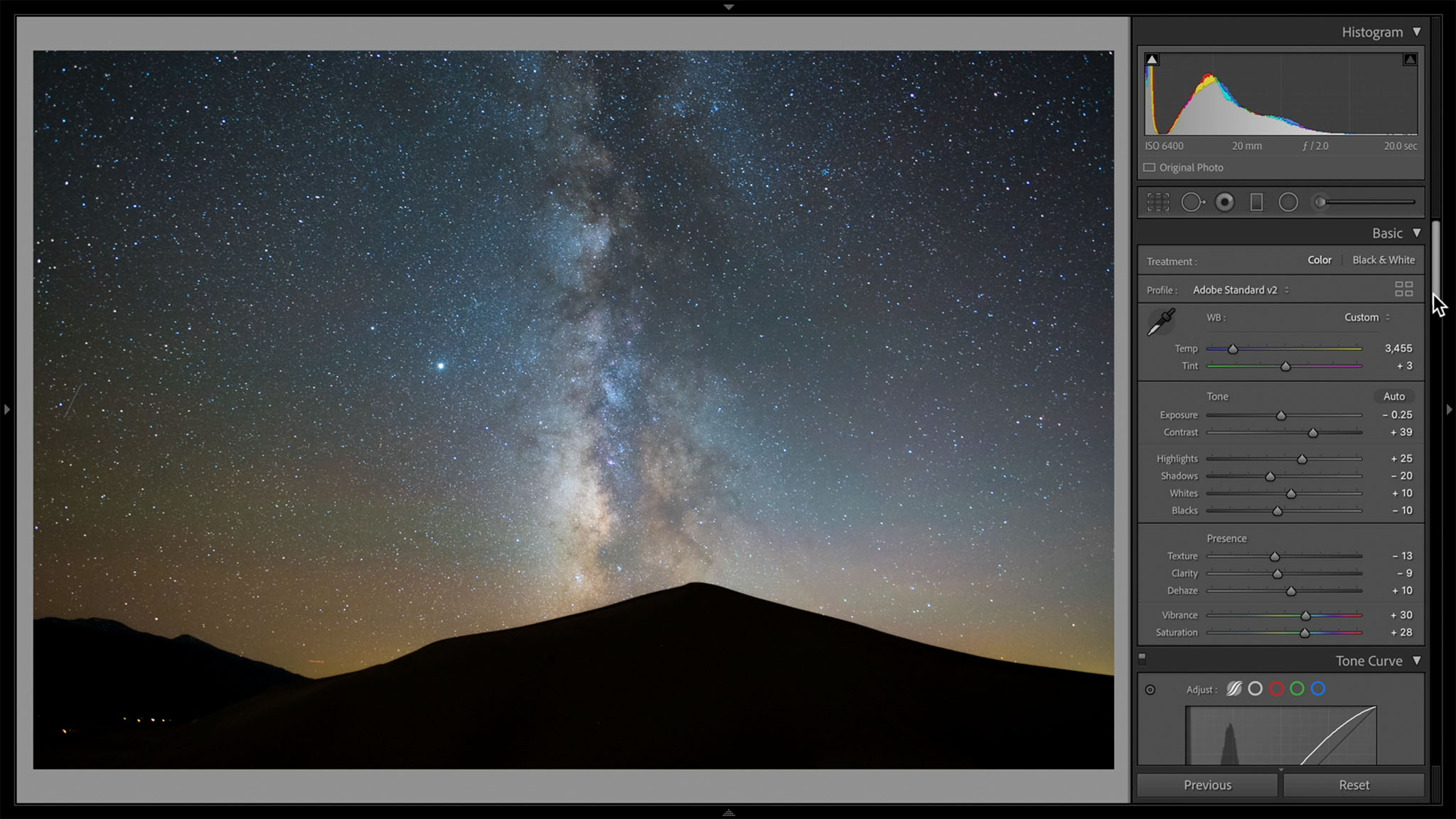
4. Make Global Edits in the Basic and Tone Curve Panels
The next step is to do your most important brightness and contrast edits using the two top panels (Basic and Tone Curve). There aren’t any set values here that are good or bad. It depends entirely on the photo at hand. I would, however, caution moderation. For example, the Texture and Clarity sliders can crunch up the stars in a way that really pops out, which may look ok at such an early stage of editing, but often looks grungy and dirty later. I usually recommend decreasing these sliders a bit rather than boosting them.
If I had to give some general recommendations, here’s what they are:
- Don’t brighten things too much. It’s nighttime!
- Use a slightly lower texture and clarity to give a subtler, more refined feel to the stars. About -5 or -10 is usually good.
- The difference between vibrance and saturation is especially apparent in Milky Way photography. Vibrance affects the whole image, while saturation primarily affects areas that were already saturated. Be deliberate about which of them you use.
- In the Tone Curve panel, the Highlights slider is a very fine edit that only affects the brightest stars. I like to decrease it a bit, maybe -10, to keep that refined feel.
- My favorite way to boost contrast is to decrease the Exposure slider in the Basic Panel while increasing the Lights slider in the Tone Curve panel correspondingly. It’s not just for astrophotography; that’s one of my go-to edits for almost any landscape shot.

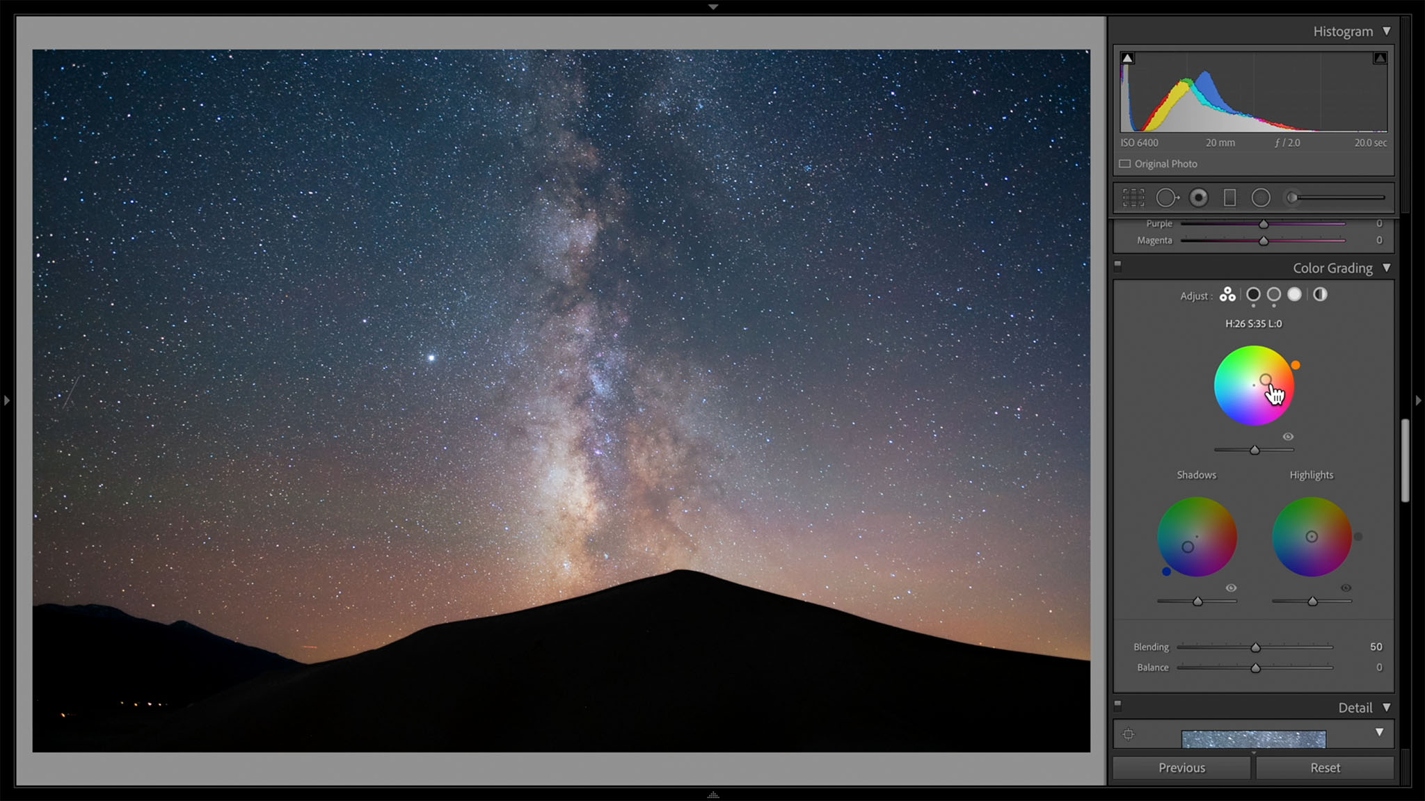
5. Use Color Grading More Than HSL for Color Edits
Although I like the level of control that Lightroom’s HSL (hue, saturation, lightness) sliders offer for color adjustments, they aren’t perfect. In particular, if you push the sliders too far from each other, you can increase the photo’s color noise significantly.
Instead, for Milky Way photography, I recommend using the Color Grading panel. It’s Lightroom’s replacement for the Split Toning panel, and it’s well-suited to this type of photo. My usual preference is to make the shadows bluer and the highlights oranger.
However, the actual “Highlights” color wheel isn’t the one I recommend for Milky Way photography. As you can see, it targets the brightest stars a bit too much:
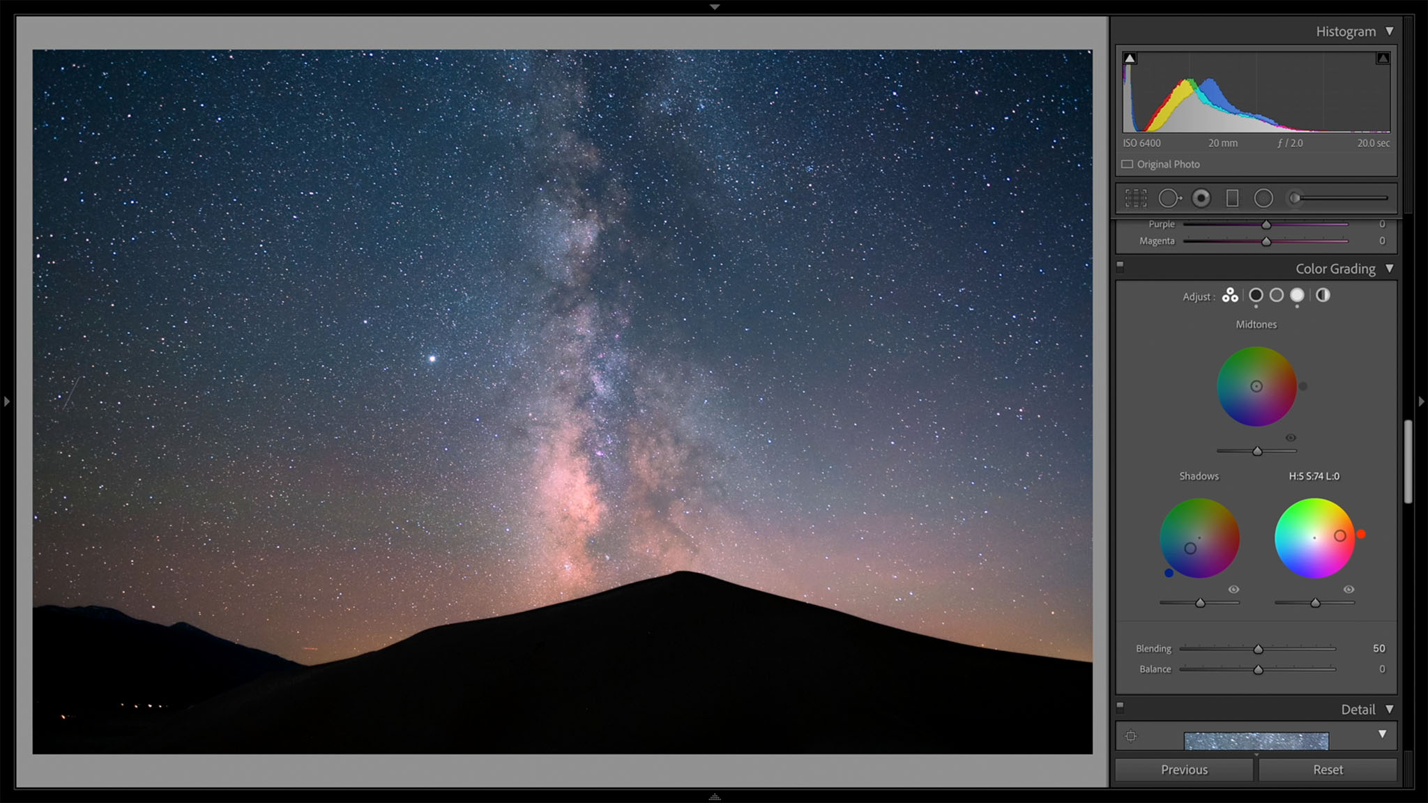
Instead, the brighter areas of the sky tend to look better if you adjust the “Midtones” color wheel instead. Here’s the result:
6. Pay Close Attention to Color Noise Reduction
I’ve written before about how color noise reduction in Lightroom harms low-level color detail. That’s especially true for Milky Way photography, where even Lightroom’s default color noise reduction destroys a lot of the color around stars. Take a look at the following crops, where you can see less color detail with Lightroom’s defaults compared to zero color noise reduction:
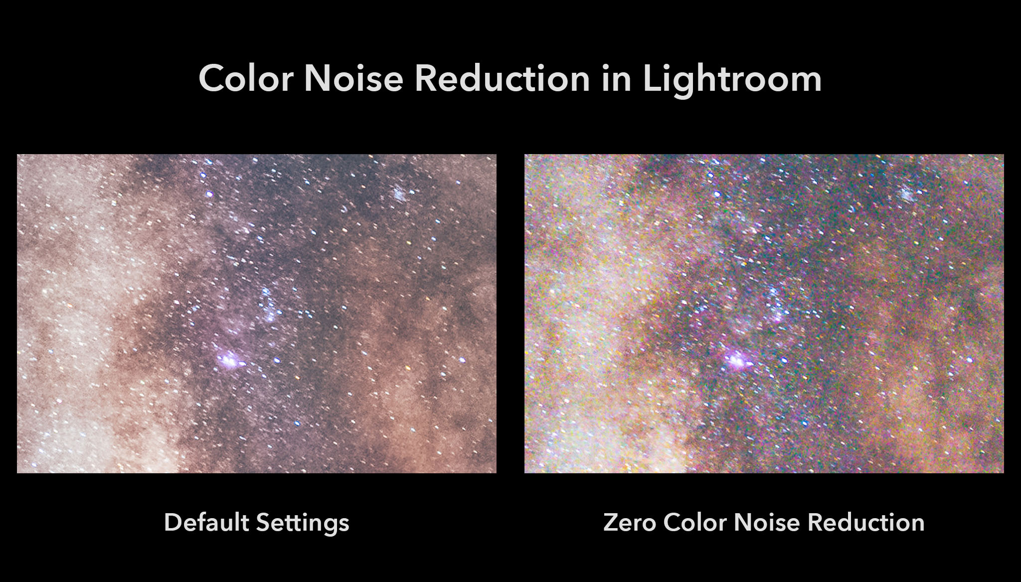
The problem is that the second photo clearly has too much color noise. So, our goal is somewhere in between: retaining the colorful stars without excess color noise. Here are the settings I recommend for your Milky Way shots (assuming high ISOs rather than using a tracking head or image stacking):
- Color noise reduction: Roughly +10 to +20
- Color detail: Roughly +60 to +80
- Color contrast: +100 every time
This is the result:
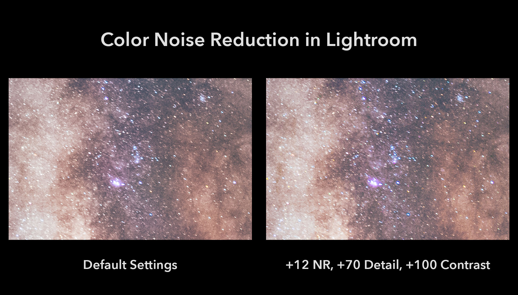
That’s what I’m after. It has much more color detail than the default settings without going overboard on color noise. (Click to see larger if the differences aren’t clear.)
You may be wondering about my sharpening and luminance noise reduction settings. Those are always a balancing act, and my settings for this photo are shown here:
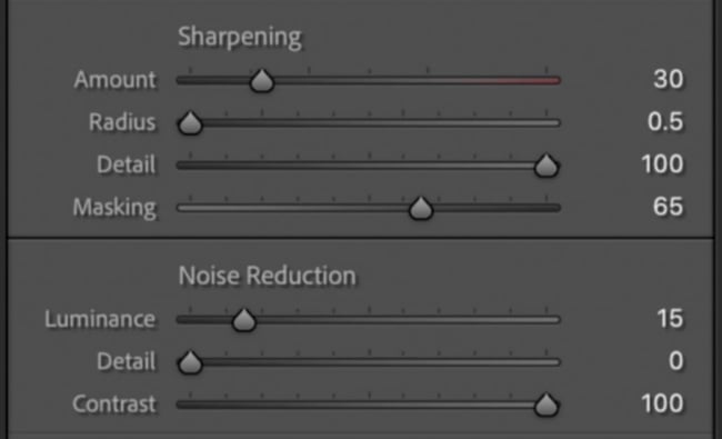
But I’m prioritizing a deconvolution sharpening algorithm (Radius of 0.5 and Detail of 100), whereas you may prefer something more aggressive. I normally don’t like to increase the Masking slider so much, but for Milky Way photography at high ISOs, it’s worth doing because of all the shot noise.
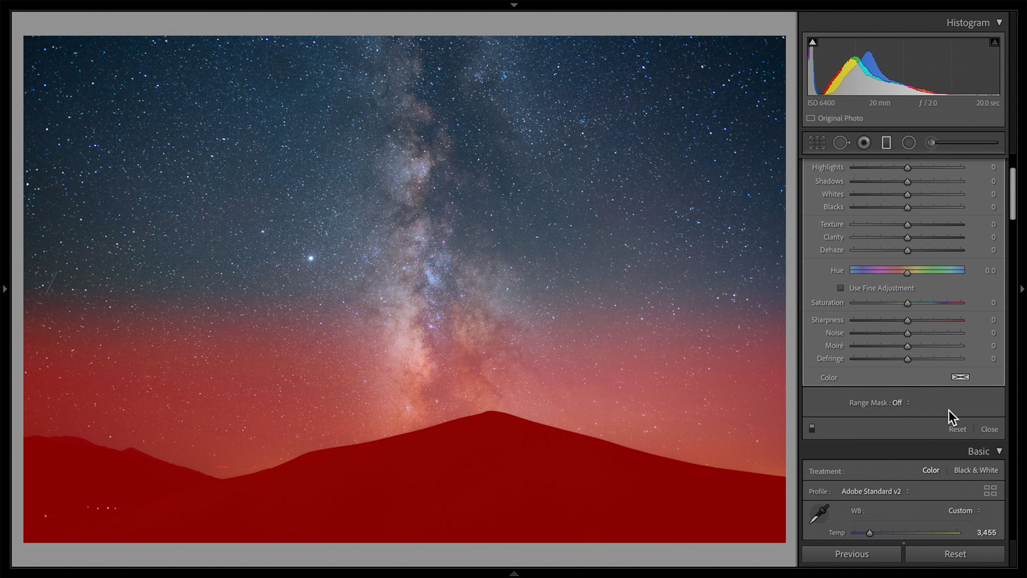
7. Use Range Masking for Local Adjustments
We’re mostly done with global adjustments at this point. It’s time to do localized adjustments on areas of the sky or foreground to make them stand out how you want.
Personally, most of the local adjustments I do are what’s known as dodging and burning – AKA, brightening and darkening certain areas in order to emphasize and de-emphasize them. But before I get into that process, I want to mention a useful tool in Lightroom called Range Masking.
Range Masking is a way to apply your local adjustments only to certain areas of the photo in Lightroom, such as bright areas, dark areas, or blue areas. It’s very useful for something like Milky Way photography. Say that I want to create a gradient of highly saturated blue in order to get rid of light pollution along the horizon. A preview of my gradient mask is shown below (with my edits affecting anything in red):
As it is, the edits I make will not only affect the light pollution but also the foreground. I don’t want to add a bunch of blue saturation to the foreground, so I can use Lightroom’s luminance range mask to exclude any dark regions from the mask. This new gradient looks much better:
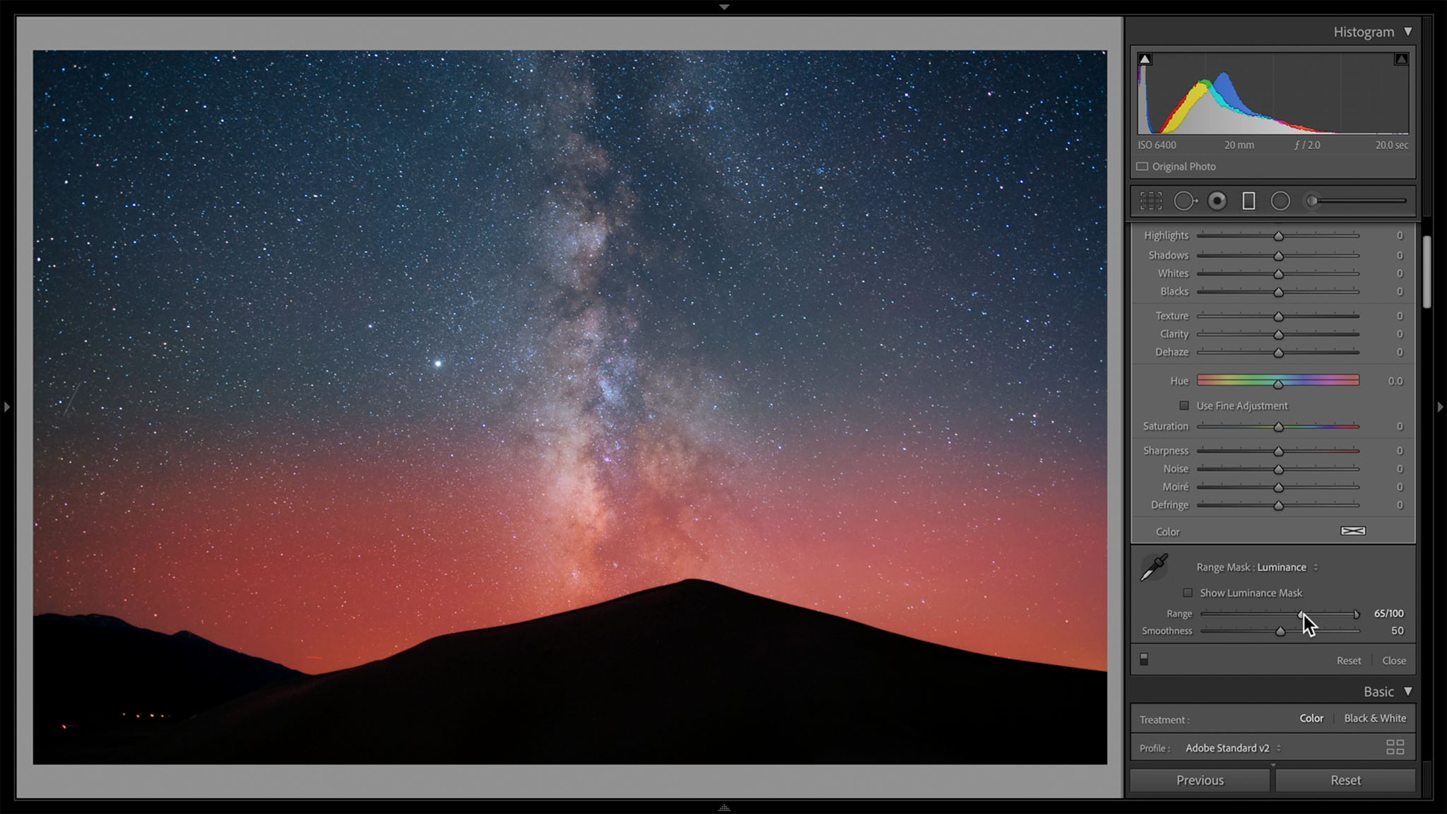
Now I can edit the colors as I wish without worrying about bleeding into the foreground. This helps avoid halos, which can be a nuisance for Milky Way photography.
If you’re wondering, Range Masking is also superior to Lightroom’s “Auto Mask” option within the brush tool, which frequently mistakes edges and adds a lot of noise. Range Masking isn’t perfect in that regard, but it’s substantially better than Auto Mask (especially if the Range Mask’s “Smoothness” value is set relatively high).
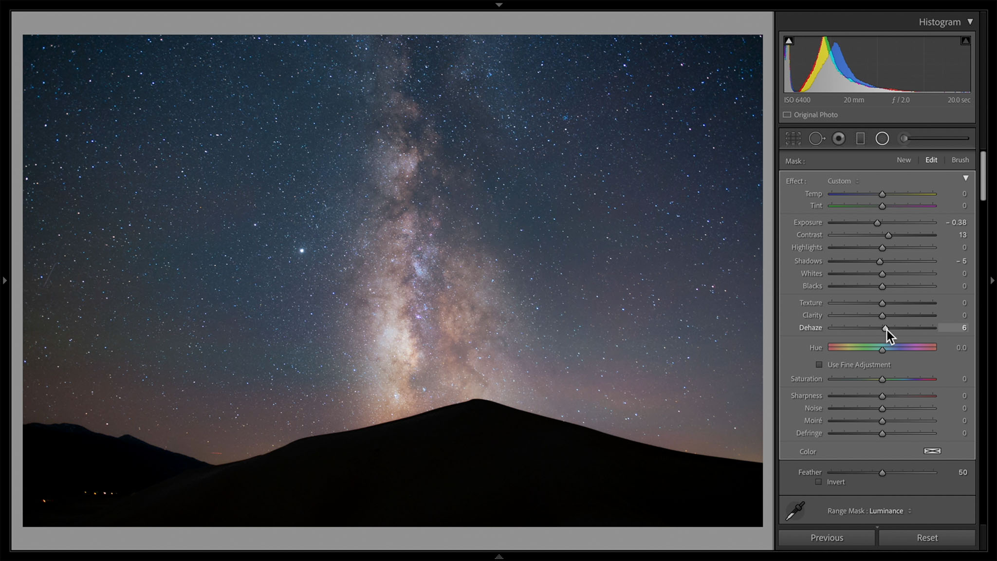
8. Make the Milky Way Pop by Editing Everything Else
At this point, you could start doing some brush or radial gradient adjustments directly on the Milky Way to boost contrast, increase the brightness, and generally make it pop. Or, you could do the opposite: Darken and de-emphasize the sky surrounding the Milky Way core for a similar result.
I usually prefer this method because the Milky Way can get too bright otherwise. But you may also want to do a combination of the two. Here’s how my radial gradient looks as I select the non-Milky Way parts of the sky:

I then decreased the brightness and made a few other edits to the surrounding sky, and the result is a Milky Way that pops much more:
9. Dodge and Burn the Small Details of the Milky Way
To bring out the structure of the dust clouds in our galaxy, I like to do some dodging and burning with small brush adjustments. Here’s how my mask looks for a burn (darkening) adjustment:
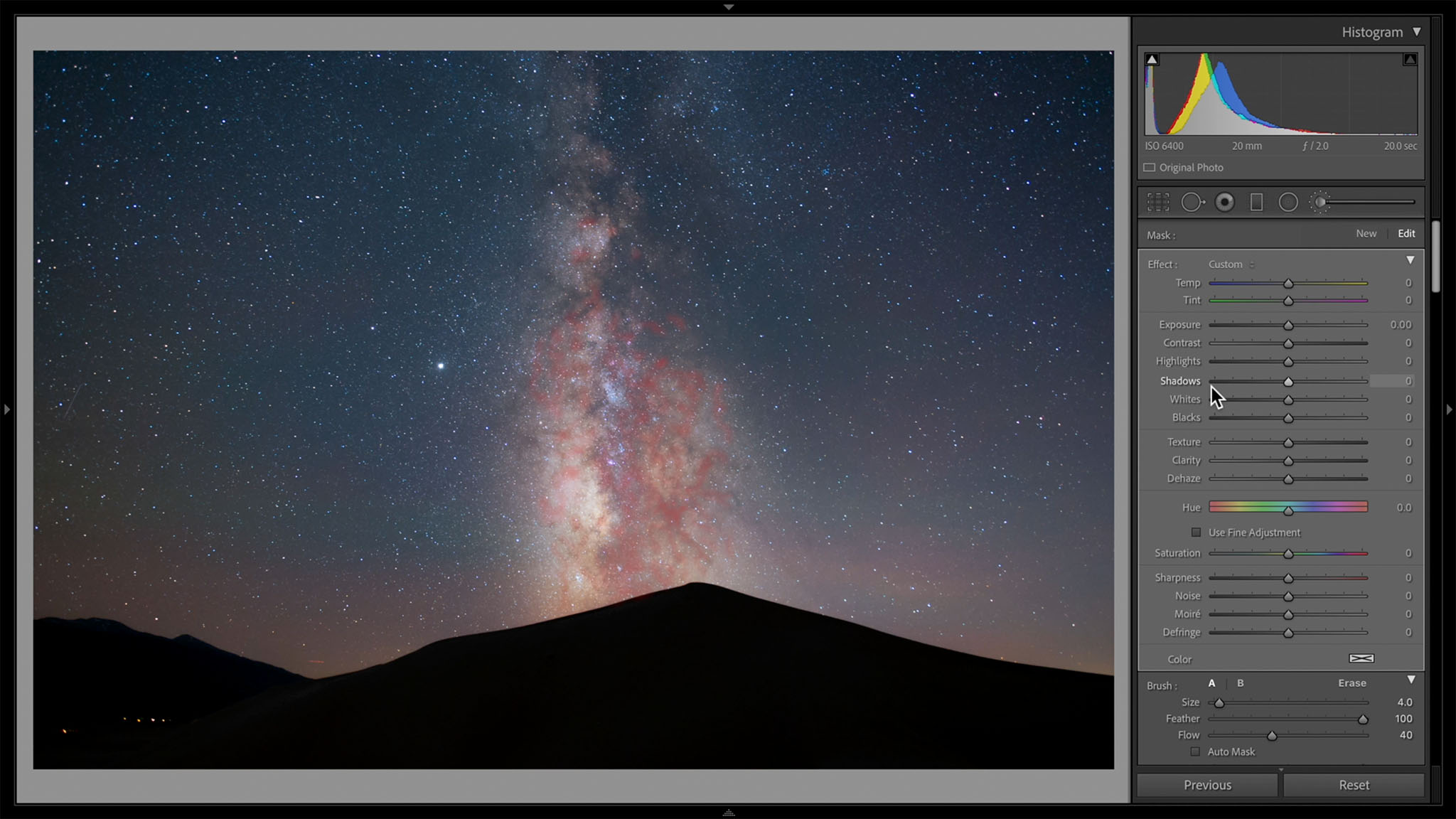
Then, by decreasing exposure, increasing contrast, and increasing dehaze, I can emphasize the shape of the Milky Way:

The same can be done to areas which you want to brighten/dodge, although I didn’t need to do any in this photo.
I recommend using a very soft brush with a low flow so as not to overdo these edits. It’s easy to get a result that looks fake or crunchy by overdoing things. Local adjustments almost always benefit from a light touch.
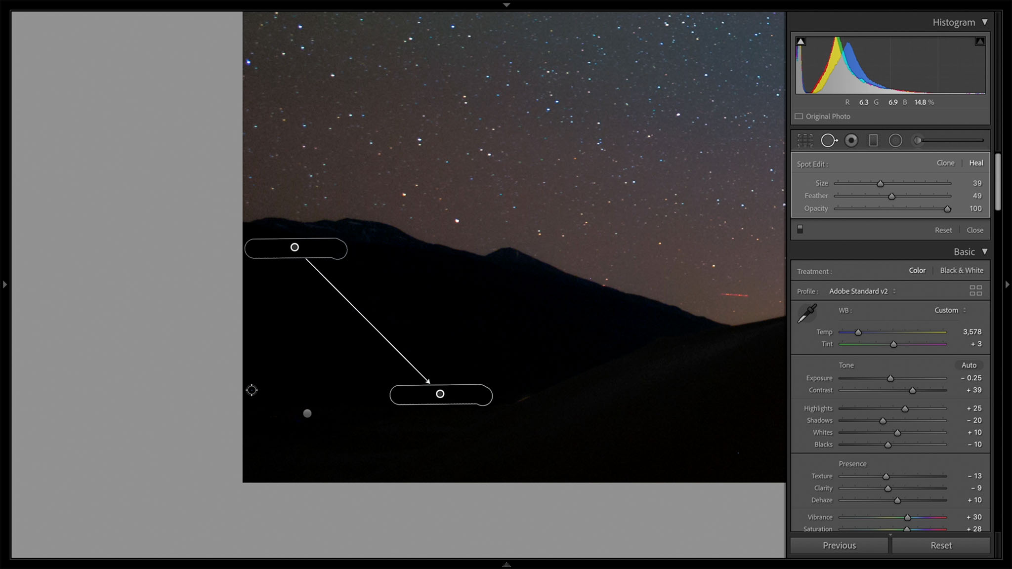
10. Spot Heal Any Small Areas That Need It
I’m not normally a fan of spot-healing details that were in front of me when I took a photo, but if it’s not something you mind, this is the right time to do it. Spot healing can slow down Lightroom quite a bit, especially if you need to do a lot of it on a particular photo. You can reduce frustration by saving it for late in the process.
In this case, let’s say that I want to get rid of those lights in the foreground, as well as some hot pixels that Lightroom missed. Lightroom’s spot healing isn’t nearly as good as Photoshop’s, but it’s perfectly fine for basic Milky Way photography needs:
11. Add Any Profiles That You Want
Lightroom’s profile browser isn’t for everyone. I’ve seen it compared to browsing Instagram filters, and not in a good way. But I confess to liking some of the profiles, especially since it’s easy to decrease their intensity as needed. I like doing this step near the end, after all other color and contrast adjustments are done. Here’s how Lightroom’s profile browser looks:
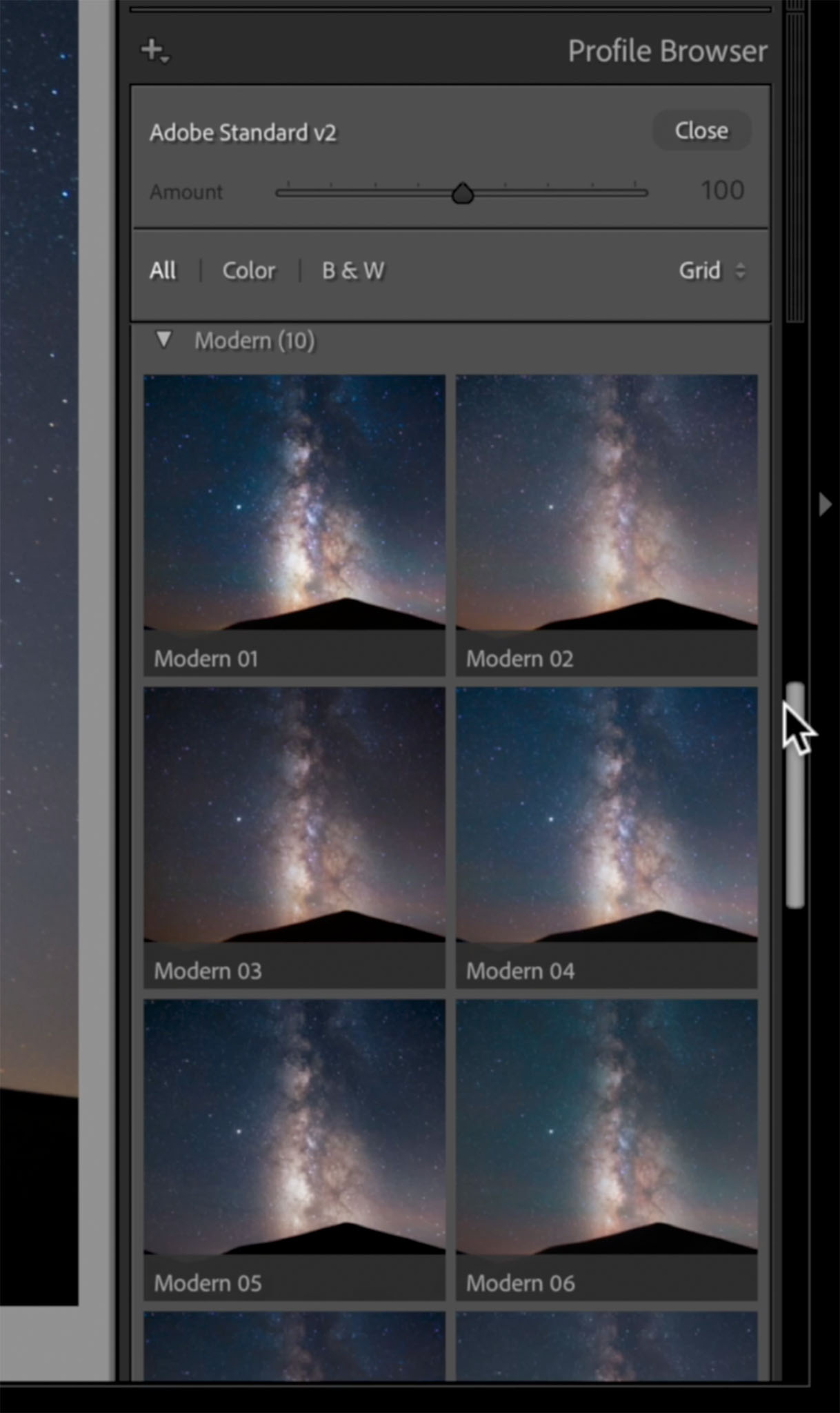
For what it’s worth, this is the reason why I told you to select “Adobe Standard” or “Adobe Standard V2” as one of the first steps in your editing process. For whatever reason, all of Adobe’s special profiles are based on Adobe Standard as a starting point. In other words, if you slide the “Amount” slider on any of the Artistic/Modern/Vintage profiles down to zero, it looks almost identical to Adobe Standard/Adobe Standard V2.
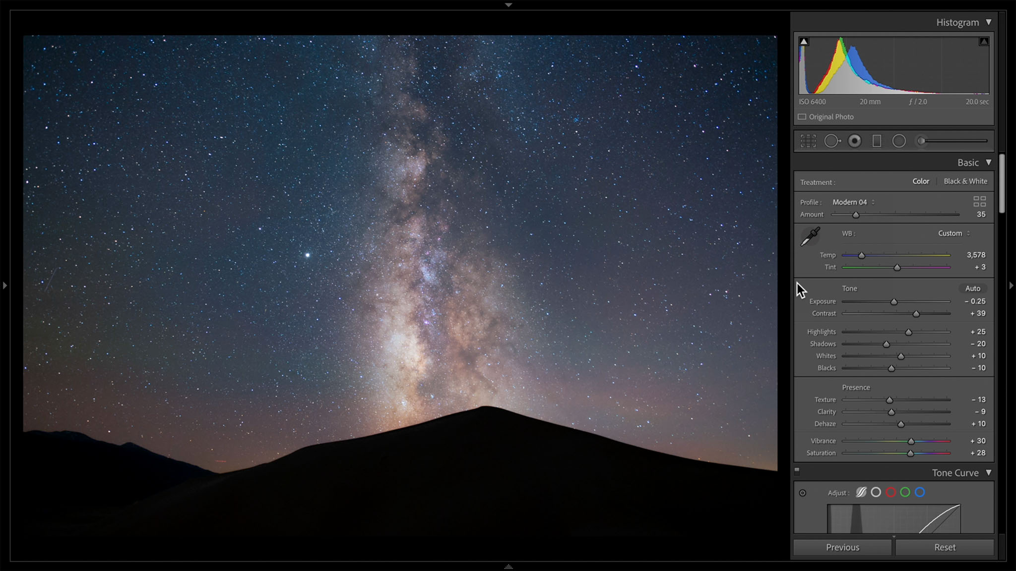
In this case, I like how the Modern 04 profile looks with the slider decreased to 35.
12. Check Your Edit By Switching the Background to Black
In Milky Way photography, it can be difficult to tell if there are strange colors in some of the darkest areas of the photo. Switching Lightroom’s background to black can make it easier to figure out.
This photo has some dull colors along the edges that I didn’t notice before, so I added a couple more radial gradients to the sides of the image for minor adjustments. The final photo is shown below (click to see larger):

And here’s a before and after:
If you think it’s overdone, you can always decrease the sliders a bit. Or, if you think it’s underdone, there’s still room to boost them. The final look is up to you.
Conclusion
Milky Way photography is at its best when you put your personality into your post-processing. Sometimes, I’ll go back to a Milky Way photo years later and try out a more colorful, interpretive edit – or, just the opposite, trying to make things look more lifelike.
You can also go beyond Lightroom’s editing capabilities by using Photoshop or other software to do specific things you have in mind. Post-processing is quite a flexible field, and even the steps in this article are intended to be a jumping-off point rather than a rigid structure you have to follow. But if you were trying to figure out a straightforward process to follow that retains your image quality as much as possible, hopefully this gave you some good ideas.
I try to follow workflows like this, and they work on a lot of milky way shots. However I take milky way shots with lighthouses, and can’t seem to get what I want without messing up the lighthouse light beams. I’d be happy to share one with anyone that would like to try edits to share with me.
I am no expert in milky way but surely will like to try editing on raw file in capture one . You can mail the file to me on “[email protected]” .
BTW you don’t happen to be Michael Vaughn “Former English Cricket team captain” :)
It is a huge file, so can’t simply email it. I will see if google will let me do a dropbox sort of thing.
The cricketer spells his name “Vaughan”. I did live in England for 4 years so know him from TV there. I attend a few test matches while over there in 2012-2016 years.
Hi Spencer, nice article again. The Z6 – 20mm is a killer combo.
I saw that you used 6400 ISO, The Z6 is iso invariant, it has basically two settings between 100-400 ISO and above 400ISO. You can also use ISO 640 and crank up the iso with software. You gain one advantage, the dynamic range is higher and you have extra freedom especially when a part of the foreground is illuminated. Another suggestion if you want to gain a better S/N ratio. Make the same 8 images and stack them later in Sequator (free easy to use astro stacking software) It stacks the stars on top of eachother and you get deeper colors and less noise. You can select the sky and the landscape will be sharp as well. You can also do without that option, but the foreground will show earthrotation. Output should be tiff and this can be processed in Lightroom et cetera. This software can also create startrails. I use this as an intermediate step to create astrolapses when I’m not using a slider or a tracker system. kind regards from a very light polluted area, the Netherlands Bjorn
Thank you for introducing with Sequator. Will surely try this .
Thanks, Bjorn. You’re absolutely right, stacking images is a great way to improve the image quality of these shots. Sequator only works for Windows, but Mac users can get Starry Landscape Stacker for something similar.
I don’t really concern myself with the differences in ISO values for Milky Way photography, even on ISO invariant cameras. I tested the Z6 at every ISO value for my personal Milky Way photography, and I found that I was happiest in the range from ISO 1600 to 6400. (Though you’re right, I’d use lower than that if there’s some bright foreground illumination.)
Even though it’s ISO invariant, software like Lightroom isn’t always great at figuring out colors when the exposure slider has been boosted too much. I didn’t find any visible dynamic range penalty in the stars until I was at ISO 25,600 (at f/2, at least), but I avoid anything above ISO 6400 just in case. It’s something I encourage everyone to test for themselves, though.
Very well placed steps. On my A7S the AWB gets colors and sky glow colors very well. Everyone suggests Daylight or Tungsten but the milky way color is 3800/3900 you can set this on camera or use AWB. I do a lot of capture over the ocean and on beaches and have found selecting portrait to get the color of sand and MW best (but just a starting point). But always do lens profile second. IF there are waves do a color pick on one, they will be white and MW/sky colors better. If AWB was used then the graduated filter down for sky adjust for temp and saturation reduced for a geryer like is seen a black but a shade of blue brings out the Dark Horse Nebula Magenta side and baby Blue side pop and reducing highlights and whites can rid light pollution but not much it will look dull. Instead of D&B use the Radial filter (invert 100%) dot on the lowest wing (pegasus) but elongate the entire MW side to side and above and below a bit. This is where everything is in reverse of global. Increase temp and tone just a bit to get the magenta to pop just a bit and reducing saturation will kind of lighten. Texture/Clarity/Dehaze can deepen the path/dark horse legs and shapen the wings and highlights and whites stars along path and within sparkly.
Noise has been a problem for ever and using in camera NR gets rid of hot and dead pixels, LR NR can soften but the best that everyone is trying to copy with an AI is Topaz Denoise using low light nails noise and sharpens stars and after you can start from zero again to brighten shadows and reduce highlight using again all sliders to get a better image. And if using a 12MP camera using Gigapixel AI will get you a 300MP image to cover a rooms wall.
As far as the silhouette I like a bright foreground ground, If you use a f/2.8 of faster it will be bright like daytime and exposure will have to be reduced and shadows increased anyway to your liking.
Nice article.
My only comment is with Point 3, White Balance. In a dark sky without the Moon, the night sky closely approximates “Daylight.” Some astrophotography software will use 5000K, 0 tint. Using other white balance settings is typically done to get rid of the colors from light pollution but this has the undesired side effect of changing the colors of stars and other deep sky objects (DSO).
A better method is to reduce the light pollution, typically found in the red and green channels, and leave white balance close to 5000K/0. See, for example,
clarkvision.com/artic…ocessing2/
for methods on how to do this.
The final images from these techniques result in a night sky that is less blue than is currently popular — but is more accurate. Artistic license, however, means that the photographer can still choose what colors are “best” for their image.
Thank you, David! That’s a very interesting method to lower light pollution with RGB curves. You’re right that, coupled with Daylight white balance, it gets you a very yellow result (though one that’s more accurate for the Milky Way’s actual colors).
There are also differences between what works best for deep-sky astrophotography versus nighttime landscapes. I gravitate toward a bluer look for a lot of my Milky Way landscapes even though it’s not as accurate, and an oranger, more accurate look for deep-sky work. Between the two, the method in this article of boosting vibrance/saturation and finding a neutral white balance is closer to the blue side of things.
Any ideas about DxO Photolab 4? I have no experience in Milky Way photography but just installed this version and the results are phenomenal with the new DeepPrime noise reduction for RAW files. In my humble opinion noise reduction is better as Lightroom.
Only drawback is that not all combinations of (older) camera’s and lenses are supported.
There is also DxO PureRAW
Simply better RAW files
Enhance your RAW files to open up even more possibilities with
Adobe Photoshop and Lightroom®.
I haven’t used it, but that sounds interesting. The steps here are general enough that they can be applied in most post-processing software and Lightroom competitors.
Point 12 ” Or, if you think it’s overdone, there’s still room to boost them. The final look is up to you.” should be “underdone” .
Great article, have you used Capture one for Astrophotography editing ? If yes, how it performs in comparison of Lightroom .
Good catch, thank you!
There was a point where I tried to switch to Capture One, so I’ve used it for all sorts of photos including Milky Way photography. Other than Capture One’s better tools for color editing, I didn’t notice substantial differences in favor of either software, at least specific to Milky Way. Most of the edits in this tutorial are equally possible in Capture One.