I like to photograph nature, particularly landscapes. One of the factors that drew me into it is the challenge of capturing the beauty of mother nature. As landscape photographers, we often have to embrace the weather and work with it rather than around it, which means you may need to accentuate the light in post-processing software like Photoshop. That is what I will cover in this article.
Some genres of photography – those done in indoor studios – provide a controlled environment to create the ideal color and light you envisioned. In landscape photography, the great outdoors is our studio, and the sun is the main source of light. Although there are no comfortable chairs or the luxury of shooting tethered, we enjoy every moment of being outdoors.
Landscape photographers find the mere presence of good light to be exciting. Personally, I get particularly thrilled when there are rays of light – the more the better. When I encounter these situations, I become trigger-happy with my camera. However, this does not always translate to a good image once you load it on your computer. To appreciate these light ways, you may need to use techniques to bring the light back to life.
Over the years, I have experimented with different post-processing techniques to accentuate light, and I’m going to share that with you in this article.
Table of Contents
Accentuating vs Creating
Before I go further, I just want to clarify this. I know the sound of the word “accentuate” may not appeal to some readers because you may have the impression that you are making something out of nothing in Photoshop. By accentuating, I’m merely working on what already exists in the image and emphasizing it visually to draw viewers’ attention. If you have strong ethics about post-processing, then I can reassure you that you won’t be “Photoshopping” your image to the point of absurdity.
Having said that, this technique will also work in situations where there are no visible light rays captured in an image. So, if you are approaching photography from that point of view, you might find this an easy and quick way to create light in your composite work.
Finding the Right Image to Edit
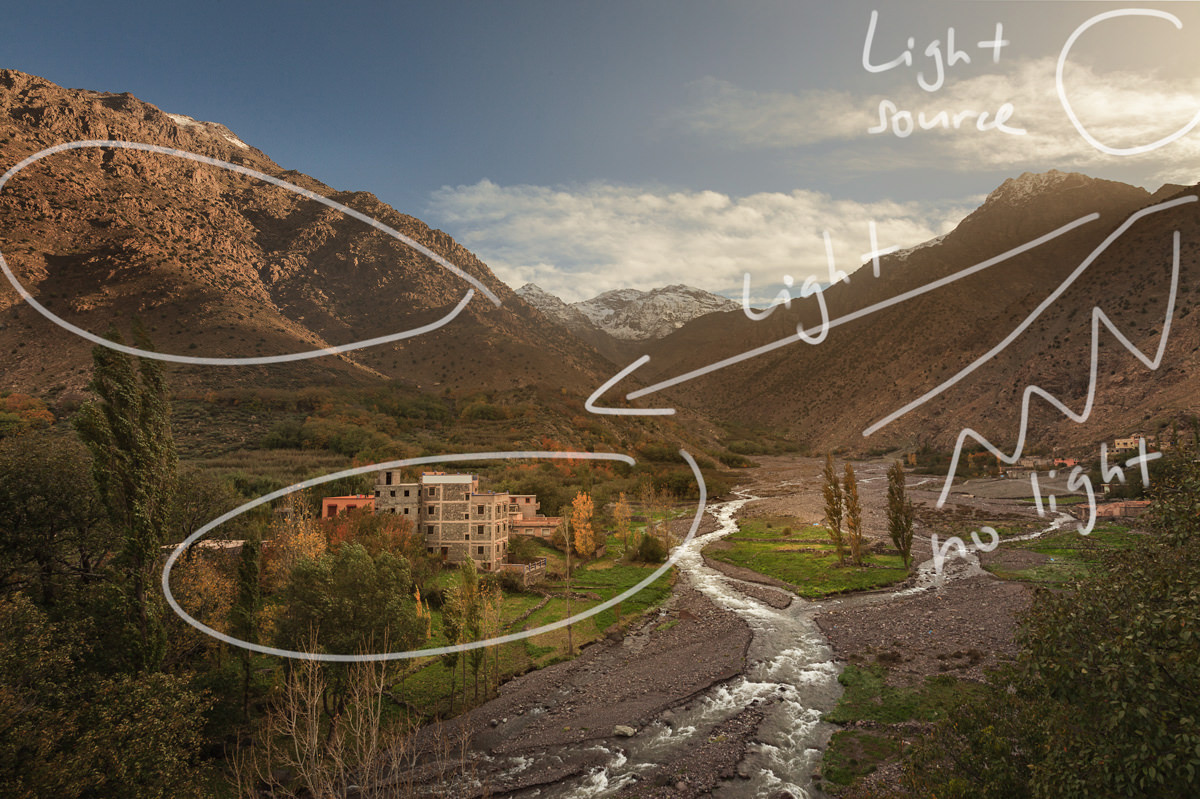
A good result comes from being selective about the type of image you choose to work on. You want an image that has good tonal separation between the light and its surrounding. A good example is when rays of light break through leaves on a tree, or bright light shining through a window into a dimly lit room. In both cases, because the light is moving from a bright to a darker space, it gives the impression that it is “visible.” A picture paints more than a thousand words, so I hope the image below illustrates my point.

Accentuating Light in Photoshop
This technique doesn’t require any third-party plugins or scripts in Photoshop. For that reason, you can technically replicate what I’m showing you here in most image editing software.
Also, instead of instructions, I’m going to share with you what I normally do. You can then process this information the way that works for you. It doesn’t matter if you decide to follow my steps completely or adapt it to your own workflow. Ultimately, there is more than one way to skin a cat.
Once you have opened the image in Photoshop, the first step is visualization. What I normally do is to take a closer look at the image and identify the source of the light. I pay attention to the path of the light, whether it is dispersed or converged. I then look at the direction of the light and the objects around its path. Finally, I visualize how the accentuated light might look and figure out what I need to do to get there.
Personally, I think attention to detail is important. At the end of the day, you want to create an effect that is as natural as possible. This “pre-flight check” gives you an opportunity to do the mental sketching and think about how you can achieve the goal.
The 3-Step Process: Paint, Blur, and Mask
Once you have done your homework as explained above, it is now time to do some actual work. The process of accentuating light is pretty simple. First, you paint with white. Then, you blur it. Lastly, you mask out any unwanted areas with the effect. Let me elaborate further.
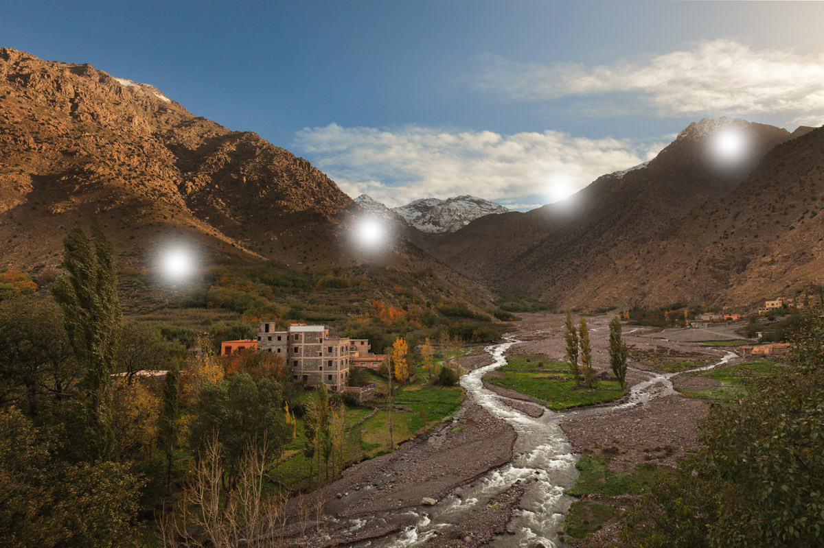
The first step is to select the brush tool and set the foreground color to white. I prefer to set the hardness of the brush to 0 so that the effect blends seamlessly into the image. In regards to the size of the brush when drawing the dots, this is what impacts the size of the light rays in your final image. So, go with whatever will look good according to your visualization in the “pre-flight check.”
Now, create a new layer and paint several dots using the white brush along the path of the light you want to accentuate. The larger the brush size and the more dots you paint, the stronger the effect. Still, you don’t need to worry too much about that, because you can always mask it with a layer mask or reduce the opacity of the layer.
I know everything looks unpromising and bizarre at this stage, but I assure you this is all part of the process!
Applying a Gaussian Blur and Motion Blur
The next step is to create the light from these white dots you have painted. This is achieved by applying two types of blur: motion and Gaussian.
First, use motion blur to render the white dots to a hazy line. With the new layer (the one painted with white dots) still selected, go to Filter > Blur > Motion Blur. Set the angle in the direction of the light. The easiest way to do so is to use the dial to the right of the angle value box. Distance sets the amount of blur you wish to apply. Typically, you want just enough blur so that the white dots don’t look like dots but all fuse together into a white blurry thick line.
Now that you have what it looks like “light”, the temptation is to stop here. But if you look closely by zooming in, you can see the light you have created has some unwanted texture. This can easily be rectified by blurring it with Gaussian blur. To apply it, go to Filter > Blur > Gaussian Blur. You want just enough blur to get rid of the texture and make the light looks diffusely soft. This can normally be done by setting the radius for Gaussian blur approximately between 10 to 30. Too much and you are likely to render everything unrecognizable, to the point that you may as well not have added any effect in the first place! Here is the result, with an added sense of haze and light to the image:

If you find it difficult to visualize the effect when applying the blur filters, view it on a black background by adding a new layer underneath the layer with the white dots and fill it with black. This layer can be deleted afterward when you are done editing. When you are done, change the blend mode of the layer to soft light and you should see the result immediately! You can lower the opacity of the layer to reduce the effect if it is too strong for your taste. If it isn’t strong enough, simply duplicate the layer to double the effect.
Adding More Definition to the Light Ray
Depending on your image, the last step is optional, and you might even find it unnecessary. But if you want to make the light you created more defined, you can do so by masking out parts of the layer you just created.
In the example above, the source of light comes from the top right corner. You can see how the light is partially blocked by the tip of the mountain on the right. So, I want a relatively hard beam traveling diagonally downwards to the left. I can make it more defined by masking out light in a line from the tip of the mountain down to the opposite side of the image.
This is a simple task. Just add a layer mask, select the brush tool, and set the foreground to black. Put hardness to 0 and size relatively large. With a quick and straight movement to mimic a stroke of a brush, paint on the layer mask to conceal any light spilled from the tip of the mountain.
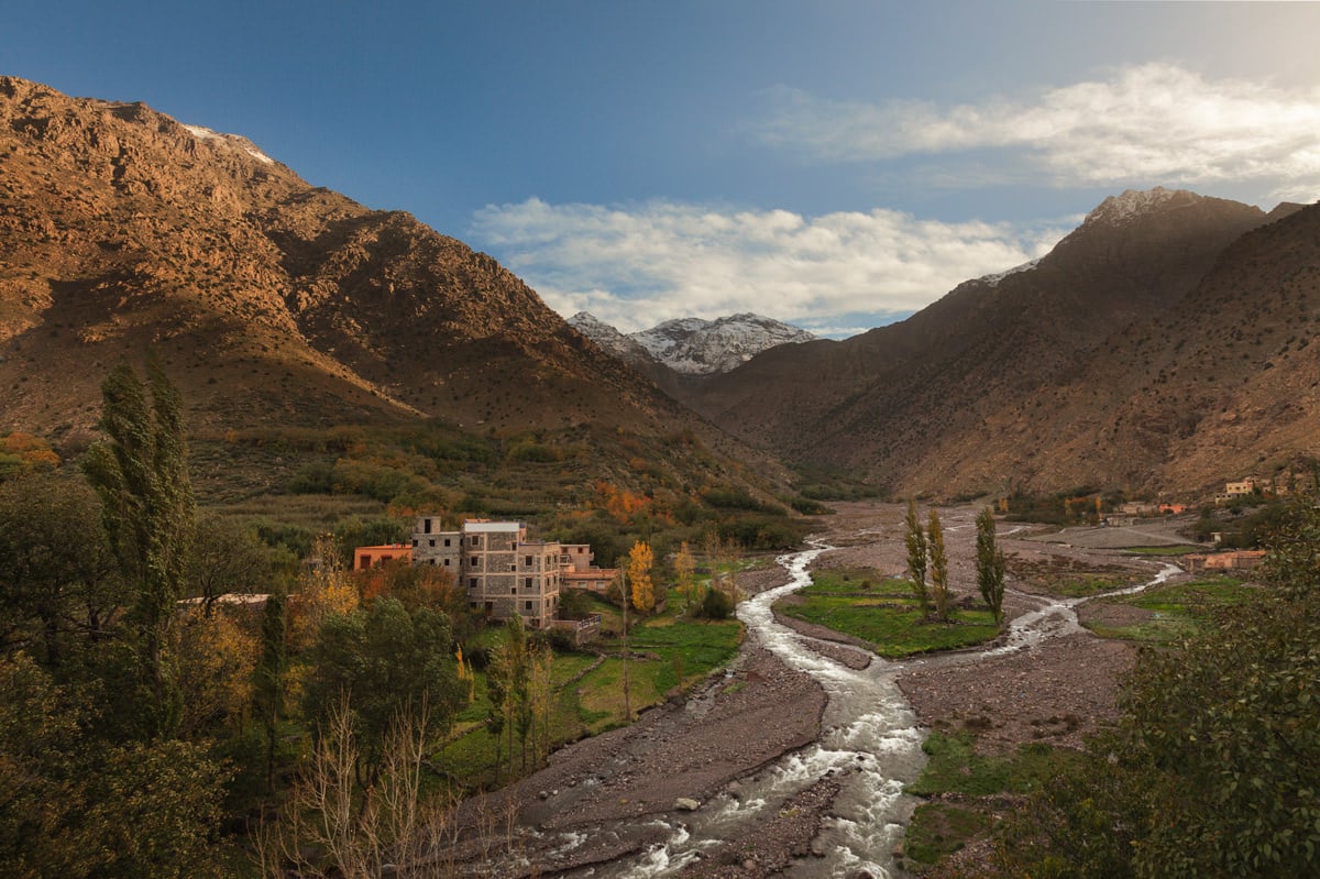
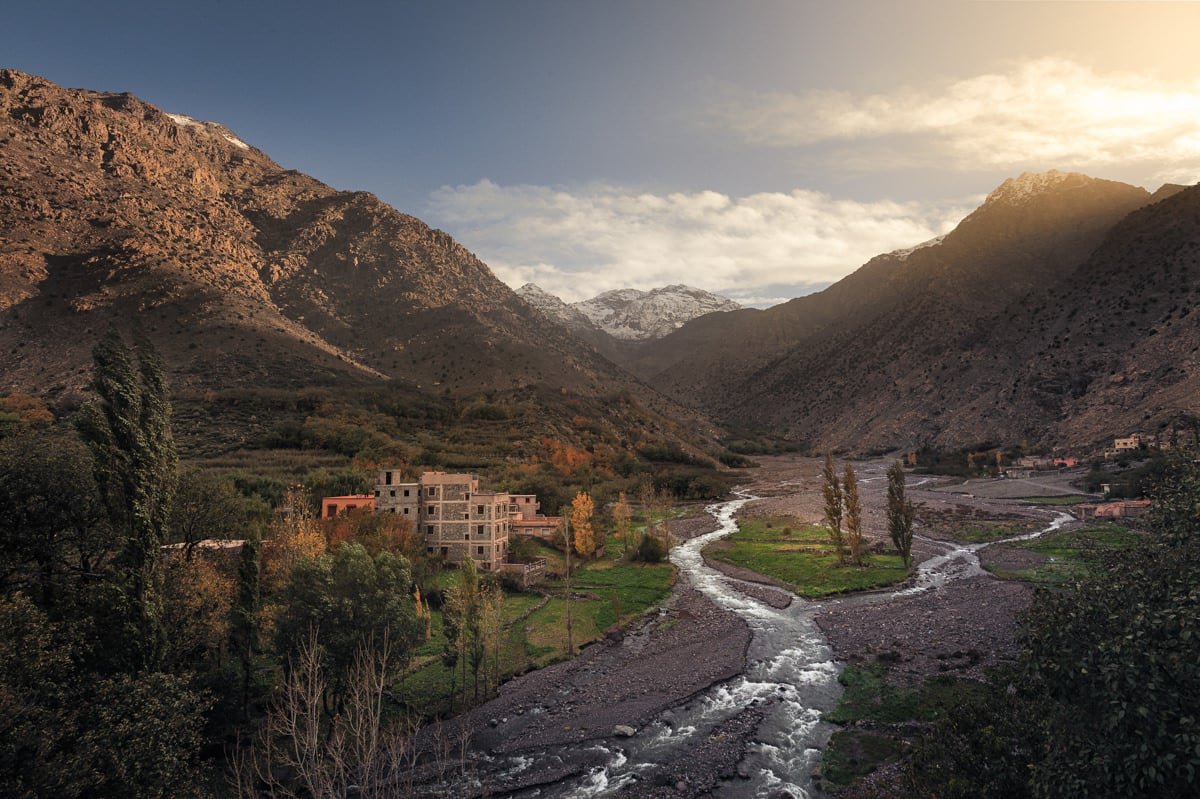
Here is a comparison between the before and after, which also includes further tonal and color adjustments:
There you go, a really easy way to accentuate light in Photoshop!
A More Complex Example
The example I have just given you above is a fairly straightforward scenario where you accentuate light in a single direction. In this second example, I’m going to show you an image with a more complex lighting and how to tackle it.
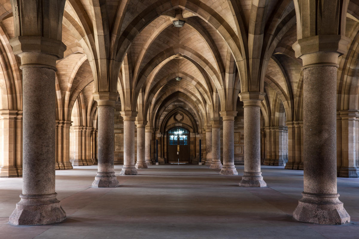
This image was taken at Glasgow University in Scotland. It has a Gothic style architecture with a beautiful cloister connecting the two main quadrangles. I considered this image complex in the context of what we have discussed in this article – accentuation of light in post-processing. When you look at the image, you can see the light is coming from the left, outside the cloister, shining through the arched entrances before dispersing in all directions to illuminate the pillars and the arches in the roof. In addition to that, the image has depth, and the intensity of the light is stronger near the background compared to the foreground.

In the first step, painting with white, I painted several white dots along the lines that I imagined would be the path of the traversing light. Instead of a single line like in the first example, this photo should have several beams, since the light is dispersing from the source (the arched entrance).
So, after drawing dots along the lines drawn above, I did the same steps: I applied motion blur and Gaussian blur until the image looked right. This time, I also changed the layer’s blending mode to “soft light,” since I liked the result better than “normal.” Here was the result:
I was quite happy at this stage, but not entirely satisfied. I thought the image could do with some additional light. So, I repeated the steps to add more light from the arched entrance in the back. That’s something you are welcome to do – duplicating these steps until the image looks how you want.
Lastly, I did some layer masking to cut off the light in certain areas where it did not belong. This is because the light was coming in from different arched entrances, and these were at different depths in the image. So, I added a layer mask and painted black with a soft brush on areas that I didn’t think should be affected, especially including some of the columns themselves. I turned the layer on and off every time I masked out a structure to make sure the overall lighting in the image remains natural and realistic.
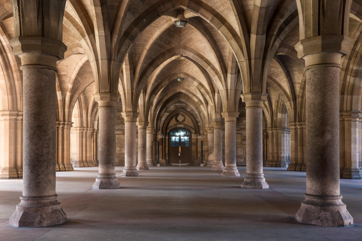
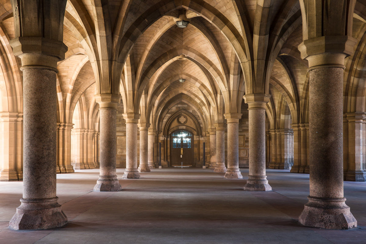
The final version, which also has some additional tonal adjustments, is below:
Conclusion
As you can see, there is no complicated Photoshop workflow here. Just three simple steps: paint, blur and mask. This is by far the easiest way to accentuate light in post-processing that looks natural. Although I personally use this technique to enhance light that already exists in the image, you can use this technique to add light to more of a composite workflow as well.
Thank you to Photography Life reader Yaopey Yong for writing this article as part of our 2018 guest post contest! Yaopey is a landscape and urban photographer. He frequently uses HDR in his workflow and prefers natural HDR through exposure blending. He shares his views on photography on his blog and work on his portfolio.
Very helpful article. Just gave the method a try and it worked very well.
At the risk of impertinence, I would like to suggest one small addition for those like me how cannot line up by eye alone a series of dots.
Before you create a layer for the white brush marks that will form the light ray, create a guide layer with a coloured line. Then place the white brushed layer on top of that. Once you finish with the various blurs, throw away the line layer.
Hi VC, that’s a great and handy tip! Never thought of that.
Sometimes when I find myself having a crooked line, I increase the amount of motion and Gaussian blur. This will normally render any imperfection unnoticeable. Just another thought :)
Nice article Yaopey. Good step by step explanation. I feel some images are missing though? For example – there should be a comparison image after the statement – “Here’s a before and after comparison….”
Hi Gurunath, thanks for pointing this out! It wasn’t something wrong with Yaopey’s article – instead, it looks like our comparison tool isn’t working properly at the moment. While we work on the issue, I updated the photos to be one after another rather than a before/after slider.
Great. Thanks for the quick action Spencer.
Fixed! Thanks again for noticing. If you see the issue pop up again, just let us know.
Thanks for publishing my article! Happy to answer any questions :)