We all have our strengths and weaknesses, as well as ways to deal with the latter. And it is only natural for us to sort of… drift towards our strengths. Hold on to them, practice as often as we can and, by doing so, get even better at them. And so, before I inevitably talk about close-up portraits (which I am not very good at), I thought I’d first discuss much more loosely composed photography (which, though far from having mastered, I dare say I am rather better at).
My word. This is such a relief to write about.
Probably the first, most natural question I get asked when talking about loose composition is – why? Why show more than is necessary, more than just the subject? Why take two, seven, twenty steps back and have the subject almost drown in the environment? Isn’t it counterproductive to decrease the visual weight of the main person or object within the frame by making him, her or it appear smaller? Well… no. No, it’s not. For me, it’s quite the contrary.
The Context, The State and The Story
Whenever it comes to portraits – or any sort of photography a lot of the time – what matters most to me are two things: the mood (or state), and the story. Now, “mood” does not necessarily mean the mood of my model, oh no. As the author of that work, I imprint myself in it in one way or another (as do you and any other author or, arguably, at the very least should attempt to), so it becomes a reflection of my own mood and state. What I see depends on what I feel and vice versa – an immensely interesting circle, that. It is the same thing with the story, which does not mean a clearly distinguishable and understandable narrative. It means an association. It means environment and a certain detail that helps me, the author, find something close to my own world in that photograph. And then the viewer, too, finds something close to his experience. So it is as much the story I create with the image as it is one created by the viewer. In some ways, mood and state become the story, they are that interlinked and similar.
So the question is, what does one do to find that mood, that ever important state of a human being, and that ever intimate story? A lot of beginner photographers often simply move to close too their subjects when creating a portrait, thinking the emotion seen in the face of the model is often enough. Actually, often it isn’t. You see, whilst you are in the moment, observing the scene and feeling everything you want to capture in a portrait so strongly, you are not affected just by the presence of the person you are photographing (naturally, it is not always the case and there are exceptions when the subject itself creates the story, so let’s not be too picky about my choice of words). You are also affected by your own state. Such simple things as basic comfort, yes, but also your feelings, your thoughts, your mood. You are then affected by the environment, by the light, the sounds and smells. Everything you absorb with all your five (or six, of course) senses, everything you think about and the way you think has an effect on how you see the scene and the subject, on what you feel, on what you want to capture. It’s called context.
But here is the tricky part. In that moment, context acts much like leading lines in composition do – it directs you towards the heart of it all, the very center, the very tangle of all those important things in that particular photograph. Yes, the subject and his or her state and story. And thus, in the moment, one does not see the leading lines. All one sees, all one wants to focus on is the end result, the heart. And so you move closer until that’s all you can see, seemingly getting rid of all the unnecessary detail. But what if you are actually getting rid of the context? You can still feel its effect as you snap that photograph. At the same time, you’ve taken it all away from the photograph as far as the viewer in concerned, simply because you’ve framed so tightly and omitted what suddenly is very much necessary details.
In a lot of cases no context means no impact, no story and no mood, or at least a very different one. Think about it – a face of a sad eleven year old boy is very different from a sad eleven year old boy in an empty, enormous, white mansion. Similarly, a photograph of some exotic bird framed tightly is very informative and provides us with knowledge of how the bird looks up close, what sort and colour its feathers are and such. But the same subject captured with a lot more environment included in the photograph suddenly becomes part of a story. There’s a mood to that photograph. A state. And that is what makes an otherwise merely informative photograph stand out as a work of art, potentially.
And so I take a few steps back. A dozen of them if need be. And I include not just the heart, but everything that makes me see and feel what I see and feel in that scene. I give my viewer the context I am so aware of in the moment, so that the viewer may feel everything just as strongly (assuming I am skilled enough to pull it off in the first place, which is not always the case), even if differently. And, actually, viewer does not even matter. It matters for me, as it should matter for you.
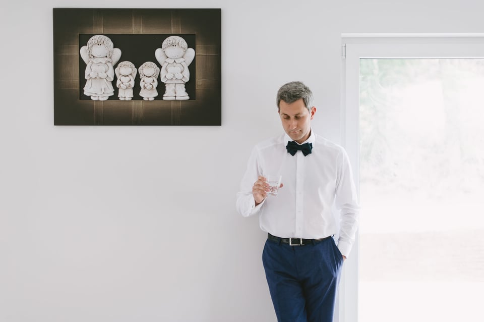
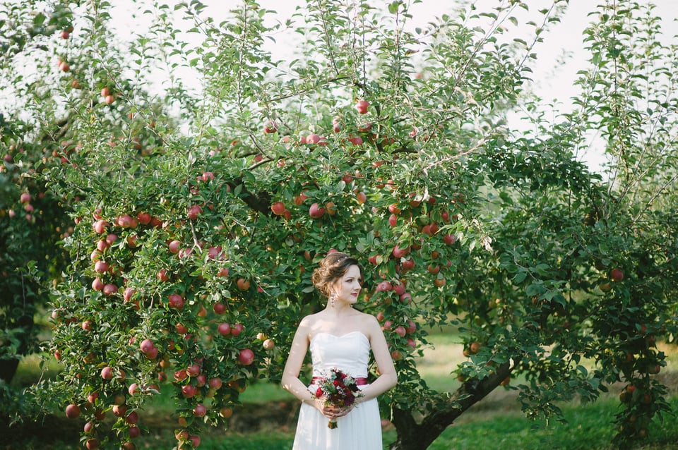
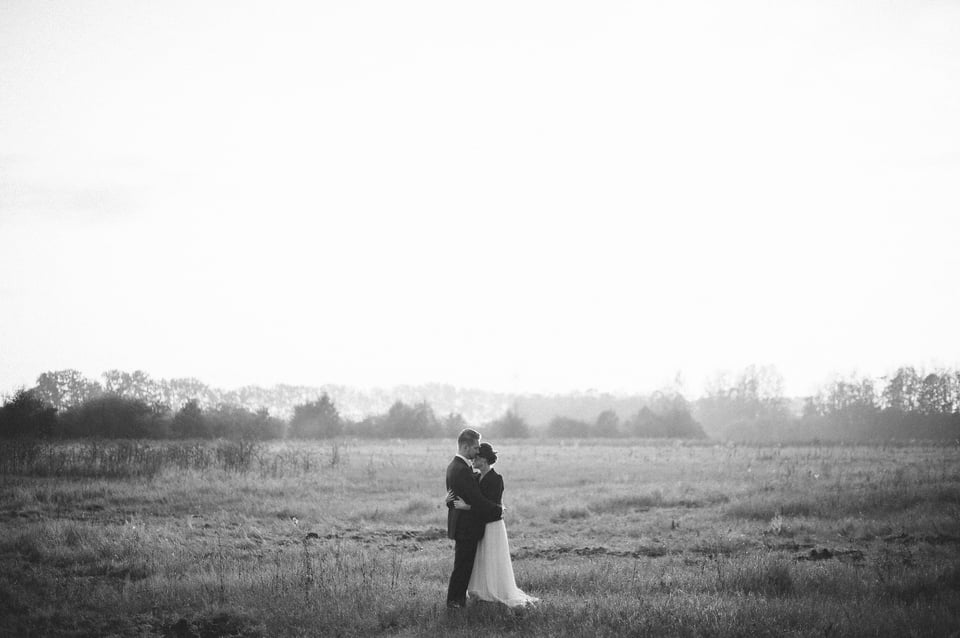
Having said all this, there are still a few points that must be made clear. To start with, the environment itself does not always have to be meaningful or packed full of details. Oh no. Negative space can very much act as a context. Simply adding airiness to an image can make the subject appear calm and peaceful, or sad and lonely. You may find the colours of the surroundings appealing and complimentary towards your subject (that is the case with the very first photograph in this article, I believe). It all depends on how the said subject is surrounded by that environment, what sort of environment it is, and then his feelings, state and mood as well as yours as the author’s. What’s more important is that loose composition – as in, the opposite of tight framing – is a very conditional definition and depends most of all on what you are trying to show as the main subject. If it’s a person, most of the image samples posted here illustrate that situation quite well. If it’s a glimmer in the eye of a person, a tight “headshot” can also be considered loose framing, and the rest of the facial features – context.
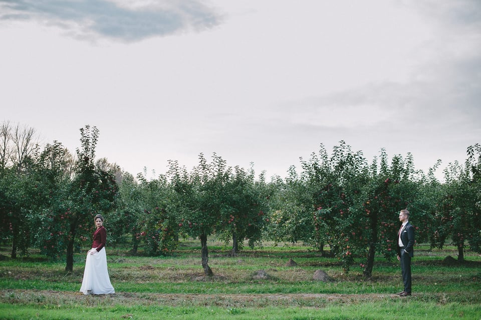
Finally, I fully support the opinion a specific photograph should contain only the necessary detail, and what is not essential ought to be left out. More than that, I’ve been simplifying my work and my approach to photography, my whole philosophy about this form of art, for the last three years, and I’ve not yet made it simple enough. For me, simplicity is beauty. It’s something worth being valued and striven towards. And yet you may think that including more space around the main subject adds chaos and the mentioned unnecessary detail. There is certainly truth in that, it might. But remember, it’s not the object itself, it’s how much visual weight it has in a given composition. Which means, a visually “light” object, one that does not draw too much attention to itself on its own, suddenly becomes part of the background and not an actual detail.
Final Words
There is nothing wrong with close-up photography. Absolutely nothing. But the way such composition is used often does a real disservice to the author, if he’s using it as the default choice and not with thought and purpose. I’ve seen so many portraits portraying (sorry for the word play) beautiful, interesting, catching subjects. But the photographs merely showed that person. They were merely informative. Whenever I see someone’s photograph, it is never the person or location or narrative shown that is interesting to me. It is the authors input I care about. And if only those authors would have taken a few steps back from their subject and included a little bit more of the environment – a little bit more of the context – the informative portrait would suddenly shine more brightly and give me something to resonate with, something to discover.
So, take a few steps back every now and then. You’ll see how much there actually is to what you are looking at. More importantly, so will the viewer.
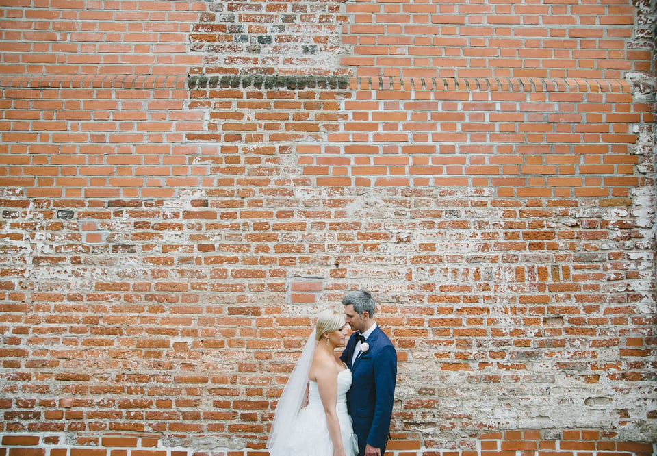
Hi RomanasI found many of theses images interesting except for number 2 (sorry but I don’t get it). I would crop number 1,4,6 to make the images more panoramic. The image no 6 I would add vibrance +clarity . My first choice is no 5 the man on the wall. As for the first image of the girl and the apple trees, I found the trees gives a sense of fertility will all the apples.
regards
Taking a step back can add story to photography. Years ago my wife and I stopped by the Grand Canyon on a cross country trip. We were enjoying the scenery and taking pictures when two young ladies gave me their camera and asked if I would take their picture. I agreed and as the two of them stood together taking a touristy pose, I decided to take a couple of steps back. Through the viewfinder I saw a look of shock on their faces as they waved at me. I stopped and turned around to find myself near the edge of the canyon. That would have made a helluva story. The point to the anecdote is that stepping back can add story to photography – but you can step too far back.
To be really honest, If I were you I would step forward a little bit for some ofthe pictures there as they weren’t my taste somehow. But as I prefer oranges than apples I am not going to discredit any of your work. I would even appreciate it as they could be really good for people with your taste of photography. However, the B&W photo was stunning… With this picture I think I’m catching on what you’re trying to tell us. At the correct time this technique could give new perspective added with a lot of negative space.
Cheers!
Environmental portraiture has its place, the ultimate question though is; wedding photography, for the photographer, should be about sales – right? So are these images going to sell well? Answer… probably not. It would be interesting to know just how many the author sells, or are they included in a package deal? Wedding photography is and should be customer driven.
Sorry, Anthon, but I disagree with just about every word you say past the first four or so. :) My work is not about sales and is not driven by customers. Nor do I think it should ever be. Couples book me because of my work. They choose what I do, and thus choose me. I do not do work to find customers, otherwise I’d be shooting very differently than I do now and, more than that, changing my style every year.
I am glad your approach works for you and your customers. My experience, and others I know, is more commercial and customer driven. So lets just respect that there is more than one way to do the same job. By the way this is not a critic of your images at all – I like them – what we have here is a difference of philosophy.
I loved this article and even more so loved the images!! Thank you for sharing!!
Thank you, Glen!
how do you focus images correctly when your subject is on one side of the frame? You use a pretty wide aperture but how come both your subjects and the background is in focus? D700 does not have AF area mode does it so you cant chose 2 focus points to keep over your subjects. How is the guy and the painting perfectly in focus with an aperture of 1.4?
Muhammad, there’s no secret here – I focus using he center AF point, then recompose. The reason why the apples are in focus is because they are roughly on the same plane as the bride. I almost literally made her stand in the tree to have some of those apples in focus. As for the other photograph, I focused on the face of the groom, but because I moved back quite a bit, the artwork on the wall is also relatively in focus (it’s a relief painting (?), it protrudes out of the frame).
Bokeh and shallow depth of field are overrated :)
Beautifully done Romanas. I love how you plan your portraits, even the way your models pose is so much different from conventional photography.
Thank you, Muhammad, that means a lot!
Whether or not one likes any of the images represented here, for any reason, is not the point of the article. Imagination and concept is.
As a journalist I often find myself at the beginning of an assignment falling into the routine of just obtaining shots to satisfy the work itself. I’m good at that since I’m a geezer and cut my teeth with film, as many of PL members did in the past. Not having the luxury of making a thousand shots at an event forces photographers to capture what our editors wanted in the shortest amount of time. I’m impressed at the education Romanas offers here rather than the images; although I do get them and created my own scenario regarding why he made them the way he did, and what he might have been trying to relate to the viewer. Whether or not his mind set behind the creation of each image matches what I, as the viewer see, is not important. All that was done here was to illustrate a different view point to a creative process.
Thanks Romanas, I’m going to give this a try and incorporate this technique into my work.
Thank you, Mike. As always, a very reasoned comment I enjoyed reading.
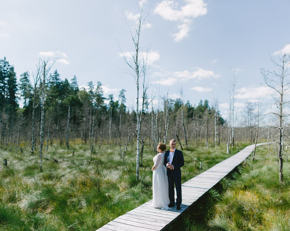
I love image 6, from the boardwalk. It seems to me that this is more of an 85mm photo at 2.0 . The background is out of focus but not the clouds. Is there photoshop work on this at all? Love how it looks almost like a medium format photo.
Patrick, thank you! The clouds are also out of focus, but they are clouds, not much detail in there in any case :) I used Brenizer method panorama for this image, hence the medium format look. Colour work was done in Lightroom, merging to panorama was taken care of in PS CS5.
We do have articles on the technique if you are interested. Just do a “brenizer method” search in the site and you will come across them.
ah! I knew it! Yes, I love the Brenizer method. LOVE it. Nice work and thanks for clearing this up! I’ve done a few photos like these and always wonder why I don’t do more.
It is a great technique, although can sometimes take a while to do correctly. And we don’t always have the luxury of taking a while to do something, do we? :)
A great reminder. I can relate to some of what you said very much. When I first started taking pictures of people they were very much too close. It was like I could only understand a composition of a head shot. As I got more comfortable and challenged myself I started to pull back. What really helped was going to a 2 day workshop and having the pro leaders sit me down and tell me what changed my portrait world: I was being too reticent and deferential and to do well I needed to be respectfully assertive and direct people clearly.
Since that time I found that photographers, especially of people, begin in one of two camps: 1) Overly aggressive/controlling and maybe unsafe and 2) Overly deferential and mealy-mouthed and kinda wimpy. Better to move to the middle where you are respectful, safe, and the leader in the photo shoot with clear direction and purpose.
I think more people would try the compositions you mention if they had someone they trust/respect come alongside them and give them a metaphorical splash of cold water on their efforts and show them what their tendencies are that they can’t see and then challenge them to work on it. A lot of people think photography is an individual sport but there’s a lot to be learned with a mentor or at least some honest feedback.
Thank you for your input! You are, of course, correct. I hope to earn the said trust/respect some day, it’s why I do all of this :)
I’ll be totally honest; if I were the customer and you gave me the first picture I would be disappointed.
I imagine that wouldn’t be the only picture. For a wedding album it would be perfect. Also it allows room for decoration/wording to be placed on that would make for a great cover page or wall art.
Jstevez,
thank you for your opinion! To each his own (I may have been using the phrase far too often lately). Personally, this is one of the few portraits that I took that I actually like a lot. The light is beautiful, the framing unconventional and the colours are simply gorgeous for me. Somehow, it just works. That said, my work has never been the sort that most people like, it’s a bit of a niche. I like that. And I’ve never taken portraits to satisfy to someone else’s taste. That sort of honesty is important, wouldn’t you agree?