A few weeks ago, I visited Casa Mila, also known as La Pedrera in Barcelona Spain, which in 1984 was declared a World Heritage site by UNESCO. It was the last civil work designed by renowned architect Antoni Gaudi, who was the best-known practitioner of Catalan Modernism. When visiting La Pedrera, I walked onto the stepped roof called “the garden of warriors”; called so because of the chimneys which appear to protect the sky lights, and discovered to my disappointment that due to the size of the crowd and the presence of a fence, I wouldn’t be able to photograph the entire architecture of the roof in a single shot.
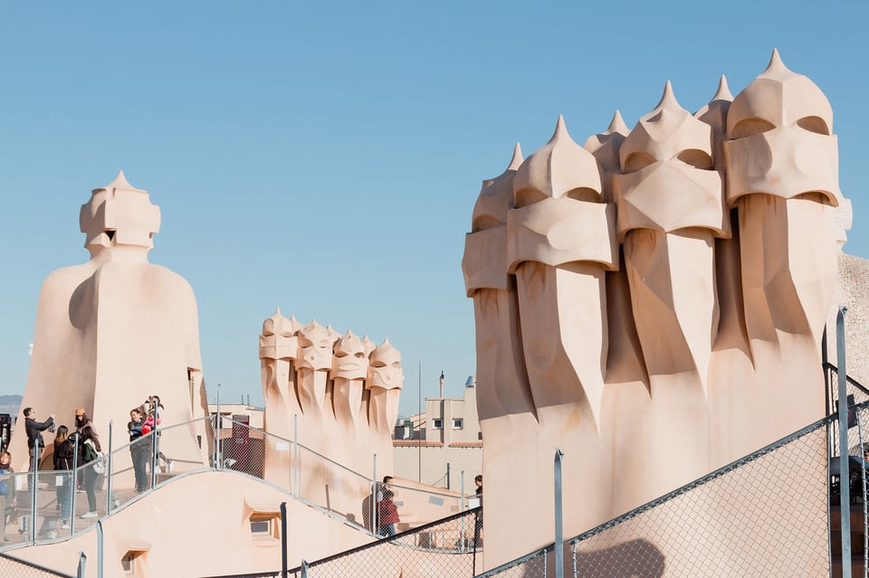
As seen above; the people, the fence and the buildings behind ruin the organic and looping arches of Gaudi’s beautiful architecture piece. While I realized that photographing Gaudi’s work in its full content will be impossible, I decided to start separating the intricate and exclusive aspects of his work in such a manner that one would appreciate the separate pieces, just as much as the whole.
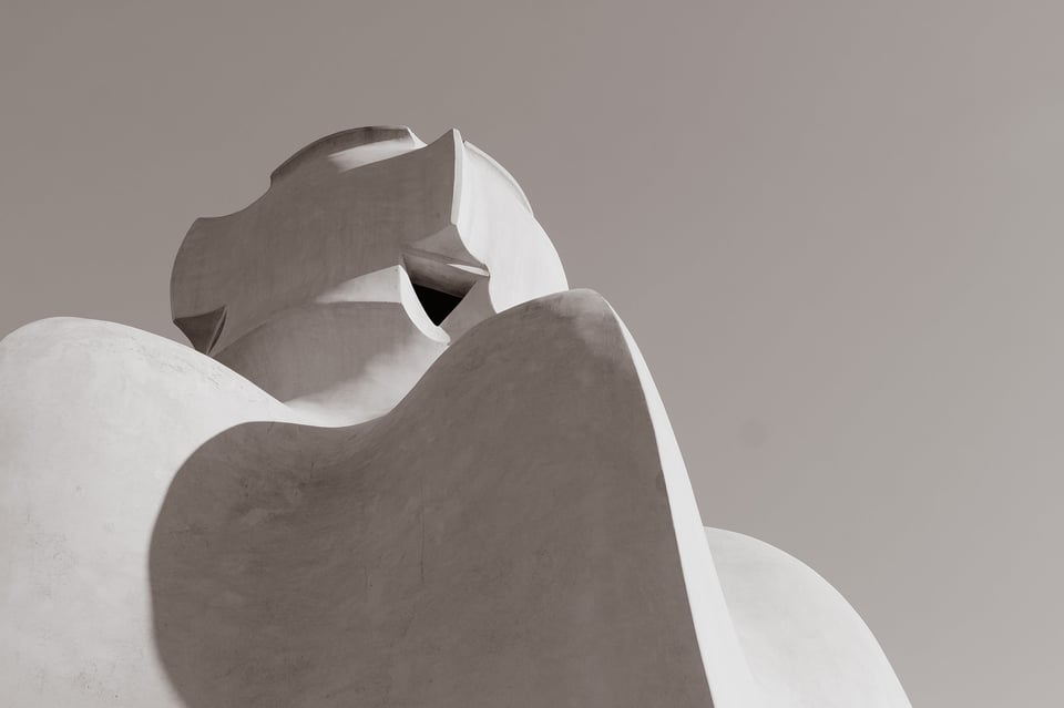
The first photo I took was from a low angle and I tried to position the structure in the top left part of the image following the rule of thirds and it was great that the curved lines of the structure lead one’s eyes directly to the top.
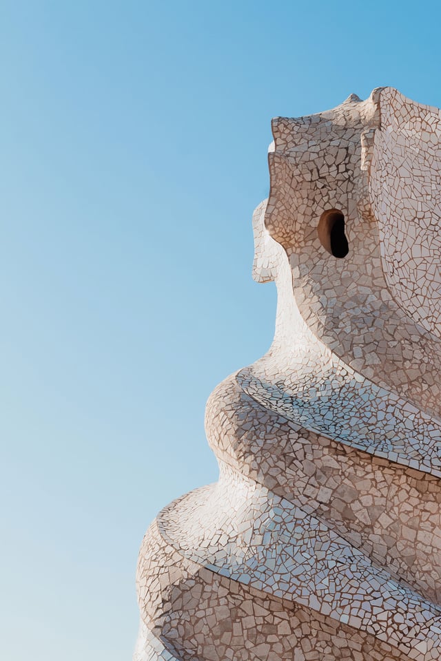
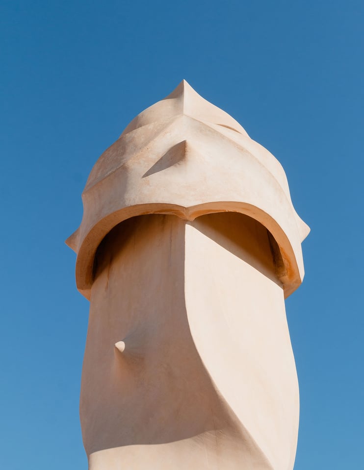
For my second image, I noticed this chimney which was facing in the direction of the sun. I had to zoom in at 50mm and have my hand covering the top part of my lens to minimize any lens flare, since I didn’t have a lens hood that day. I really loved the intricate mosaic and the perfect spirals around the structure. It reminded me about the Fibonacci spiral and the picture of the bicycle riding man by Henry Cartier-Bresson. I later found out that the reason why it is twisted is so that the smoke would come out better.
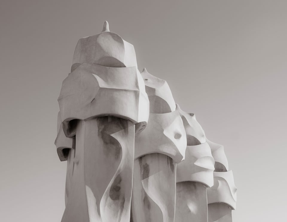
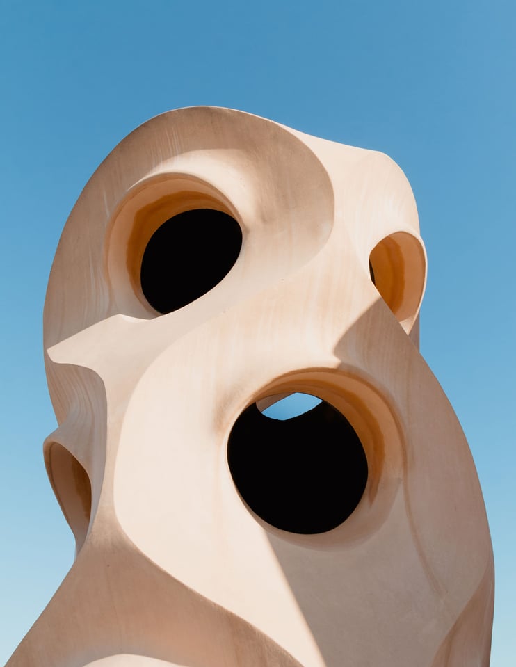
My favorite photograph is one that I took of the ventilation shaft. It is quite simple in composition and it reminded me of “The Scream” by Edward Munch, because the top holes looked like eyes and the bottom one like the mouth.
In conclusion, it is quite hard to photograph places that are renowned for their architecture without having people in your frame or any other distractions such as a modern fence. However, my own takeaway was that if you can’t be the first one to arrive at the desired photographic location, then concentrating on the details is just as important and can be just as creative and satisfying.
This guest post was contributed by Marc Belciug. You can check out more of his work on his website.
Hi CJN,
Any time of day is the best time when you have no other time to take the photo. This happens so often when on a holiday tour etc.
It is similar to the expression:
“The best camera you have is the one with you at the time” (My iPhone has helped me out on many an occasion).
Regards, Colin B Sanders LRPS
Lovely snaps, enjoyed the details.
I don’t know into which category these pictures would fall into – Landscape as some say or architecture.
I observed that the snaps had a very good exposure, to natural light. I even observed the shadows the structure had cast and wondered must have been captured around midday. The sunlight seems to have been very harsh.
You will apologize to my query as I have read in articles on photography, to avoid any sort of photography during midday as the sunlight would be very harsh.
Would someone dispel the myth that I have been carrying on in my brain and convince me that anytime is good for any sort of photography.
Thanks
Of course the best time to shoot would not be midday but the Gaudi house was really popular and the tickets had to be ordered a few days ahead, and so i couldn’t choose the “optimal” time. It would be similar for photojournalism. The photojournalist doesn’t choose the time to photograph an event, the event is scheduled and there is nothing he can do, but nevertheless still goes out, in spite of the fact that it might not be the golden hour or the blue hour.
I had a friend that commented I never had people in my pictures and that was before I discovered post processing which makes it much easier.
I found that I can crop what I need with Corel AfterShot Pro (Lightroom). I rarely need to use PaintShop to get the details I already had in mind when taking the shot.
Interesting commentary regarding the inclusion of people and restricted viewing angles. What to include is not a debate but a composition choice. In some cases the choices are made for you. I think of the castle in Britain where the entire countryside (farms, trees, etc.) were set up to provide a nice view from the castle.
thanks for the great article!
this is popular site!
In my opinion all of the images will pass for calendar publication.but a complete story would have been told if there were people in the background.
Please sir, l am seriously looking for some advice on how and what to shoot for calendar publication. I teach introduction to photography to senior secondary school students in my state, delta state Nigeria.
I love to hear from you.
Thank you for an anticipated response
FLAWA Brodericks
Flawa Brodericks,
Why are you “seriously looking for some advice on how and what to shoot for calendar publication” considering that you are already teaching “introduction to photography to senior secondary school students in my state, delta state Nigeria”?
Not being rude: I seriously think that your students are the ones who should be giving you the advice you are seeking.
You wrote: “In my opinion all of the images will pass for calendar publication.but a complete story would have been told if there were people in the background.” Which is a clear demonstration of being rude!
Hi Marc,
I had the very same problem here a couple of years back. I isolated the chimneys by careful shooting and post processed them in a charcoal effect from Topaz Adjust. They really looked menacing. I cannot show an example here, but if you want to see the results:
viroarts.com is my portfolio – see under “Monochrome” section.
Keep up the good work, Nasim.
There are some very interesting images here. I encourage others to check them out both in the color and b&w sections.
Hi Nasim,
I also was in Barcelona last November for the first time in my life and I had the same disappointment. The same problem holds for Park Güell, but luckily its most fascinating points of view were not crowded, since people were mostly attracted to the benches in the monumental zone, that IMHO are the less interesting things for a photographer. Not to mention all those selfies, the smartphones held in the air and those selfie sticks… you have already discussed the phenomenon very well in a previous article ;-)
Kind regards,
Alex
I should have written: Hi Marc – but I was misled by the e-mail notification being signed by Nasim and carrying his portrait. I love the pictures on your personal website. Congratulations, carry on the great work!
Thanks Alex! I ran into the same problem in Park Guell too :)
Hi Nasim,
Good article and information. I know that I probably have many photos similar to the first image that you provided in this post. I know I never looked at it before from the perspective that you gave, separating individual aspects into separate pieces instead of photographing them as a whole. Sometimes though, I don’t think that including people in a photo is always a bad thing, but it must be in a way that does not take away from the image you are photographing. In the image you used as an example though, the fence and buildings in the background definitely did not add to the image. The way you captured the different elements of the architecture in individual photos really showed the beautiful detail of the artist’s work.
Vinnie
Marc, I inadvertently addresses my reply to Nasim. I apologize for not being more observant to who wrote the post. But my thoughts are the same… good article and it will make me look at things differently in the future when I am presented with similar circumstances.
Vinnie
Thanks Vinnie ! I am happy you liked the article. I did take a few more pictures with people to show the scale of the structures but i didn’t add them because i didn’t want to contradict the article’s title. It is a great topic to discuss when people should or should not be in the frame. I agree with you that it depends if they take away or not from the final image.
One of the very first things I learned with photography was….. to come closer. Isolate your subject. Of course that does not apply to landscape as such and at the same time it does. That’s why I find photography such a fascinating subject. Forever the challenge. I loved your article, thanks!
Surely it depends on the shot, some structures/landscapes encourage people or animals even to be within the images bounds whereas some other images within the same sphere do not. Like wise both depend on us the individual image takers, and what we see or want to see.