A while ago, I wrote an article on low-contrast B&W conversions with Lightroom. After reading through some of the responses the article received, I was pleasantly surprised that so many of our readers actually prefer the low-contrast look over the ever-popular high-contrast conversions. That is not to say high-contrast B&W photography is in some way inferior, not at all. As we have covered before, it merely sends a different emotional message. It is the more popular, the more easily accepted sort of look, which is exactly the reason why I saw fit to go against the wave and start with the opposite. Now, ever since I wrote that piece, I’ve received several requests for a similar article on high-contrast conversion. This topic is particularly tricky for me since I rarely do high-contrast B&W, but the requests did remind me of one occasion where I was deliberately working towards such a result from the very start. And so, as always, we begin with a photograph.
A side note: whilst reading the introduction of this article and some of my statements further on, you might come under the impression I see high-contrast photography, in general, to be somehow wrong. You may think I dislike it. I assure you that is not the case – as, with everything, it’s all a matter of pre-visualization. We don’t (or should not) choose a particular post-processing method according to our “likes” and “dislikes” – the subject, the light, the mood (that conveyed by the image and our own), and the photograph itself dictate the final look of our work. What I do dislike is the overuse of contrast – for some photographers, it is common practice to try and fix images by adding contrast and even saturation (the same way some try to fix their work by converting it to B&W, actually). In other words, it is not the technique, but how and when you apply it, artist or not. As always it is also important to note that the conversion I chose, and the steps to achieve the end result, are very case-sensitive. There is no one perfect way to do things and no one perfect look. Whether you like the result or not depends immensely on both your taste in B&W photography as well as your monitor calibration. There are so many ways to convert images to B&W, this isn’t even a scratch on the surface, barely a drop of water in the ocean.
Table of Contents
The Photograph
For this particular article, I had to dig quite deep in my Library to find something suitable until I re-discovered a project I worked on almost a year ago. There is no point in talking you through it in much detail given that there’s a whole article already written. What is most important in this particular case is that, from start to finish, I was working intentionally to make this a high-contrast B&W image. From setting up the lights to choosing the subject and equipment, I knew exactly what the photograph would look like and it could not have looked any different. The emphasis in this portrait is on the contrast between the calm mood (to an extent where it is almost absent) and the well-defined, contrasty, impactful texture of the skin. Now, given that this is an unprocessed RAW file, not that much of what I described is visible, but the start is there: the light accentuates the wrinkled, rough skin of the personage, and because there’s so little fill-light, the face remains the brightest area of the image and thus attracts the most attention. This part is very important – the way I lit the subject ensured not only smooth, but also high-contrast rendition. The decisions I made during post-processing served only to enhance that, not fix it.
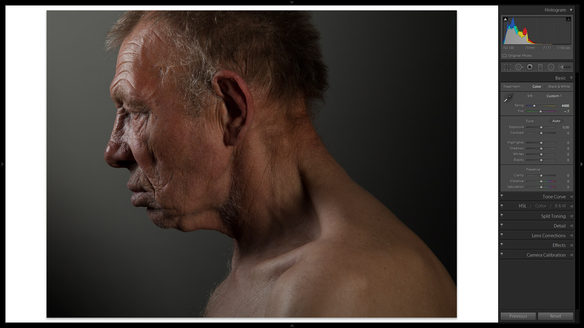
This is part of the reason why the initial photograph might appear underexposed for some, too (especially if you take a look at the Histogram). The overall exposure of the two images, before and after, is quite similar, as you will see. It is common practice to “expose to the right”, especially when working in the studio, to save as much information in the shadow areas as possible. It is also the common practice that I rarely follow myself as I try to get as close to the necessary exposure in-camera as possible when I know I won’t be needing that extra bit of shadow detail. Perhaps shooting film and thus judging exposure precisely has something to do with it, or perhaps because I don’t find post-processing a glamorous endeavor as is without complicating it further with such overly technical, if useful, techniques.
Unlike in the previous tutorial, I am about to do quite a bit more local adjustment with this photograph. Before I start, though, it is worth mentioning the equipment used to take the portrait. Normally, I tend to work with my Nikon camera and lens, but for this particular project, I chose the Canon 5D Mark II for its higher resolution sensor and native ISO sensitivity of 100 (useful in a studio, especially if one plans to use wide aperture settings). The D800 might have been even more suitable, but I did not have one at hand at the time. Even so, the Canon proved to be brilliant for the task. As for the lens, I chose the brilliant Canon EF 24-70mm f/2.8L II USM. Using a zoom lens in a studio is very convenient and yet, because the aperture is often stopped down quite a bit (f/11 in this case for both depth-of-field as well as maximum detail resolved throughout the frame, edge to edge), there is no downside to image quality even when compared to some of the best prime lenses. The portrait was taken in a studio with two light sources, as can be clearly seen.
The Result
The screenshot above shows the portrait with some very minor, basic adjustments – White Balance, Cropping (aspect ratio was also changed to 4:3 for better composition), and Sharpness, mostly. The following image is the result of all the steps I took during post-processing:
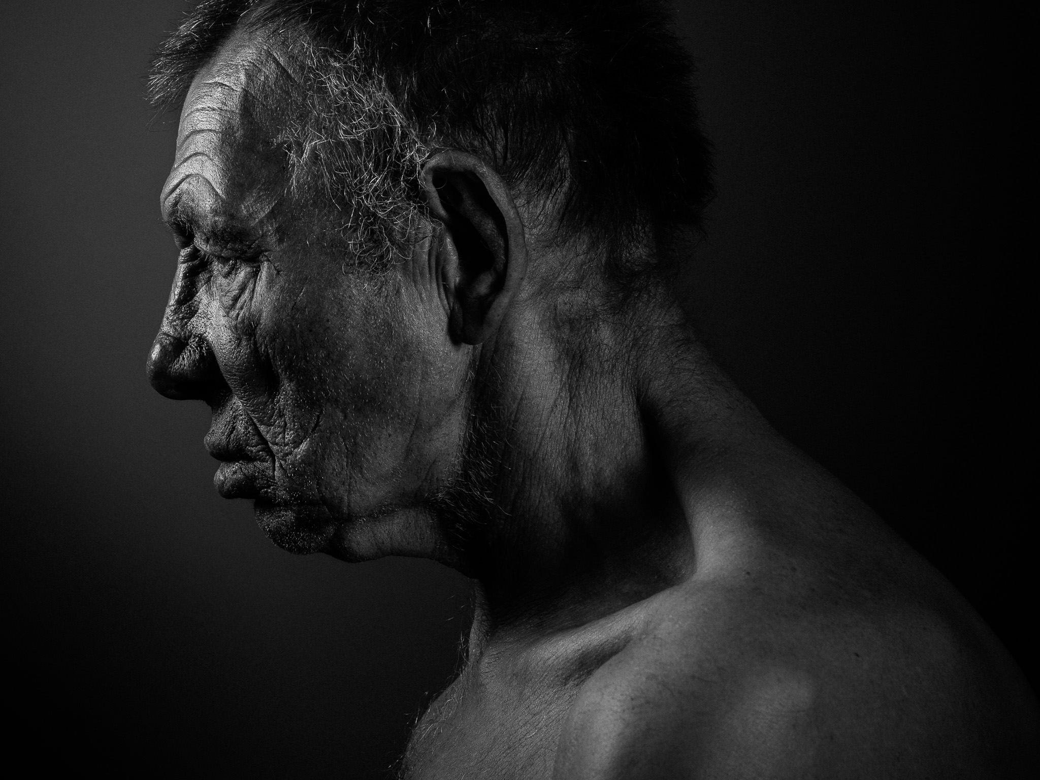
As you can see, the result is quite a bit different than the image I started with, and not just because it lacks color. During post-processing, I tried to strongly enhance the subject’s facial features and some significant local adjustment was necessary to achieve that, not least because a flat RAW file “softens up” the skin texture considerably. I also had to take measures to ever so slightly adjust the light on the background since I did not manage to control it well enough during the brief shoot. Overall, there is much difference between the two images, and that once again shows us just how important post-processing really is for photography, and always has been.
So, shall we?
The Process
Usually, my post-processing routine is quite simple. First of all, I need to find a good starting point for two specific areas of the photograph – the background and the main subject. What matters here is not the amount of contrast itself, but the visual relationship between the two elements. Once I sort that out, it is then only a matter of adjusting the general contrast of the photograph to a necessary level. But let’s not get ahead of ourselves – basic corrections and conversion to initial B&W are where we start.
1. Basic Conversion
I’ve already mentioned some of the first steps that I took in the preparation of the image for the “real” process. I always do these adjustments beforehand to give myself a better idea of how the scene really looks like and which settings specifically need to be adjusted to achieve the desired look. So, before I do anything else, I adjust the White Balance, Sharpening, Crop and, if necessary, Exposure. Mind, Exposure is always likely to be adjusted as you work, sometimes even on more than one occasion, so this particular step applies only if your original exposure settings are way off and considerable adjustment is necessary. Last but not least, I correct any distortion the lens may produce in the Lens Corrections tab – a very simple matter if Lightroom has a profile for the lens used. If not, I apply this correction only when distortion is apparent. Otherwise, it is not necessary.
After that, the basic conversion to B&W needs to be done as a starting point. With Lightroom, you have at least four ways to do it:
- Treatment, Basic Tab – set the Treatment at the top of the Basic Tab on the right-side panel in Develop Module to Black & White;
- Saturation slider, Basic Tab – set Saturation to -100 at the bottom of the Basic Tab;
- Saturation sliders, HSL Tab – set the Saturation of each color separately in the HSL/Color/B&W Tab;
- B&W, HSL/Color/B&W Tab – select B&W section in the HSL/Color/B&W Tab, which is effectively the same as the first option, choosing Black & White Treatment at the top of the Basic Tab;
Strangely enough, each initial conversion method (bar the first and the last one as they are essentially the same) results in a slightly different look. If you choose B&W as the Treatment, Lightroom will automatically assign certain values in the B&W Tab based on its analysis of the image. Whether you find those adjustments to your liking or not is very personal and depends on each individual photograph. This time around, I chose to desaturate each color individually using the HSL Tab. There’s no particular reason for it other than the fact I will be making quite a few adjustments using that tab, so might as well do the first step there, too:
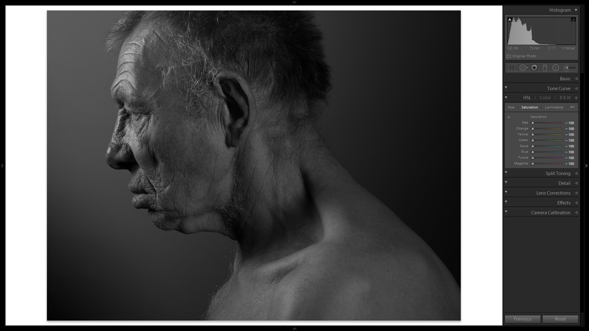
What we end up with is a B&W photograph with a very smooth tonal transition, but also one that is quite “flat”. Still, such an early conversion already gives us a pretty good idea of what needs to be done – removing color helps us notice the luminance of different areas more easily. All the other steps are basically meant to brighten up the light areas and darken shadows further.
2. Tone Curve
What is likely among the most powerful tools in Lightroom or indeed any post-processing software, Tone Curve is where I do the most to achieve the look that I want, be it a low-contrast conversion or that which requires a swifter transition from highlights to shadows. In fact, in many cases, Tone Curve in conjunction with the HSL/Color/B&W Tabs is all you need for beautiful B&W. The first thing I did with the Tone Curve in this particular instance is switch it to Edit Point Curve mode, as shown in the following screenshot:
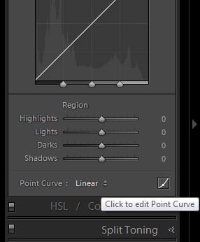
This allows free transformation without Lightroom’s aid of keeping the curve smooth. There, I click on the Point Curve drop-down menu at the bottom of the Tab and select the Strong Contrast preset. The photograph is instantly transformed into a much more “punchy”. Take a look at the changes I’ve made in the Edit Point Curve mode with just a couple of mouse clicks:

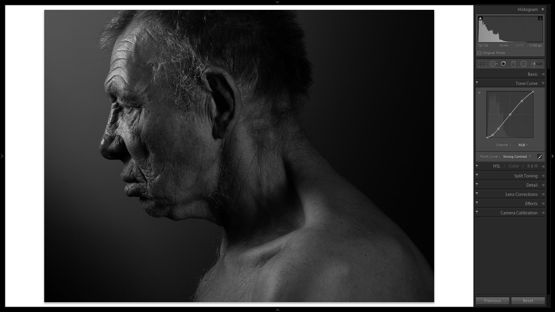
Quite the difference, yes? Now, we are not done with the Tone Curve yet. The Strong Contrast preset serves as a better starting point for the background as well as the main subject than the straight, linear setting, but some final adjustments will be required a little bit later. For now, the current changes gave the image enough “pop” for me to start searching for a good relationship between the main subject and the background with comfort. And now that the background is closer to my vision, time to do some local adjustments with the HSL Tab and the Adjustment Brush to give the main subject of the photograph an equally good starting point before final adjustment.
3) HSL/Color/B&W Tab
What Luminance adjustments within the HSL/Color/B&W Tab allow me to do is change the brightness of certain areas of the image based on their color and not tonality, as is the case with the Tone Curve. In other words, even though we are working with a B&W image, this “more local” adjustment, in a somewhat peculiar way, involves working with color. For this particular case, this means I can brighten the skin of my subject without affecting, say, the background of the image, and this is exactly the sort of local adjustment that often proves key in a well-done B&W conversion.
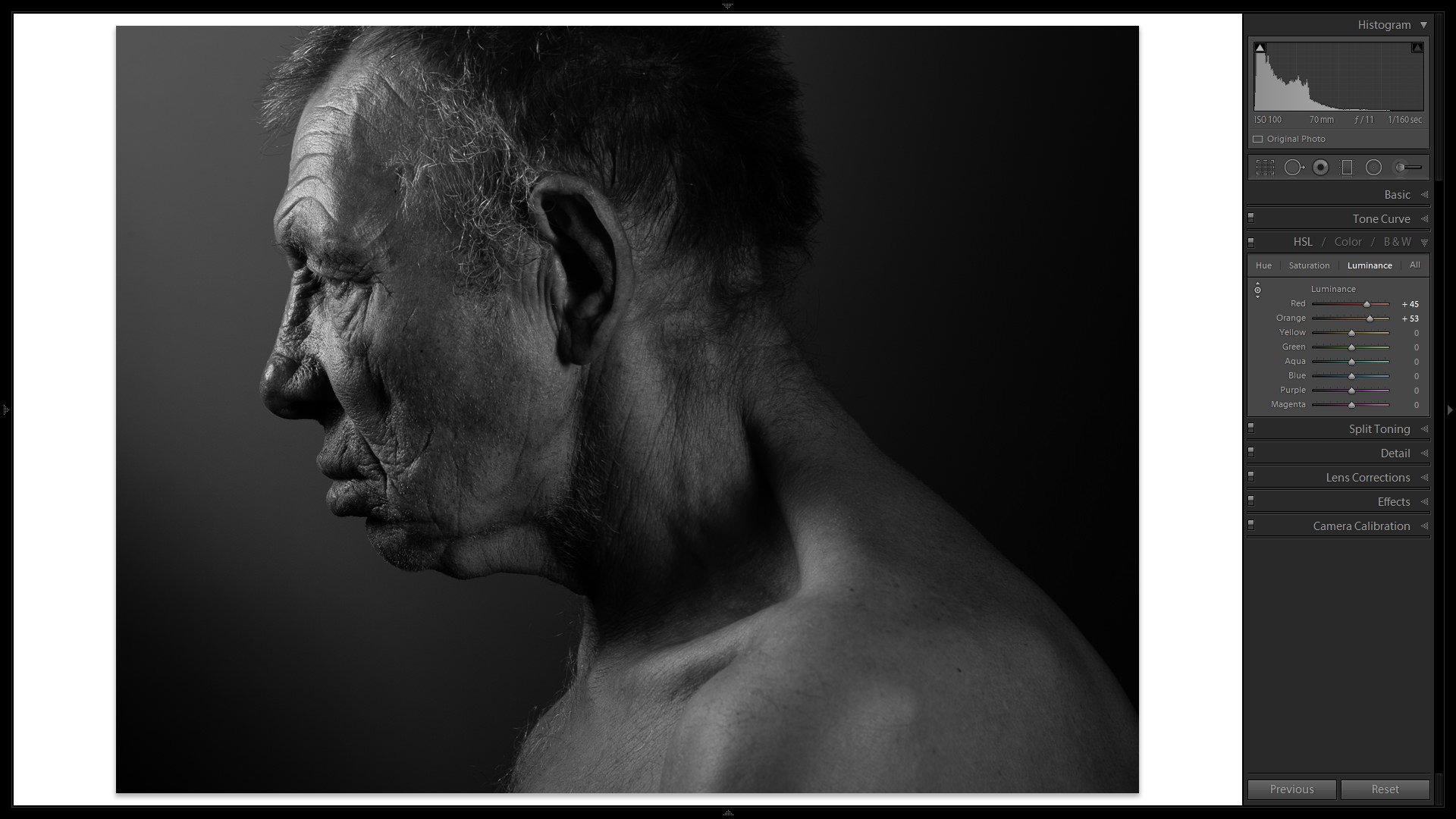
As I trust you remember, skin tones mostly consist of orange, some red and a little bit of yellow color. I only adjusted the red (+45) and orange (+53) sliders since yellow was much too subtle and unnecessary in this particular case. There was no particular reason why I chose to set Orange to +53 and not, say, +52 – I merely dragged the sliders till I was satisfied with the look. Naturally, it involved some going back and forth, so don’t expect the same numbers to work in your case – experiment to find what suits your vision. With the portrait I am working on, the changes resulted in generally brighter skin tones. What matters is that the most prominent highlights on the subject’s face were further emphasized, yet the background did not change at all. Use the tool above to compare the before and after HSL Luminance adjustment images.
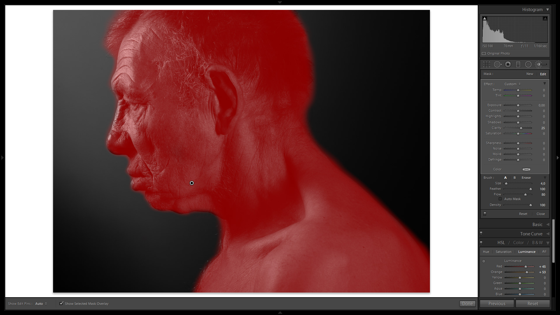
4. Adjustment Brush
Now that the skin, on average, is more or less as bright as I need it to be in relation to the background, it is time to increase local contrast and add even more visual impact where the subject’s face is. For this, the Adjustment Brush is the perfect tool. I have two choices that would help me increase the prominence, and definition of the skin texture – Contrast and Clarity. Since Contrast actually increases the brightness of the highlights and makes the shadows even darker, it can potentially blow out some of the detail that I’d rather preserve, especially since I plan to use the Tone Curve to increase general contrast at the end. Clarity is the better choice in this case since it only affects the intensity of the transition from shadows to highlights, and so that is the setting I chose.
In total, I will need two Adjustment Brushes, one for the whole subject (lower Clarity value) and one for the subject’s facial features (more aggressive Clarity adjustment). For the first Brush, I set the Clarity slider to 25 and “paint” the whole subject, as can be seen from the following screenshot:
The second Brush was much more aggressive (I set the slider to 62, and that is in addition to the first slider as the two areas of effect overlap), but was only applied on the most prominent area of the subject’s face to help all the creases, wrinkles and textures of the skin stand out. And they certainly did. Use the following tool to compare two images – one before Adjustment Brush, the other after:
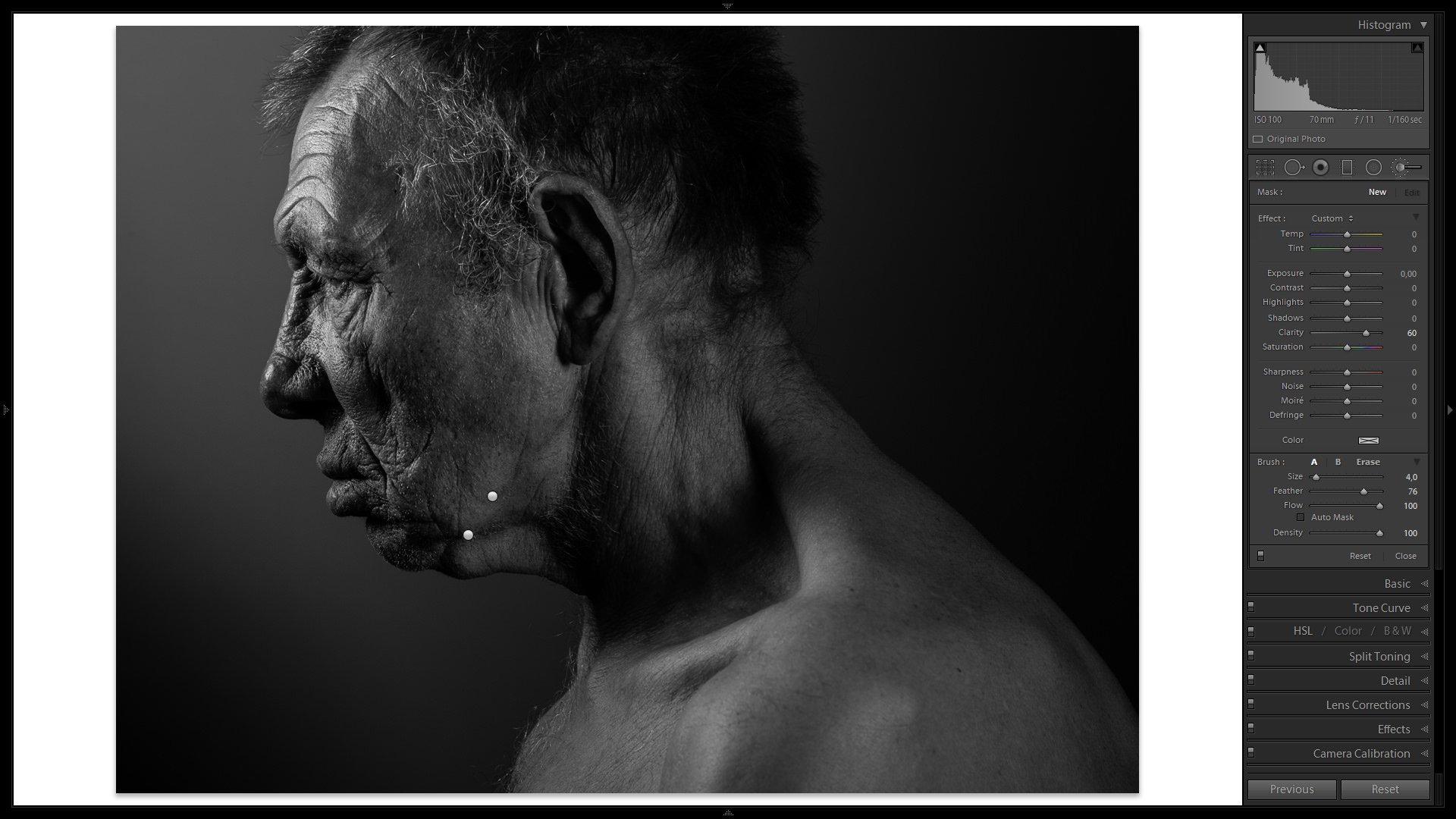
As you can see, Clarity setting greatly emphasized what you might call “skin imperfections”, and that was the main goal. We are nearly done!
5. Back to Tone Curve
If you remember, the last time we made changes to the Tone Curve, it was done in the Point Edit Curve mode. Final tweaks to the overall contrast of the image are easier to achieve in regular mode, so I disengage the Point Edit Curve and enter the following values:
- Highlights: +8
- Lights: +22
- Darks: -6
- Shadows: -14
Now that is more like it. You will notice that the values are, again, quite aggressive, but then I believe they work for this particular portrait and were very much intentional. Take a look:
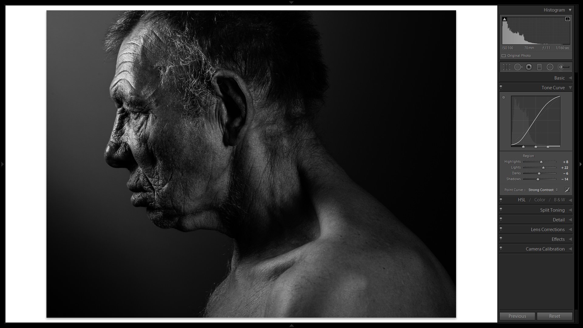
Note the Histogram – some blacks are actually lost and while from a technical standpoint it is good practice to avoid such results, I really don’t mind since it is so graphical in its nature. It just works for me.
6. Vignetting
If you ever hear someone say vignetting is an optical flaw that needs to be fixed, ignore them. It is, theoretically, an optical flaw. But only if you’re a scientist. For the photographers among us, if used correctly, it can potentially be a very powerful yet subtle tool. The basic use is to darken the corners of the image to keep the viewer’s gaze inside the frame for longer. It also helps direct the gaze towards the most prominent (usually the brightest) element of the composition. I added some mild Post-Crop Vignetting (; Amount: -16; Midpoint: 15; Roundness: 100; Feather: 100; Highlights: 0) using the Effects Tab for these very reasons:
- Style: Highlight Priority
- Amount: -16
- Midpoint: 15
- Roundness: 100
- Feather: 100
- Highlights: 0
Should you need more control, use the Radial Filter tool, it is much more powerful.
7. Grain
One last final touch is a little bit of grain to make the image seem more organic. The settings I chose in the Grain section of the Effects Tab are as follows:
- Amount: 16
- Size: 34
- Roughness: 65
Compare!
If you are curious about just how much difference all this fiddling made, take a look at the following comparison. The “Before” image is the basic conversion to B&W by desaturating each color individually using the HSL Tab; the “After” image is our final result:
Final Words
Whether you like the conversion or not, even whether you like the portrait itself does not matter. With this article, I did my best to show you how several of Lightroom’s tools can be used in conjunction to come up with a high-contrast B&W conversion. Hopefully, I managed to teach you something. More than that, I hope I managed to inspire you a little bit to try and work on those B&W looks on your own. As always with post-processing, a lot of experimenting happened “behind the curtains” before I settled down with the numbers and choices that you saw described. And do you know why? Because there is no one way to do a good high-contrast B&W conversion. There just isn’t. In fact, I’ve worked on this photograph before and having started from scratch for this article, I came up with a final image that is slightly, yet noticeably different from my first try.
I hope you found the article useful. In case your conversion method is different from mine – and it most likely is – be sure to share your preference in the comments section below. I am sure our readers will be curious to learn more ways to achieve spectacular B&W images. I know I am!
Hey Romanas, thanks so much!
Great article! I’m a photography newbie, shooting B&W film exclusively, and still found this article very helpful for processing my scans. Many thanks!
very useful tutorial, well explained. thanks.
Good commentary , For my two cents , if people is wanting to merge PDF files , my secretary used a tool here www.altomerge.com/
Is it possible to edit partial picture in black and white in light room ? I mean I want to edit only half portion of picture in black and white and rest is coloured. I tried many options, couldnt able to find it out. Thanks
Romanas,
I have an odd situation using technique 3 above – I’ve still got some colour in the image.
I use LR 4, any ideas why this might be?
Thank you
Gary,
that’s very weird! Did you do any adjustment specifically where the person’s eyes are with any tool?
Romanas,
Yes That’s it!
I had previously applied ‘Iris Enhance’ – I’m glad it’s user error
Thanks again for an informative article – one of many in fact!
You are welcome!
Homeboy there is missin’ a tooth.
You would too if you ate corn nuts everyday.
Romanas,
I have an odd situation sing technique 3 above – I’ve still got some colour in the image.
I use LR 4, any ideas why this might be?
Thanks
I just found this article and thanks for sharing the teaching points and more importantly how to create your own vision
Thanks very much for an interesting article, Romanas.
I wonder if you would be prepared to make the original RAW file available please, for those of us who might like to try emulating your results in Lightroom or perhaps other applications and plugins.
Thanks for the article.
It’s worth noting that the auto mix feature, which allows Lightroom to make its best guess at black and white tone adjustments when you use the treatment conversion in the Basic panel or the B&W tab in the HSL panel, can be enabled or disabled. If enabled, clicking either the “Black and White” label in the Basic panel or clicking the “B&W” tab in the HSL panel will kick in Lightroom’s adjustments to the color sliders in the HSL panel to adjust the tones. If not enabled, the color sliders in the HSL panel will stay set to zero, though still adjustable. The feature is found at Edit > Preferences > Presets > “Apply auto mix when first converting to black and white.”