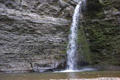
I intended it as kind of a fun one - the marked contrast between the bare, gray rock on the left and the green mossy rocks on the right, bisected by the white water.
This is "as shot".
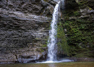
I have played around with it in post - I tried a square crop to balance the amount of each, punched up the contrast and desaturated the left side and did the opposite to the right side...but it never seemed to "work". <shrug>
Any ideas - either things to try in post or what I should have done in composition?
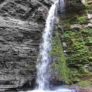
Looks like an amazing location and a scene begging to be photographed. I sort of feel like there is too much rock on the left side of the image. I wonder whether a portrait orientation would have been more effective. Of course, that is easy to say once one is back at the computer :) Does cropping to something like that orientation work?
Great minds think alike. 😉 That's why I tried the square crop. Here's a quick and dirty edit of the JPEG:
Yeah, I think that keeps your eye focused on the waterfall.
...and it balances the gray side and the green side.
I showed this to my sister and asked her what she saw and without any prompting she said she saw gray and green with a white stripe down the middle, so I guess it "works" but I'm still not sure how I feel about it.
@bo-gussname I think you are right. When you feel there could be a better picture try several viewing points and choose the one you like best. It is your picture.
https://www.allmondo.com
@bo-gussname I think you are right. When you feel there could be a better picture try several viewing points and choose the one you like best. It is your picture.
Yeah, that's what I usually do.
After I get home. 😐
Personally, I like the square crop better, it's well balanced and an interesting composition. I think I would either give it a bit more room at the bottom (and maybe also at the top), or try to crop even tighter and cut off the top and bottom of the fall.
For the rest of the post-processing, I would play around a bit with color temperature and tint, and probably increase vibrance/saturation. Also, making everything a bit more "contrasty" could bring out the interesting texture of the rock and plants better (but careful not to overdo it).
I think the image might also work as black & white, although I have no experience with that myself.
I also like the square crop. Try using the rule of thirds and placing the waterfall on the righthand vertical line of the thirds crop grid. (or the left, whichever you prefer). It'll still focus on the waterfall with the crop, but the falls won't be right in the center. And I'd like to see as much of the top and the bottom as possible, so I know where the water is coming from and where it's ending up. Also try upping the vibrancy and see how that looks. It looks like a beautiful location! Lucky you to be able to capture it!
Try using the rule of thirds and placing the waterfall on the righthand vertical line of the thirds crop grid. (or the left, whichever you prefer). It'll still focus on the waterfall with the crop, but the falls won't be right in the center.
I'm usually not one for symmetry, but in this case, that's what I was going for and the falls wasn't really supposed to be the focus, but a "dividing line" between the gray and the green.
And I'd like to see as much of the top and the bottom as possible, so I know where the water is coming from and where it's ending up. Also try upping the vibrancy and see how that looks.
I don't remember what the top was like, but I do remember the foreground being really uninteresting. If you look at the uncropped version you can see some of it - just crumbled bits of shale (which I was standing in). I seem to remember the outflow being just flat and....boring.
I try to (key word "try") not cut anything off when framing but maybe the lesson here is to start including a little more than what I think I need. As a toolmaker I am well aware that "you can always cut more off, but you can't cut it back on"- maybe I need to add that to my list of things to remember about photography, as well.
In the quick edit version above I did two gradient masks, one from each side. I desaturated the left and pushed the contrast and structure. I pushed the saturation as much as I dared without it going nuclear, on the right and softened it a bit. This seemed to help a little
I have played around with it in post - I tried a square crop to balance the amount of each, punched up the contrast and desaturated the left side and did the opposite to the right side...but it never seemed to "work". <shrug>
Any ideas - either things to try in post or what I should have done in composition?
Hope you don't mind that I took the liberty to do a quick retouch in Lightroom (wanted to kill a bit of time waiting for for a device to be complete its test run :-). Cropped it to a 7:5 to position the waterfall slightly out of center to the right + some basic exposure/color adjustments and a bit of local dodging/burning.
Nice location, I like the left/right (color) contrast in the composition.
btw I you don't like it, please let me know and I'll delete this comment :)
btw I you don't like it, please let me know and I'll delete this comment :)
Oh heck no, this is exactly what I was hoping for - input! I checked my ego at the door when I posted it, and truth be told, I'm not completely in love with the original image myself.
Several people liking the cropped version and suggesting they'd like to see more above and below the falls has made me think that maybe I should have at least tried a portrait orientation shot. DOH!
I wonder about a couple of things here.
The first is light. This seems to have been taken in shadow or on an overcast day. The good thing is that the light is consistent across the image, but OTOH brighter sunlight might have brought out details and a bit of sparkle on the water. But of course it's likely this is a place that doesn't get much direct sun anyway, not to mention that we mostly have to just work with the light we get, vs, having the luxury of camping out on one spot to wait for the right gleam of sunshine at the right angle.
The other thing is shutter speed. Did you try taking this as a longer exposure, to smooth out the waterfall? It's personal preference of course, but sometimes a longer exposure of moving water can add some punch that's missing with a shorter snap. In this case, would a more "smooth" waterfall have added something, especially to the division between the two sides of the image?
I don't have answers, just questions. Photographing moving water is on my yet-to-master list - to put it politely. 😅 You may well have taken some longer exposures of this, and they weren't as good as the image you've shared!
I do prefer the portrait orientation for this image, as I think it strengthens the waterfall's presence.
Several people liking the cropped version and suggesting they'd like to see more above and below the falls has made me think that maybe I should have at least tried a portrait orientation shot. DOH!
hehehe yeah hindsight is a wonderful thing, now if we would only remember it for a next time that would be great ;-)
The first is light. This seems to have been taken in shadow or on an overcast day.
...wait, there are conditions other than "overcast"? I thought all those sunsets and stuff were just Photoshop.
The other thing is shutter speed. Did you try taking this as a longer exposure, to smooth out the waterfall? It's personal preference of course
I used to be in the "turning waterfalls into milk" camp, but I've since grown to kind of dislike it and see it kind of as a band-aid to try and convey what a still photo can't... But in this case it may well have functioned to make a more well defined "line" between the contrasts.
I don't have answers, just questions. Photographing moving water is on my yet-to-master list - to put it politely. 😅
Yeah, even though I've come to dislike "milky" water, I'm not a fan of "frozen" water, either. The worst part is, the ideal shutter speed varies from place to place and even day to day in the same place, depending on water flow!
The waterfall shot I'm happiest with was an accident - when I pulled the Fuji out of my bag, I hit the Exposure Comp dial and bumped it three stops down. When I put the camera to my eye, all I could really see were the splashes where the water was hitting the rocks below. At first I went "".....W...T....H...? .....hey...wait a minute..." I postprocessed it as a B&W. About the only time I was happy with my near constant bumping of the physical dials on the Fuji. 😝
I do prefer the portrait orientation for this image, as I think it strengthens the waterfall's presence.
Okay, you guys have convinced me. I will go home and write "I will not neglect to consider portrait orientating" 100 times.


