Not a lot of foregrounds accomplish what I want them to do in landscape photography. Maybe that’s why I don’t take a lot of classic-style landscape photos with a big, obvious foreground layered in front of the background. But I do still constantly think about finding good foregrounds as a landscape photographer, and it goes without saying that your choice of foreground can make or break a photo. I hope this article sheds a little bit of light on what makes good foregrounds and how to capture them in landscape photography.
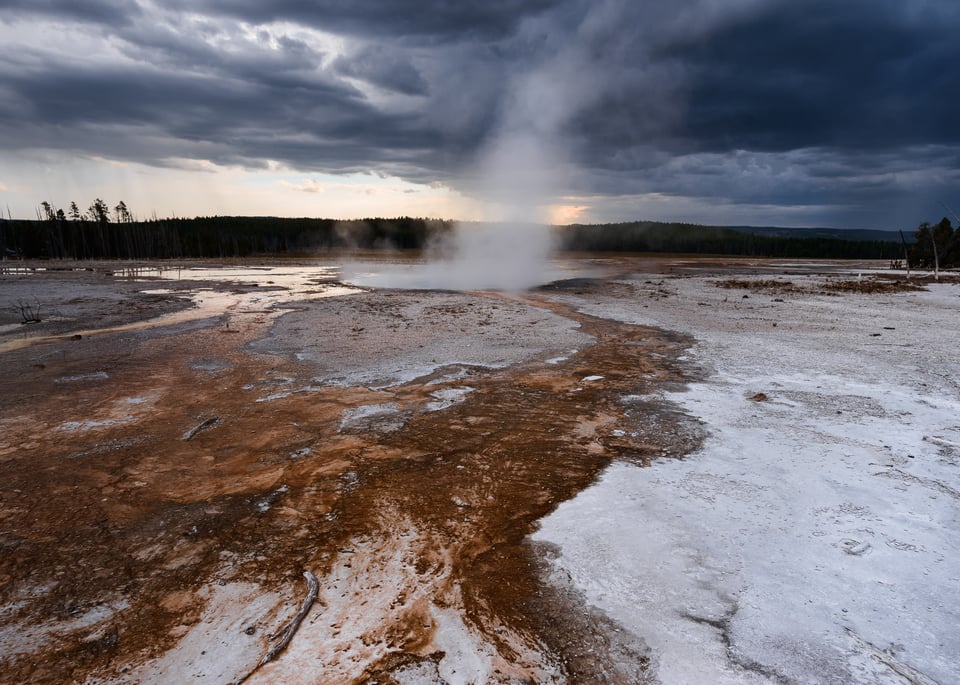
In the first place, I should mention that the concept of a foreground means something different depending on the photographer. Whether you define it loosely (anything nearer than the distant background) or narrowly (something that you could practically reach out and touch), the principles I’m discussing today are the same. Simply put, a good foreground is one that complements the story of the photo. I know that sounds vague for now, but I have a few examples to hopefully make things more concrete.
First, here’s an example of what I consider a bad foreground:
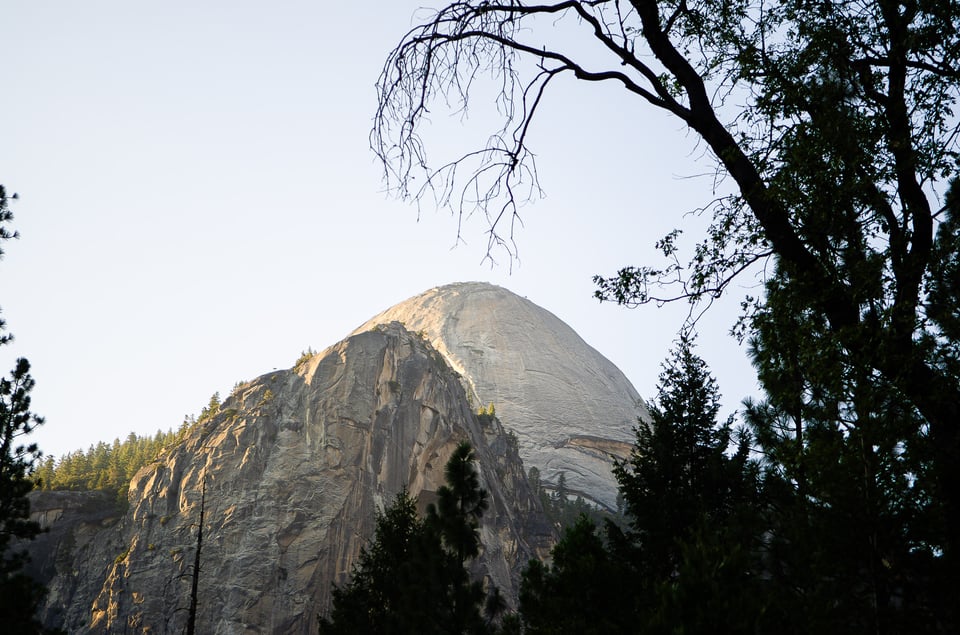
To me, the silhouetted trees don’t complement the story of this photo at all. I probably included them because I wanted to try to “frame” the distant mountain, but what are they actually adding to the photo? They’re just unrelated trees. Why are they there? What story are they telling? Nothing obvious – they don’t seem to have any connection to the background or the rest of the image. Given the cool shape of this mountain and the colorful light at sunset, I should have looked for a better foreground – or a more interesting composition without a foreground at all – that made the most of the scene. Instead, I just found some random trees and superimposed them on the rest of the photo with little thought. Perhaps predictably, the result is not one that I’m happy with.
By comparison, here’s what I consider an effective foreground:
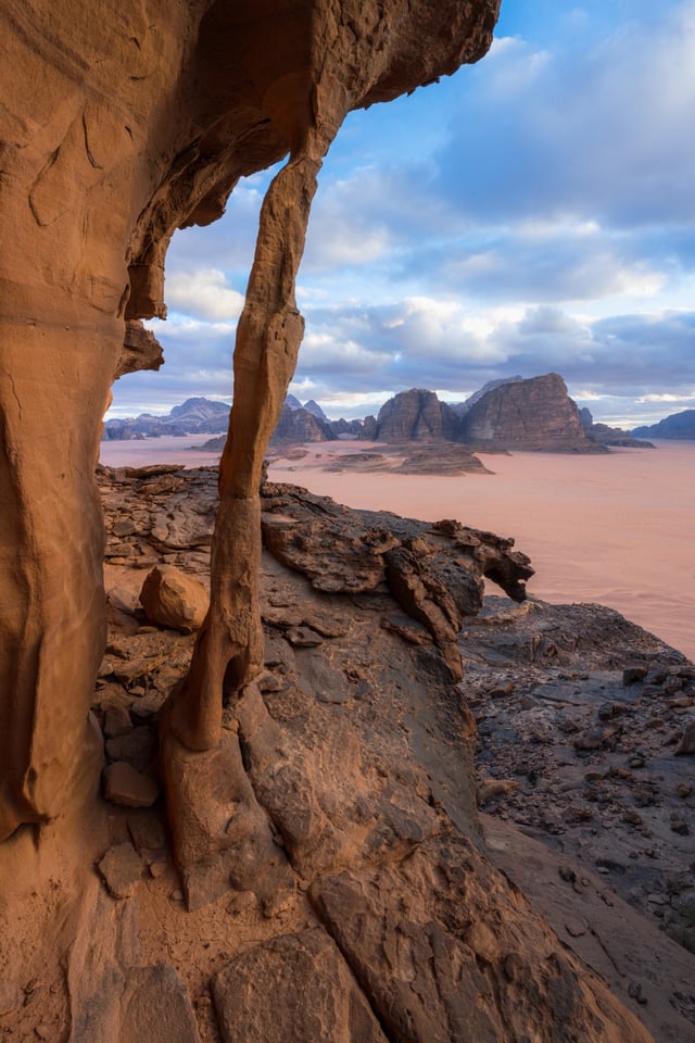
What is the story of this landscape? I think it’s the beautiful, yet alien nature of the scenery here. The vivid orange colors and the fascinating shapes of these rocks are very different from what most of us regularly encounter. I like that you can imagine the rest of this landscape being filled with its own unique patterns and rock formations – what a fun place it would be to explore and look for more oddities like this thin archway. Given all that, I’d say that the foreground here definitely adds to the story of the image. It even puts the background mountains into a somewhat different context and makes you wonder how they might look up close.
Sometimes, you’ll hear the idea of a “leading line” being an example of a good foreground. It drags the viewer’s eye from the bottom of the photo to the top (or vice versa) and gives the composition some structure. I agree – I’ve got nothing against leading lines. But even then, you need to justify their existence in the photo.
Here’s a leading line that I think is not very effective:
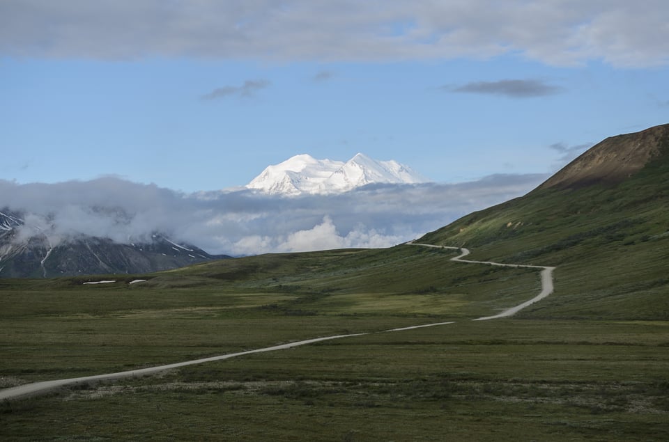
Why don’t I like the leading line here? Simply put, it’s just a leading line. Where is it actually leading you from? There’s nothing in the foreground to reward dragging your eye to and from that part of the photo, and the line itself doesn’t have any particular interest to it. If anything, it distracts my eye from the main subject of this photo, which is the peak of Denali looming in the distance. I know that there are good photos to be had of this stunning mountain, but you won’t get there just with any old leading line.
Here’s an example of some leading lines that I think are stronger:
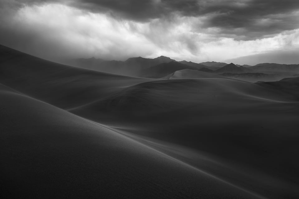
This time, the leading lines are dramatic diagonals that guide the eye from the foreground sand dunes to the distant, dusty mountains – all of which share similar angular, harsh shapes. There’s also sand in the air in the distance, so the physical substance of the foreground and background is similar. I find that this photo tells a pretty cohesive story where every part of the composition adds to the whole, and the leading lines draw you across the photo from one area of interest to the next.
I find that in many landscapes, though, the foreground doesn’t obviously complement the background, though. It’s almost an exception to the rule when they do work well with each other. I recommend keeping that in mind when you’re preparing to take a classic foreground/background style of landscape photo. Just because you find something cool both at your feet and in the distance doesn’t mean they’ll go together.
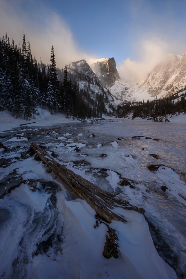
It’s also very important to consider the size of your foreground relative to the background in order for it to contribute to the photo as best as possible. Focal length and camera position play a big role here. To be specific, a wider lens shrinks the size of the background, while a telephoto makes the background loom large over the rest of the photo. Combine that with some different camera positions, and you can change the relative sizes of the foreground and background to your heart’s content.
I can’t tell you which one – wide angle or telephoto – is going to look better, but they will feel very different. Sometimes it’s better to have an in-your-face foreground (AKA a wide-angle lens and a very close camera position). Other times it’s better to stand back and zoom in so that the foreground is positioned in a different spot against the background. In any case, it’s better to pick your focal length intentionally rather than just leaving it wherever it was for the previous photo.
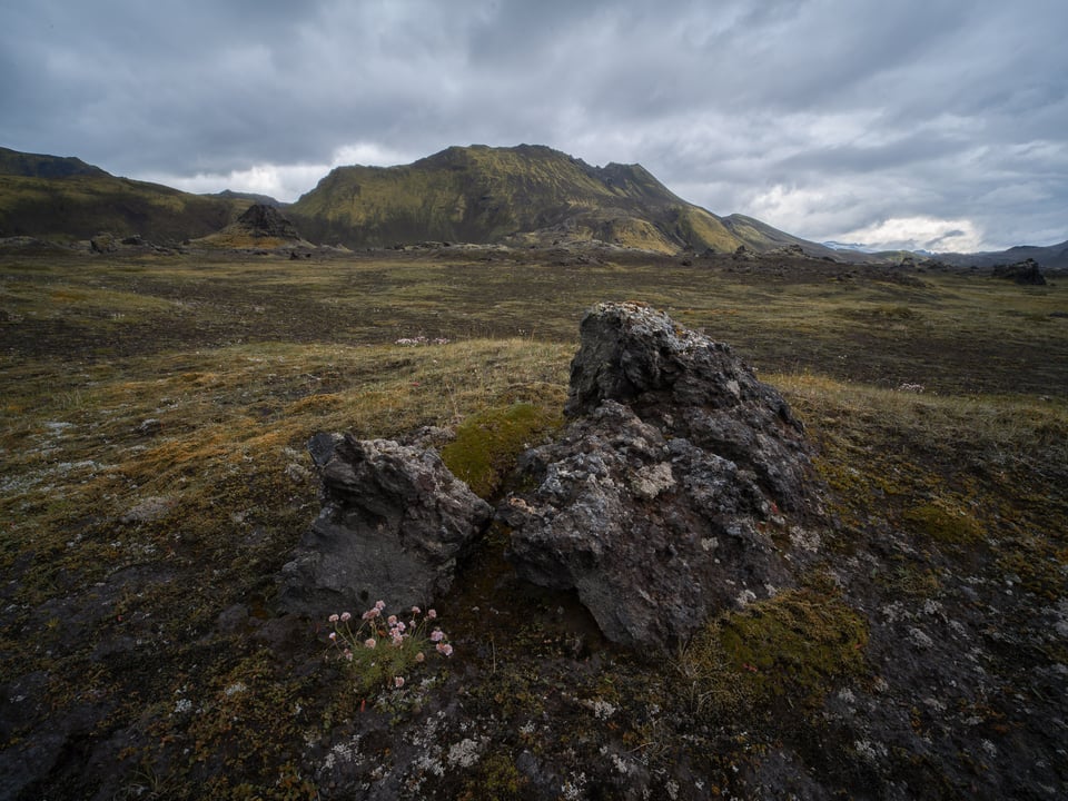
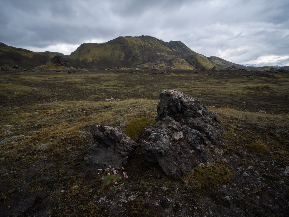
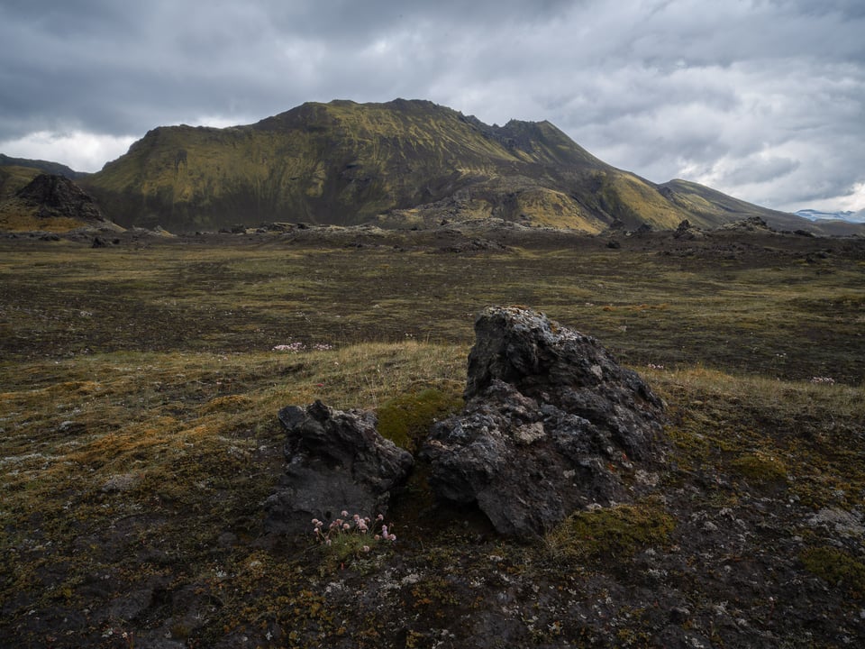
As a final note, I think there’s nothing wrong with a photo that completely prioritizes the foreground and avoids adding much interest in the background at all. Photos like that are more like portraits of the foreground! You’re relying on the quality and interest of the foreground to be the subject itself, rather than photographing the relationship between it and the background.
For this type of photo, choosing a good foreground is no different from choosing a good subject in any genre of photography. Try to find something visually interesting or that tells a good story, and see if you can put it under some complementary light. That alone will get you most of the way to a successful photo. Landscape photos don’t need to have a big, important background in order to be successful!
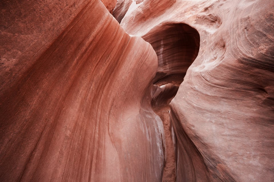
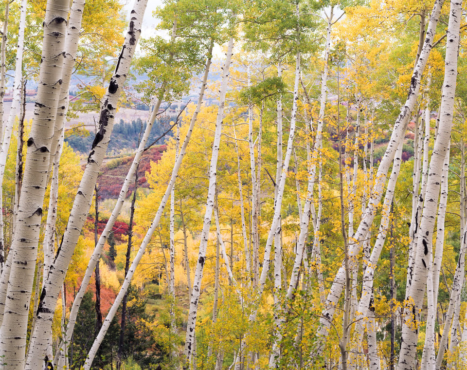
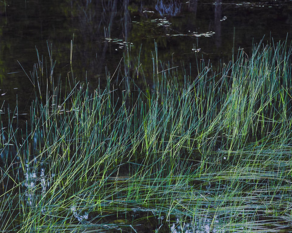
I hope this article gave you some ideas of what to think about when you’re photographing foregrounds in landscape photography. It really all goes back to the idea of a story – yes, finding a foreground with some visual interest, but also making sure that it doesn’t feel too disjointed from the rest of the photo. Ideally, there would be some meaningful relationships between the foreground and the rest of the photo – maybe a similar color or shape, a continuation of the same terrain, or a story-based connection of some kind.
The main idea is to pick a foreground that doesn’t feel haphazard and instead feels purpose-built for the background behind it. Or, if there is no substantial background, the foreground should be interesting enough to be the main subject of the photo. That’s not always an easy task, but it’s one that involves a lot of creativity and self-expression. What more could you want as a landscape photographer?
I shoot landscapes with my Nikkor 20mm lens and really like the results. I did a “leading” line shot of a pier going out into a very calm ocean that came out great. It made your eye follow the old pier all the way to it’s end .Glad I got it because the next storm took the entire pier away.
Not sure I agree with you about the ‘ineffective leading line’ photo. Crop the sky to more like a 16:9 format and I think it improves significantly.
I like the 16mm. I think that’s because the foreground flowers grab attention and function as the start of the visual journey.
Makes sense! And it’s a good example of how no two photographers will see the same thing in quite the same way.
Thoughtful ideas and examples – thank you Spencer!
Like Jason points out in his comment, having a way of “seeing” the world needs to be inherent in the shooter, I believe. It should drive the image capture. And as you pointed out in your distant mountain photo, no one wants to simply take “a pretty picture.” I find that anyone on this site is serious about conveying the world around them – though their photo equipment – in a serious manner. At least, not being cavaliere.
This is good and essential dialogue, in my view.
Much appreciated, Bill! I think you’re absolutely right. I’ve always liked the title of Bruce Barnbaum’s book, “The Art of Photography: An Approach to Personal Expression.” Especially the keywords personal expression.
Anyone can go and put their tripod in the same spot as a great landscape photo and try to recreate it. If the conditions are good, the result will probably be aesthetically appealing. But it won’t reflect the photographer’s personality or vision in the slightest. Photography to me should be about putting some of yourself into the photo.
PS: Thanks Spencer! And thanks for the introduction to Bruce Barnbaum. After doing some research on the guy, I just picked up the paperback version on Amazon, based on your comment. ($387.11 for the updated hardback. YIKES!) Interesting that Barnbaum was a mathematician and Ansel a musician/pianist before their immersion into photography. Such a melding of the technical and the intuitive!
You made a good choice! That’s my favorite book on photography and the one that I learned the most from.
Choosing a foreground and what to do with it once you’ve found it seems like such a tricky topic. Photos with emphasized foregrounds using wide-angle lenses for example are so prevalent that going for one with the widest focal length could be quite easy, perhaps because at least at one point, they were so popular. Looking at your three examples though, I feel like the 20mm one looks the nicest. Although that’s subjective, I think that it must require a lot of thought to choose the right one.
It must also be a way of seeing the world when it comes to taking the photographs. I’ve always felt a lack of intuition for wider focal lengths, so while I like many shots with wider angles, I don’t really take that many.
Do you think “a way of seeing/feeling” might be one reason why you aren’t particularly attracted to big, obvious foregrounds?
It’s very subjective! I’m with you that I like the 20mm image the best of the three, although it’s hard to say exactly why.
I very much believe that everyone sees the world in unique ways that inform how we approach photography. What you call a lack of intuition for wider focal lengths may just be that they’re less compatible with how you see the world.
That’s definitely the case for me. I still like using ultra-wides when the subject is right, but I usually feel more at home with a medium or longer lens. Even when I do use an ultra-wide, it typically isn’t to create the “big foreground / superimposed background” relationship. Some photographers take those kinds of photos very successfully, though.
I believe the 20mm wins in this example, because in my eyes it strikes a good balance for the emphasize between the background and foreground. It feels harmonic.
So at the end one has to ask himself, where he wants to weigh the interest.
The 16 mm wins it for me. There’s a flow in that picture that I don’t see in the other two. To me it is the most striking one.
I can see it. The darker corners, the additional shape of the cloud, the rounder foreground and background – it all contributes to a circular shape in the composition and gives a nice structure to the photo. Maybe that’s part of what you like about it even subconsciously.
To underscore the point, I prefer the 27mm example. It makes me feel as though I am standing there.
Nice article! Thanks Spencer
Thank you, Zigman! Glad you liked it.