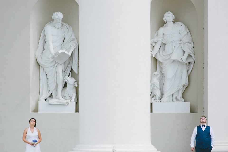
If we see the rule of thirds as the default, “bread and butter” sort of composition guide, I can think of at least two ways to break that rule and distance your work from it. The first one is to use, against the advice of many photographers, central composition. It is a very natural, simple way of composing an image and generally results in a very “open”, peaceful, calm photograph. You could say it is classic. As I mentioned before, it is also one we instinctively learn first. The second way is completely opposite and perhaps much less “natural” to our eyes, yet one I adore at least as much as central composition. You see, if one naturally expects to find something of importance at the very center of a frame, the very edges of it might be the last place they’d look. And that sense of unexpectedness is perhaps the best part about it.
Hold On… Why?
There are so many proven ways to compose an image well. The rule of thirds and golden mean are probably the safest and work in just about any situation. Why go to such extremes and place elements at the very edges of the frame? Shouldn’t one attempt to divert the viewer away from the edges instead, so as to keep the gaze from moving on to the next work? Valid questions, of course, and the answer to the latter is, more often than not, positive. But not always.
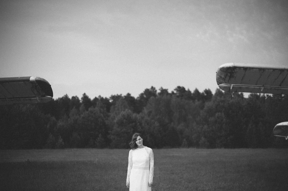
You see, if a main element of interest is placed somewhere near the border of an image, it inherently becomes intriguing. Why is it there? Photography isn’t math, of course, and you don’t always need a specific reason. For me, it just feels right. It allows me to include more environment in my portraits, and environment often compliments the feelings, mood, emotion I am trying to show. If not the environment itself, then at least the space and how much or little there is of it. It helps create, emphasize mood. Place your subject at the bottom of the frame and you will create an airy impression. Perhaps a reference of sky, and thus dreams. Place your subject at the top and and you will, on the contrary, contract the space around him, close him in, make the photograph visually heavier.
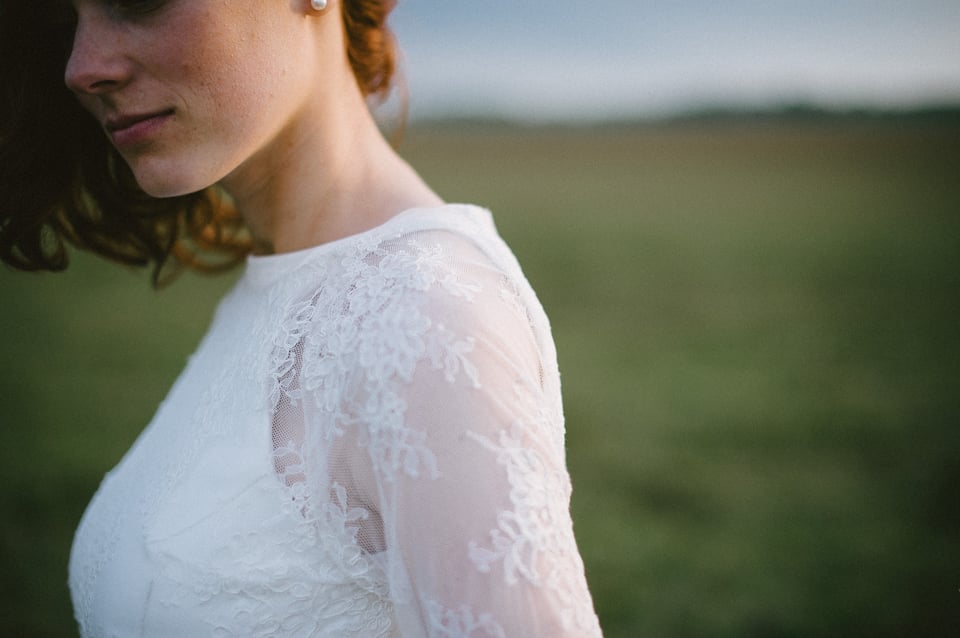
And, if it’s somewhere at the edge, what is all that other (hint, negative) space for? Well, two reasons. The first one is rather simple – to put more emphasis on the subject. Remember my example with a sheet of paper and an ink spot on it? If not, read my article on negative space again, it’s that important. The second reason is a bit more subtle – to strengthen the emotion, mood of the image by emphasizing the, say, vastness of the surroundings.
Final Words
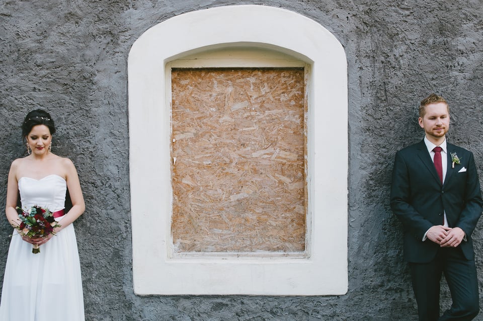
It may be that I am simply weird this way and placing subjects at the borders of the frame is just silly. Perhaps it does not work at all and only seems to be natural in my head. Perhaps this whole article makes no sense. So? One of my biggest fears in photography as much as in life is to become boring. And so I try different things, attempt to learn them, master them. Whether this is a mistake or not I do not know. What I do know is that it works for me right now. It resonates with me, with how I see the world, which things I consider important. It adds intrigue. I like that. No, no. I adore that.
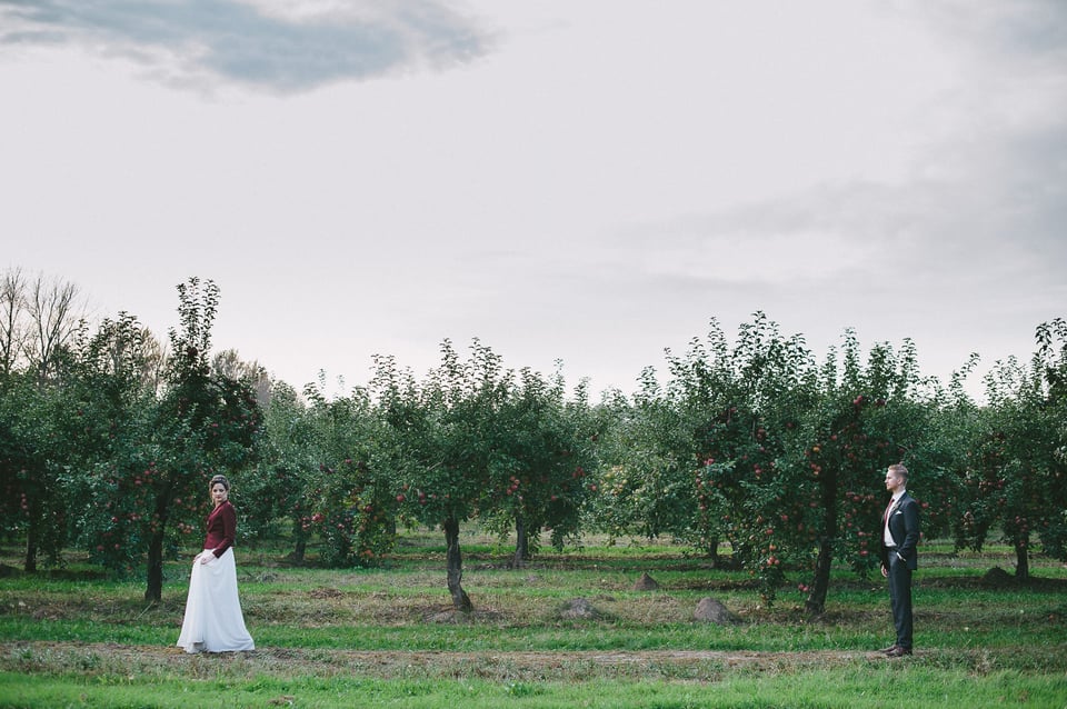
Try it. You might hate it and that is fine. But you might also find it to be a breath of fresh air. After all, art is often an experiment, is it not? So experiment. Overdo it, even. Try everything you can to find that which works for you and shows you in your work. Otherwise, if there is no you in your work, how can you say it is yours?
good
Love the photo of the redhead in the white lace wedding dress. Just beautiful!!
Great article and photographs, Romanas — just what I needed. I tend to slavishly adhere to the rule of thirds, and as a result, my photos too often feel static. Balanced, yes, but just not that exciting. Maybe I’m just a little bored with this particular rule. I love the bride image; it’s so intriguing. The very slight smile, the turn of her head. My other favorite is the couple in the apple (?) orchard. To me, this implies a great story — is the woman leaving the man? Are they playing a game? Will she turn around to face him? There’s a bit of tension and mystery in the composition, and for some reason it reminds me of a fairy tale.
Anyway, thanks a lot for the encouragement to experiment and try new things!
ive been trying to find someone whom have thought about photography composition in differ way. its awesome and cant wait for your next article
Roman, I like all your article that you write this week. It challenge me to re-think about my photography knowledge. Sometimes, what you write is the same with what I know. Other times, it is the opposite. But, that’s the one that I really like.
For example, the second photo in this page. It breaks many traditional rules in photography. Subject in the center, cut the person around knee area, small subject, cutting the photo in the middle and put too much emphasize in the bottom area. The only rule, that you adhere, is placing light subject againts dark background. If I just following the rules, I will say that it’s a bad photo. But, it’s really unfair to judge a photo based on how many rules that it adheres. So, when I look at it, I throw away all rules and use my feeling. I even compared it to one of Art Wolfe’s photo (outdoor photographer october 2014 page 44-45), which has simillar composition.
Unfortunately, no matter how I look at that photo, I just can’t find the beauty of it. My conclusion is I don’t know the woman on that photo. Maybe that composition suits her personality. Maybe she wants a certain mood for her photos. Too many things are unknown to me.
Anyway, thank you for this article. I may not enjoy the photos, but it inspires me to try different kind of composition.
Johny,
thank you for such a detailed comment, I enjoyed it and I enjoy that we have these differences :) That photograph is quite beautiful to me, yes. But you know what’s a real compliment? That it attracted your attention so much. Even though you did not like it, you were still attracted to it. That’s nice.
A side note – she is not cut around knee area, but quite a bit higher. I’d not cut at the joints, it’s a big no no for me.
I appreciate your attitude towards experimentation and agree that the same old thing can be boring and applaud you for trying new ideas. I disagree heartily with just about everything else. I do like the image of the two people standing before the two statues, not because of the composition, but because of the relationship between them.
You say that Photography is not math… Nothing could be further from the truth. Composition is all math, just as music is all math. We may not be aware of the math, but our minds are doing it. We are simply playing the interface without being consciously aware of the math. Just as a high school softball outfielder has to perform over two dozen quadratic equations from the time the ball is hit, through predicting where the ball will land, to getting there and catching it, your brain is calculating balance and distances, gradation, contrast and most importantly where leading lines intersect the edge of the image, behind the scenes. Just as in music, some frequencies blend in a pleasing manner, so does the placement of elements in an image…
For all of the egg-heads out there that will bring up abstract expressionism and/or twelve tone music, etc., yes sometimes the creator is looking to represent chaos or discord, which is all well and good, but such folks generally have very good knowledge of what rules they are breaking.
There is no shortcut to good composition. The rules that have taken centuries to determine can’t be broken with consistent effectiveness if they are not first understood…
I support your efforts in the name of creativity, and your courage to put yourself out there. You are to be commended for your bravery!
Duffy
Hey, Duffy, thanks for your comment, it was very interesting to read!
I realize there is math in photography – I’ve mentioned on a few occasions that the golden mean is based on the Fibonacci sequence. And yet we don’t always compose guided by our calculations, conscious or otherwise. Sometimes it is pure feeling and emotion that guides us. In other words, some choices add up and make sense, others do not. The brilliant thing is, they don’t have to always make sense. That is why I said – photography is not math. Although it can be.
Again, thanks! I am actually very glad there were things you did not agree with. It’d be boring if everyone thought the same.
I like the article, your point of view, and your delivery and conclusion…great things to think about. When I have a photo that I like I often wonder if others will like it or is it just me, but ultimately we have to be true to ourselves, no? Thanks for posting.
Hey, Dave, thank you! I tried hard, glad it was of use :)
Romanas,
Thank you for the good article on composition.
With no intent to offend you or question your taste, in the second picture, if I wanted to place the woman closer to the edge of the frame, I would place her on the right side to give the subject more “personal space.” With the current composition I feel she is placed with her face against the wall.
Just my thought.
Thank you for the article again,
Val
Hey, Val! No offense taken, and I can actually explain my choice. First a question, though – do you really mean the second image or rather the third one?
Yes, it is the third one. Sorry, I am still waking up.
Right, so – what I like about that image and that placement of my subject in particular is the unexpectedness of it. I think placing her on the right side and leaving some space in front of her is the more obvious and natural choice. It is by no means a mistake, but I like an intrigue. For me, current choice of composition creates a slight mystery about her. She is almost leaving, throwing her last glance at the viewer. That, for me, makes the image work, as well as the light and detail on her cheek and shoulder.
It is, of course, a very subjective feeling. Some will absolutely hate the image. To each his own, right? :)
I actually somewhat hesitated to post my original comment because one can obviously see that “I am leaving” theme in the image. It makes the image dynamic rather than static.
In my suggested version, with the bride on the right side, it would definitely be a static composition. Dynamic vs static – it all depends on what one is trying to convey, like you said.
Thank you for the explanation.
I love it, it is different :)
Thank you, Marta :)
The link “read my article on negative space again” does not work…
I continue to enjoy and learn from your articles. Thank you
Danelle,
thank you for letting me know, I’ve fixed the link :)