I was consumed by the technical aspects of photography during the early days of my career in photography. Getting a sharp image was all that I had in mind. “Which shutter speed should I use to capture birds in flight? Which ISO will give me images with less noise? What aperture will give me a creamy background with a sharp subject? What are the recommended auto-focus settings?”. These cliché questions were the only ones running through my mind most of the time.
Little did I know then that the art of photography was much more than sharp subjects and creamy backgrounds. I don’t mean to say sharpness is insignificant. Obviously, no one would take a second look at a blurry picture. But good photography goes way beyond mere sharpness. In this article titled, “Elements of Photography”, I shall discuss the four elements that would distinguish a good photograph from a casual click.
Table of Contents
Light and Shadow
Light is obviously the most important element in any photograph because of the basic fact that photography itself is about recording light. As a beginner, I often used to wonder why my sharp image isn’t as eye-catching as I supposed it should be. It was only later that I realized that even the sharpest of the pictures when shot with bad light end up becoming mediocre ones. The human eye registers only the frequencies of light reflected all around, irrespective of the subject that one is trying to capture.
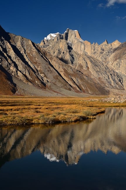
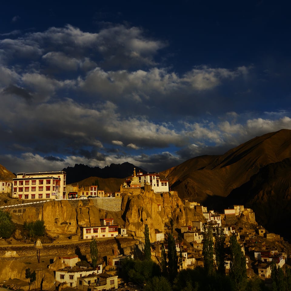
The above picture was photographed at about 9 AM, during the month of September. Had I photographed the same image under harsh light (either at mid-day or during summer months), the picture would not have had the same visual impact.
The quality of light that is reflected from the subject is almost as important as the subject itself. Textural details and contrast are directly proportional to the quality of light that illuminates a subject. For any subject under the sun, every hour would produce a different photograph. This is one of the reasons why some photographers are able to capture a stunning original picture out of the most beaten-up photo-spots. Soft light accentuates the highlights and shadows, thereby contributing to the overall mood of the picture.
Shadows
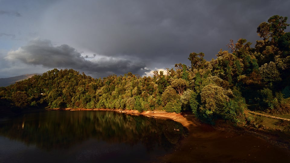
If light makes an image, shadows enhance it. Shadows push the highlights pop-out, eventually bringing about depth in a picture. In the picture above, it is the dark clouds and reflections that give the trees depth.
Most often shadows are confused with underexposure. A picture with a lot of shadows might not necessarily be a dull picture. When used properly, shadows add to the feel of an image, provided the highlights are in place. A number of us often make the mistake of trying to extract details from almost every pixel. It should be understood that we are only compromising the overall contrast of an image by making the shadows brighter. The balance between highlights and shadows is what gives life to an image.
Backlit Scenes
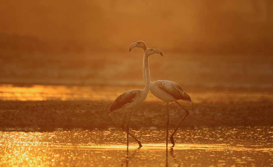
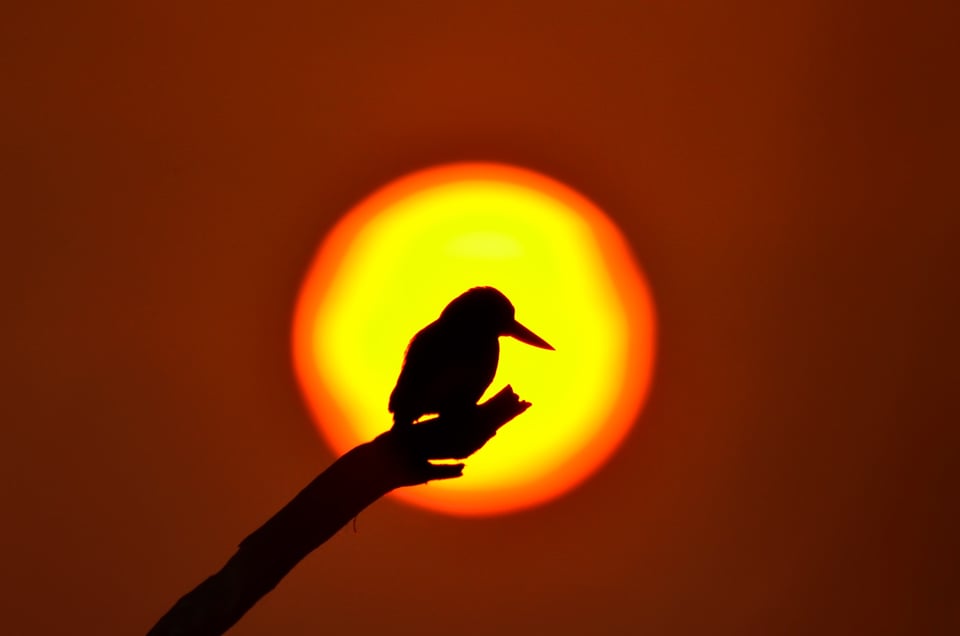
The source of illumination (the Sun) was behind me in all of the above images. Does that mean shooting against the sun always yields bad images? The answer is NO. Backlit images bring out a different mood. In fact, sometimes backlit shots end up being more lively than the ones with the sun behind the photographer. Pictures shot against the sun might not bring out the sort of contrast as seen in the above images. However, they bring out soothing warm tones in the overall image. Still, one must be careful when dealing with backlit subjects, as they are trickier.
Backlit scenes throw harsh light earlier when compared to directly bounced light. As a result, the window to shoot backlit images becomes narrower. Photographing against the light inherently puts us between extreme highlights and shadows. Care should be taken not to blow out the highlights. In most cases, it is best to avoid the source of light in the frame unless it is deliberately desired.
Factors Affecting the Quality of Light
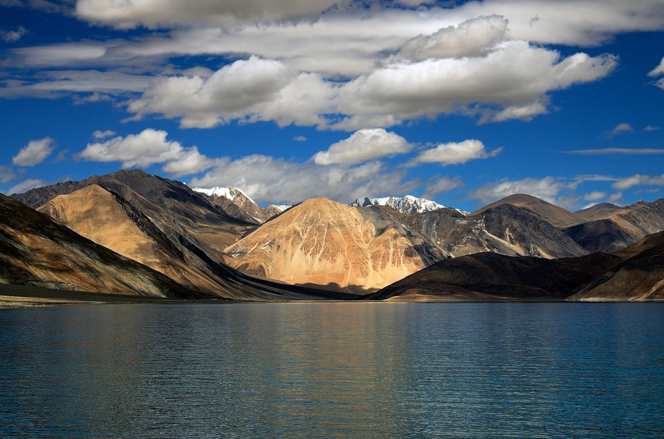
Sometimes, we get amazing light at the least expected hour of the day. For example, the image below was shot at about 12 noon. Many of us would not pull out our camera during mid-day as we are all aware that mid-day light throws harsh highlights and shadows. However, if you want blue tones to dominate your frame, mid-day is pretty much the best time.
Sunlight has to pass through substantially longer distances through the Earth’s atmosphere during the early hours of the day. The increased distance scatters most of the blue frequencies, leaving behind the warmer tones.
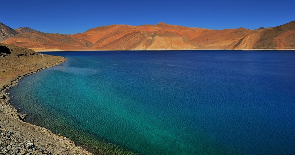
Nevertheless, good light during mid-day is uncommon. The above image was shot at an altitude of about 15,000 ft. Light tends to get softer and devoid of heat haze when the altitude increases. Light also tends to be the harshest around the equator and progressively gets softer as we approach the poles.
In addition to the altitude, as one would notice in the picture above, I was standing at an elevation much higher than the lake. If we get an obtuse angle, while connecting the source of light, the camera, and the subject, we get smooth highlights and shadows. One should worry about harsh undesirable highlights and shadows when the angle is acute or about 90 degrees.
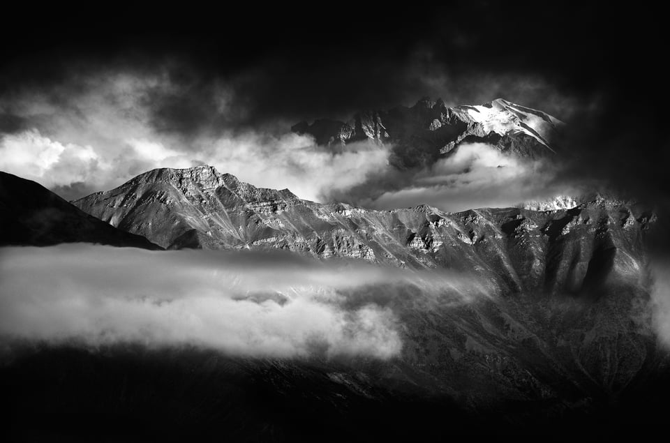
For further reference on highlights and shadows, there is an in-depth article titled, Light and Shadows, by Rick Keller here on Photography Life.
Color and Tonality
Color is another predominant entity that sets the mood of a photograph. Warm colors like red, orange, and yellow can bring about a happy emotion whereas tones of blue bring about a cold or gloomy feel. In most cases, colors act as a defining factor of the picture itself.
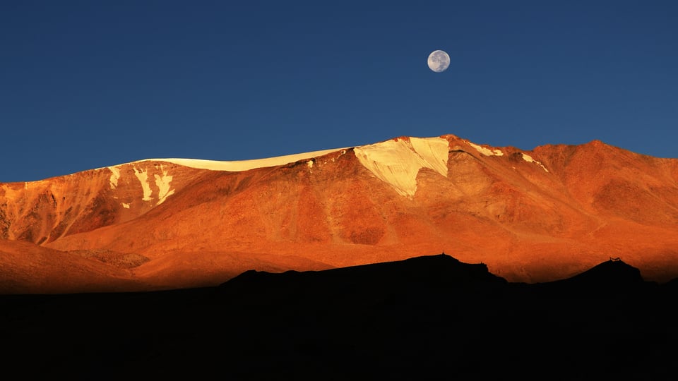
Take a look at the picture below. It has the mountain saturated with golden hues set against a blue backdrop and a neutral white (moon) in between. Similar to luminosity, colors also bring contrast to an image. As we know, most of the light we see in the digital form is set in RGB (Red, Green, and Blue). Their counterparts are CMY (Cyan, Magenta & Yellow), respectively. Had the same picture been set against a red backdrop, it would not have had the color contrast as this one does.
Tones
Some of us consider all monochrome images to be black and white. All black and white photographs are monochromes, but not all monochromes are black & white images. Take a look at the picture below. Unlike the one above, this one does not display a definitive color contrast, instead it is made up of various tones of blue, making it a monochrome image.
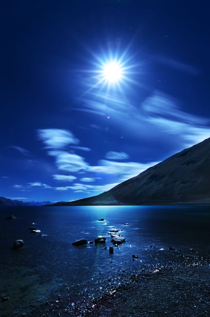
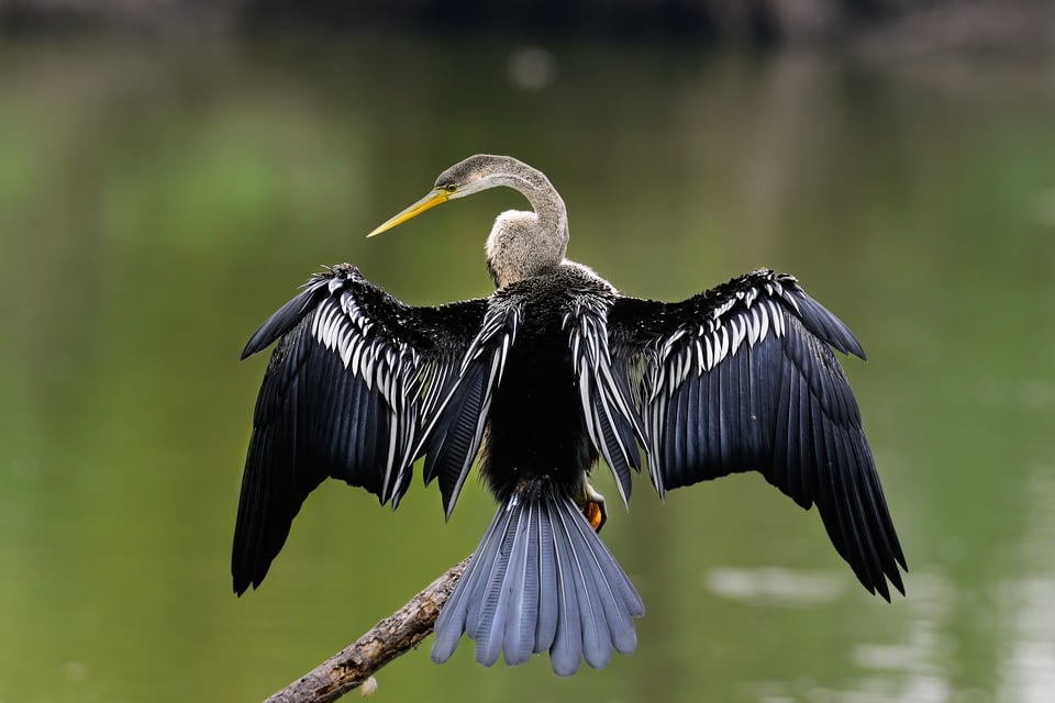
In the two pictures above, we could clearly see blue being used to bring out two entirely different emotions. Let us take another scenario. The oriental darter is a rather dull-colored bird except for the yellow bill. It is the green background that makes the subject stand out. Color contrast or the lack of it can be used in almost endless ways to bring about a specific feel to a photograph.
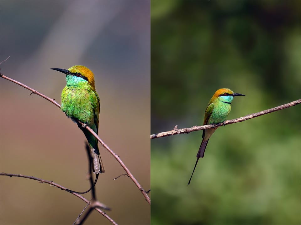
As seen in the picture above, the same subject with almost similar bokeh and composition feels totally different when the background color is alone changed. The only major difference between the two images is that the one on the left has complementary color as the backdrop whereas the one on the right has a backdrop with similar tones as that of the subject.
Composition and Direction
Framing
From a broader perspective, pretty much everything in a photograph boils down to composition. Using light and color to our advantage is done predominantly through composition. Most of us know of all the guidelines like the rule of thirds, spirals, leading lines, etc. Here at Photography Life, we have tons of resources on all the guidelines.
A lot of us use the rule of thirds almost blindly as it comes embedded in the most modern camera live views. It is just not enough to know the above-mentioned guidelines and techniques. It always matters to choose the right one in the right context while taking a picture.
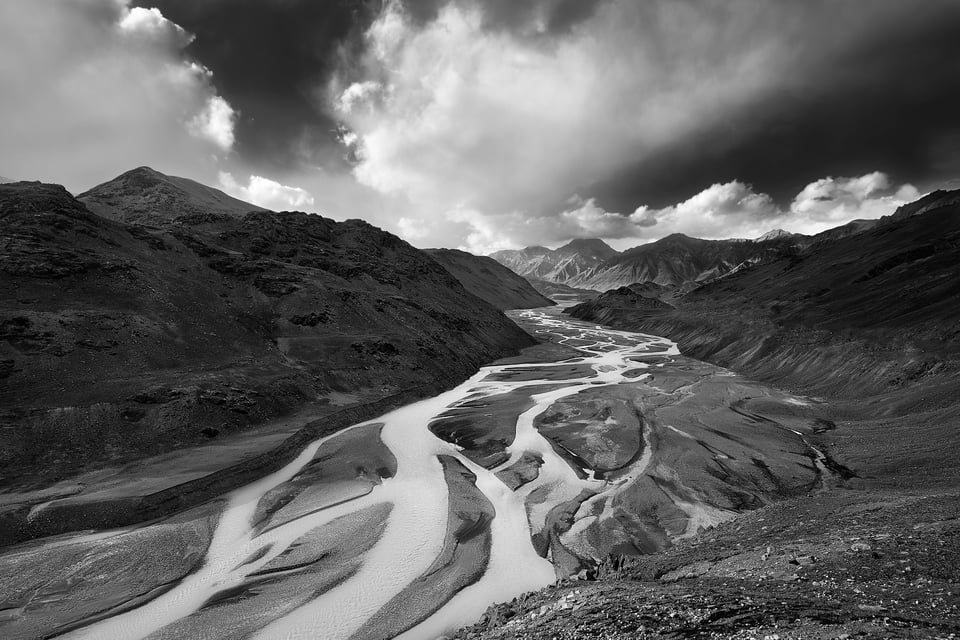
Take a look at the picture above. Contrast and depth are what I wished to convey in this photograph. Had I tried to fit this picture with the rule of thirds, I would have ended up pushing the valley to one of the sides. It would have negatively affected the sense of balance in the photograph.
Understanding the scene is more important than trying to fit it into one of the rules. Once you are clear with what you wish to convey, selecting a rule that fits your desire best will not be much of a hassle. But without a clear idea of what you wish to portray, guidelines like the rule of thirds will not help us the way we think they would.
Direction
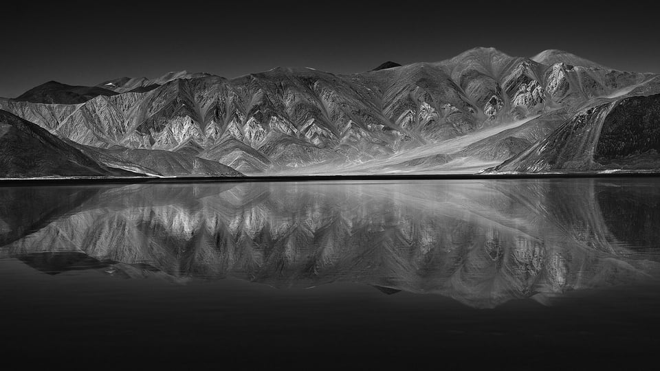
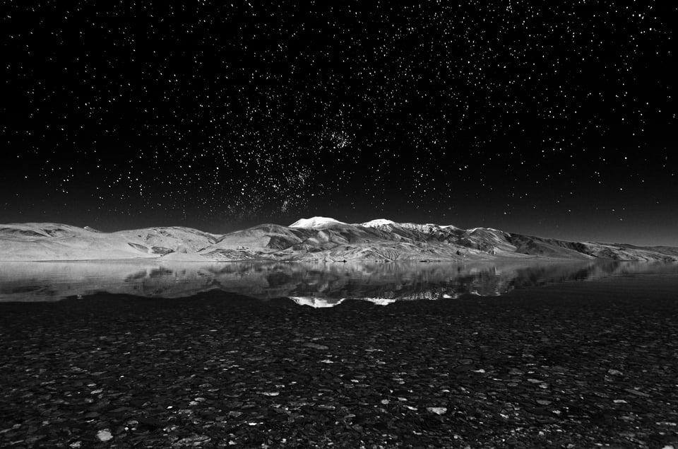
Photography is about finding the most beautiful rectangular area in endless chaos. What to include and what not to in the frame makes or breaks a picture. Let us compare the two images below. The former one is a perfect reflection with nothing else in the frame. The latter has pebbles in the foreground and stars in the background to compliment the reflection in the center of the image. The former is all about geometric balance with the entire frame split into almost two identical vertical halves while the latter isn’t. It might fall into individual perspectives on which one is better, but the bottom line is, even though both the images appear to be similar, they have two different views to convey.
In the first image, the viewer’s eye is drawn first to the center which then is guided outwards. On the other hand, in the second image below, the eye moves into the frame below upwards. This is how a composition directs the viewer around the frame.
The basic idea here is to hold the viewer’s attention as much as possible into the frame. As a photographer, we can either choose to guide the viewer’s attention around the frame or make it glue to one or a few points of interest inside the frame. Guidelines like the rule of thirds play a major part in arresting the viewer’s attention. But such guidelines can never be used as a foolproof approach blindly for all compositions. Blurry pixels around the intersection of thirds can easily make a viewer lose interest. It can be overruled efficiently if there is something overpowering it in the image.
Subject and Negative Space
Most of us are so pivoted into frame-filling images, especially with wildlife photography. In fact, reach is the primary reason why most wildlife photographers even think about 500+ mm lenses. It is obvious to get inclined to get as much data on the subject as possible. Textural details will grab the attention of anyone. But how long a viewer’s attention stays inside the picture depends more on the story-telling capacity of the image.
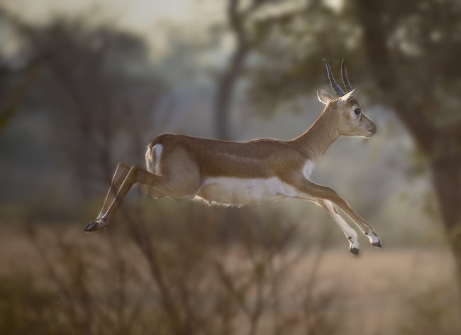
The image above of a black buck is a tighter crop of the one below. The above image simply speaks of a leaping gazelle whereas the one below conveys a more detailed story of how high a black buck can leap. With modern DSLRs and Mirrorless cameras that leap over 50 MPs of data, it is possible to extract details like never before. Even though a sharp image with tons of details can make a viewer’s eye pop, it is the storytelling capacity of the image that keeps the viewer’s attention hooked into the image.
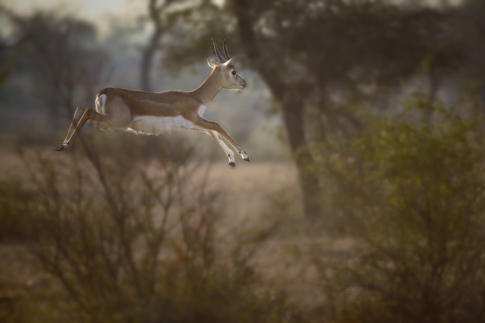
In most cases, negative space is almost as important as the subject itself. It conveys the vastness of the scene. A picture of only the subject in the frame with inadequate negative space often gets boring to a viewer. For example, it is a general practice to add more negative space in the line of sight of the subject.
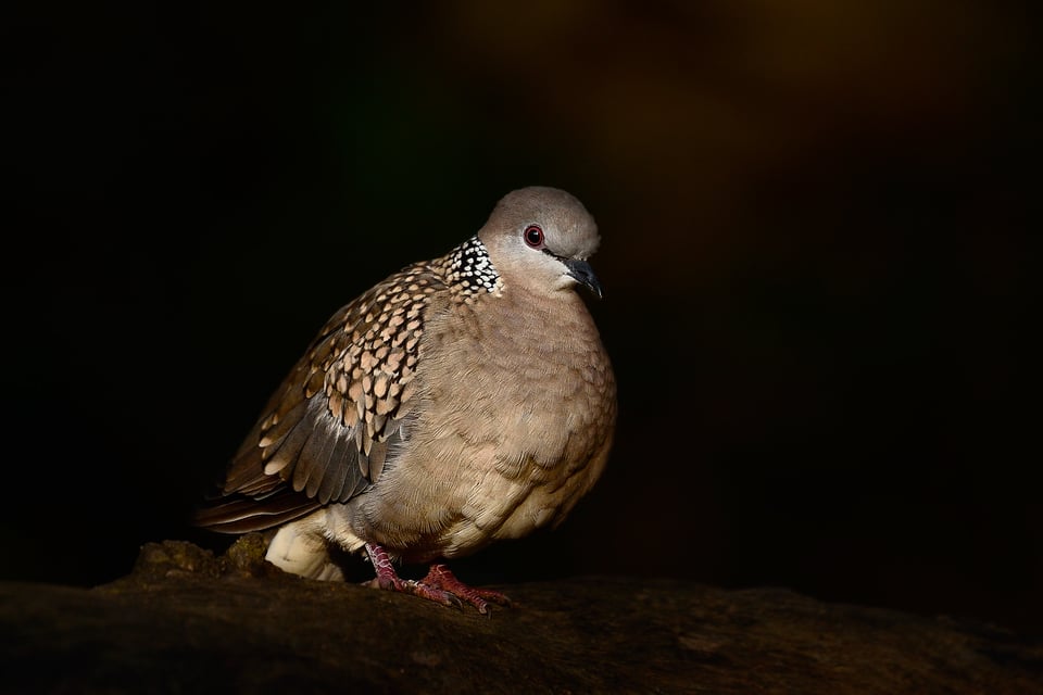
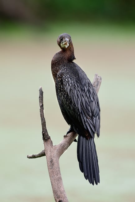
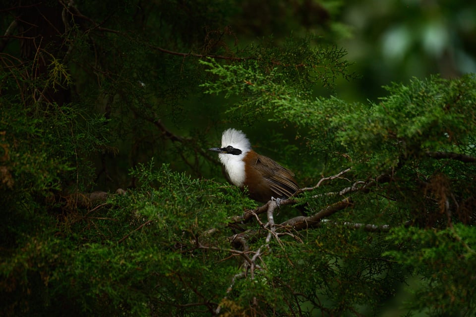
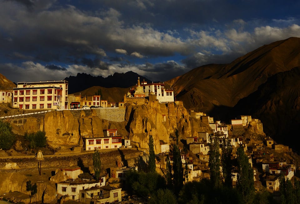
There is a general notion that negative space becomes prominent only in portrait and wildlife photography. In reality, the prominence of negative space is not constrained to wildlife and portraiture. Take another example of two different crops of the same image below.
Conclusion
In this article, I have pinned down the basic elements of the artistic aspects of photography that I wish I knew as a beginner. A technically sound photo might not end up being a great photograph if it lacks artistic elements. The scope of this article is to give an introduction to the basics of the four elements of photography: light, color, composition, and subject. If you have any questions or if you think I have missed out on anything, please let me know in the comments section below. I shall try to update the article or include it in future articles.
Interesting and informative article. I hope the author will go into further in future article
Wonderful content for photography lovers like me…this helped a lot….
thank you again!!
No worries homie :)
– G Money in da house
Composition consists of both space and color composition. Color aspect means arrangement of pleasing colors, no hot spot like white element that does not let the eye view the image, and no over powering blaze of one bright spot.
This is truly an eye opening article. Many thanks for enlightening us Madhu Manickam. I strongly agree with your opinions on the frame filling in wildlife photography which fails to tell a memorable story in many situations. On a different note; what is your opinion on collecting photography books (especially coffee table books) by great photographers? Would that be beneficial for learning rather than looking into youtube videos?
I’m glad you found the article useful Buddhika.
IMO, books are any day better. I ain’t against youtubers, but most of the stuff except a few are repetitive stuff.
Most landscape photographers wouldn’t have progressed without seeing the works of Ansel Adams. But as always, they only had to be followed as guidelines.
Well done, Madhu! You succinctly captured my own similar journey from a laser-focus on settings to the one I’m on now, turning my attention to composition, light/shadow, color/tonality, etc. Lots of food for thought in this article, and the sample photos were very helpful.
This article is very helpful. I did not know about the blue tones and how distance played a role in the saturation of it. You’re right. I would not have pulled my camera out at 12 noon. But I would have guessed that the photo was shot with a polarizer. So good to know. Thank you!
Wonderful article. Philosophical, as duChemin is, but practical like A. Adams. I’m going to study this page for a while. Thank you
I’m glad that you found the article useful Phillip
I think this is a great article for bringing out the Art side of Photography. And you are right hindsight is very clear. I think that it is important though to “Enjoy the journey!”
We all have to learn and grow and I certainly have enjoyed learning and growing in this hobby. Your article helps me continue that journey as I grow in the art side.
Thanks David. I’m glad you found the article helpful. Very true! if you don’t enjoy the journey, then it literally means nothing.
Excellent writing coupled with apt examples – your explanation is crystal clear and there is a lot for people who visit this site to learn. I second others comments that you should write more.
Lot of times, we do not apply enough thought into light, shadows, tonality, color – at least not as much as the technicality of the photograph and the equipment as you rightly point out. Thinking about photographing the way you do is guaranteed to yield superior results regardless of the make and model of the camera.
I guess the abundance of new gear in less than a month have us all worked up. Thanks for adding your views on it.