Sometimes, it helps to take a step back from broader discussions on creativity to look at the truly fundamental elements of composition. Although there are countless elements of composition in art as a whole, this article covers the ten most important that are specific to photography – critical parts of nearly every photo you take. They’re divided into two main categories: objects, and their relationships. These are nothing less than the building blocks of creativity.
Before starting, I do want to mention that we just filmed a real-world roundup of these ten elements of composition. Highly recommended if you like watching photography videos!
Table of Contents
Objects
The first six elements of composition are simply different types of objects you may find in a photo, ranging from simple to complex. These elements do not depend on anything else in a photo, or upon the borders of your composition itself. Every object in your photograph exhibits these characteristics to a degree, sometimes obviously and sometimes hidden.
1. Points
The simplest element of composition is a point.
Points are a bit deceptive; mathematically, they have zero dimensions. Photographically, we’re a bit more lenient. A point is just a small area of interest in a photo, or the intersection between areas of interest.
Stars in the sky in a photograph are “points,” and so is an out-of-focus light in the background. The same is true of the spot where two mountains meet one another, creating an intersection that pulls at the viewer’s eye.
Points matter in photography because they are one of the most fundamental ways to draw our attention – to add interest to a particular area.
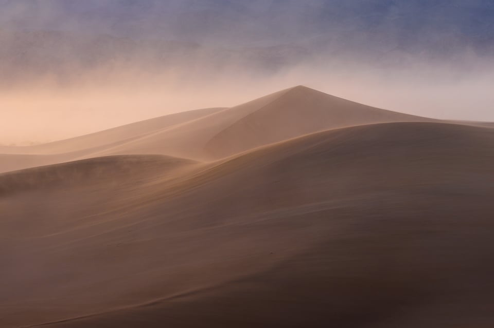
In the photo below, what element draws your eye the most? The answer should be immediately clear:
It is, of course, the peak of the sand dune – the point. It has a gravity to it. Our eyes follow the lines of the slope and end up at the same spot.
If you’ve internalized that points can draw a viewer’s eye and attract attention, you likely have a good idea of why they are so important in photography; they help give a photo structure. But hold that thought for a minute, and return to it for the “Relationships” section later. For now, I’ll cover the next simple element of composition: lines.
2. Lines
In contrast to points, which draw a viewer’s attention, lines are more like a path for a viewer to follow. Or, they are a boundary: the division between sky and ground, for example.
Like points, lines in photography are not defined as rigidly as lines in geometry. Photographically, anything that connects two parts of a photo or stretches across your composition is a line. That includes a curved road or a jagged mountain ridge, for example. Even the fuzzy, lightly defined edge of a cloud is usually a line.
Lines also serve an important function of connecting two different elements of your photo. They can give an image structure, which is a crucial part of making an image feel deliberate and intentional. A path leading from foreground to background has a way of making the image feel connected.
Sometimes, lines in a photo are imaginary, but they’re still there. Imagine a portrait of a child looking at a toy truck. The space between the child and truck might be “empty,” but the viewer knows it is important anyway. There’s a line – a connection between the two elements of the photo that makes each one more impactful.
Lines don’t have the same weight as points. Instead, they connect points, or divide them, or guide a viewer’s eye toward the one you want. This makes them some of the most important elements of composition.
3. Shapes
Now, we move from the simple elements of composition to the complex. Shapes can be anything, from the crescent moon to the shape of a smiling face. Each variety of shape has its own emotional impact on a photo, and it’s impossible to generalize. A circle might be peaceful, a heart evocative, a triangle dynamic, and so on – but the only thing to be said about every shape is that they have the power to attract our attention.
Sometimes, shapes are just the object itself. If you’re photographing the sun, it makes a circular shape. Other times, shapes are more conceptual, like a curved cloud over a curved valley that gives the entire photo a circular composition. Both types of shapes matter. The first attracts attention; the second gives the photo its structure.
In photography, keep an eye out for shapes in your photo, either obvious or abstract. Remember that they are very powerful in drawing our eye – particularly simple shapes, as well as those of humans and animals. Compose your photos accordingly.
4. Texture
The texture of an object plays an important role in determining its emotional impact, as well as the amount of attention it draws.
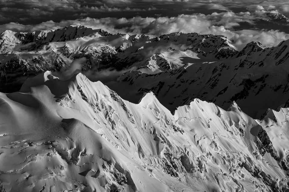
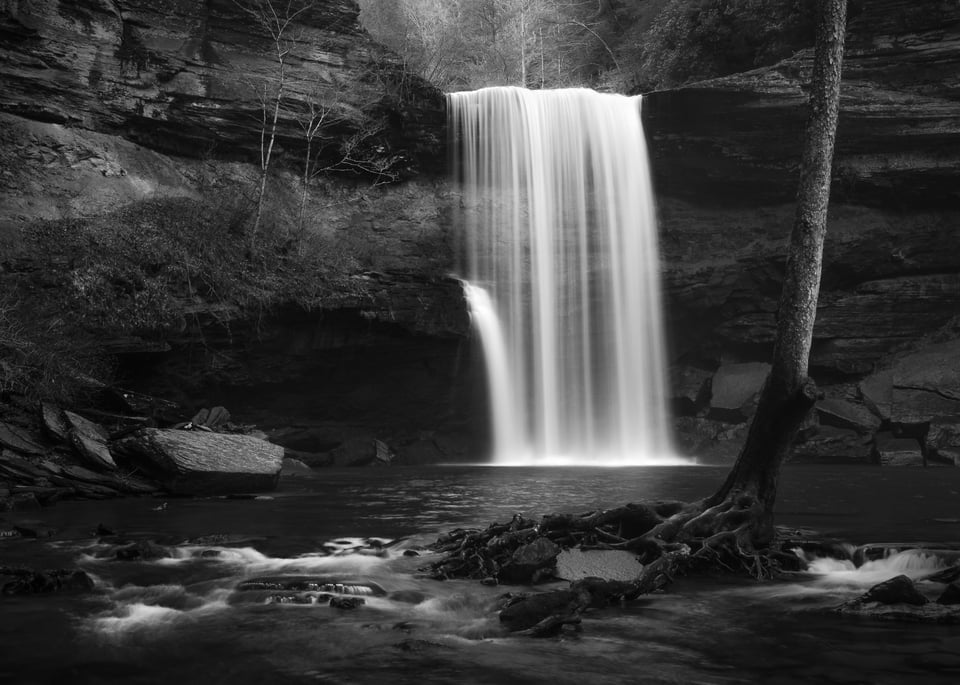
What mood do you capture when you photograph smooth pebbles and mist from a long exposure of the sea? What about jagged, rough mountains in high-contrast light?
Sometimes, textures themselves may be the subject of your photo, like patterns in the sand or waves of water. More often, though, textures are individual elements of a larger photo – either giving your subject some dimension or filling in the spaces between subjects.
Areas with more texture tend to draw extra attention. Sometimes, too much texture in “unimportant” areas of a photo can be distracting, making the overall photo appear too complex. In other cases, texture gives your subject a crucial sense of dimension, such as filling out the shape of a mountain landscape.
5. Color
Other than black and white photography – a creative choice of its own – color makes a big difference to the composition of a photo, as well as the mood.
Each color brings its own emotions to photography, a topic that could fill far more than the small space here. Nevertheless, the most important distinction you need to know at the moment is that of warm versus cool colors.
Warm colors are red, orange, and yellow. They are active, jumping to the front of an image and conveying more movement and excitement. I don’t just mean that they metaphorically jump to the front; if you put a vivid red dot against a vivid blue background, many people genuinely perceive the red dot as nearer to the viewer, almost casting a shadow behind it.
Cool colors, then, are the opposite: green, blue, and violet. These are calmer colors, with a bit more gentleness to their nature. Blue and green in particular are the most common colors found in nature; a blue sky or green field convey a reassuring and comforting message. But cool colors also appear in lower light environments, even shadows on a sunny day, so they do have a sense of darkness to them – one which can be particularly powerful in photos of a storm, for example.
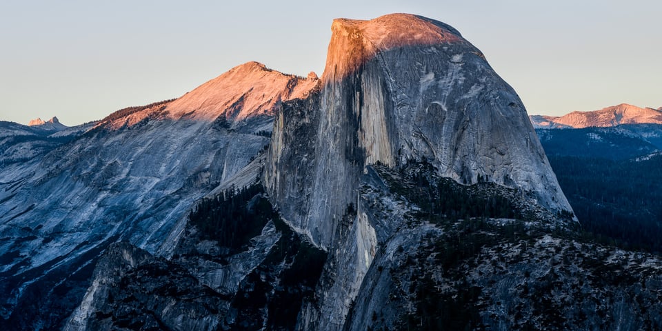
When you’re composing your photos, recognize the colors contained within, and try to use their strengths to your advantage. Often, pairing a warm color with a cool color creates an interesting sense of contrast, leading to an eye-catching image. Similarly, photos with just one or two dominant colors present a very unified message – a message that can be highly successful if created with care.
6. Tone
Another important element of composition is tone, both for individual objects and for the photograph as a whole. Although tone can refer to hues and intensity of color, it also relates to the brightness and darkness of an image, as well as its contrast.
A few other words can describe this same concept, but I prefer “tone” because of its connection to music. Photographs which employ tone successfully will carry the eye through the flow of a photo – much in the same way that musical tones carry listeners through the highs and lows of a performance.
Brighter regions of a photo attract the eye. So do those with high contrast – both low-level contrast (sharpness) and broader juxtapositions of light and dark.
At a more general level, the tones of a photograph also change its overall emotions. Photographs which are darker tend to obscure more of your subject, giving it a mysterious, intense, and even refined appearance. Brighter photographs are more etherial and optimistic.
Of course, you can adjust many of these factors in post-processing software very easily. Personally, I often darken the corners of an image to attract attention to the center. I’ll also “dodge and burn” (brighten and darken) individual elements of a photo that I want to emphasize or obscure. If there’s a distraction in your photo, one of the easiest ways to make it draw less attention is just to darken it a bit or lower its contrast.
So, pay attention to the tones of your photo, both in the field and in post-processing. They control how a viewer flows through the photo, as well as the emotions the photo conveys.
Relationships
The other elements of composition fall under a different category: relationships. Rather than applying to individual objects in a photo, the four elements below are all about how the different parts of a photo interact.
7. Distance
The simplest relationship between elements of composition is the distance between them.
Distance matters for a few different reasons. To start, if some of your subjects are too close together – or if one subject crosses another – the results can be distracting. I often try to move around a bit so that every important part of a photo has its own “breathing space.”
Beyond that, distance also applies to the concept of shapes as mentioned earlier, or, more broadly, structure. The most common compositional structures are simply a line (connecting two areas of interest) and a triangle (three). But as you add more and more subjects, as well as playing around with the distances between them, you’ll create compositions with significantly more complex structures.
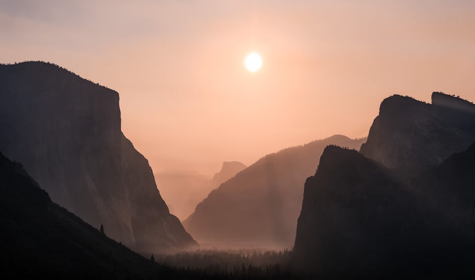
The composition in the photo below is, roughly, a pentagon – the result of the sun and different points on the mountains being the right distance away from one another:
Also keep in mind the distance between your subjects and the edge of your frame. Often, I see very good photos harmed by something minor like a mountain peak that nearly touches the top of the photo, drawing away attention from the rest of the composition. Watch the edges of your photos in the field; they’re some of the most important parts.
The good news is that you almost always have a lot of control over the distances between objects in your composition. Just move around; get closer to your subject or farther away. Put effort into capturing the emotional message you have in mind, and you’ll naturally end up with strong results.
8. Balance
The next element of composition is balance, related closely to the concept of visual weight. Visual weight isn’t complicated; it’s just the amount of attention each object in your photo attracts. Every part your photo has some amount of visual weight to it.
Which elements attract the most attention? More than anything else are faces and eyes, particularly of people but also of animals. Along with that, bright areas, sharp areas, regions of high contrast, vivid colors, unusual objects, and interesting textures also attract attention.
Balance is about the arrangement of visual weight in a photo. A balanced photo has similar levels of visual weight between the left and right halves; an imbalanced photo has more weight on one side or the other.
Sometimes, a “lighter” element can balance a “heavier” element simply by being farther from the center of a photo – like balancing a child and an adult on a seesaw. To check the balance of your photo, imagine putting the visual weights of every item in your photo on a fulcrum. Which way does it lean?
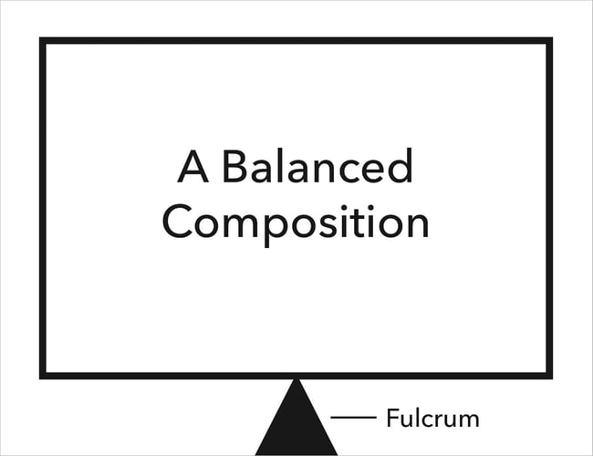
It’s worth noting that you don’t always want your photo to be perfectly balanced between the left and right sides. Although balanced photos often feel more natural and harmonious, imbalance is more dynamic, with a sense of tension that works for certain photos. So, when you’re arranging your composition, focus on balance or imbalance only to the degree that their emotions match your intended mood.

A balanced composition, where the mountain and the lake have similar levels of visual weight, and both are equidistant from the center of the image
9. Space (Positive and Negative)
Islands and water; clouds and sky; ink and paper. Positive and negative space.
Positive space is any part of the photo that attracts attention. Areas with significant visual weight are usually positive space. The same is true of areas with high levels of texture.
Negative space is the “filler” between regions of positive space. It doesn’t necessarily fade into the background like cool colors tend to do, but it isn’t the portion of the photo that attracts the most attention.
Photos with high amounts of positive space feel crowded, while photos with high amounts of negative space feel empty. Neither of these sounds like a particularly good emotion, but both can be very powerful in a photo. I’ve taken cityscape images with a sense of business and urgency because of their high positive space. I’ve also taken the opposite – photos of a tiny subject in a grand scene to convey a sense of isolation and immensity.
Positive and negative space depend quite a bit on other elements of composition, such as visual weight and distance. But even a photo of a single subject – say, a portrait – can have different ratios of positive and negative space depending on your composition. Just change the size of your subject in the frame, surrounded by greater or smaller amounts of background. The emotions of the photo will change significantly.
10. Patterns
In photography, patterns are everywhere. This isn’t just something small like a texture that repeats itself throughout the photo, but really in any repeating element at all. Even the reflection of a mountain in a pool of water is a pattern – one which should not be underestimated, since it ties the photo together.
That’s what patterns do, really. They tie photos together. They give photos a reason to exist – a strong statement for why the photographer took this photo and not some other.
Patterns are arguably more obvious in manmade scenes, like architectural photography. But even natural scenes and living creatures have patterns, like feathers on a bird or waves crossing in the sea.
Not every photograph you take will have an obvious pattern, and that’s not a problem. But when you do see some sort of repetition or interconnectedness in the world, take note. It could make for a very strong photo indeed.
Conclusion
Most other techniques in composition – from simplicity to emotion – start with the elements of composition listed above. Although there are more than just ten elements of composition, these are the most important for photographers to know.
They’re also some of the easiest to implement in your photography, so it’s worth the effort to think about them while you’re taking pictures.
- Introduction to This Guide
- What is Composition?
- Elements of Composition (You Are Here)
- Light
- Color
- Simplicity
- The Refining Process
- Composition Tips

Nice article! What I read before is all fixed rules of Composition. Maybe it’s not bad for beginners to familiar with the basic techniques of composition, but it’s more important to get a consciousness of the real purpose of composition.
Thanks so much for sharing!
my teacher making me read this article
That’s because it’s a good article 👍
I love it
I get the best ideas thank you very much
This is my favourite article on the topic! Though I would love to know how one can apply this to fashion editorial or food food photography as well!
wonderful article indeed
thank you so much
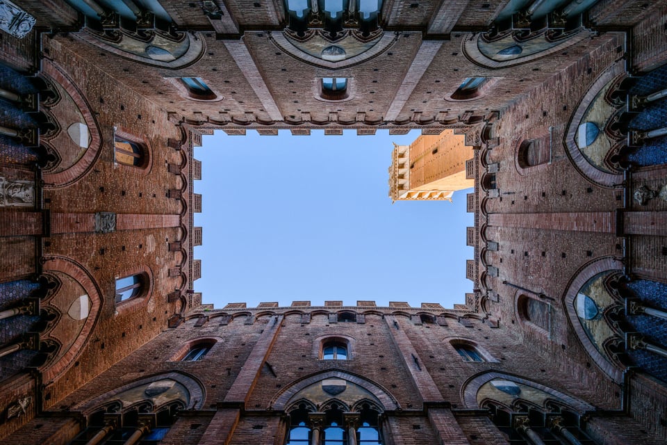
Nice article, but I thought the composition from Siena looked familiar.
flic.kr/p/JVfFbt
I guess that great minds do think alike ;-)
David, that’s so cool! Can’t believe I just saw your comment, but count me impressed.
Excellent explanation of the various elements of composition in photography! Also, love the images that you included. Thanks for sharing Spencer
Love how easy to understand your teaching is!! =) I’m learning so much I’m a beginner, photography has been a hobby of mine for a while but just recently I have been wanting to learn properly I’m self teaching at the moment through articles/websites online, books, and practice, oh and being inspired by my favourite photographers Jessica Bubb (@rusticbones) and Steve MCcurry being two of them. I love your photos too and politely ask with sugar on top that you run this website forever haha its great, nice job.
Regards,
Becca