Every January, I spend couple of days reviewing the photos I made the past year. My first step is to narrow those down to about 45 – 50 favorite images and then eventually to top 12 (the latter reduction often aided by a Facebook poll). I find this exercise rewarding and a very effective way of improving my photography skills. I thought of sharing these final 10 – 12 photos from 2015 with the Photography Life community including the preparation that went behind creating each image, the thought process that led to the final composition, post processing technique etc. After a quick email back and forth with Nasim, I decided to take a stab at it and here is my first write up of this 12 part series.
I. Reflections and mist on a tranquil morning, Sunday Pond, near Baxter State Park, Maine
Table of Contents
Background
I visited Baxter State Park (BSP) in Maine in June 2015 for a three day trip. We started from Boston on a Friday afternoon, reached Millinocket, the closest town to BSP by 10 pm and checked into a hotel. Rain was in the forecast for the night and it was supposed to clear up by 4 am. BSP gate opens only at 6 am and with a sunrise time of around 5 am, it was impossible to reach any location within the park at dawn. Instead I had planned to check out Sunday Pond location for the sunrise shoot. Sunday Pond is situated 2 miles before BSP and is about 20 min drive from Millinocket.
Planning
Back home, before starting for the trip, I had carefully plotted the sun’s position at Sunday Pond using ‘The Photographer’s Ephemeris’ (this is an invaluable resource and a must have for any landscape photographer). It had revealed that a rising sun will be side lighting the distant Mt. Katahdin- a good angle for photographing reflections. Essentially, I had a vague idea of what I will be photographing this particular morning even before starting for BSP- a stage often referred to as previsualization in photography, which has served me well over past many years.
The Morning
We got up by 4 am and reached the Sunday Pond around 4:45 am. The sky was completely clear and there was plenty of mist rising over the pond. The overnight rain had saturated the colors and it was a very calm morning with no wind. The overall scene invoked tranquility and peace.
With sometime at hand, I soaked in the atmosphere and picked my elements- distant Mt. Katahdin as the background anchor, a line of trees on the opposite shore and rising mist as the prominent background, reflections in the still waters of the pond as the middle-ground, and the back-lit weeds among the front-lit rocks in the foreground. It was a complicated scene and I needed the right balance for a composition involving all the elements to work. In addition, there was an opportunity for simplified compositions using only a subset of the above.
Shooting
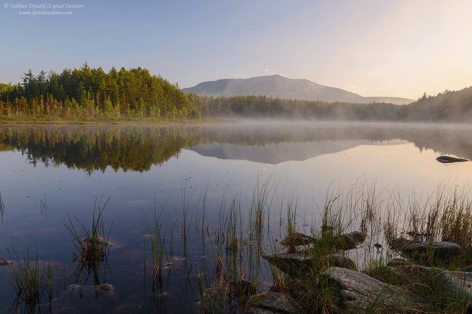
The first decent picture I made that morning is shared next. It looks ok but somehow the light is not right for conveying what I felt that morning. The distant trees are dark, the foreground doesn’t complement the background and the composition looks unbalanced to me.
Dawn, Sunday Pond, ME, 5:13 am
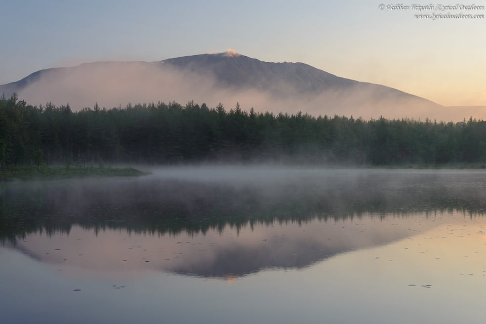
Next, I simplified the composition. It involved switching form wide angle to a mid-range lens and zooming in to isolate the part of the scene with most interesting elements (to me). I think this simpler composition emphasizes the contrast in highlights and shadows and works well.
Mt. Katahdin, morning mist and reflections, Sunday Pond, ME, 5:16 am
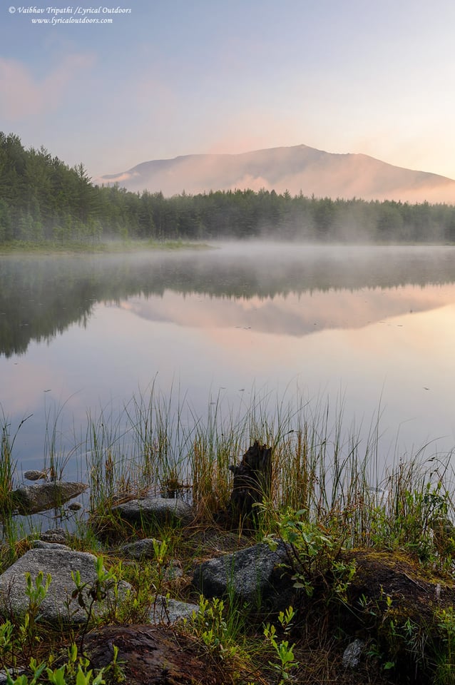
The scene kept me occupied but essentially I was waiting for the sun to come up just enough to bathe the distant trees in golden hues. Also, I had moved a bit to the right to find a foreground that was humming well with the overall scene. At around 5:35 am, the sun started to hit the top of the trees and at 5:37 am, I made the opening shot of this post. Couple of minutes later, the sun started to hit the water and the mist disappeared almost instantly- not really ‘static’ as is often associated with landscape photography. The changing light makes the landscape dynamic with the best moments lasting only a few minutes, sometimes even less.
Dissecting the Composition
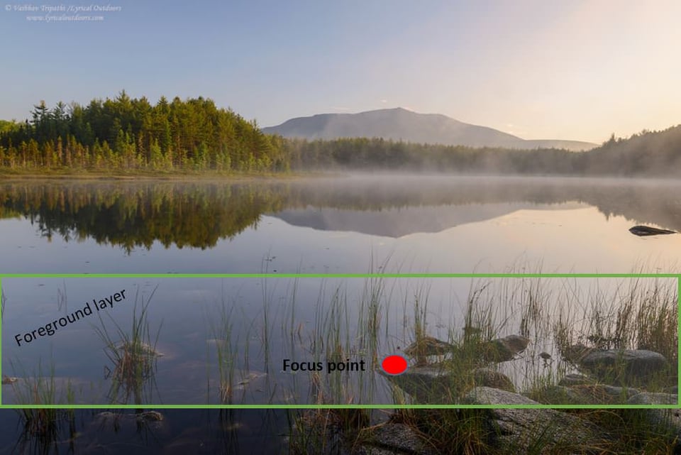
With the tripod height of around 4 feet (not the full 60+ inches and not very close to the foreground), and by pointing the camera down at an angle, I ensured that the weeds/grass do not touch the reflections in water. Also, the pattern of weeds now forms a layer, which complements the distant rows of trees (unlike the image I made at 5:13 am). The light on the foreground rocks sings well with the light on the trees. I turned the polarizer just enough to reveal the submerged rocks in the foreground but not to cut the reflections and last but not the least, the back-lit mist adds to the overall mood. If, I really want to nitpick, I will crop out the little rock located towards the right but since it is dark and doesn’t cut the reflection line, I left it there.
Technical details
The image was made using a Nikon D610 and Nikon 24-120 mm f/4 VR lens @ 27 mm and an aperture of f/16 (for DOF). The shutter speed was ¼ seconds. I focused the lens at the point of focus as shown in the above image, which was good to hold sharpness from front to back. The raw file was processed in Adobe Lightroom 5.6 and then converted to a jpeg. Since I had a good exposure to begin with, this last part was the most boring part of the process (something, I actually prefer).
My photography style is to find quality light and then let the compositions flow from my emotional response, which may be a recurring theme in these articles. I hope you enjoyed this dissection of one of my favorite images from last year and will eagerly look forward to comments and feedback. Since, this is the first article in the series, please let me know if there is anything more you want me to cover in the subsequent write-ups. Stay tuned for second installment of the series.
Update
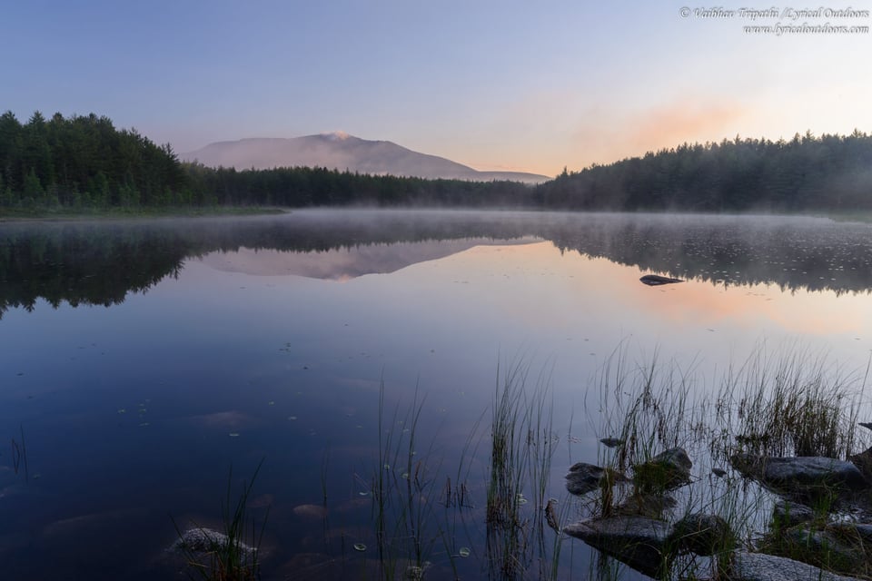
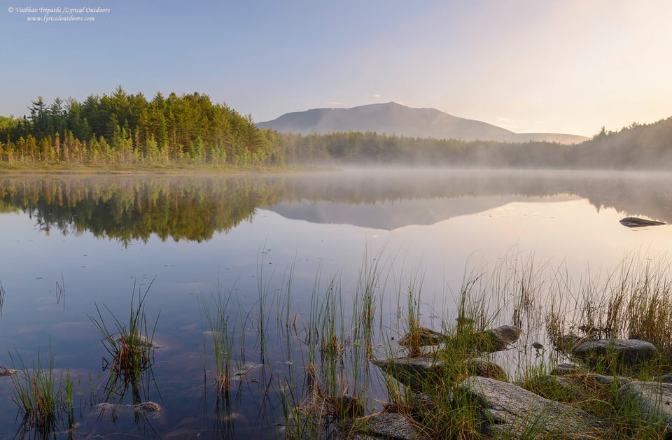
Based on couple of critiques, I re-processed the image in Lightroom- boosted the shadows in foreground and midtones in the overall image. I like this version. Also, I found another image from my archives, which captures the sense of the place before sun started hitting the tress in the opposite shore. Somehow, I missed this one before and now am undecided, which one I like more. Would love to hear your thoughts!
Vaibhav,
It’s the FINAL IMage !
A Flawless Trifecta !
Thank you,
~ Michael ~
what a wonderful description of the entire process. I am just beginning to learn digital photography and therefore it is inspiring to learn how much thought process goes into making an amazing picture. I have not learned the post processing yet, however, that is essential and perhaps more time consuming.
I like the idea of annual spring cleanup of your entire photo collection.
Thank you for sharing and for taking the time and effort to write this informative post.
It’s nice to know how a talented photographer goes through the whole process of creating a beautiful photo.
Amir
Vaibhav,
I found your article very interesting because it highlights a problem that I had to overcome in my photography, which is perhaps best explained by one of the questions that I learnt to always ask myself before I press the camera’s shutter button: Under what conditions will this photograph be viewed?
Here are my observations of comparing your first image in the article to your re-processed image in the Update section… Scrolling between them on the web page, I prefer your re-processed version. After downloading the images and comparing them full screen via an image viewer, I much prefer your first image. My preference switch is, I think, caused by the simultaneous contrast effect:
en.wikipedia.org/wiki/…fect#Types
The 100% white web page surrounding your images causes the foreground at the bottom of your images to look much darker than it actually is. If instead the web page was black, it would make the foreground look lighter; it would also increase the overall apparent lightness of the images.
The simultaneous contrast effect becomes especially important to take into account when preparing an image for printing, mounting, and framing, because the colour of the card mount and the frame — even the colour of wall on which the frame is to be displayed — all affect the viewer’s visual perception of the photograph.
Asking for feedback on our images via the Interweb is problematic because we don’t know the viewing environment of each person who provides us with feedback. Were they using a calibrated display screen; what was the level and the quality of the ambient light that was surrounding their display screen; were they assessing the image(s) as displayed on the web page, or did they download the image(s) and use full-screen viewing mode? Likewise, those providing the feedback don’t know how we intended to present our image to our intended audience. A digital image is a very different type of entity from a printed, mounted, and framed photograph displayed on a wall in our home.
Very good advice!
Very good point Pete! I have myself had the same problem and am aware of the fact how the luminosity of the surrounding areas effect the perception of a photograph. And given these issues with web viewing, I understand it’s a little hard to critique but as we can see that we already had had a great discussion by the means of this first article itself- in my view that alone is worth it :)
Happy clicking!
Wow, that is practically my back yard, Vaibhav; I know this place well! :-) I took a 1.5 gigapixel spherical panorama that you can pan around in and explore here: galleries.aaronpriestphoto.com/Lands…July-2013/
Your panorama is amazing, thanks for sharing! And I am jealous of your backyard, Baxter State Park and surrounding areas are real beautiful places.
I love this area! Shoot me an email if you come back up, would love to meet up! Congrats on the Milky Way shot from Chimney Pond. I’ve shot some nice 360° panos there too of the mountain, but not at night yet. Great stuff!
Thanks Aaron, it will be great to meet up. I will let you know if I drive up there again. In case you are around Boston area, do send me a message.
– Vaibhav
Eagerly waiting for the next 11 photoes :)
Thanks for sharing, I found your exact thoughts during the process especially interesting to know about.
I’ve been following this blog for a few months now, and it is definitely my favorite photo website, and yet this is my first comment. I do not by any means consider myself a photographer, as I mainly take pictures as a secondary activity when my main purpose is e.g. travelling, hiking or skiing. Unlike good landscape photographers like yourself or Nasim, I would never wait for hours, let alone days, in the same place for the right conditions to appear in order to take the perfect picture, as I would rather be walking around and discovering new sights during that time. Still, I end up taking many pictures and spending time processing them, and I enjoy it. (Sorry about the self centered monologue, this was just to give you some background so you can decide whether to give my opinion any consideration at all :) )
As stated above, I found the post and the thought process really interesting, and yet I’d have to agree with Bruce & Mark (comments 3 & 6): to me, something is lacking here, and I wouldn’t rate this picture as high as the ones I’ve seen in your other posts, i.e. good, but not that special. Mostly, I find the composition unbalanced; I guess, to me, there is too much empty space in the bottom half of the frame. I think I would have tried including more grass, eventually by stooping down a little in order to replace some of the water with it, or just by backing down a step, and I would have tried making said grass more visible (not as dark). The latter, rather than distracting you from the reflection, I think it would have guided you towards it (oddly, the reflection was not the first thing I noticed when looking at the picture). I also have the feeling the picture could be slightly tilted counter-clockwise (that’s easy to check on reflections: a point and its reflection should be on the same vertical line, and they aren’t here!), although of course it might look unbalanced then. Another thing: as I understand, the original purpose of the picture was to capture the ‘golden’ sunrise light and how it illuminated the trees and mountain. With that in mind, I find the end result to be lacking a bit in this respect; this is very subjective but I would have liked to see more vivid colors on those parts. If, on the other hand, your main purpose was to transmit a sort of calm, mystic atmosphere (especially with the mist being there) I would then rather see this picture converted to B&W.
I agree with Mark that of the 3 pictures you showed, the second had the most interesting composition to me, and I would have liked to see the result of that picture taken a bit later, with sunlight on the mountain/forest!
That was my two humble cents; in any case, I am looking forward to the other 11 pictures/posts!
Diego
Hi Diego,
Thanks for taking out some time and posting this thoughtful critique. I re-processed the image and boosted the shadows in foreground so the grasses are not dark like before. Please take a look at the updated post.
I agree with Mark (and you) that the image #2 has lot of potential and possibly is a stronger composition. Please read my reply to Mark.
I have not given b/w a try for this image. Thanks for the great suggestion!
-Vaibhav
Hi Vaibhav,
Thanks for taking the time to read and consider my suggestions!
I much prefer the re-processed image. I also like the second one, maybe even more, but I also find it hard to decide between the two. I like that the latter shows the fog/mist better, it gives (me) a more ethereal feeling.
After reading Pete A’s comment below, I thought it might be useful to add: I’m looking at your pictures directly on the webpage, i.e. not on full screen and with a white background, and my monitor is not specially calibrated – but most other pictures on this website look good to me that way.
Diego
Great shot! I would encourage anyone who has interest and ability to hike and explore to visit Baxter State Park. I’ve climbed Katahdin a couple of times and hope to do it this summer again. Here are photos from my last hike which was ten years ago!
photos.google.com/share…VCRU5KSU53
Thanks for sharing your creative process with us. It is very helpful.
Very nice photos. I loved them. This is the website I a.ways bank on when I need some inspiration.