There was a time when photography had to defend its place in the sun among traditional artistic disciplines. It was accused of being a soulless reproduction of reality with only a hint of the author’s creative imagination. Those days are thankfully over.
Creativity abounds in photography. I always find it interesting to see how different photographers photograph the same scene at the same time in unique ways. We all have our own ways of looking at the world; we are each an original. This is also evident in the post-processing stage, where the RAW files hatch into photographs.
To demonstrate this reality, I came up with a little challenge for our team. Spencer, Jason, and I each contributed a pair of images: one landscape, one wildlife – for a total of six images. We sent each other the RAW files and edited them as if they were our own.
One of the conditions I set was that no one would see their colleagues’ final photos until they were done with their own edits. This was to prevent us from converging on a similar visual solution. Before you take a look at how we handled each file (I’m deliberately not calling them photos yet), let me show you what ingredients we cooked with. Below you can see the unedited images as exported directly from RAW to JPEG.
Unedited Landscape Photos
Unedited Wildlife Photos
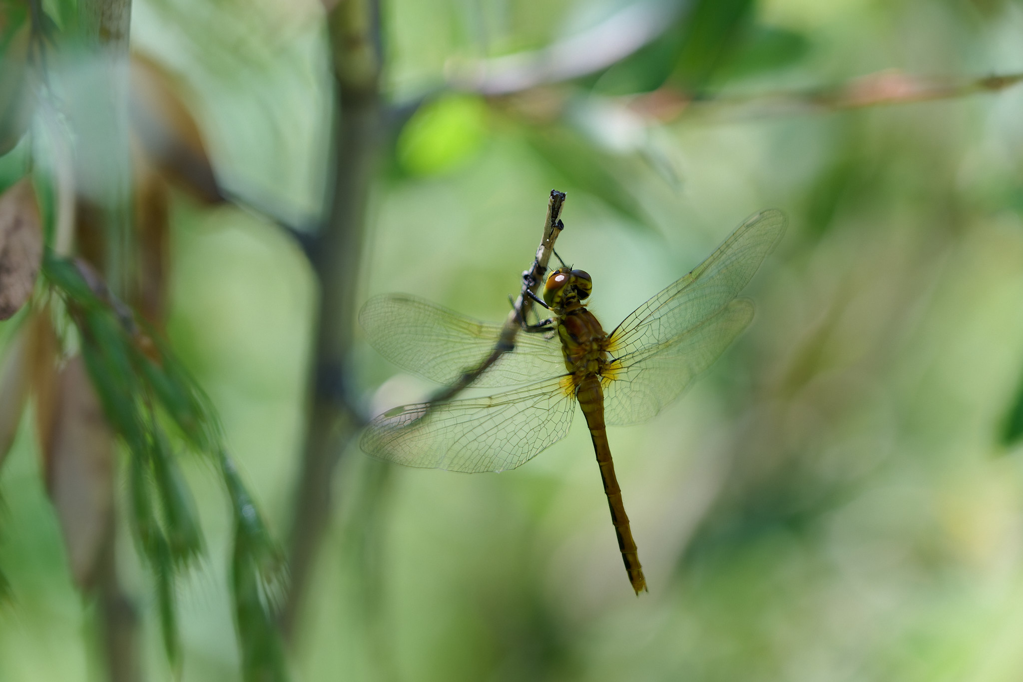
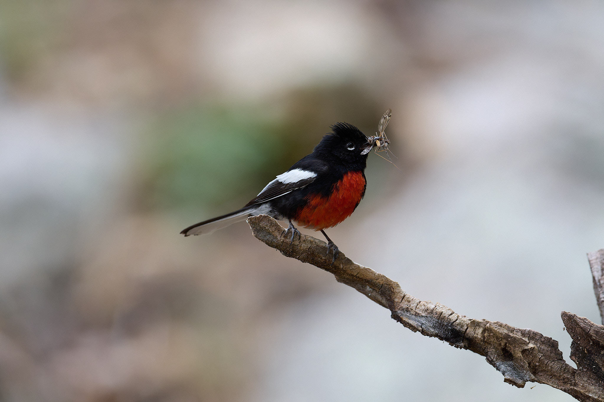
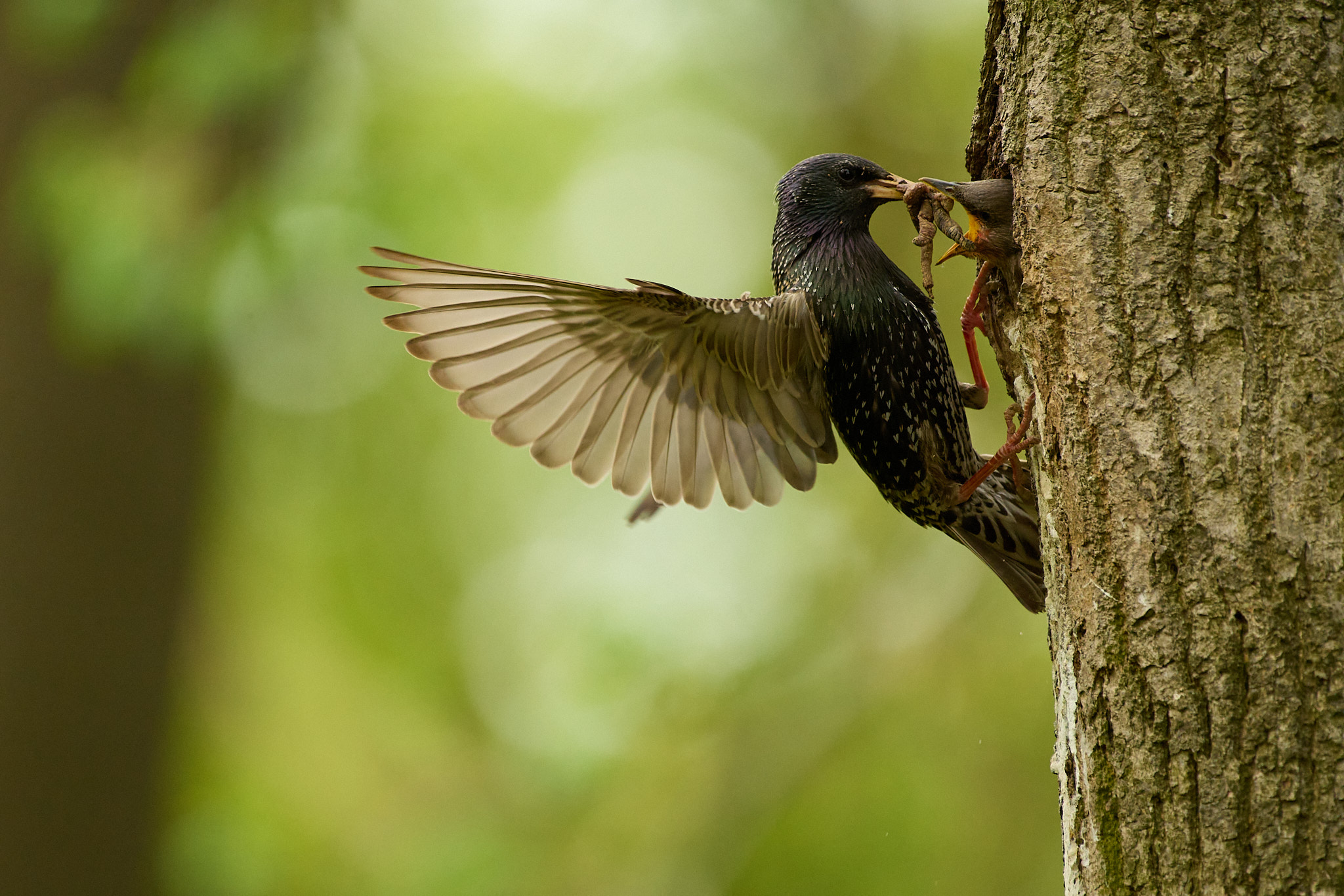
Table of Contents
Landscape Photos
Spencer’s Landscape
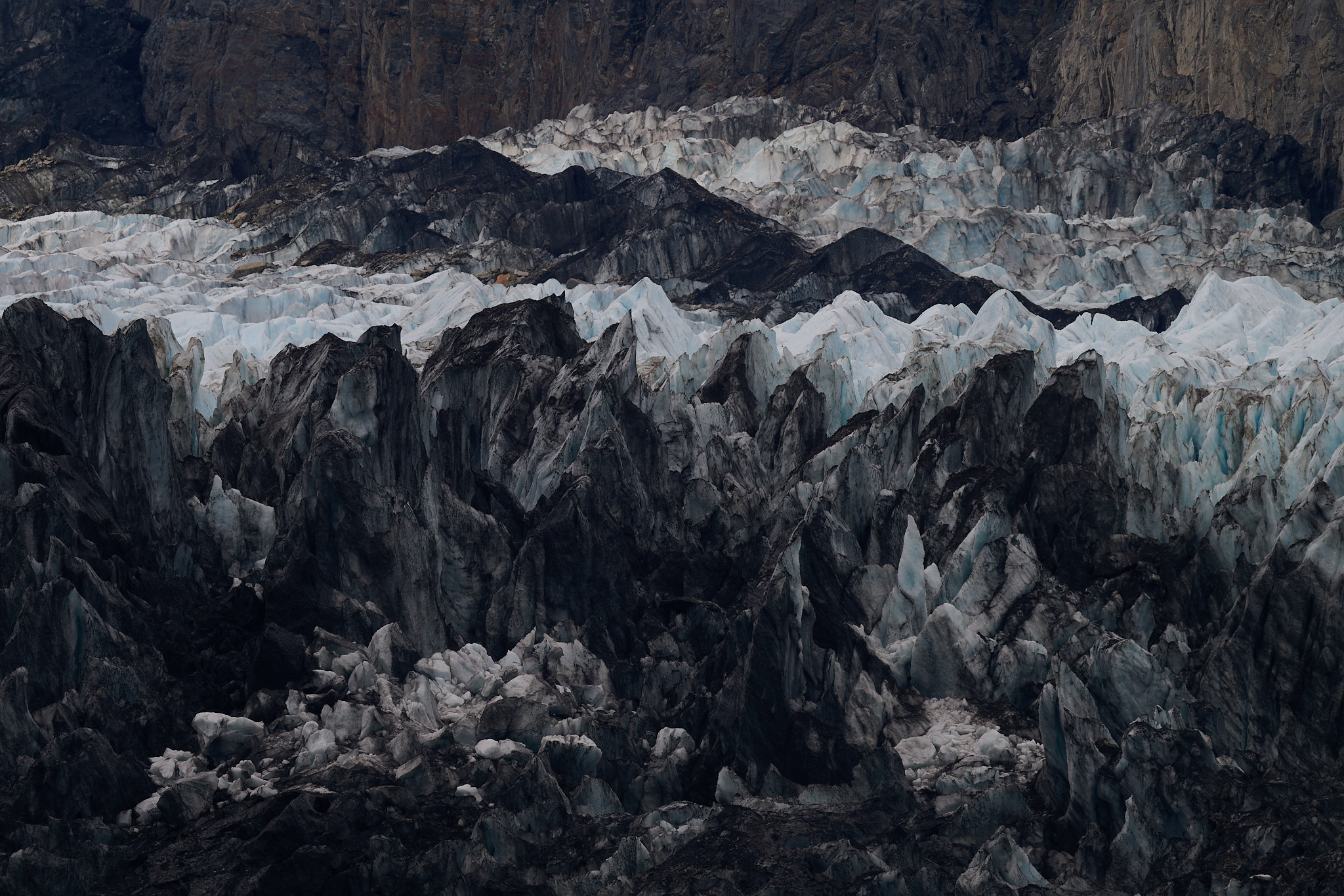
Taken with a supertelephoto 800mm lens, Spencer’s landscape beautifully compresses the perspective of the rock massif and ancient jagged glacier. A photograph that inspires awe and respect for nature.
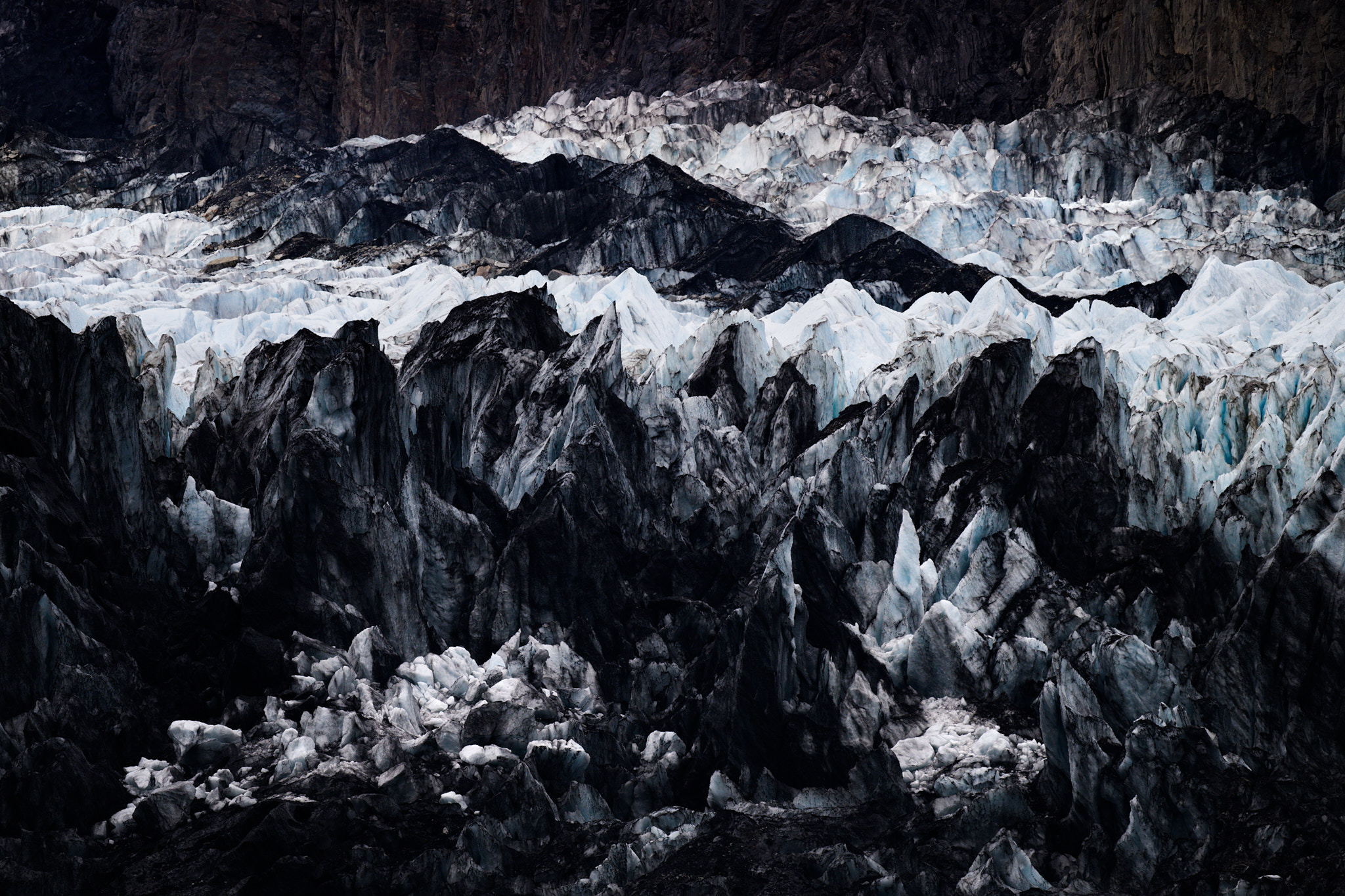
Spencer’s editing includes slight compositional corrections by cropping from the sides and top. This is most noticeable in the dark ridge of the glacier on the left, the top of which touches the edge, causing the viewer’s eye to slide back into the frame. A small detail, but it works nicely. The overall feel of the photograph is dark, dense, and almost monochromatic. Only the rock in the background and the occasional glimmer of blue from the glacier reveal that this is a color photograph.
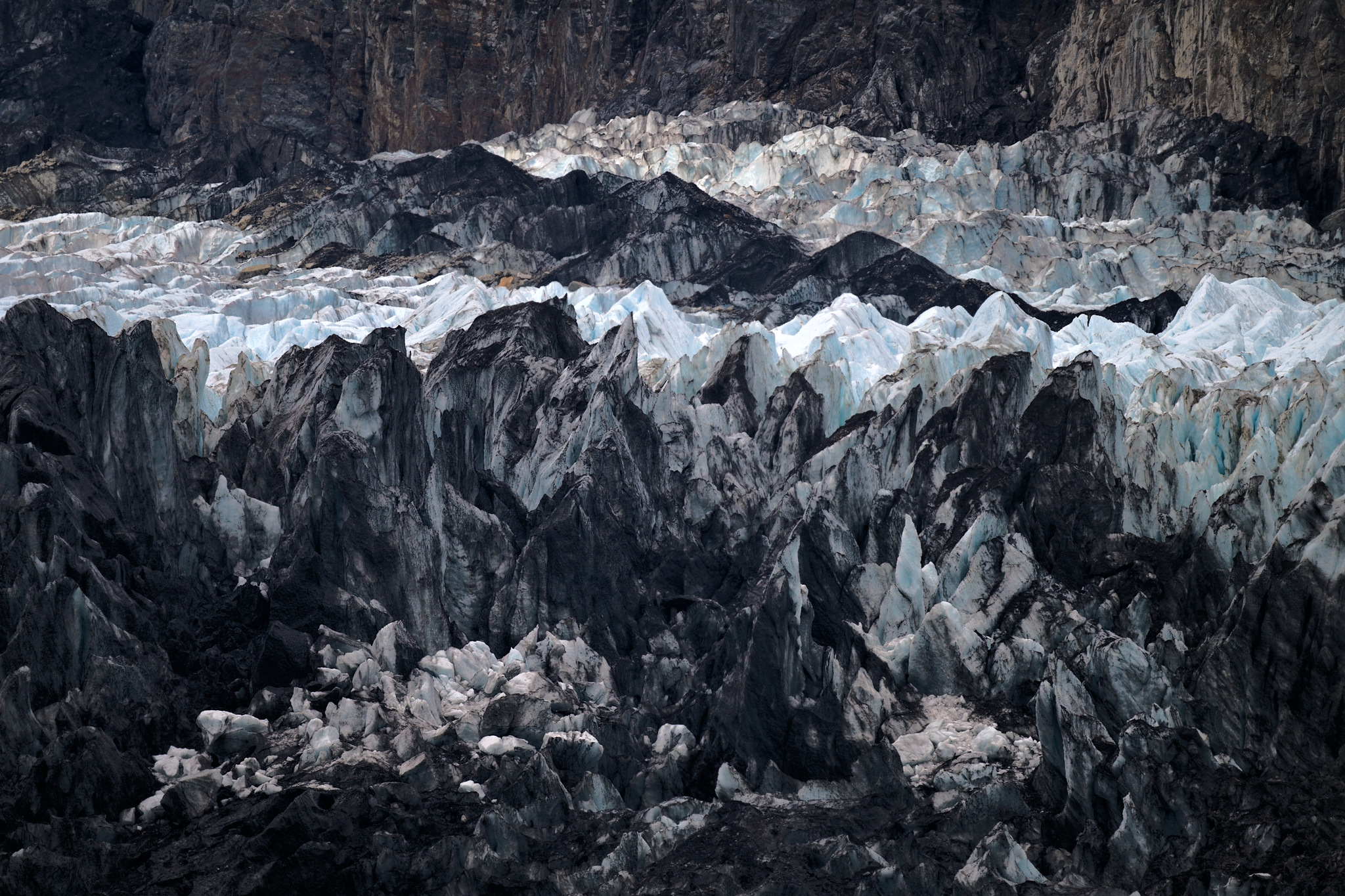
In his editing, Jason respected the artist’s original composition and left the photo uncropped. Jason processed the RAW into lighter tones and maintained a lower-contrast look, emphasizing the distance of the landscape. The shadows are not as dark as in Spencer’s version, and the blue of the ice is a bit more pronounced. Although I wasn’t on location, I suspect this is what the whole scene looked like in reality through a pair of binoculars.
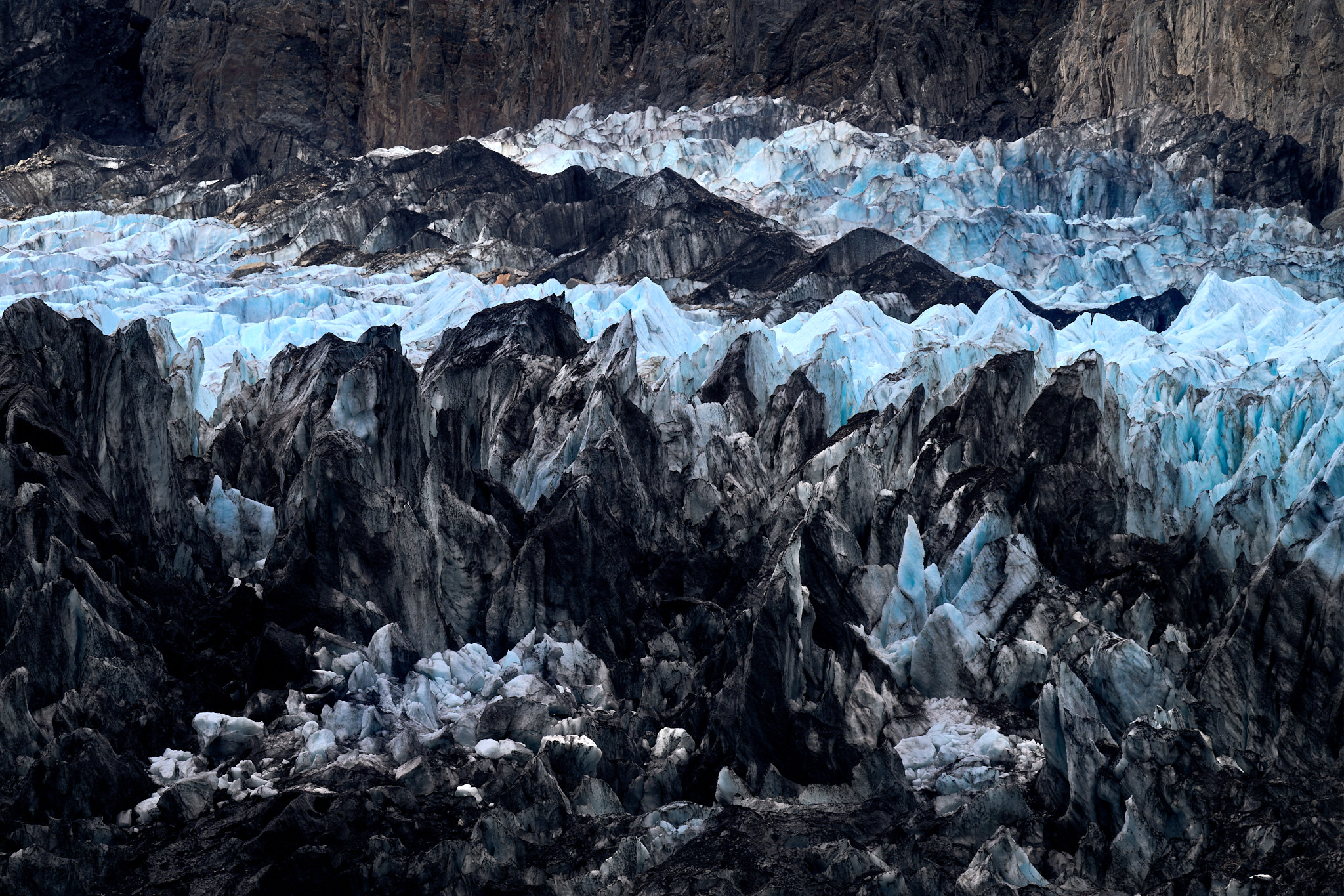
I predicted that the guys would stick more to reality when editing the files, so I decided to get a bit more adventurous in my processing. And this shows it. Old, compressed, bubble-free ice tends to be a beautiful blue, which I wanted to emphasize. I did this by locally adjusting the white balance to daylight, which gave the ice a cool tint. I darkened the browns and blacks for contrast, so the mood is somewhere between Spencer’s dark and Jason’s lighter version.
Jason’s Landscape
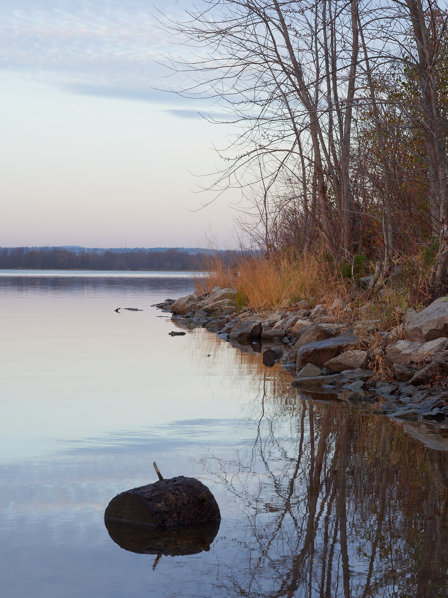
I wonder if this photo, full of beautiful pastel tones, cost Jason his dry pants and a good portion of his body heat. If so, it was worth the sacrifice. On a late autumn day, Jason captured a beautiful image full of subtle color transitions. The harmony of warm and cool colors so typical for this time of year is also pleasing.
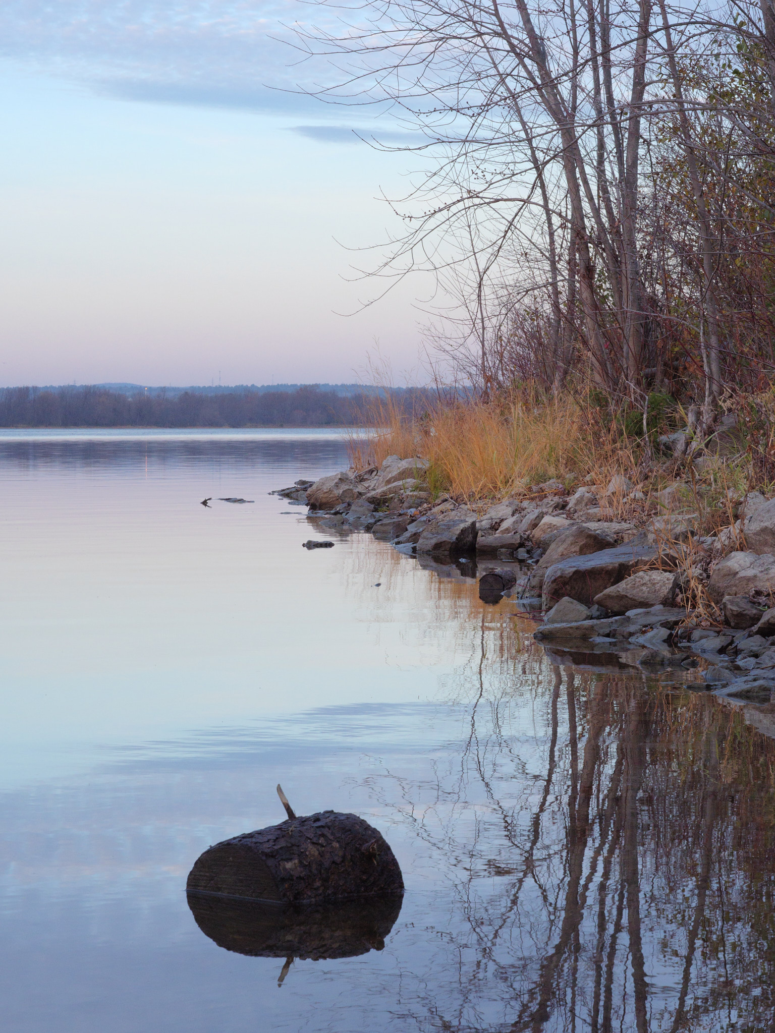
Spencer “cut down” the two trees that touch the right edge of the frame by cropping them out. He also cropped a bit of the sky to preserve the aspect ratio. His choice of white balance and darker approach to the image suggests a later moment in the evening, post-sunset. The lower-contrast look is relatively similar to the original, but the small saturation boost evokes a film-like appearance.
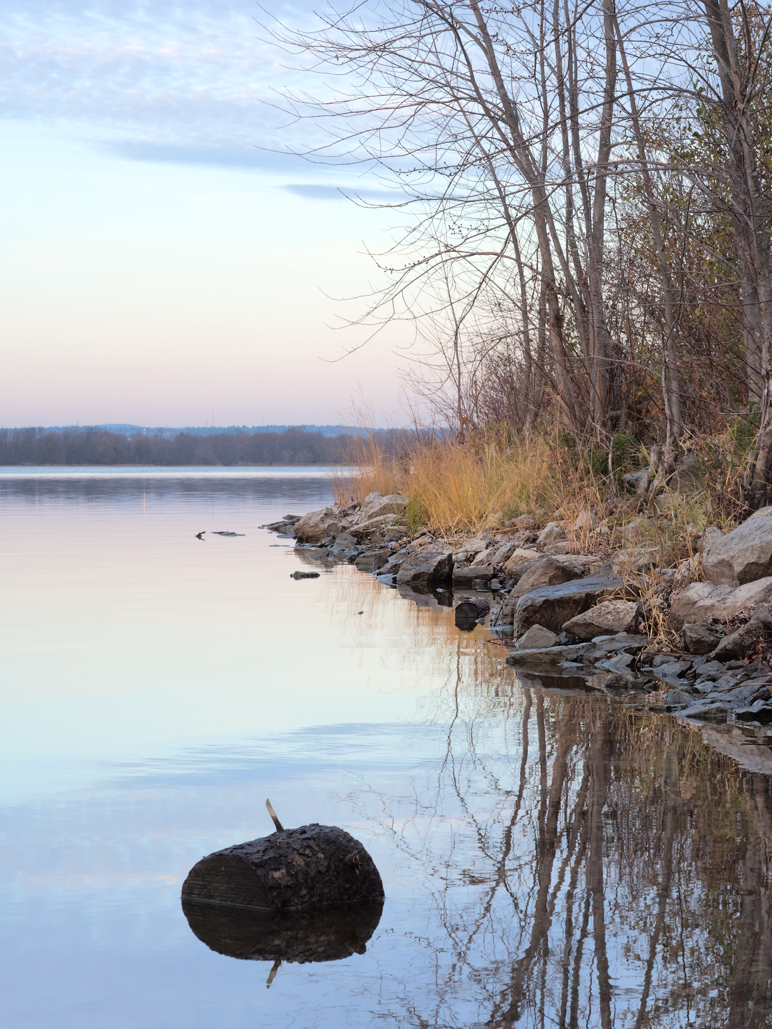
Jason took a slightly different approach than Spencer. He left the photo uncropped. He also brightened the tones in the sky a lot more, but maintained a lower-contrast look. In the time that I’ve been watching Jason’s work, I’ve gotten a sense of his artistic style. It shows in the soft pastel colors, the lower contrast, and the overall dreamy atmosphere.
I made slightly more radical edits to Jason’s image. While I didn’t crop the photo, I used the Draw Healing Mask tool to remove some rocks in the water and a stick protruding from a boulder in the foreground. I saturated the whole shot a bit more, and I also added some contrast and clarity. To make the rocks at the water’s edge inviting to sit on, I brightened the shoreline by increasing brightness and clarity.
Libor’s Landscape
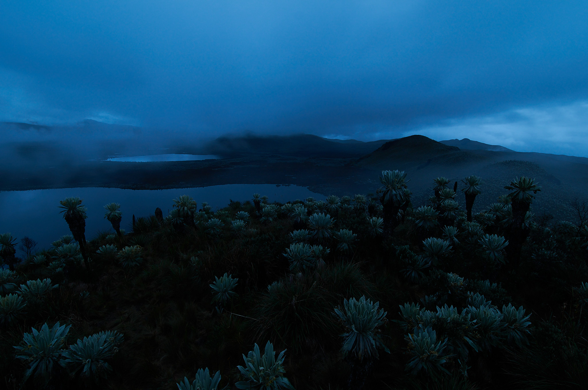
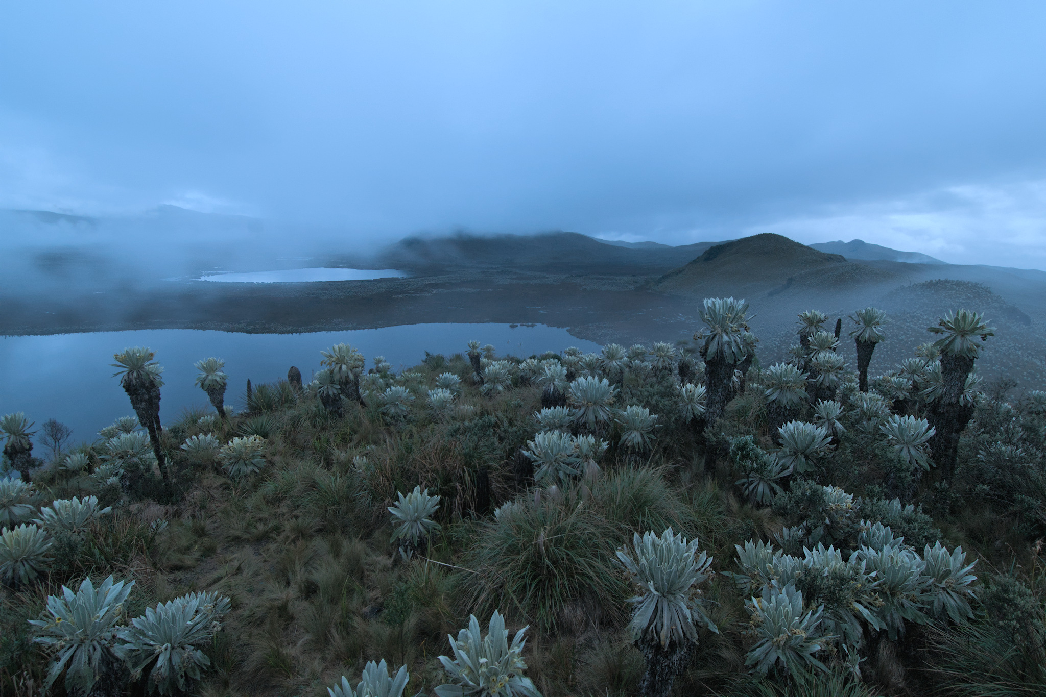
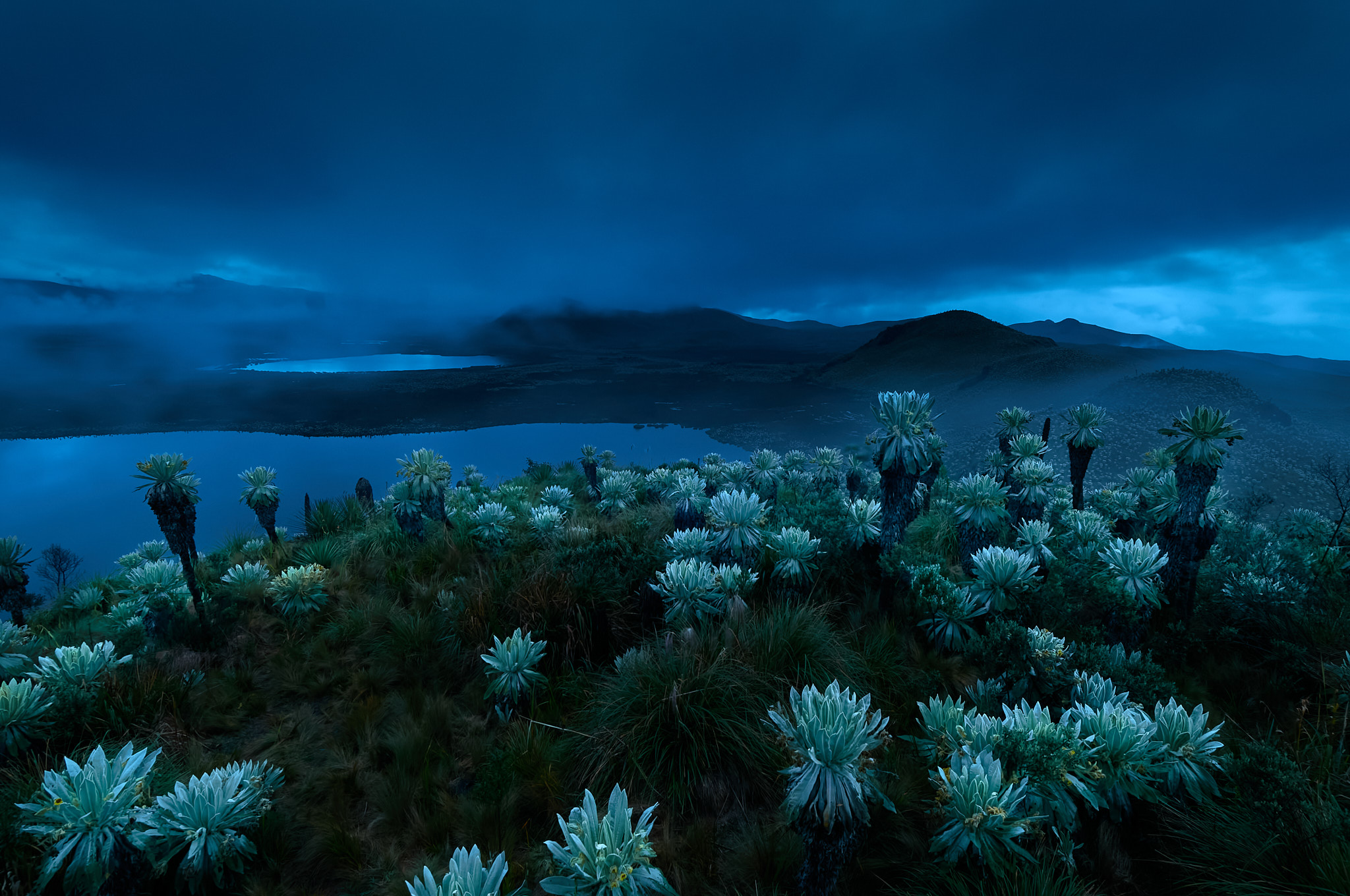
The mountain steppe, or páramo, of northern Ecuador and Colombia is characterized by special plants called frailejónes. Thanks to its proximity to the equator, the post-sunset landscape is bathed in a bluish light, fog, and (despite the tropical climate) a chill. The photo was taken at an altitude of over 4,000 meters.
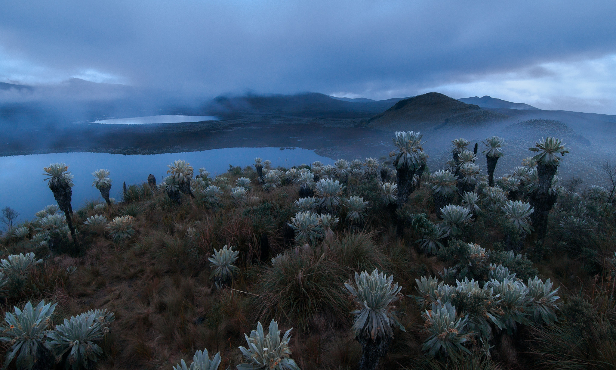
Once again, Spencer’s crop tool wasn’t idle, cutting out a frailejón on the far left and a decent amount of the sky. The white balance has reduced some of the blue cast. Spencer’s editing seems to have turned the clock back about half an hour, not long after the sun had set behind the horizon.
Again, Jason keeps his editing style. The soft pastel tones, without deep shadows or dramatic contrast, give the mountain landscape a brooding but serene character. Note that the differences in tonality between the dry and green grass are much less pronounced than in Spencer’s edit. But, like Spencer, he brightened the original file and also made the image appear to have been taken earlier in the evening.
If Spencer and Jason’s edits shifted the mood of the photo back half an hour, I moved it in the opposite direction by the same amount of time. I kept the strong blue cast and just pulled out the shadows overall. Conversely, I darkened the sky and added more drama with the Clarity tool. I lightened the leaves of the frailejónes so they would stand out against their surroundings.
Wildlife Photography
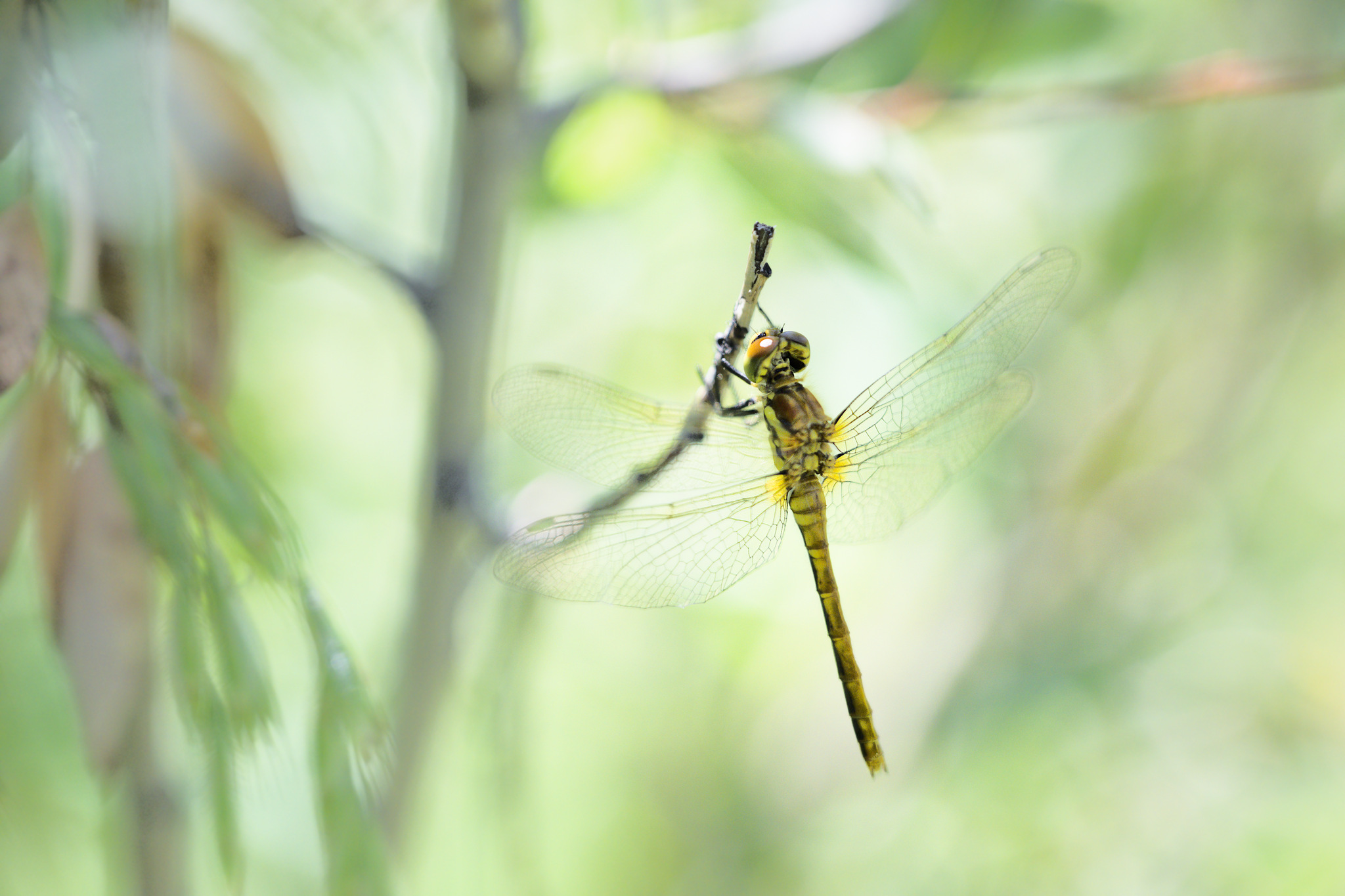
Spencer’s Dragonfly
Dragonflies have been flying over our planet since the Carboniferous Period. Some of them were much larger than they are today. Today’s dragonflies are smaller, but just as beautiful and just as dangerous – at least to the insects they catch in flight. Spencer captured a dragonfly at one of its roosts, where these small predators observe their surroundings and scout for prey.
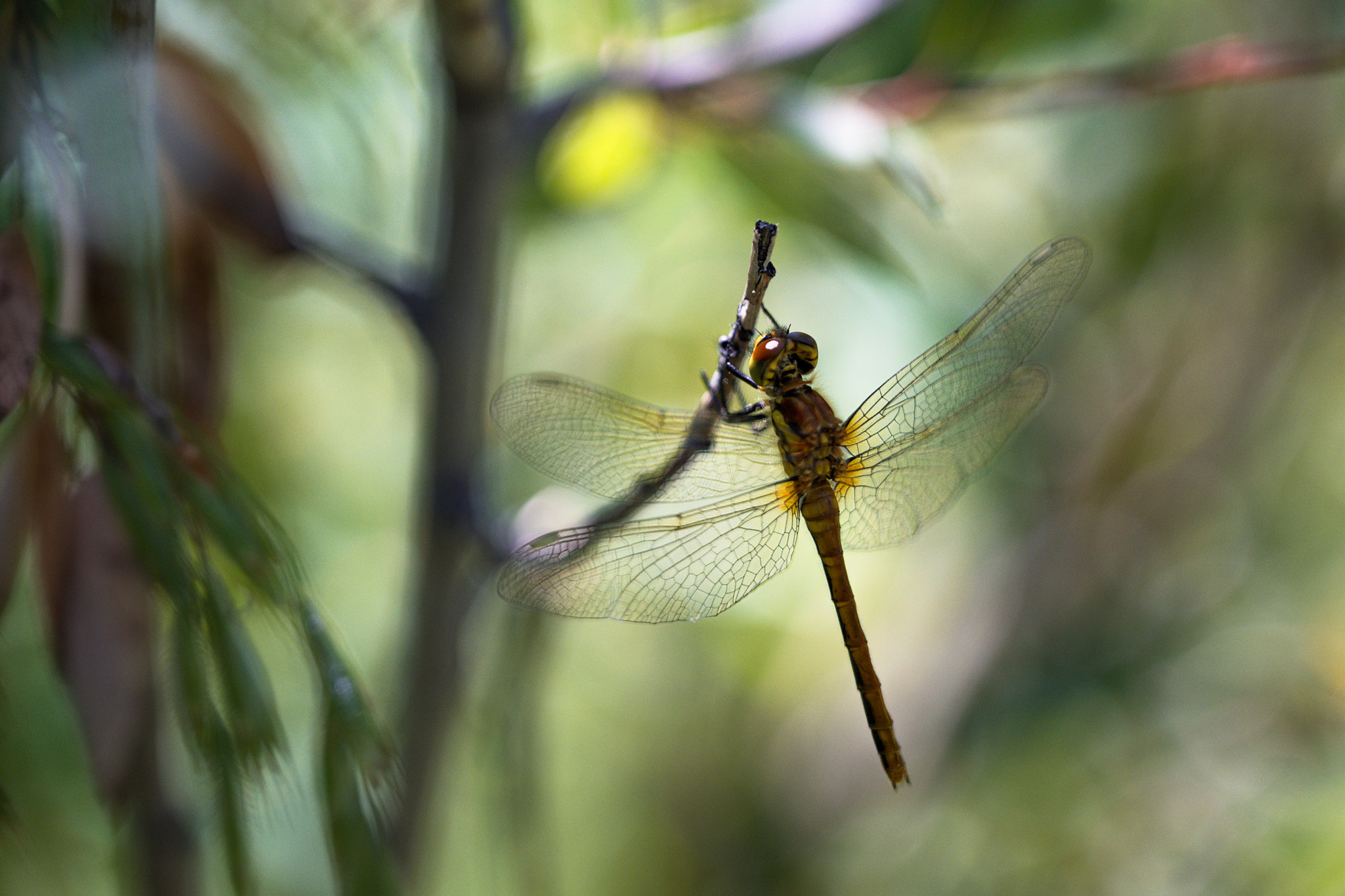
Spencer’s main edit was to increase the overall contrast, which slightly increased the color saturation and highlighted the tonal differences in the vegetation. The overall darker feel of the photo is consistent with what I wrote in my caption above. Spencer’s version shows the dragonfly as a predator, lurking for its prey.
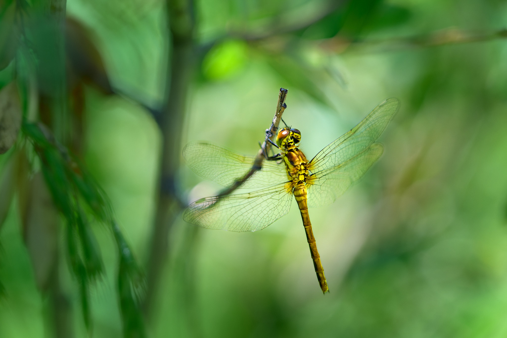
Jason went a completely different route in his editing. His dragonfly would be more worthy of its romantic-sounding French name, “libellule” or “demoiselle.” In a dreamy tonality of bright colors, the dragonfly looks as fragile as a snowflake. Most of Spencer’s and Jason’s edits were (if I’m not mistaken) global and therefore relatively quick. But as you can see, the effect is dramatically different.
I placed my dragonfly in the forest and let a beam of light shine on it from somewhere. By adjusting the brightness and contrast locally, I brought the dragonfly out of the shadows. To make it pop more in the photo and to contribute to the overall “forest” look, I decreased the contrast and gave a more uniform hue to the background. I also used a circular mask to suppress the flare in the upper left corner. Finally, I added vignetting to draw the eye to the main subject.
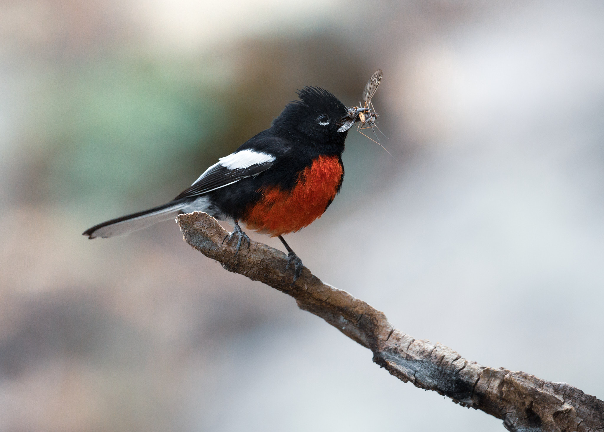
Jason’s Redstart
Redstarts are small songbirds found primarily in Latin America. Early in the morning, long before sunrise, they light up the surrounding forest with their beautiful song, which seems to grow in intensity as it progresses. As beautiful as they sing, they are a joy to watch. Unless you’re one of the insects they feed on.
Jason has provided us with a little moment from the life of this charming bird, so come see how we polished his photo.
Looking at this set of photos, I feel like a certain regularity is starting to crystallize for us here: contrasting realism (Spencer), pastel romanticism (Jason), and saturated junglism (Libor). Also, it’s interesting how we all more or less converge on the cropping. Go back to the original RAW file for this image, and you’ll see that it is cropped very differently. Our consistency in how we cropped this image is remarkable.
Jason’s Redstart is edited with a similar aesthetic as his previous photos. Compared to the RAW original, the processed photo has a pinkish tint, and remarkably, the sharply defined gradients in the background have largely dissolved – no doubt a result of careful local editing. Also, the redstart and the entire branch it is perched on give the impression of being lit by a large softbox.
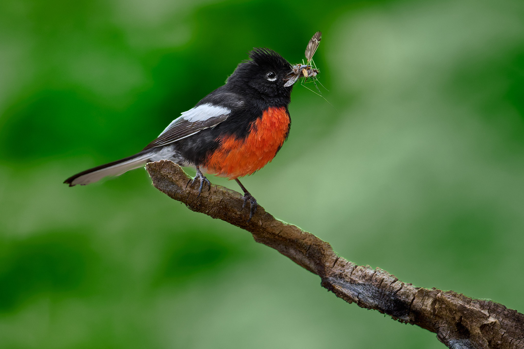
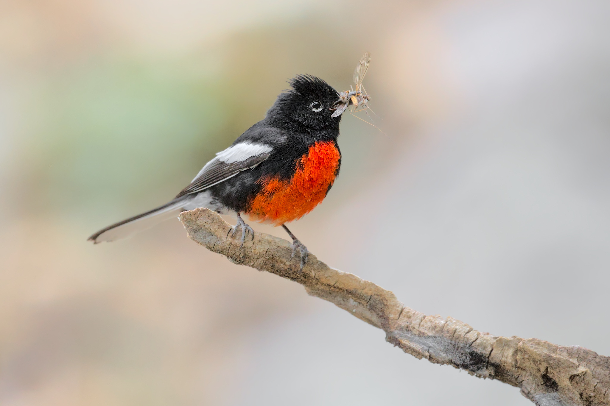
As with the dragonfly, I chose the jungle look for the redstart. Using Capture One’s auto-generated masks, I edited the bird, insect, and branch separately. I then created a mask for the background and added green by moving the hue slider about 15 ticks to the left. I then unified the background hue in the Portrait tab of the Color Editor. The final adjustment was to darken the edges of the photo.
Libor’s Starling
Starlings are one of the most common birds in the world. They can be found from Europe to Australia, where they were introduced by European immigrants. They destroy winemakers’ crops and, even worse, our enjoyment of wine. Because of their huge flocks, it’s a good idea to carry an umbrella even on a sunny day in Rome. It may seem that it’s not easy to love these birds. But when you look at their beautiful plumage, all is forgiven.
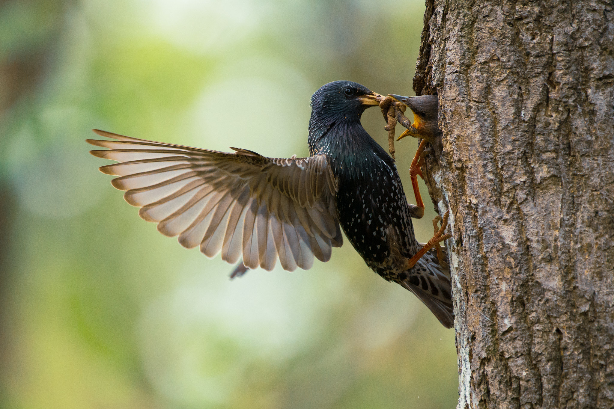
I’d be repeating myself if I wrote again that Spencer is the most faithful to reality. His edit best captures the true color of the whole scene. The original RAW has a slight green tint from the light coming through the leaves. Spencer removed it perfectly. He also brightened the whole photo a bit, but by brightening the wings the most, he emphasizes them in particular.
If I wasn’t sure that I was the author of this photo, I would definitely say that it was Jason’s photo based on the editing. It doesn’t matter if it’s a dragonfly or a bird, the romantic Jason makes them look like angels. To recap: the photo has high brightness, reduced contrast and a kind of glow, as well as soft gradients between shades and pastel soft colors.
And we’re heading for the finals. It probably won’t surprise anyone that my edit is quite significant. The colors are rich and saturated. Since the starling was backlit, I had to move the shadow slider quite a bit. This made the metallic green, purple and blue feathers and their unusual texture really pop. I made this adjustment locally through the mask on the starling only, leaving the background softer.
Conclusion
So there we go. Three authors, three different editing programs, six RAW files, eighteen different photos. But with each new set of photos I looked at, I saw that each of us had a distinct, unique style. It shows that the journey to the image is far from over when the shutter is pressed.
Of course, the journey from RAW file to photograph is a long one, and the paths you can take are countless. You don’t need to lock yourself into any particular style, and most likely, your approach to post-processing will change over time. Just figure out an approach that you like, and have fun.
I come from the printing industry where craftsmen ship made the industry. I see a different perspective. Color edits and image manipulation was a real art. Printing projects began with photographers striving to creat a great raw image. There was very little “ don’t worry about it we can fix it later”. Technology has shifted most photography from raw image integrity through the lens to manipulating nature into hyper imagery. Pretty easy to see images that do not represent natures natural beauty. I understand technology and use it myself, I appreciate my early photos taken with E3 slide film. What you shot was what you got. I still shoot almost every day and enjoy the flexibility of modern technology. But I do know the difference …
Very interesting! It reminds me of contests organised in the forum of, I think, the Digital Outback Photo website. Raw files were provided and members were invited to submit their versions. Icing on the cake, you could win a Capture One Pro licence (back then, this was worth several hundred $)! Maybe Photography Life should resume that tradition ;-)
Very cool to see this. I’ve often considered starting a forum where photographers would share raw files for others to edit, a sort of collaborative vibe where one could get ideas, see how others’ styles, perspectives, and influences might shape their own art, or even to get ideas when you’re having issues editing a “trouble photo”, as I like to call them (i.e. the ones where you love the shot – subject, composition, action, etc. – but the edit is just giving you a hard time, which happens to me occasionally). This article demonstrates that it would be pretty cool to see on a larger scale with a wide variety of photographers and styles.
This is an excellent article and demonstration!
It’s the type of interaction that happens in a photo club and a thoroughly worthwhile investment in the growth of the photographer/artist. It also points out the need to appreciate and respect another artists internal eye on a subject. For me, I empathized with Jason’s interpretation of most of the edits he made. And yet, seeing the edits with each of you having your own internal eye makes me a more appreciative (and humbler!) craftsman with my own images.
THANK YOU / THANK YOU!! Maybe a regular posting of this type of exercise? Regardless, this piece is great!
Seeing that Jason uses dark table, I had a mooch around it.
One review suggests it good: ‘if you’re the type that reads manuals …’
(That’s me out).
Thoroughly enjoyed this article, chaps.
I’d say a lot of the fear around darktable is due to it being different than other programs and the early versions being rough around the edges. But even so, I will admit that some things about darktable are really not obvious at all. However, after using it since the 1.x series, other programs look alien to me now….it would be hard to use anything else with the same fluency.
Thanks so much for this amazing article. I thoroughly enjoyed the three artists’ work. You’ve changed my mind today about post-processing — I have been reluctant to spend a lot of time on edits for fear of changing “reality.” My favorite photos cross all three photographers, and I agree with Jason that it looks like the feelings/perspectives experienced during the shoot influences each artist’s edits.
Definitely don’t be scared of editing to change reality. Reality is less about a carbon copy of the scene according to science and more about storytelling, which involves making a narrative out of the image based on your own experience!
I think sometimes editing gets a bad reputation, and for some good reasons: the viewer expects some sort of message or fragment of communication from the image, and like words, that message can be honest or deceptive. When the latter comes into play, such as using generative AI to modify the scene so much that the photo becomes disconnected from the experience of the photographer, then it becomes deceptive, sort of like when someone tries to hide their personality by pretending to be someone they aren’t.
But editing within your personality is something that can be relatively free, expressive, and honest.
That is beautifully stated and the truth!
I agree; thanks Jason for your wise words and encouragement!
my ‘director’s cut’ would differ too.
as with most things, perception is relative. there is no one ‘correct answer’, as the answer relates to both ‘the artist’ and ‘the audience’. this principle of relativity can be best described as ‘style’.
when styles become too ‘cookie cutter’ — they become monotonous. corporate. mechanical.
one of the reason’s i enjoy dropping by here — from time to time — is because the authors don’t need to pander to the ‘most common denominator’. i enjoy the exercise of ‘shaking things up’. helps prevent creative atrophy from setting in. JMO.
It seems your screens are quite different :)
These are three movies:
Spencer, directing the documentary: “Magenta: my addiction”
Jason, directing: “Exposure first, color accuracy later”
Libor, directing the rock documentary: “f00k the Noise: -highlights +shadows +contrast”
🤣
This is a wonderful exercise, many thanks for bravely undertaking it! It is very interesting to see the results, whether they are as different as Gould’s 1955 and 1981 Goldbergs or not. There are so many interchangeable articles on the philosophical side of photography and so many equally interchangeable ones on its technical side but this short and to the point combination of the two looks rather fresh.