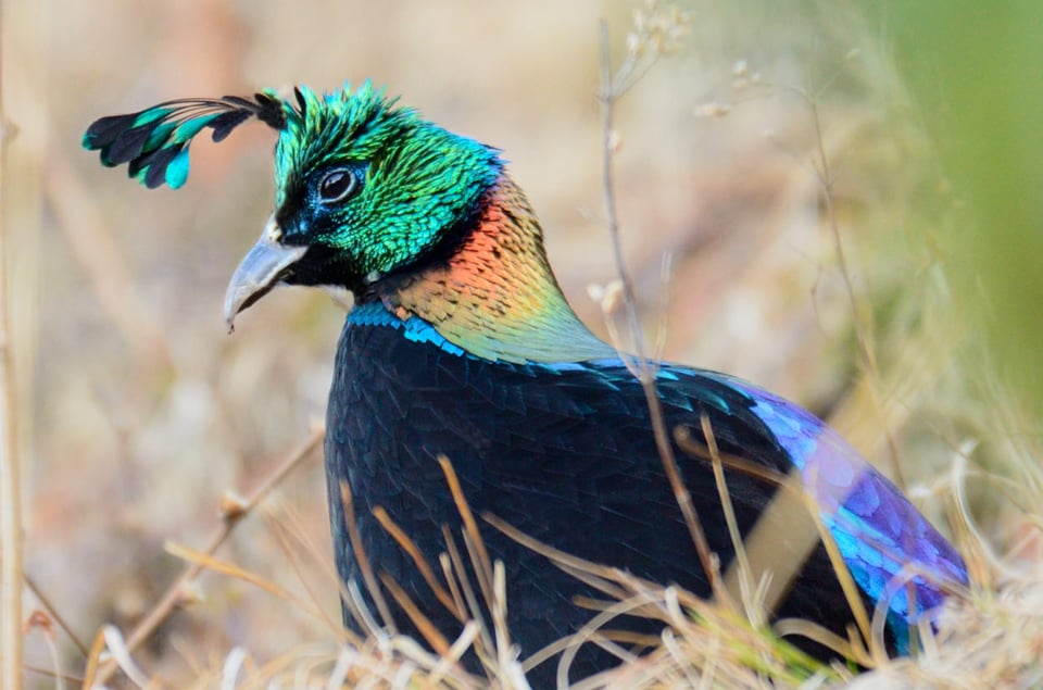
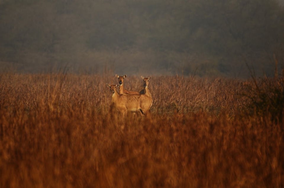
Composition and Framing
Let’s take a look at the composition and framing aspects of wildlife photography. Below are some tips that I compiled based on my experience photographing wildlife.
Eye-Level Shot
This would be something that a lot of wildlife photographers keep repeating. Why is it so important?
Consider the first case where the photographer is standing with a subject much lower to him. If you follow the line of sight, it falls shortly after the subject, which would be the ground. On the contrary, in the second case, when the observer gets down to the eye-level of his subject, his line of sight falls much behind the subject and the theoretical background falls almost to infinity. Most of us know that for a given focal length and a given aperture, depth of field boils down to the distance between the photographer and the subject. The quality of bokeh depends upon the distance between the subject and the background in view. Undoubtedly, we all crave for a soft, creamy background for our subjects to “pop out” or separate out of the background. Also, when we have the background falling at infinity, we can move around to get a complimenting background to suit our subject, whereas in the first case, we have limited scope to choose on what background we might desire. It might not be always possible to get to the eye-level. Before shooting, it is a good practice to keep note on the angle at which you are going to shoot your subject. An eye-level shot also gets to a perspective that gets a more connected approach to the subject.
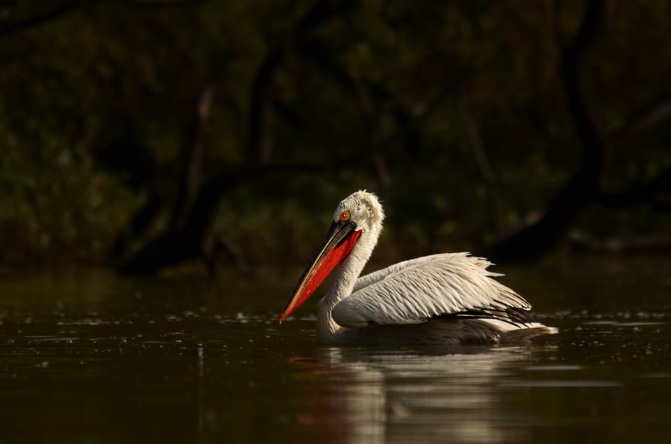
NIKON D7000 + NIKKOR 200-500 f/5.6E VR @ 500mm, ISO 800, 1/1250, f/5.6
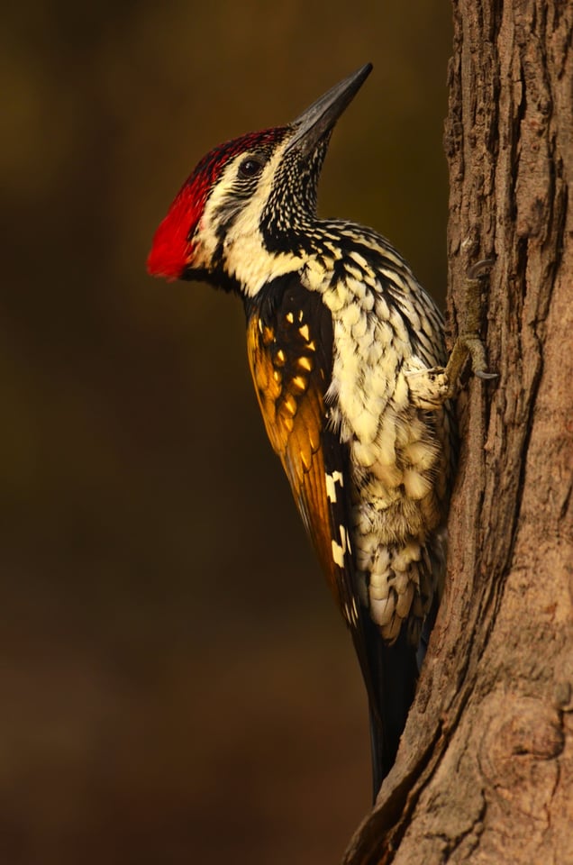
NIKON D7000 + NIKKOR 200-500mm f/5.6E VR @ 500mm, ISO 1000, 1/2000, f/5.6
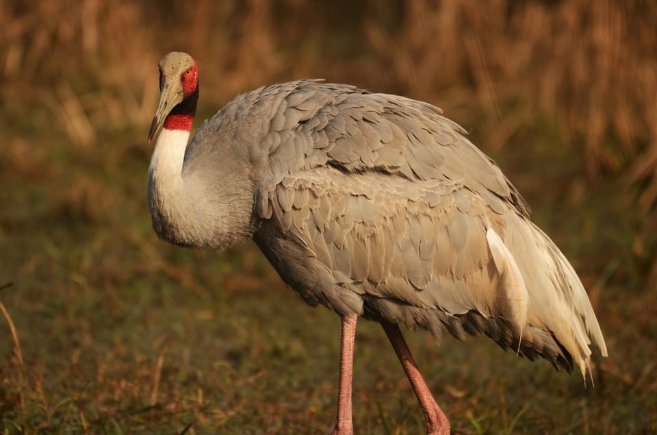
NIKON D7000 + NIKKOR 200-500mm f/5.6E VR @ 360mm, ISO 640, 1/1600, f/5.6
It is wise to remember that an eye-level shot gets us to a pretty shallow depth of field. More often the subject’s tail or the rest of the body will not be at the same plane as its head / eye which we generally focus upon. In such a scenario, stopping down by a couple of f-stops would get more of our subject into the field of focus.
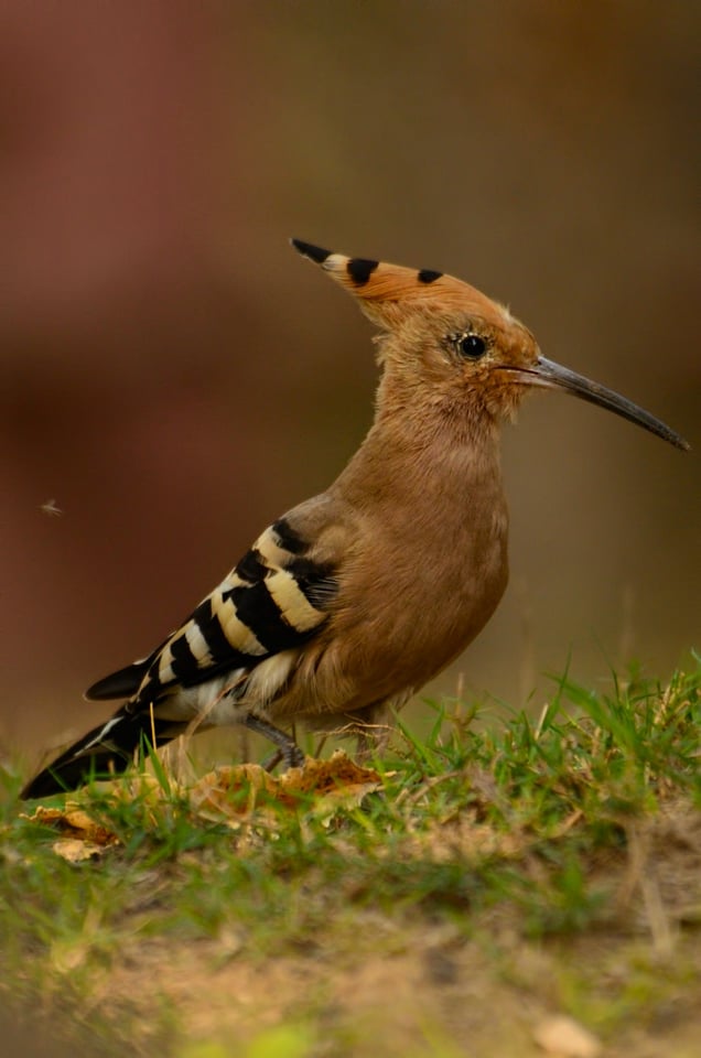
NIKON D7000 + NIKKOR 200-500mm f/5.6E VR @ 500mm, ISO 500, 1/800, f/8
As you can see in the picture above, I was laid flat on the ground getting at eye-level to the Hoepoe. As a result, you can see beautiful subject isolation. I had good light, as it was almost 10 AM and it was not an in-flight shot so a 1/800th of a second was more than sufficient.
Quick Tip
Using bean bags can come very handy when shooting eye-level with subjects that are on ground.
Eye Contact
Portrait photographers and artists know more about the eye contact. Once the subject looks into the camera, it creates a deeply connected emotion between the subject and the observer of the photograph. In wildlife photography, we seldom have that luxury of our subjects looking right at us. But if we are lucky or patient enough to get that, such photographs can pull the observer’s attention, drawn into it like a magnet.
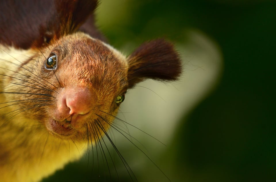
NIKON D7000 + NIKKOR 200-500mm f/5.6E VR @ 500mm, ISO 800, 12000, f/5.6
There is no disagreement that in wildlife photography, reach is a predominant factor. We get the lens with the longest possible focal length, most probably with a teleconverter, all for that extra reach. That does not exclude the pursuit of us getting as close as possible to the subjects. On the other side, as we get closer to our subjects, they get aware of our presence. The key is to go just close enough without scaring away our subject. There will be a crucial moment where our subject will contemplate on whether to consider us a harmful treat or to let us be around. Those few crucial seconds would give us the eye contact and make it appear as if the wild animal was posing for us. But before those few moments, we need to make sure that all of our camera settings are set to properly expose the subject properly. It’s always a useful practice to take a few test shots when we are at a distance, dial in the optimum settings and then close in so that you do not miss out those moments.
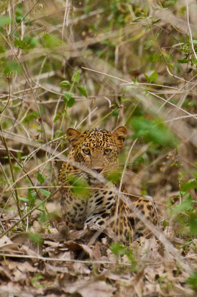
NIKON D7000 + NIKKOR 200-500mm f5.6E VR @ 480mm, ISO 1250, 1/400, f/5.6
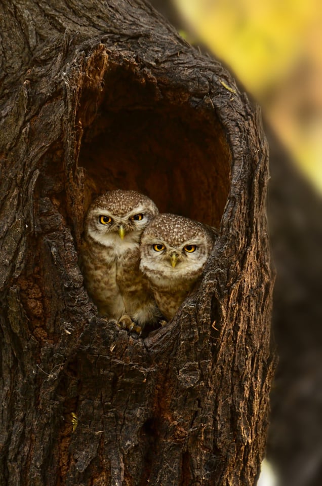
NIKON D7000 + NIKKOR 200-500mm f/5.6E VR @ 500mm, ISO 800, 11000, f/5.6
Background
In my opinion, for any given subject, the background is what makes or breaks an image. Lens manufacturers are as much focused on the quality of the bokeh as they are with the sharpness of the subject. We all love a creamy smoothed out background with absolutely no distraction, which pulls all of the observer’s attention at the subject.
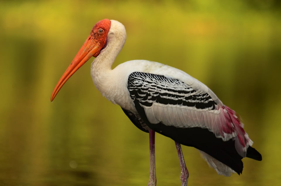
NIKON D7000 + NIKKOR 200-500mm f5.6E VR @ 500mm, ISO 800, 1/2000, f/5.6
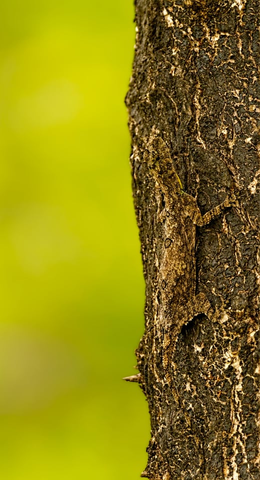
CANON D1000 + TAMRON SP 150-600mm f/6.3 @ 550mm, ISO 800, f/6.3
Most of us know of the factors that influence subject separation: sensor size, lens focal length, camera to subject distance, subject to background distance and lens aperture being the most important. All these factors have been explained to pulp all on the Internet. Let us move on to the other aspects.
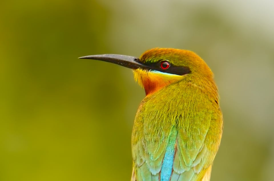
NIKON D7000 + NIKKOR 200-500mm f/5.6E VR @ 500mm, ISO 640, 1/1500, f/5.6
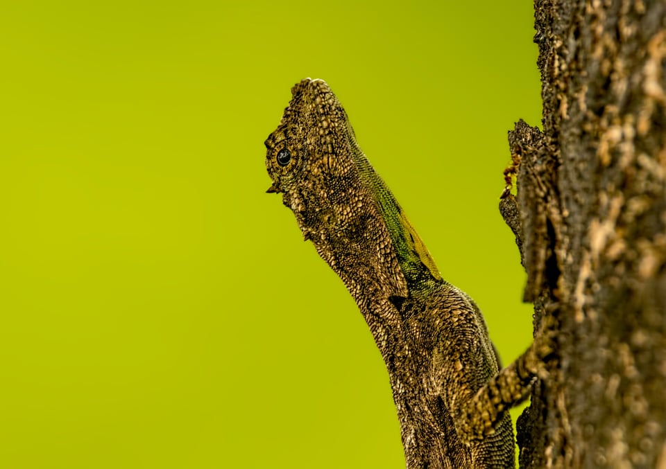
CANON D1000 + TAMRON SP 150-600mm f/6.3 @ 550mm, ISO 800, f/6.3
The images above need no explanation, as they would be examples of the most sought-after, which also means that they would be the sort of pictures everyone has seen all over the Internet and in print.
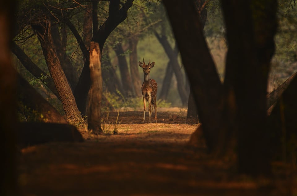
NIKON D7000 + NIKKOR 200-500mm f/5.6E VR @ 200mm, ISO 400, 1/1500, f/5.6
Let us compare the picture of the Indian spotted deer with the two pictures above, of the Blue-tailed Bee Eater and the Malabar Flying Lizard. I did have a lens that could get much closer to the deer that would have brought all the details on the subject, removing most of what was around, and at the same time blurring what was remaining. But a close shot would have not conveyed the message this composition carries. I had been to Bharatpur Bird Sanctuary many times in the past years, and it still is like an annual pilgrimage for me. Every time I would hope for some wildlife to get right there, but after almost three years of craving for that one shot, I finally got one and the added bonus was to get the deer to look at me when I ripped the shutter off until my buffer was filled to the brim. This is what we call a complimentary background which adds to the overall feel of the image. It is a fact that a completely blurred out background separates a subject out, but not always. Sometimes, it is the background that brings meaning and story to the picture. This is what we mean by complimentary background.
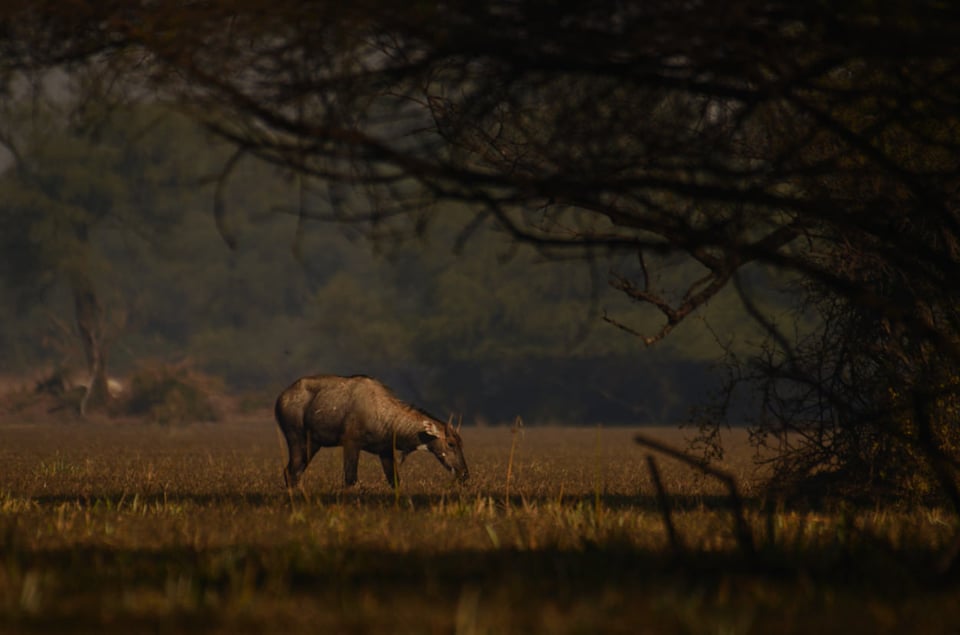
NIKON D7000 + NIKKOR 200-500mm f5.6E VR @ 320mm, ISO 200, 1/4000, f/5.6
A complimentary background could be one that separates the subject, or one that adds meaning in terms of aesthetics, it’s story-telling capacity to a picture. Another example would be the picture below. I did have room to get closer to the subject, but I loved this composition more with the branches of the trees in the background:
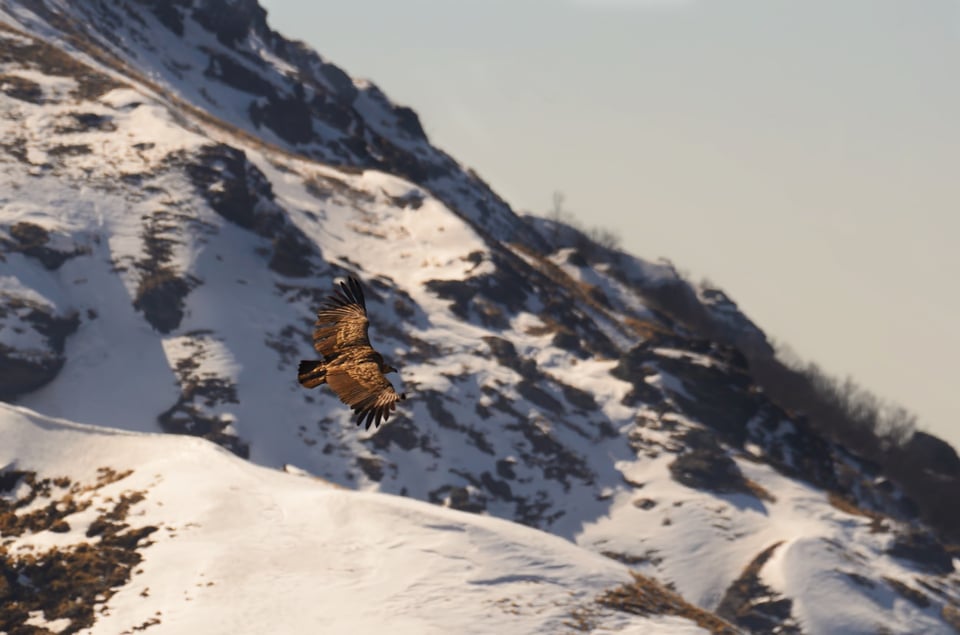
NIKON D7000 + NIKON 200-500mm f5.6E VR @ 320mm, ISO 1000, 1/3200, f5.6
The picture above of the Himalayan Griffon Vulture is an example of how the background adds to the story-telling capacity of the image. A tighter crop would have brought more details, but this composition tells the story of the kind of landscape they patrol. This also is yet another example of how planning and persistence pays out. I had to hike up to the top of a peak which was at an altitude of around 4000 meters (~13,100 ft) to get this one shot from above them. The first two days I saw them glide through the valley. On the third day I decided to make it to the top, but did not get a shot. The following day, however, it paid off. In fact the Griffon did circle around and I have a much closer shot than this one, but this was chosen for the story-telling capacity more than the other shots.
Negative Space
We all love those tight crops or head shots that we will be looking at a bit later. But sometimes, immersing your subject in negative space also does pull in the attention of the observer to our subject. In fact, as the scale of the subject becomes too small, it increases the curiosity of the observer, drawing his focus more into the image.
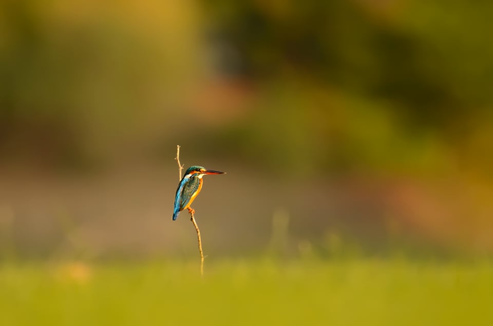
NIKON D7000 + NIKKOR 200-500mm f5.6E VR @ 400mm, ISO 500, 1/1800, f/5.6
The only way we can draw the attention of the observer into a picture having a common subject, is by creating a unique composition. I personally don’t even look more than a few seconds into a tight close crop of a common kingfisher, as I have come across thousands of such pictures, and of course most of them with a creamy backgrounds. With this picture as well, I had the room to get much closer, but I refrained from doing so, as I personally did not come across a similar composition. We might come out with an aesthetically stunning picture. But if it happens to be the one that everyone has, then it would be “yet another picture of a kingfisher”. That is where unique compositions come into play. We have to remember at all times that it is not only the subject that draws attention, but it is the picture on the whole.
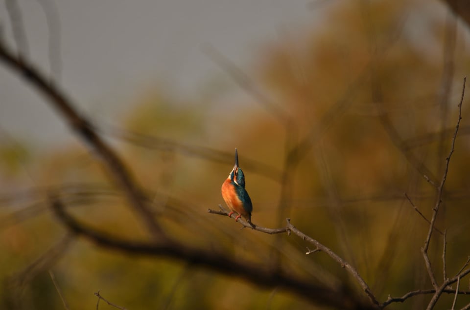
NIKON D7000 + NIKKOR 200-500mm f5.6E VR @ 200mm, ISO 200, 1/1600, f/5.6
Below are a few pointers to keep in mind while composing pictures with ample negative space:
- Firstly, make sure that there aren’t many distractions close to the subject. Basically, negative space in itself means, non-distracting entities. The basic idea behind negative space itself is to bring the focus of the observer searching for the subject.
- Compose in a way that there is a contrast between the negative space and the subject. It could be either in terms of exposure (brighter backgrounds with darker subjects or vice versa) or complementing / contrasting tones. If the subject is in sync with the negative space, it will not ‘pop’ into or out of the image.
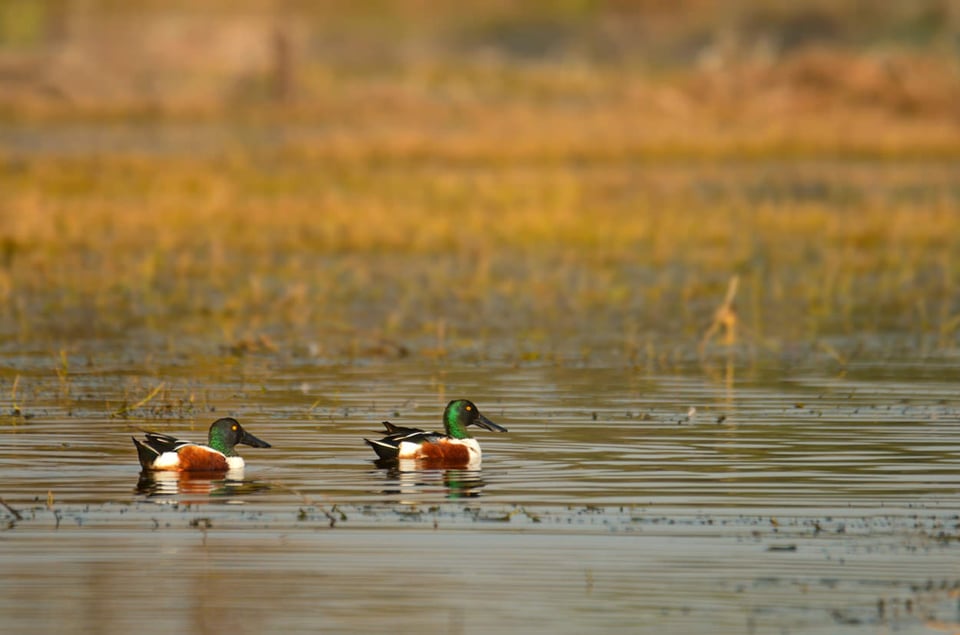
Northern Shoveler
NIKON D7000 + NIKKOR 200-500mm f/5.6E VR @ 250mm, ISO 800, 1640, f/8 - Surprise the observer! Most of us prefer the rule of thirds. It is true that instinctively, our focus gets to the intersection of the thirds. But when we expect a subject somewhere in the frame and it ends up being elsewhere, it does create a sense of surprise, and hence draws attention to the picture. As the famous saying goes, learn the rules so that you can decide when to break them.
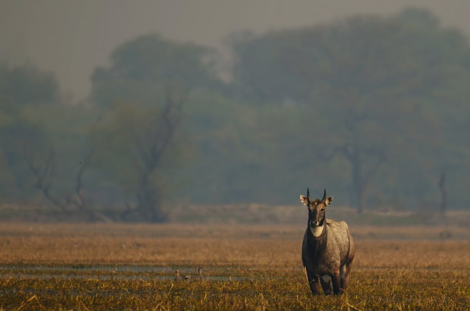
Male Nilgai
NIKON D7000 + NIKKOR 200-500mm f/5.6E VR @ 300mm, ISO 640, 1/2500, f/8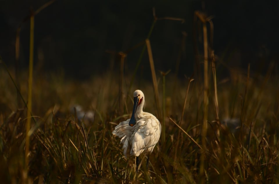
Eurasian Spoonbill
NIKON D7000 + NIKKOR 200-500mm f/5.6E VR @ 350mm, ISO 800, 1/3200, f/5.6 - In addition, draping a picture with negative space also gives a perception of depth to our pictures. You might have heard of a “flat image”. Those are the images that seem to stick to the background. Negative space when composed properly does add a sense of depth. I intentionally did not go with the rule of thirds in some of the images presented here, to give more negative space to the mid-ground and background that makes the subject pop forward.
- The placement of negative space also has a vital role to play in the overall story-telling capacity of an image. Generally, we have comparably more negative space on the side of line-of-sight of the subject, giving an impression of the bird looking at something in that direction or flying into that direction. When the subject is looking right at us, it makes sense to place the subject right in the center of the frame.
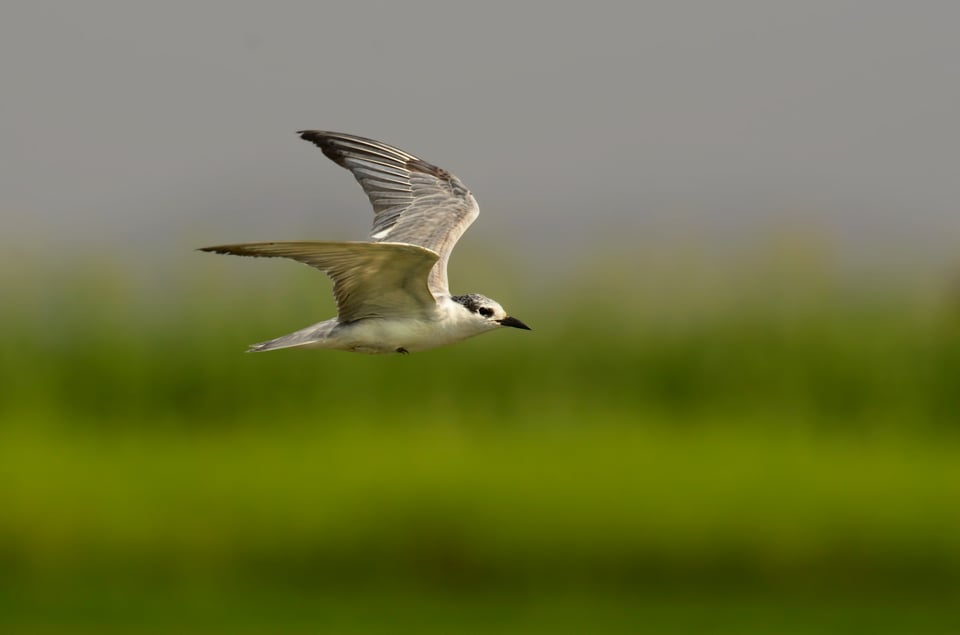
Common Tern (more Negative space on the right in the direction of flight)
NIKON D7000 + NIKKOR 200-500mm f/5.6E VR @ 350mm, ISO 800, 1/3200, f/5.6
These are not strict rules and only the scene decides the placement and the amount of negative space. In the picture below of a pond heron, I want to convey the story that the bird has taken off, leaving the rock behind, hence leaving less negative space in the direction of the flight.
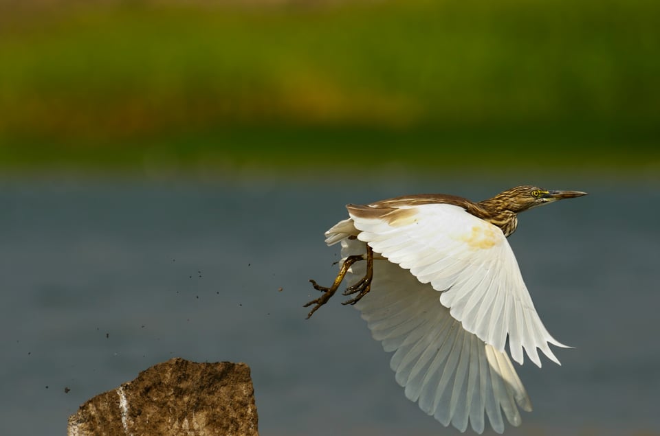
Table of Contents
