Whether you’re working on a desktop, laptop, or tablet, there’s a number of important settings that can make or break your editing experience. In this guide, I’m going to take a look at the most important settings and options in your device’s operating system to ensure consistent edits.
Table of Contents
Monitor Color Calibration
Step one, regardless of which operating system you use, is to color calibrate your monitor. This is essential for ensuring that the colors you edit in your post-processing software are accurate, and that you won’t need to re-do all your edits the day you ultimately calibrate the monitor. It also ensures that you can print photos which look similar to the image on screen.
While Photography Life already features an extensive guide to setting your monitor’s color calibration, some of the other settings discussed in this article will cover color and brightness related settings, too. By default, a lot of computers use the “wrong” settings in these areas, and it’s more important to fix them than almost anything else.
Windows Settings
There can be a ton of variance across Windows installs. For reference, my recommendations are for Windows 10 users, and I’ll be showcasing a few specific graphics driver options in Nvidia’s control panel. Similar options should be available to AMD or integrated graphics users, but they may be in different locations. I’d recommend opening up your graphics control panel app or interface and just looking around, as they should be laid out similarly.
1. Monitor Dynamic Range
On my older multi-monitor setup, Nvidia’s handling of the dynamic range setting caused a persistent issue where my images looked washed out when dragging them between monitors. I eventually found that the Monitor Dynamic Range setting was to blame.
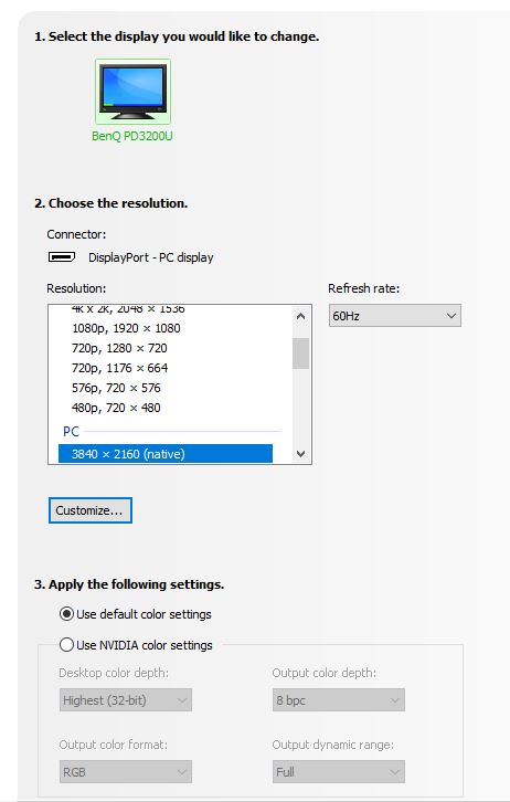
Unless you’re using a weird monitor setup, this should definitely be set to “full” instead of “limited.” To check your monitor, right click your desktop, select Nvidia Control Panel, then Display>Change Resolution. You’ll see a Color Settings section at the bottom, and this is where you can make the change.
You should particularly check this dialog for secondary monitors (that’s where my problem was). Default color settings should be fine, but if you notice an issue like the one I did, you’ll need to switch to “full” in the manual options.
2. Pointer Precision
If you’re using a mouse on Windows, do yourself a favor and disable Pointer Precision. Commonly referred to as mouse acceleration, this setting messes with your mouse’s tracking, turning up the sensitivity on quick mouse moves, and turning it down on slow ones.
While this might seem helpful, I’ve found it to be more of a problem as it messes with muscle memory. Choosing a proper DPI, in combination with the 6th tick mark for pointer speed, is a way better choice.
To set it, open the Control Panel, then Mouse Properties, then Pointer Options. Also, if you care about your mousing experience, look to gaming mice for the best photo editing performance, too. Gamers care about consistent sensor accuracy, adjustable DPI, and remappable buttons – all features that have a ton of crossover with editing tasks. I particularly like Logitech’s gaming mice, like the G Pro Superlight or the far more affordable G305 Lightspeed.
3. Monitor Settings
It’s also important to check your monitor’s actual settings. Unfortunately, there’s a ton of variance with how monitors perform, which modes are good, and which features can have a significant impact on your images.
Broadly speaking, your monitor should be set with the following characteristics in mind.
- Be bright, but not too bright. The baseline that is often referenced is 120 cd/m^2, but in even moderate ambient light levels, I find that a bit low. I’ve calibrated my monitor to around 150 cd/m^2, but will also cross-check important images against other devices like my iPhone or MacBook to get an idea of what other users will see.
- Settings that adjust automatically should be disabled as much as possible. Some monitors have eco modes, which auto-dim, while others will have black equalization or other features that mess with color, gamma, or some other characteristic. None of these fluctuations are good for editing, and should be disabled. (The one exception to this is OLED monitors, as these feature a number of burn-in mitigation measures. Disabling these can risk reducing your panel’s lifespan.)
- Monitor dynamic range should be set to “full.” This setting doesn’t exactly relate to HDR monitors. Instead, it’s meant to control the dynamic range even in plain 8-bit color. If it’s set to “limited,” this will lock the range to 16-235, instead of the full 0-255 that should be available. It’s found at the Nvidia Control Panel, then Display>Change Resolution. You’ll see a Color Settings section at the bottom. “Use default color settings” is usually fine, but if you’re using Nvidia color settings instead, make sure that “limited” is not selected.
4. Check NVIDIA/AMD/Intel Control Settings
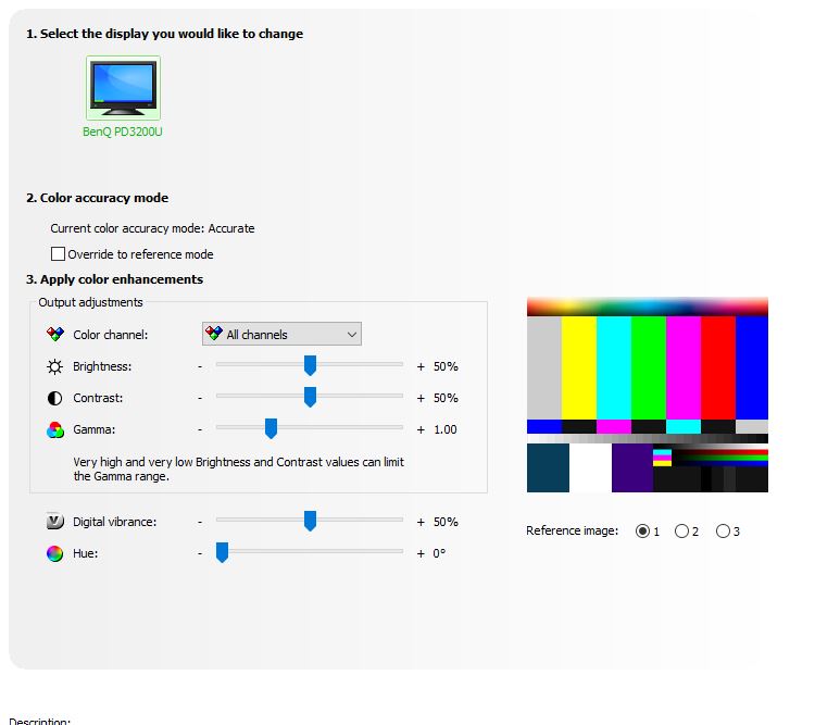
Whichever brand of graphics card you’re using, it’s definitely worth checking out the driver’s settings panel. While I can’t cover every setting for all 3 brands, some of the big things to look for are things that adjust the color or contrast.
Nvidia’s Adjust Desktop Color Settings panel is a great example. All of these sliders should be set to the defaults; any of these alterations are going to skew your image’s look severely. If you’re finding that you need to adjust any of these settings to get the right look on a calibrated monitor, pick up a new monitor – you shouldn’t have to adjust these to get the image to look right.
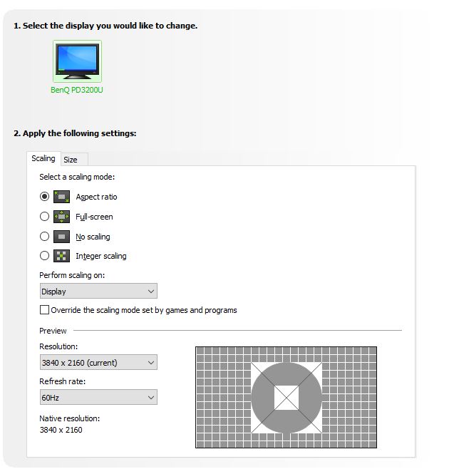
Another big pitfall comes with scaling settings. Ideally, your output resolution and monitor resolution should match 1:1. If you have a 4K display, running it at 4K with no modifications (other than scaling via PC settings>Display Settings) is going to give the best sense of whether your image is sharp. Scaling via software or the monitor’s built-in scalar can give a false sense of aliasing, sharpness, or blur, depending on how things are handled.
Lastly, when it comes to frame-rate, I really feel that more is more. If your monitor supports 60fps or higher, go ahead and set it to that refresh rate. While this is more of a consideration for video editors, even Photoshop workflows can benefit from smoother perceived brush strokes.
5. Disable NVIDIA VSR
This last one is kind of niche, but as a quick note, if you’re running a recent NVIDIA GPU and want to evaluate the sharpness of videos (such as lens review videos), make sure RTX Video Super Resolution is disabled. VSR is a new feature from NVIDIA on 30 and 40 series cards that uses machine learning to upscale video content on the web.
While it’s a cool feature to have sometimes, since it is supposed to improve lower-resolution and lower-bitrate content, it could cause problems when trying to evaluate lens performance in video reviews. Of course, trying to judge performance from a 1080P or less video is going to be difficult to begin with, but still, having NVIDIA throwing in some artificial upscaling and sharpening will only make it worse.
This toggle lives in the NVIDIA Control Panel, under Adjust Video Image Settings, under the subheading RTX video enhancement. Confirming that this is off before evaluating video content for sharpness and resolution would be a good call.
MacOS Settings
I think it’s fair to say that Mac users have a few less knobs and dials to move when getting things set up for photo editing. However, the defaults that Apple has chosen on recent releases are much more consequential than the defaults on Windows. As such, making sure you understand the impact of these settings is crucial.
1. True Tone
Apple uses the information from the ambient light sensors built into their monitors and laptops to skew the color temperature to more closely match ambient lighting conditions. Imagine you’re on your MacBook in the bright and color-temperature-cool sun, then duck inside to a room lit with very warm incandescent lightbulbs. If your display is skewing the white point to match these two scenarios, your sense of your image’s color is going to be thrown way off.
True Tone is a great quality-of-life feature, but isn’t compatible with color-sensitive work. Fortunately, it’s easy to turn on and off. Click the Apple Menu, then System Settings, then Display. Select your display, then toggle True Tone. (On older MacOS versions, this setting will actually be System Preferences instead of System Settings.)
On a related note, make sure Night Shift is disabled if you’re doing color accurate work. While this doesn’t default to on, if you’ve set it in the past, it will persist on the schedule and is subtle enough that you may not notice it until after you’ve edited a batch of images.
2. Display Brightness
Continuing the theme of Apple’s dynamic adjustments getting in the way, display brightness can move your monitor’s brightness around drastically. While you don’t have to be precisely at 120cd/m^2 to match with a print medium, having a constant level of brightness is still important. Just like True Tone, this is under the Apple Menu, then System Settings, then Display. Select your display, then toggle off Automatically Adjust Brightness.
3. Power Options
This next tip is only relevant to users of older machines with integrated and discrete graphics cards, like MacBook Pros from a few years ago – there are some situations where you will want to force the computer to use the discreet GPU rather than the integrated GPU for complex editing tasks.
As a quick refresher, integrated graphics is the power-efficient, but lower performance GPU built into your processor. Discrete graphics, on the other hand, is the separate GPU that offers more performance but draws much more power.
MacOS is supposed to automatically handle switching between these two GPUs as the situation demands, but for some scenarios, you may just want to force on the discrete GPU at all times. While this will drain your battery faster, if you’re plugged in at your desk, it’s just going to give you more performance.
To lock tasks to the discrete GPU, click the Apple menu, then System Preferences, click Battery, click the Battery tab, then toggle the automatic graphics switching checkbox. When working while you travel, you’ll want to re-enable GPU switching via the same option in order to save battery. On older MacOS installs, the same setting is instead under Energy Saver Preferences in the System Preferences menu.
iOS Settings
Just like the bigger brother of MacOS, the mobile iOS (and iPad OS) offers a limited number of options, which may make things easy but comes with defaults that aren’t ideal for color accurate work. Many of these share the same names and downsides as the MacOS settings.
1. True Tone
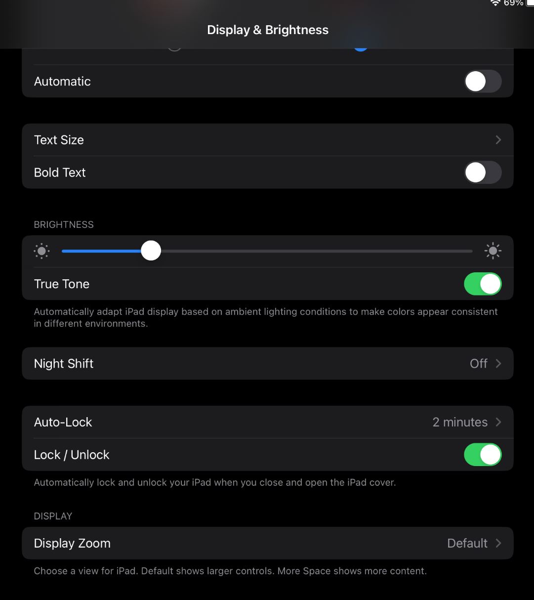
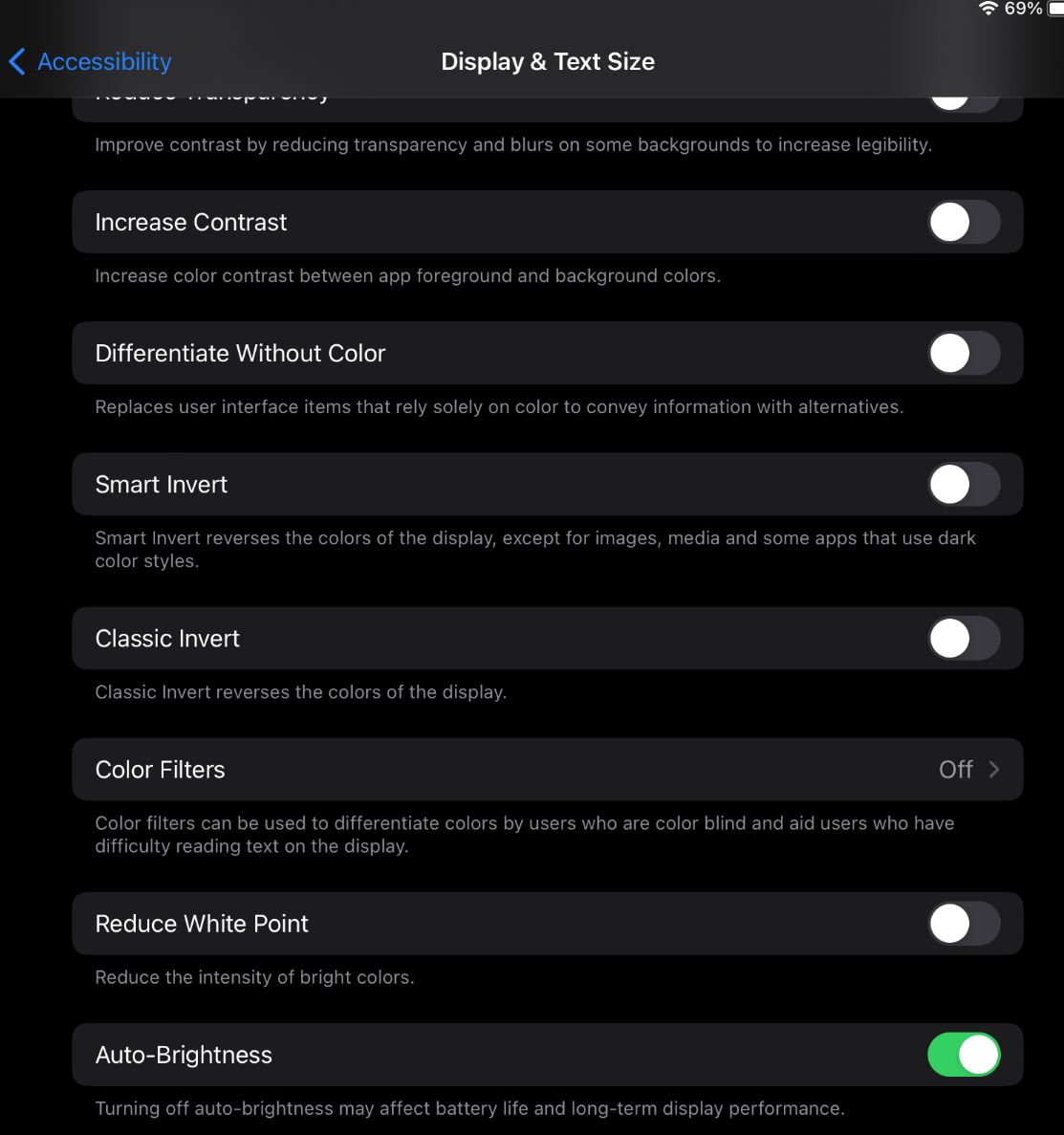
Since True Tone skews colors to match the ambient light temperature, it’s the most important option to disable if you’re using your mobile device for color editing work. To toggle it, open Settings, Display & Brightness, then toggle True Tone.
2. Display Brightness
Auto brightness, like True Tone, dynamically the display’s brightness, throwing off the consistent nature of the otherwise excellent iOS device displays. Toggling it is a bit less intuitive, as it’s actually disabled via Settings > Accessibility > Display, then Auto Brightness.
Again, you don’t have to keep these settings off all the time, particularly for devices like an iPhone that are used for a variety of other tasks. But, if you’re sitting down for a long editing session, like on the flight home with an iPad, taking a few seconds to toggle them can improve your edits.
3. Night Shift
Just like on MacOS, Night Shift is off by default. If you use it, however, you may want to toggle it off when you need better color accuracy. Open the Control Center, long press on the Brightness Slider, then disable Night Shift. This should allow you to temporarily disable it.
Conclusion
As our devices and displays shift toward increasingly automated features, it’s important to understand how they impact what you see.
Apple is a great example: The XDR displays and even iPhone screens are staggeringly good displays, with a huge gamut, great brightness, and excellent color accuracy right out of the box. However, for precision color work, you have to make a few modifications to the defaults to avoid issues.
Have you run into operating system options that just don’t mesh with your workflow? Want any suggestions for which settings to use? Let me know in the comments below!
Setting the colour/dynamic range to full from limited, does absolutely nothing on most monitors by the way. It only applies to HDMI connections. Changing this setting to full is a persistent myth, because it sounds better, but a myth nonetheless.
For newer MacBookPro’s, and I assume iMacs, their are options in Display settings for setting Presets, including Photography (P3-D65), Apple XDR, et al. Your thoughts on best choices?
I’m still confused on what the best settings are for my MacBook Pro M1
Max for editing photos in Lightroom. But I now have a better understanding of True Tone.
Great interesting article, thank you Alex. Although I own an Eizo 4K monitor and regularly calibrate with EX 4 Calibration sensor and Eizo Color Navigator 7 software. The colors are great but I sometimes feel that when I have a photo book printed it contains more contrast and also the photos are usually a bit darker than on my monitor. Turning up the brightness?! It is now at 100cd/m2. Thanks for reply.
Hi Danny, thanks for the comment! For jumping to print from screen, you’ll want to check that you’re using a proof mode. Both Lightroom and Photoshop support this, and having a calibrated screen is a great first step. Proofing helps adjust the image to look more like how it will when printed via a profile.
Just a quick comment. If your monitor is set too low (100cd/m2) when you print the result will tend towards the lighter side, and vice versa. So, if your photo books are too dark, the typical reason would be because your monitor is too bright.
Think of it this way. If your monitor is too bright, you’ll darken the image to make it look good on the monitor. Then when it hits a neutral source (the calibrated printer) the image will be darker than you see on the monitor. Likewise, if your monitor is too dark, you’ll raise the overall brightness to compensate, and so the prints will look brighter than you expect.
I am on 90cd/m2 and 5500K; but it depends also on your environment – how light that is.
(have an Eizo of 2008 that still works perfectly)
remember that you do not know if the photobook printer alters your image. They get mostly phone-images to print and i have found they like to put (local)contrast and colours up, compared to my own calibrated fine art printer.
“but it depends also on your environment – how light that is.”
Not just your viewing environment’s illuminance, but also its white point! E.g.:
Viewing environment, sRGB, Wikipedia
en.m.wikipedia.org/wiki/…nvironment