Composition, in general, can seem like a fuzzy concept to many photographers. Trying to frame an image in a way that “works” is not something that is intuitive, even for people who have been taking pictures for years. And, unlike other aspects of photography — focusing, selecting a sharp aperture, exposing properly — composition has no correct answer. The best you can do is to create something that looks good to you, or looks good to your intended audience. Still, there are some composition tips that can help make this abstract topic a little more concrete. One of my favorites is to give your subjects their own personal, breathing space in your photos, so that they aren’t cut off or bunched up against anything else in the image.
1) Keep The Edges Clear
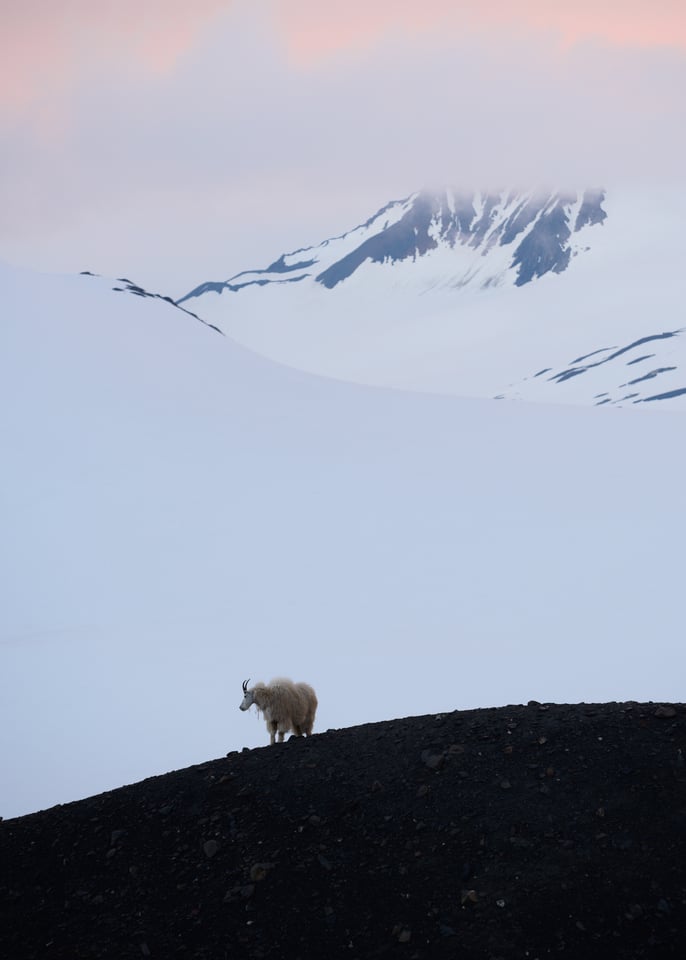
Ideally, every important element in a photograph should be positioned far enough away from the photo’s edges that it is not distracting.
If you keep the edges of your photo clear, it’s as though you are creating a built-in frame for a photograph. Essentially, you’re drawing a viewer into the image.
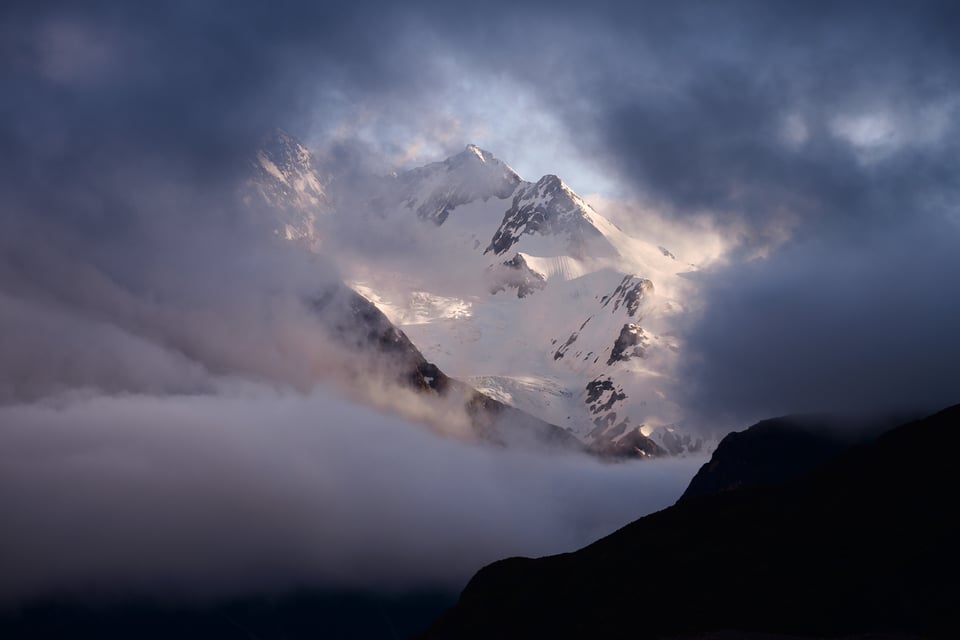
It is easy to overlook the edges of your composition. They are the parts of an image that typically attract the least attention. But that is precisely why they matter; if they do attract attention, unless you have a good reason for it, they can lead to photographs that look distracting, messy, and unintentional. The first thing I pay attention to when composing a photograph is the way its frame looks.
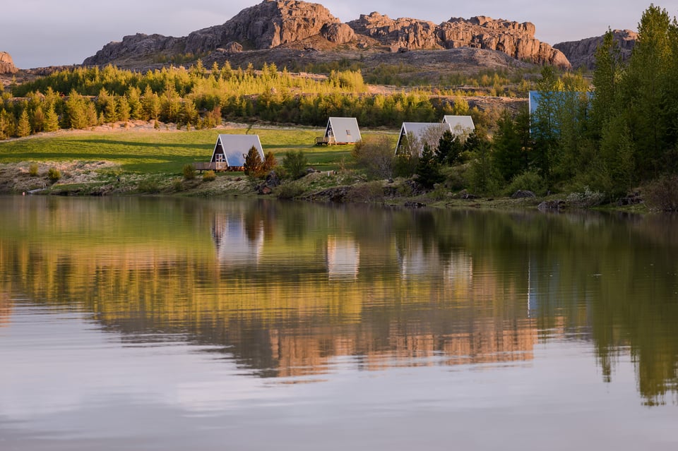
(In this case, there isn’t nearly enough breathing space at the top of the composition. The image clearly suffers as a result.)
It won’t always be possible to compose a photograph in a way that leaves a perfect buffer around all its edges. And if you have minor elements that bump up against the frame, so be it. An image doesn’t need to have a dark, featureless border in order to avoid distracting your viewer. But the fewer elements that appear at the edges — particularly the most important elements of a photograph — the more intentional that your composition will tend to look.
2) Don’t Interfere With Your Subject
Even worse than crowding the edges is if you block a significant portion of your primary subject with elements that are far less important.
What do I mean by this? Say that you’re photographing the reflection of a mountain in a pristine lake. However, depending upon your angle, parts of the lake shore might be too close to the reflection — or even block parts of it completely. Take a look at the photograph below for a particularly bad example:
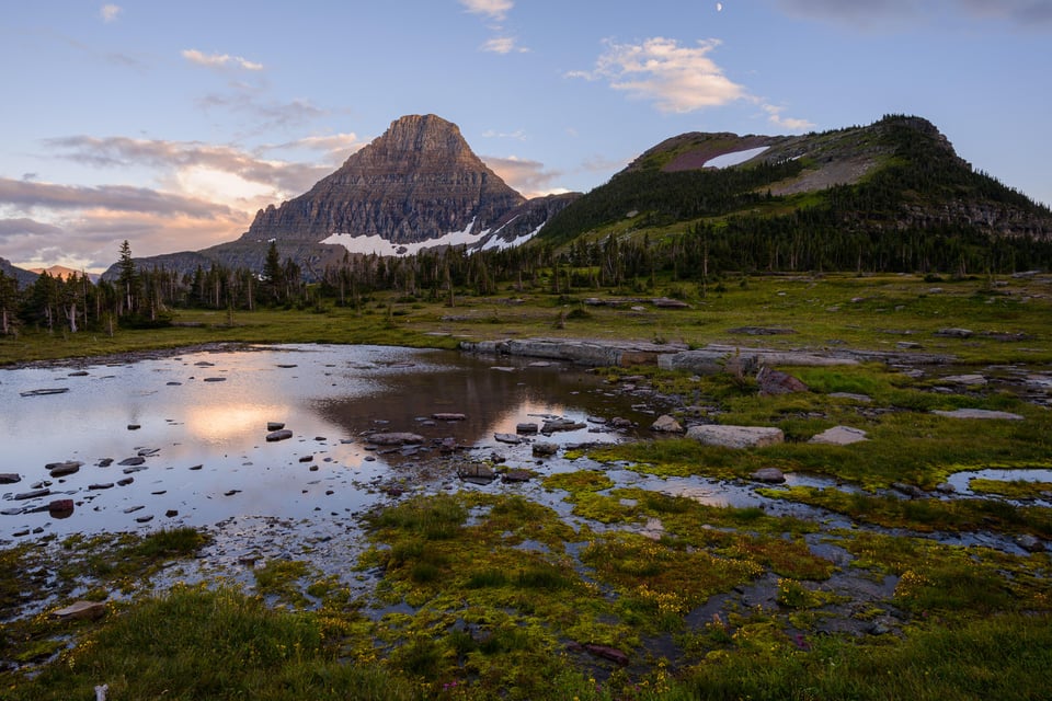
(This is a beautiful landscape, but the photo itself has a bad composition, which makes it ineffective. One of the main issues is that the foreground interferes too much with the reflection of the mountain.)
There are a number of problems with this photo. Not only is the reflection particularly bad, but other elements of the photograph (say, the moon at the top) are cut off awkwardly by the edge of the frame. The end result is a composition that looks haphazard and accidental.
How would I fix this problem? The simple solution is to move my camera to a position that gives each subject its own breathing space. I don’t want anything to interfere with this mountain’s reflection, and I want to ensure that the moon is nowhere near the top of the photograph. Here is the corrected version:
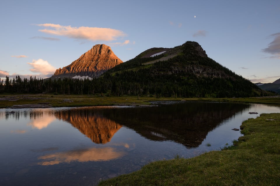
That’s a clear difference. This photograph looks far more deliberate, as if it has a reason to exist.
When you frame an image, you should do so with the intent to provide breathing space for all of your subjects. If they are cut off or blocked by anything else in your photo, the final image will be too chaotic.
3) Conclusion
Breathing space — between your subject and the edges, as well as multiple subjects — is one of the fundamental parts of composition. Alone, it isn’t enough to guarantee a successful photograph. But if you don’t give your subjects the space they deserve, it is hard to argue that your composition is as effective as possible.
This isn’t a difficult concept, but it is one of the more common reasons why I see some good photographers take bad photos in the field. And that’s simply because, by default, your first view of a scene might not be one with the most breathing space for your subjects. This is the type of thing that takes conscious effort to correct in the field; if you don’t keep it in mind, it is very easy to end up with suboptimal compositions.
When you capture an image, the two words stuck in your head should be deliberate and conscious. Every single part of your photograph should exist intentionally; nothing should be accidental. An image with good subject separation is one of the main steps toward that goal.
Good article that is common sense but often forgotten.
I’d add another tip if I may. If you can, take a few pics at slightly different zooms. Taste vary with age and time. That breathing space is one of the changing factor. Also, don’t hesitate to shoot a bit zoomed out in case you are not sure and if you can’t take many pics. A bit of cropping wouldn’t impact much the picture but missing some elements would definitely be regretted.
this article is refreshing.
it works too for people/portrait, street photos, arcitecture & others.
Thanks Spencer.
The topmost photo is a great shot!
Great timing on this article. I am still editing photos from our first trip to Iceland last month. ( I could write a blog on the lessons learned from this trip from avoiding the selfie hordes to protecting your lens from volcanic dust) There is definitely a tendency to stuff your viewfinder with the incredible vistas. I had to catch myself several times trying to show too much. Even then, I produced some examples of poor composition like you have above. I have started to make it more of a practice to not only review the histogram of each photo, but the composition on the view screen as well. Sometimes you get too caught up in the technical aspects of taking the photo once you think it is composed and focused. If I think I may have missed the composition or there could be a better angle or vantage point, I can make corrections and shoot again.
About any of Spencer’s article, I do always like the simple way he uses to compare and bring out the better. An important subject, and a very brief and sweet contents…for amateurs like me it always helps to read more and more on a particular subject. So I thought this article abruptly ended.
Again thanks for the article!
Very interesting, Spencer! I realize now that I’ve unconsciously been adhering to this tactic in many of my shots, but now that I know I can pay more attention to it, and experiment away.
Great article. It is another example of the wisdom of making your decisions thoughtfully. I am encouraged to do more Landscape photography – which is what I need.
I especially appreciate your use of colour. Recently, I have been put off landscape photography because of the huge number of GOSLI I see posted on photography sites and for sale (Grosely Over Saturated Landscape Images). They all look like postcards. Rather than enhancing our appreciation of the subject, they seek to idealise and “perfect” the natural word into an impossible and unrealistic version, and somehow it diminishes the landscapes shown.
I shall use try to think about the breathing space in the composition.
I understand the temptation to boost the saturation a little bit, but not the desire to make every image into a cliché.
An interesting article, but I think you lost a great shot with the example of the mountain scene.
The second image is a dime a dozen shot, no different to a million other photos showing a reflection of mountains on some lake. This has become a cliché type of shot and who likes clichés?
The first example I feel is much better, were it approached slightly differently. I would have gone low to the ground, hopefully removing the reflection, so that the moss, water plants and water gave a lead-in to the mountains in the background. The expansive low, flat, foreground would have added a foil and balance to the tall, heavy mountains in the background. It would have become a photo with some asymmetry.
I would then have waited for the light to give the golden glow in the second image, which gives the second image an unfair advantage, and lightened the foreground shadows to add to that balance against the mountains.
Interesting points! I could see a very successful photo exactly how you describe — with the foreground of the first taking up a more prominent position. And yes, the light in the second photo certainly gives it an advantage.
Counterpoint and then Point. Excellent education. The comparative analysis. Should be done more often. Please do more of these kinds of articles Spencer. Thank you Peter
I will continue writing articles like this, glad you enjoyed it!
Thanks for sharing this along with your precious photographs. It is nice to see that others obsess and meditate the same thing, background and borders! ;-)
Yes, I do spend a lot of time thinking about things like this! Thanks for your comments :)