Before I started shooting with large format film, something that almost scared me away is that composition on these cameras is completely backwards. It’s also upside down. And I’m not talking in metaphors – the image on the ground glass, used for composition, is totally opposite from the real world.
This odd fact has slowly become one of my favorite parts of working with large format view cameras, but I’ll get to that in a moment. First, for context, here’s what I mean when I say “upside down and backwards.” This is the scene:
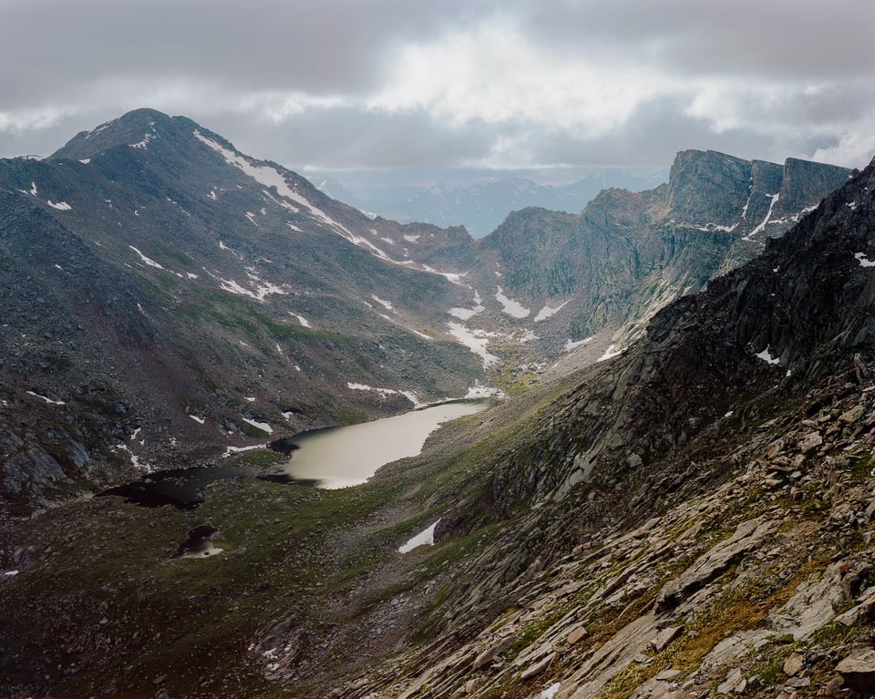
And this is what I saw on the ground glass:
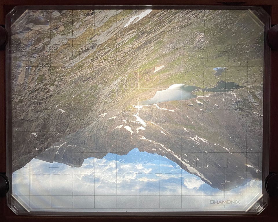
Trippy! Up is down; left is right. In concrete terms, a tall mountain to the left of my camera would appear at the bottom right of the ground glass.
Of course, this makes composition harder. Even with a geared tripod head that can adjust pan, tilt, and roll separately, a lot of beginners will struggle to adjust the composition quickly while looking through the ground glass of a view camera. Aim to the left to see more of what’s on the right of the ground glass. Aim up to see more of what’s on the bottom. And tilt clockwise to… tilt the view clockwise. That one stays the same :)
It’s easy enough to explain why this inversion happens. Lenses – at least, typical ones – always invert the image. It isn’t something that only happens with large format. However, DSLR cameras un-flip this projection when you look through the viewfinder, thanks to the optical path of mirrors and prisms. Mirrorless cameras and LCDs do it with software. (That’s also why a dust speck on the bottom of the camera sensor will appear at the top of your photos.)

The difference is that, in a view camera, there’s no mirror or software to flip the image back to normal when you’re composing it. Instead, you’ll see exactly what the lens is projecting onto the ground glass.
Here’s why I like that.
For starters, composition in photography is sometimes taken too literally. The first instinct of most of us, especially as beginners, is to see something interesting and point the camera at it. The rule of thirds (which I don’t like) is the first time that many photographers will encounter someone saying don’t put the subject in the center all the time.
But composing upside down and backwards means that you’re hardly composing “subjects” at all. Instead, you’re composing unfamiliar shapes and figuring out their relationships. It’s a method of composition that easily focuses on aesthetics and emotional messages rather than simply trying to fit the literal things you see in front of you.
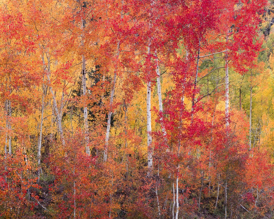
This topsy-turvy process also demands you spend more time per composition. No matter how many large format photos I take, the first moment that I see a backwards, upside-down image on the ground glass is always jarring. It teleports me to a different world. I clear my head, start to understand what’s in front of me, and begin to compose the photo.
The whole thing takes time. And, in my experience, spending time on a composition usually improves it.
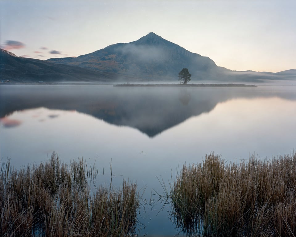
Long before I started shooting with large format film, one of my favorite techniques as a digital photographer was to flip my images horizontally in post-production. I still do it to this day. My goal isn’t to keep the photos this way. Instead, I simply want to see them with fresh eyes – how a new viewer might interpret my work. It’s a way to see and critique my photos anew.
Hence why I don’t think composition is harmed when the image is upside down and backwards. In many ways, the creative process benefits from the inversion.
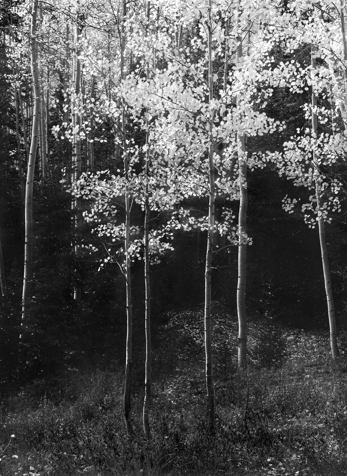
Don’t get me wrong – I’m glad that digital cameras show me things right-side-up when I’m trying to take pictures quickly, like when I do macro or wildlife photography. I also sympathize with some large format photographers who buy reflex viewers to flip the image back to normal – not everyone prefers the jarring nature of upside-down composition.
However, for my style of photography and composition, it’s been an unexpected blessing. And if some camera company added an inverted view as one of the options for the LCD or EVF, I would enable it more often than not, at least for my landscape photos. (Maybe someone already has; I’d be interested if you know.)
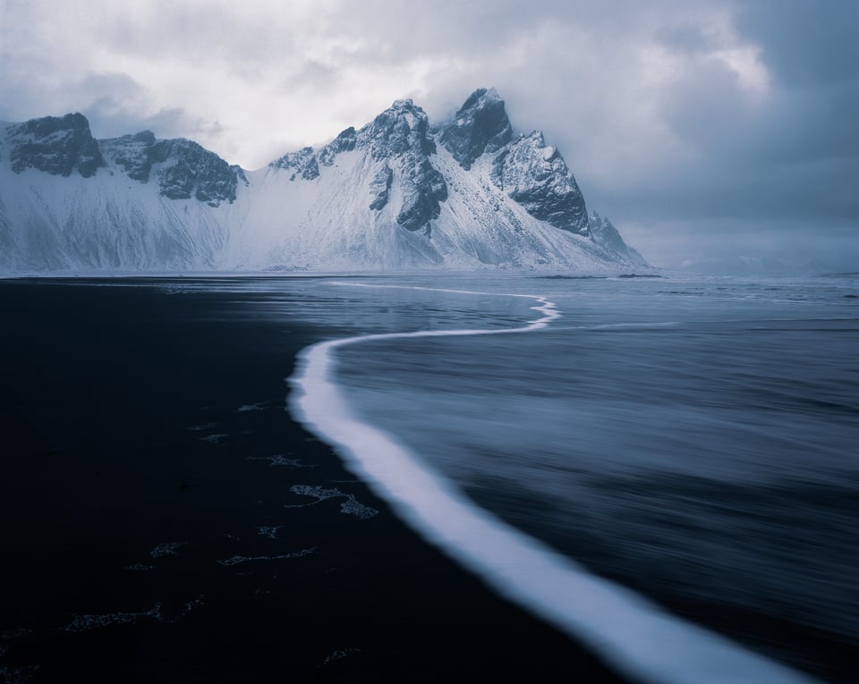
In short, it’s easy to think of composition as the simple, mechanical act of pointing your camera at subjects. But no matter what camera you have, if you take one thing away from this article, I’d say to turn that idea on its head! Composition is the most creative and personal part of photography. It’s better to focus on the relationships within the composition, as well as the photo’s emotional message, in order to help it succeed.
Very well done approach! :-)
This is cool. I had no idea the image looked like that in this sort of camera. I would also be very interested in trying an EVF mode that inverted the image…
Interesting technique. I’ll have to see if doing something similar helps me choose the better compositions in post.
I think it will, especially flipping the photo horizontal to see it with new eyes. Go and try it!
I haven’t been affected at all by composing in tamrof egral.
Haha, I love it! I promise, this frown is really a smile ):
Thank you for an insightfull analysis. Changing the way the image is presented can really be usefull for evaluating composition. In the field I sometimes defocus the image so only the main elements remain as ‘blobs’ in post dialing the brightness way up and way down or reducing saturation can also help to take attention away from the subject and understand the composition.
That’s a great tip that would act very similar! Compose when the lens is defocused to get a sense of the scene’s colors and relationships of light and dark. Then re-focus and make whatever smaller adjustments are left. Mostly, just take the time to see beyond the literal side of what’s in front of you.
I have used 4x 5 inch plate photography in the past when i did architecture and even made my own built to take into the mountains… I used to develop and print BW and even colour.
It is true that when you use this heavy plate camera’s everything goes slow and that can be a very good thing. Only on returning home you find out if you did the right thing.
Also you can use tilt and shift to make the photo even more your own. It makes you realize more what you are doing and why. Of course it is such a slow medium that it is not suited for capturing anything that moves. The result has a different look compared to digital camera’s, especially when it is printed analogue as it was meant to be. Also the lenses you buy today for the small digital sensors have a different rendering compared to the older 4×5 inch glass. Far more contrast for one. All in all a very different photography, and for people that are not familiar with analogue photography it can be very interesting.
Personally i am very glad that time is over now. Like with film to video you can now directly see what you did and learn directly from your mistakes and possibly correct them. Also my large format printer can do everything more controlled and better and with much less effort; Foremost colourprints. Qualitywise i think 4x 5 inch equals about a 100Mp camera, but with a different softer but sharp look.
My advise would be to take more time to think about what you are doing before you capture the moment in time. Think about why you want to take that photo, think of composition- your position – try to predict what is likely to happen in time. And be there at the right time and place to make the photo you want.
The work that goes into large format is not for the faint of heart, and I wouldn’t recommend that digital photographers try it just on a whim.
That said, the slow pace and technical demands of large format are significant enough that I think they’ll improve most people’s skills as a photographer. If you can get the photo you want on large format film, you can get the photo on almost any camera. And like you say, large format film compares favorably in technical quality, if everything is done correctly.
In terms of final output, digital printing is certainly quicker and more consistent, not to mention that it’s far easier at large print sizes. In my opinion, fully-analog black and white prints still have some clear advantages over fully-digital black and white prints. However, that’s a lot harder to argue with color, where I’d prefer a digital workflow.
I also think that the real unsung method for extraordinary print quality is to combine the two approaches into a digital-analog hybrid workflow. For example, making pt/pd or carbon transfer prints from digital negatives. Some of that is even possible in color.