One thing that gets me about some post-processing software, including Lightroom, is that the default settings do not always make sense. Of course, because they are the defaults, a huge number of photographers use them anyway. A clear example of this is color noise reduction.
First, you may want to take a look at some of our previous articles on noise and noise reduction if you have not already. The following article deals with a particular type of noise reduction – color noise reduction (as opposed to luminance).
A lot of post-processing software allows you to reduce color noise in an image. Indeed, many software options automatically apply a color noise reduction filter by default. In Lightroom, that default amount is surprisingly high: +25 (with most cameras). Lightroom applies the same amount regardless of the camera you use, from a full-frame sensor to a point-and-shoot. As I will show below, that correction is often too extreme.
The root of the problem is that photographers tend to think of color noise reduction as almost a free ride. Raising the slider “too high” doesn’t appear to have any major side effects, and it’s very effective at reducing color noise. More than that – unbelievably effective.
Here’s a before/after of a high ISO image (ISO 6400) with no color noise reduction, followed by correction in Lightroom:
That’s a huge difference. It may be hard to see at web resolution, so here’s a tighter crop:
There’s still a lot of luminance noise left, but color noise has almost completely disappeared.
Still, for all the benefits you see in high ISO images like this – and all the articles on this topic you’ll see online – color noise reduction really isn’t as good as it seems. It muddies your photos in subtle but often important ways, particularly at the high default of +25. I’ll try to demonstrate that with some images below.
Table of Contents
Why It’s Hard to Recognize When You’ve Overdone Color Noise Reduction
Color noise reduction works on the small details of an image much more than the “big picture.” So, if you’re viewing the image without zooming in, you may not realize how much damage it’s doing.
Here’s an example from a small sensor (1-inch type) where there was some noticeable color noise in the photo. The “Before” image on the left is +20 color noise reduction, while the “After” is +100:

There aren’t many obvious differences in the above images; they look very similar. If you look closely, you may notice that the “Before” has a bit more color noise in the clouds, especially at the top left. But it’s hard to tell at web resolution. (This is also easily fixed with selective noise reduction in Photoshop.)
What if we zoom in, though? Here are the same images, cropped significantly:
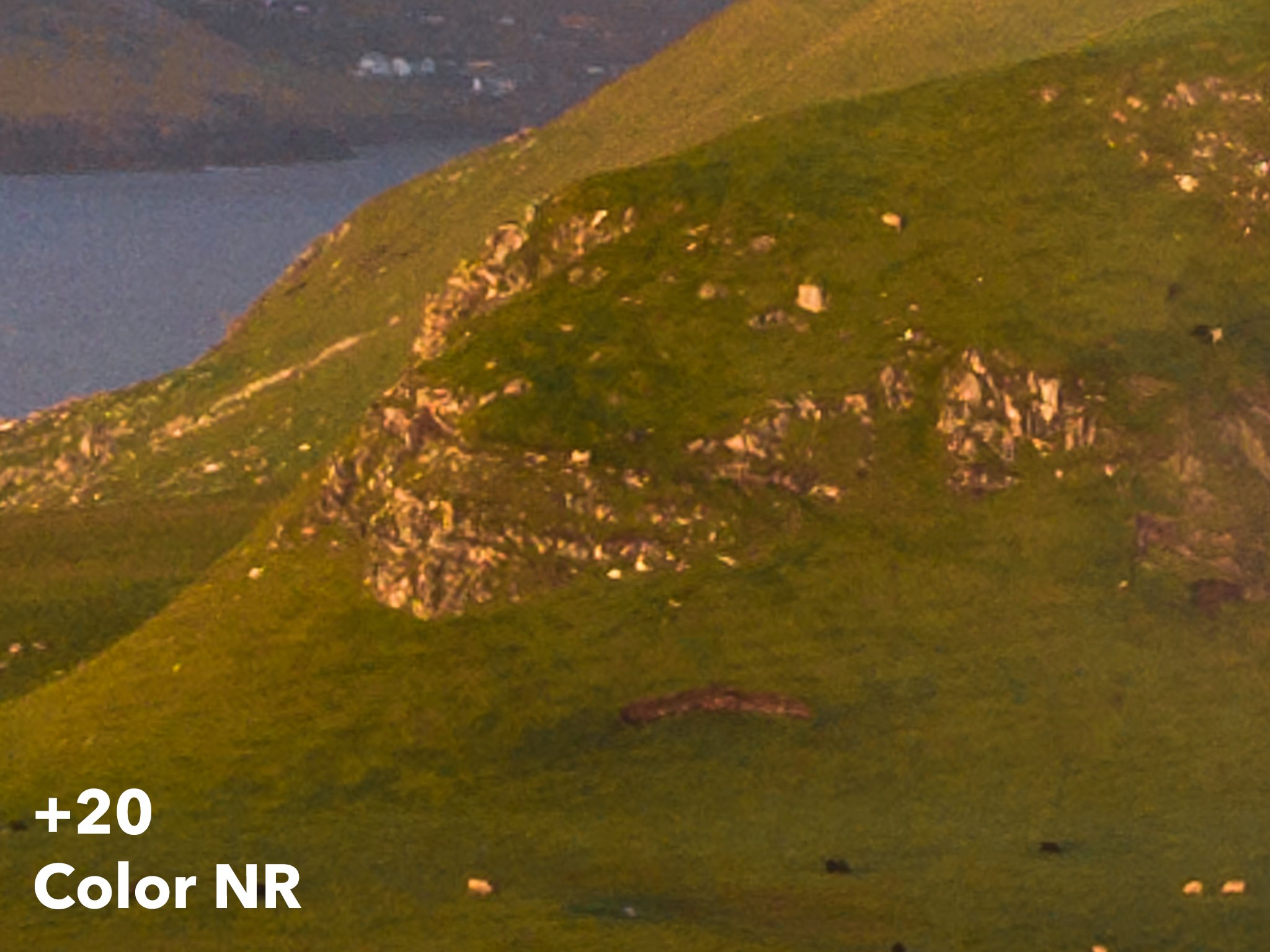
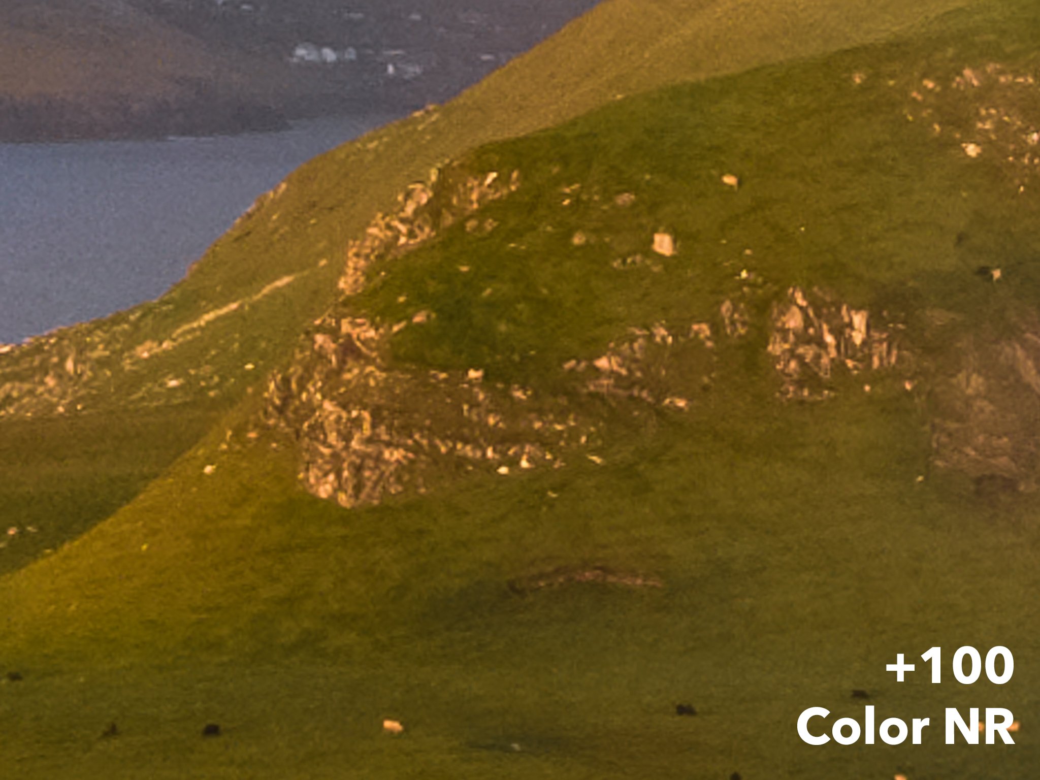
Up close, you can see that the “Before” image is actually significantly better. Pay attention to color of the rocks, especially the lowest rock outcropping. There is also a huge difference in the area of the photo where the hill meets the ocean behind it. To be specific, the +20 image has rich, defined hues in places where the +100 has dull, muddy colors.
These differences may not show up when you post the photo online, or look at it in Lightroom’s “Fit Screen” view. But once you start making medium or large prints, they’re going to show to a discerning eye.
Still, this is dealing with +100 – the highest that Lightroom goes, and not a common setting for most photographers. Are more mild corrections still a problem? Not always, but they certainly can be. I’ll demonstrate that next.
Even +25 Color Noise Reduction Is Often Too Much
The example from the previous section demonstrates how easy it is to overdo color noise reduction without realizing it. However, that example is also from a 1-inch type sensor. Some amount of color noise reduction is probably needed in that photo, and Lightroom’s default of +25 isn’t so bad.
What if, instead, you’re shooting at base ISO with an aps-c, full frame, or even larger camera sensor? In those cases, +25 can be too much.
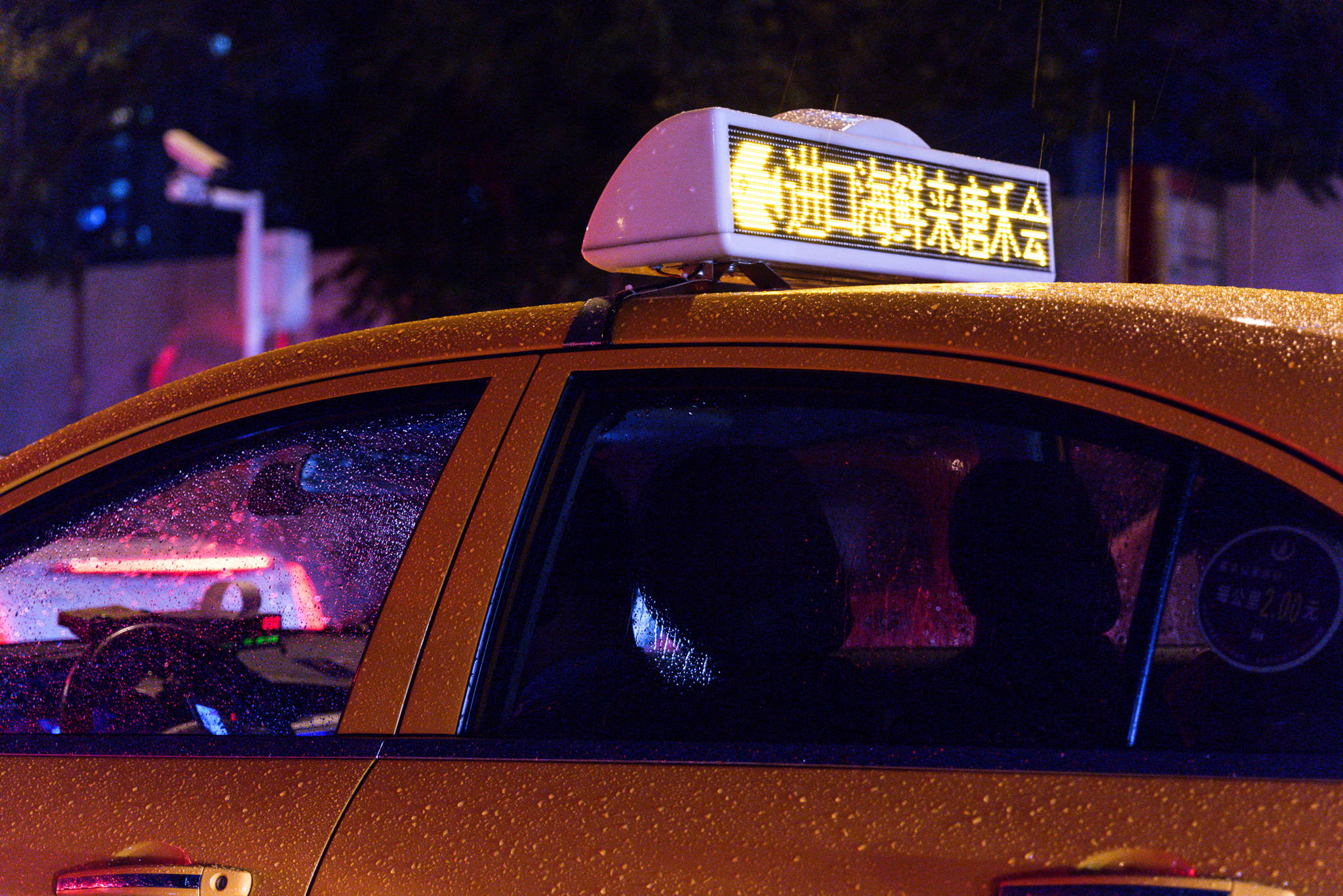
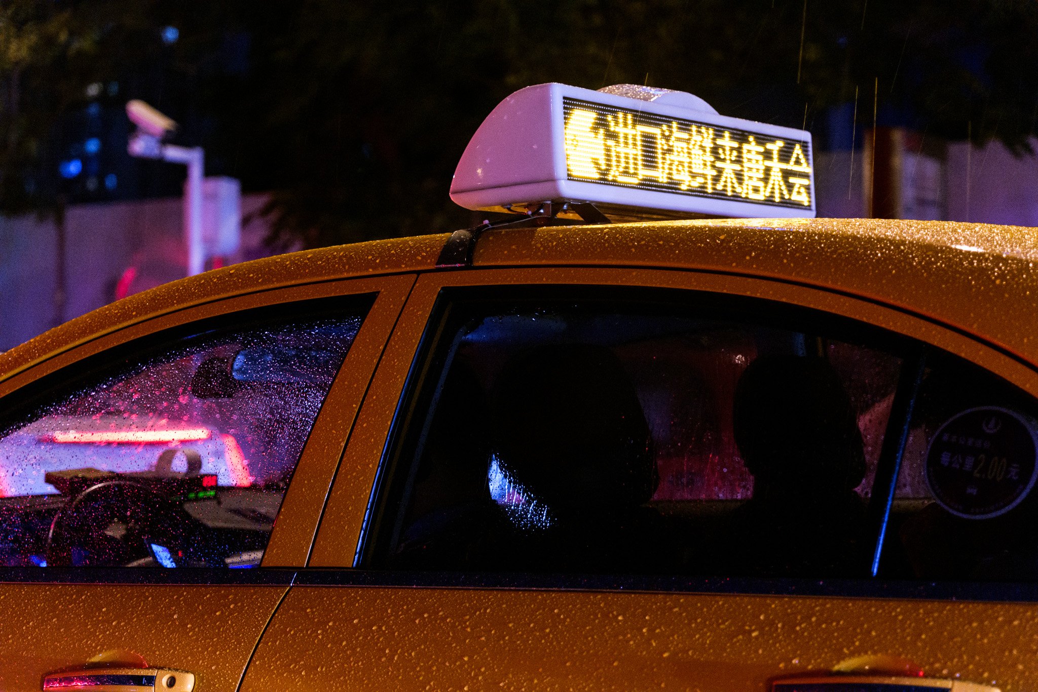
Here’s one example comparing zero color noise reduction to +25. The following are 100% crops from the Nikon D800e, base ISO 100:
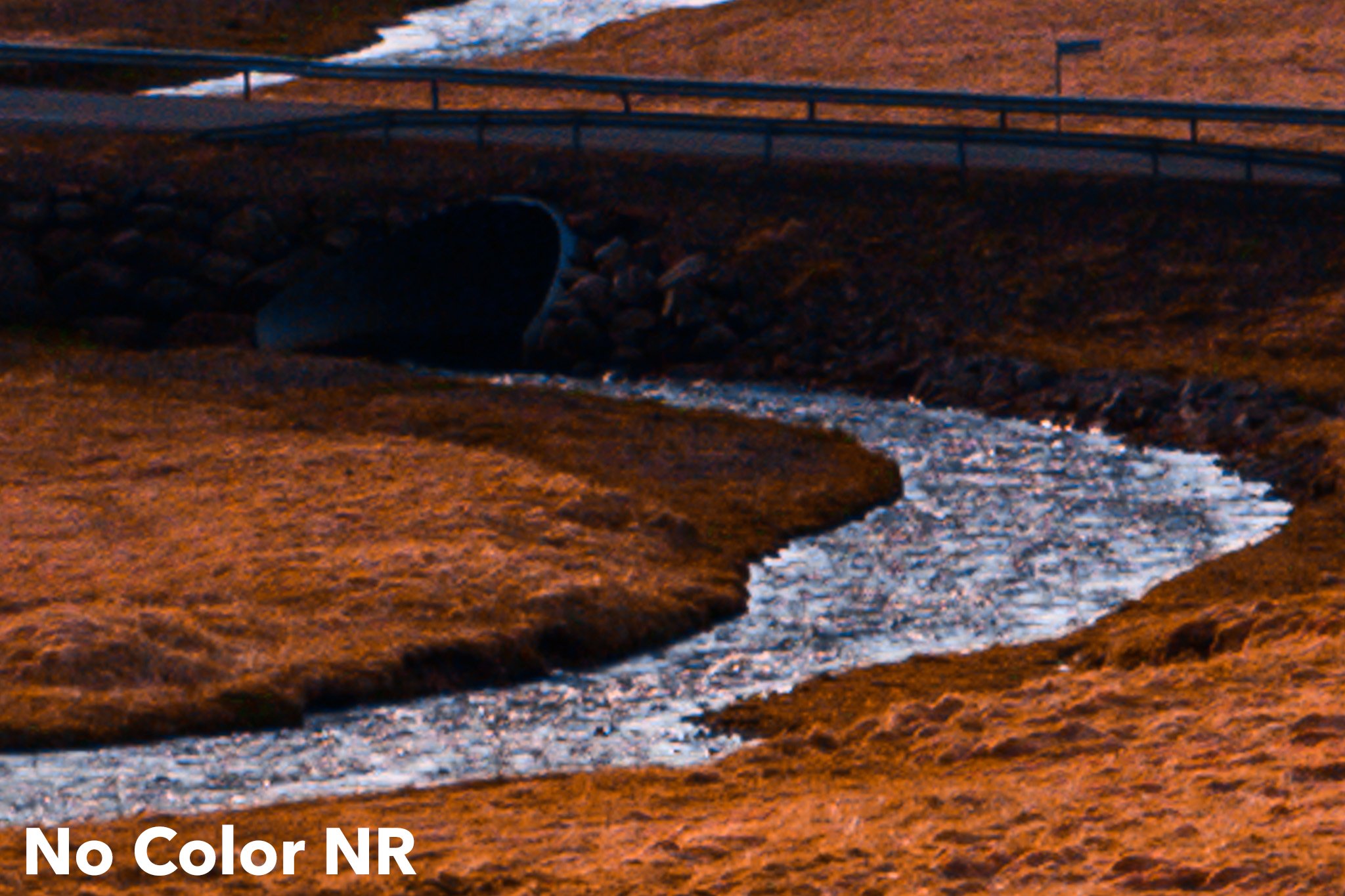
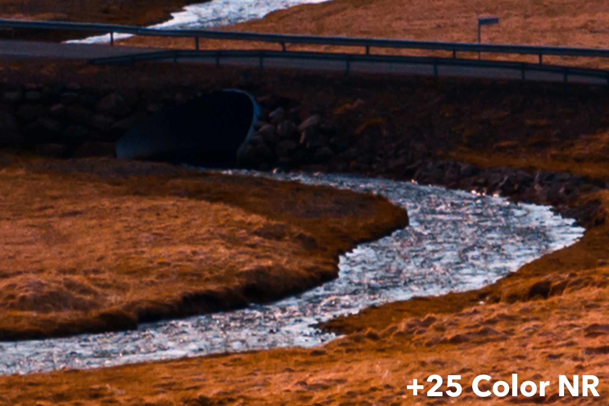
To me, the version with zero color noise reduction looks significantly better, with more color nuances and better separation. It even looks sharper, though all other settings are exactly the same. There is a tad bit of unwanted color noise, but it’s a worthwhile tradeoff for me – and if it’s obtrusive for you, some minor color noise reduction (not nearly +25) gets rid of it completely.
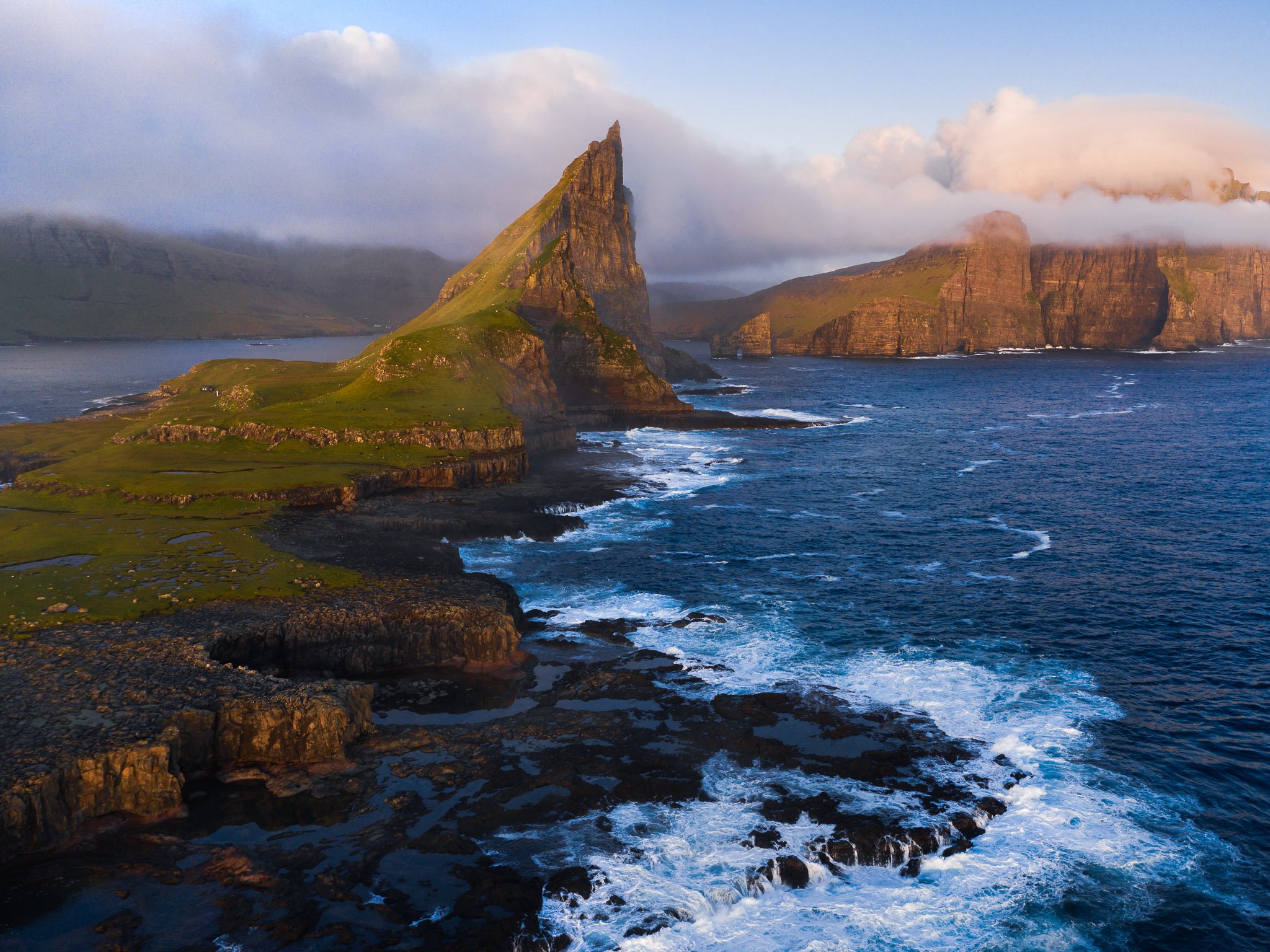
For reference, here’s the image from which I took the crops above:

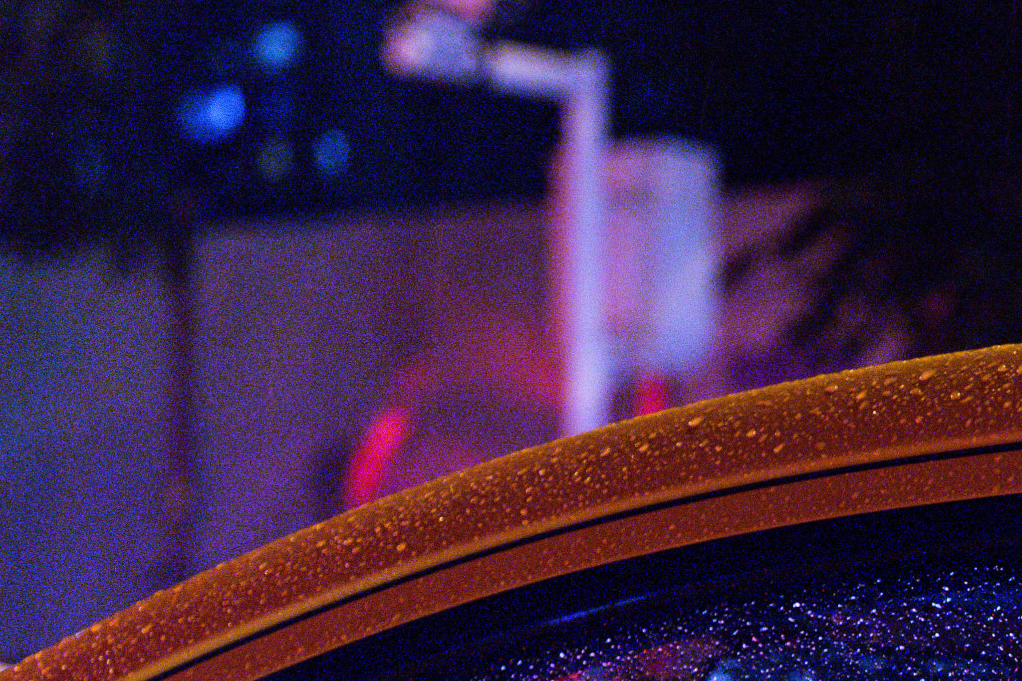
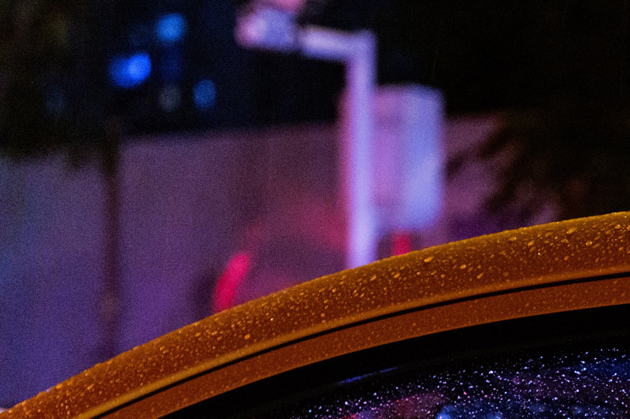
Here is another example, again comparing zero color noise reduction to +25. I took this photo at ISO 200:
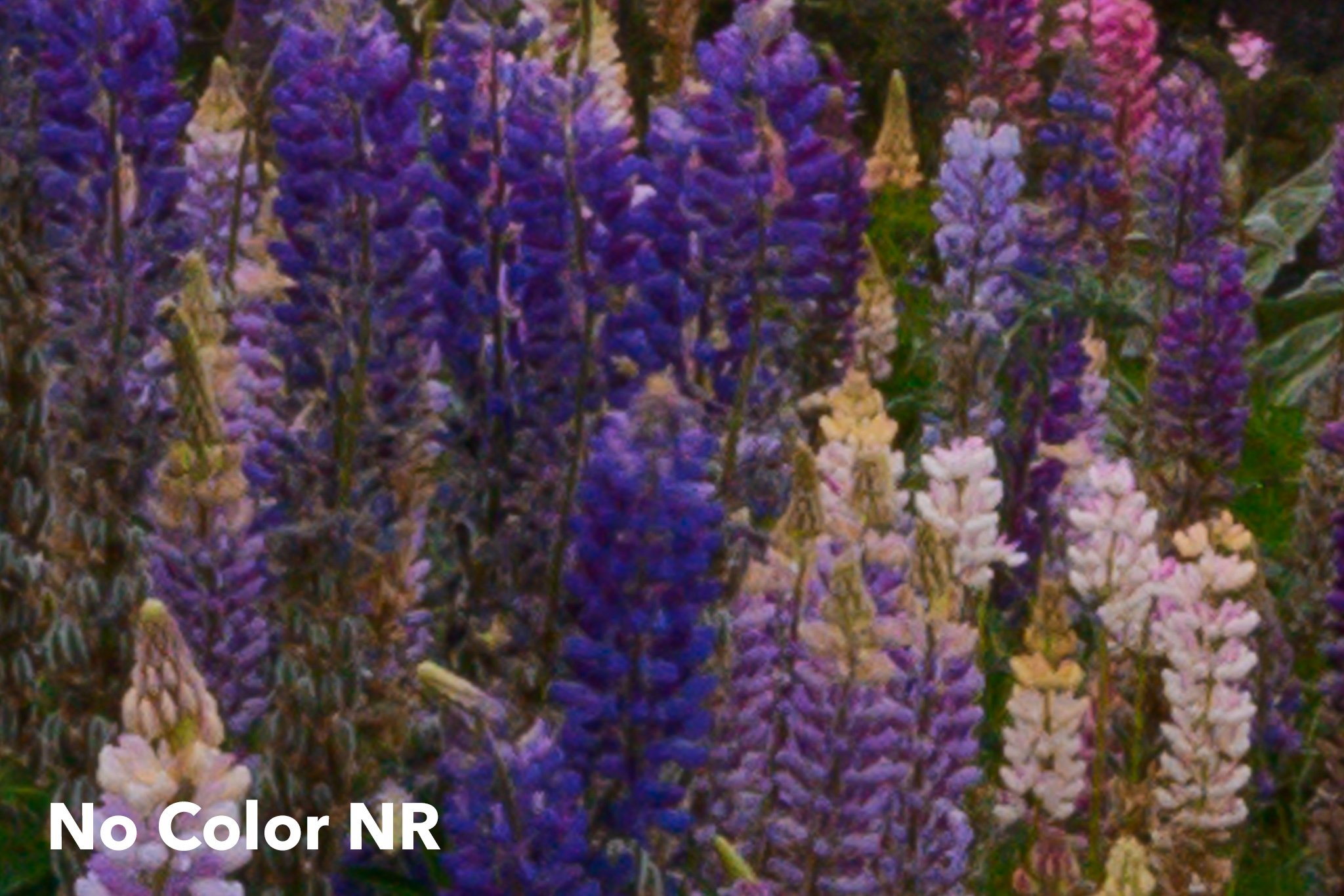
The differences this time are a bit more subtle, but you can see that some of the greens in particular are duller in the version with +25 noise reduction. Interestingly, the areas of the photo that were already a bit less saturated are the ones with the biggest problems at +25 NR.
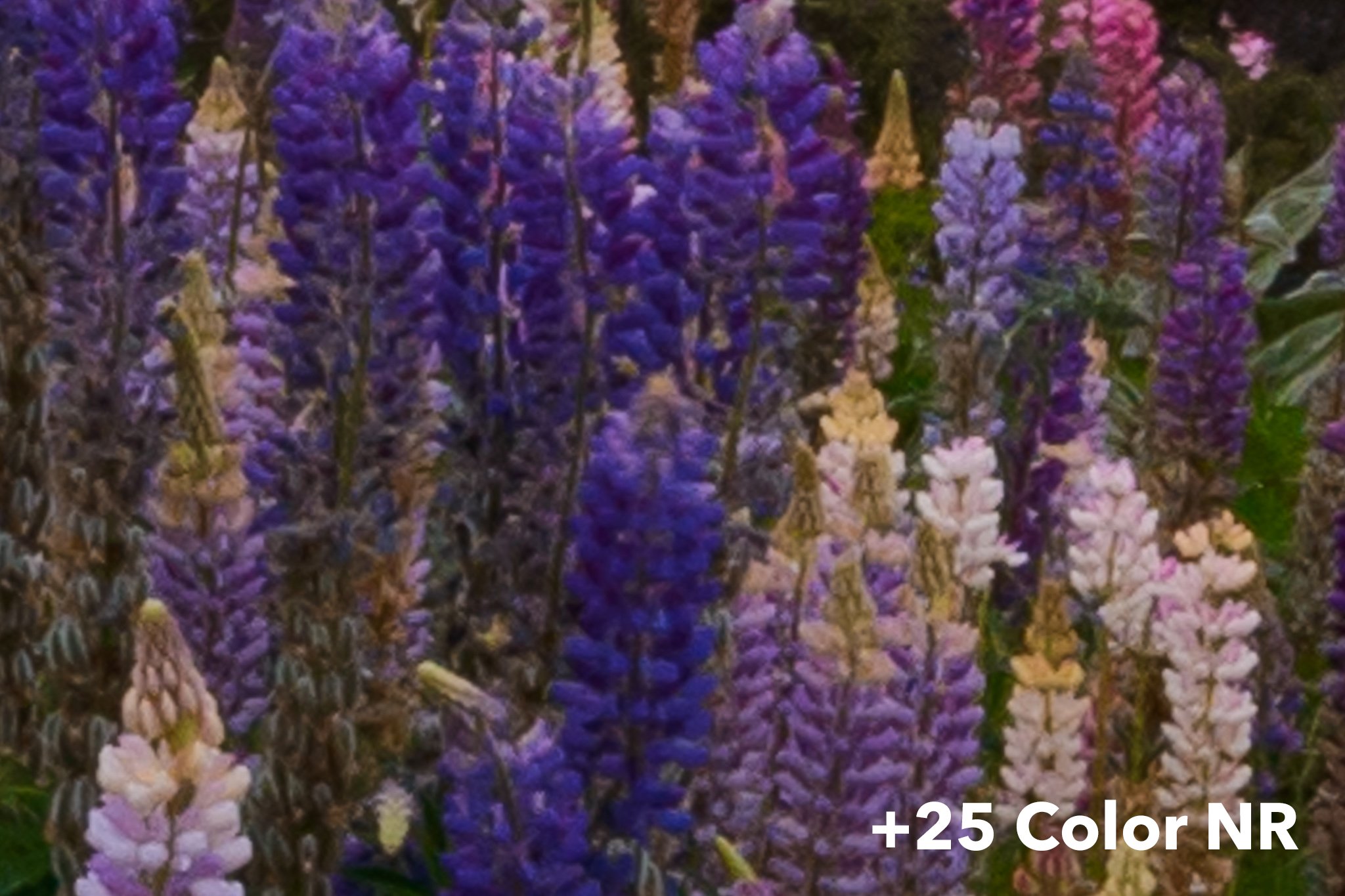
It’s not just color photos that this impacts, either. Black and white photos also can look worse with too much color noise reduction. Here’s an example, again comparing zero vs +25 color NR:
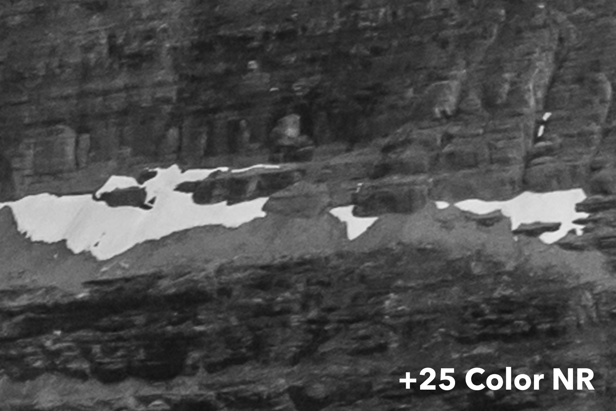
The details in the +25 image look flat and even “plasticky” – very similar to the effects of luminance noise reduction, interestingly. I will note that I took this particular image at ISO 800 (with a Nikon D800e), so the “No Color NR” version isn’t perfect; it has some excess noise. Even so, it looks better than the alternative. A good compromise value here would be around +5 to +10.
How Much Color Noise Reduction Should You Do?
So, if +25 is often too much – and +100 is way too much – what is the proper amount of color noise reduction in a given image?
My personal answer is often none at all. If you shot a well-exposed image at base ISO (assuming aps-c or larger camera sensor), and you didn’t do extreme post-processing, you probably don’t have much color noise to worry about anyway. Might as well keep as many little color details as possible.
Beyond that, it depends on the image. For high ISO Milky Way photos, I tend to find Lightroom’s +25 default to be about right, or only a tad too high; +15 to +20 is about where I usually land. For other images, I’ll do selective color noise reduction in certain areas of the photo (often the sky) while keeping it low or zero for the regions with more detail.
There’s no universal answer here. But whatever you choose, I recommend zooming in to at least 1:1 magnification, and perhaps more like 2:1 or 3:1, to analyze the changes you’re actually making. This might sound like an “every last inch” approach that isn’t totally necessary, and that’s fair – but for important images and larger prints, the differences exist.
A Final Recommendation
Lightroom isn’t the only culprit here; a lot of photo editing software starts with excessive color noise reduction by default. I highly recommend changing that. The process is fairly easy. Here’s how to do it in Lightroom:
1. Go to the Lightroom Develop module and edit any photo to the settings you want as “default.” In this case, that means setting color noise reduction to zero.
2. Look for the “Presets” section on the left-hand tab. Click on the “+” button to add a new preset.

3. Name your preset and tell Lightroom which camera settings you want to include in it. For our current purposes, all that matters is Noise Reduction > Color. However, feel free to use this opportunity to create a general preset of basic adjustments for every photo you import.

4. Next time you import photos, look for “Apply During Import” on the right-hand tab. Change the “Develop Settings” option to your new preset.
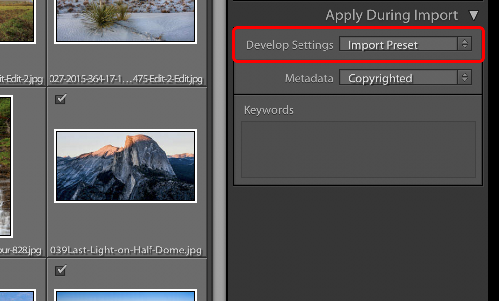
5. From then on, by default, Lightroom will automatically apply your preset upon importing photos. Every new photo you import will have zero color noise reduction added.
The exact steps won’t be the same in every software application, but the broad strokes should be similar. If you are unsure how to change the defaults in your particular software, I recommend looking it up online.
Conclusion
There’s nothing wrong with color noise reduction at all, and I’m glad it’s an option we have at our disposal for noisy photos. It does do a good job reducing color noise, often a great job, and I don’t want you to think I’m saying otherwise.
But it’s also not a free ride. When you increase the color noise reduction slider too high, you’re damaging low-level details more than you may realize, both for color images and black and white. “Too high” depends on the image, but even Lightroom’s default setting often crosses that threshold.
The fix is not just to set color noise reduction to zero; sometimes – no surprise – that results in too much color noise. However, the fix also isn’t to leave your software at its defaults. Instead, handle each image differently, according to its own nuances.
Like most things in photography, the more thought you put into finding the right color noise reduction setting, the better your results will be.
Thanks for diving into this topic, there isn’t much information out there. However, all of those instances where you call something “significantly better”, the differences are *very* subtle and only if you pixel peep. More importantly, this article may be out of date. All of the NIkon mirrorless cameras have a tremendous amount of color noise, much more than any DSLR that I owned. Night photos look horrendous with that noise, and it is very easily remove with a color noise setting of about 60-80 in Lightroom. There is no perceptible difference in sharpness if you look at the whole image and that tool is a must have.
Great article! I had some problems with color noise, so I tried Lightroom’s color noise removal, and it worked almost perfectly. I noticed it made all the eyes in the photo brown, which kinda killed the photo, so I decided to stay with the color noise instead.
I see very little difference at all in your results. pixel peeping you can see a slight loss in contrast on colors and maybe sharpness as well in the BW images. I am looking at this on a calibrated 4k monitor. My opinion is you are pixel peeping and it’s not significant. I use a nikon coolscan 5000 to scan 35mm. this scanner has a 20 year old CCD sensor. It has a good amount of color noise all the time when pixel peeping. i move the slider all the way to the right (100) and see no appreciable difference except the elimination of the sensors color noise. i printed them before i found the color noise feature and after. i see no loss in contrast or sharpness using color denoise in lightroom with these scans. it looks great.
In fact i see a significant reduction in unwanted blues in your blacks on the first image with the taxi. the addition of color denoise is better imo.
Well if you can always do film
Spencer,
It would be really interesting to read an article that addresses your standard import preset package. Explaining each standard setting you use and why you use it. Also discussing different import presets for different circumstances – if you use several different sets of presets.
For instance, I have been using a sharpening setting in my import preset similar to the typical sharpening in a jpeg. But the more I do the more I am beginning to question whether or not this might be too much for the base import. At the same time if you have no sharpening an image can look terrible and I can be inclined to think the focus is off and just discard it.
Sometimes I think the more I learn about processing the more I find that I don’t have a complete understanding of.
Wow; a mostly very subtle effect. Looking on my iPad Pro, I could not see any “before” and “after” differences. On my iMac with a 27″ monitor, I could see no difference in the large taxi image, and a slight difference in the cropped one. I could see no difference in either of the seascape images. I could see a slight sharpness difference in the 100% crop of what appeared to be an arctic scene. I could see no difference in the flower shot. I could see a sharpness difference in the B&W crop.
But I suppose you can look at the question this way as well: what exactly does color noise reduction get you anyway? In the examples you give, it doesn’t seem to hurt much, but that is, to my eye, because it doesn’t seem to make much difference at all.
Totally agree, Barry. Unfortunately, that’s the annoying thing about doing these comparisons online rather than showing them in person. In Lightroom, for me, all these differences are dramatic – even in the flower photo, which is the most subtle of the group. But with a compressed JPEG online at 800 pixels wide, the differences look much, much smaller, even nonexistent.
I could try cropping more, but fundamentally the problem here is display size even more than the amount of the crop. Instead, I recommend trying it at +100 and +0 on some of your own images, then flipping before and after in Lightroom. That’s probably going to be a better illustration of the benefits (or lack thereof!) of low color noise reduction for your own work.
Have you ever tried DxO Prime noise reduction to see if it has the same problems?
Another informative article, thank you. Raise shadows, lower highlights, haze reduction, clarity, increase sharpness…all take a toll and your article supports the idea that there is not no free lunch.
Sorry “no free lunch”.
Curious. Is there a benefit to making an import preset vs setting colour noise to zero in the default lightroom settings?
Great article, Spencer.
I have a slightly unrelated question: do you know if there’s a way to this kind of juxtaposed image comparison in LR or PS? The side-by-side comparison is just not as useful when it comes to subtle differences.
Thanks.