There are most likely as many ways to achieve a beautiful B&W look as there are photographers. Maybe I am exaggerating it a little, but then I am in love with B&W. It is not as if I don’t like colour, oh no. It’s just that I like the “classic” look that much. So today, instead of doing some general article on B&W conversion and trying to cover several different looks, I am going to pick out a photograph and just work on it until it is exactly how I pre-visualized it a second before pressing that shutter. First of all, though, we need a photograph. I think I have just the right one.
Table of Contents
Before We Start
Low-contrast photography is not everyone’s cup of tea, so to speak. In fact, a lot of people will absolutely hate it, because, well, it’s not really what you’d call the popular choice – many think that low-contrast means lacking in contrast or associate it with flat. Some also believe that the more contrast there is, the better. It is fair to say that low-contrast photographs are nowhere near as eye-catching as the high-contrast B&W photographs you’ve certainly seen before. That does not make them in any way inferior. So if that is your thing, low-contrast images seem somehow under-processed to you and you feel you might get irritated by a different opinion, the best advice I can give you is to skip this article altogether and wait for the next one that will cover a different sort of conversion with a different sort of subject and mood, too.
Also note that the conversion I chose in this case is extremely subtle and the actual difference you are going to see depends immensely on both your taste in B&W photography as well as your monitor calibration. There are so many ways to convert images to B&W, this isn’t even a scratch on the surface, barely a drop of water in the ocean. At that, it is also really very simple and does not involve anything remotely complex. That was the intention. The end result is far from something you would see on the cover of a magazine, but then, not everything should be suitable for that.
With that in mind, let’s take a look at the photograph I chose to work on.
The Photograph
There is almost nothing special about this portrait, and that is what I like about it. The simplicity of the elements in the frame, the very fact that there are so few of them. The calm, deep, thoughtful mood of the bride – I don’t think she even noticed I was there that second. The very simple, and even more than that – very beautiful natural light coming from a window just behind my shoulder, and the natural, rapid falloff the deeper you look into the room partly responsible for the said lack of elements. There wasn’t that much space for me to position myself – I am basically sitting on the windowsill – but I am glad I managed to squeeze in in front of her to take this photograph. Even though the dress seemingly should have been on the right side of the frame – something I could not arrange at the time – to balance out the overall composition (two bright elements on the left side and so much negative space on the right), in the end I am happy with it as is. Might not be by the book, but this time perhaps all the better for it. For me, it is a keeper and I can not imagine it in anything else but B&W tonality. But before we get to the result, here is the imagine I am starting with:
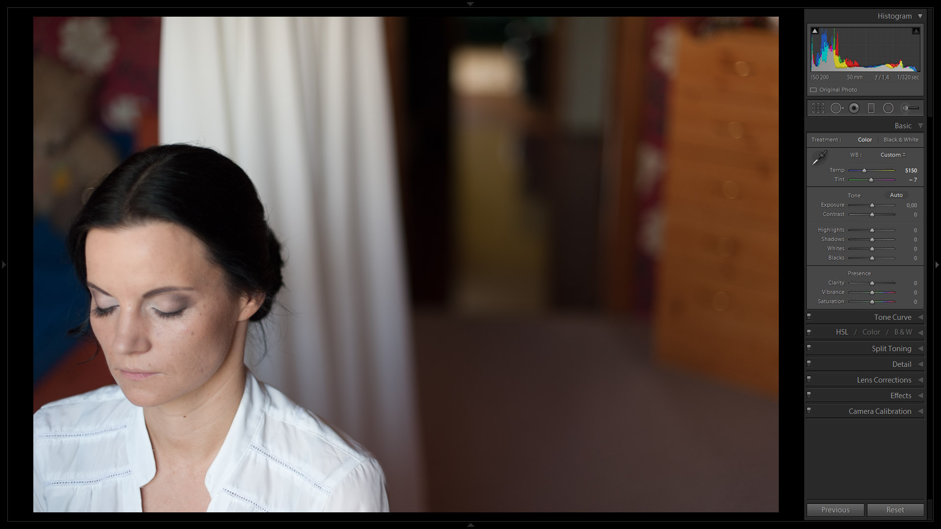
The image you see above is almost as it came straight out of camera. It was taken with my trusty Nikon D700, the versatile 50mm f/1.4 lens at f/1.4, ISO 200 and shutter speed of 1/320th of a second. The only changes that I did make before taking the screenshots are the changes that I always start with – lens correction to counter any slight distortion there was as well as quite significant vignetting (something I rarely do, but because of the composition it was not working well for this image), my default sharpening settings (Amount: 75; Radius: 1,3; the rest at their default Lightroom values), and White Balance. And while the portrait might look just about presentable as is, it is not what I saw through the viewfinder.
The Result
This is, or at least as close as I managed.
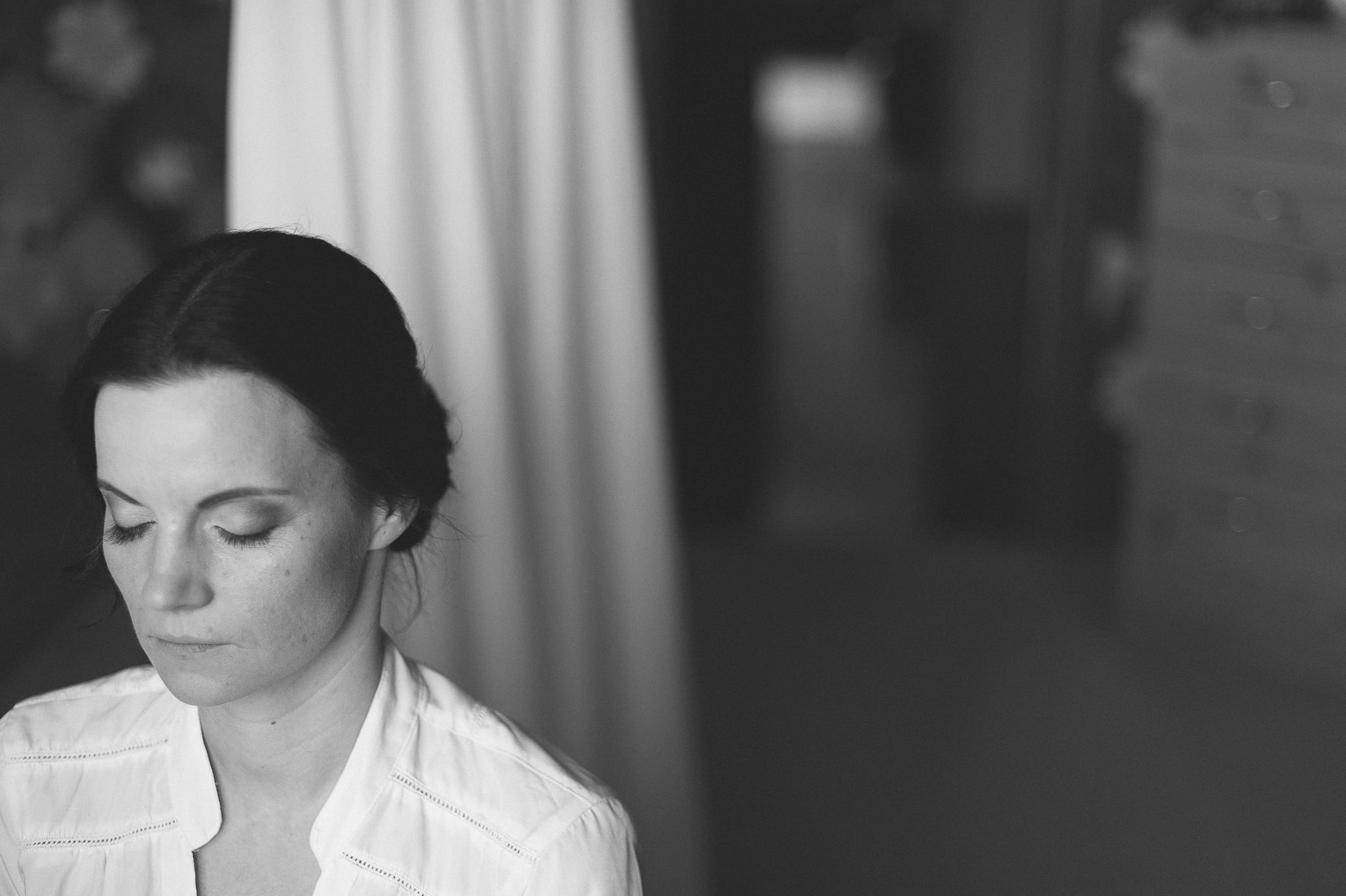
As I’e mentioned before and as you will notice straight away, this is not your regular magazine look – the bride’s skin is not pearl white, her hair is not pitch black and the photograph itself is not super contrasty. In fact, there is no black in the image at all, just very dark grey. And, quite obviously, not everyone will like such a look, it might seem too flat at first, before the eye gets used to it. Right now, I do. I find it… more subtle, with more emphasis not on the luminance, but on the light and how it bathes the subject. In a couple of years I will almost certainly no longer like it, but then that is how growth works.
If you, like me, do like the look, I have some good news for you. It is very easy to achieve and straight away there are two choices. The first one – and the one I choose more often than not – is to use VSCO’s original film pack. Eight times out of ten the Ilford HP5+ preset is exactly what I want (and it’s my favourite B&W film, too) with just one or two minor tweaks. It’s how I see. The second way to do it is manually and whilst it does take a little longer than just selecting a preset, it’s not really what I’d call complex. So how about we start?
A side note: you will also notice I did not do any retouching/airbrushing. Not because I am lazy, mind you. There is a good reason for that, but that is a whole different subject to discuss. Sometime soon, perhaps.
The Process
1) Choosing Your Starting Point
As I mentioned at the beginning of the article, the first steps when converting an image to black and white are exactly the same as they are when working with colour – I try to get the WB right, apply sharpening and see if any optical imperfections need to be fixed. If necessary, I would adjust the Exposure as well, but there is always a good chance that this particular setting will need further adjustment as you go. After that, the basic conversion to B&W needs to be done as a starting point. With Lightroom, you have at least four ways to do it:
- Treatment, Basic Tab – set the Treatment at the top of the Basic Tab on the right-side panel in Develop Module to Black & White;
- Saturation slider, Basic Tab – set Saturation to -100 at the bottom of the Basic Tab;
- Saturation sliders, HSL Tab – set the Saturation of each colour separately in the HSL/Color/B&W Tab;
- B&W, HSL/Color/B&W Tab – select B&W section in the HSL/Color/B&W Tab, which is effectively the same as the first option, choosing Black & White Treatment at the top of the Basic Tab;
Strangely enough, each initial conversion method (bar the first and the last one as they are essentially the same) results in a slightly different look. If you choose B&W as the Treatment (as I did in this case), Lightroom will automatically assign certain values in the B&W Tab based on its analysis of the image. Whether you find those adjustments to your liking or not is very personal and depends on each individual photograph. When working with this particular photograph, either with Lightrooms automatic adjustments or not, the start was already pretty good. In the end, I zeroed all the values and started from scratch:
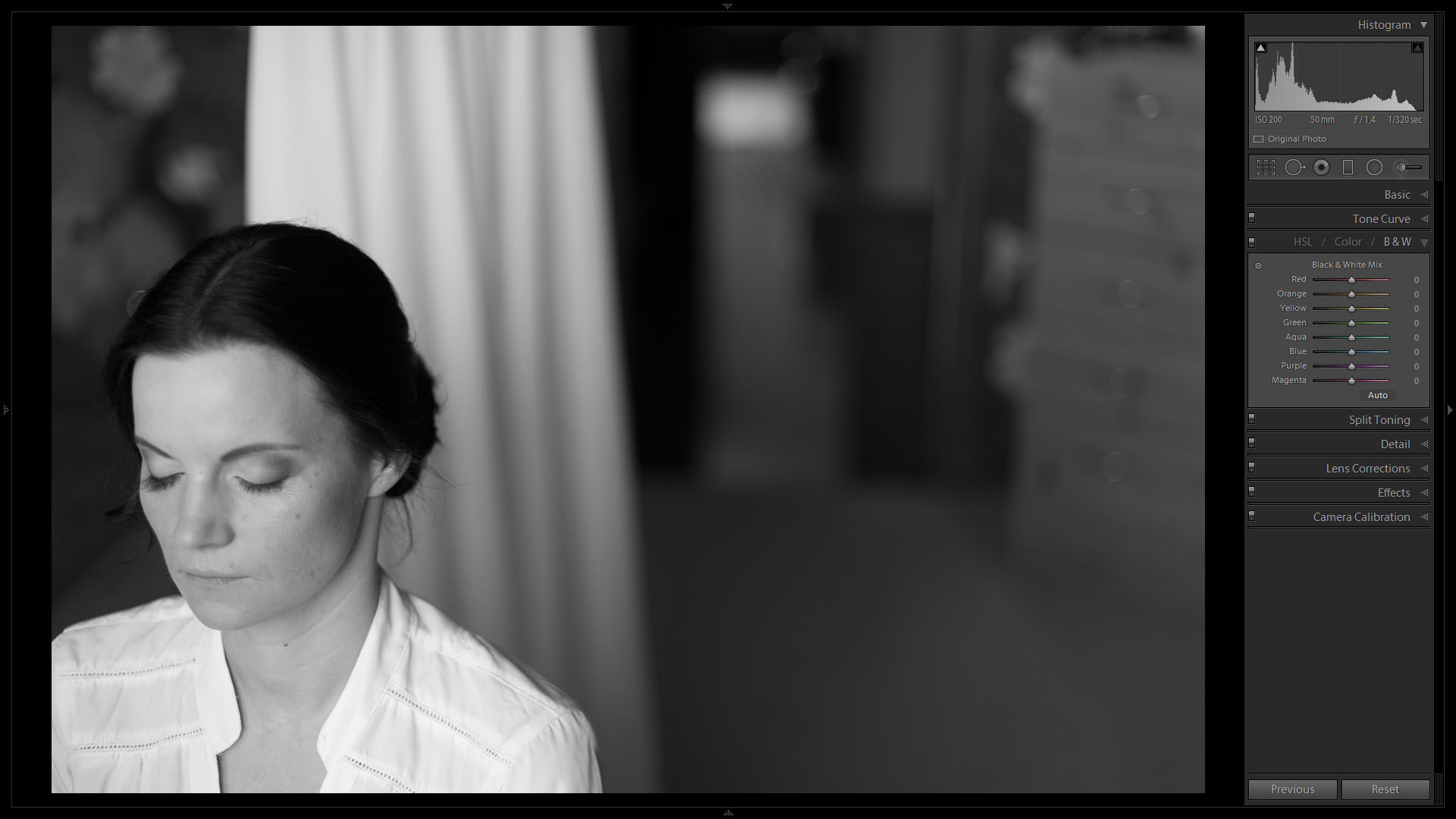
For someone who is a little bit less picky than I am this is already very close to the final result. But then I am picky, so let’s move on to the next step.
2) Tone Curve
What is likely among the most powerful tools in Lightroom or indeed any post-processing software, Tone Curve is where I do the most to achieve the look that I want. In fact, in many cases Tone Curve in conjunction with the HSL/Color/B&W Tabs is all you need for beautiful B&W. The first thing I did with the Tone Curve in this particular instance is switch it to Edit Point Curve mode, as shown in the following screenshot:
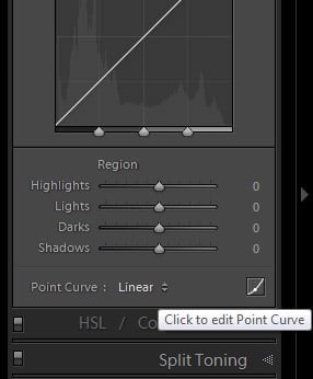
This allows free transformation without Lightroom’s aid of keeping the curve smooth. There, I limit the tonal range of the photograph by “cutting off” blacks and whites a little bit. To do that, you just need to drag the extremes of the tone curve that represent the blacks and whites up and down, respectively. What that does is basically turn blacks and whites into either dark or light grey. In this case, I upped the black point to around 13.3% grey and lowered the white point to around 98.8% grey, so that there is no absolute white in the image, and no absolute black, just a wide range of grey tones. Take a look at the changes I’ve made in the Edit Point Curve mode, and how that affects the Histogram:
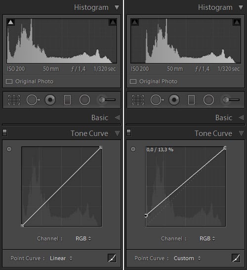
A side note: to learn more about such Tone Curve adjustment and some of my reasons behind it, read our “That Classic Vintage Look” article where I explain it in a bit more detail.
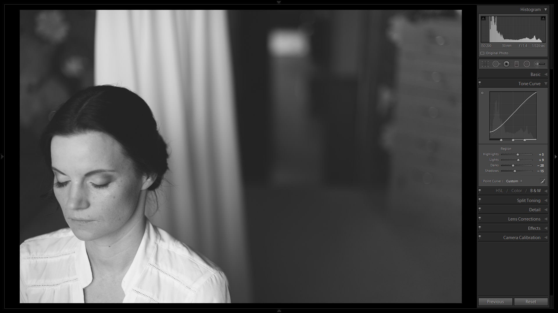
Not done with the Tone Curve yet. Because I moved the Black Point up a bit to limit the tonal range of the image and omit deep blacks, the rest of the Curve has also lifted slightly, which means the image lost contrast and got a little brighter. To fix that, I left the Edit Point Curve mode and, after some going back and forth, adjusted the Tone Curve sliders like so:
- Highlights: +5
- Lights: +9
- Darks: -28
- Shadows: -15
Overall, the portrait starts to resemble the final look that I want in terms of general level of contrast and tonal range, but not quite in terms of exposure. Overall, I still find it too bright, but there are some very specific areas that I think should be a little more prominent (the bride’s face). A quick double-press of the minus key on the keyboard sets the Exposure to -0.20 and fixes my issue with overall brightness, but the more local adjustment will still require two more steps. For now, here is how the image looks after Tone Curve and Exposure adjustment:
3) HSL/Color/B&W Tab
 Before I applied Exposure slider adjustment, overall I found the image to be a little too bright, save for one particular area – the bride’s face, which was more or less how I wanted. After dialing in -0.20 Exposure, the whole image got “darker” as I wanted it to, but so did the bride’s face. With this step, I am going to lighten it up a little again.
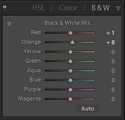
This “more local” adjustment, in a somewhat peculiar way, involves working with colour. What I am interested in is the skin tones which consist of a some red, yellow (perhaps most of all) and orange colour. Since the brightness of the bride’s face is almost as I want it, the adjustment is going to be very subtle and done in the B&W section of the HSL/Color/B&W Tab (because of my initial conversion to B&W choice). You can see the changes that I’ve made on the left, it was enough to lighten the bride’s skin just enough. Were I not as happy with some of the other tones in the image, I’d have had to adjust more sliders, but as it is I found nothing distracting enough to be worth toning down and risk potentially compromising the smoothness of tones, which would require further fixing.
4) Radial Filter and Adjustment Brush
Now that the overall contrast, tonality and exposure of the image is how I want it, time to subtly increase the prominence of some of the bride’s facial features by emphasizing the shadows. Two simple ways to achieve that – use either the Radial Filter tool, the Adjustment Brush or both. For me, I thought I’d go with Radial Filter tool alone this time. Because I am going for a low-contrast look, the adjustment is, again, extremely subtle and involves just two settings within the tool – Shadows, which I set to -21 so as to make them slightly darker, and Clarity, which I set to +17 to emphasize the shadows further as well as make her eyelashes somewhat more prominent. I also marked the Invert Mask checkbox so that the changes take place inside the selection and not outside of it.

Applying Clarity has also emphasized what you might call “skin imperfections”, but in this particular case I did not find that objectionable (not to mention that her husband would most likely call them facial features and, as they are part of her, it is also something he almost certainly loves). In any case, I am not a fan of the “plastic look” and the soft window light itself has done enough to smooth her skin.
5) Grain
One last final touch is a little bit of grain to make the image seem more organic. The settings I chose in the Grain section of the Effects Tab are as follows:
- Amount: 14
- Size: 38
- Roughness: 61
Final Words
And so I am done with the adjustments. Naturally, the settings that I specified, I did not select them at first try – there was a lot more adjustment involved before I settled down with the numbers and choices that you saw described. The best way for me to check whether I liked the progress I was making or not, and whether I liked the final look, was to use Lightroom’s Lights Out mode. With Lights Out, Lightroom allows you to dim or completely turn off all elements of the program except for the image itself for preview purposes (press “L” to go to “Lights Dim” or “Lights Off” modes). I set my Lights Out color to white. This lets me preview the image in a black background when in normal working environment (Lights On) and see how it looks in a white one when I choose the “Lights Dim” or “Lights Off” viewing modes.
A side note: if you are yet unfamiliar with Lights Out viewing mode and would like to set it up, you’ll find the necessary settings in Interface Preferences dialogue which I covered in this article.
I hope you found the article useful. If this sort of B&W conversion is not to your taste, however, don’t be disappointed – perhaps you will find what you’re looking for in our article on high-contrast B&W conversion.
I just saw this well-written piece some years after it was published. Most such pieces are about perking up low contrast images but the unique feature of the present article is that it tries to show how to make a low contrast B&W image in PP. I do not have Lightroom, using Photoshop and the Nik Collection software instead. I have been trying to simulate the subtle greys of an uncoated Zeiss Tessar lens, mainly for landscapes. It is not that there is no contrast in prints from the pre-War Tessars. It is just that it is less stark than in later lenses with more elements and progressively improved coatings. The old Tessar images are sharp and resolve detail without tiring the eye. I have been playing with Soft Contrast and Contrast in the Silver Efex Pro application of the Nik Collection, with varying results. If anyone could post some more suggestions towards realising the kind of result that I was attempting to get, I should be obliged.
Black and white are extremes of the light phenomena, that in photography becomes idealizations like the line or the circle. Rubens painted around 20 different blacks for example, all of them product of different “emotions” of blacks. The same happens with white. Even the most white paper is no white, it bounces a complex sources of light, but the brain makes adjustments and look for a word. Pure white and black are exception phenomenas in Nature.
Very well executed….. I think and shoot in Monochrome…. Much like the “organic” reference as that is what I feel using Silver Efex Pro until that certain feel…. you nailed with Organic….
I realize I’m late to the party on this one…. Thanks for posting on this subject. I’m on a long journey to improve my B&W images. After searching extensively (Fraser, Schewe, Ming, etc etc), I’ve come to realize there isn’t a “correct” method – whatever gets you to a desired result (although I’m sure there are wrong or inefficient approaches from a technical standpoint). I like low contrast images in certain situations – sometimes subject, lighting, and composition point you in that direction. Not a universal answer – just as a high contrast full tilt saturation image isn’t the answer for every situation either…..
A couple of questions – why do you apply a sharpening preset at the beginning of your conversion? Particularly a value of 75 – that seems high. Do you find a need to trim that back when done? I typically apply noise reduction and sharpening last. (I should point out that my B&W work in Lightroom is almost always done on a copy of the original color image and as such it is likely that a different level of sharpening and noise reduction will be needed for optimal results – if I know an image is destined for B&W, I usually do quick adjustments in the Basic Panel w/ perhaps some saturation changes via HSL before conversion. No sharpening until I’m satisfied w/ the rest of my adjustments. I may go back and tweak things slightly, but those are usually small changes for seasoning…) I like the tip on adjusting the far left black point up on the actual left hand border of the tone curve – haven’t seen that before. The manner in which you describe adjusting the HSL sliders to brighten the face implies that you are moving the individual sliders. Why not use the targeted adjustment tool on the image itself? Seems that would be a more direct method. I appreciate your comments on being aware when applying positive clarity on skin. More often than not, I find myself pulling back on clarity on portraits (probably has something to do with the age and “weathering” of most of my subjects…)
Thanks again for insight into your approach. There is no one single answer – seeing your strategy for B&W conversion (rather than the specific move this, adjust that) is enlightening. Thanks. (And I’d be remiss to say the final image is captivating – reminds me of Andrew Wyeth)
Romanas….. Good article
Pre-visualization… that is the key to this photo. I miss film. I loved Panatonic X (and was devastated when Kodak discontinued this great 32 ISO b&w film decades ago) & mostly developed in HC110 with specific dilutions depending upon lighting conditions.) This film had incredible tonal range and could give you the soft look or a very contrasty look, depending upon development of both negative and print. Tri-X became my favorite b&w film (shot at ASA 200 developed mostly in D-76 at 1:1 with different times (and on occasion dilutions) depending upon the light I was shooting in and my pre-visualization. And last, I used TMax-100 which I liked much more than the other T-Max films….
Speaking of pre-visualization. No matter how much one pre-visualizes a photo, there is always a bit of a surprise once the first test prints occurred. We b& photographers owe a lot to Ansel Adams and his ground breaking work on the negative and print. I always tested for D-Max in the darkroom. At least with film there was an incredible surprise upon contact printing and then doing some test strips, but even with digital there is an amazing amount of surprise once I import the photos, even after immediately viewing the shot in camera.
Have you tried Capture One Pro 8 with b&w? I feel that Capture One’s RAW processing algorithms have a bit more subtlety to them and a better dynamic and tonal range upon RAW processing than LR – and for me, that is why I am experimenting with CO and thinking of switching from LR. Their sliders work totally different than Lightroom sliders; and CO does not have as many sliders as LR does in its Basic and Tone Curve sections. Nor does it have as many adjustment filters. However, it does have a great layer system where one can make very accurate changes to small areas of the photo. The learning curve for CO at first appeared to be daunting, but like LR, once you got into it, it’s not that difficult.
As other readers have commented, NIK software, especially Silver Efex, is incredible. I just hate having to convert to TIFF files, but I should probably use it more often…..
My Best, David (neversink)
I love love love that b/w look!!!! thanks for this great article :)
Romanas,
I have had a long-standing inquiry I have been making of the creation of B&W images from color ones, Raw and even JPG. I have used Light Room, NIK’s Silver Efex (which I have as an application in my PSE), and PSE.
I would be most interested in providing you an image I took several days ago of a train entering a cut–in-the-rocks to see what you would do with it in Light Room and compare that to what I have done in PSE. (By PSE I mean Photoshop Elements – I am simply too poor to afford Photoshop and have somewhat of a paranoid of going the Cloud route that Adobe has made available, primarily because I often find myself in places for which there is no connection-to-the-WWW.
Most sincerely,
Ed Long
I have a few of OnOne’s presets for B&W, but having heard more and more about Silver Efex, I’ll be checking them out as well.
Hi Keith,
For what it’s worth, I’ve been using Silver Efex for many years now. I’ve tried the offerings from other companies along the way, and I’ve experimented a lot within Lightroom as well, but nothing seems to give me the results I am looking for aside from Silver Efex. They seem to have pretty much nailed it. And depending on your workflow, you can use it within Photoshop, too, and have access to brushes in addition to the native Control Points that the programme utilises. Very handy! I have all of Nik’s software (it comes bundled now from Google), but I don’t much use the other programmes all that much — only Silver Efex. If you can swing the cost, I think you’ll be really happy with the way it converts B&W. I even think the grain that it adds (optionally) looks pretty organic as well.
Best,
Brian
Well, I think you have that right; Silver Efex has it for B&W. Was taking a look at their site, and I am impressed. I’m not one to be too hip on downloading a bunch of presets for this, that and the other. I’m still at the stage where, as an amateur photographer, not shooting a gazillion photos a year, I like doing most of my adjustments in LR by hand, with just a few home-made presets. But when you come across software that gives you more enhancement of what LR can do, that’s always worth paying attention to.
I’ll tell you, though, right now I’m trying to find free, or really cheap, software that has stitching, layers, composite ability (to deal with dynamic range issues), and enhanced spot removal and cloning. I can’t afford Photoshop and I don’t want to pay monthly for it. GIMP seems to be the runner up, but many of the reviews I read say it’s got a difficult learning curve. Eee gads! When does it end!
So, down the road, I’d like to invest in Silver Efex, but my next project is to find software that will enable me to do those tasks that LR can’t do.
Thanks.
Thanks for sharing.
I’ve never been able to get the same blacks with Lightroom as I do with Silver Efex when converting to black and white
Love the shot! But I must say, I’m left wondering: is the bride just pausing, shutting her eyes for a brief minute. Is she doing something with her hands? Otherwise, I love this kind of B&W.
Something to note (from my notes, where ever I got them…)
When creating a B&W conversion by using the “B&W” label either in the Basic Panel or in the HSL/Color/B&W panel, you can have Lightroom decide additional color-slider adjustments it thinks will make a good (or better) conversion to black and white by pressing the “Auto” button within both sections (the color sliders in the B&W section of the HSL/Color/B&W panel will show the adjustments.) Additionally you can have Lightroom apply these changes by default when you use this method by going to Edit > Preferences > Presets tab to enable or disable “Apply auto mix when first converting to B&W.”