Something tough about photography is choosing between similar variations of the same photo. If you’re especially shutter-happy, you might end up with many similar photos on your hard drive without a clear “best” image among them. Although you could just pick one of these photos at random, I think that it’s much better to put some thought into your decision and choose between them carefully. The small things definitely matter in photography, and this can be a golden opportunity to put your personal style into practice.
The Culling Process
There won’t always be enough differences between two photos to really matter which one you choose. If you set up on a tripod, and nothing in the photo is moving, you could take a sequence that really is identical for all intents and purposes.
However, more often than not, something will have changed between your photos. Before doing anything else, identify what those changes are. It might be as small as a blade of grass that shifted in the wind in your landscape photo, or a slightly different position of a bird’s wing in your wildlife photo. These minor differences are worth focusing on. The version of a photo that works better for you is a reflection of your unique, artistic eye as a photographer.
I don’t think that you need to approach this in a methodical or analytical way – you could just as easily approach it by feel. But if you struggle to pick between different versions of the image, following the steps below can lead you in the right direction.
- Step one: Double check the technical quality of each image. If the images are already similar, I think it makes sense to eliminate any that have technical issues. This usually comes down to things like missed focus or motion blur.
- Step two: Think about the emotional message you’re trying to convey and how well each image matches it. For example, if the emotional message is a bright, cheerful sunrise, an image where the sun is higher on the horizon could be more emotionally effective than a similar image where it’s barely peeking out.
- Step three: Scan the photos for anything that you don’t like. For example, if you have several photos at a coastline with different wave patterns, see if there are any distracting waves in one of the photos. Conversely, if there are any unique elements in one of the photos that you really enjoy, take note here.
- Step four: Revisit the remaining photos and see if any resonate with you more than the others, even if you can’t consciously identify the reason. Scroll through the photos at different speeds to gauge your initial and secondary reactions to each photo (and repeat the process on a later day). If you’re still not sure, revisit the previous steps and think about how the pros and cons of each variation affect the photo’s message.
Example One:
Let’s start by looking at an example where the two photos are pretty similar, but hardly identical. Of these two images, the second is the one I display as part of my portfolio.


Both of these photos are similar, but I strongly prefer the second one. The reason is that the emotional message is more effective in the second image (going back to “step two” of the process). This is an intense, high-contrast scene, and a sharper block of ice works better with that message than a rounded block of ice. There are other reasons why I like the second photo better, too, but none are greater than the different moods conveyed by each block of ice.
Example Two:
Next, let’s look at an example where the similarities made it tough to pick between the two images. Nevertheless, I prefer the second one again.
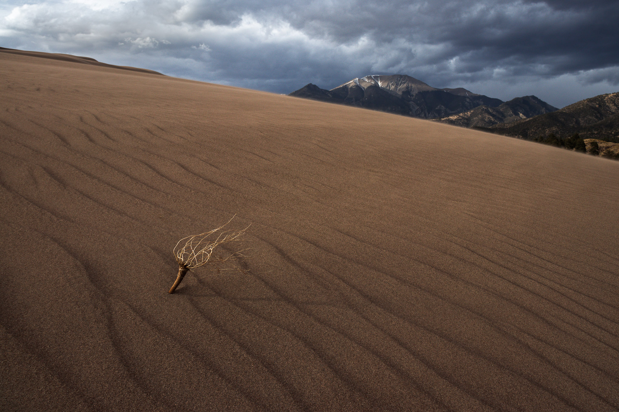
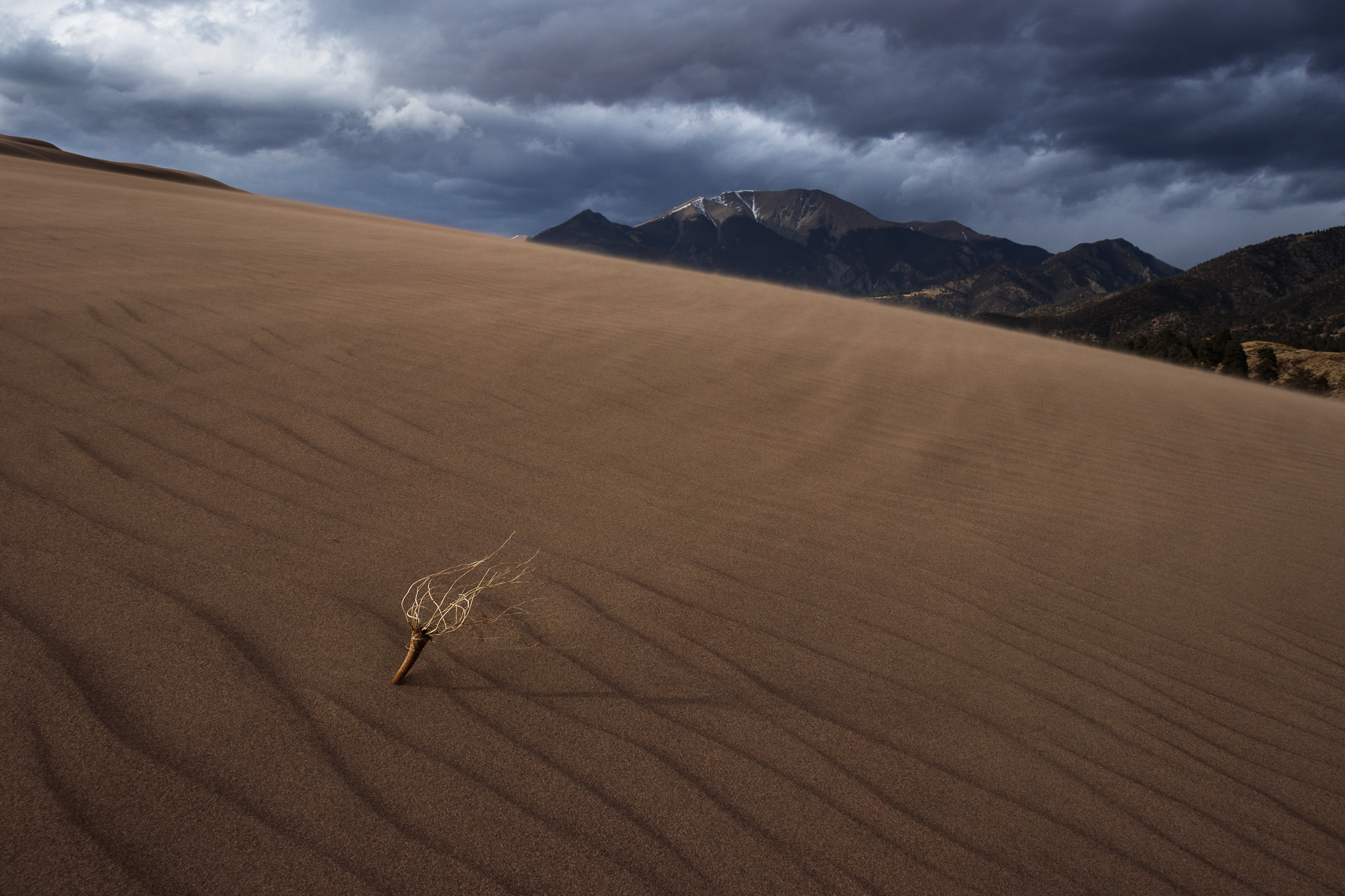
To see the differences more clearly, I recommend clicking the images above and scrolling between them. The most obvious change is that, in the second photo, I backed up a bit so that the plant in the foreground takes up a little less space. I think this is a good thing, because I don’t want it to outshine the mountain; they’re equally important subjects to my eye.
But there are other, subtler differences as well. For example, the mountain and plant are both a little closer to the center in the second image, so the viewer’s eye doesn’t need to jump as far between them. And – what ultimately won me over to the second image – the wind picked up, throwing more sand in the air and adding a fierce element to the middleground of the landscape. This complements the mood of the stormy sky overhead, and I think it makes the second photo more effective than the first.
Example Three:
This time, I’ll show a pair of very similar images where it was quite difficult to choose a favorite. Like before, I settled on the second photo, but it was even harder this time.
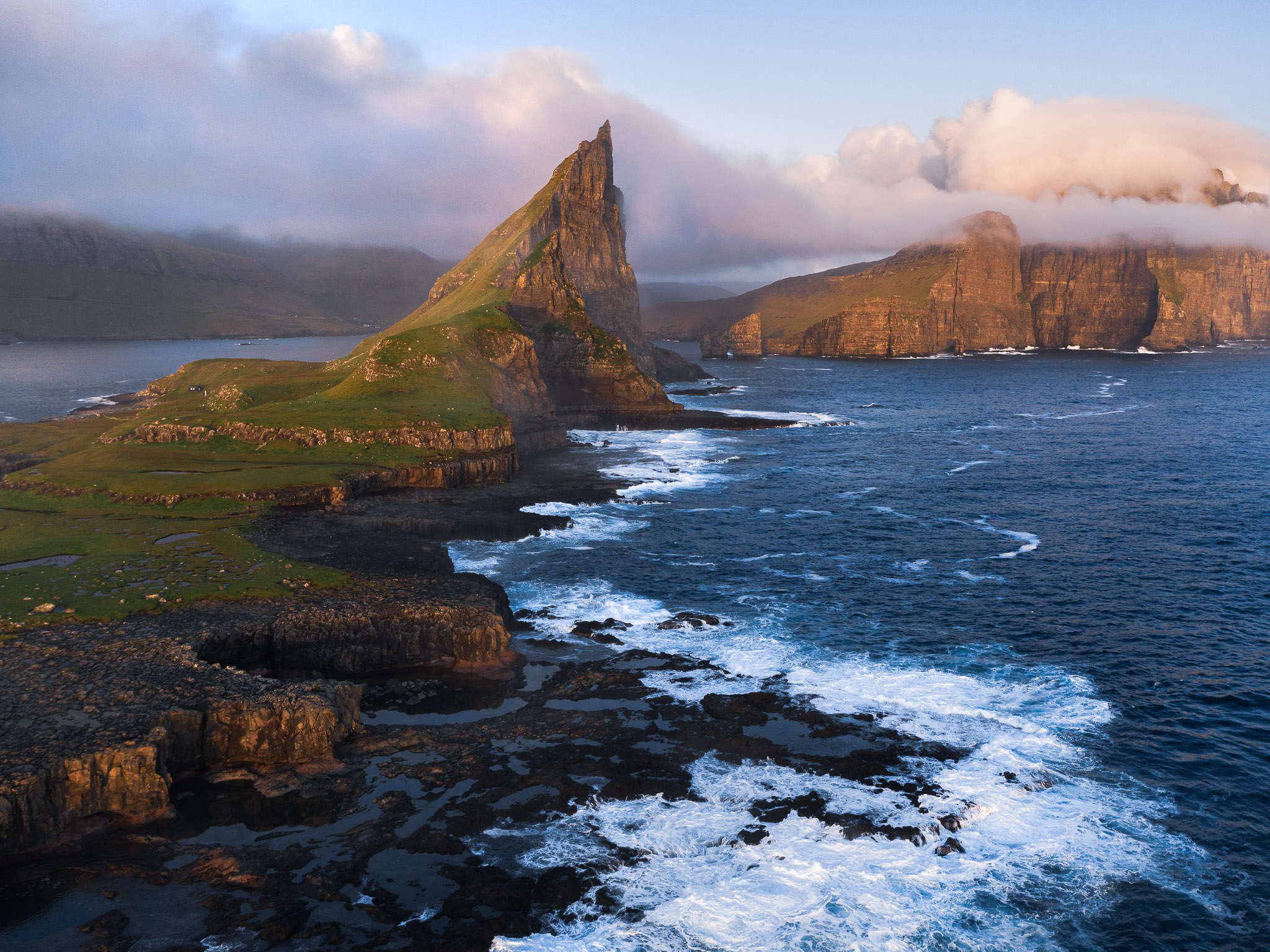
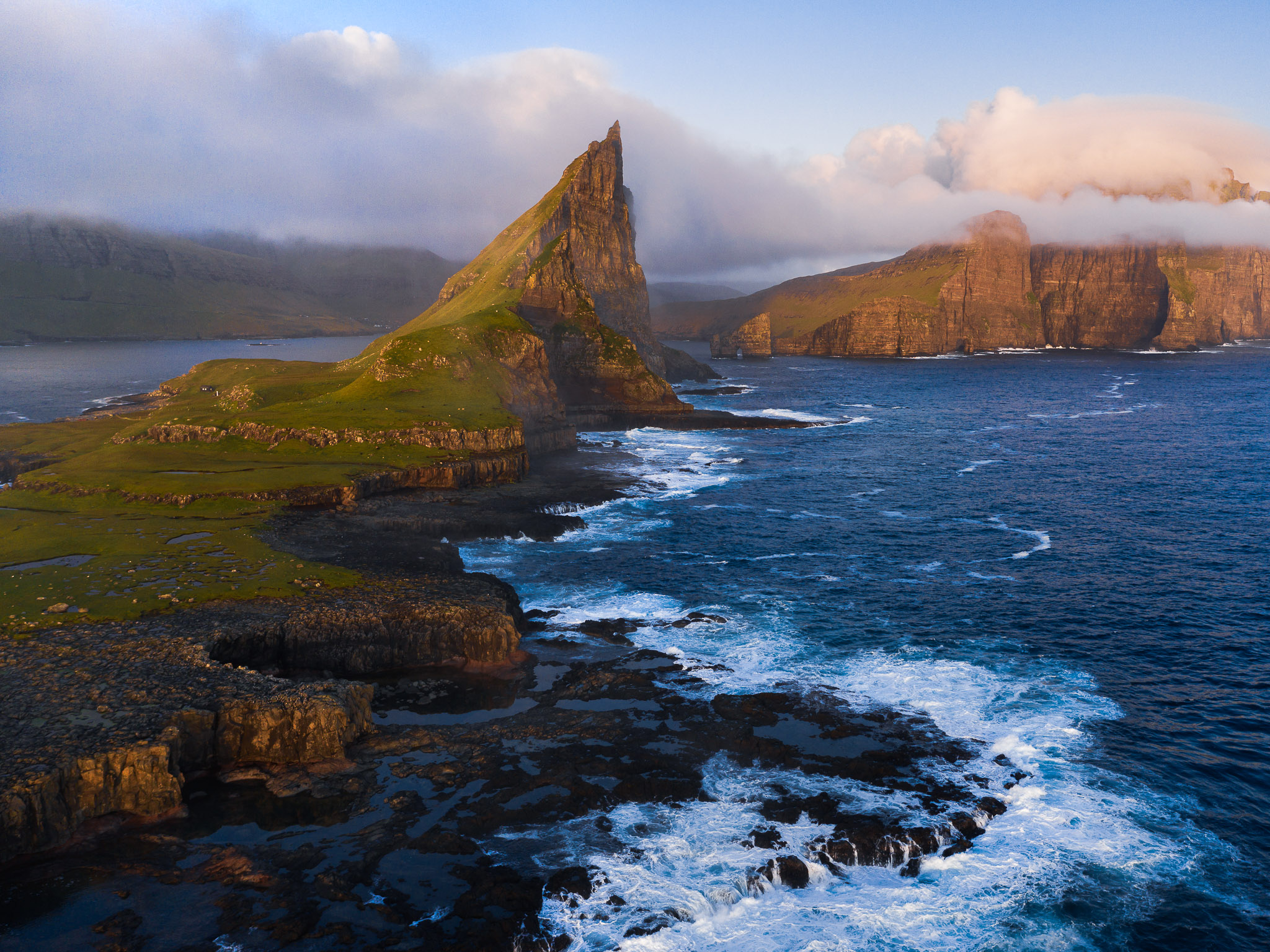
Here, the photos are so similar that it can be hard to see the differences without clicking between them. Still, after careful consideration, I landed on the second image as my preference. The reason is pretty simple – the wave pattern at the bottom of the photo allows for more of the island to be shown. In the first photo, the same area of waves is more of a distraction; it draws visual attention but doesn’t flow as nicely into the rest of the photo. The difference is definitely subtle, but often, it’s the subtle differences that matter when culling your photos.
Case Study
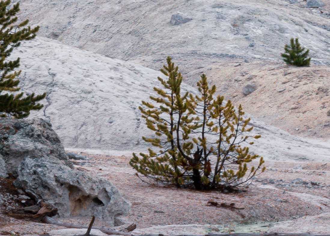
I’d like to end this article with a detailed case study. When I visited Yellowstone recently, the most dramatic landscape I saw was Roaring Mountain covered with vents of steam. It put on quite a show that day – I’ve visited in the past and didn’t see much “roar” at all.
I took seven different photos of Roaring Mountain as the landscape caught my eye in different ways. The photos turned out similarly, but not identically, leaving it up to me to decide on the best one. Apologies if this gets a little monotonous, but for the sake of completeness, I’ll show all seven versions below:
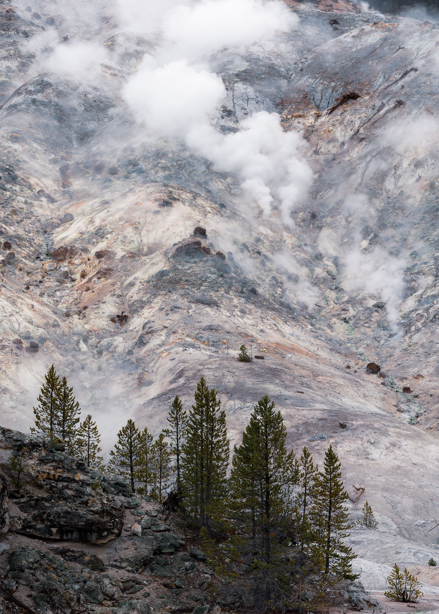
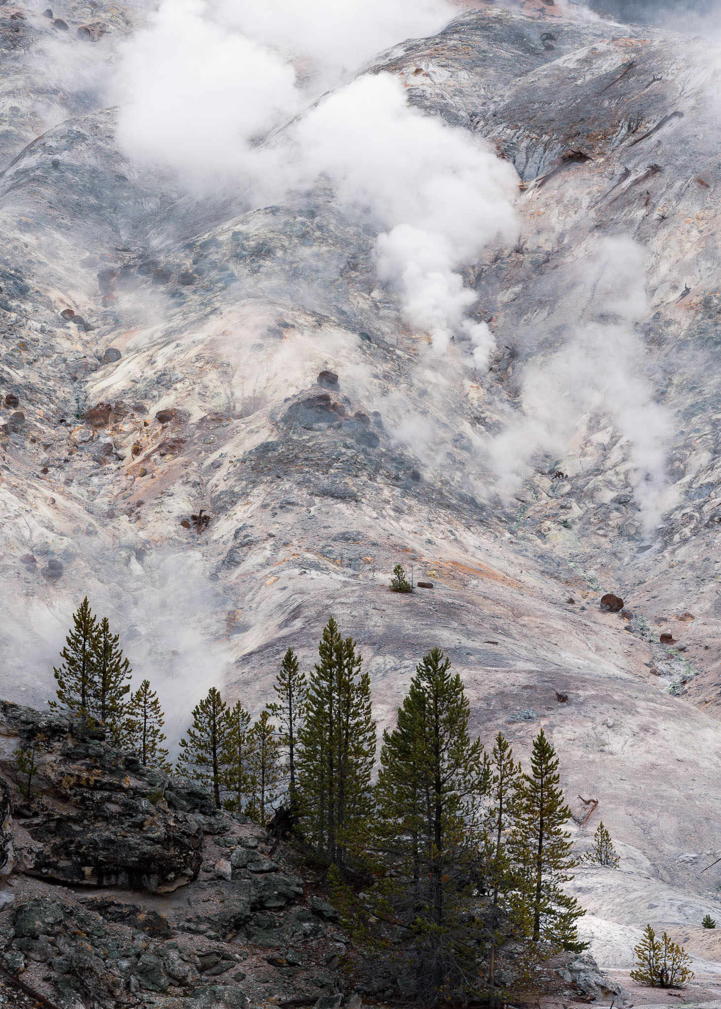
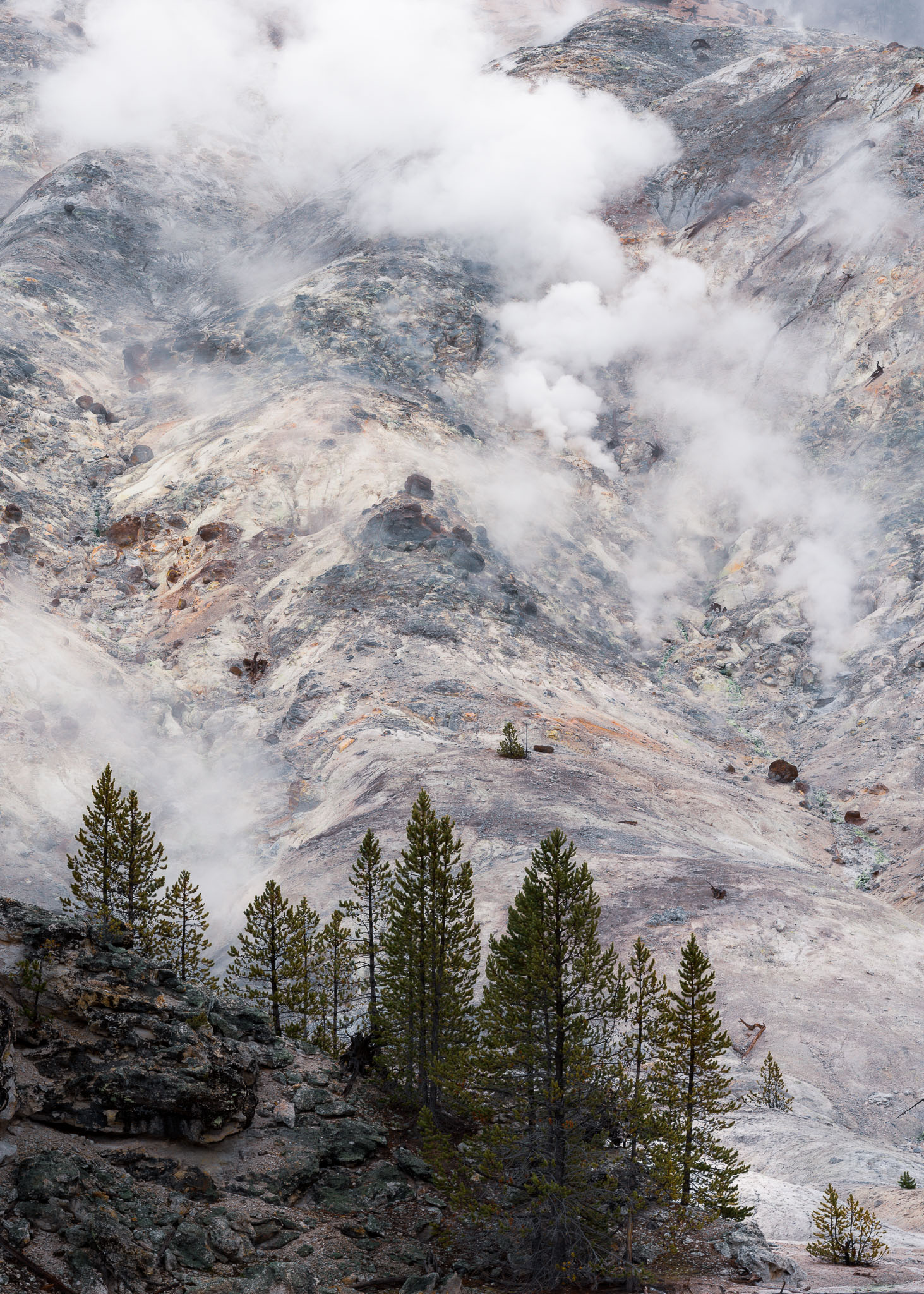
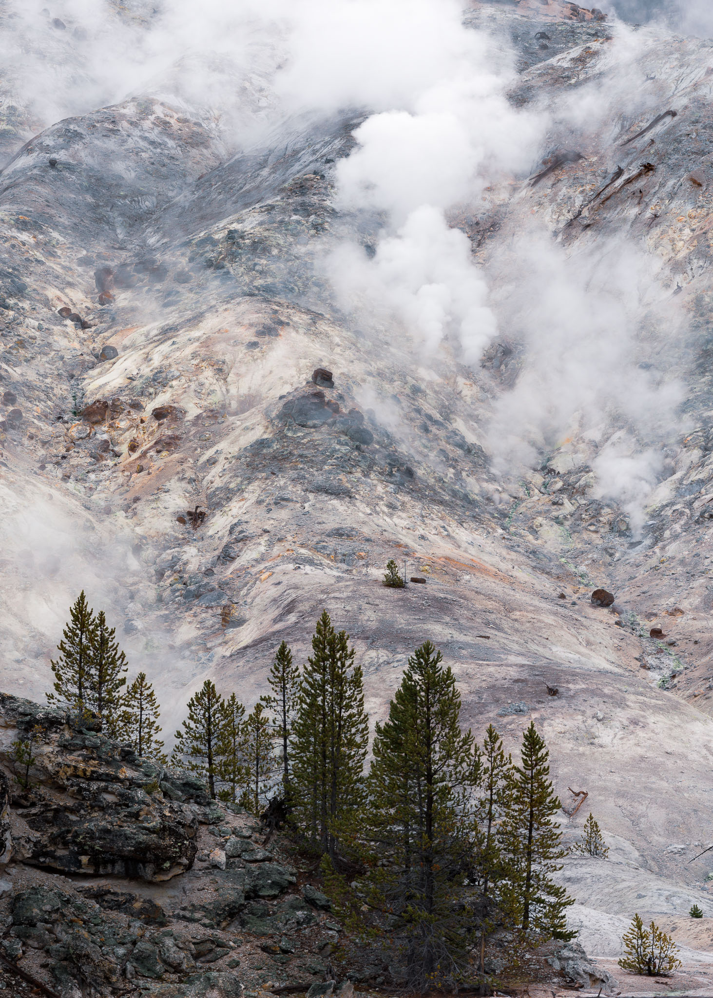
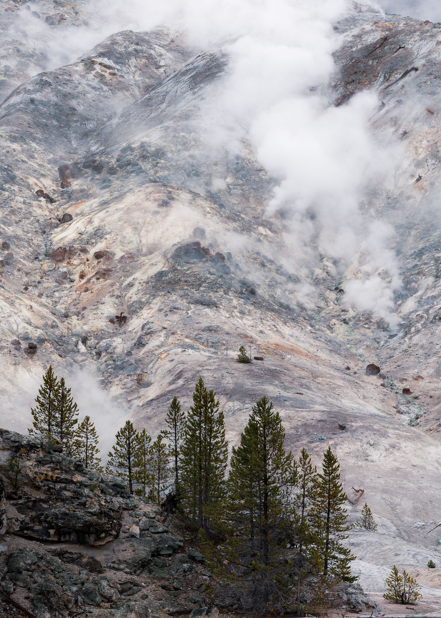
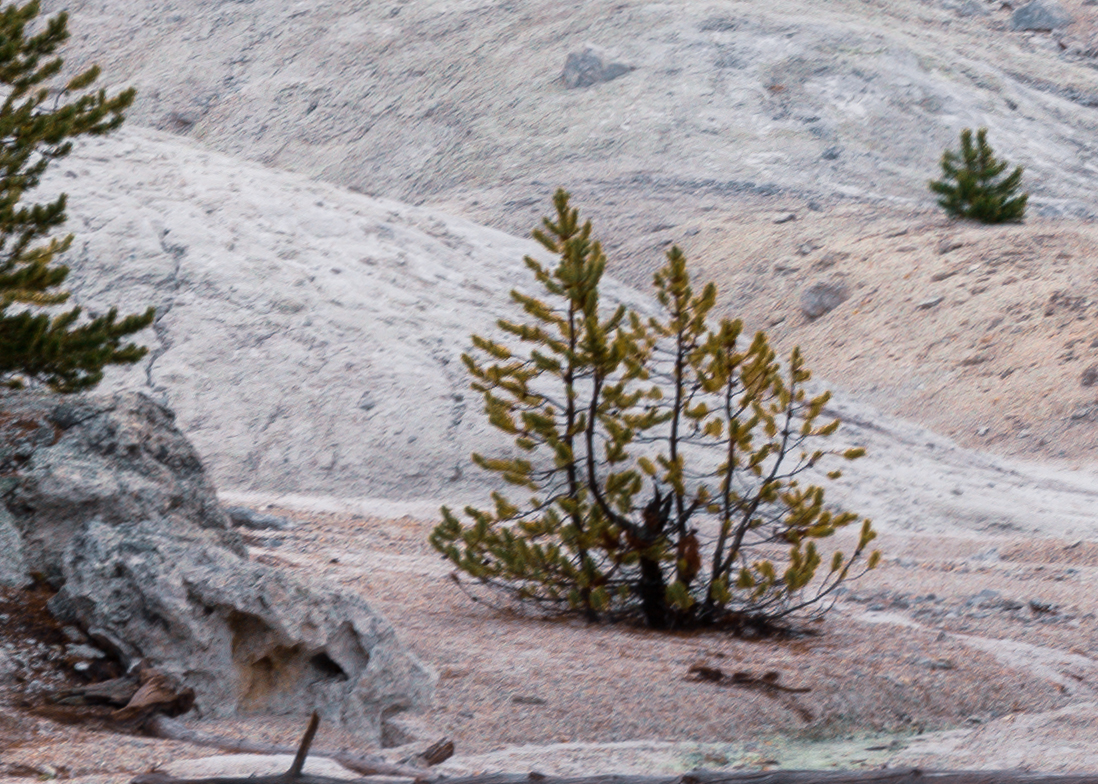
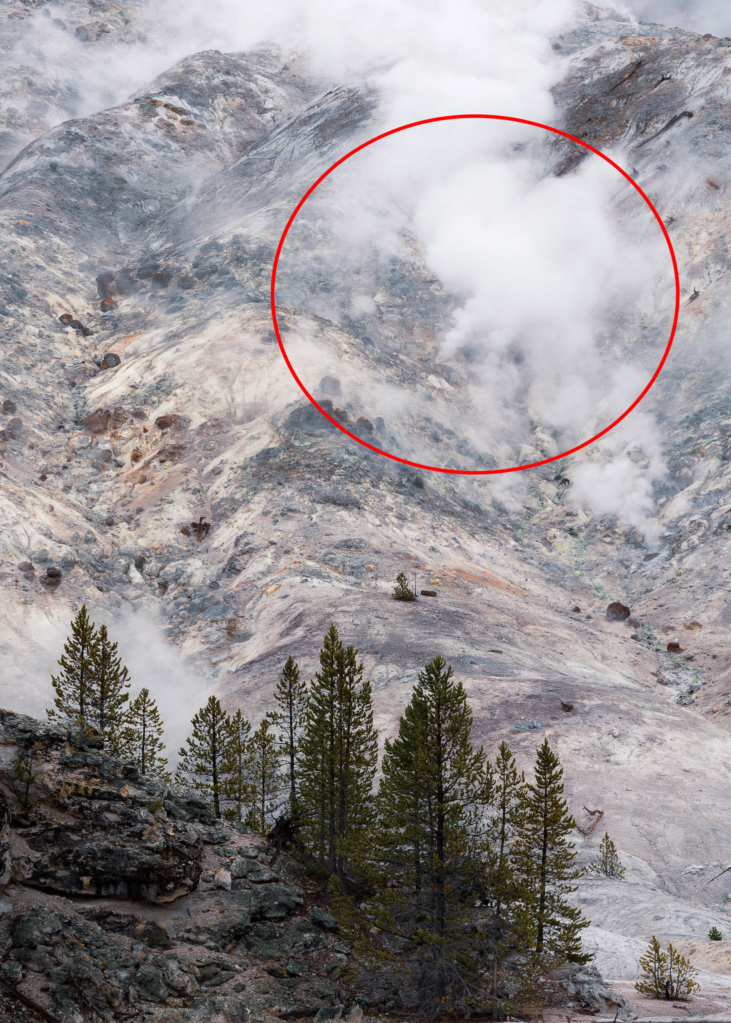
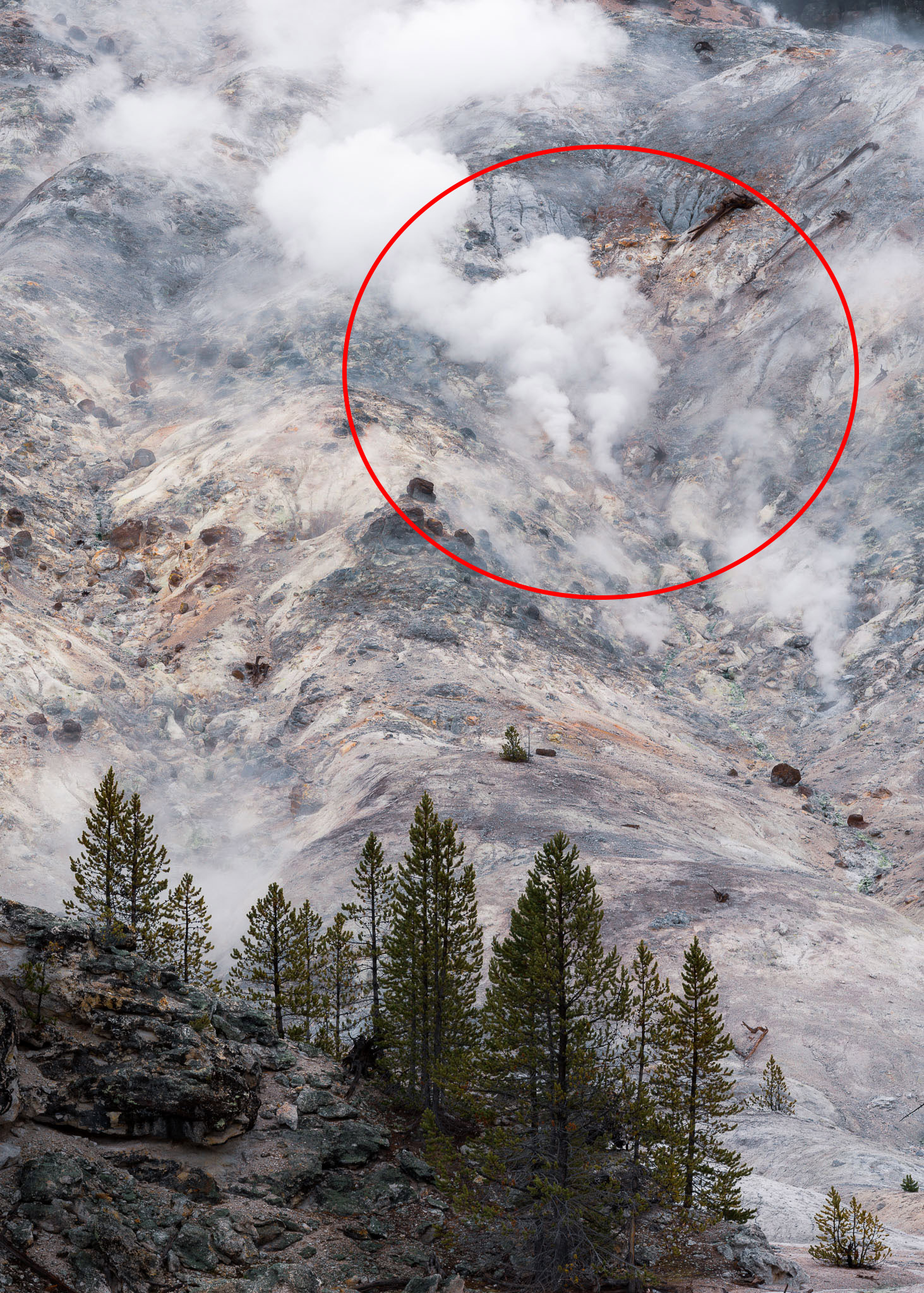
Step one of culling these seven photos was to check technical quality. I shot all of these images handheld on a cloudy day. My shutter speeds ranged from 1/200 to 1/250 second, which was on the edge of acceptable (given a 90mm lens without image stabilization). Handheld motion blur is usually the most significant in the corners of a photo, so I checked the corners before anything else. And indeed, one of these pictures was outside the range of acceptable sharpness. Photo #4 was eliminated from contention – here it is compared to a sharper image for reference.
Step two was to define my goal, or emotional message, with the photo. I knew that I wanted to convey the well-defined “smoke stacks” (actually steam vents) rising from the ground, giving the impression of a forest fire – yet making the viewer pause upon realizing that there are no trees on the hillside that could catch fire.
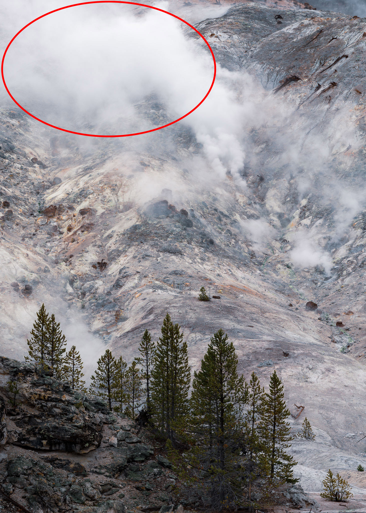
So, the best photo here would need to have well-defined steam vents rather than just a low-lying cloud or fog. Photo #6, and especially photo #5, did not fulfill this message, so I eliminated both of them from the set. Compare, for example, photo #5 versus photo #1 below:
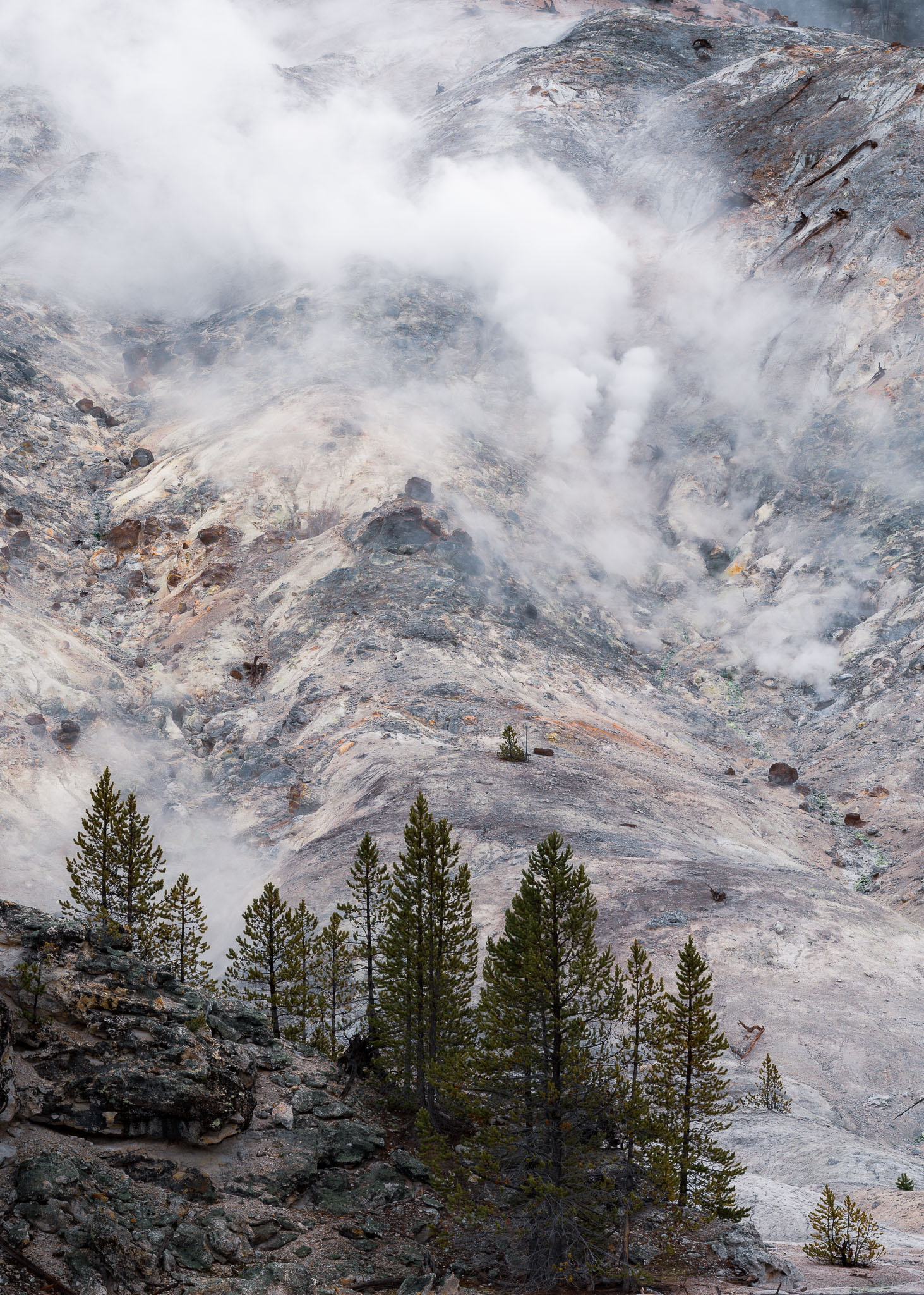
By step three, I now had four photos with good image quality and an effective emotional message. At this point, it was time to scan each photo individually for things that I didn’t like or that bothered me in some way. In this case, something that I didn’t like about photo #7 was the large, empty area at the top left of the image. The steam was just too thick in that part of the frame. Since I wanted to convey a feeling of complexity in my photos from this landscape, I knew that I wanted an image with more positive space. A large area of negative space took away from that, so photo #7 was eliminated.
Step four was the most difficult. I liked all three remaining photos a lot, and there wasn’t much left to differentiate them. This is usually the point that I’ll just scroll through all the remaining photos at different speeds and see if something draws me toward one of them, consciously or subconsciously. For your reference, here are the three remaining images again, which happened to be the first three that I captured of the scene:
I liked different things about each photo. For photo #1, I liked the tighter pattern of steam and how it revealed more details of the surrounding mountain. For photo #2, I liked how the cloud of steam at the top followed the contours of the mountain in the middle. And for photo #3, I liked that the diagonal direction of the steam added some tension to the image.
This final phase of choosing between similar, effective image is perhaps the most important. It’s where personal style comes into play the most. Everyone can eliminate photos that have technical issues, and it’s not too hard to eliminate a photo with a muddy emotional message. But choosing between similar photos that all work well is where the art of photography really comes into play.
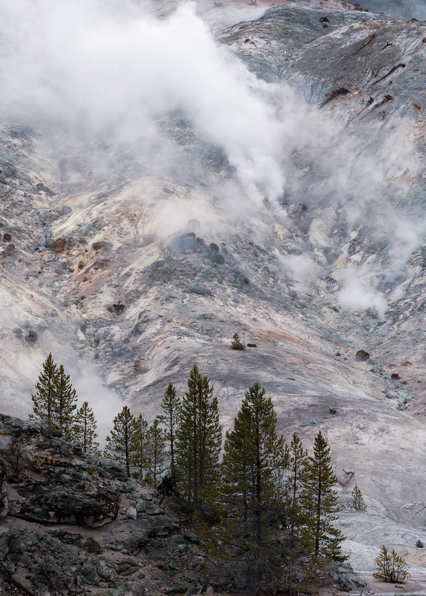
As I looked at these three images more, photo #1 is the one that I gravitated toward the most. I expect that different photographers with their own personal styles would have different preferences among these three photos, or maybe even prefer one that I eliminated earlier. There’s nothing wrong with that, but photo #1 ultimately resonated with me in a way the others didn’t.
In photo #1, the mirrored pillars of steam curve upward in a beautiful way, acting as a good anchor point and primary subject for the photo. The dance of the steam just felt exactly right – deliberate and harmonious. Meanwhile, the clouds of steam as a whole were smaller than in photos #2 and #3, allowing the contrast (and positive space) of the mountain to shine through. The longer that I looked at photo #1, the more emotional connection that I felt. It closely matched the way that this complex, yet harmonious landscape made me feel at the time that I was taking these photos.
So, photos #2 and #3 were eliminated, and photo #1 became my published image of this landscape.
Conclusion
One of the trickiest parts of post-processing your photography is choosing between two or more similar photos that you took. But it’s also a part of photography where creativity and personal style get to shine. There is no right answer; everyone will see it differently and have their own preferences. And that’s precisely why your choice is so important. It’s a distinct reflection of how you personally see the world.
Don’t fall into the trap of thinking that just because the photos are similar, it doesn’t matter which one you choose – it matters a great deal! The little things add up in art, and choosing between similar versions of a photo is the perfect example. I hope this article gave you some inspiration to cull through your similar photos more carefully.
I find that if I switch to the grid in Lightroom and set the size so I can view roughly six similar images at a time, there is almost always at least one that catches my attention or stands out in the group. With few exceptions, I’ve stopped second guessing myself and started trusting my eyes and gut reaction, so I simply go with that one. If there are two or more, I’ll spend a few more moments comparing to make the decision, but even in this case there is still often one that really grabs your attention first.
While some people will see my images in a magazine or on a computer monitor, most will view them on a small phone screen. Therefore, I believe that if an image catches my attention or stands out among other similar photos in the grid/tile format, there’s likely some “magic” in that one compared to the others, whether I can pinpoint what’s special about it or not (often I can, sometimes I can’t, but it doesn’t really matter either way).
That’s a good approach, I like it! Makes sense, it’s a good way to gauge people’s first reactions to a photo.
I always enjoy your articles, Spencer, and appreciate your attention to detail and sharing with us a practical yet daunting task. Your methods are very similar to mine in looking at the details once the obvious cull has been completed.
I also enjoyed going through each example first hand. A great exercise! :)
Thank you, Cristen! Glad you liked it.
great advises and great process description!!! Thanks!
Thank you, Robert!
“There is no right answer” is the correct answer.
my own process begins with culling in the viewfinder, then in the field — so i’ll have fewer files to edit in post. for me, there’s nothing more vexing than coming back to the studio after a long day’s shoot and facing several more hours of culling and processing , just to do it all over again the next day. it’s a costly drain on creative energy.
however — and there’s always a however — it’s equally important to understand how your photos will be used before discarding them forever. in the publishing trade, portrait mode might lend themselves better to covers, and landscape mode for banners and spreads. one may tempted to discard a photo for some personal nit — just to discover it can’t be monetized by another editor due to some other flaw. for this reason alone i encourage some redundancy.
even within a similar orientation — for example the ice blocks in the volcanic sands near the ocean above — one photo might be more appropriate as a ‘stand-alone’ in a picture frame, and another better for ‘type treatment’ laid atop it. one photo might conflict with one typeface yet not another. those are editorial decisions the photographer isn’t typically in control of — but the client. the photo complements a purpose and may not be the sole purpose alone. a diversity of photos will better fit a diversity of purpose.
if we’re just shooting for ourselves, and for the efficiencies of culling duplicates, the best we may hope for is to tailor the culling process to our personal priorities at any one time. next year might demand other considerations. in short, there is no one answer — and that’s my two cents. :)
You bring up a lot of good points. In any publishing industry, it’s not just the innate qualities of a photo that matter, but also how well they allow text to be overlayed, how well they fit the theme of the project, and many other considerations.
I also want to highlight what you said about your own process of culling beginning in the viewfinder. That’s a great way to put it! The best way to delete a bad photo is not to take it.
I really appreciate the chance to be taken through someone elses approach to this subject, and its very gratifying to be able to see similarities between my own home brewed process and the one you outline. I generally find that technical fails disqualify most of the contents of my memory cards, but the remainder still benefits from a thorough winnowing – and far too many people just don’t do it – you get shown every shot they took on the day…
Perhaps if the the subject was discussed more, the value of selecting “the one” would be more generally realised!
Thank you, David! You bring up a good point, I think we’ve all sat through slideshows where three or four photos in a row are totally interchangeable. It’s not just your artistic sensibilities that will appreciate choosing the best one – your audience will appreciate saving time, too!
Thanks Spencer for such athoughtful piece.
In film, as in books, there is a rule that the photographer/cinematographer/writer hands over the raw image/script for editing by others; have you tried that? One issue I have is that I recall just how hard it was to get an image so that I place a greater emotional aspect to one frame or clip over another.
The second observation is to turn the image upside down. This way you might start to notice imbalances in brightness, tone or color that you didn’t notice before.
Put those two together and it is amazing to see how quickly 100 photos get culled down by a picture editor to just a few (and sometimes it’s disheartening when cherished shots are so rapidly dispatched into the “out tray”). Despite the humbling, it is a great learning curve booster!
Best wishes to you all – Paul C
Thank you, Paul! Good timing – you may be interested in an article that Libor is about to publish on that very topic.
Great post with valuable insight into something I frequently do during post-processing!
Thank you!
Thanks for a well-written article on a rarely addressed topic.
When I face the dilemma of choosing between a number of similar photos, they’re usually macro photos of butterflies or other insects. The combination of very shallow depth of field, a subject that’s often on a plant that will be moved by any breeze, or by my own movements, possible movement by the subject itself, and my getting increasingly shaky in awkward positions as I age, mean that if the subject stays in place, I’ll take lots of shots knowing that some will come out better than others, but not being able to judge how good they are until I get them on the computer. For butterflies with their wings folded, or spread really flat, the key feature is how sharp they are in different areas, and which areas to prioritize. There can also be choices between low ISO photos with the potential for excellent IQ, and those with higher ISO to allow smaller apertures for less restricted depth of field, and faster shutter speeds. If the insect is moving on its plant, I’m also asking myself which is the best angle view of its body, and which is the best background.
Looking at your examples, I was intrigued how different my preferences are to yours.
For Example One I prefer Photo #1. The lump of ice looks as I would expect, while the conical shape of the back of the lump of ice in Photo #2 looks weird; fascinating, and well worth keeping for that reason, but not as attractive. (But perhaps that weirdness makes it more striking to include in your portfolio.) Also I consider the breaking wave in Photo #1 more exciting, although I think a rather faster shutter speed would have improved it even further.
For Example Two I don’t have strong views; I like the more gritty texture of the close-up sand in Photo #1, but I think I would have had to be there to decide between that and more movement in the sand in Photo #2.
For Example Three I share your preference for the rock shelf being more visible and better defined in Photo #2.
For Example Four I latched onto Photo #1 quickly once you’d given a reason for eliminating Photo #4, because those are the only two that show the rock a little way above the centre clearly. But I also agree with your other reasons for choosing Photo #1.
Thanks for the tip to look for motion blur in the corners. I had assumed that as lenses are normally at their sharpest in the centre, that is where any spoiling would be most obvious.
Much appreciated, Chris! That makes sense, it’s clear that photographers will have their own preferences. I’m glad with my choices here because they reflect my personal style, however, that personal style will be different for everyone.
Macro photography takes this to another level, although if there is anything positive to take away from the challenges, it’s that there are probably more photos that can be disregarded for technical issues! At least that’s the case for me whenever I do handheld photography at 1:1 magnification. Some out-of-focus blur is very typical, with pin-sharp photos the exception.
Spencer – Well presented and significant topic. I tend to shoot multiples all of the time becuase my holds are not always steady and a tripod/monopod is not always practical. Therefore I am always culling 75-90% of what I shoot.
It is interesting to consider how we evaluate our shots. For instance, on the drone shots of the coastline, you preferred the shot showing more of the rock as a complement to the remainder of the photo.
I, on the other hand, preferred the shot with more water because I found the excees black to be distracting. Our choices will differ – a good thing when you have multiple options.
Thank you for a good presentation of a critical topic that we must each have a method to implement.
Thank you, JAS. You’re absolutely right, no two photographers will see things exactly the same way. And thank goodness for that, it would get boring otherwise!
Good topic, in time the culling process has become more relevant and time consuming, simply because of the changes from analogue to digital and the advances in digital imaging to a point a camera can make about video speed photography.
As an event photographer i was happy in the analogue days to have one sharp coarse grained photo (BW-1000asa) of some music gig out of 36 images on my film.
To find it I had to develop the film, make a contact sheet ; and find under the enlarger the best photo.
Now I make a 1000 or more photos on an evening. Thanks to Fast Raw Viewer ( and a fast harddisk) i can select the best ones very quickly. I keep about 25% , and I make mistakes of course
luckely you cannot remember if you by accident choose the wrong one… as if it never was there. My costumers also don’t know…
I’m just glad I’m not a wildlife or event photographer! With landscapes, I’m usually only deciding between a few different variations rather than dozens.