Central composition is considered by many as downright boring. Here is what I say in return: cliché. When used well, I absolutely adore central composition, there’s nothing else quite like it. Of course, there is a strong reason why so many photographers, when giving advice to beginners, start with the phrase “don’t put your subject in the middle”. So, in order to see central composition for what it really is, perhaps we should first understand why it’s so avoided. And the reason for it is surprisingly simple.
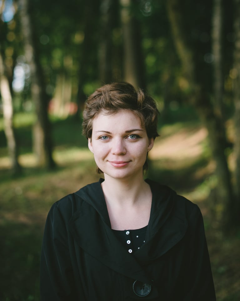
Everything Starts Here
Meet Joshua. He is a man in his thirties, your average Joe. He has a job, a beautiful wife and three adorable children – two boys and a girl. He’s never had much experience with photography aside from the usual snaps with his phone, but he’s just bought a camera to photograph his family. He picks it up to take a portrait of his youngest son, frames the scene and snaps a photograph. Now, tell me, where do you imagine his son, as an element of composition, is placed within the frame? Exactly. Dead center.
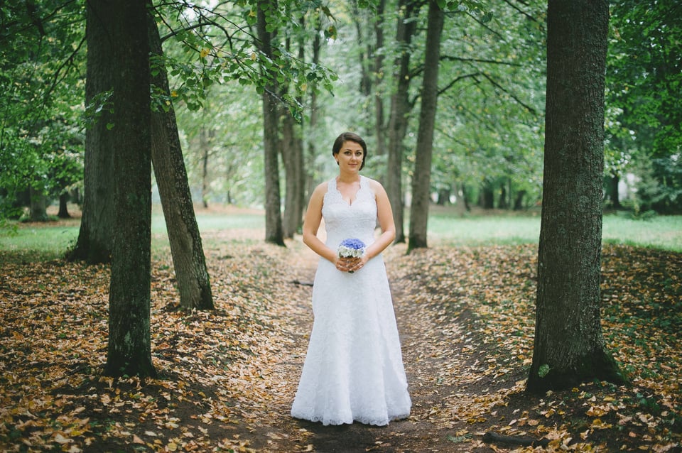
I cannot say for sure why that is, but central composition is the very first choice one makes when composing a photograph. Only a while later do we learn to deliberately place our subject off-center, and only some time after that do we learn to do it subconsciously. Perhaps it’s because one expects the camera to focus on the center portion of the frame without even thinking about it, perhaps because one expects to find something in the very middle. Perhaps because it is the most obvious point of intersection of lines that go from one corner towards the opposite one. I do not know.
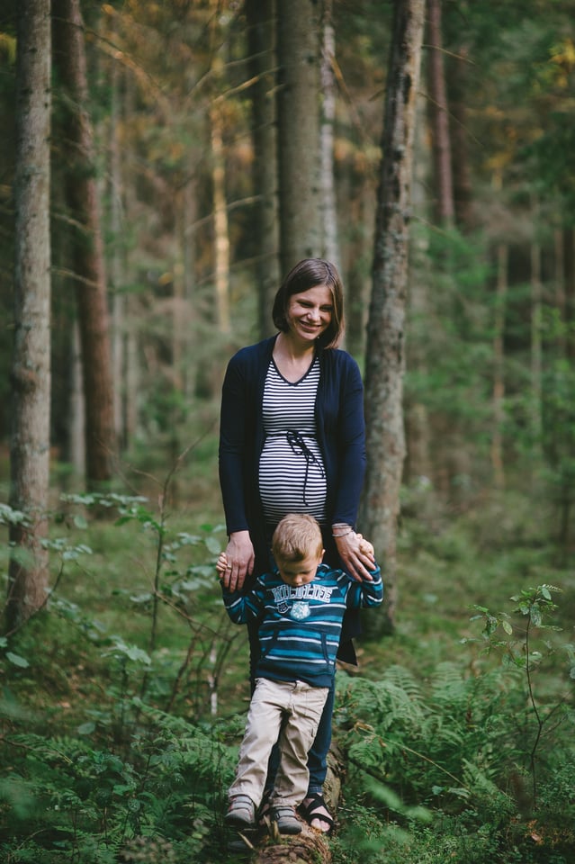
All I know for sure is that this is what we learn to do first and foremost and something that takes quite a bit of time and effort to unlearn again. Because of this, “don’t put your subject in the middle” has become such a popular phrase and lesson. Place your subject close to the left or right third of the frame and voilà, your photograph instantly stands out from the crowd and looks more “professional” and creative. Some modern cameras even have such guides built-in whilst others, I hear, actually compose the image for you by recognizing the subject’s face in the frame and cropping the image accordingly. Scary.

The Good Bit
The problem – or, perhaps, solution – is that so many people (you may have noticed how many have taken up photography in the last decade or so) now avoid central composition, it has become the standout choice. Everyone knows the rule of thirds. Not that many people know how to properly compose the subject in the middle or when to do it. I will not claim I have learned to do so, but I certainly am trying to.
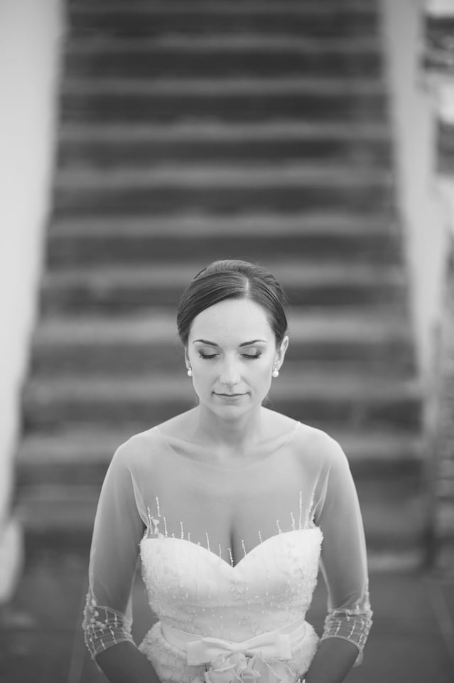
You all know the saying “less is more”. A few years ago, I remember talking to one of my lecturers when he voiced something I’ve been thinking for a while up until then. He said, simplicity is something one must grow and mature to like. Here’s a weird metaphor – it’s like olives. Some like olives, others can’t understand what is good about them, but most of those who like them did not at first. They had to grow to like them. And so with composition, at first it’s “oh, look at this, and that!”, and only later does it change to “don’t look, feel”.
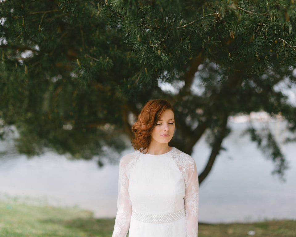
Central composition is the simplest one of all. It’s less, which in some cases turns out to be more. Central composition is often calm, static, honest. By composing your subject in the center, you are basically placing him in front of the viewer as if attempting to introduce them. It’s… open, as in “an open book”. It’s naked. It also helps emphasize the space (assuming it’s there in the first place) around your subject as it becomes the very thing that leads the viewer’s gaze towards where you, the creator, intended it to go. Perhaps Ted Kozak’s portraits can support my point.
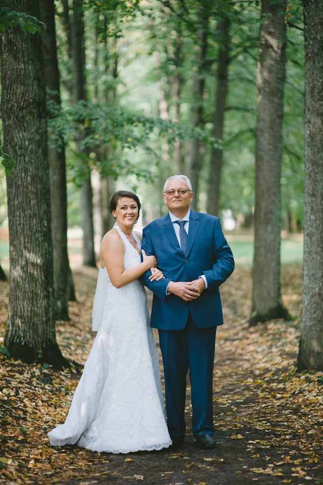
Now, I said simplicity and, by extension, central composition is something many need to grow to like. That is not to say there is something wrong with you if you don’t like it! One does not have to grow up, more like… grow sideways, if it makes any sense.
Final Words
I am being very subjective here in my praise of such a way of composing your images. I adore it. It suits me, it suits my love for negative space, my choice of mood, subjects and locations. You could almost call it a whisper of a slowly emerging style. I do not use it all the time. If I did, it would become boring and predictable. Curiously, after writing this article and looking for image samples to support it – either those more serious or otherwise – I noticed I don’t use it enough. If I am to learn to master this type of composition, I ought to put more effort into it. And yet I use it. Your style, your taste might be completely different and that is fine.
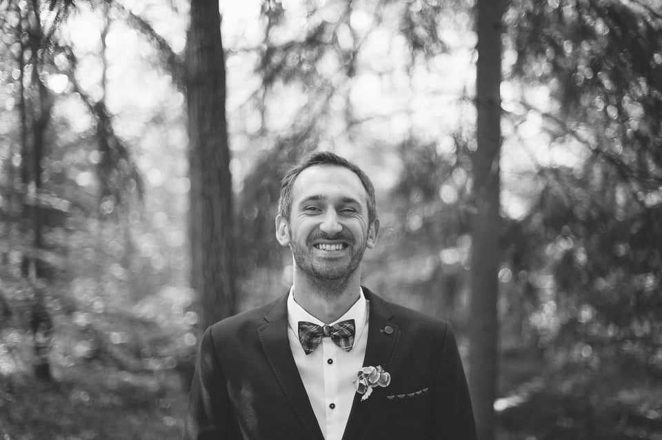
The most important thing to understand is that, while central composition is often synonymous with simplicity, it has nothing to do with that which is basic. I’d go as far as say there is absolutely nothing basic about composition in general, it is something you learn, improve and change throughout your life as a photographer and an artist. Now, olives are olives, I am sticking with them. But composition, well, I certainly hope there is more to grow to like after this.
Just read your article. I think the photos, which benefit from central composition show more or less symmetry. That is why they are looking good. If you don’t create symmetry they usually look more like snap shots. Just my opinion.
I don’t agree. Olive is just not olive.
There is many sort of olives, many way to prepare them. More you grow as a person, more your taste in olive will change.
What I want to say is this: there is always room for change. Room for improvement of course (technically speaking) but more important for change in general. Everything change, all the time, and so for the olive taste. It may subtle, but the most subtle thing can become the most important thing. It’s particularly true in my opinion in photography.
I love olive.
Go easy on the olives there Matthieu ;)
Nice examples! I think many if not most photographers often if not always get caught up in the importance of their capture over the importance of their subject. I see Central Composition as a very simplistic straight forward way to keep the subject more important than the photograph itself. When I take a picture of my beautiful mother, I want the focus on her, not on how “good” my picture is. That is what I think makes Central Composition great.
I love your photos, I noticed (and love) you taking central shots well before I saw this post. What I don’t love – and no not because it’s cliche but because it’s really distracting, is when something looks like it is growing out of someone’s head – and you kinda do this a lot lol! I thought I’d mention it in case you didn’t notice it. Other than that, I love everything you do, from your photos to your tutorials to your reviews. Keep it up please! To you and Lola, with peace.
I think that these are good pictures and the subjects would be very pleased with them, even if the wider photographic community finds things to nitpick.
Something I am trying to do is separate what I look for as a photographer vs. what brings out the best feeling for the subject when they review it. I have developed this based on seeing what photos my subjects like vs what I would have chosen, I find that they sometimes break several of the photography tenets of composition and posing. Since doing that my idea of a good photograph has changed.
Some photos make the subject and their families pleased and others make the photographer look good, they don’t always coincide but the former is way more important. The photos above could be improved in some areas but i think they capture the spirit of the people.
Hi everybody. From my observation, central composition (even dead center) is actually nice for a fairly large subject(subject/frame). For a smaller subject, it is preferred for the subject to look straight to the camera. My rule of thumb about portrait composition is the larger the subject, the stronger its gravity to pulls frame toward its center.
The reference to Ted Kozak’s photos is a very good contradiction to the author’s whole discourse.
I think the idea of the subject being “in the middle” is definitely off target.
In Ted’s photos, one can clearly see that even though many of the images depict the subject located evenly between the left and right frame of the picture, there’s a very subtle and deliberate two-thirds spacing vertically.
The heads are most definitely located in the upper third of the pictures and if it’s a full-length picture there’s one third of space below the feet and two-thirds space above the head.
There are photos where the subject in focus is located on the third with other similar objects forming a lead-in line, even though the three might be “centrally” located! The other subjects are out of focus, giving a definite location on the third/golden point for the main subject.
Having things “grow” out of the subjects head is definitely disturbing because it make the subject extend totally out of the top of the picture with a disruptive change in texture, colour and line.
I would suggest that if one is to locate the subject “in the middle” it should be with reference to the right and left sides of the image whilst being careful to either have the face in the top third or else for a full length photo have the space at the bottom equal to about half of that for the space above the head.
Just my two-pence. use it, don’t use – it’s up to you.
Thanks, Kevin! I never implied that center composition means dead center. We are not mathematicians, are we? :) In my examples, I mostly by saying central composition I mostly mean placing the subject centrally according to the y axis, and not necessarily according to the x as well.
In any case, thanks!
Eh, I am sure the rule can be broken, but most of these images don’t pull it off at all, instead look very amateur. This is the problem with breaking compositionsl rules., if you don’t pull it off you look naive
I’ve no idea what your name is, so I can’t address you properly. Forgive me. In any case, thank you for your comment – there is most likely lots of truth in what you say. But then, I never said I was good at this. Just that I want to be :) Just a human being here, learning all the time. There are plenty of readers here who are much more talented than I am.
Again, thank you and good luck.
Well if it’s good enough for Leonardo and ‘Mona’ ….
Romanas, I really like the photo that is 6th from the top. She is not smiling but she appears to be at first glance. Is she even posing? Did you ask her to pose for this or was she just moving around when you took the photo? I don’t think it was a pose. Her face and hair are placed at a strange angle. It seems she was moving her head sideways and you took the photo. It is a beautiful photo. Mysterious.