I’m sure that most of you have heard about the rules of composition in photography. You know, rules such as keep your horizons level and follow the rule of thirds. Well, a question I sometimes hear is, “What will happen if my subject isn’t at a third point?” The short answer is nothing! To be truly creative, you should know how and when to break the rules. In this short article, I want to give you a few ideas for producing creative images, while throwing the rule book out of the window.
Table of Contents
Myth No. 1: Always Place your Subject Along a Third Point Line in Your Frame.
The theory behind this rule is based on the idea that your image will be more balanced by locating your subject at one of the intersecting third point lines in your composition. However, if you want to add tension to an image, try placing your subject near the edge of the frame. Because your subject is not in a typical location, it will force your viewer to pause and take a second look.
In this image, not only is my horizon very low, but I place my subjects in the bottom right corner of the photograph. In addition, I also caught them exiting the frame. Typically it is advisable to give your subject breathing room. Having them walking out of the frame added even more tension to the image.

In this shot, I opted to place my horizon near the top of the frame. Putting it here emphasized the patterns in the sand, rather than the sky. Because the horizon line is so high, it forces the viewer to ask “wait, what am I looking at here?”

In today’s world of social media, viewing images at lightning speed is the norm. Any chance you get to slow your viewers down, while they are swiping through their feed, is a victory.
Myth No. 2: Never Amputate your Subject’s Limbs!
When you are composing an image with people, you should never cut them through a joint, such as their wrist, knee or neck. OK, most of the time this is a good idea. However, there are instances where your subjects will survive aggressive slices, and will not hemorrhage all over your photograph! When you cut off a body part, it forces the viewer to ponder what is missing. They have to complete the story in their imaginations.
Here are three images where I have cut off the subject’s limbs. In one shot I even beheaded a person! I can confirm that all these people survived my creative choice to amputate. By making this creative decision, I believe I have added a bit of mystery to the images that would not have been there had the entire subject been shown.

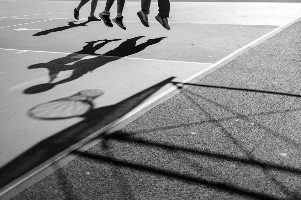

Myth No. 3: Make Sure Your Horizon is Level
I must admit that one of my pet peeves is seeing images where the ocean is draining out of the side of the photo. Because our brains are wired to know that the world is flat, photographs where the horizon is slightly off don’t look quite right. However, intentionally tipping the world off-kilter can be another effective way of adding tension to an image. With a wildly skewed horizon, it gives photographs a sense of excitement, whimsy, and surprise.
Just make sure if you are going to create an image with an unleveled horizon, that you do it with gusto. You want to make it clear to your viewer that your choice was intentional and not accidental!
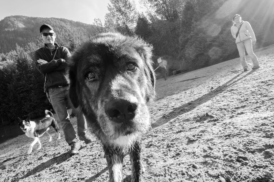

Myth No. 4: Fill the Frame with your Subject
You don’t need to fill your entire frame with your subject. Using large areas of negative space creates striking images. This type of approach emphasizes the importance of your subject and creates a sense of scale.


Myth No. 5: Simplify
Having a lot going on in your frame isn’t necessarily a bad thing. Good storytelling images often have more than one focus. Consider these two images below. Because there is not a primary subject, your eye wanders through the frames. In doing so, the viewer finds several vignettes in each image. These vignettes combine to tell the story about the scene.


Often the success of these types of images relies on a bit of luck, and good planning. With such a complicated scene, make sure that your background is uncluttered so that it doesn’t compete with the elements of the story. And, be ready to react quickly as your story unfolds.
Myth No. 6: Make Sure You Correctly Expose Your Photo.
This myth may fall slightly outside of the rules of “composition”; however, I feel it is an important point to bring up when we are talking about creativity. I often hear experts say “Make sure you don’t clip your blacks or whites.” With today’s advanced sensor technology, cameras are getting better and better at capturing a larger dynamic range. However, don’t be afraid of dark shadows and blown out highlights. I often pull down my blacks to deepen my shadows. This creates a feeling of mystery and tension. I like to leave my viewer asking “what is lurking in the darkness?”
Here are three images where large portions of the frame are black. To create images like these, look for areas where light and shadow play together. Underexpose your photograph, so the shadows become blocked up, leaving the highlights exposed correctly.
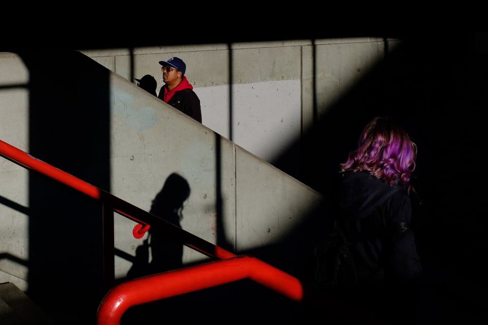
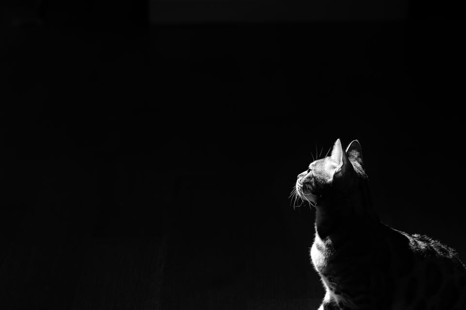
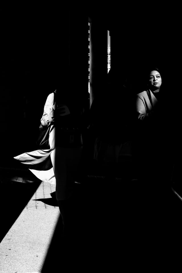
In this image, I set my camera up to capture a high contrast black and white image. In post-production, I accentuated these extremes even more. The result is a photo with powerful graphic elements.

Myth No. 7: Make Sure Your Subject is Sharp
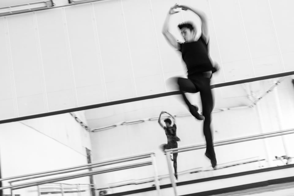
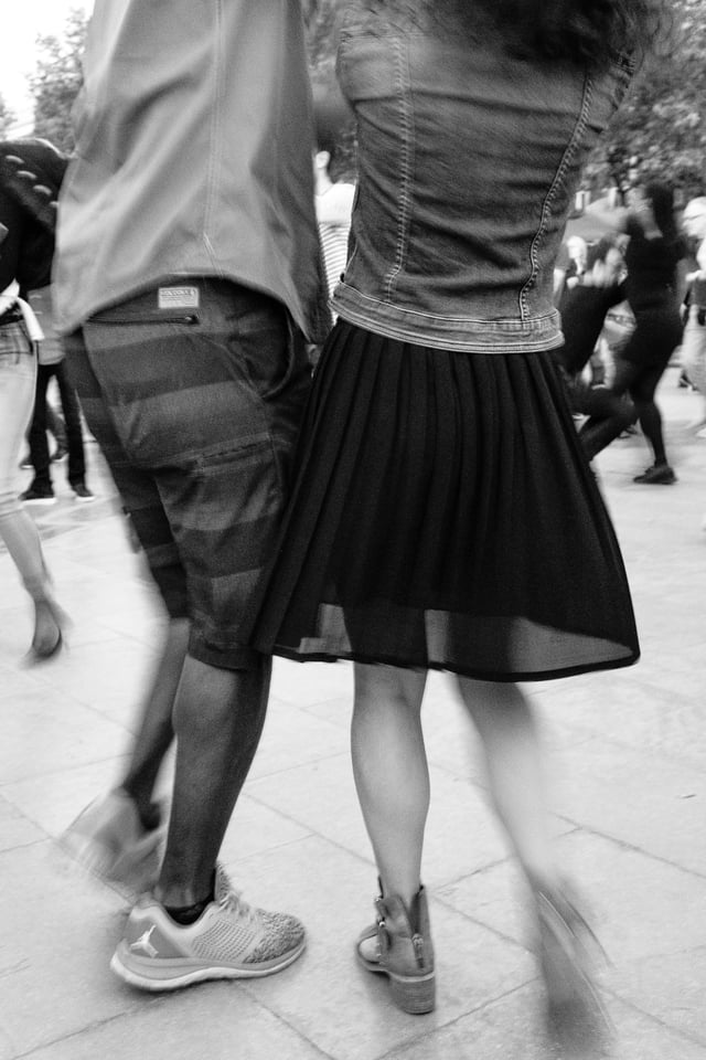
Henri Cartier-Bresson’s quote, “sharpness is a bourgeois concept,” dismisses sharpness as a critical characteristic of a good photograph. I couldn’t agree more! Pixel peepers may disagree, but crafting a beautiful image does not hinge on sharpness. A slight softness produces an airy, ethereal feeling to images. It can also provide a sense of movement and flow. Don’t get hung up on creating tack-sharp images.

Conclusion
The best way to grow as a photographer is to shoot often. And while doing so, don’t get bogged down by the “rules” of composition. Instead, use them as guidelines. Experiment with your photography, and allow yourself the freedom to break those “rules” sometimes. If you do this, you will inevitably learn to see more creatively. And one last thing, don’t forget the most important rule in photography. That is, to have fun!
Excellent explanations! Clear, concrete, and some humour too! Thank you!
No rules worthy of concern. Try not to have strong image design on boring subject matter.
Interesting.
Big thanks.
The only photography rule set in stone is that there are no photography rules set in stone. But I have seen many potentially really excellent images fall on their sword due to poor composition.
It’s very hard to break rules when one doesn’t care what they are. In fact I create my own rules.
fstoppers.com/profile/bokehen
Great exposé!
Thanks for the tips. Sometimes I can learn more from them, that from a large and heavy professsional article
What Elizabeth has revealed convincingly in this piece is how photographers, in challenging certain time-honored conventions of the craft, can achieve high levels of artistry in images. The examples are very strong in telling a story of ways to see the world differently through the viewfinder, and create images that we might otherwise have avoided or even discarded. Thank you for this wonderfully aesthetic gaze at picture-taking.
The rules of composition are meant to help us quickly identify the subject and make sense of the meaning. When you break the rules you will make people uncomfortable looking at what they feel is wrong, but they might not be able articulate exactly what that is; thus, I agree that people will look at your photographs for a little longer period on the internet. The following is some explanations of this through cinematography, but its just as valid in photography.
For example, the horizon if not level looks odd, but if you want the viewer to feel angst, something is amiss, your dutch angle will do the job.
Amputating your subjects body parts is strange as we are used to close ups, which is a face shot, or to the medium level close up, which is a shot of the subject from the hips up. Cutting off a body part will make the viewer pause to understand why the shot is strange because they have seen so many proper compositions.
If you do not correctly expose the shot, the viewer will look for clues to what is the subject and what is the story from the clues given in what they see. If it looks too dark, they can be subconsciously persuaded that something is amiss; for example, in the first two Godfather movies the shots were deliberately underexposed and it was meant to make the viewers feel uneasy, as the darkness was meant to represent evil.
If you know the composition rules then you can break them, but do it only if their is a purpose to it.
Thanks so much for your comments, Artur. You bring up a great point. It is important to know why you want to break the rules. If there isn’t a purpose that improves your composition, or helps to tell your story, then don’t break them just for the sake of breaking them.
I followed the rules in photography when I first started out, my enjoyment went to another level when I realised that rules make us all the same and I can’t be like the best photographers in the world. but I can enjoy it as much as them by taking off those damn lines on my viewfinder!!
Well said, Darren! I hate those ruler guides in my viewfinder too! Thanks for your comments.