In today’s article, I’ll go into the story, camera settings, and post-processing behind this photo I took of Iceland’s Vestrahorn Mountain. From a technical standpoint, it wasn’t too hard to take, but a decent bit of luck went into this photo as well.
Table of Contents
Conditions
If you’re near the Arctic or Antarctic Circles around the summer solstice, you’ll see extraordinarily long sunsets that blend directly into the “golden hour” of sunrise the following day. It’s no surprise that this makes for great photography.
Both times that I’ve been to Iceland, I’ve intentionally lived on a reverse schedule in order to stay awake during the entire sunset/sunrise process. It’s exhausting and a bit disorienting but generally worth the effort for photography.
I took the photo I’m discussing today in 2015, about halfway through the first trip I took there with my dad. He’s not a photographer, but very patiently puts up with my outlandish schemes, including living on a reverse schedule for about two weeks.
This day was fairly cloudy, which meant a slightly longer blue hour and not much orange or yellow in the sky. We had arrived at Stokksnes, one of the spots I’d most wanted to photograph during the trip.
To set the scene, the Stokksnes peninsula looks like this from a low aerial view. Every shot in this article is taken around 2-4 AM local time:
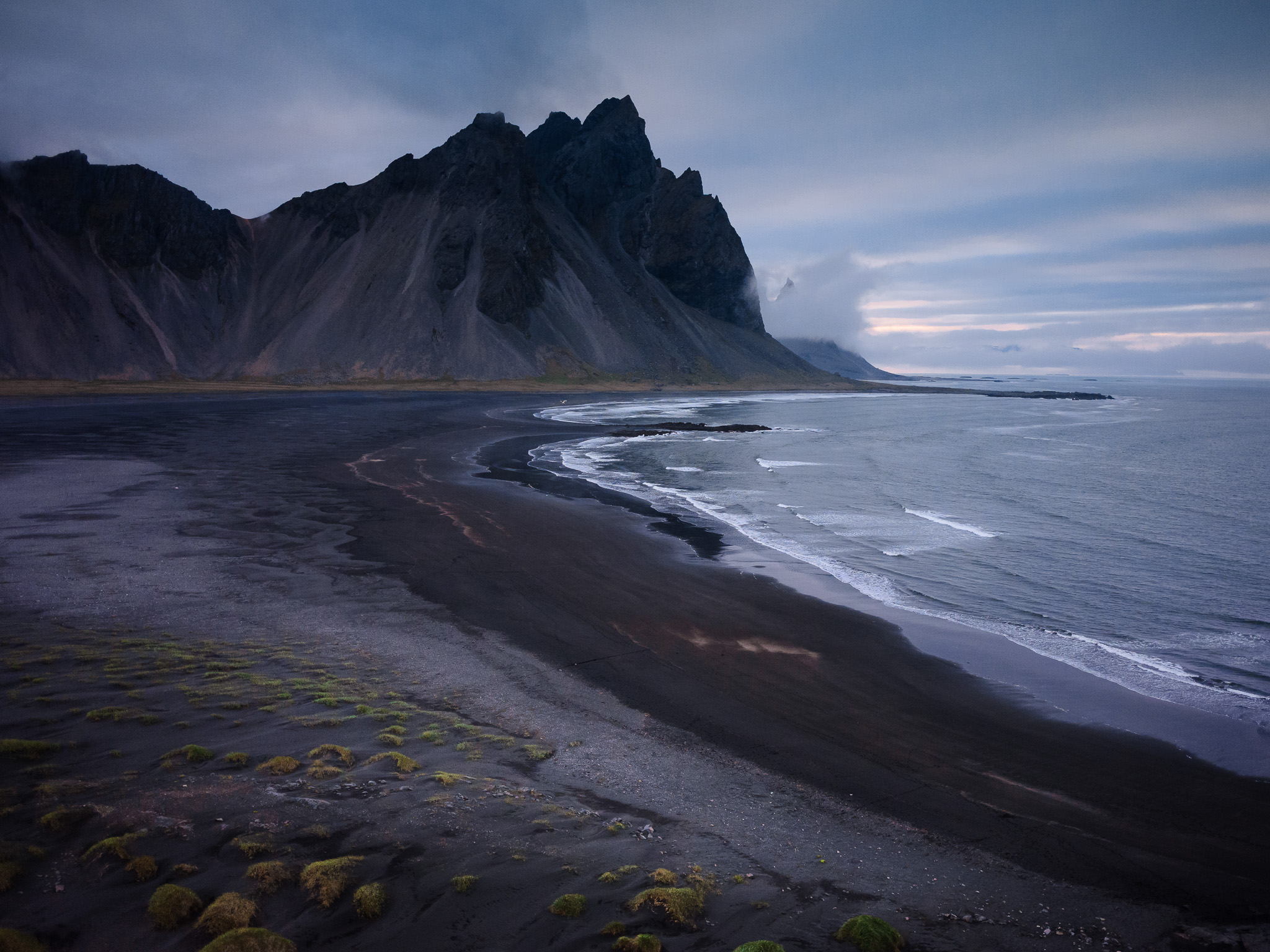
There’s a road just out of frame at the bottom of the image, then some low sand dunes (you’ve probably seen some photos of these before), with the ocean and Mount Vestrahorn in the distance.
At this location, there are really two main shots you’ll see people take: Mount Vestrahorn with grassy sand dunes in the foreground, or Mount Vestrahorn reflected in the ocean. Both of those shots are pretty easy to capture with just a short walk from the main road.
In other words, there’s no good reason to walk the roughly 2 miles / 3 kilometers it takes to get to this spot:

Admittedly, there is a rock outcropping near the spot I chose, so the scenery wasn’t completely uniform the whole way. However, those rocks were very slippery and didn’t feel safe with the waves coming in. It didn’t look like it would have made a great foreground anyway, although perhaps with some effort a photographer could find something to shoot there.
No, what I was after was much stupider: getting closer to the mountain itself simply because it looked cool. That’s one of my impulses in landscape photography – walking forward no matter the cost (short of walking off a cliff). It seems about 50/50 whether that improves my photo or not, but it’s my go-to impulse most of the time anyway.
This is one case where it just didn’t make logical sense. After all, the ocean in the foreground was almost identical near the road. All this did was let me take similar photos with a much longer walk. Maybe that reverse sleep schedule had addled my brain…
Now you know how, through sheer stubbornness and moderately bad decision-making, I ended up in a spot where some amazing waves started rolling ashore.
I haven’t yet mentioned that it was windy that morning, but it was. It was so windy (coming in from the ocean) that sea foam at the front of the waves would occasionally stay in place or blow farther ashore as the wave receded.
Here’s one of my earlier photos from that spot, where you can see some hints of what I’m talking about:
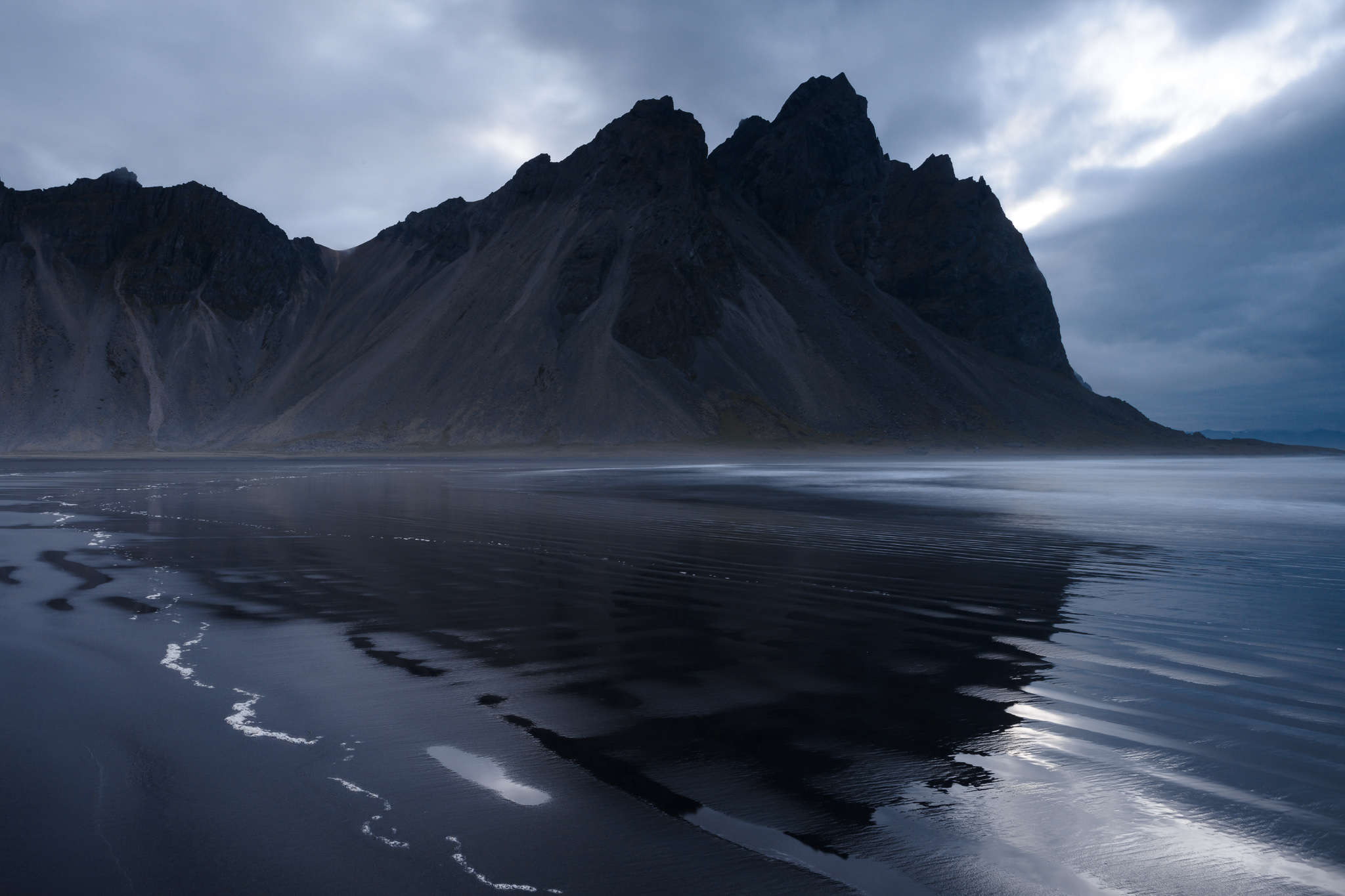
But this was just the start. A few more waves rolled ashore, and one of them made a great leading line pattern in the foreground:
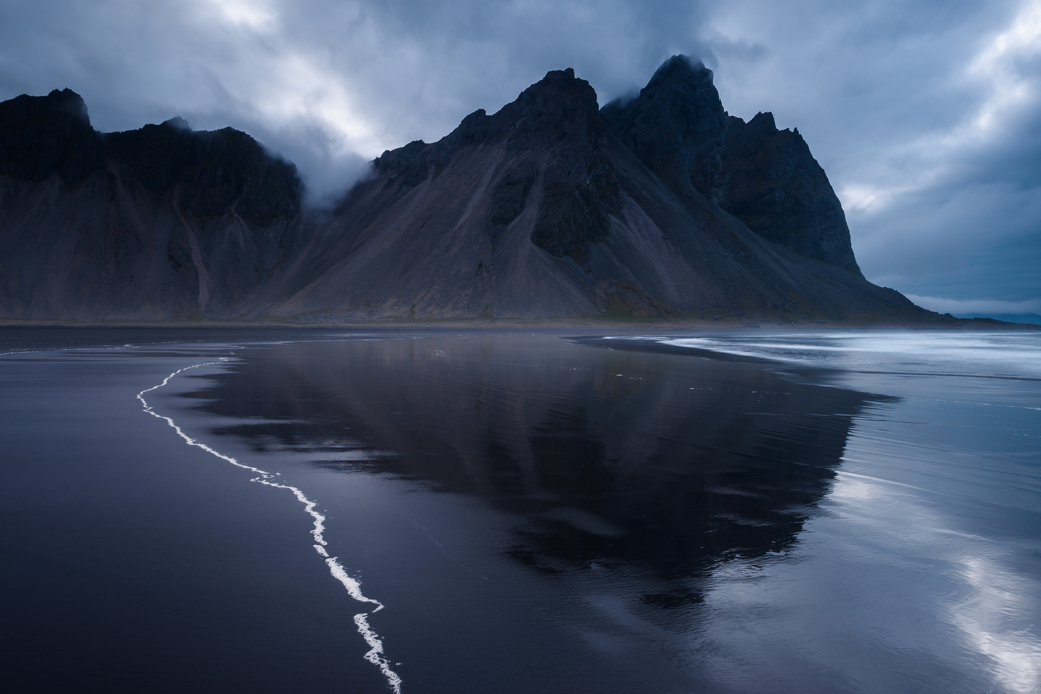
I’d have been satisfied if this was it – maybe not enough to publish this photo on my website/Instagram, but enough to illustrate an article on leading lines. The ocean, however, had other plans.
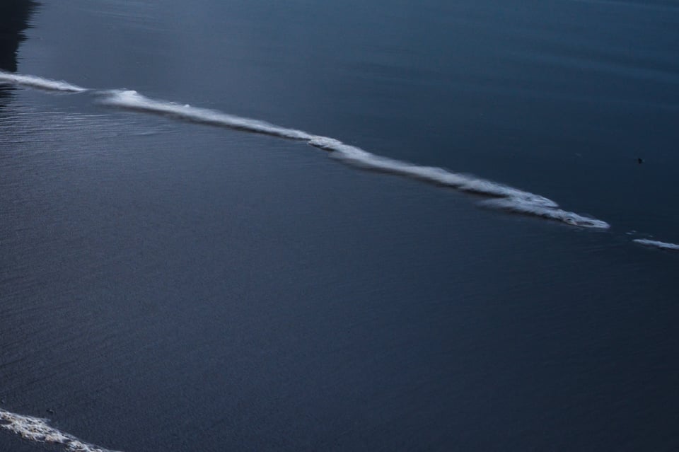
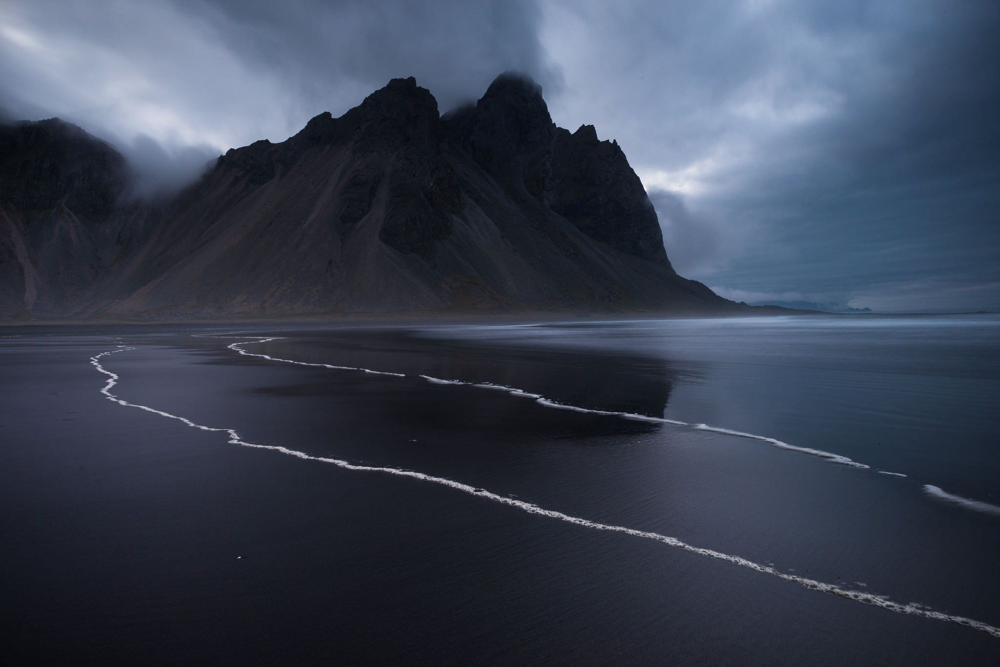
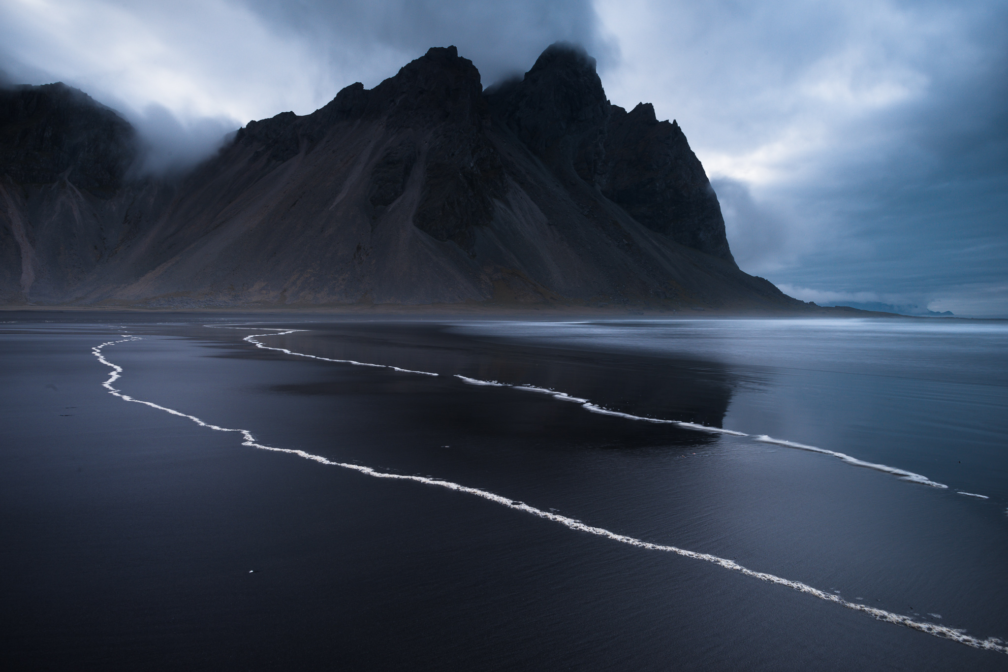
About two minutes later, this happened, which ended up being my final shot:
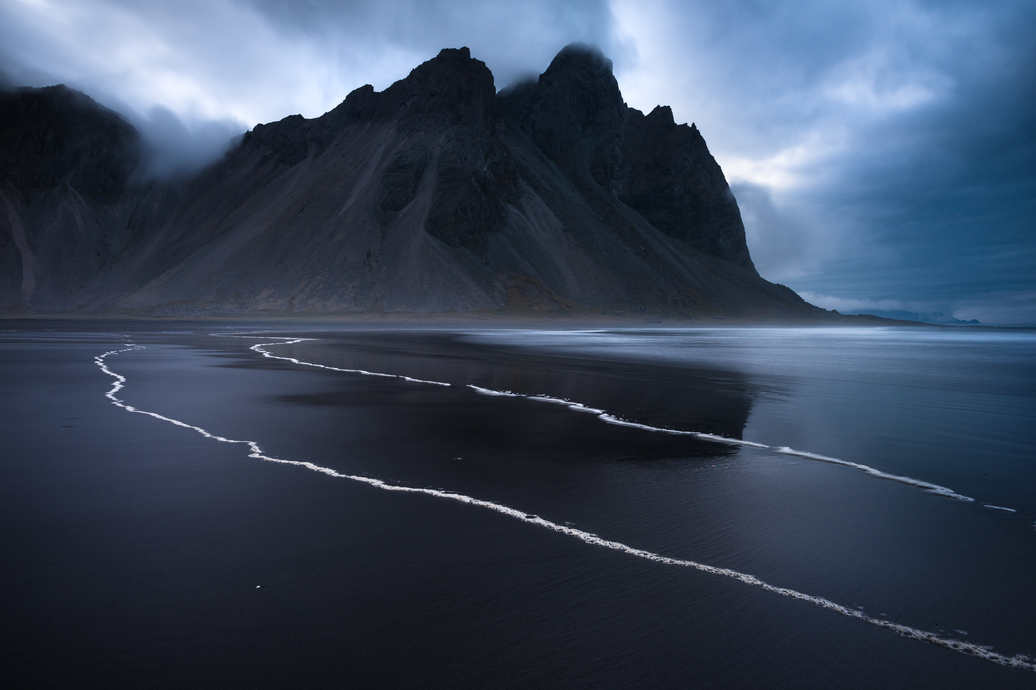
I actually don’t remember if it was a second, smaller wave that washed up just shy of the one in the previous photo, or if the previous one faded and these two rolled ashore afterward. At the end of the day, it doesn’t matter; I was thrilled with how the new foreground looked. One pattern of sea foam makes an interesting leading line, but two lines of sea foam make for a much more unusual sight that will immediately draw a viewer’s attention.
Camera Settings
This was a tricky landscape for camera settings, for a few reasons. First, it was pretty dark, which already meant my shutter speed would be fairly long. Second, the nearest element of the frame (some sea foam at the bottom right) is closer to my lens than it appears. Third, the sea foam itself was moving a bit in the wind, and there was a risk of more waves coming ashore and wiping out the interesting foreground.
All in all, I set my base ISO of 100, then picked an aperture of f/16 to guarantee enough depth of field. In hindsight, I’d probably have set f/13 or possibly f/11 instead, but it wasn’t too far from optimal.
I ended up using a shutter speed of 8 seconds, which definitely is not exposed to the right. Let’s take a look at my histogram:
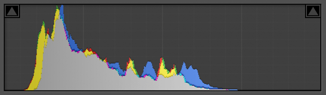
As you can see, although it’s not wildly underexposed, it’s still at least 1.3 stops away from perfect ETTR. I wasn’t as experienced of a photographer five years ago and didn’t try to capture optimal ETTR exposure as often. However, I’m actually quite glad I didn’t try to push it, because upon zooming in, I later realized that the sea foam was moving more than I had thought. You can see that it’s a bit blurry in one part of this image:
So, 8 seconds was about the longest I could get away with anyway, maybe 10 seconds at the most. With a bit more experience (though not all the way more), there’s a good chance I would have aimed for ETTR and inadvertently captured too much blur in the foam with a long shutter speed like 20 seconds. Or, a wave could have washed away the foreground before my exposure ended.
To me, it’s another example of luck that went into this shot. Granted, I didn’t exactly break all the odds to capture this photo, but I easily could have walked away empty-handed, too. Luck almost always plays a role in photography, often a big one, even if we do what we can to gain control. Another reason to keep taking pictures as much as possible to improve your chances!
Post-Processing in Lightroom
Here’s how the unedited RAW photo looked when I opened it in Lightroom:
As per usual, it’s very flat, with low contrast and saturation (and the apparent underexposure doesn’t help much either). It’s not too difficult to fix these issues, though. We’ll start where I usually do, in the Basic Panel.
Basic Panel
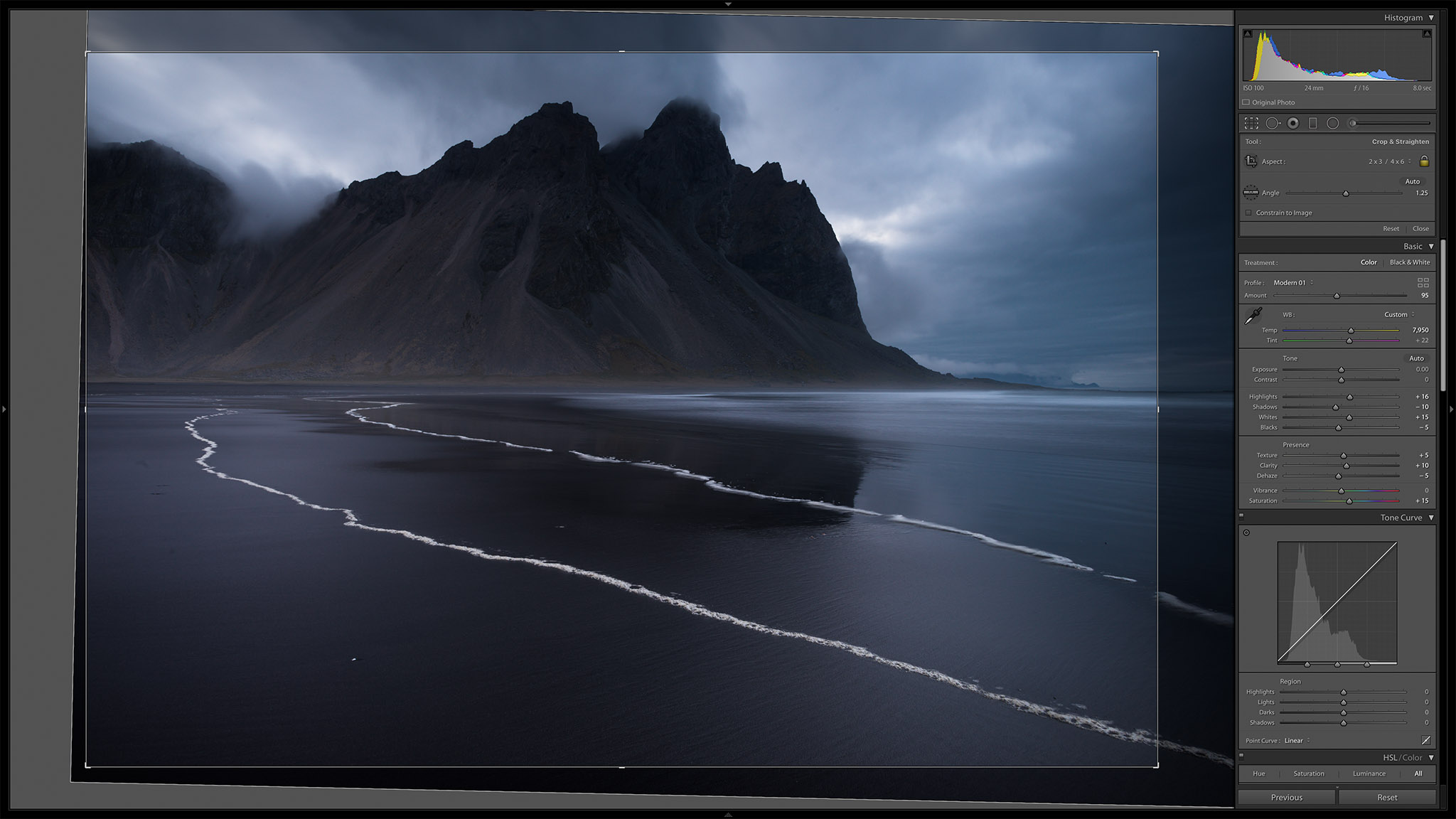
Here are the slider settings I used in Lightroom’s Basic Panel:
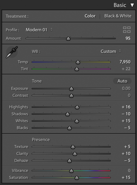
None of my edits here are particularly extreme. The “Modern 01” profile is useful for making the photo bluer and more saturated, but the rest of the settings are quite standard.
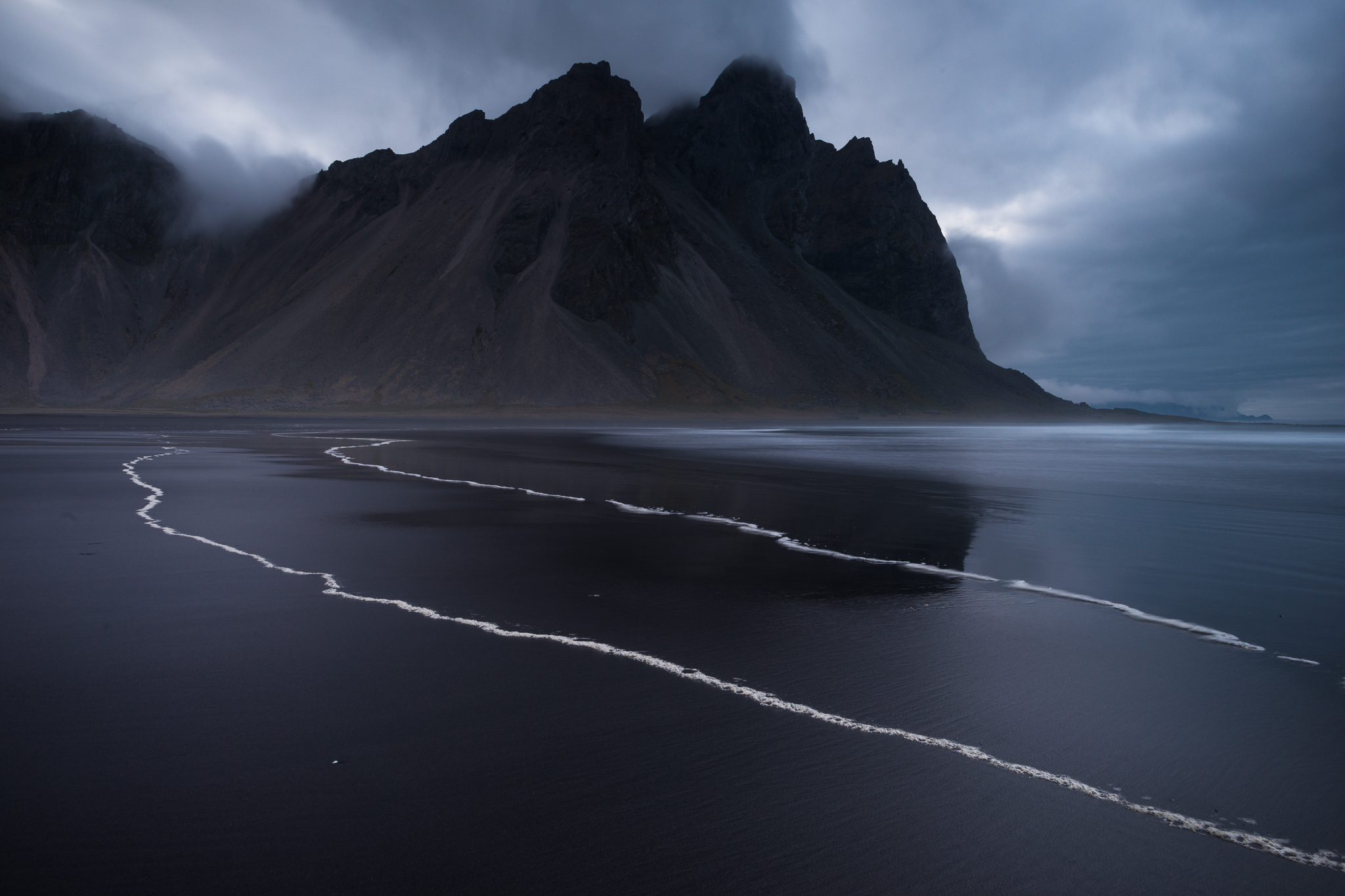
You might, however, notice that I increased highlights and decreased shadows, which is the opposite of what I usually do in Lightroom. That’s because I didn’t really need any highlight or shadow recovery in this photo. Instead, I needed a contrast boost on both sides of the histogram. Here’s how things are looking so far:
A nice improvement, but there’s still work to be done.
Cropping
I generally like to crop my photos as one of the first steps once I’ve finished basic post-processing. Here, I already have a pretty good idea of how this photo will look, so I’ll crop as my next step. Here’s how the cropping dialog looked for me in Lightroom:
The main thing I had to fix was the large region of empty space on the right-hand side of the photo. It was highly distracting and led to a clear imbalance in the original file, so to me this is a big improvement. I also needed a pretty significant 1.25 degrees of straightening, since the original was fairly tilted. Here’s that result:
Tone Curve and HSL Panel
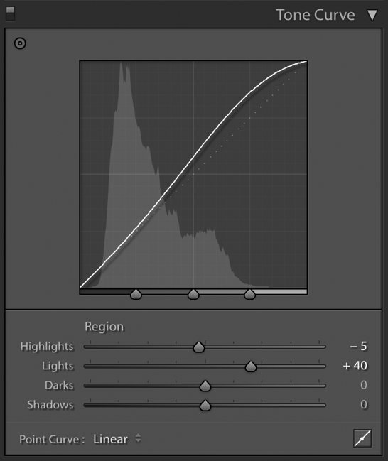
As I’ve covered in the previous “Behind the Shot” articles, I really like Lightroom’s Tone Curve, particularly the Lights slider. It makes for a great contrast boost and extra punch, without looking fake in most cases. I boosted that slider pretty significantly here, and did a small bit of highlight recovery as well:
On top of that, the colors to me were looking a bit too purple earlier, so I moved down to the HSL panel. These are my settings:
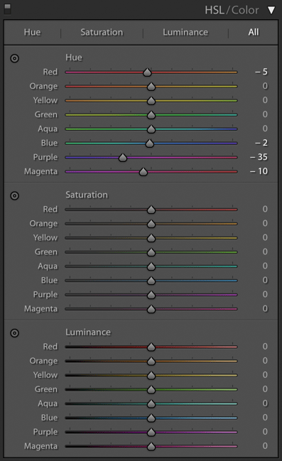
I mentioned in the previous “Behind the Shot” article that extreme HSL adjustments can lead to some excess color noise. That’s true; it’s usually best to leave the sliders within 10 points of each other, and as close to zero as possible. Here, though, I needed a pretty extreme shift of -35 to the purples, whereas the other colors looked pretty good around their defaults. No big deal – after fixing the purple hue, I just boosted color noise correction later. (I don’t like color noise correction if I can avoid it; in this case, I used +12 instead of none at all.)
Here’s how that looks:
Not bad! There’s still some fixes I’d like to make – especially some areas that need dodging or burning – but things are falling into place now.
Local Adjustments
Last but not least are my local adjustments. Using three gradient tools, I added a vignette to all corners except the bottom left (which is already dark enough). With two radial filters, I dodged/brightened some of the waves and added a bit of clarity to them. With another, I did a bit of burning/darkening to some areas of sand that looked too bright. Next, I decreased contrast on the mountains (which just looked better to me that way). Finally, I dodged the top of the mountain and the clouds behind it to help them stand out a bit more.
I didn’t need to do any brush adjustments here, because there weren’t any irregular shapes I needed to dodge or burn. I did do a bit of spot-healing to get rid of some sensor dust specks, but that was it for local adjustments.
Lastly, my usual sharpening routine is as follows:
- 0.5 radius and +100 detail to mimic a deconvolution algorithm as much as possible
- +30 sharpening (give or take about 10 in other shots)
- +15 masking; I usually prefer about +10 if possible, but because I didn’t expose to the right here, there’s a bit more noise than I’d prefer
- Luminance noise reduction at a small value of +10; color noise reduction at +12 as I mentioned
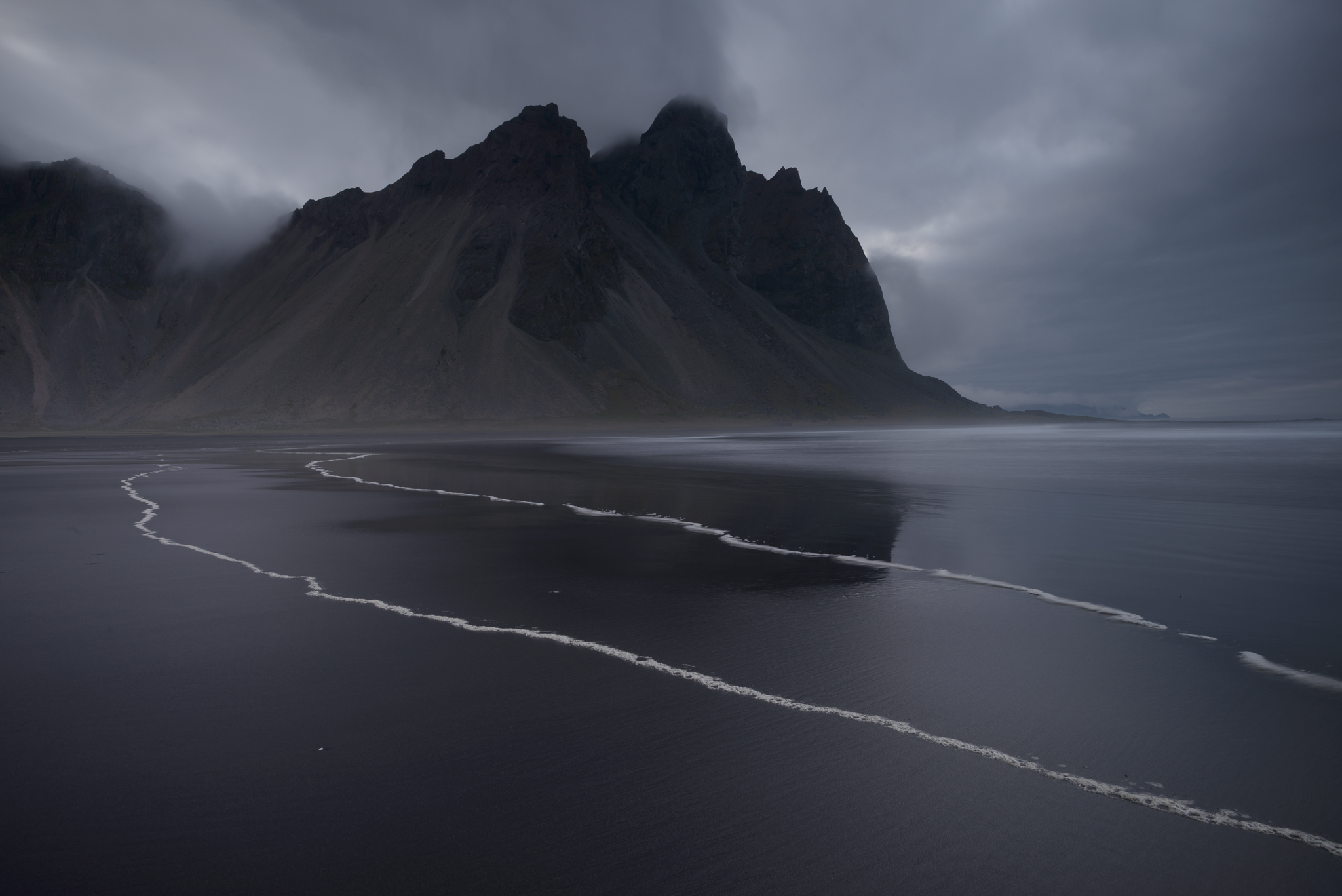
And there you have it! The final edited photo is below – click to see full screen:
Conclusion
If you’ve read the previous two “Behind the Shot” articles as well (Thorsmork and Liwa Desert), you’re probably starting to see a pattern in how I approach my photos, especially in post-processing. It’s a fairly easy system that gradually moves from the broadest edits to the most granular. I’ll often go back and fine-tune things along the way, but I like this approach much more – and especially find it much easier to modify – than a system built mainly on local adjustments.
Beyond that, one takeaway for me from this photo is the importance of luck in photography. I made two “bad” decisions here that actually worked out well – walking so far into this scene for no real reason, and neglecting to capture an optimal ETTR exposure. These apparent mistakes led me to a spot with beautiful foreground patterns, and also to a shutter speed that froze most of the sea foam’s motion. The photo I got as a result is pretty unusual and special to me.
In short, the more times you go out, the more times you’ll experience good luck as a photographer. Combine it with practice and good technique, and I’m certain that you’ll return with some amazing photos.
Two miles??? Where did you walk from, town? You can easily park within a couple hundred yards of the spot you indicated.
Maybe I pointed to too close of a spot (I’m trying to do that by memory) but I’m not wrong on how far I walked that day. I walked along the beach for quite a while.
Thank for sharing Spencer. Very useful to me.
Great image, and post-processing. Could you show us how you would have processed it in Capture One ?
regards
Ah, my favorite Spencer Cox photo ever! The brilliance of this photo cannot be overstated. All the pre-shots are perfect, too. You could not have gone wrong with any one of them. But I like the final version the most. Well done, Spencer!
Thank you, Elaine! I’m happy that you like it so much :)
Hi, Spencer, thank you for your sharing. I have two questions. The first is about focus. I’d like to know where did you focus for this image. The hill itself, or somewhere at the shore? The second is about sharpening. I found the detail slider exaggerating details in most photos, especially in case strong tonal adjustment was performed, e.g clarity, dehaze. So I always set my detail to 0. I also set radius to 0.5 by default, but my amount value is some what between 50-70, higher than your suggestion. I am very interesting in your sharpening process. Could you give some comment about low amount/high detail sharpening and high amount/ low detail sharpening ? Thank you !
Sure thing!
The sharpening settings you pick in Lightroom have an element of personal preference. However, the usual “best practice” for sharpening is to do a three-step process: deconvolution (getting back low-lying details), local sharpening (like sharpening a bird and not the background) and export sharpening.
The detail setting in Lightroom just changes the software’s choice of sharpening algorithm; setting 100 for detail is the closest Lightroom gets to deconvolution sharpening (when in combination with 0.5 radius). This article covers more: photographylife.com/advan…sharpening
I honestly don’t recall where I focused for this photo (certainly somewhere in the foreground), but where I SHOULD have focused is the same as for most landscape photos: double the distance from the nearest part of the photo (in this case, the bit of bubbles at the bottom right is the nearest part; twice as far as that is ideal).
Double the distance method will equalize foreground and background sharpness and is my go-to recommendation for focusing in landscape photography. We’ve written more about it here: photographylife.com/doubl…-explained
Thank you for your detailed reply. I have seen this photo on photographylife.com several times. The leading lines were just impressed. It’s so great to read the story behind. Nice work !