A couple of months ago, I took an abstract/intimate landscape photo that I was happy with, and some people have asked me how it was made. It’s a somewhat tricky image to parse, so today I thought I could go behind the scenes and show how I took it.
Here it is:
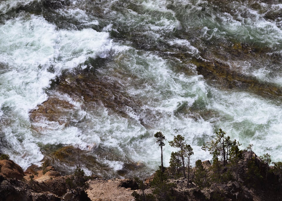
I call the image The Rapids of the Yellowstone River. That should give you a pretty good hint about the content of the photo if you’re trying to figure out the scale of the scene and exactly what’s going on here.
How did I arrive at this photo? Where was I standing in order to get this perspective? Let me harken back to my article about the refining process and go through some of the images that led up to this one.
Photo 1
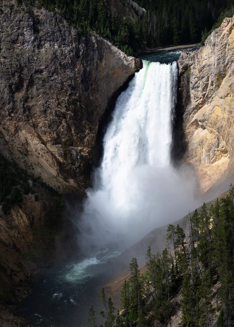
This is one of the first photos that I took from a particular overlook in Yellowstone National Park. If you’ve ever been to Yellowstone, there’s a good chance you visited Yellowstone Falls – a picturesque waterfall in the heart of the park. Taking photos of Yellowstone Falls is hardly an unusual thing to do, and I don’t think my photo here stands out at all considering the boilerplate composition and midday sunlight.
Photo 2
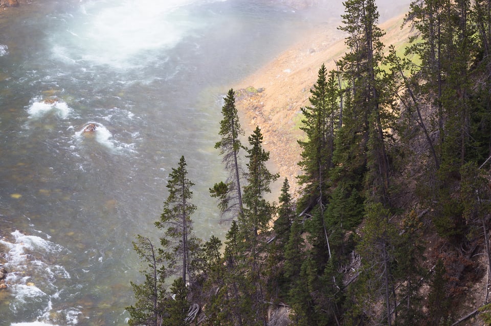
Realizing that photos of the waterfall itself wouldn’t be enough to satisfy me, I started looking for some details to photograph instead. This entire area of the park – known as the Grand Canyon of the Yellowstone – has beautiful colors in the rocks and trees. But I don’t think the photo above is particularly interesting. The blown-out area of rapids at the top left is distracting, and the whole bottom-right of the composition is an uninteresting mess. Not to mention the lack of a clear subject.
Photo 3
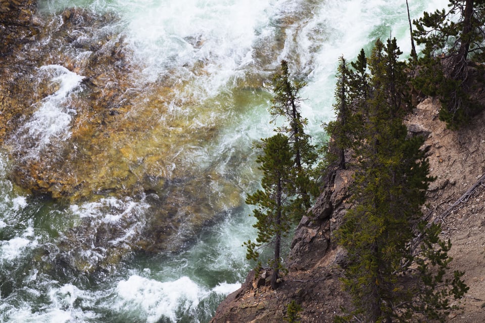
As I searched for better compositions, what caught my eye were the colors of the riverbed. They were some of the most beautiful earthy tones that I’ve ever seen in a riverbed (and this was without a polarizer, too). I think this photo is a distinct improvement over the other two so far. It still doesn’t have the clearest subject, although the dark pine tree leaning over the water is close. There aren’t as many distractions in the composition, either. But there were still better compositions to be found.
An Aside – Some Context
If you’re wondering how this landscape looks in an unedited smartphone photo, it’s something like this:
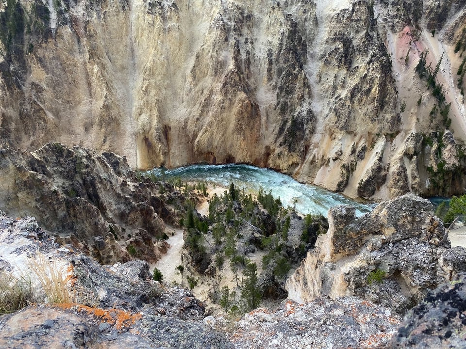
I hope that gives you a good sense of context for where I was standing when I took these shots – specifically, on the edge of a canyon! (Although safely behind a fence.) What makes the final photo somewhat unusual for one of my portfolio images is that I took it on a sunny day from a popular overlook in the middle of a National Park. It goes to show that you can never count out a location even if you’re after something unique.
Photo 4
After searching around for better subjects, I noticed a set of trees that are actually visible in the iPhone photo above. Here’s a bit of a crop to show the trees I’m talking about:
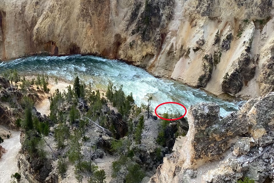
Even from the wide-angle iPhone photo, you can probably tell that these spindly trees stand out well against the rapids of the Yellowstone River. I was really thrilled when I noticed them and immediately started honing in on new compositions. The first step was to reposition myself off to the right, where the rock in the foreground was no longer blocking some of the trees, and there was a better view of the rapids.
Since I had a long telephoto with me (the Nikon Z 100-400mm f/4.5-5.6), my initial thought was to zoom all the way in to 400mm:
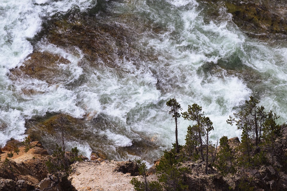
Although I really liked where things were going, this photo lacked the swirls of the rapids that attracted me to the scene in the first place. But the colors, subject, and general composition were all improvements over my other attempts so far. I also realized that the constantly-changing rapids were blending into the trees on the right in this particular image. I had hoped for a bit more subject separation.
Final Photo
After zooming out, I ended up taking about two dozen photos of this scene with slightly different compositions. My main goal was to get a photo where the rapids were relatively bright behind all the trees. Ultimately, I was happiest with this photo out of the bunch. Feel free to click it to see a larger size:
To me, it harkens back to some classical landscape paintings because of the tones and chiaroscuro in the photo, largely thanks to the colors in the riverbed. And, I should add, thanks to the light – harsh, midday sunlight from about 11 AM. It’s normally not the light for landscape photography, but here, it adds great shadows to the rapids and the riverbank.
My post-processing on this photo was minimal. I did a bit of dodging to the rapids around the right-most tree, and I did a bit of burning to the sunlit rocks in the foreground that were distracting the eye. I also cropped to this composition from a wider scene to match my favorite composition (it’s still over 24 megapixels, don’t worry, pixel peepers :).
Cropping obviously sacrifices some resolution, and I try to avoid it as much as possible. But even though I took some photos here that wouldn’t have needed cropping, I chose this one instead for a simple reason: subject separation. Out of every photo I took from this spot, the trees had the best separation against the rapids in this one. To me, the silhouetted trees are what ground this entire photo, so it was an easy decision. Composition always comes first!
Conclusion
I hope you found this behind-the-scenes detour to be interesting. This beautiful scene along the Yellowstone River reminded me not to fear midday sun as a landscape photographer, and to keep an eye out for unusual, abstract scenes everywhere I go, especially at popular spots. Let me know in the comments if you have any thoughts or similar stories about photos of yours!
It’s an increasingly common problem. The view is impressive, but everybody and his brother have shot it. This is a great reminder of why you shouldn’t allow yourself to feel discouraged.
When I first saw your final image I wasn’t at all sure what I was looking at – for a brief moment I thought it could have been trees against a turbulent, roughly painted sky. Understanding came quickly, but I did enjoy that moment of uncertainty and being made to think a little!
Spenser, Thank you for sharing your behind the scene thought process … truly inspirational and educational. Excellent presentation.
I really appreciate it, thanks, Richard! Glad the article could be so useful.
Excellent! Also inspiring and instructional. Many of us would have been happy with one of the precursrors, and moved on. A reminder to work the scene.
Thank you, Gary! I would rather regret spending too much time on a boring scene than not enough time somewhere promising.
Thank you for your in deep view of this photo. Saw this as award winning picture “Intimate landscape” on Natural Landscape Photo Awards. On the web it happens not that often that a photographer shares his adventures as you do on this site.
Thank you, Egbert! I try to share and teach as much as possible here at Photography Life. I don’t like the idea of keeping “trade secrets” as a landscape photographer (other than hidden locations to keep them from being over-visited) and am happy to share my techniques any time people ask. In my opinion, no one can steal a landscape photographer’s style or ideas, because we all have our own ways of seeing the world.
Very helpful. Thanks!
Sure thing, Victor!
Great write-up, Spencer, and I appreciate the window into your thought-process. It’s a gorgeous image, too – I love the greens in the water, and I’m a big fan of this kind of intimate landscape shot.
Out of curiosity, how do you approach your iPhone photography? Is it just for the sake of documentation, behind-the-scenes images, etc? Or do you occasionally bring out your phone with the goal of capturing a fine-art photo?
Thank you, Jaymes!
For years, I rarely pulled out my phone at all for photography, except to take photos of something to send to my friends. Even now I never use it with the goal of capturing a “good” photo on my phone, since I would rather take that photo on a better camera that I have with me.
That said, now that I’ve started to shoot a lot of large format film, I find myself using it increasingly often as a compositional tool – either with a “focal length preview” type app, or previewing the red/green/orange/etc. filter for black and white. The number of phone photos I’ve taken has skyrocketed recently. I will take several photos on my phone at different possible angles, compare them, and only then set up my tripod with the 8×10 positioned exactly where I want.
I always relied on it very heavily for planning, and still do.
Very nice photo, Spencer, and I always love a good ‘behind the photo’ article.
IMHO, what makes this image stand out is how it combines a chaotic subject (the rapids) with a simple composition. Personally, I often dislike the simplification mantra, as I enjoy complex images that can be viewed at large sizes with continuing interest (as opposed to typical Instagram images created for viewing in a split second on a phone). Here, you managed to combine the best of both worlds – it will be an attention grabber at any display size. Congrats with the NLPA award!
That’s a great point, thank you, Greg!
I try to think of “simplicity” in photography not as minimalism, but as removing distractions and anything that takes away from the photo’s message. Complex photos can still be simplified if they don’t have any unwanted elements.
In any case, it’s a look I really like in landscape photography – complex compositions that still manage to be effective. I’m glad you think this photo succeeds at that!
Congrats on the win with this photo. I saw it on the Atlantic’s website on Tuesday. It’s an interesting photo bc the perspective isn’t entirely clear so it’s a little mind bending trying to figure it out without knowing where you took it.
Thank you, Andy! That’s part of what caught my eye in the scene, too. I’m glad you like the photo!
Thanks Spencer for going through your thought processes. I’ve found the 100-400 has become my favourite landscape lens simply due to offering my so many different compositions from any given place.
Sure thing, Rich! I agree – it’s a seriously good lens for landscape photography, even though it’s nowhere near the usual landscape focal lengths. It makes me wonder if the 200-600mm on the roadmap will also be a hidden gem for landscapes if it ever comes out. Not a lot of photographers seem to shoot landscapes beyond 200mm, but there’s a lot of potential…
Kind of an everyday idea … that I seldom have. I recently purchased a Nikon Z 100-400 and I’ve started to think of it as a lens that opens up many opportunities. Now you have added to that idea. And since I live a few hours from Yellowstone, I’ll take your advice. THANKS !
The 200mm+ focal lengths definitely grew on me for landscape photography when I tested the 100-400mm! Lots of good abstract and intimate landscape possibilities. I’m glad this post gave you some inspiration.