The aspect ratio of an image is the ratio between its length and its width. Almost all modern digital cameras create images with a 3:2 or 4:3 aspect ratio, while the 16:9 format is common for video. On the other hand, the aspect ratio of a photo can be changed in post-production to anything you want. How does aspect ratio affect perception and composition? In this article, I’ll dive into the mysterious world of aspect ratios and what you need to know about them as a photographer.
Table of Contents
What is Aspect Ratio?
The aspect ratio of a rectangle is simply the ratio of its length to its width. For example, a photograph with a 4:3 aspect ratio has a length of 4 units and a width of 3 units.
Sometimes, the aspect ratio is expressed as a fraction by dividing the length by the width, so that a 4:3 ratio becomes 4/3. And then of course, it can be expressed as a decimal: 4/3 = 1.333, and 3/2 = 1.5, and so on.

Almost all cameras have sensors with an aspect ratio of 3:2 or 4:3, although there are a few exceptions. And in post-processing, you can choose any aspect ratio you want. But should you?
Aspect Ratios in History
Even before photography existed, artists spent agonizing amounts of time deciding the proportions of their canvas. Which aspect ratio would best represent their painting?
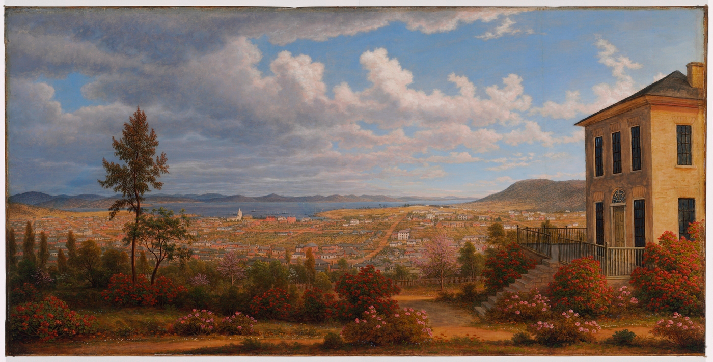
When it came to the classics, painters experimented with a wide variety of aspect ratios. For example, John Glover’s “Hobart Town” painting has an aspect ratio of exactly 2:1:
However, it turns out that the most common aspect ratio for classic paintings was just under 4:3 or 1.33, approximately the ratio of Micro Four Thirds cameras. It’s not hard to check this out for yourself. For example, the Web Gallery of Art has data on tens of thousands of paintings, and they also have a handy database of the physical specifications of each of them. Using this data, we can visualize the distribution of aspect ratios of over 20,000 paintings in a histogram:
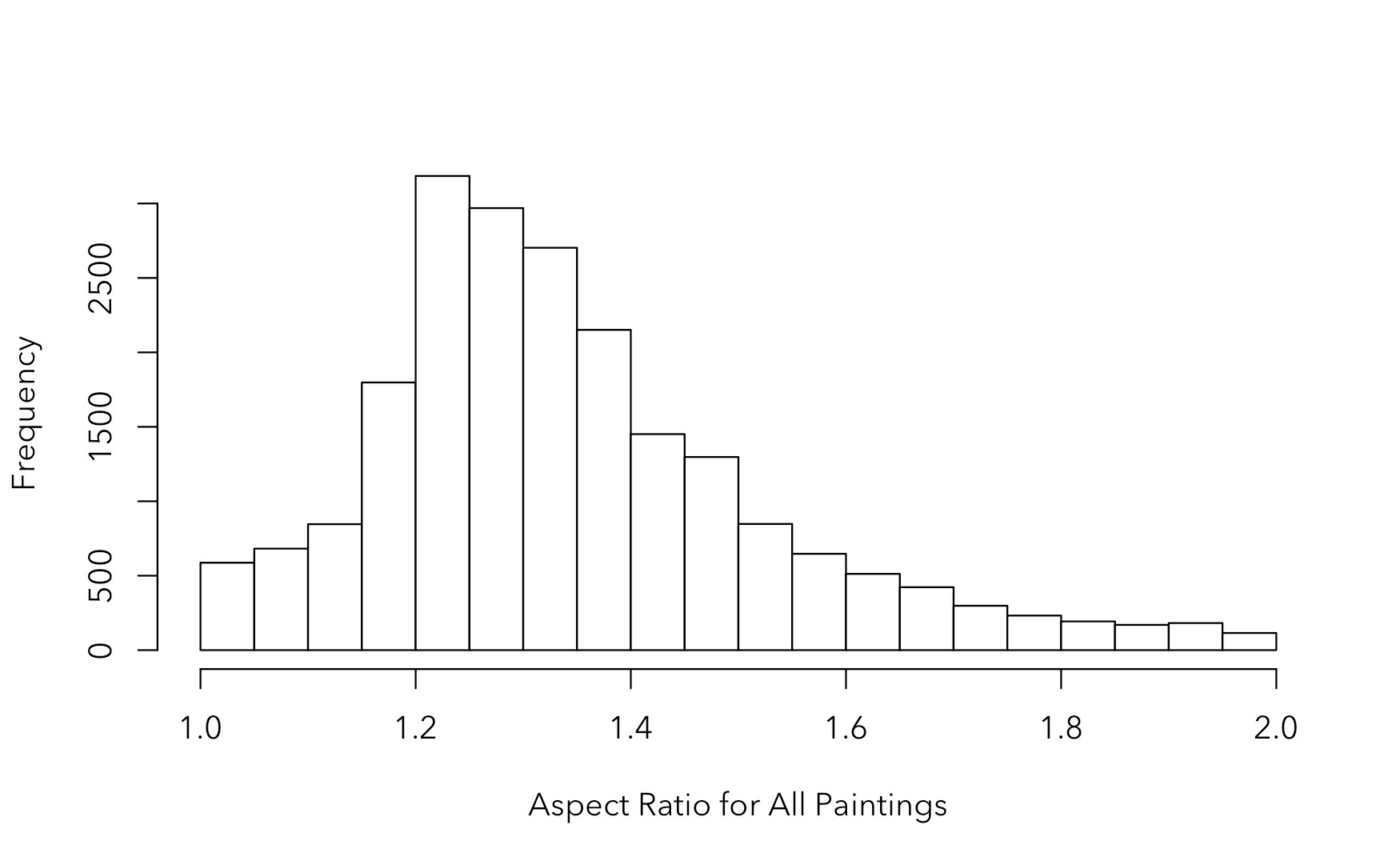
This shows that the most popular aspect ratio is between 1.2 and 1.35. Curiously, there is a rapid drop-off of aspect ratios very near to the square aspect ratio, even though many of them are close to square. This may be because near-square compositions are a bit tricky to pull off. A slight difference between length and width can add a sense of visual interest – a lack of symmetry that is demanding to be restored in the case of balance, or strengthened in the case of imbalance. But what to do with a square?
The aspect ratio distributions are not exactly the same for all types of classic paintings either:
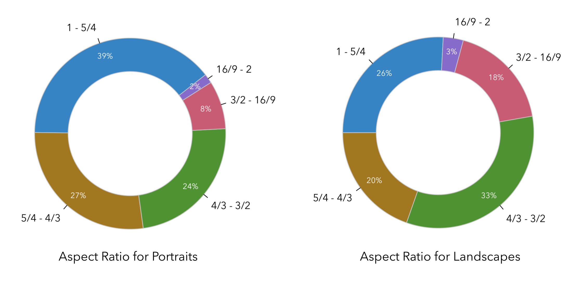
Although the 4:3 ratio is still the peak of the distribution for both portraits and landscapes, there is a definite trend towards wider aspect ratios like the classic 3:2 aspect ratio with landscapes, whereas portrait painters seemed to prefer more squarish aspect ratios.
Perhaps that was part of why the 3:2 ratio became so common in photography: it offers a decent compromise for most genres. The thinner aspect ratios have become further solidified with the rise of video, where 16:9 (1.777) is the standard for regular videos, while longer movies frequently use the anamorphic 2.39:1 ratio.
How Aspect Ratio Affects Composition
Even though aspect ratios are partly entrenched in tradition and historical trends, it is useful and interesting to experiment with different sorts of aspect ratios. That’s because the aspect ratio in your final image can greatly affect the mood of your composition, and you don’t have to be stuck with what your camera gives you!
As Spencer Cox said to me when I was writing this, “Don’t be afraid to use non-standard aspect ratios, if that’s what the composition demands. Printers and computer monitors aren’t limited to accepting 3×2 images! Use whatever aspect ratio brings out the best of your composition.”
It can be difficult to pinpoint makes an aspect ratio work, or not work, for a particular photo. But there are some trends we can discuss.
For example, the impact of diagonal lines and open-ended patterns will be very different in a squarish aspect ratio versus an elongated aspect ratio:
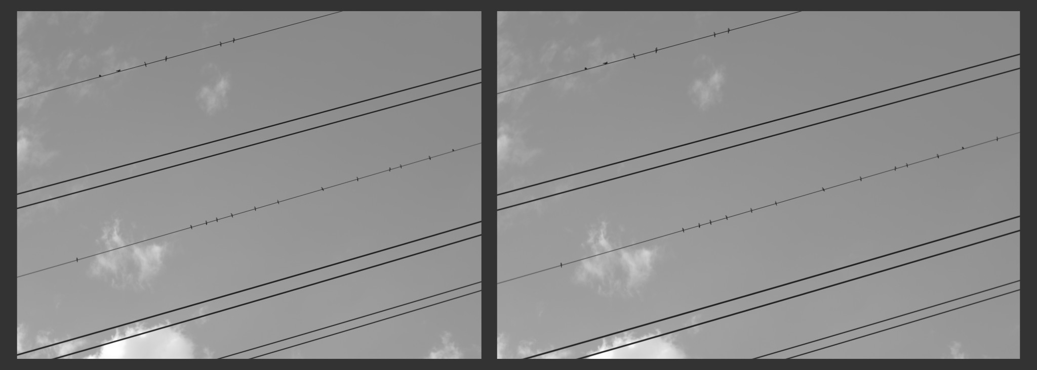
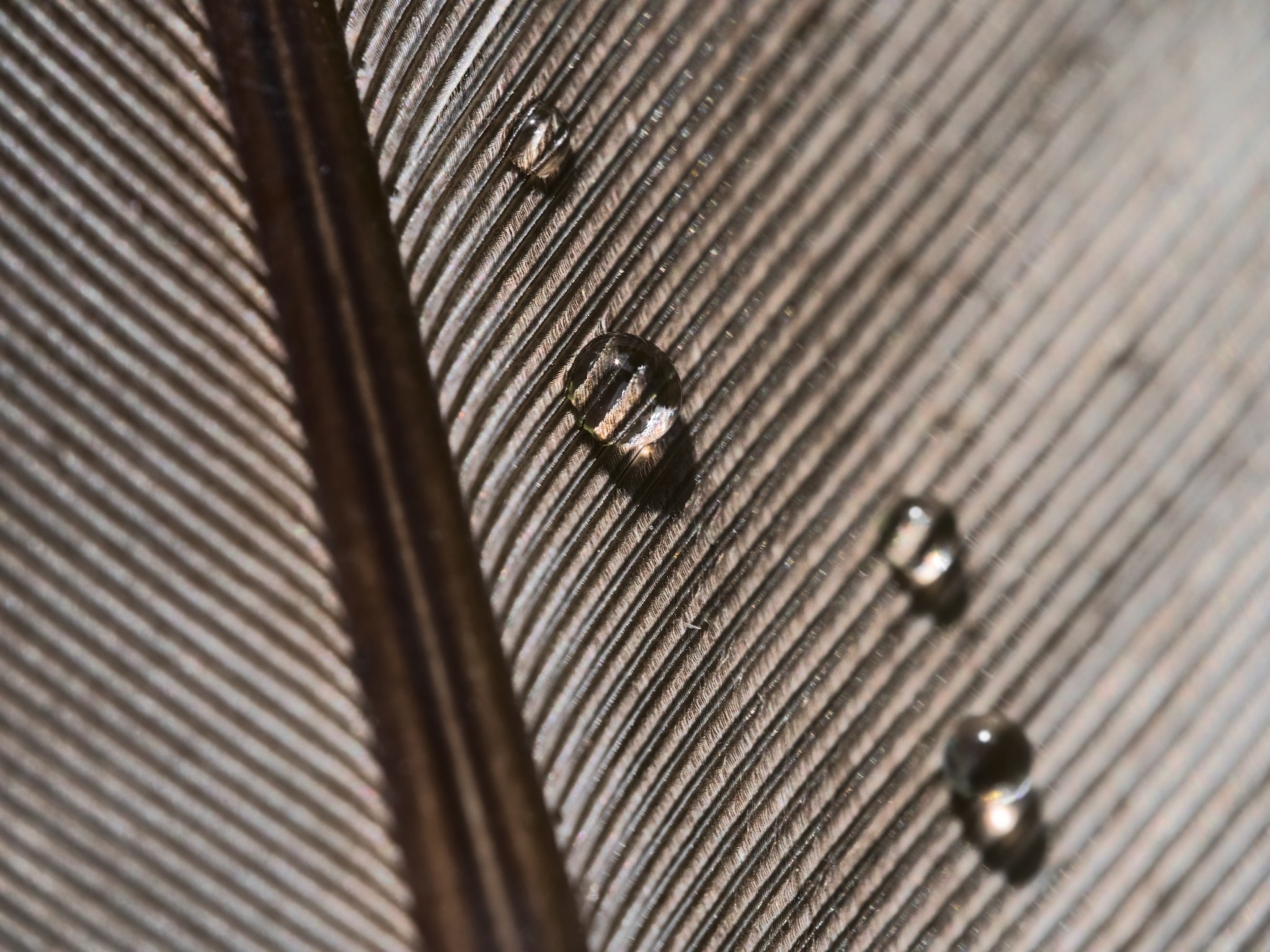
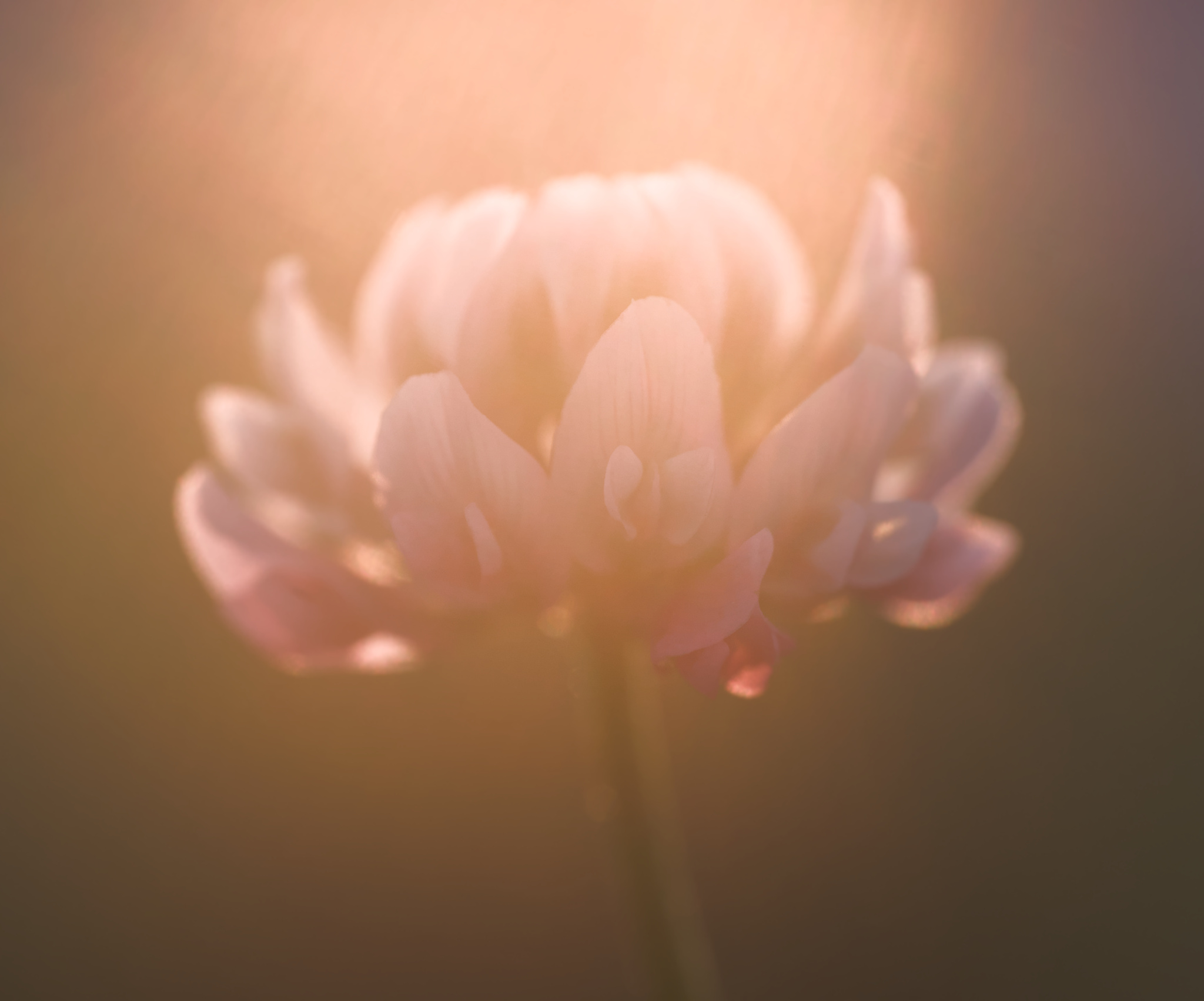
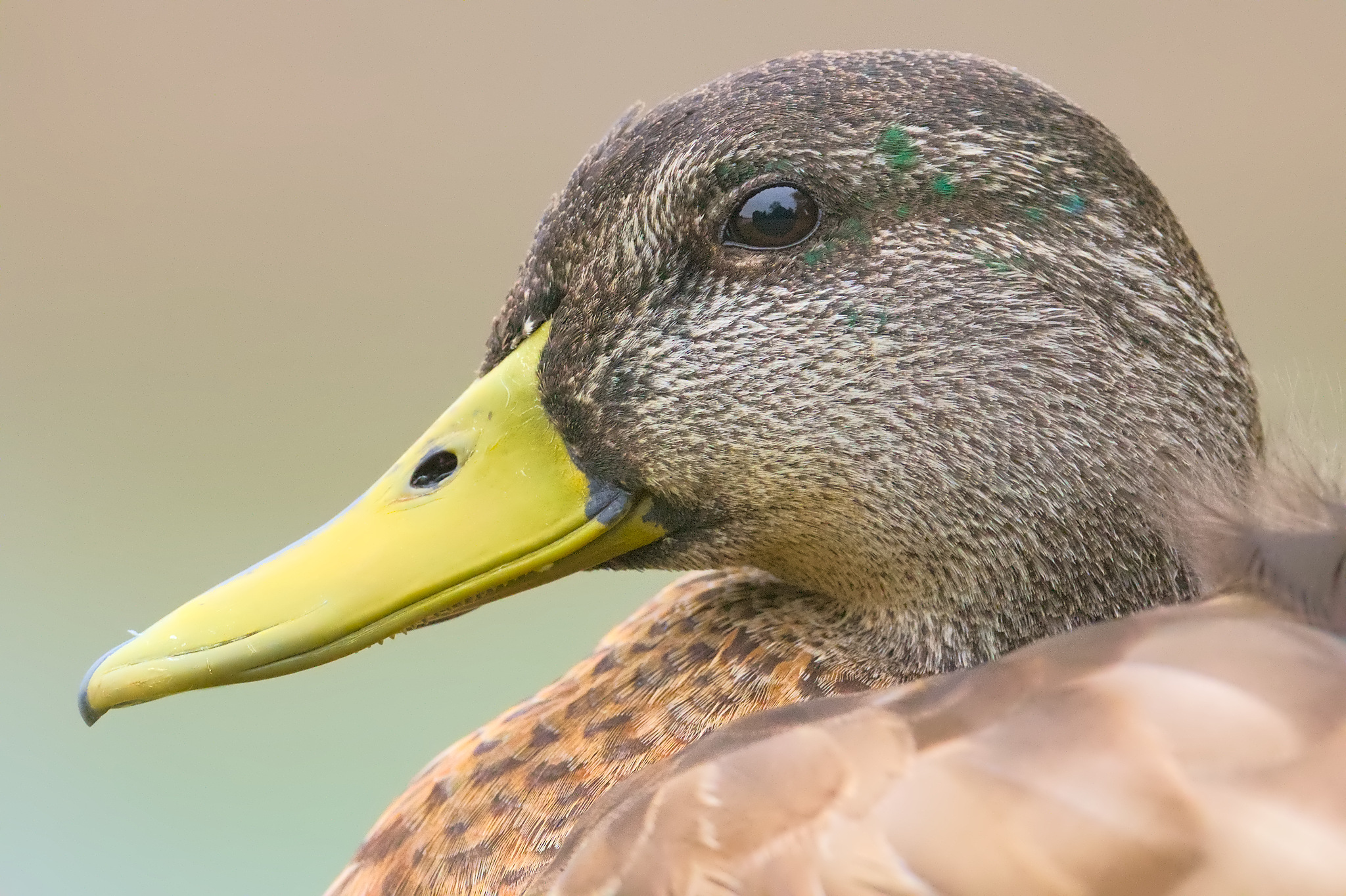
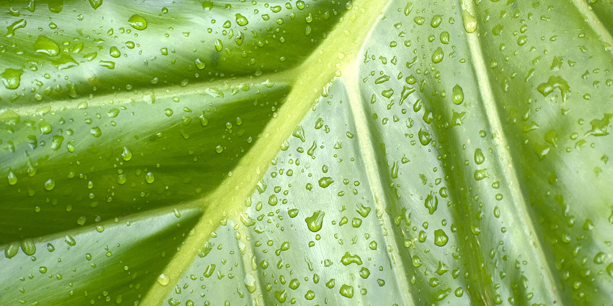
To me, the extra elongation can drag a viewer’s eye in an excessive manner in the example above. When photographing patterns like this, I will often prefer a more squarish aspect ratio. For example, in the following photograph of a bird feather, the aspect ratio of 4:3 seemed a bit better to me because of the multiple directions of lines:
Meanwhile, narrow aspect ratios are useful for drawing attention to particular subjects. The small distance between the long edges of the frame will squeeze your subject into the composition. Also, if your photo is horizontal rather than vertical, our eyes can scan very quickly from left to right. This partly explains why so many movies are filmed in wide, narrow aspect ratios.
Speaking of which, the proper aspect ratio definitely depends on whether you are orienting your photo in the landscape orientation (i.e. with the long edge horizontal) or the portrait orientation (i.e. with the long edge vertical). Any asymmetry in a photo’s aspect ratio is emphasized when the photo is in portrait orientation. This is likely because of our horizontal-oriented visual system. Any aspect ratio feels more narrow when it’s vertical, including the classic 3:2 aspect ratio – perhaps too narrow, at times.

Thus, the key to choosing an aspect ratio is to understand the lines and shapes in your photo, how much empty space will surround your subject, and what elements of the scene will interact with the edges of your frame. As with all things in photography, try to make your choices deliberately rather than by accident.
Should You Use Nonstandard Aspect Ratios?
For photography, the most standard aspect ratios are 3:2 and 4:3, since most camera sensors utilize one of those two aspect ratios. Also standard are 5:4, 7:5, 16:9, and 1:1, plus a variety of less popular but still “standard” sizes (more on that in a moment).
One benefit of using a standard aspect ratio is that you may be able to set the viewfinder of your camera to show you one of these aspect ratios. For example, my Panasonic G9 has 1:1, 4:3, 3:2, and 16:9 formats available in the viewfinder. This helps to visualize your composition mentally.
Another benefit is that standard paper sizes and displays are more likely to be one of these standard sizes. For instance, many computer monitors are 16:9, making that aspect ratio a great choice if you are trying to promote your work for computer backgrounds. Standard print sizes include 5×7, 8×10, and 20×30, all of which are based upon common aspect ratios.
That said, there is no rule stating that you must choose a standard aspect ratio for your photos. You can fine-tune your composition in post-processing by picking whatever aspect ratio looks best for a particular photo. If you print the photo, you may run into a few difficulties like finding a non-standard frame or mat board, but these can be worked around. And displaying the photo online usually can be done at any aspect ratio without a problem.
In our conversation, Spencer made another good point to me. He said that “if you have a body of work to show, you can make it feel more cohesive by using the same aspect ratios consistently. Most photographers will have their favorites, too, and might be able to compose more effectively within the aspect ratio they like the most. So, don’t be afraid to use standard aspect ratios!”
That makes a lot of sense for the 3:2 ratio or 4:3 ratio that your camera likely uses. They’re just so common – you’ll be familiar with them when composing, and it’s easy to print your work at standard sizes matching those aspect ratios. Paradoxically, the creative limitation of composing within a chosen aspect ratio can be quite freeing.
The Most Common Aspect Ratios
In this section, I will go over the most common examples of aspect ratios. Of course, you can use any of them or anything in between with freehand cropping, but these are what you will most likely see:
The 1:1 or Square Aspect Ratio
Although all rectangles have reflectional symmetry, the square has in addition rotational symmetry. Thus, the square aspect ratio represents the most symmetrical, even harmonious shape of rectangle – before it is thrust into the chaotic realm of photography.
A square aspect ratio draws more attention to itself than a rectangular aspect ratio. Because the square is so harmonious with its equal size, yet so distinct, square compositions need something special in order to justify their usage. Perhaps it could be extra disorder?
The 1.20 or 6:5 Ratio
The 1.20 or 6:5 aspect ratio is very close to square, and perhaps that is why it was used so much more often in classic paintings. For photography, it is less common partly because even M4/3 camera sensors are more elongated than this. (Among reasonably popular cameras, the nearest to this aspect ratio is 6×7 medium format film.)
6:5 is squarish without being square. Sometimes, this is very welcome. Perhaps because of human binocular vision, I find that the square aspect ratio often seems a bit too tall. In those cases, the 1.20 ratio can satisfy the urge to compose something that feels like a square without the total symmetry of a square.
The 1.25 (8×10 print) Ratio
The 1.25 or 5:4 aspect ratio is not too far from the square ratio, either. Although it is not as popular in digital media, it is a very common print size, especially for 8×10 prints. And the 5:4 aspect ratio is quite common in large-format film cameras like the ones that Spencer uses.
Psychologically, perhaps one could say that the 1:25 aspect ratio is just far enough away from the square to make palpable the imbalance between length and width. At the same time, it is not so far away from a square that it loses the square’s tranquility.
Perhaps this is why the 8×10 is a common portrait print size: the approximately elliptical human head can comfortably fit in the 5:4 ratio and go harmoniously with it, even with plain backgrounds. Vertical landscapes also tend to have more breathing room on the left and right when composed in 5:4, compared to 3:2.
The 1.33 (4:3) Ratio
A massive number of photos today are taken with a 4:3 aspect ratio. It’s not just because of Micro Four Thirds cameras, but also because many cellphone cameras have a sensor with this aspect ratio.
Now, the sense of losing symmetry has become definite: no longer are we close to the territory of the square.
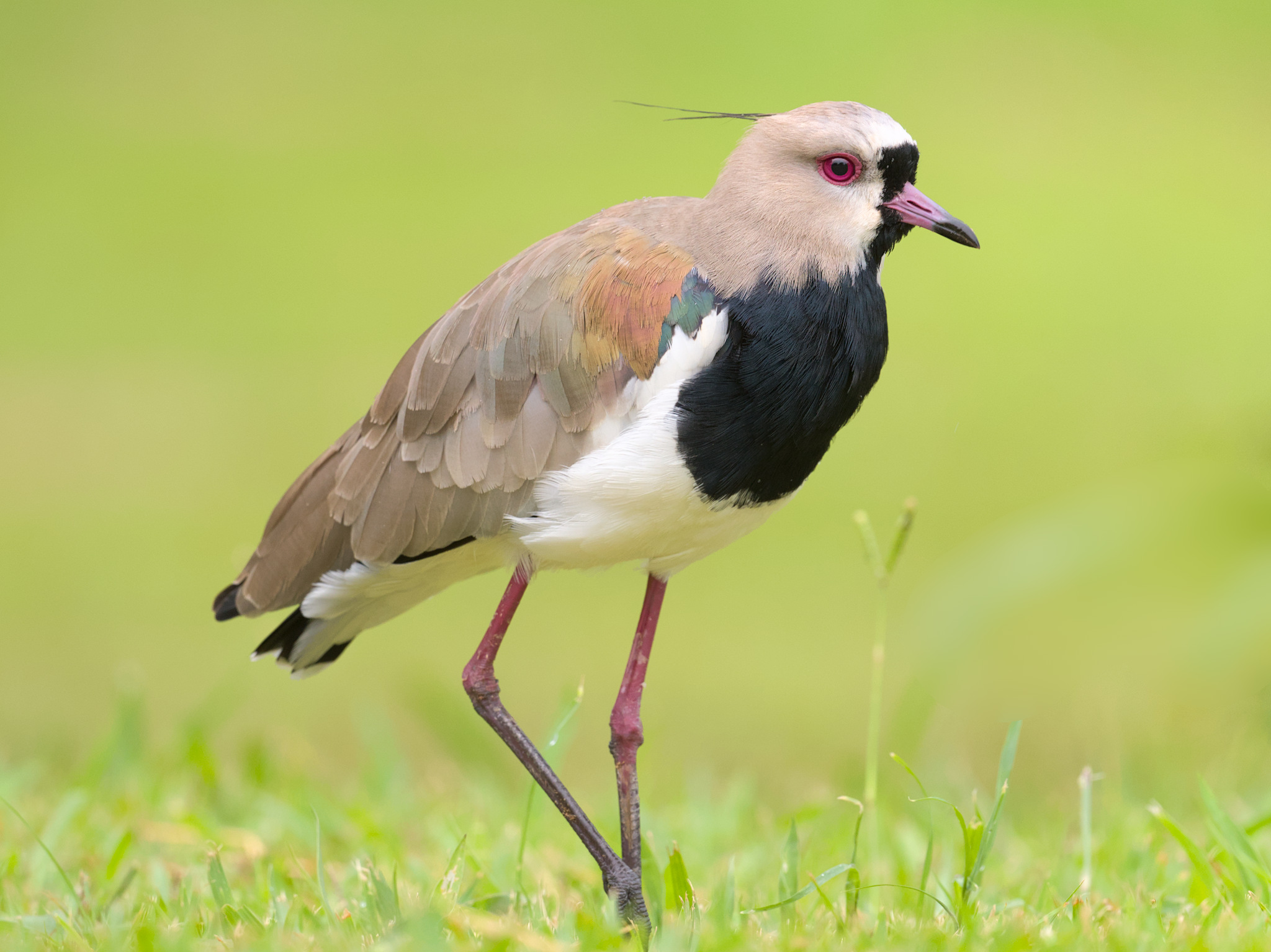
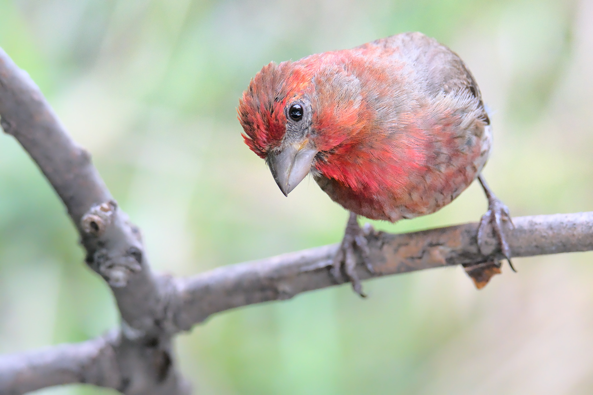
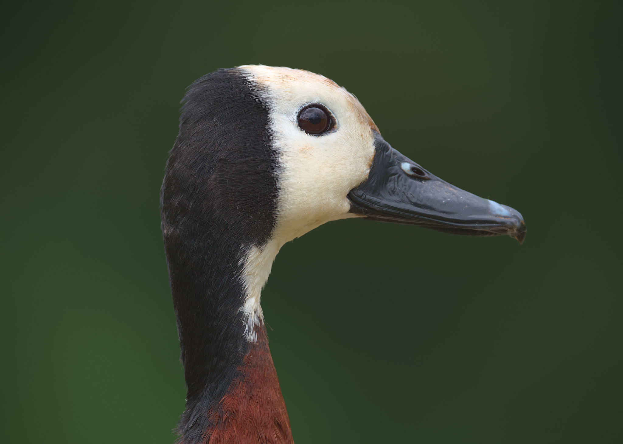
The 4:3 ratio keeps some of the harmony of the square but gives a definite imbalance, suitable for a wide variety of compositions. Compared to the more elongated 3:2 aspect ratio found on APS-C and full-frame cameras, the 4:3 ratio can feel a little more natural for some vertical photos (particularly portraiture) because of the additional breathing room on either side of the composition. As a wildlife photographer, I sometimes use the 4:3 orientation with still portraits of animals, especially when they take up a fair amount of vertical space.
The 1.40 (5×7 print) Ratio
The 7:5 aspect ratio is most popular as the 5×7 print size. Of course, you might think that this print size is a little strange because it’s so close to 3:2 and 4:3—in fact, it’s almost exactly the average of the two. But perhaps some of the popularity stems from the fact that photographers working with either a 3:2 camera or a 4:3 camera can likely crop their photos to 5×7 without messing up the compositions too much, and get some nice prints!
The 5×7 format was once popular in large-format film photography, sliding in between 4×5 and 8×10 cameras. One such camera is the Linhof Technika 5×7, and some are still made today by niche companies like Chamonix and Intrepid. Even if you don’t plan to getting into the now-unusual world of 5×7 format film, you might still find it interesting to experiment with this historical aspect ratio!
Spencer wanted me to note that he wrote an essay for college dedicated to the virtues of the 5×7 aspect ratio in art, and was given a C on it.
The 1.5 (3:2, Most Cameras) Ratio
Now, we come to the most common aspect ratio today in terms of professional photography. Today’s APS-C and full-frame cameras pretty much all follow the 3:2 aspect ratio, modeled after 35mm film photography. Libor Vaicenbacher has this to say about the 3:2 format:
My beginnings were associated with shooting on black and white negative. I liked it when the photo was naturally framed by a thin black line formed by the unexposed edge of the film. The 3:2 format somehow stuck in my brain that way. To this day, it’s my favorite format and I use it almost all the time. Part of the reason for this is that I often present more photos, for example in lectures, and I feel that the photos give a more consistent impression. Also, when I compose, I think in 3:2 scale.
But I am not a dogmatist and I admit that other formats have their merits. I like squares, but I also like wide panoramas. Personally, I think that any format is good as long as you consider it from the beginning of the whole photographic process.
Many will never leave the 3:2 format, and that’s not a bad thing either. While other aspect ratios can be fun, there’s a good chance your camera shoots in 3:2 format. If you stick to using that, you have less to worry about when composing your photo, and you can become an expert at utilizing the merits of 3:2. Although it sometimes feels too narrow for vertical photos, the 3:2 ratio provides a nice, versatile view that makes it a great all-purpose ratio.
The 1.618 (Golden) Ratio
The golden ratio has been discussed for centuries because it has a unique property: in a rectangle with the golden ratio, the ratio of the length to the width is the same as the ratio of the sum of the length and width to the length. Mathematically, this ratio works out to be exactly (1+√5)/2, which is about 1.618.
Unlike most aspect ratios we have talked about today, the golden ratio is irrational, which means it is not equal to the ratio of any two whole numbers.
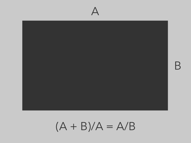
The golden ratio holds an unusual place in art because the property that defines it gave it a sense of mystique and otherworldlyness to the ancient Greeks and many others. Many believed that the golden ratio is the most perfect of all ratios and holds a special harmony in artistic expression.
However, the aesthetic qualities of the golden ratio have definitely been exaggerated in pop culture, and many recent psychological experiments show that it is not particularly significant aesthetically – certainly not the the degree that some have thought in the past. When it comes to photography, you should choose your aspect ratio to fit your composition, and not place any extra significance on the golden ratio for its pure mathematical qualities. However, if your optimal crop happens to align with the golden ratio, don’t avoid it, either.
The 1.77 (16:9 Widescreen) Ratio
Now we are leaving the realm of the common in photography and proceeding into the very asymmetric 16:9 ratio. You’ve probably seen this ratio because the vast majority of videos on the internet are in 16:9 format. And in fact, this format is usually the only aspect ratio available on consumer cameras for video unless you have a higher-end camera with open-gate recording.
Of course, the 16:9 ratio can be used in photography as well, although it is less common. Perhaps that is because video has the ability to show motion, and most motion we see is horizontal. Therefore, the wider 16:9 ratio can capture more horizontal motion with the same vertical framing.
The 2.0 (Univisium) Ratio
The 2:1 aspect ratio has an interesting history in the realm of film. It was proposed as a standard for cinema by Vittorio Storaro, the cinematographer behind the Francis Ford Coppola film, Apocalypse Now.
Some say the 2:1 ratio is a good compromise between the more square ratio of 16:9 and the much wider 2:39:1 In fact, the 2:1 ratio is almost exactly in between 16:9 and 2.39:1.
Although the 2:1 proposal did not gain much traction when it was first introduced, it has become much more popular over time, such as its use in the film Jurassic World and in the Netflix series House of Cards. The 2:1 format may have gained popularity due to the changing nature of how film is being viewed: more than ever, people are watching on roughly 16:9 screens on which the narrower 2:39 format does not fit well. In this case, the 2:1 ratio still gives a look wider than 16:9 and so appears to be a decent choice.
For photography, the 2:1 format is wider than what your camera shoots (unless you have a very specialty camera), and so you either have to make a conscious choice to crop a lot from the top/bottom of your photo, or else shoot multiple images and combine them into a panorama.
The 2.39 (Anamorphic) Ratio
The 2.39:1 anamorphic ratio is a common aspect ratio for big-screen cinema. It is quite wide, and looks a lot like a panorama. Ratios of 2.39:1 are not too common in photography. However, they may have gained a bit in popularity because recently, some manufacturers have produced relatively affordable anamorphic lenses.
Thus, with a lens like the Sirui 24mm f/2.8 Anamorphic 1.33x Lens on your camera, after the so-called “de-squeezing” process, your images will naturally have an aspect ratio of 2.39:1. Of course, these lenses are more typically used for video productions, but it is definitely possible and even fun to use them for still photography.
The 3.0 (Panoramic) Ratio
The 3:1 aspect ratio was probably made popular by the APS film system.
Although we are all familiar with the APS-C format that is still popular in digital cameras today, APS originally had two other formats: APS-H and APS-P. The “P” stands for panorama, and it gave an approximate 3:1 crop, allowing the photographer to take panoramic shots.
Of course, panoramas aren’t defined by this aspect ratio. Even when it came to film, there were other popular panorama formats. One such example is the well-known Hasselblad XPan camera, which could shoot regular 24x36mm film and a panoramic 24x65mm film, which gives an aspect ratio of about 2.7:1. There are also dedicated medium-format panoramic cameras that shoot with a 6×17 aspect ratio on film.
Conclusion
The aspect ratio is a subtle but powerful influence over the mood and character of your photo. It is subtle because it is contained in the borders, where no one typically looks, but it is powerful because it influences the entirety of what is inside your composition.
Although early artists were biased towards aspect ratios near 4:3, and that ratio is still a very useful one for many purposes, wider aspect ratios also can be used with great effect in different sorts of compositions.
Thus, instead of merely defaulting to the aspect ratio of your camera, pay careful attention to aspect ratio in your photography. Even if you decide on using the 3:2 or 4:3 aspect ratio that your camera uses by default, at least you are doing it for a reason! Over time, experiment with different crops and different print sizes to discover the value of aspect ratio in your art.
Conforming to standard formats drives me crazy! I think the single best way to improve an image is to CROP IT: Command L in lightroom to darken the outside, then slide the L or W in and out to improve the composition; no rules; just do it till it gives you the most visual satisfaction. (That said, i then typically round off to the nearest L and W in inches.) I see sooo many good images that would look great if only some uninteresting area would be cropped off. And welcome to the world of custom framing…
Très instructif, merci
Is it worth pointing out that the 1.40 (5×7) ratio is almost exactly the ratio of standard A4 paper (standard in Europe, at least) which is actually 1.414. The ratio is mathematically 1
x the square root of 2, so A4 and the other A sizes have the useful property that if you cut them in half the halves have the exact same aspect ratio as the whole (so a sheet of A4 divides exactly into two sheets of A5)
It doesn’t match any of the ISO 216 “A”, “B”, or “C” series of paper sizes.
[https://en.m.wikipedia.org/wiki/ISO_216]
However, 127 × 178 mm (so-called 5 × 7 inch) is covered by international standard ISO 1008.
en.m.wikipedia.org/wiki/…rint_sizes
If we were to leave a 2 mm border between the edges of the printed image and the edges of the paper:
123 × 174 mm gives AR≈1:√2.001
In other words, when a print is mounted/framed, the aspect ratio of the image is often different from the aspect ratio of the mount/frame. This is an important consideration when preparing photographs for an exhibition.
I have absolutely zero information to back up the theory I’m about to present … it’s just a thought, so don’t ask me to defend it. I can’t. Is it possible, for some reason to do with the manufacturing process or whatever, the spread of canvas ratios was a matter of economy or availability in a lot of cases? Perhaps financially successful artists were more able to obtain their desired ratio!? Is there a corresponding spread among canvas sizes that might indicate correlation? I ask, being loath to accept any theory without exploring obvious alternatives.
It’s not my intention to minimize your essay, which I found to be thoughtful. :-)
It might be possible indeed. Some standard ways of doing things might have set in and there probably were only limited options. Unfortunately, there is little or no research that I could find on the topic but I’d be open to hearing about anything I missed!
‘Three-quarters, kit-cats and half-lengths’
British portrait painters and their canvas sizes, 1625-1850
National Portrait Gallery (2013)
www.npg.org.uk/colle…1625-1850/
I tried to read it; I really did! :-)
Thanks so much. I’ll read it over and update this article with anything I find!
Thanks Jason! Lots to chew on here!
I’ve been struggling with cropping for composition a lot lately.
At least for me, a perfectly free choice of aspect ratios can lead to choice paralysis. Just getting close to a “standard”, and shifting the image a bit within that frame often stops the dithering. Having a bit of “lore” around some of the different choices can also help break ties, or suggest options.
Very helpful (if it doesn’t just open another rabbit hole for speculation…)!
I’m glad you found it useful. One thing you could try is just stick to one ratio and experiment with just that one, see how it goes!
Well, I’ve been shooting MFT for a while, and usually doing little or no post-processing. Mostly that’s fine; my camera does an excellent job of returning a JPG that looks like what was in the EVF, and that’s how I was making choices in the field. 4:3 has gotten very comfortable. It’s when cropping to “fix” an image that bothers me that I run into the too-many-choices issue. For the moment, I seem to have settled mostly on a) stick to 4:3, b) see what happens with a 1:1, or c) see what happens with something else. It’s not really a problem – I’m having fun learning and overthinking.
Since i make lots of panoramas i completely abandonned the idea of an aspect ratio.
I make the panorama and cut to get the best image that i like -for me it is liberating.
Working with a fullframe 3:2 ratio camera I often end op in architecture to a more square format. But it also happens that i choose a very wide format. I decide afterwards on the computer.
Well, that is not really abandoning the aspect ratio but choosing a “more free” one rather than one of the fixed, more popular ones.
Thank you, Jason! Informative.
You are welcome!
Very nice and informative article Jason, thanks for posting it!
For the past couple of years I’ve been experimenting with the 5:3 ratio – a bit wider than 3:2, but not as wide as 16:9. While reading your article I realized that 5:3 is very close to the golden ratio… :-]
Let ϕ denote the golden ratio.
5:3 ≈ ϕ + 3.0% of ϕ
8:5 ≈ ϕ − 1.1% of ϕ
Many laptops were/are 8:5 e.g.:
1920×1200
2560×1600
3840×2400
Good point Pete – thanks for bringing 8:5 to my attention!
Most enjoyable. Thank you.
I often use 16:9 for landscapes. Wildlife format will be driven by the image.
I did like your example with the wires – interesting that your preferred format had the thicker wire in the corner and I wonder if that affected the choice?
That may be true. I tried to use the same “simplified” photo to illustrate the concept. but that could be a confounding variable. And 16:9 is an interesting format for wildlife since it is often moving!
I tend to crop by vibes instead of being deliberate about it, so I appreciate these posts that systemize something I don’t have language for. Atypical content, and I’m here for it. Thanks Jason!
You are welcome! There are definitely some zones of photography that are difficult to think about on a systematic level, whereas others seem very intuitive.