The secret to a good black-and-white print is controlling the dynamic range. The dynamic range is the range of tones, from the blackest black to the whitest white in an image. In a black and white photograph, you want to make full use of the entire dynamic range. The problem is that, when printing, the printer usually hits the limitations of its dynamic range long before our eye (and camera, and monitor) stops differentiating detail. As the printer lays down ink to create your black tones, there will be a point at which you can no longer differentiate the detail in those blacks anymore. The same is true with white – every printer has a point where white simply becomes “paper white” and you can no longer see any ink at all. And if that’s not bad enough, this “black point” and “white point” will be different for every printer/paper combination!
Fortunately, there is a simple solution to this problem. By using a simple black and white test chart, you can see how your particular printer and paper handle the white and black areas of your pint and you can edit your picture to maximize the available dynamic range of your printer:
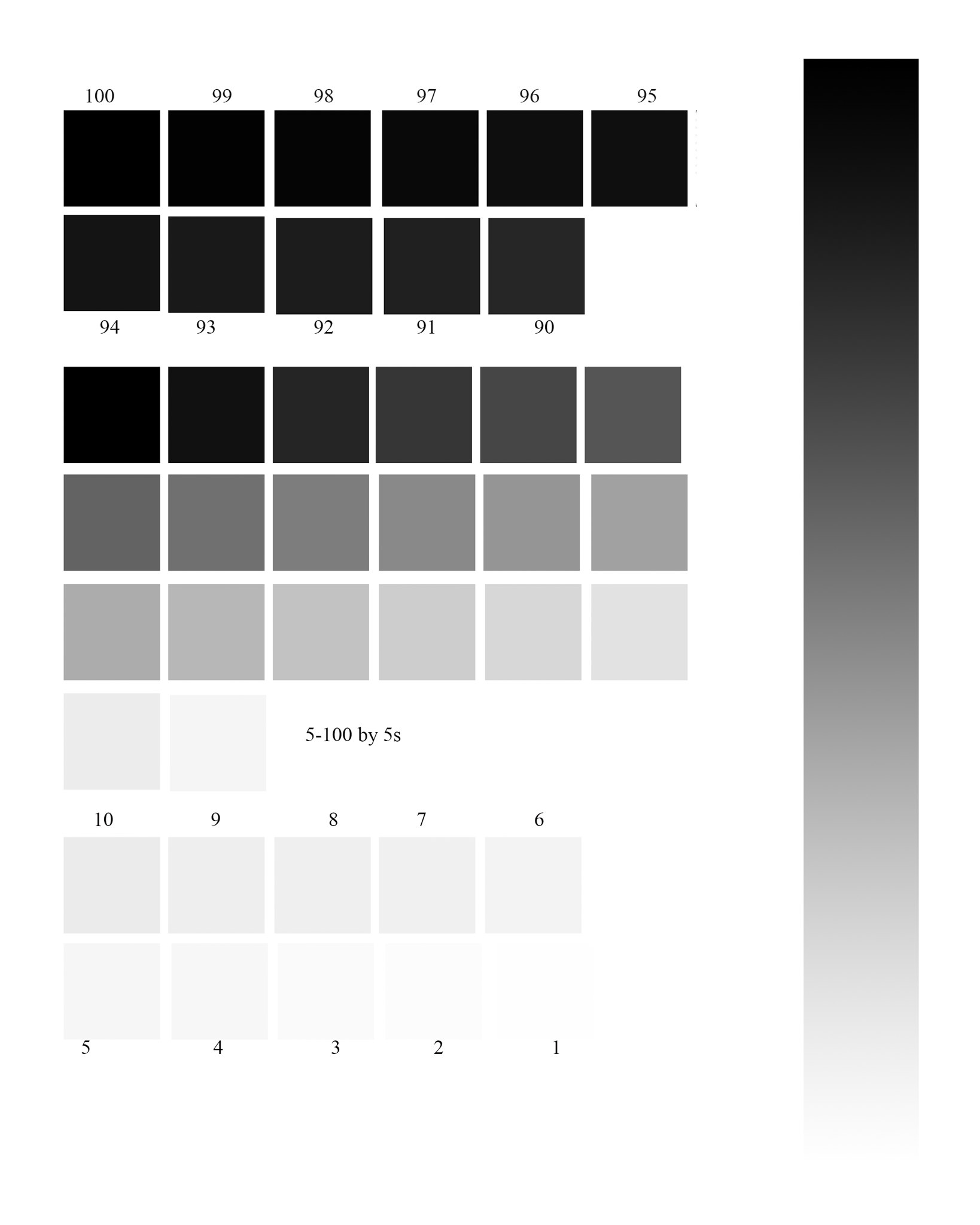
Table of Contents
How to Understand This Chart (or Make Your Own)
You can either use the test chart above or create your own. The important part is that you have a document with a black-to-white gradient, and also swatches of gray tones that transition gradually from dark to light in small increments. Whether you’re using this test chart or creating your own, you’ll need to open the info pallet in Photoshop
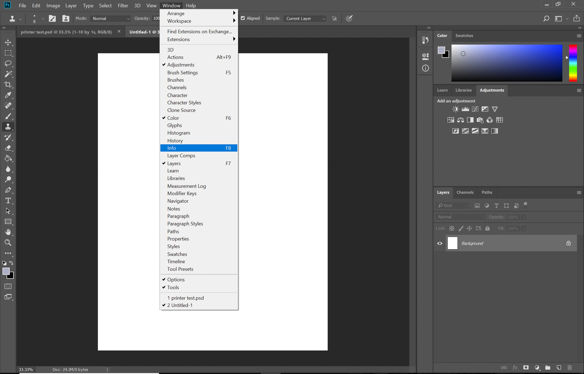
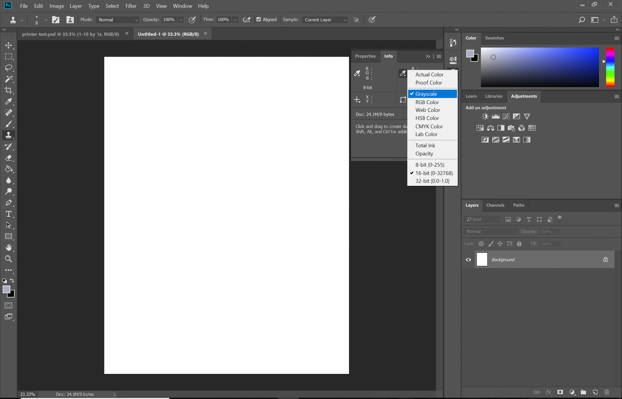
In the info pallet, click on one of the eye dropper icons and select RGB color from the drop-down menu. Click on the other eyedropper icon and select grayscale from the drop-down menu.
If you are creating your own test chart, there are a number of ways you can do this. I prefer to use the grayscale info pallet in 8 bit to measure my gray values, simply because it works on a scale of 1-100, making it simple to create gray swatches with incremental changes in value. If you look at my test chart, the first 11 gray swatches start at black and decrease in lightness by 1% in each square. When you hover your cursor over the squares and look at the k value in the info panel, you will see that it starts at 100% black in the first square, and each square decreases in darkness by 1%.

In the middle section of squares, I incrementally decrease the darkness of each square by 5%, and in the bottom section the lightness decrease by 1% again, beginning at 10, down to 1. The side of the chart also includes a gradient from pure black to pure white.
The important part is that you show the decreasing gray values incrementally in small increments. If you choose to create your own chart, how you set that up is up to you.
Tips for Printing and Analyzing Your Black and White Test Chart
Since this is a printer test chart, it’s not doing us much good on the screen! The next step in this process is to print out your test chart using the same printer, paper, and setting that you intend to use for your photograph. Once you’ve printed it, you’re looking for how your printer/paper combination handles those grayscale values, especially in the whites and blacks.
When evaluating the blacks, you want to look closely at that top section of swatches. Where can you see a difference in tone from one square to the next? You may find that the first 3 squares look identical, but the fourth one looks lighter. Or you may get all the way down to the second row before you can see a change in tone.
Evaluate the whites the same way, except this time you’re looking for the point at which you can see the square – the point at which the printer actually starts to lay down a visible layer of ink, and it’s not just paper white. At any point, you can return to the onscreen version and hover over a swatch or a tone on the gradient and see its value in the info panel. You can use the gradient on the side too, to help you see how the various black and white tones are going to reproduce and see how much detail you’re going to retain in the darkest and lightest tones.
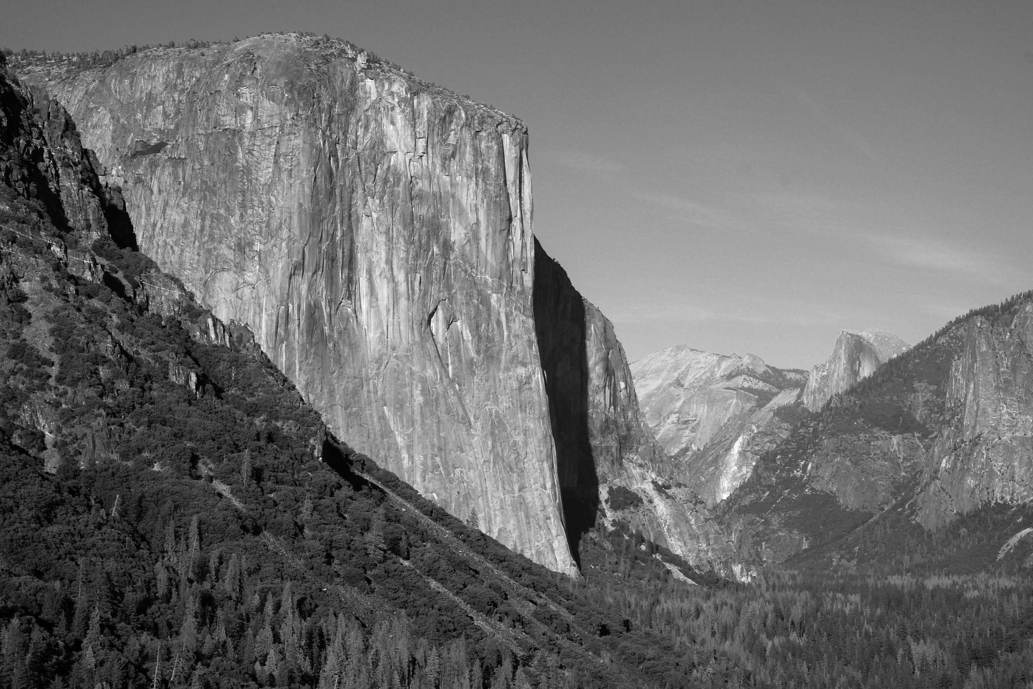
Now that we can see how our printer is going to reproduce those black and white tones in our image, it’s time to put that information to work in creating the best possible photographic print we can. Let’s say that this is the photograph I’m attempting to print:
And for the sake of this example, I’m going to assume that with my printer/paper combination I could begin to see a difference in the black tones at 94%, and I could start to see the white tones at 4%. Every printer and paper combination will be different, so make sure you print a test chart for every paper you use.
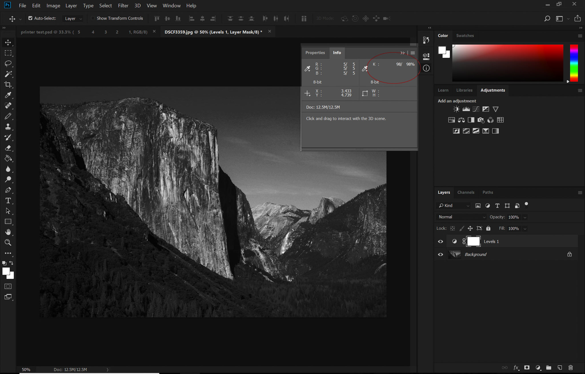
The first thing I do when I open the photograph I want to print in Photoshop is to take a look at the shadow areas. I simply run my cursor over the shadows, with the info panel open so I can get a feel for which areas are darker than that 94%. If you look at the screenshot below, you can see that the shadow area my cursor is hovering over has a black value of 98%, and moving my cursor through those shadows tells me that I have a number of small patches in the 95-99 range that will all print in the same black tone. In this particular image, my highlights are less of a problem, but I do have some spots in the clouds and the rocks that are slightly lighter than that 4% that will be visible in our print. Despite the fact that this image looks great on screen and great to my eye, the test print shows us that there are a few subtle changes we need to make before printing the image.
Editing Photos Based on the Black and White Test Chart
To edit this image for printing, we are going to use the levels panel.
Earlier, when evaluating our gray tones, we were using the grayscale (K) value in our info panel – but Photoshop’s levels tool works in RGB instead (from 0 to 255 rather than 1 to 100). So, before getting started in levels, we need to know the RGB values that are equivalent to our grayscale values in order to set our black and white points. Since 94% is the first square where I could see a difference in dark tones, our darkest black should be set at 95%. On the white end of the spectrum, I want to maintain detail in all of my whites, so I don’t want any of my highlights printing lighter than 4%. To find the RGB values in this image, all you need to do is hover your cursor over the square with the grayscale value you are trying to evaluate. Then, look at the RGB value that should also be visible in the info panel.
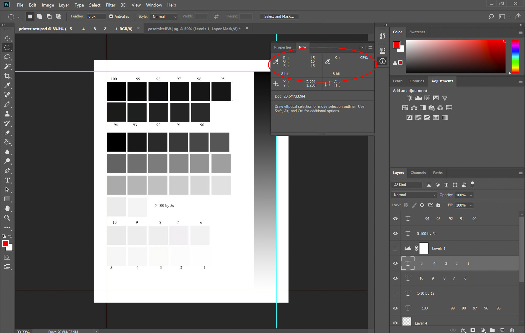
The screenshot above shows that the grayscale value of 95% corresponds with a RGB value of 15. Doing the same thing for my 4% on the white end gives me a RGB value of 247.
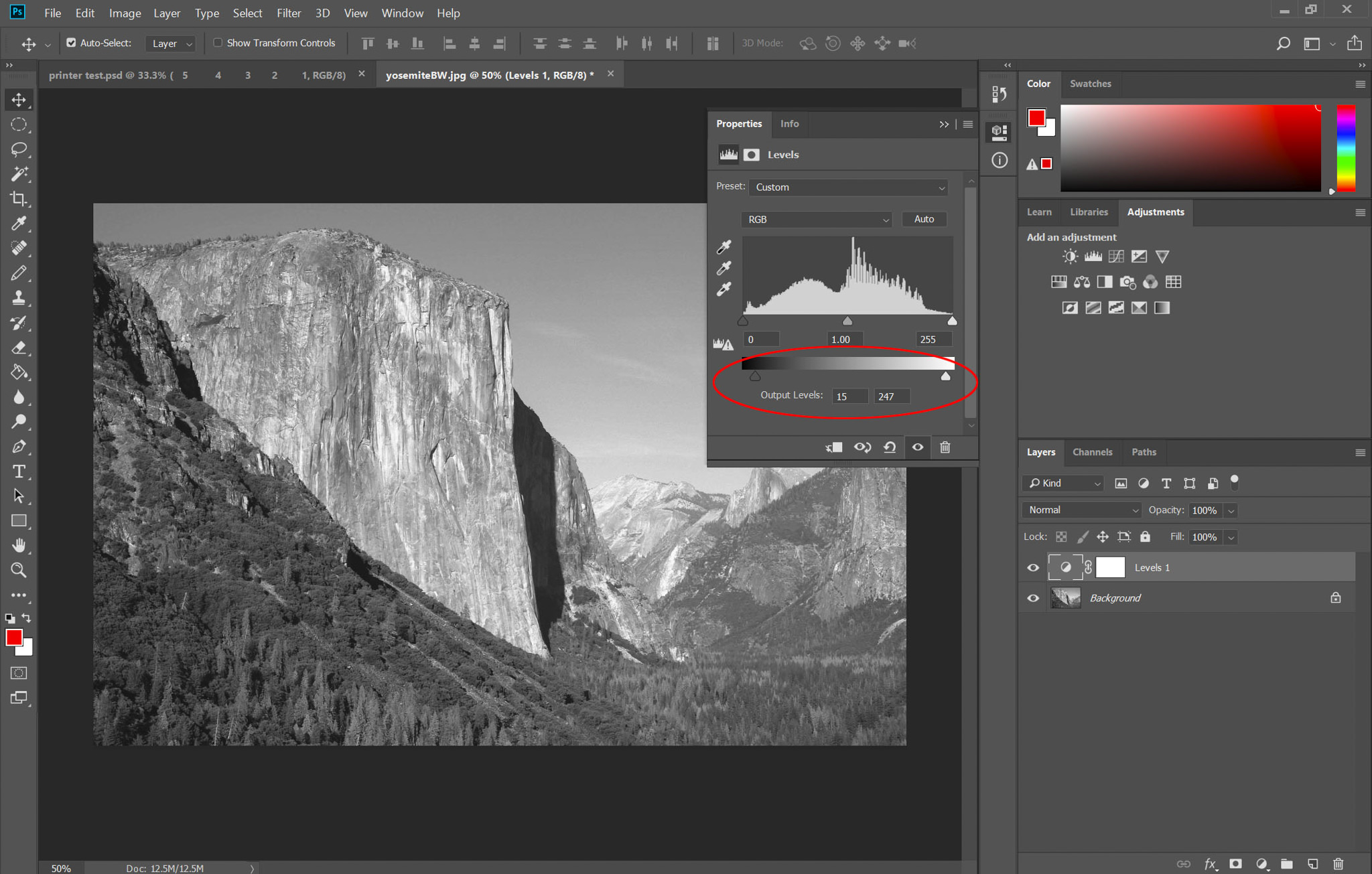
At this point, I’m going to create a levels adjustment layer (windows > adjustments > levels). There is an output slider under the “levels properties,” where I will enter the RGB values found in the last step: 15 and 247. This will redistribute all the tones in our image within those values, preventing us from losing detail when we print.

Toggling the eye icon next to the levels layer in the layers panel will show you the before and after. The difference is subtle but important. You can see a comparison below:

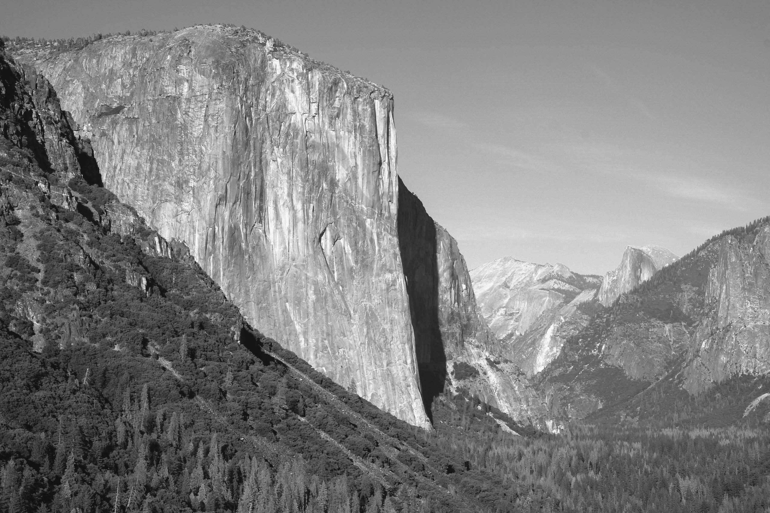
To our eye, the before version is more attractive, with its increase in contrast and dark blacks. But our printer can’t reproduce all of those tones. The after version will take advantage of the printer’s entire – albeit more limited – dynamic range and give you the best possible print.
Using the Black and White Test Chart in Your Own Prints
Whether you create your own or use this one, going through this test chart process will help you make the best possible black and white prints. Personally, I print this test chart for every type of paper I use, and I keep the printed copyright in the paper box. When using a lab for printing, I print a copy of the test chart as an 8×10 image, so that I can edit my images accordingly before sending them out for good. Once you’ve done it a few times, it is a very quick process that will make a big difference in the quality of your black and white prints.
Thank you to Photography Life reader Meg Faehl for this tutorial! You can see more of Meg’s work on her website, and follow her on Instagram as well. This article was written as part of our 2018 guest post contest.
Great Article , I have my monitor calibrated and I got the ICC-files for the ink and printer combination they use in the lab. I use the Ansel Adams zone system to discover the zones and handle the zones if necessary individually. I tell the lab to expose a small version, some times an important crop of the photo to paper, maybe in two versions: without the automatic optimization of the lab’s systems but also, if I am unsure, a lab-processed copy.
This is a great article. thank you so much for sharing your method. I am going to try it to solve an issue that I am having with prints that are way too dark. Again, many thanks!
The printer,ink & paper combination also can vary a print greatly. I always go for a High Dmax Low Dmin paper. This always out performs a warmer paper for the example image above.
Using a b/w icc profile also make a difference.
Is it possible to obtain a copy of the test chart you used in this article? If so, how?
You can save the chart that’s embedded in the article and resize as needed. Or to create your own in Photoshop you can start with a blank document, draw the gradient on the right hand side (I used the marquee tool to create a rectangle which I filled with a gradient black-white). Then with the info pallet set to Total Ink, I used the eyedropper selected each gray value I wanted (the gradient contains all of the values so use the eyedropper and look at the total ink value on the info pallet to select the shade of black/white/gray you want) and filled each square (again using the marquee tool to create the squares that I filled). For the top and bottom section the values I used are listed on the chart- for the middle section the squares are filled with the gray values 5-100 counting by 5’s. Hope that Helps!
Great article, thank you very much.
I give my prints to a lab (which is no lab anymore, cause they print with ink). They have printers I could and would never afford for bigger sized prints and they have the much greater expertise and experience that I have. I want to focus on taking pictures. Nevertheless I thought about buying a printer for photos. So far I am uncertain of how much that makes sense for my situation. While it would be convenient to print at your own place the above said is still true.
I have my monitor calibrated and I got the ICC-files for the ink and printer combination they use in the lab. I use the Ansel Adams zone system to discover the zones and handle the zones if necessary individually. I tell the lab to expose a small version, some times an important crop of the photo to paper, maybe in two versions: without the automatic optimization of the lab’s systems but also, if I am unsure, a lab-processed copy. I choose the better for the bigger print. That worked out very well for me and this way I have all the advantages of all the steps of the process from taking the photo to the print.
What I like to know from you if you are so kind to tell: How far do you go with printing your photos yourself? Do you use special paper as Hahnemühle as well? I do not know about your printer, but printing on expensive paper I would use 8 (or more) ink pro printers like a Canon imagePROGRAF PRO-4000S or PRO-1000 only. But my main reason is the lack of experience and time to do it by myself.
Very important is not to have pure withe on your image because the surface of the paper might be more or less glossy than the ink. Always have all areas of your image covered with ink. Avoid 10 on the Ansel Adams’ zone system and close to 100 or 255,255,255 at all times.
sorry for the typos: that -> than: “experience than I have” and withe -> white
The choice to invest in a printer for your own is seductive. Ultimately, and this is just my opinion, having worked at a high end shop with our own printers, having owned a couple myself, and working with a lot of people with less expensive to real expensive printers – most people will spend far less time and money and get better results working with a local, or online printer. It may take a test print or three to get some paper/DPI combos understood, but once you get things dialed in, one can get very reliable results allowing others to foot the cost of a printer, ink, and media. In most cases, unless you intend to print a lot, it just isn’t cost effective. Also, the better shops often have output profiles for the most common media/DPI combos and that properly used in Photoshop can allow one to dial in a particularly important image.
For myself and the shop I worked at, we would have the image dialed in, on accurately profiled monitors, typically with our main image in a 16-bit colorspace. Then we would duplicate that, load up the output profile, and add Hue/Sat, Curves, Levels adjustment layers as needed to dial things in, then convert to an 8-bit file. Some of these details vary based on user preference, but this is the basic approach we used.
Good luck with whatever route you go!
Mark, thank you very much. This is just the perspective that helped me the most. I am very happy with your answer. Cheers! -jan
I used to do all of my own printing, using Epson printers, and a variety of fine art papers (Hahnemühle rag is my favorite, but there are a number of great fine art papers out there). Used to do all of my own calibration, create my own ICC profiles, etc. Digital printing is similar to working in a darkroom- if you enjoy that detail work and the technical aspects, then it’s worth it. Its very time consuming, but I enjoy retaining full control of the final image and I find it satisfying as well. As for cost, I’m not sure that it’s more cost effective to print your own, it is more convenient in some ways, but if you factor in your time I’m assuming that you would probably come out ahead using a lab.
That said, in recent years I’ve done most of my printing through labs, just due to time constraints. The nice thing about the technique in this article is that it works equally well with a lab or your own printer. I just send that test print off to the lab, so I can get those black and white point values, before sending off my final image.
I much appreciate your article and answer. Very helpful. Thank you!
Cheers!
-jan
Given the fact that most R&B panels, tutorials and other sources of information make use of the zone system and list the zones with their RGB-value ranges, I think it would be easier to not use the K-values of 1 – 100 but to use the RGB-values instead.
That way it would be clear immediately what RGB-values are visible (or can be distinguished) at the white and black points, so that the levels can be set accordingly.
So the boxes on the B&W chart would be as shown here, but with their RGB-values instead of their K-values.
You could certainly do that, and I see how that might be simpler for some. When creating the chart, I liked the ease of the 1-100, and I found it easier to look through my image using the info palette and that k-value to evaluate lights and darks, but there is no reason you can’t do the same thing with the RGB values and skip that step!
Good thing to know is that Jim Welninsky uses a more or less improvised way to not have too much loss of detail at either end of the scale when processing his B&W images. In most of his adjustments he uses curves instead of levels and then moves the ends of the curves somewhat off the absolute black and white points, by just nudging the curve up and down respectively. That too results in better prints, even when increasing the contrast considerably.
When it comes to tweaks to optimize output for printing, there is often the question of levels versus curves. The challenge is that with a printer, you are dealing with brightness levels (0-100 per the preference of the author). Levels adjustments created hard adjustments to the ends, with the ability to adjust the mids, as needed. Curves provides an adjustment at the two ends, but still allows data to be above or below that adjustment, which means you will have data that is darker that is still going to be compressed down, whereas levels actually limits the end values, which is more desirable for this kind of data massaging. The difference in final result would be subtle, but in essence with curves you will have more data that is compressed, not controlled, whereas with levels you have more absolute control over the ends.
Kudos to the author. Nicely done.