A good looking image consists of many different things, most of which are subjective. In this article I want to briefly discuss one specific variable, which is image brightness. While I don’t plan on going into much detail and getting very technical, I do want to show you how you can adjust image brightness and the final look of your image using a few different methods in your post processing software. Although I’m using Lightroom, the method and concept should be similar regardless of what software you prefer using to edit your images.
To start with, we should figure out what the term brightness means. We all know what the concept of “bright” means in our everyday lives. For example, if I say that the sun is bright you know exactly what I mean. This is not the same meaning as “brightness” in photography. When you change the brightness of an image, you are mainly affecting the midtones of the image. Compare this to changing exposure, which affects the highlights, midtones and shadows evenly, and you’ll see that adjusting the brightness of an image can be quite powerful.
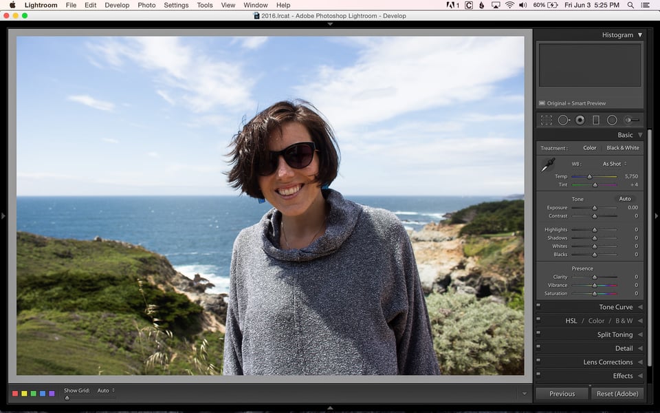
Let’s look at some examples. So that you know what’s going on, these are screenshots from the Develop module in Lightroom. We’ll specifically be looking at the sliders in the “Tone” sub-module on the right side. Here’s a straight out of the camera snapshot that I took of my wife while we were driving down Highway 1 near Big Sur. You can see that the overall exposure looks pretty good, but the image looks a little flat.
By adjusting the “Whites” slider, you can see how it changes the image. Here you can see the difference between -100 and +100:
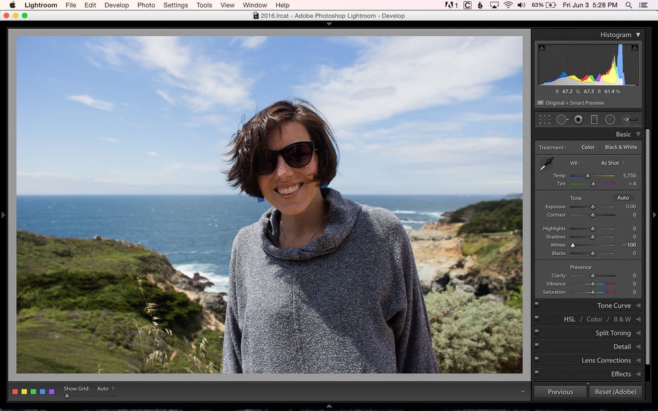
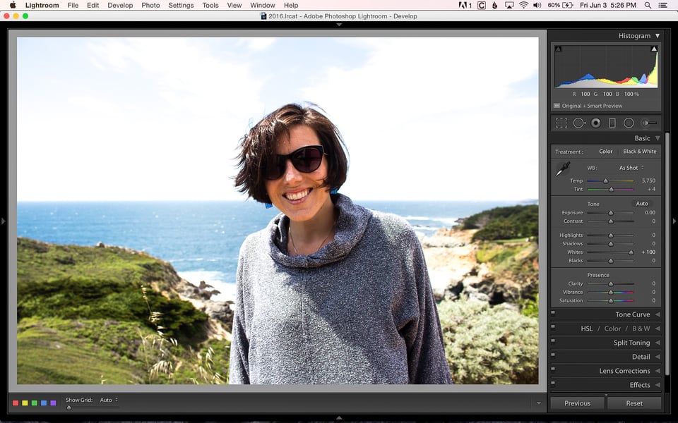
You might have noticed that the entire image seems to have a change in contrast. When the white levels are increased (+100), the sky and her skin are greatly affected, while the shadows on her shirt barely change. When the white levels are decreased (-100), the image looks much flatter
Let’s do the same thing with the “Blacks” slider. You can see how it changes the image when we adjust the slider between +100 and -100:
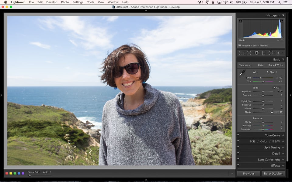
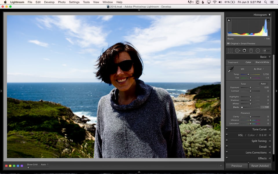
This time the effect is opposite of when we adjust the whites. When the black levels are increased (+100), the image looks flat and when the blacks are decreased (-100) the image has more contrast.
Now, compare this to adjusting the exposure by +1 and -1 stop:
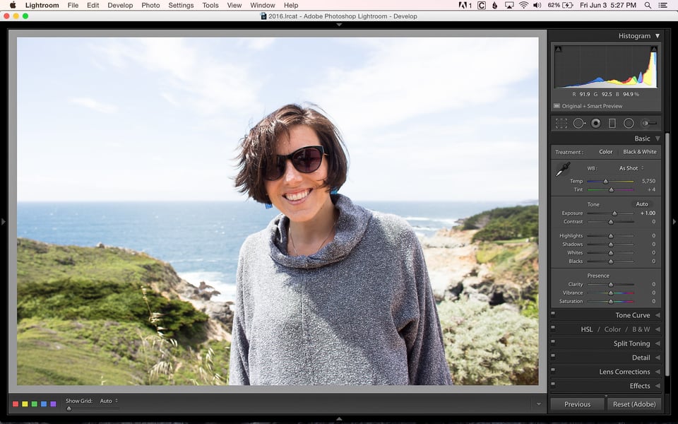
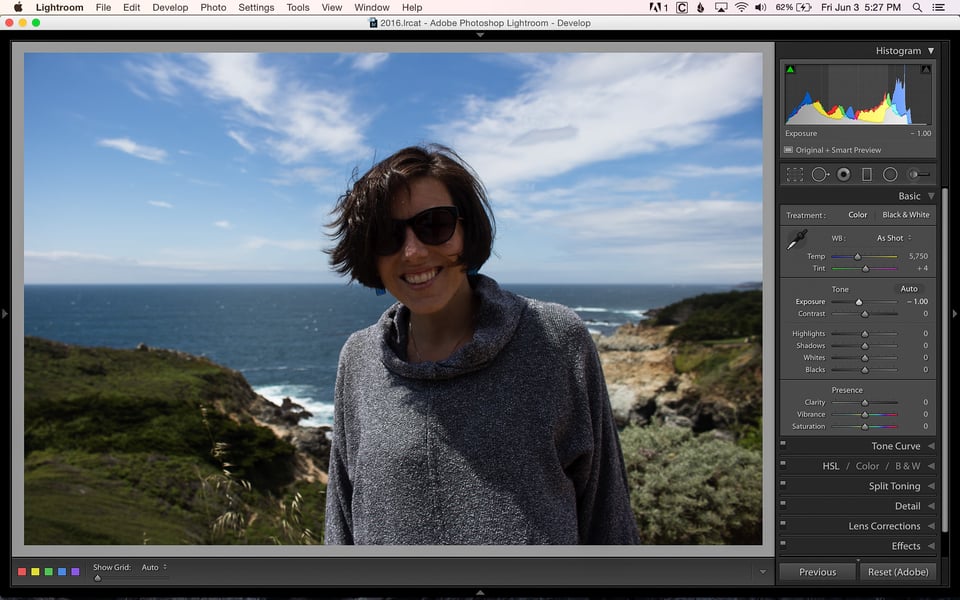
You can see that everything is affected when we adjust the exposure. Both the highlights and the shadow levels (of the image, not the controls) increase or decrease depending on if we increase or decrease the exposure.
So now that you have an idea of how adjusting the Whites and Blacks tone sliders affects an image, let’s see how we can use them to adjust the brightness of an image during editing.
Here you can see an image that is slightly underexposed. You might notice that the Tone sliders have been slightly adjusted. By default, when I import images, slight adjustments are made to the image to give it a bit more pop. Let’s use this as a starting point and see what can be done to make this image look better.
As a reference for brightness and overall image exposure, keep an eye on the numbers below the histogram in each of the following images. These give you an exact RGB (Red Blue Green) percentage for specific areas in your image (which you can choose simply by moving your cursor to any part of the image). In this first image, you can see the values listed as “R 65.8 G 64.6 B 49.2%”. While adjusting the brightness in each image, my goal was to get the “R” values as similar as possible. Although you can’t see my cursor, I had it in the same spot for each screenshot (part of the yellow on the part of the plant closest to the camera).
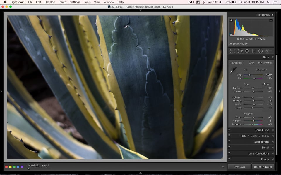
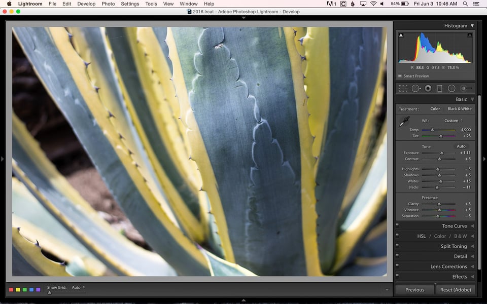
Let’s see what happens if I simply increase the exposure so that the image looks properly exposed. Things are looking much better now! My target value is R 88.3. To my eye, this image still doesn’t look quite right. The shadows aren’t dark enough and the image looks a bit washed out.
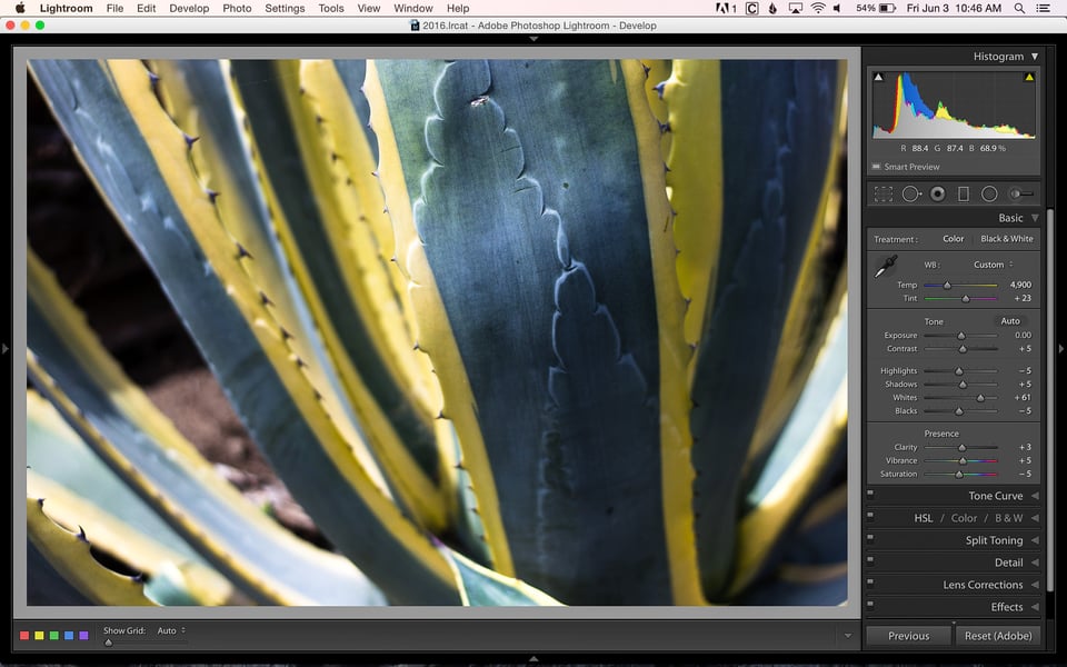
Let’s see how resetting the exposure and only adjusting the Whites affects the image. Here you can see my target value is R 88.4 and the yellow parts of the plant do look similar, but the rest of the image has changed drastically. It has a much darker feel and too much contrast for me.
Now let’s combine both exposure and white/black tone level adjustments and see what happens. In this image my target value is R 87.8. The lighter parts of the image are looking good, while the shadows remain darker. The entire image has contrast and, to me, is much more visually appealing than the previous two images.
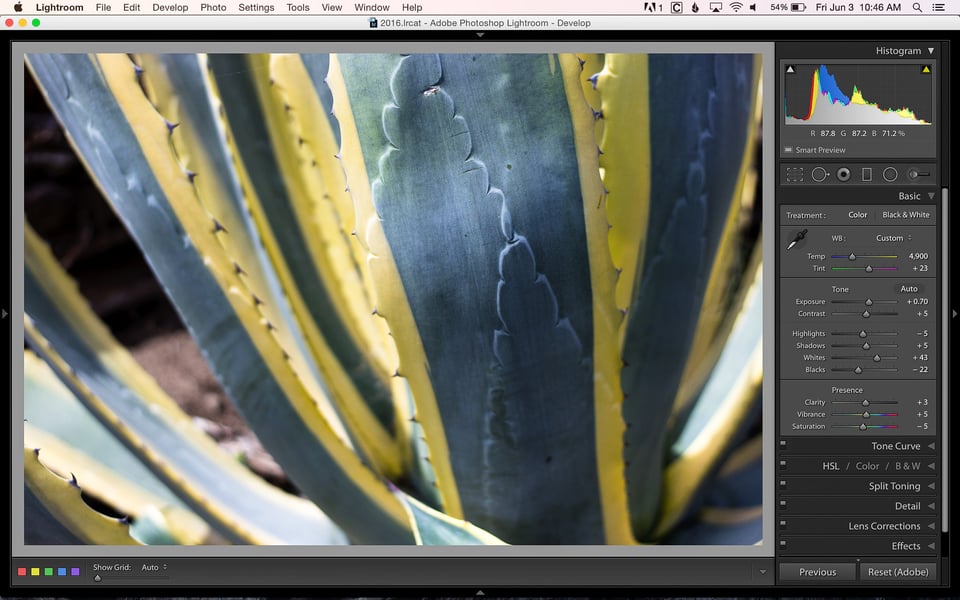
You might notice that although I adjusted both the exposure and the white/black tone levels, I didn’t have to adjust either one as much as when that was the only adjustment I was making to the image.
How about one final example? Here’s an image from a recent wedding I photographed that has a bit more dynamic range and a better starting exposure than the plant example above. Without going into too much detail, I’ll let you look at two different final edits that I did… one done with only the white/black tone sliders and one with a combination of both white/black tone sliders and exposure:

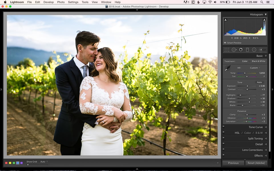
Both of these images look very similar. It’s amazing how practically the same edit can be done with two entirely different methods. For my wedding photos, I prefer the slightly less contrasty look of the second image (w/b+exposure). If this were more of a fashion type of image, a bit more contrast might be preferred.
I hope that you’ve found this both interesting and helpful. Realizing that there’s more than one way to affect the brightness of an image can open up post processing options you might not have explored before. Every image is different and you’ll have to experiment with a variety of different types of images before you get a feel for which method works best for any given situation.
How do I find the brightness of an image taken from a DSLR camera with the given shutter speed and ISO Sensitivity?
Janvi, brightness isn’t really something that you can find or measure. It’s more of a visual aspect of an image that you adjust based on the histogram and your personal preference.
Thanks for setting this out like this. I’m trying to sort out these myself. Some sliders seem to combine several operations. ‘Exposure’ in light room seems to affect mainly the mid tones while keeping the endpoints more or less constant, unlike changing the exposure on the camera, where everything shifts equally. Maybe a more understandable name for the ‘Exposure’ slider would be brightness (or is it gamma?). So a challenge in post processing is to decide on the best combination of exposure, white and black levels, and highlights and shadows. The balance between these is often slight but on some images they can make quite a big difference. Any chance of a follow up article exploring these differences?
I’m glad you found it helpful, John! It does seem like there are many different potential options while editing an image. There is a good chance at a follow up article exploring the different options and combinations of all of the exposure and tone sliders.
John Bosley
John Barrow’s question is a classic example of what I am talking about.
Someone trying to post process images without understanding what the adjustments are, what they do, how they do it or in which order they can most usefully be applied.
And yes, there are many options, but not all options are ‘optional’ – some work while others don’t.
Worse, he and others talk about exposure, brightness, gamma, white and black points, contrast, dynamic range etc, without actually understanding what they mean and how they relate to each in the context of editing a digital image file. That is not to criticise him or them, I was once just as confused, but an article like this should try to clear the fog of misunderstanding, not add to the confusion.
John Barrow
To clarify a couple of points.
The exposure slider is misnamed because exposure can only be altered in the camera at the image capture stage. Anything done to brighten an image in software involves nothing more than increasing the signal gain. The increase in gain, you may have noticed, is accompanied by an increase in noise noise – it’s equivalent to increasing ISO in camera.
The effect looks similar to an increase in exposure in that all tones are affected equally including the end points.
These however can only be altered separately by adjusting the white and black point sliders to expand or contract the tonal range. Just as in Photoshop, the black point and white points should be set at or just below clipping point – assuming one wants to maximise the tonal range in the image. Many images look a bit flat, or over contrasty or ‘not quite right’ because this has not been done.
There is some overlap in the function of the white, highlight, mid tone, shadow and black sliders as shown by the five faint white bars on the histogram in the Develop module. The same is seen in the Curves panel where the area of overlap can also be adjusted. The overlap is necessary to provide smooth transitions between areas of different tonality rather than an abrupt cutoff which would look weird.
Gamma is a different animal altogether. Put simply, gamma is contrast.
Another way to look at it is that brightness moves the entire histogram left or right (without compressing or stretching tones, regardless of any resulting shadow/highlight clipping), whereas gamma adjustment just redistributes the histogram within a given tonal range (so that it actually compresses highlights to bring out the shadows, or vice versa, without introducing any clipping in either the highlights or the shadows). If you were using the levels tool, changing the brightness would be equivalent to moving the white and black points left or right by an equal amount (so as not to affect the relative tonal relations in between). Similarly, for gamma this is equivalent to moving the midtone slider left or right. This is what the old Brightness slider in previous versions of Lightroom used to do.
As you rightly say, balancing these elements of an image can make quite a big difference. I would go further and say balancing these elements is crucial to optimising an image and is often what separates the fine image from an amateur snap.
John
I found this article confusing, at least from the perspective of a beginner.
The overall impression given is
that one can push a number of sliders around almost at random until one hits on a combination that works.
That’s not a workflow, that’s trial and error.
I appreciate this article was not meant to be an in depth discussion, but it’s so vague as to have little value to someone trying to understand the rudiments of post processing.
“By default, when I import images, slight adjustments are made to the image to give it a bit more pop.”
Making an import/develop preset is fine if it’s right for the majority of images you make, but without some qualification as to why you do this (and how), just saying you make slight adjustments by default that makes images ‘pop’ is likely to lead to some strange results for others.
As you say, the (misnamed) exposure slider will affect the overall brightness of an image – equally from highlights through mid-tones to shadows. This should be adjusted first to give the best overall appearance, even though it might result in some highlights and/or shadows being clipped.
Setting White point and Black point comes next and establishes the contrast/dynamic range.
For a maximum dynamic range ( usually, but not always, the most desired result) the white and black points are set just short of clipping using the threshold control. This sets the maximum achievable black and white points (the widest tonal range) in the image. I usually set them slightly shy of 0 and 100 to ensure they are not clipped during later stages of processing.
Then, Shadows and Highlights sliders can be adjusted to taste – without affecting the previously set white and black points.
Finally, mid tone contrast can be tweaked with the Clarity slider and/or a Tone curve ….before going on to colour.
Often adjusting one parameter will affect another adversely, so some to-ing and fro-ing may be necessary to achieve an optimal balance.
The above is not intended to be definitive, but it does at least give a logical order to the process in Lighroom which a beginner could follow with the expectation of a reasonable result. I trust this will happen in the upcoming PL video series.
This article wasn’t about developing an editing workflow. It was indeed intended to encourage people to push around some sliders and see what happens. In my opinion, there’s far too much information out there telling people exactly how to do things and not enough encouraging people to try it and see what happens. Many people don’t even know what parts of the image the “Whites” and “Blacks” sliders affect (hint, it’s not actually the white and black parts of the image). I’m hoping after reading this article they do.
I’ve edited tens of thousands of images and am still learning things about the editing process. Of course I have a workflow that I follow, but sometimes breaking that workflow can be eye-opening. For example, I had never tried to get an image to look the way that I want it to look using only the Whites/Blacks sliders (such as in the wedding example above). I always start with exposure, etc…, much like what you mentioned. I was pleasantly surprised to discover that I could actually make an image look good with only these two simple sliders. Of course, it won’t work for every image, but I figured that if this was news to me, other people might be interested as well.
Fair enough, breaking a workflow and experimenting with various controls is a valuable and interesting exercise once you know what you are doing and why you are doing it – and can open surprising new avenues and perspectives.
However, pushing sliders around in the hope that something good may emerge is what newbies do anyway, so I felt that an article of this sort might give more insights and suggest a more ordered approach.
I feel that one should learn the alphabet before trying to write the novel.
So true, but I feel like you want me to give a cooking recipe, while forgetting that someone might look at it and say, “What the heck are shallots and how do I sauté them?” We’ve all got to start somewhere and a little trial and error can make someone a much better cook than just following a recipe to the letter!
Again, this wasn’t intended to teach people how to edit their photos, but simply to point out what a specific term (brightness) means and a few different ways to adjust it using post processing software.
John Bosley
Your analogy is perfect.
If you know neither what a shallot is, nor what sautéing is, it’s a bit pointless giving someone a frying pan and suggesting they try a few interesting moves and then eat what they come up with.
Surely it’s better to explain that a shallot is a vegetable and that it should be fried in a little butter and seasoning?
What this article does is present an Irish stew and suggest the recipient work out what the ingredients were and how they were cooked – with no recipe.
In fact I can think of few things better than giving someone a sensible ‘starter recipe’ which will set them off in the right direction. That’s at least a sound foundation from which they are then free to experiment.
I was not suggesting a rigid rule book, in fact I was at pains to say that the workflow suggested was not definitive, but to suggest that learning photographers push sliders around “to see what happens” without any insight into their purpose and function is just adding confusion to ignorance.
As for the specific term brightness, this was made anything but clear. No distinction was drawn between brightness and exposure, in fact they were used interchangeably and the description of brightness given, “When you change the brightness of an image, you are mainly affecting the midtones of the image.” is just plain wrong (unless you were referring to the brightness slider in an obsolete version of Lightroom..)
Also, adjusting overall tonality with just the black and white tone controls is not a great idea, least of all for a beginner, and there was no explanation of what the black and white sliders do, other than changing contrast. Well they do that for sure, but pushed too far they can also destroy all detail in the shadows and highlights. Surely some explanation of what white point and black point are, and their importance, would have been in order?
Even this cryptic statement is misleading. “Many people don’t even know what parts of the image the “Whites” and “Blacks” sliders affect (hint, it’s not actually the white and black parts of the image). I’m hoping after reading this article they do.”
Hint, put simply, it actually IS the black and white parts of the image since they are tonal controls setting luminance values. Setting black and white points (which was not explained) is vital to the correct rendition of a full tonal range and does indeed define the maximum, unclipped darkest shadow (0) and lightest highlights (255) in an image file and ensures that every last bit of information is retained.
Articles like this help no one.
It seems that you really want this article to be something that it’s not. I’m sorry you don’t find it useful.
It’s not about what I want, but about what the people it was aimed at have a right to expect from a member of the editorial team.
An article that was 1, informative and 2, accurate.
It was neither.
I am constantly amazed at how many pros do not understand the basics of their work.
You can say and think what you want about me and what I write, but it does not necessarily make you correct. I’ll let you have the last word on this and I’m going to call it a day. Thanks for all of your input. It will definitely cross my mind before I write my next article. Consider it noted.
I have said nothing about you personally.
If anything I have said about the content of this misleading article can be shown to be wrong, I will gladly accept the correction and learn something new.
I am likewise “constantly amazed at how many pros do not understand the basics of their work.”
Thank you for spending the time to properly explain the fundamental principles involved. The only thing that I shall add is that the term “brightness” [used throughout the article and the comments] should be swapped for the term “relative brightness”. The “brightness” of an image is determined by the luminous intensity of its illuminant; only the “relative brightness” of a digital image can be manipulated via image editing software.
I am also amazed at how many people abjectly fail to understand that criticising the content of their message/work is *not* an ad hominem attack.
I found this thread both fascinating and uncomfortable at the same time. I am a total novice when it comes to post processing. In fact, I’ve never shot RAW. I’m researching and reading before purchasing software. Sometimes that leads me down a rabbit hole like reading this thread! First, I’m disappointed by the lack of resources out there for true beginners. Everything I’ve found assumes a certificate level of background. Maybe some day I will just have to develop a resource for others like me. Second, I hope that among debates like this, experts like you are actually working with true beginners to see what their struggles are or asking true beginners what questions they have or what is paralyzing them from getting started. Third, I am an elementary school teacher by profession. I mention that because it’s important to understand that we learn differently. As Betty correctly suggests, beginners learn with a series of steps, or a “recipe” to use as a starting point and an understanding of all the terminology. And as Pete correctly suggests, beginners learn by playing around with the software to see what happens and then find themselves in a position of asking questions and being ready for next steps in their learning. So, there really should be no argument about this point. Elementary school teachers understand that not every child learns the same way. And adults can reflect to determine their learning styles as well. What is best for one person is not best for all.
Tanya
If you are beginner keen to learn, you could not do better than look at Photography Life’s Home Page. On the top right is a section with a number of headings starting with ‘Beginner Photography’. It starts with the absolute basics and is a gold mine into which you can tunnel as far as your quest for all things photographic can take you. Happy learning and welcome to the world of image making. Betty.
Pete, please don’t take this to be offensive, but I don’t think you’re my target audience for wedding photography. Glad we got that cleared up.
I’m delighted to discover that, regarding wedding photography, our clientele have vastly different tastes.
“If you can’t say something nice, don’t say nothing at all” — Thumper, from the movie Bambi. Even my 3-year-old son knows this. No offense, of course. And I liked the picture. I didn’t pay much attention to the foliage until you mentioned it. I noticed it, but I didn’t care.
I guess you also “didn’t pay much attention to” the overexposed foliage right behind the bride’s behind.
Who was the “overexposed foliage” marrying ? These were wedding photos right?
The overexposed clouds in the sky totally overpower the bride’s white dress; the brown stuff the couple are standing on looks like, horrible brown stuff; the overexposed foliage drooping down towards her behind is the giddy limit. This is the most derogatory picture of a bride and groom that I have ever seen.
As posted above post processing to achieve the best look for an image that will be shared, requires a calibrated monitor. However regarding this articles theme of adjusting for brightness, this is a hot point for me. While there is an industry standard for color there isn’t one for monitor brightness. An anecdotal incident to illustrate; a while back while viewing an image on another web site, in the comments section was both a too bright comment and a too dark comment. My voice is far to small to affect a change in this regard but I sure would like to see a standard here also.
Rich, I agree with you. Even with a properly calibrated monitor, the environment where you edit photos will affect the image brightness depending on if the area is too dark or bright. Not to mention how easy it is to change the brightness on a laptop display.
When I edit images I go back to those RGB percentages below the histogram and always try to have a target value for skin tones. This way I know that at least my editing for people should be somewhat consistent regardless of where I’m editing images.
Rich
In a way there is a standard for brightness (more or less!) in the photographic editing world which derives from calibration in a constant (if not necessarily standard), viewing environment, but it’s simply not possible to set a universal viewing brightness because viewing conditions and requirements differ so much.
Gamers for example, seem to want a 9000ºK white point and eye watering brightness, while photo editors favour D65 and about 100cd – and never the twain shall meet!
Betty, No matter my viewing conditions vs yours for example, I am sure that the manufacturers could all come up with settings for various outputs/viewing conditions. At least on the high end monitors designed for image processing. However what in part sells monitors seems to be how bright they are. I know when I have an image for printing to lower my monitor brightness to its lowest value for proofing. However for web use there isn’t a standard. Having worked in the electronics field for over 55 years I know there could be. It takes motivation.
I couldn’t agree more.
It’s nice to hear from someone who cares enough to have a bit of a rant about it here!
Rich, I echo Betty’s reply and I thank you for your knowledgeable comment.
There is, of course, a standard for the World Wide Web — sRGB — but, as you correctly implied, the vendors of display devices still do not provide a preset to honour this standard:
en.wikipedia.org/wiki/…nvironment
did you call your wife ‘flat’ ? :) nice article. I use ‘Nikon view’ a lot for simple tweaks and find the shadow detail slider has the best overall effect. Is this the same as w/b ?
No.
Haha, no I didn’t dymmy. :)
Although I’ve never used Nikon view, I’m assuming the shadow detail basically affects information in the shadows, but doesn’t work the same way as the white/black sliders. In Lightroom, the “Shadows” slider should work in the same way.
thanks Jhon for this very interesting article… complete and clear!
You’re very welcome!
Hi John, thanks for the article, it is a good starting point for those who have leapt off the JPEG format and are developing their skills at RAW processing themselves instead of letting the camera make those decisions.
I don’t use Lightroom, but I do use the Camera Raw element of Photoshop sometimes. Other times I use DXO Optics Pro. Both of these are RAW post-processing applications, and brightness is of course included, though I tend to use the ‘exposure’ slider if needed, and then adjust the Highlights / Mid-tones / Shadows & Blacks sliders to fine tune exposure (brightness) that way. The individual adjustments are great. I think better than just whites and blacks adjustment, and I find the mid-tones and shadows sliders are very useful at regaining image detail where the ev range in the image is more than seven stops.
Sometimes with a difficult image, I find I have to use the clearview slider (DXO) or the clarity slider (photoshop camera raw) to bring up the saturation slightly, but in a different way to using just the ‘saturation’ slider, with better results overall. When I do that, I often have to re-visit the exposure slider to compensate for level changes these sliders can make to the overall look.
I never caught the Lightroom train, it is highly popular now, but when I was starting out with digital processing, having done a web design degree, we had learned photoshop for three years in the context of making graphics for websites, page backgrounds etc, so I already knew the software and naturally progressed to using it for my images’ post production.
DXO solves many problems that Photoshop cannot, in a superior noise control system (prime) and very easy to use, but very accurate perspective controls, for buildings, keeping doors and windows straight on indoor shots, and outdoor shots with posts, poles and other vertical (and horizontal) objects or lines which you need to square up – a bit like having a tilt / shift lens with you when you shoot except for adjusting for huge depth of focus. For that you still depend on the camera lens aperture at the shoot.
Good basic article though, sometimes the more advanced articles in here swamp the people starting out with far too much information in one hit.
Thanks for the comments and thoughts! I think you’ve perfectly illustrated that point that there are many different ways to achieve the same result. Even using different software will present different solutions to the same problem. Happy editing!
Hi John, I posted because there are still one or two of us using something other than Lightroom, and I wanted to bring to the table the fact that there are many overlapping tools between different software processing applications.
As Betty says later on, getting the white and black point set (In DXO these are set in a panel of four sliders, white, mid, shade & black) so I get those set up after a gentle, if needed, move of the exposure slider. once done I proceed as I outlined above. Same thing, different program, so if anyone doesn’t fancy Lightroom, there are other options. I love Optics Pro, for noise, setting dynamic range, the clearview slider, and of course, the perspective correction tools which make it so easy to do. On the downside, there is no local adjustment brush so you will have to export your image as a Tiff and work on it using something else if you have to make local adjustments too.
Much of the time, that is not the case for me, but I guess some kinds of landscape work would produce images that need local adjusting, which is where I use Photoshops’ Camera Raw.
Pretty good article John, rather basic, however I’m sure people just starting with LightRoom will benefit the most. To me though the most important part of post processing is to have a properly calibrated setup, and that would include your laptops and display monitors. I can’t stress how important this is. I’m not a professional photographer like you and many others, but if you want to get serious with your post work that would be the first place to start, and for sure it makes a big difference. Anyway, thanks again and keep up the good work. Best wishes…
Agreed, but it is perfectly possible to adjust an image to perfection on an uncalibrated monitor.
Unfortunately, the image will only ‘hold true’ on that one monitor in that one set up.
If the image is shared in any way, (web, another monitor, print, etc,) the whole thing unravels and the image will no longer display as originally intended.
The point of calibration is to work to a set of universally agreed parameters so that all devices in the imaging chain are speaking the same language and all images are displayed as intended.
Which is why we need to properly understand the varied viewing conditions of our intended audience *before* we press the shutter button.
An image that succeeds only when viewed on calibrated monitors — and breaks when viewed on uncalibrated monitors — very likely has zero artistic merit.
I am not sure about this. The intended audience is the key. If it is a magazine spread for example. Are you sitting at home in the evening, in incandescent (tungsten) lighting, or low energy LED lighting? is it directional? or what if it is bright daylight outside with strong sunlight coming from the windows of the room?
If the light is reaching the magazine, the viewer will get a very de-saturated impression of the image due to the strength of the ambient light.
The list goes on and on, the viewing environments are limitless, and so, impossible for the photographer to cover all of them in his post adjustments.
This renders the anxiety of calibrating monitors somewhat impotent, unless there is some way the photographer can restrict the intended audience to viewing his work ONLY on the monitor to which it has been calibrated, and the image is not permitted to be viewed elsewhere?
I buy magazines, some of them photo magazines, and mostly for inspiration when I am out of ideas, but when I look at them in the store, under artificial lighting, and then glance through them in the car when waiting for my partner to join me, and again, at home or in the office, again, under different lighting, this change of ambient lighting at each locale has an impact, or if you prefer, a contribution, upon the impression of the images. I have bought books / magazines which looked great in-store, and when viewed at home, not so great. The opposite holds true, sometimes images improve by being viewed at home.
So where does this leave monitor calibration? I think, at best, a tad overstated in its’ importance in the grand scheme of things.
Even as I type, the room this computer in undergoes considerable lighting variation through a full day, as we head into the evening, artificial lighting comes into play, replacing the either overcast, or sunny light that preceded it, and again, impacted, or if you will, contributed to the viewing experience.
Thus, calibrating for your intended audience is a bit of a problem to say the least, as even the intended audience is in a constant change of state, regarding viewing ambience, rendering a lot of effort in this area somewhat wasted.
Just my take, and no offence intended, hope it makes sense to most.
AutofocusRoss, Thanks for your reply. I’ve observed the same things, particularly the effect of changes in room lighting.
The images I’ve had published were all edited by the journals before being sent to their publisher. The journals use their own calibrated workflow to optimise the contrast, brightness, colour balance, saturation, highlights and shadows to get the best results from their publisher’s CMYK printing. I found it a very interesting learning experience; the major lesson being that I was spending far too much time fine-tuning my images before submitting them.
Having a calibrated monitor is very useful for maintaining consistency in our work — especially if we have one or more artistic styles/themes that we’d like our audience to easily recognise as being uniquely ours.
As Motti said in comment 1.1.2, after spending ages editing a set of images to look their best, it can be an unpleasant experience to see them displayed on various computers and mobile devices. I initially found this very discouraging, but we have to keep in mind that human colour vision is highly adaptive: users quickly adapt to their uncalibrated display screen(s) therefore our images will look fine to them on their display, even though their display doesn’t look right to us. Conversely, if we show them our images on our calibrated display, it won’t look right to them.
AutofocusRoss
Quite muddled thinking if I may say.
The apparently altered appearance of printed material under different light sources is a function of colour temperature, the spectral power distribution/the chromatic rendering index of the light source, not to mention metamerism.
It does not alter the fact that the source image file, if processed under calibrated conditions leads to the production of a screen image or print, which if viewed under standardised screen viewing/daylight conditions, will look as the author intended.
The fact that an image ends up being viewed under non-ideal conditions does not negate the need for calibration and standardised lighting when making and later viewing, the image. In fact it makes it all the more important for without it, instead of some variance in appearance, to which the human eye readily accommodates, complete chaos would ensue.
You also seem to be missing the point of monitor and other calibration and profiling when you say , “This renders the anxiety of calibrating monitors somewhat impotent, unless there is some way the photographer can restrict the intended audience to viewing his work ONLY on the monitor to which it has been calibrated, and the image is not permitted to be viewed elsewhere?”
The whole point of calibration is that an image made on a calibrated monitor can be viewed anywhere in the world on another calibrated monitor and it will look nearly identical. Moreover, the ISO standard specifies a uniform and constant set of illuminants and conditions for viewing colour that can be utilised the world over. The same cannot be said of an image from an uncalibrated device.
The aim of colour management is universality, consistency and reproducibility. If you were to send an image file made under colour managed conditions to a third party print house whose workflow is also colour managed, they can proof print with a high degree of accuracy. If either party is not colour managed, the whole process becomes guesswork.
If, as you say, you view your monitor at home when working on photographic images, under “considerable lighting variation”, then with respect, you are deluding yourself in thinking you have a calibrated monitor. A constant and reproducible viewing condition is a prerequisite for calibration.
So, having standardised working parameters in science based applications like photography is not negated by the fact that they cannot always be perfectly applied under daily conditions.
Betty… And what if I have a perfectly calibrated monitor, I correct an image to perfection, put it on the web and go and look at it on my wife tablet.
Horror! It’s not even close!
There is no way anyone can make photos look exactly true when put on the web. Between different phones, tablet and millions of monitors around this image will look in a million different shades.
Calibrating our monitor is ONLY good when calibrating to our printers or the lab we use. Other than that we can only pray people who watch our phjotos have either a somewhat tuned monitor or a very low degree of color judgment.
Not to mention the way Facebook render our images :-(
Pete, very well said!
Mr. Motti, basically I agree with you. Maybe a lot of people like to push their content up to social media or keep a 100TB archive, but for me I like to make big prints. And if you print your work properly calibrated hardware does make a difference, even though most of the posts on PL disagree. For all those who are in doubt, take a file from your “any laptop and monitor will do” down to your local printer and get them to plot you a 24X36 print and I’m sure you will be (unpleasantly) surprised. Calibration is used as a baseline and most of the time my images coming off the plotter look pretty ok. There is good reason why you can spend a couple of hundred dollars or a couple of thousand dollars on a monitor. Anyone that is shooting medium format, high megapixel cameras (36-50MP), or doing wedding photography for a living is not interested in 8-bit jpg images posted to the web, and for sure they are not using $200 ‘should be ok’ monitors for use post processing. Personally I get a lot of enjoyment from printing my work and to me that’s what photography is all about. Try it if you get a chance…
Philip, Many years ago (when home computers didn’t have colour management) I tried making my own prints. Every print was a surprise: I expected it to look different from the monitor, but I could never predict what the differences would be! Some of the prints looked terrible; most of them weren’t worth showing to anyone; and only one was good enough to display on a wall in my house. Having previously learnt how to produce excellent prints from film in the darkroom, I couldn’t understand why domestic digital photography was such a retrograde step in photographic imaging quality.
I totally agree with your statement “And if you print your work[,] properly calibrated hardware does make a difference”, but not with the final part: “, even though most of the posts on PL disagree.” In my opinion, I think that most of the commentators on PL seem to agree, not disagree, with the advantages of having properly calibrated hardware. When conducting discussions via the comment section of an article, it is next to impossible to convey the tone of our message and its unambiguous meaning — without writing essay-length comments.
Personally, the two aspects of photography that I’ve never enjoyed are developing film, and printing my own work (either chemically or digitally), so I rely on the services of local experts to print, mount, and frame my work.
Motti
“And what if I have a perfectly calibrated monitor, I correct an image to perfection, put it on the web and go and look at it on my wife tablet.”
Well, you could calibrate your wife’s tablet, couldn’t you?
“There is no way anyone can make photos look exactly true when put on the web.”
That’s largely true but also inverted thinking.
You seem to imply that the lack of colour uniformity is somehow the fault of colour management. No, the fault lies in the fact that relatively few people understand or apply colour management – including web browser developers. However, things are improving, more browsers are now colour savvy and honour image profiles correctly and more monitors come out the box defaulted to sRGB.
As PeteA said, in the days before colour management, it was the wild west out there.
Thanks Philip. It was intended to be pretty simple and explain some basic concepts. I’m sure many people would agree with you that display calibration is a very important part of post processing. Even judging something as simple as image brightness can be drastically affected by a poorly calibrated display!